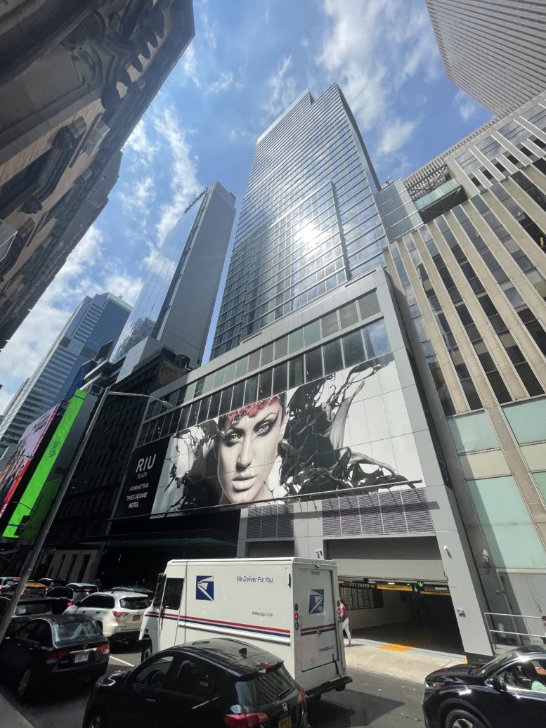
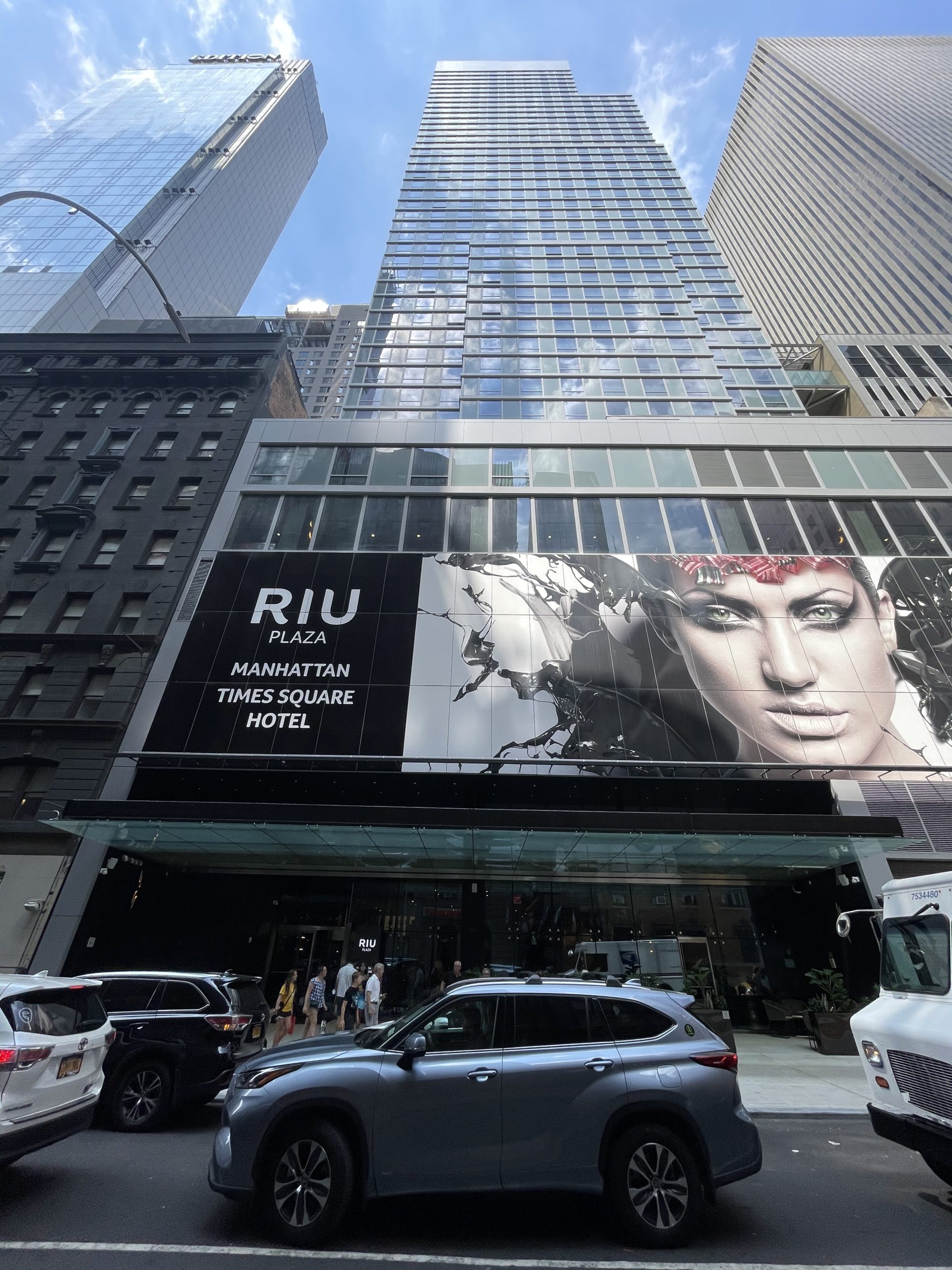
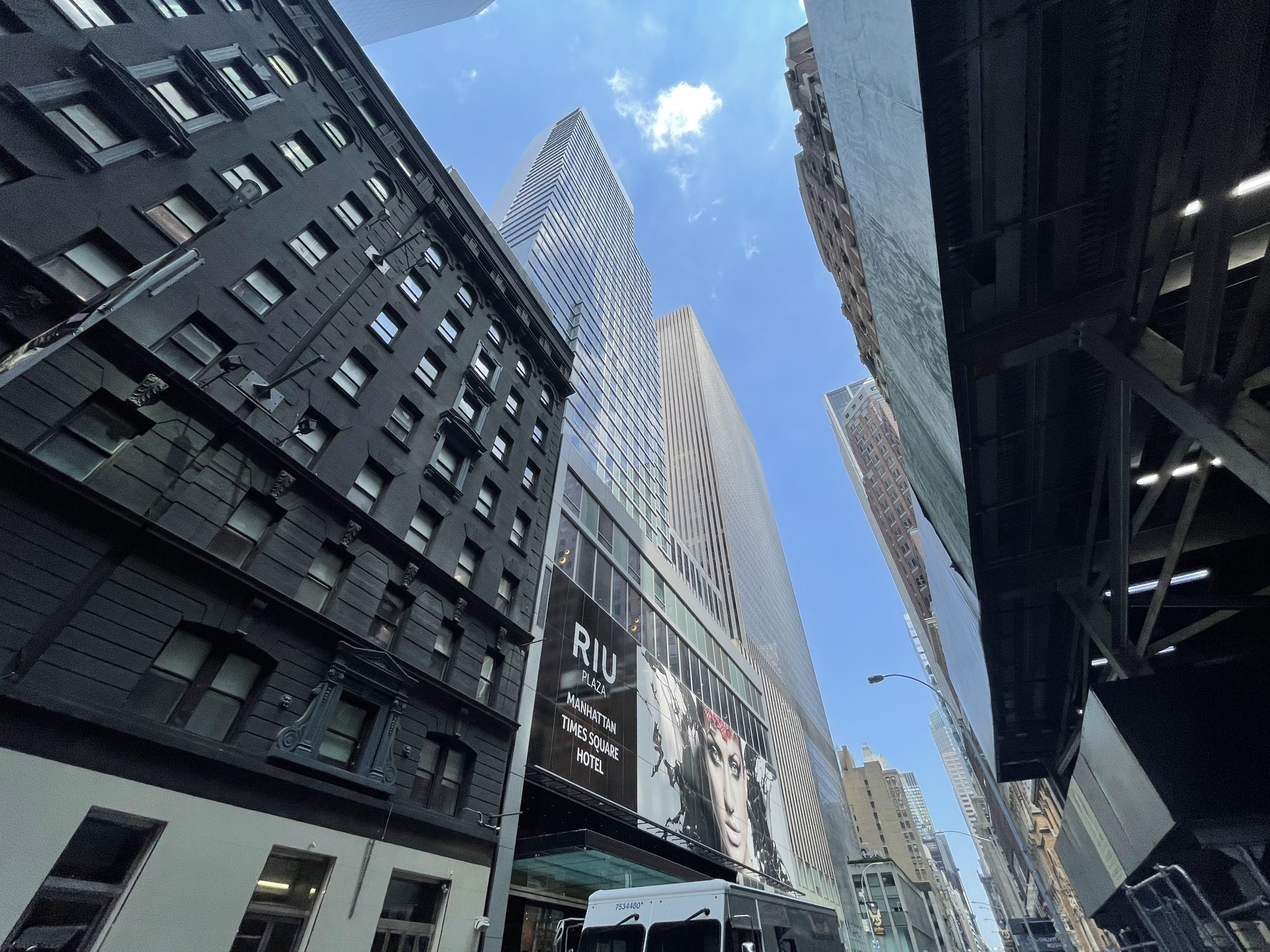
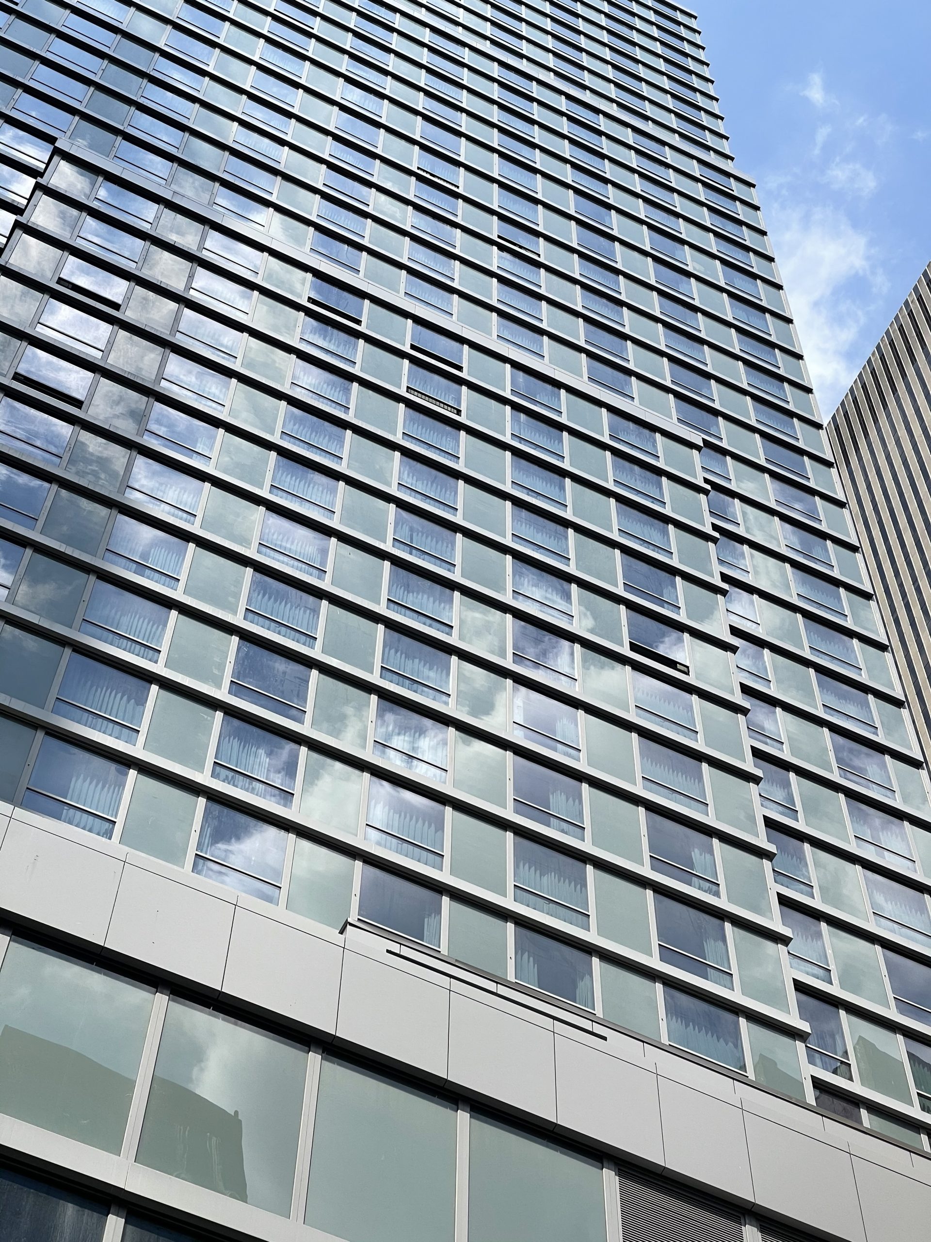
Construction is complete and occupancy has begun at the RIU Plaza Hotel, 48-story skyscraper at 145 West 47th Street in Times Square. Designed by Berg + Moss Architects and developed by Tribeach Holdings, the 519-foot-tall structure yields 353,000 square feet and 630 rooms. Transom Builders Group served the general contractor for the property, which is located between Sixth and Seventh Avenues, a short walk from the heart of Times Square at the intersection of Broadway and Seventh Avenue.
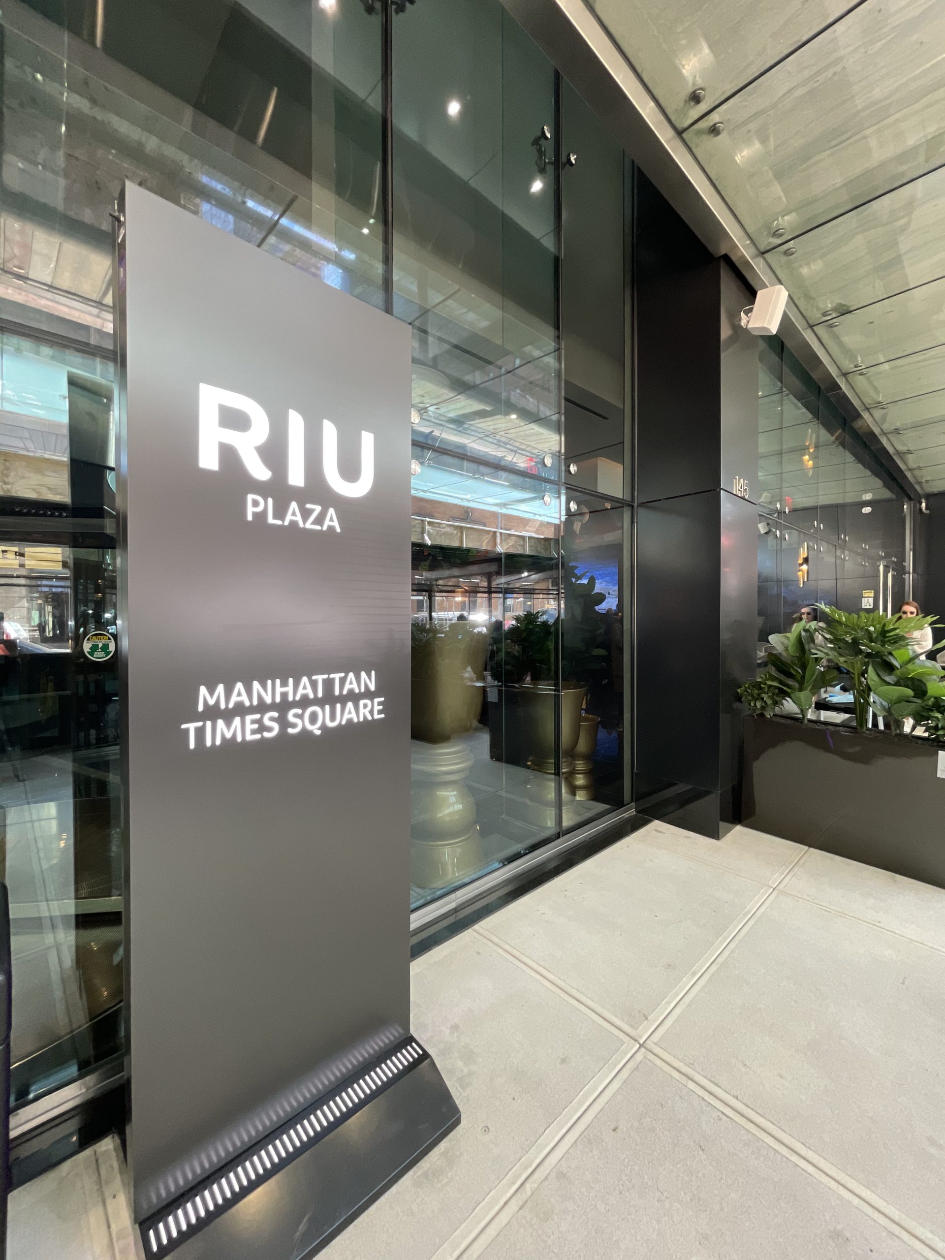
At the time of our last update in mid-January, some finishing touches were still wrapping up on the exterior. Since then, the sidewalk scaffolding along West 47th Street has been dismantled, revealing the front entrance flanked with seating, tables, and planters.
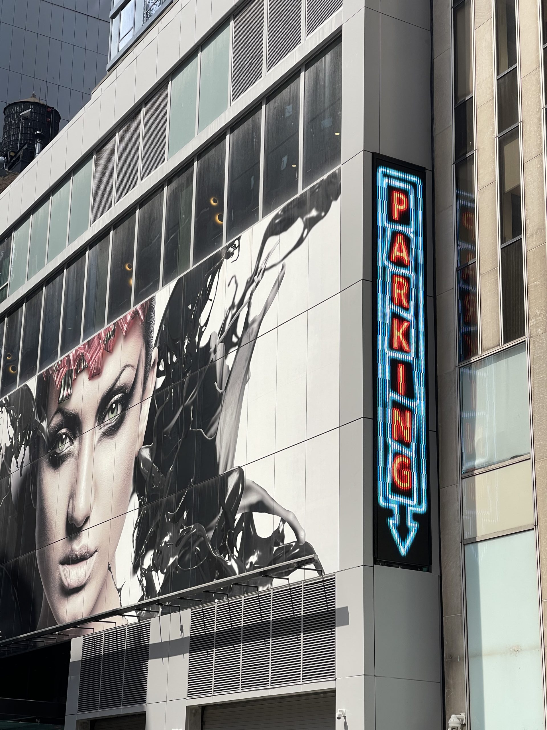
A new vertical parking sign was installed along the eastern end of the lower floors, flashing bright orange and blue lights that evoke a vintage neon aesthetic.
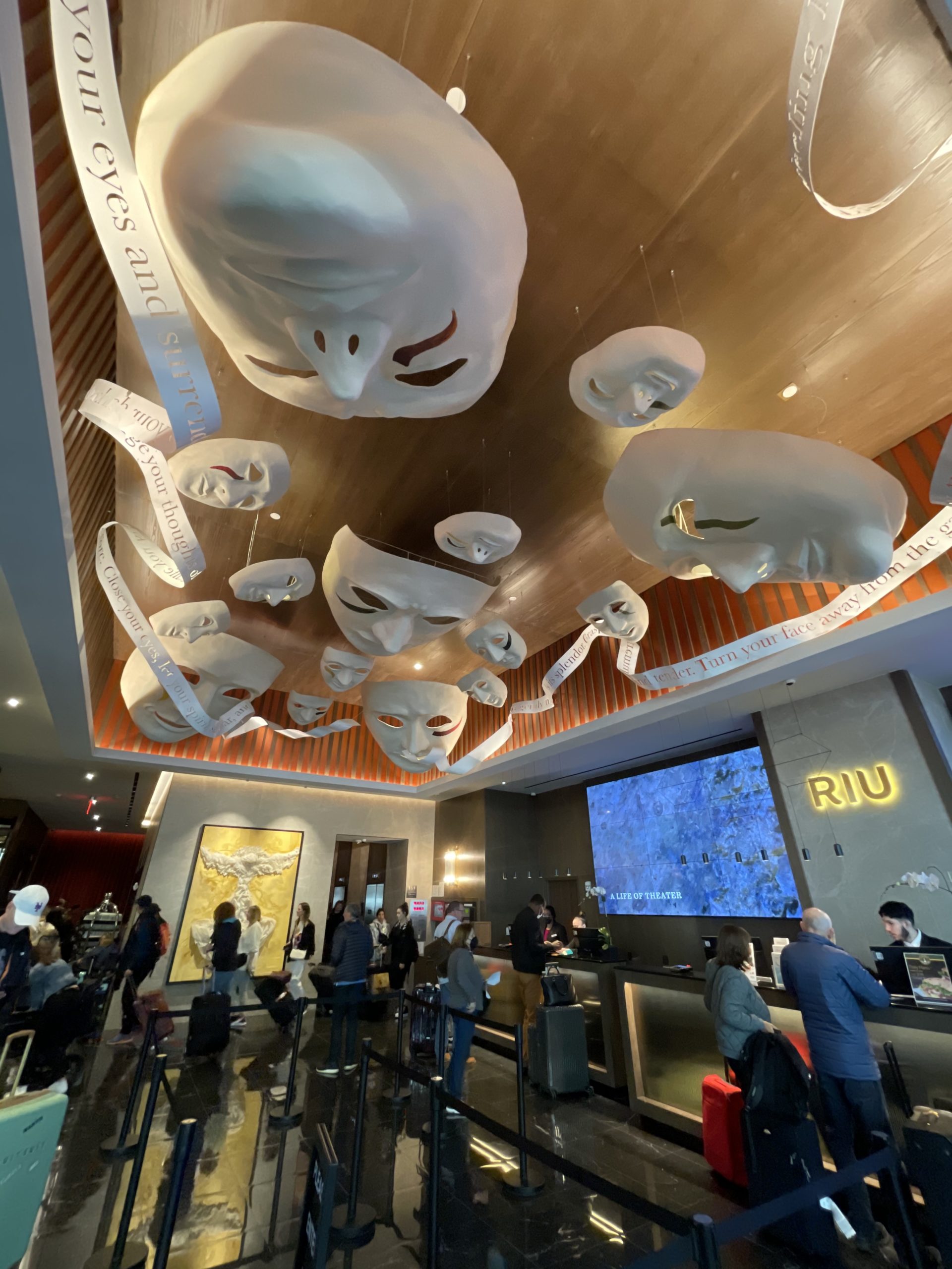
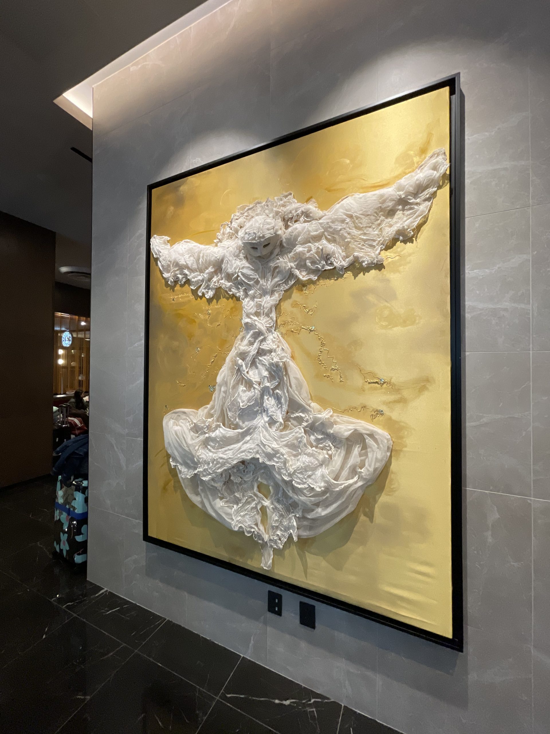
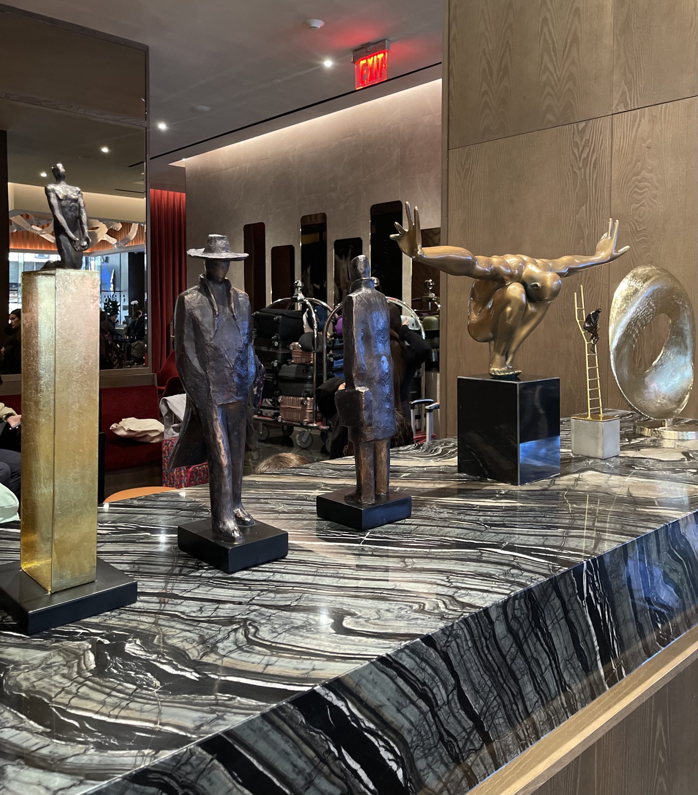
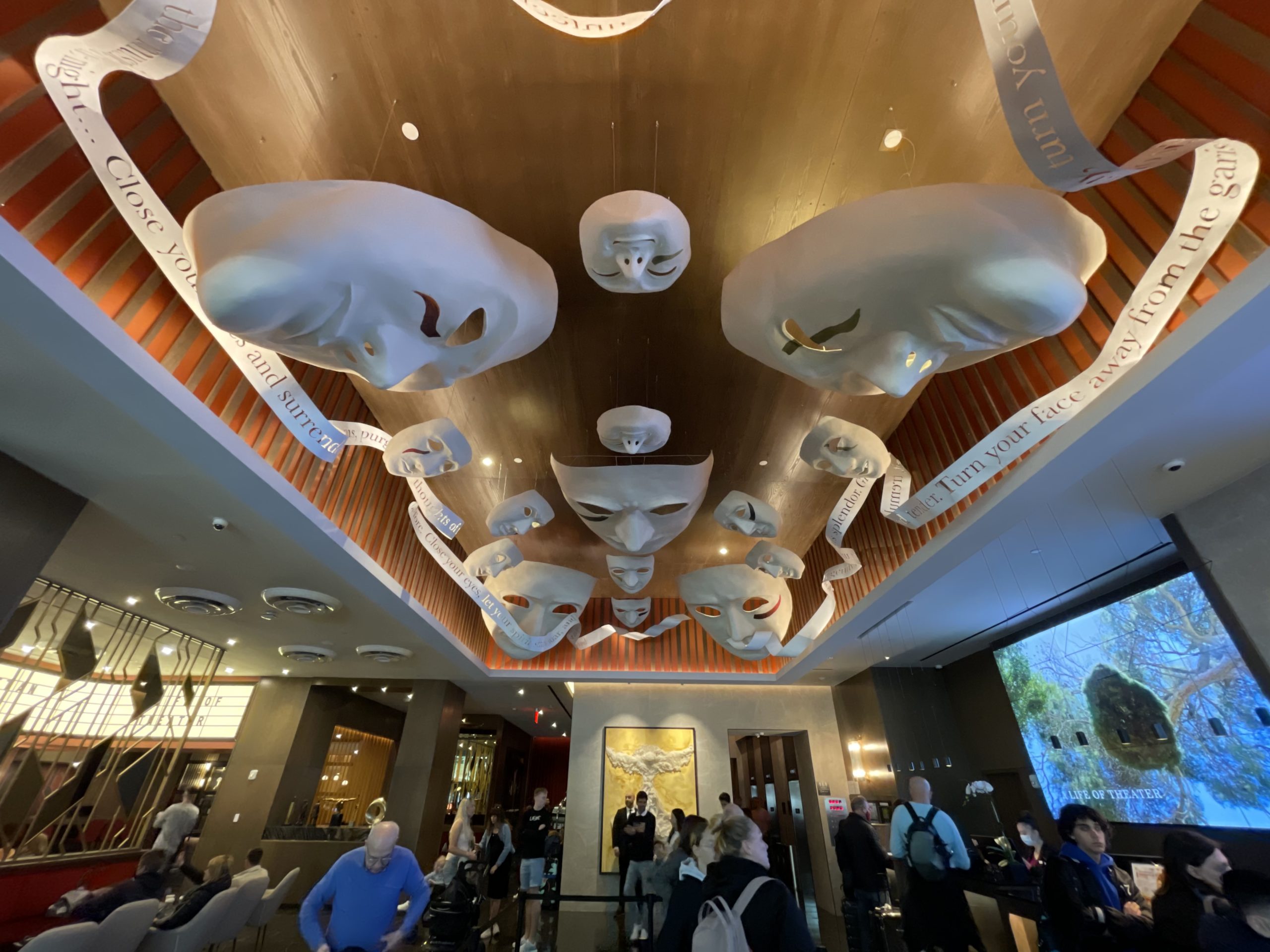
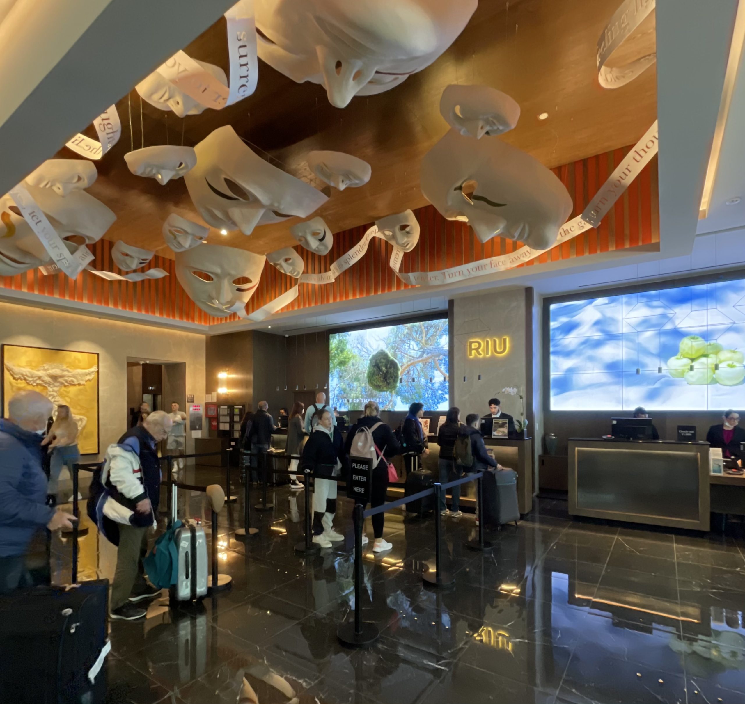
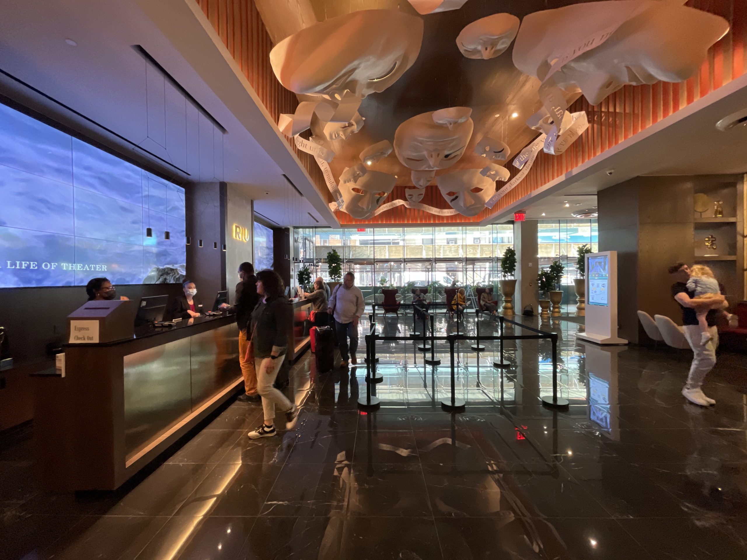
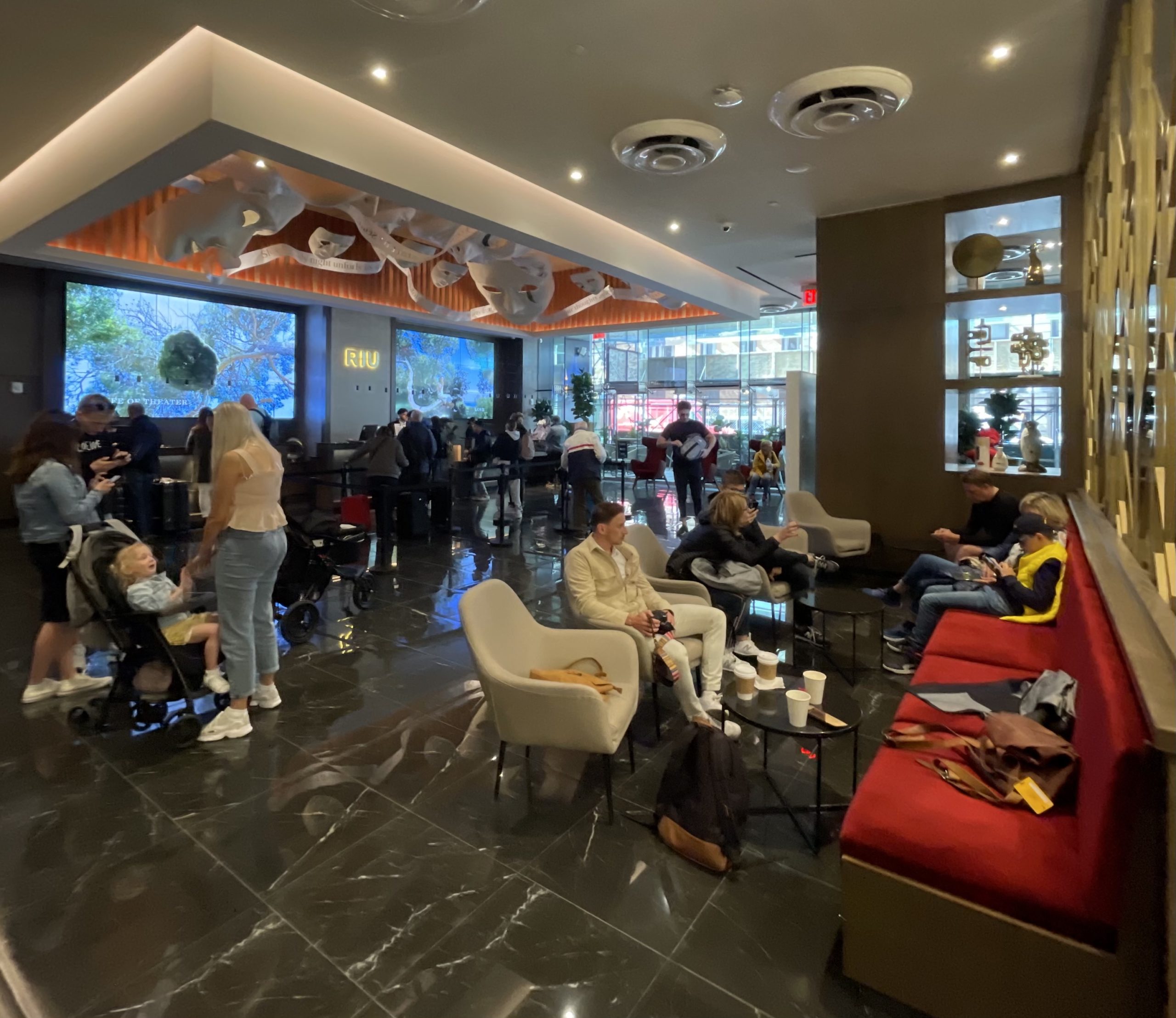
The following photographs show the main lobby adorned with theatre-themed decor.
The most dramatic appointment is the series of oversized theatre mask sculptures surrounded by a flowing ribbon above the check-in desk.
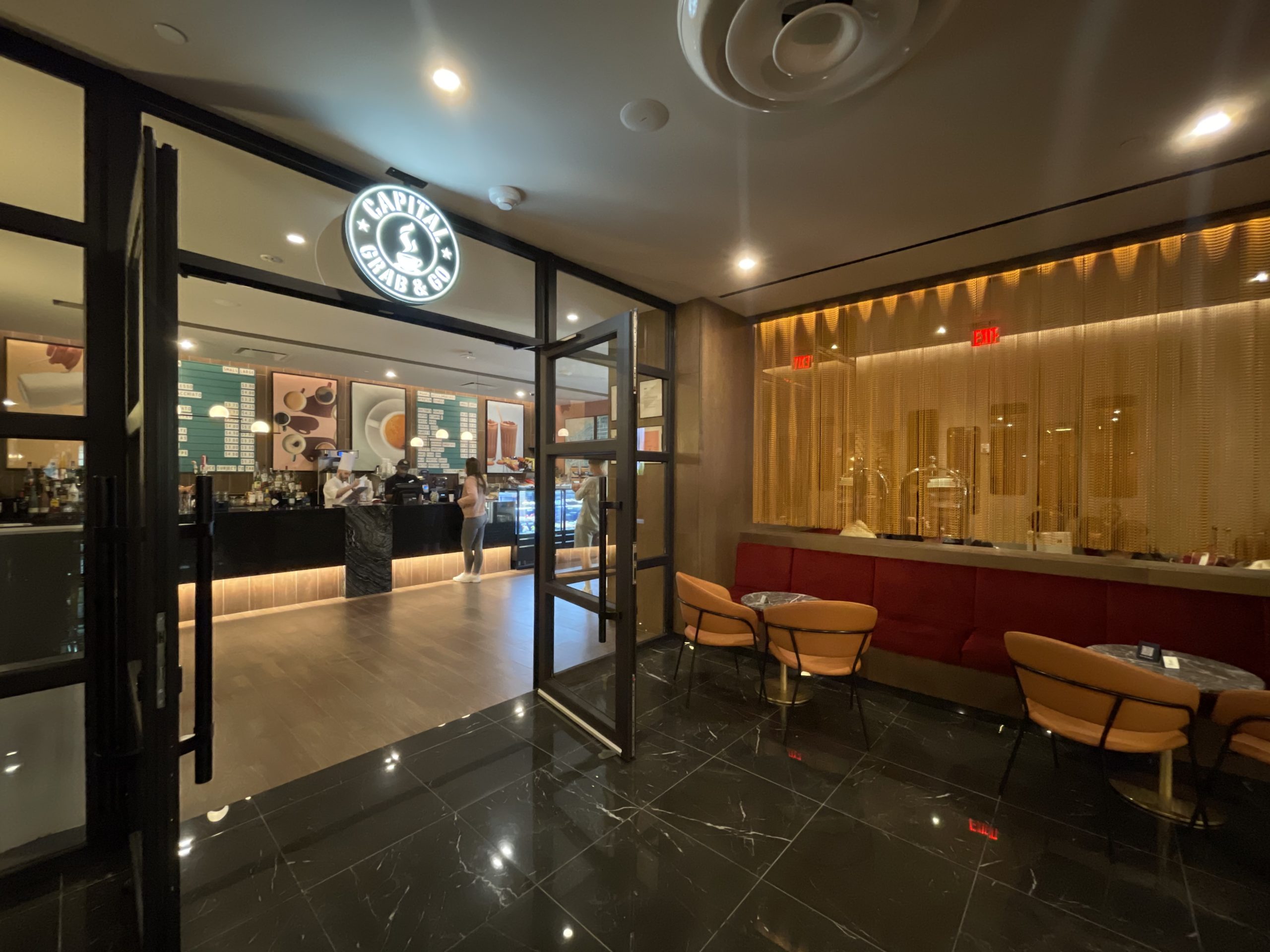
A cafe is tucked into the back of the first level.
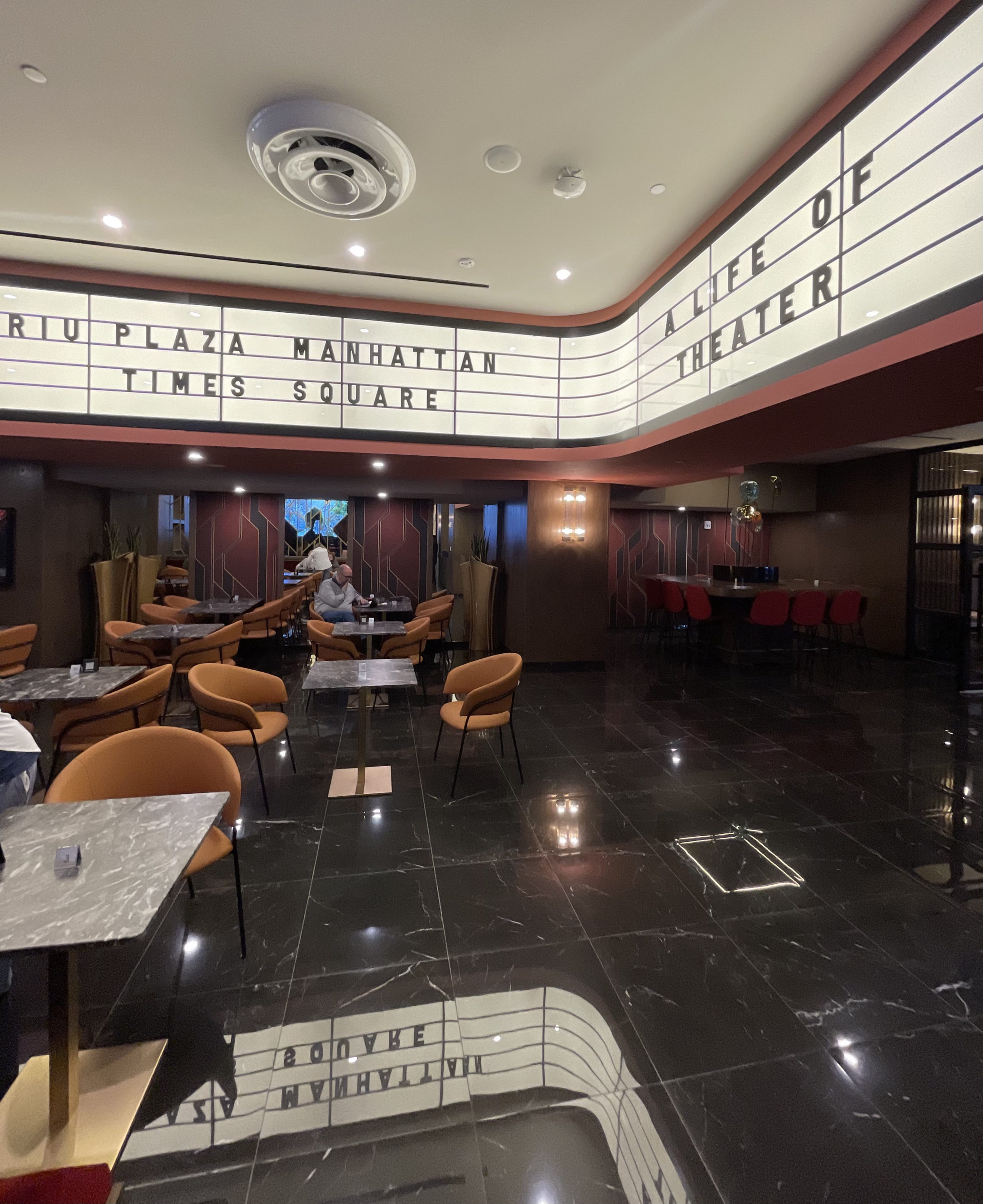
A mix of floor-to-ceiling mirrors and Art Deco motifs line the walls around additional seating and tables, with a theatre-style marquee wrapping around overhead.
The RIU joins a slate of several new hotels opening this year in and around Times Square to accommodate the massive surge in tourism in New York City from local, domestic, and international visitors.
Subscribe to YIMBY’s daily e-mail
Follow YIMBYgram for real-time photo updates
Like YIMBY on Facebook
Follow YIMBY’s Twitter for the latest in YIMBYnews





The design is not bad. It’s just fairly normal. The lobby is questionable, though.
If there is any place in the city where you could break away from the boring gray glass box it is Times Square. Why are these new hotels so dull?
Flashing bright orange and blue lights, the series of oversized theatre mask sculptures surrounded by a flowing ribbon. And a theatre-style marquee wrapping around overhead, all I have seen so unique and beautiful that unthinkable: Thanks to Michael Young.
carnivale in venice every day? why do hotel designers think they have to spit out craziness to make hotel interiors? yuk to being in that space. sad that it’s the trend. it’s anywhere, its ordinary, and its frankly, scary!! ( and so much junk around the edges, on the walls….what is the design strategy?)