Construction has topped out on 35 Commercial Street, a 22-story residential building in the Greenpoint Landing master plan in Greenpoint, Brooklyn. Designed by Handel Architects and developed by Park Tower Group along with Greenpoint Landing Associates, New York City’s Housing Preservation & Development (HPD), and the Housing Development Corporation (HDC), the 344,463-square-foot structure will yield 373 affordable housing units spread across 311,471 square feet, as well as 7,600 square feet of commercial space. Monadnock Construction is the general contractor for the property, which is located at the intersection of Bell Slip to the west and Commercial and Clay Streets to the south.
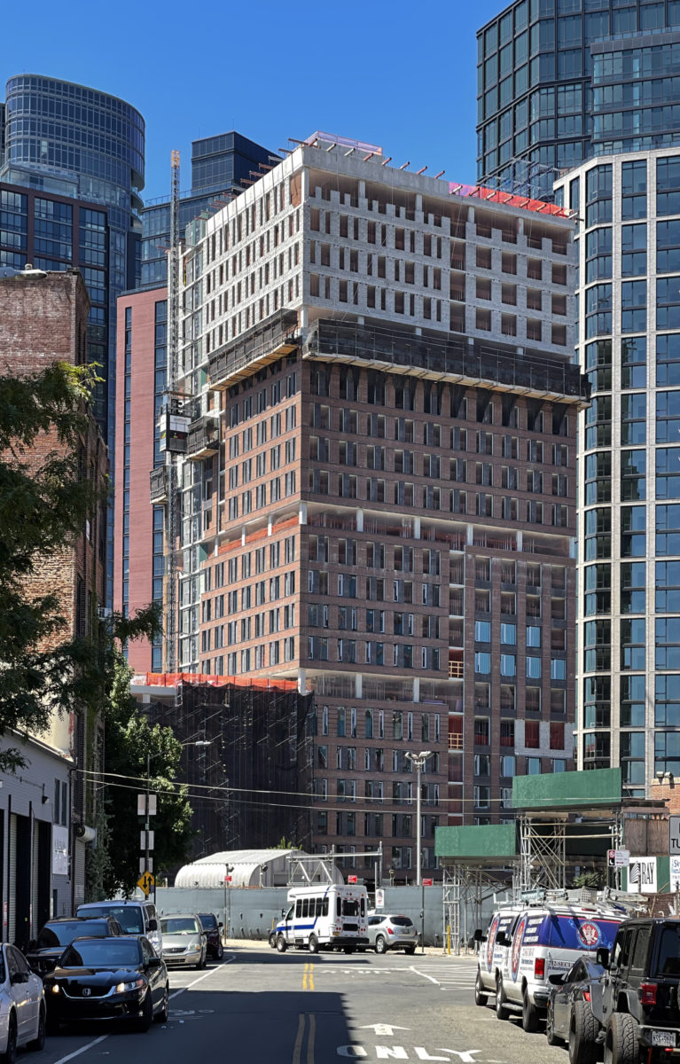
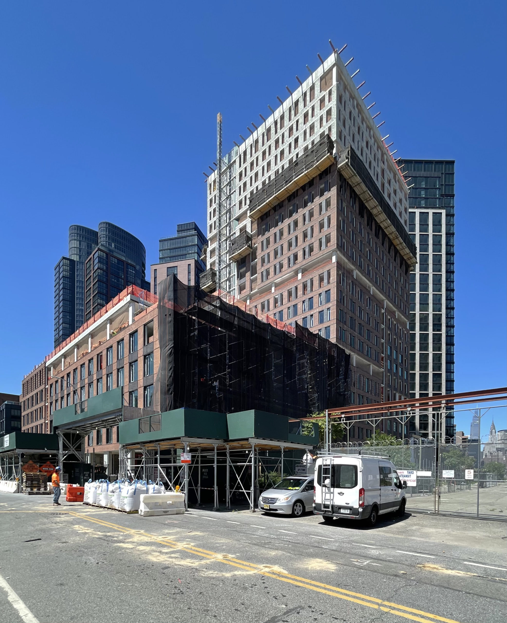
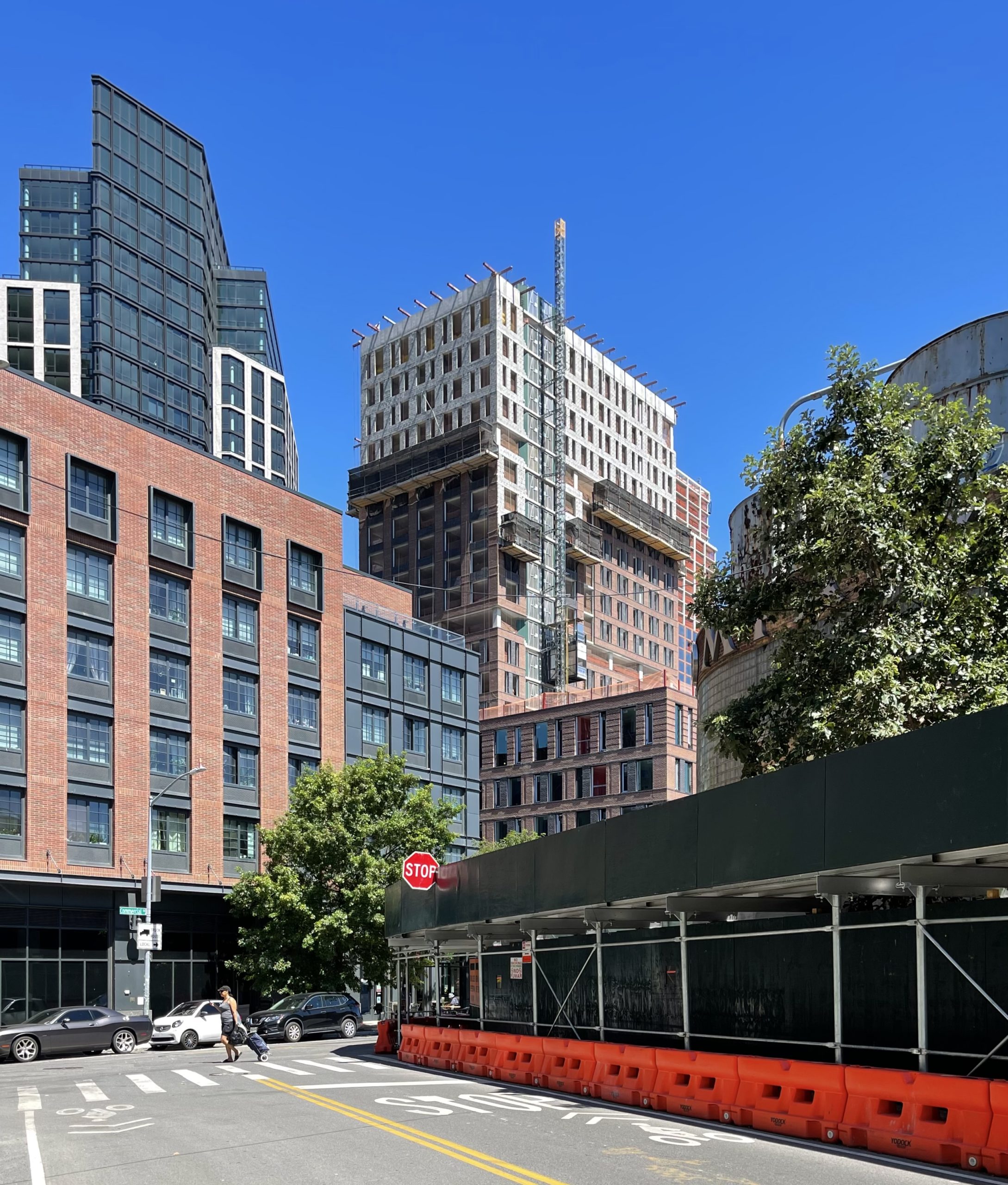
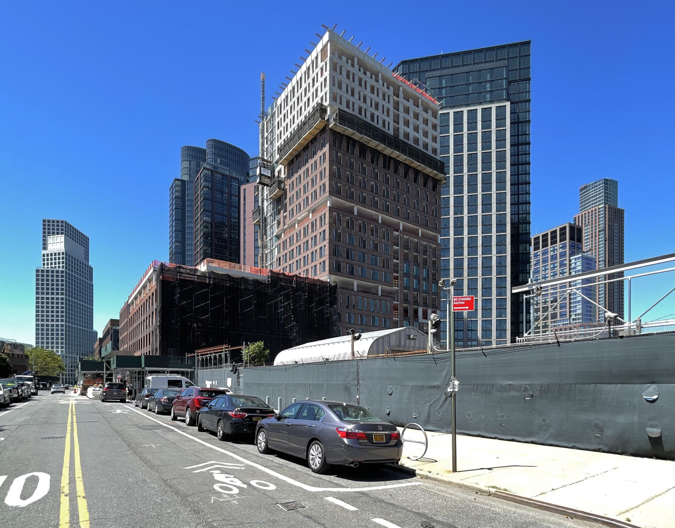
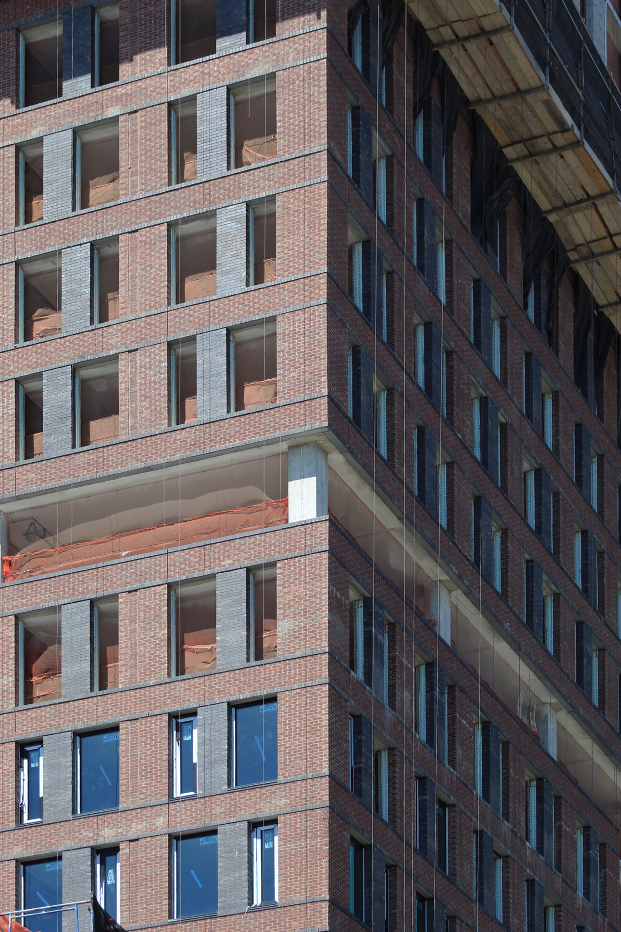
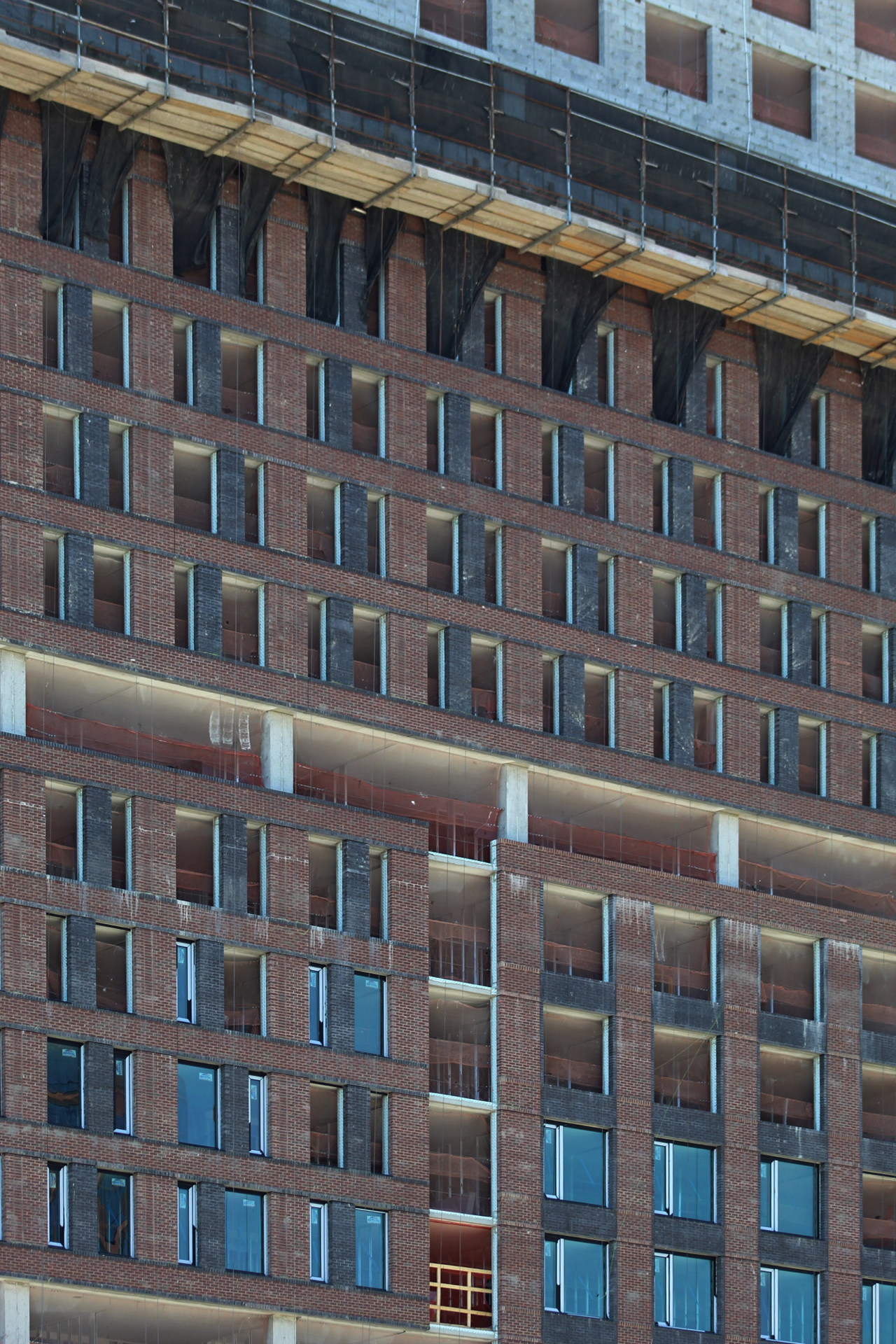
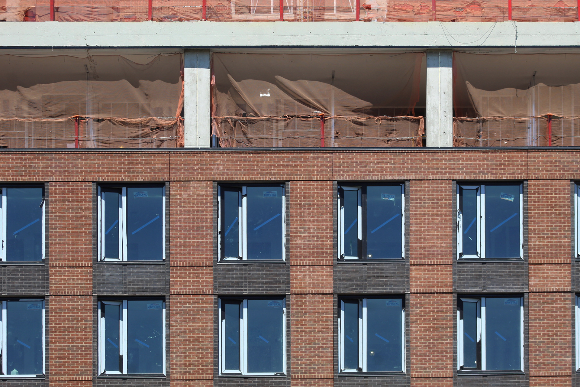
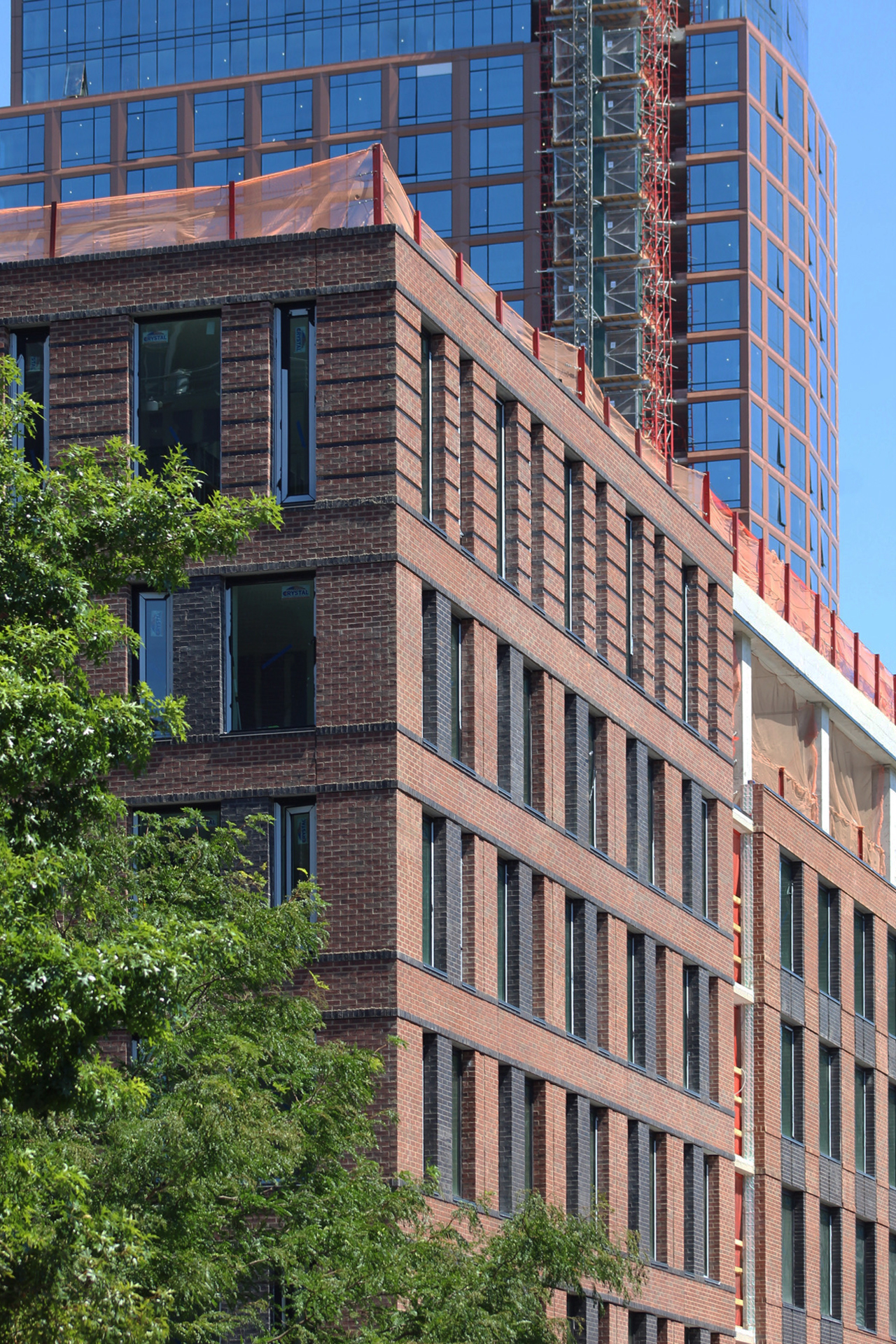
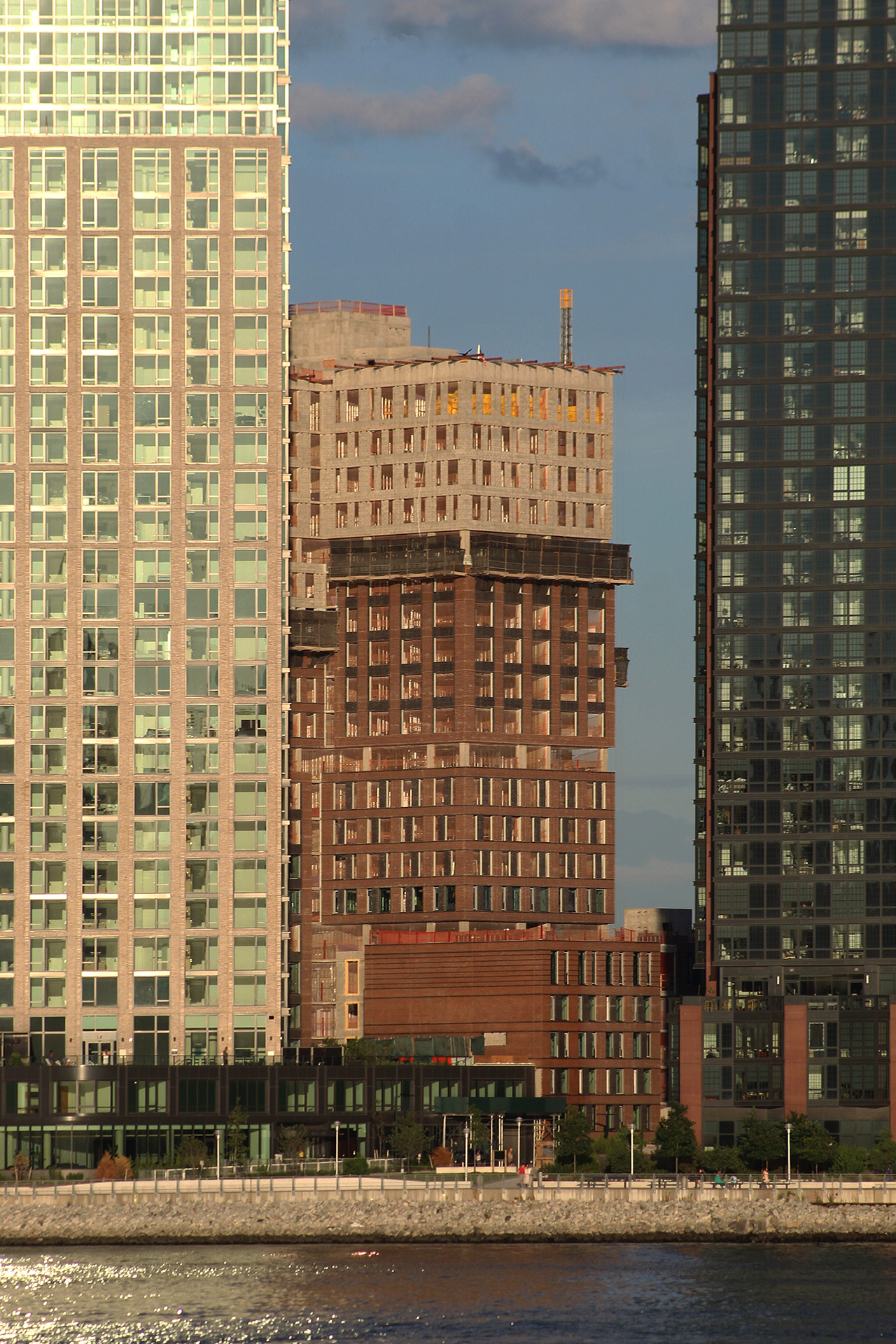
Progress has been remarkably swift since our last update in late February, when the reinforced concrete superstructure stood only a handful of floors above street level. Now the red brick façade covers nearly three-quarters of the toppd-out edifice, with window installation following quickly behind.
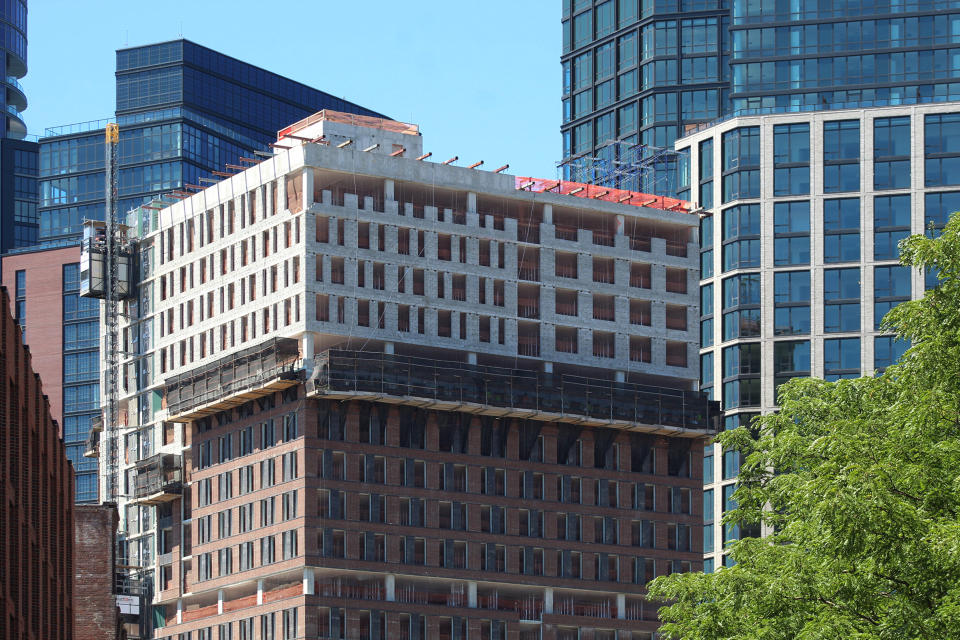
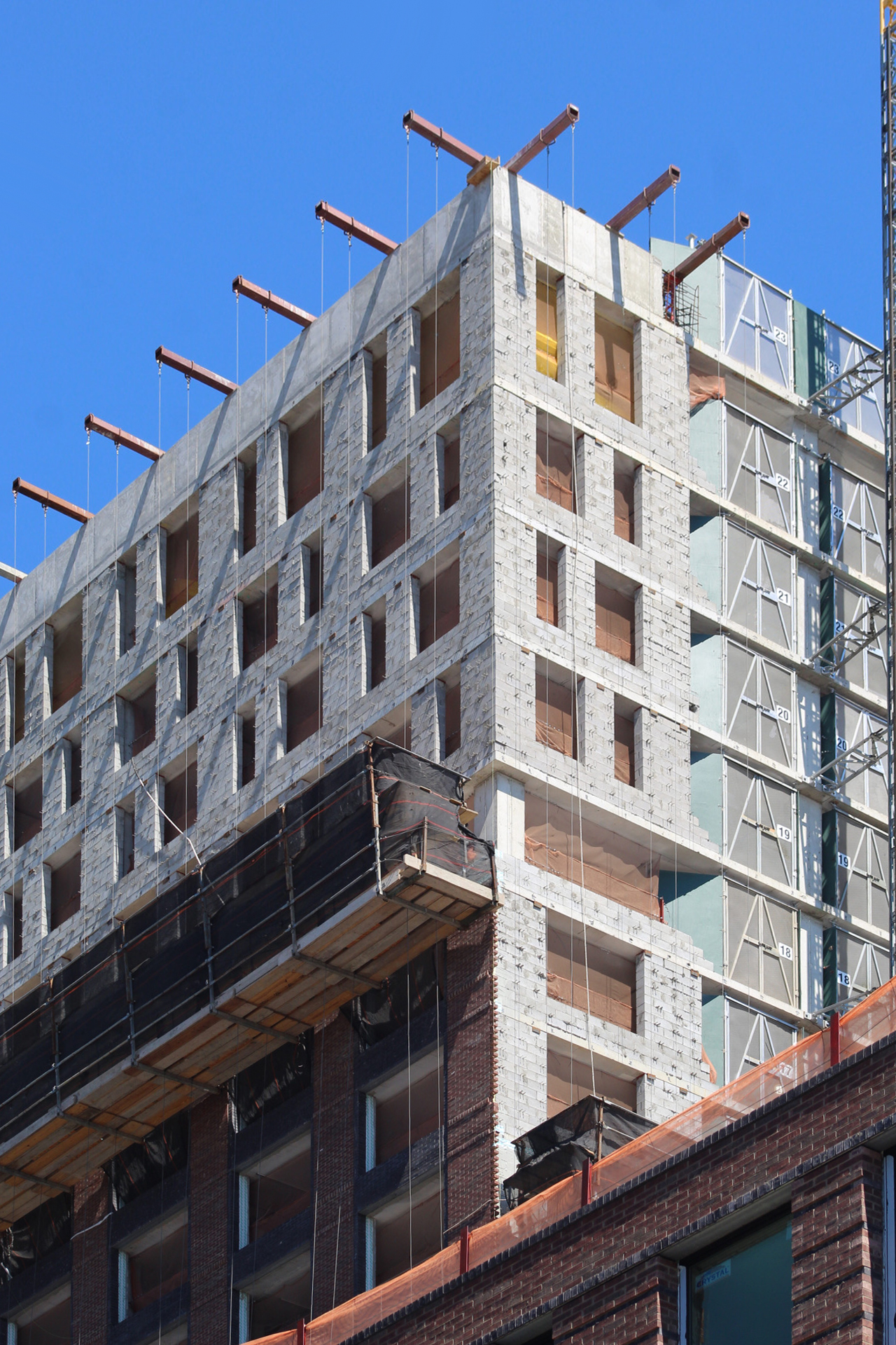
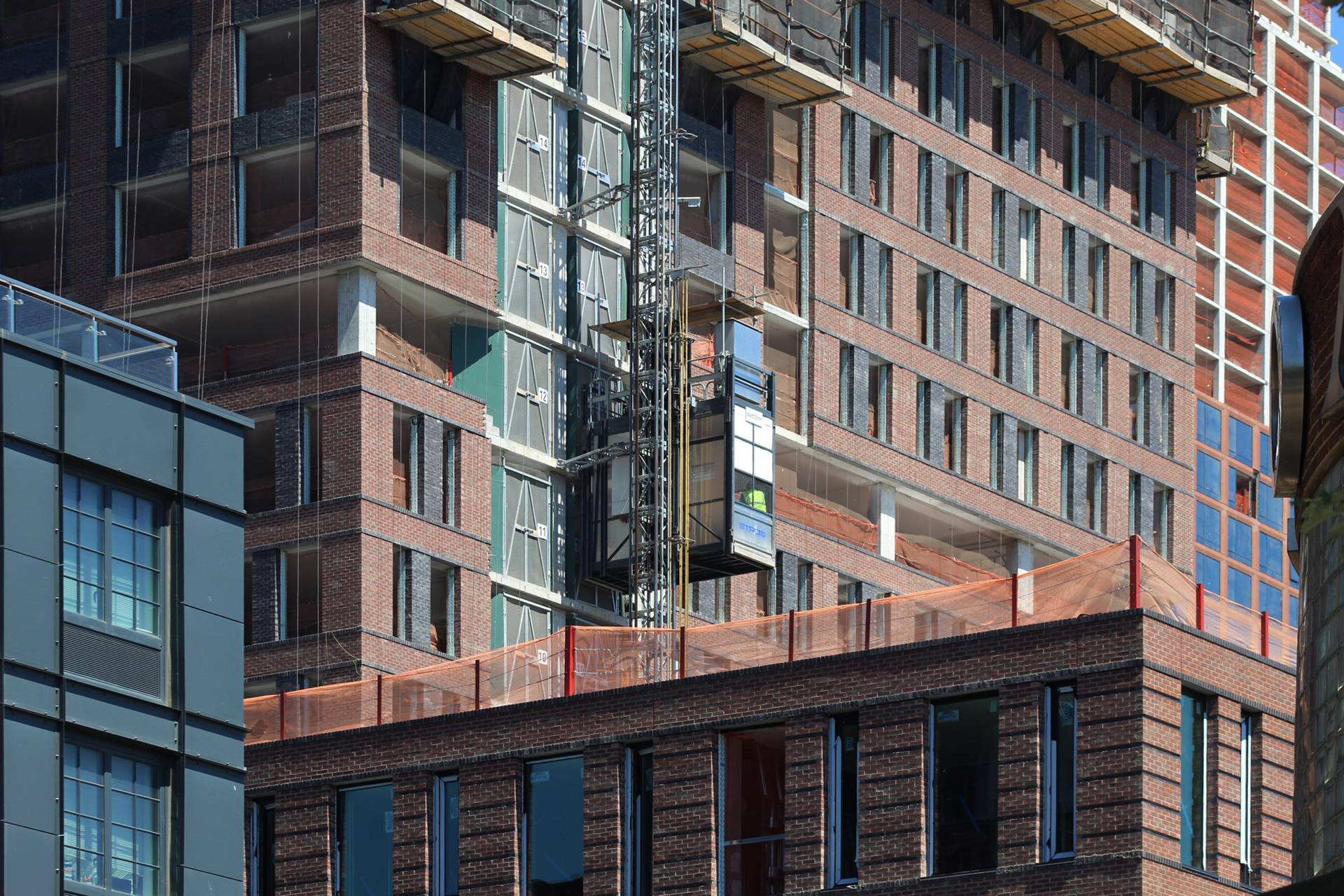
CMU bricks are forming the window cutouts on the uppermost floors as workers below lay the final masonry envelope from hanging scaffolding rigs. A construction elevator is attached to the southeastern elevation.
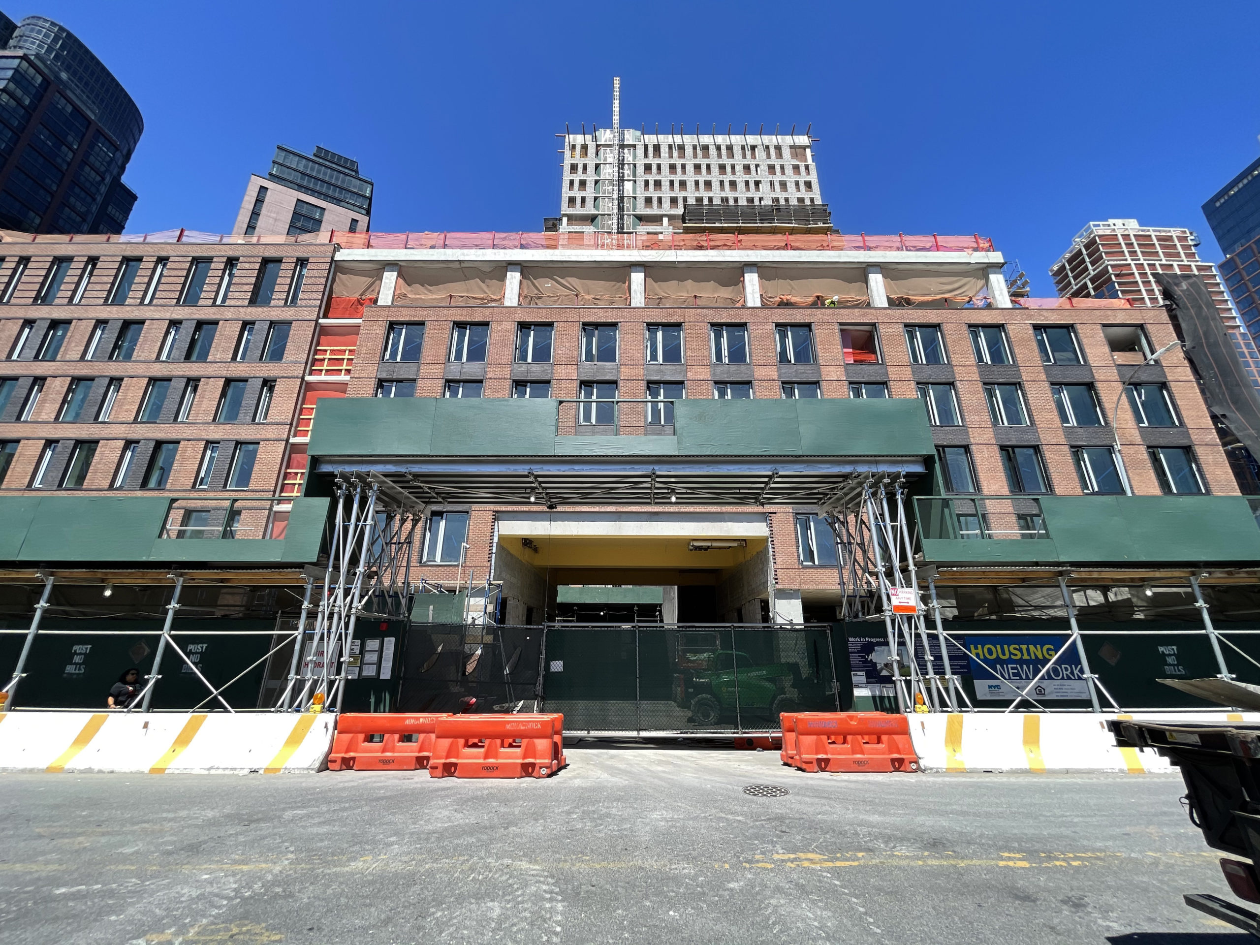
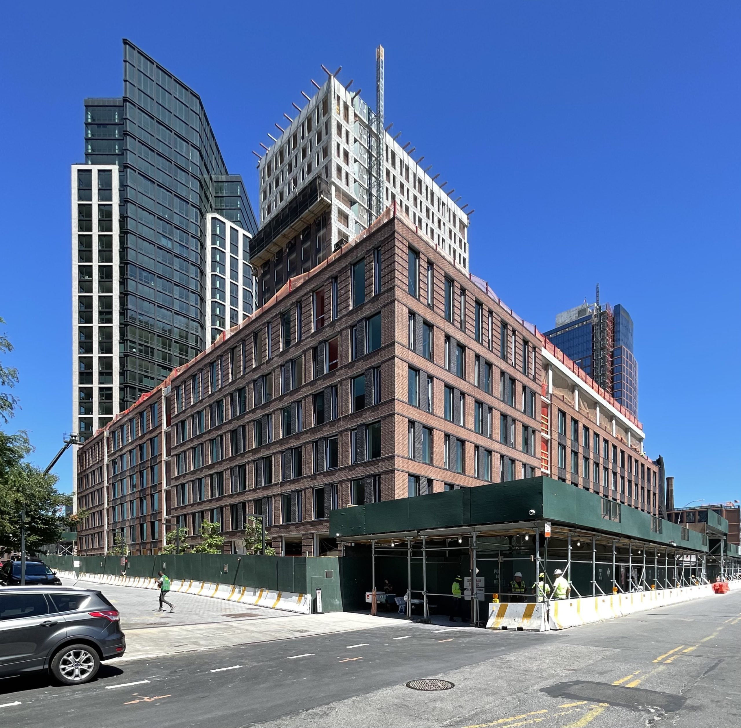
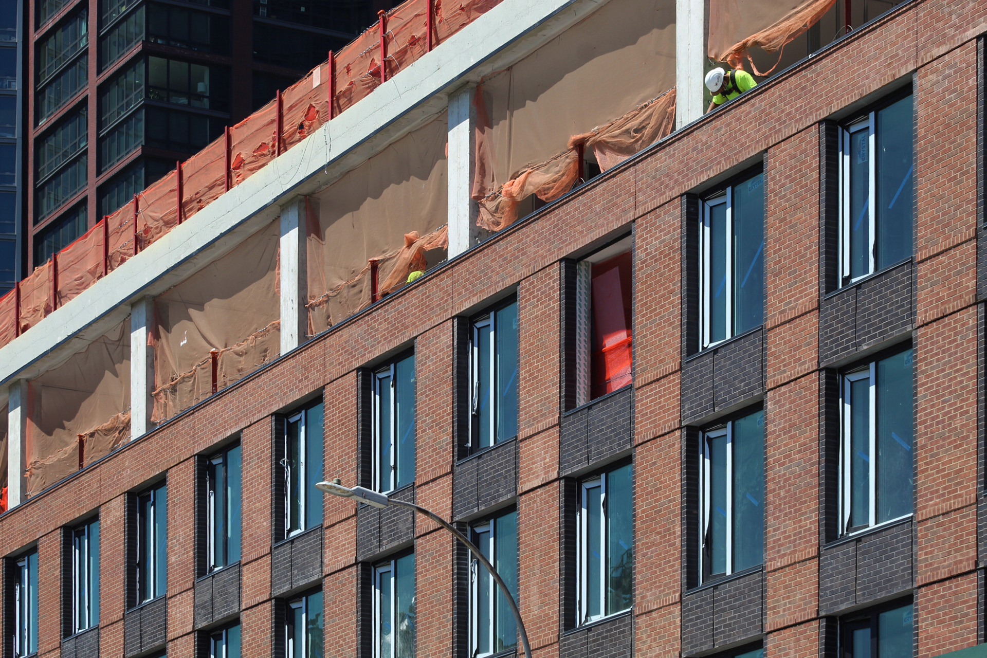
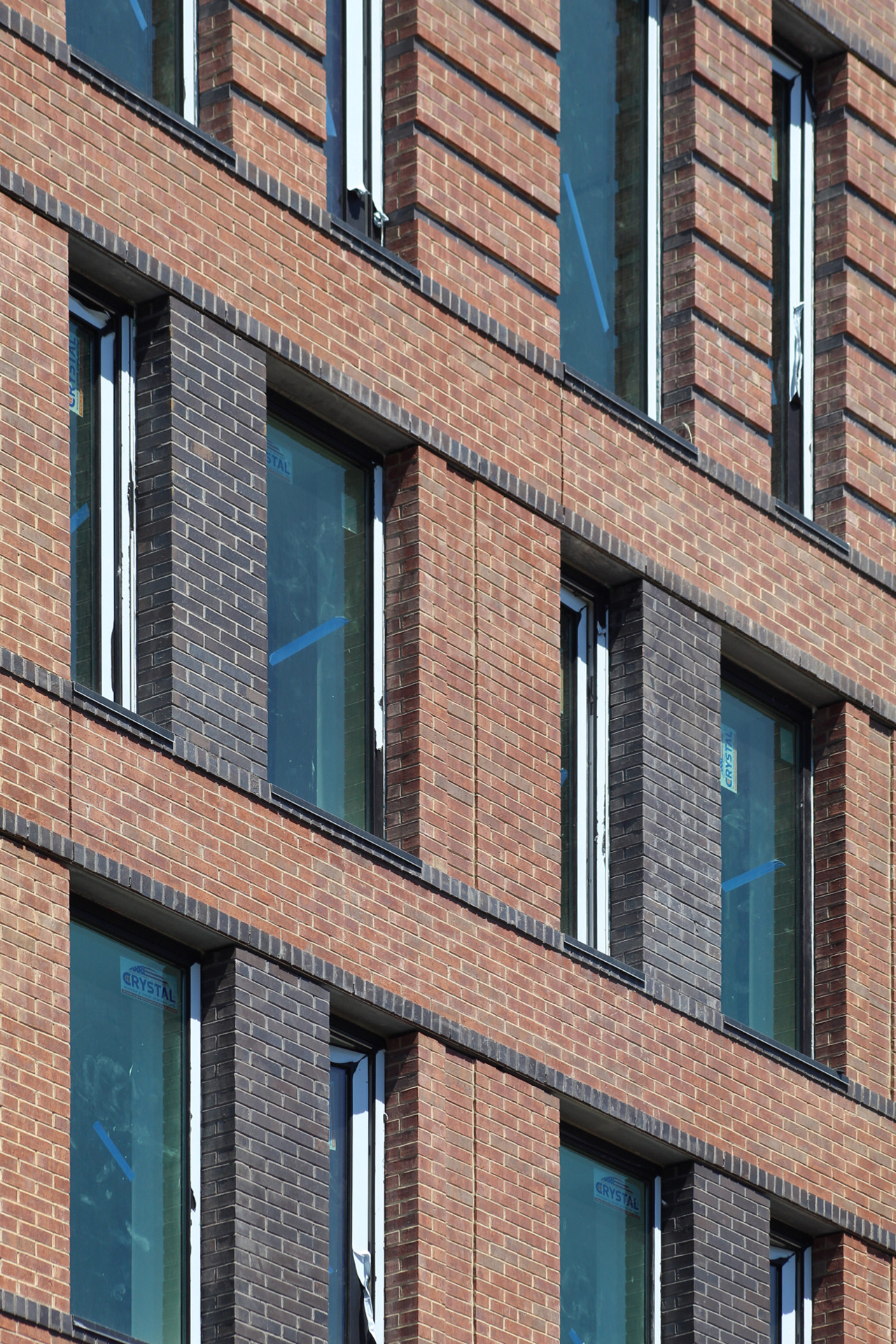
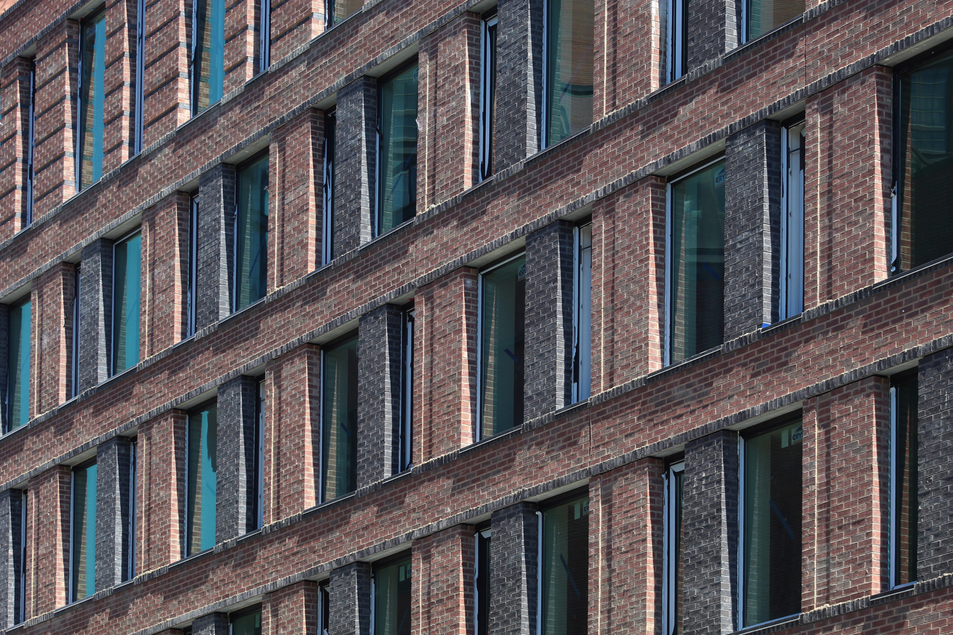
Close-up shots of the podium offer perspective on the final outcome of the brickwork. The main red brick façade is interspersed with black bricks between the windows and rows of protruding brick running the width of each elevation, adding depth to the appearance.
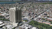
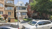
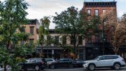
Overall, 35 Commercial Street contributes nicely to the density of the rising neighborhood, and its traditional brick envelope provides contrast with the predominantly glass- and metal-clad high-rises surrounding it. The following photos show the building’s context from the East River and surrounding streets.
Amenities at 35 Commercial Street will include indoor and outdoor children’s play areas, a fitness center, an on-site laundry room, bicycle parking, and communal lounge areas.
YIMBY last reported that 35 Commercial Street is slated for completion in the fall of 2023.
Subscribe to YIMBY’s daily e-mail
![]()
Follow YIMBYgram for real-time photo updates
Like YIMBY on Facebook
Follow YIMBY’s Twitter for the latest in YIMBYnews






This is a very nice addition to the surrounding skyline. The square shape of the building and the brick facade almost makes it look older than it really is, which I quite like.
Red brick facade is interspersed with black bricks, between the windows and rows of protruding brick running the width of each elevation. So see the depth on the outside of building, from contrasting dark colors; the shape along the river is clearly visible: Thanks to Michael Young.
Nice brickwork
How do I apply for an apartment?