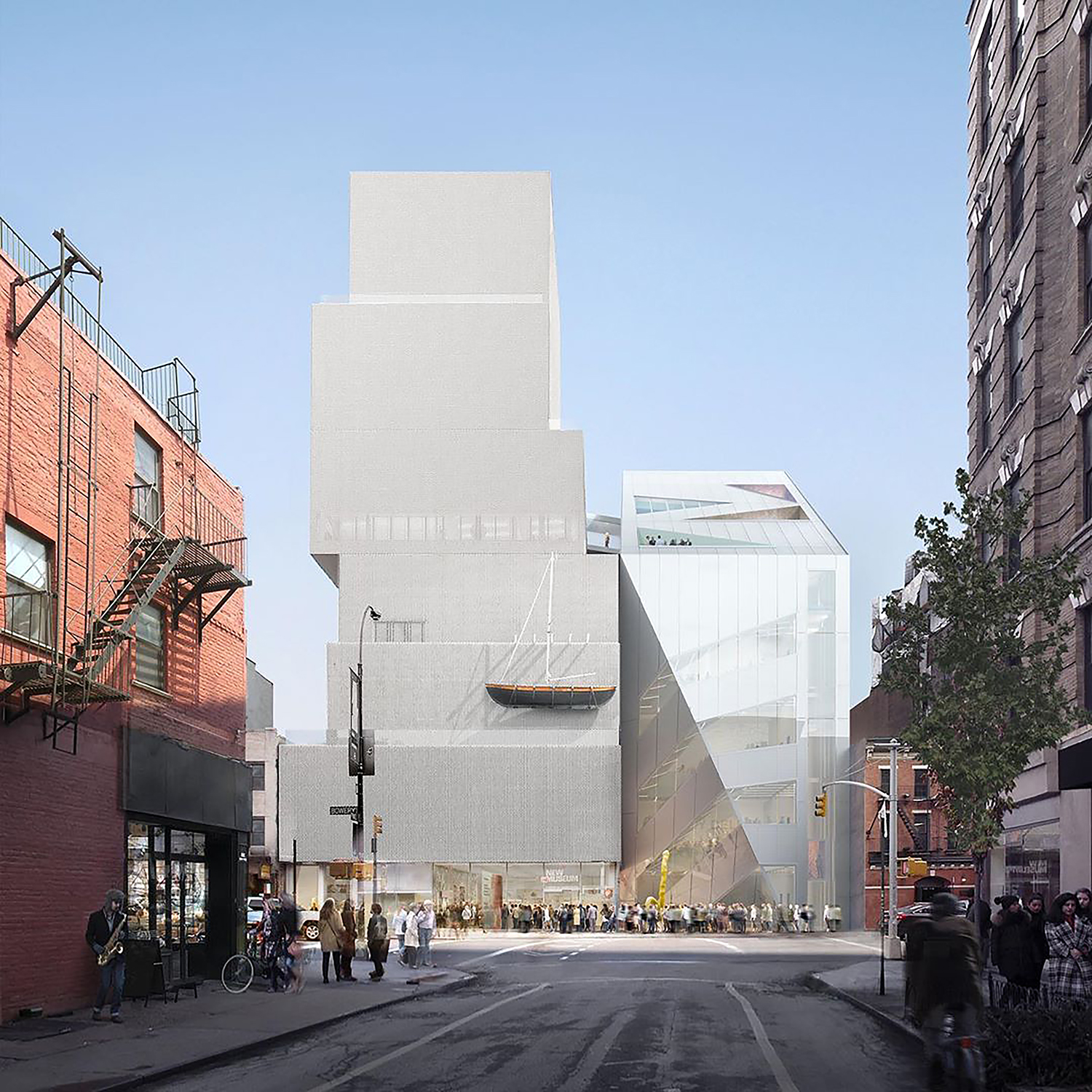
Demolition work is underway for the New Museum‘s eight-story expansion at 235 Bowery on Manhattan’s Lower East Side. Designed by Rem Koolhaas and Shohei Shigematsu of OMA and Cooper Robertson & Partners, the 174-foot-tall annex will rise directly to the south of the SANAA-designed main building from 2007 and nearly double the institution’s footprint to 115,277 square feet. The sleek, angular volume will connect laterally to the original museum and house three gallery floors, a cafe, a bookstore, offices, community and educational program space, art storage, and outdoor terraces. Sciame Construction is the general contractor for the property, which is located at the intersection of Bowery and Spring Street.
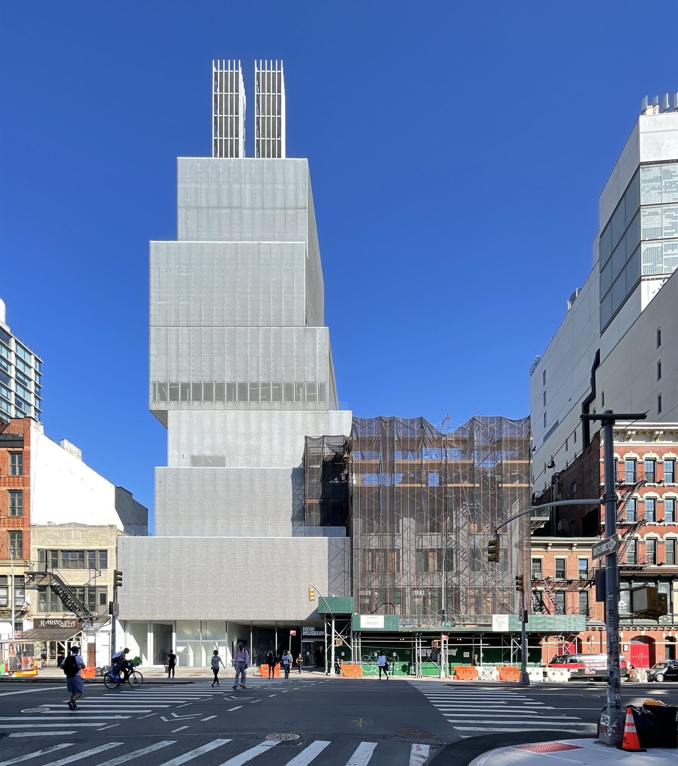
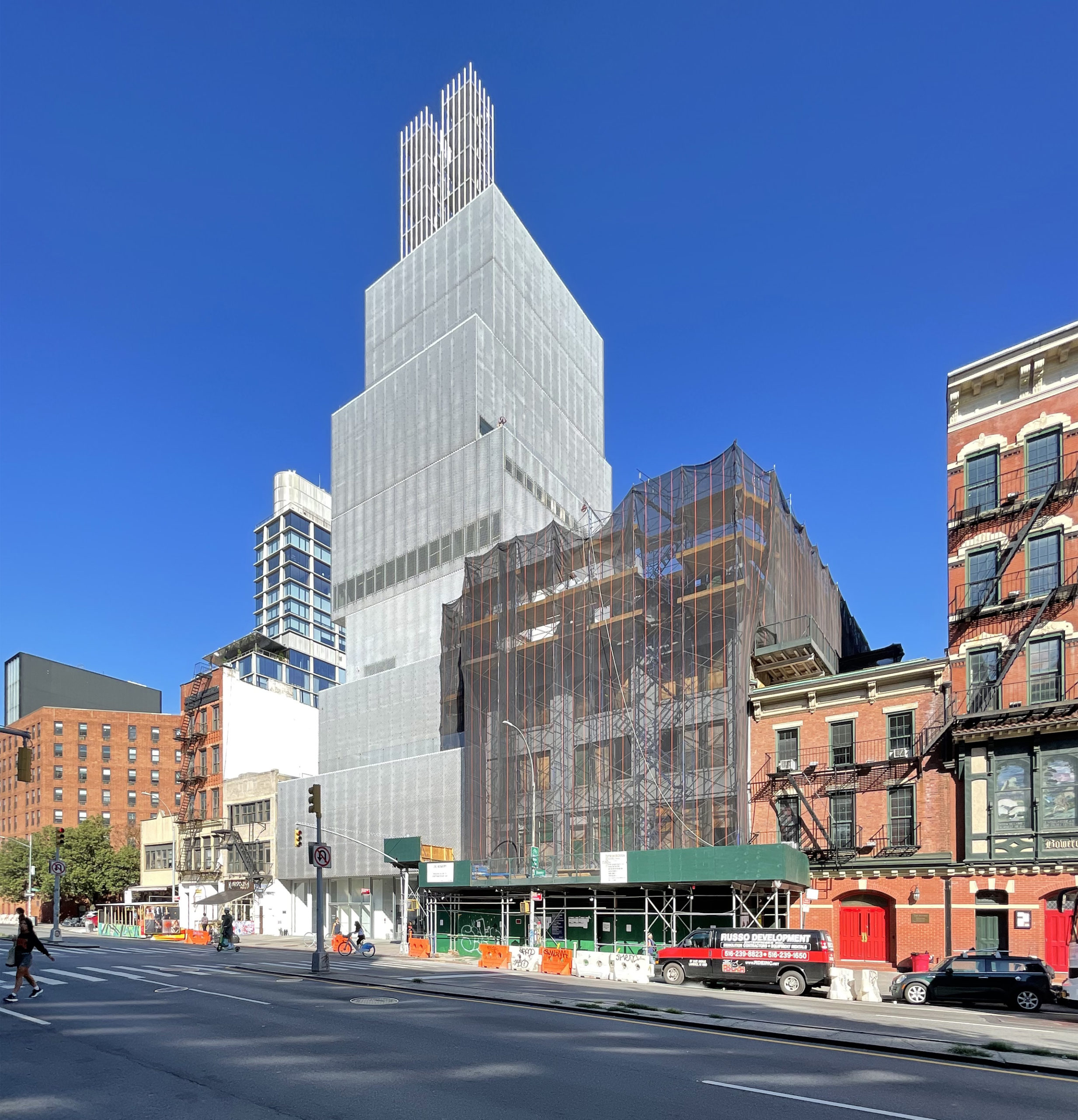
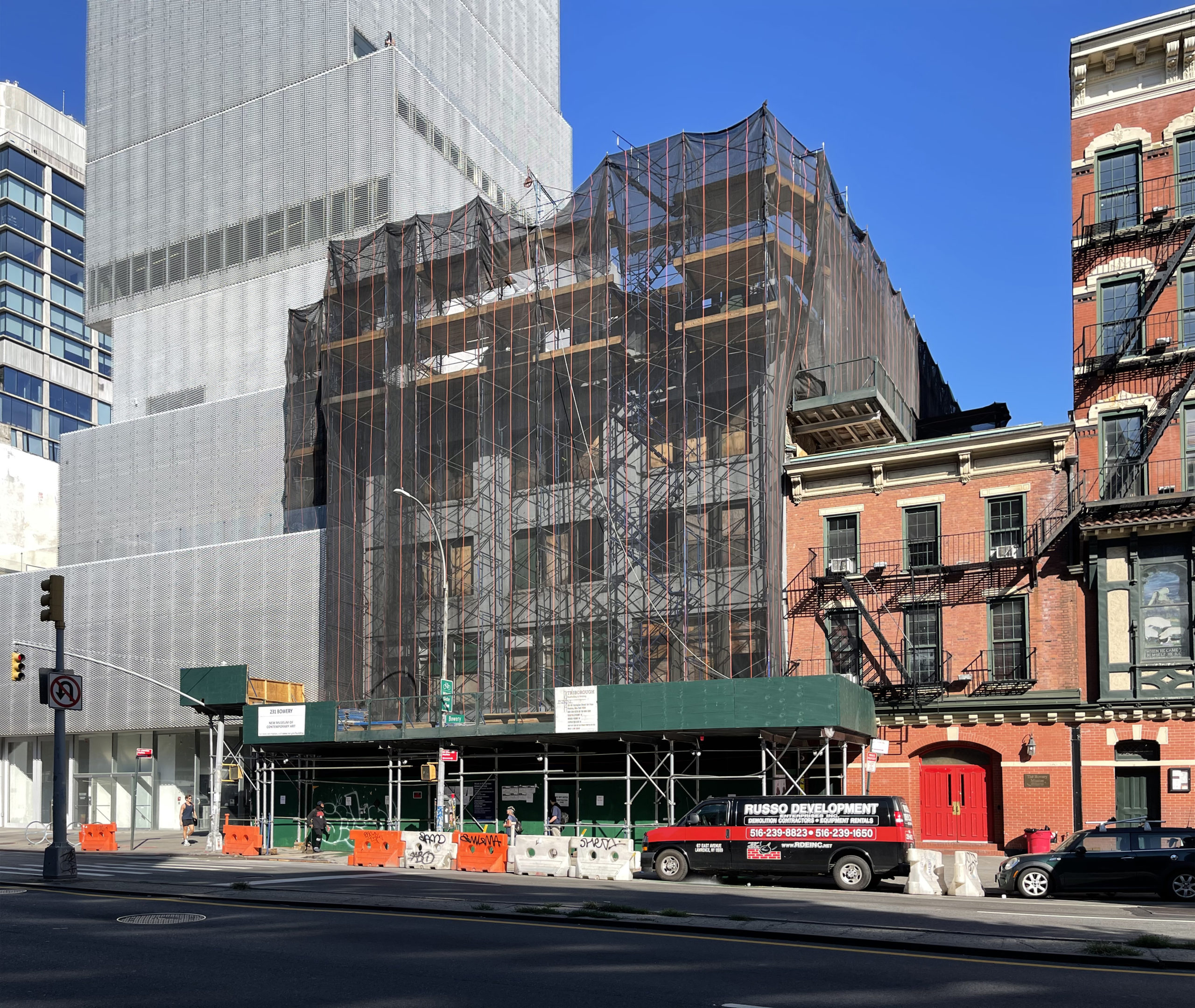
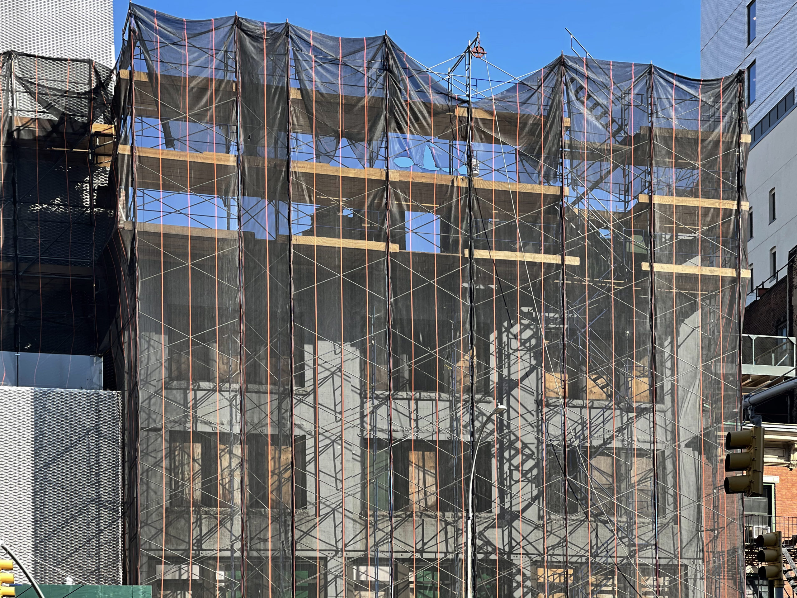
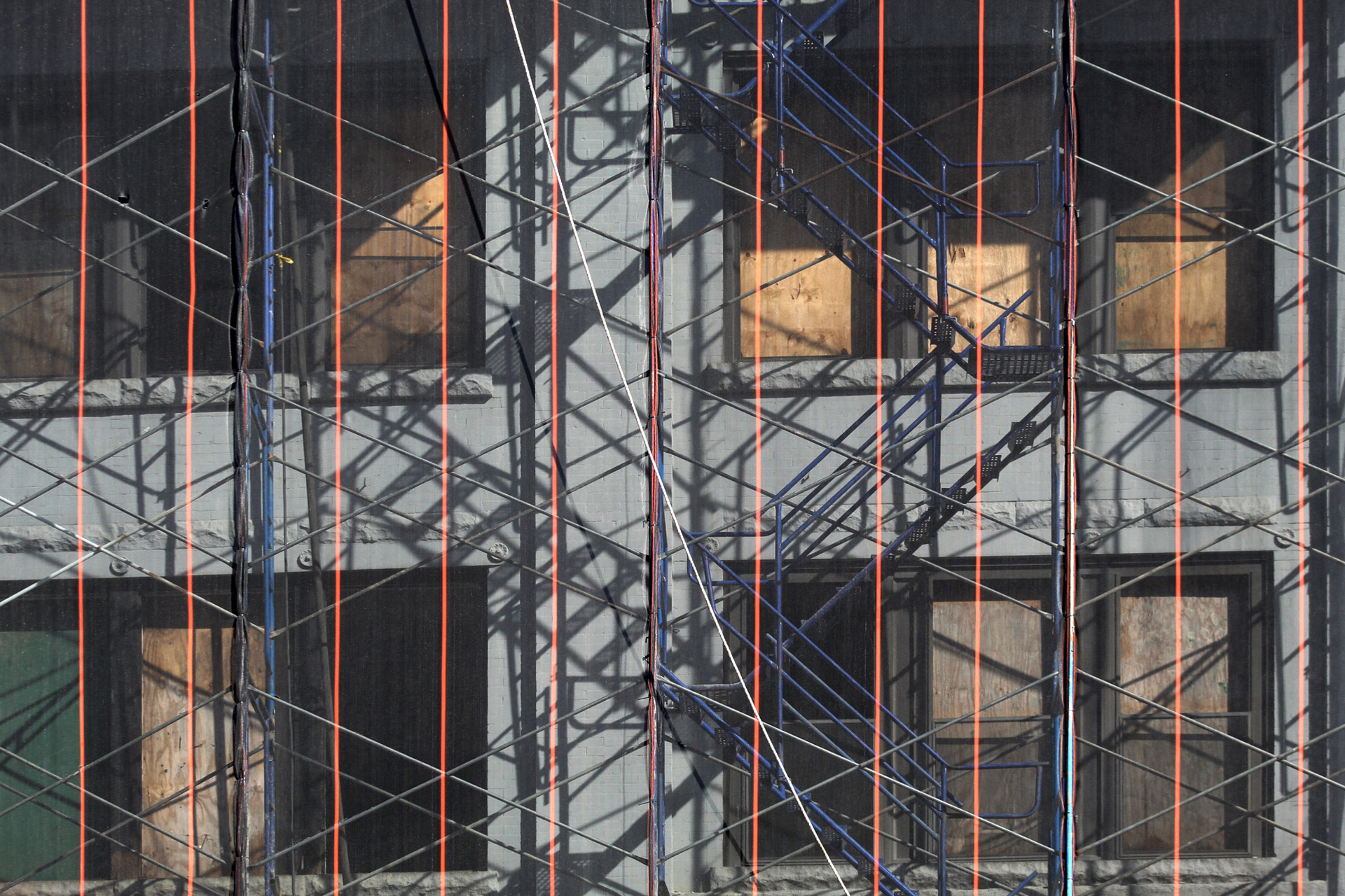
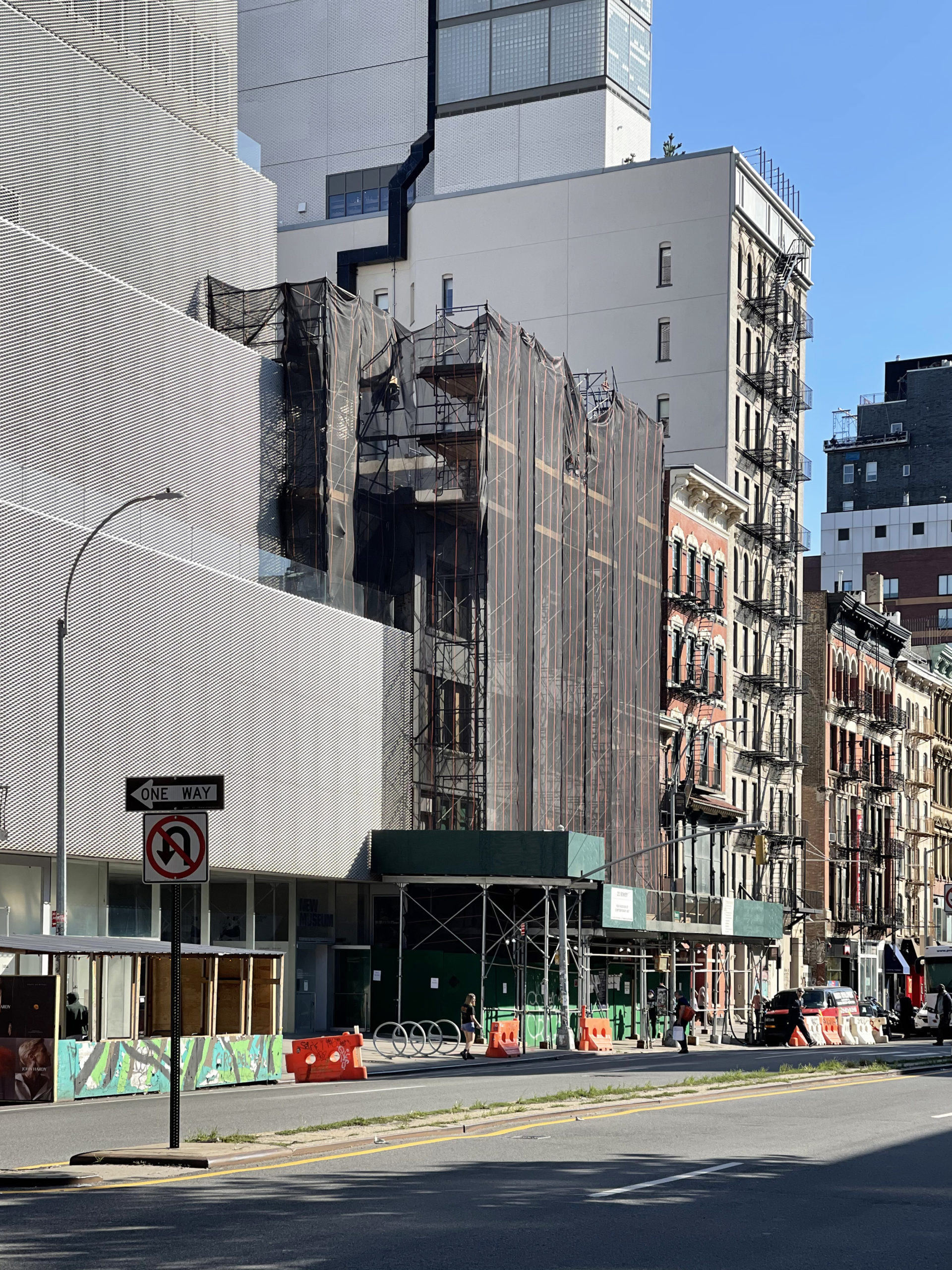
Recent photos show the low-rise structure at 231 Bowery covered in scaffolding and black netting as demolition work proceeds on the upper floors. The entire structure could likely be razed before the end of the year, given its diminutive size.
The following diagram from our last update details how the new structure will connect to the existing New Museum. This will require sections of the southern wall to be cut open to form the new hallways between galleries. 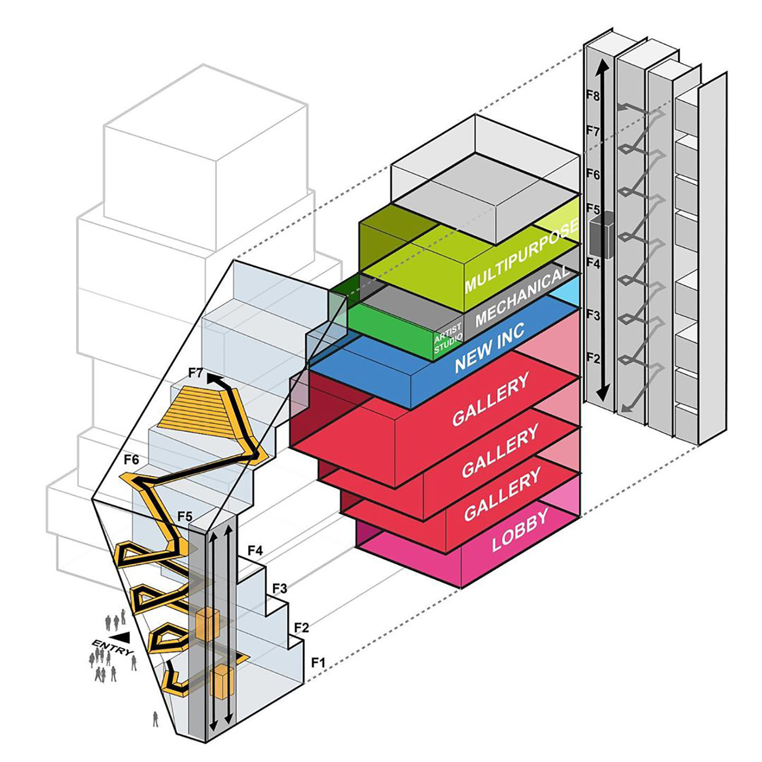
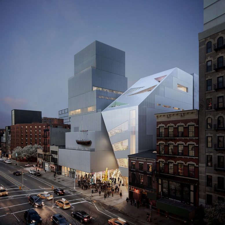
Renderings show the annex’s diagonal forms and glossy metallic cladding creating a striking juxtaposition with the existing building, which features a massing of stacked boxes and a flat façade. This contrast is furthered by the addition’s sharp, geometric windows and triangular terrace cutouts. An outdoor ramp on the upper levels will connect the two buildings.
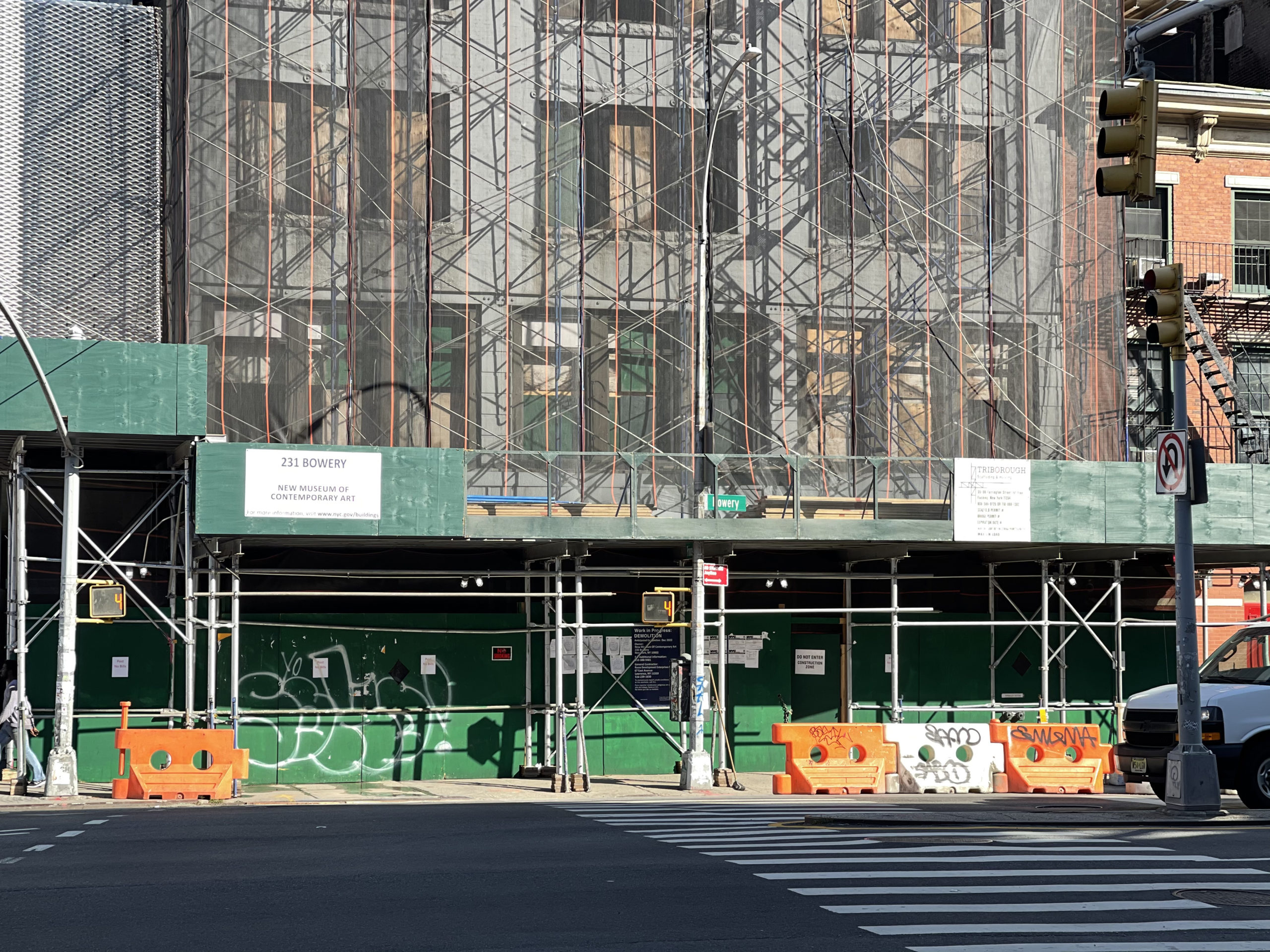
Demolition is being carried out by Russo Development Enterprises and is scheduled to be finished in December, as noted on the on-site construction board. The New Museum expansion will be completed in 2024.
Subscribe to YIMBY’s daily e-mail
Follow YIMBYgram for real-time photo updates
Like YIMBY on Facebook
Follow YIMBY’s Twitter for the latest in YIMBYnews






Pretty soon Lower East Side will totally disappear …..sad!
The demolished building is a piece of crap. I’m not sure how that represents the loss of the LES. That said the new building looks like a crashed spaceship and not only doesn’t compliment the street but doesn’t really conpliment the existing museum. Too bad the whole old new museum and the new new museum couldn’t be replaced by a single new new museum.
When the building tries to compete with its art, it usually doesn’t end well.
I don’t see what’s so sad and wrong about knocking down an old derelict building nobody paid attention to. These architects give us good looking buildings and we get a new museum.
What’s there to complain about?
A massing of stacked boxes and a flat facade, so prominent appearance from surrounding located nearby. Sharp, geometric windows and triangular terrace cutouts, unique design with the connections between beautiful and beautiful shapes: Thanks to Michael Young.
The museum will show what it looks like to be homeless
When museums expand.
It’s just as distasteful as the original.
Maybe even worse? I guess bad art deserves an ugly home.
What would Muggs and the Bowery Boys think ?
Well, I rather like the way the new addition is a smooth angular counterpart to the stacked blocks next to it. It’s all very abstract and for this museum, that makes sense.
Exactly! Total opposites and shouldn’t conform to anything like the way art has always been
The set designers for “Logan’s Run” couldn’t be reached for comment.
I am beginning to think that 90 percent of the comments on yimby are written by Statler and Waldorf, the two old guy muppets in the balcony, using aliases.
Boo!
Get off the stage!
Well they were right about virtually everything.
So I see no problem with the use or the redevelopment. The nearby structure is not historic though we could argue that it added to the overall historic streetscape of the Bowery. Kudos that someone wants to invest at this site. However, as a person who sits on review boards there seems to be the same ethos displayed in this project that I see over and over again. Build a public serving building calls for an architect that will and should design a signature structure. Even private buildings get this attention. The question is what is appropriate to stand out? Personally, I’m done with the alien space artifact look or the Jenga look (which at least has appropriate setbacks). Modernism still seems so obsessed with structure that lack any ornamentation or relationship to their surroundings. Sometimes it turns out great but a lot of the time it’s something taking up airspace.
King Charles would hate this.