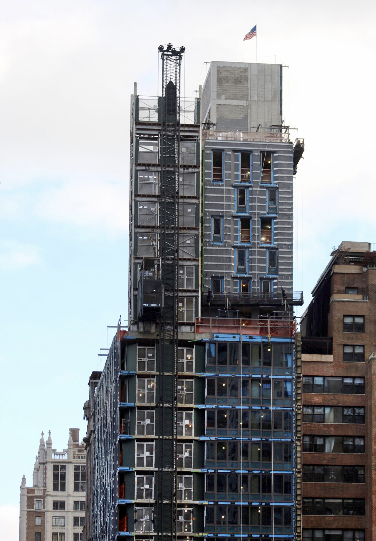
Façade work is moving along on Turken House, a 21-story residential building at 300 East 41st Street in the Murray Hill section of Midtown. Designed by Perkins + Will and developed by non-profit The Turken Foundation, which assists Turkish students in earning scholarships and job opportunities in the United States, the 227-foot-tall structure will yield 80,000 square feet with 82 turnkey residences in single- and double-occupancy configurations. Fast Track Construction is the general contractor for the property, which is located at the corner of East 41st Street and Second Avenue, near the United Nations and Grand Central Terminal.
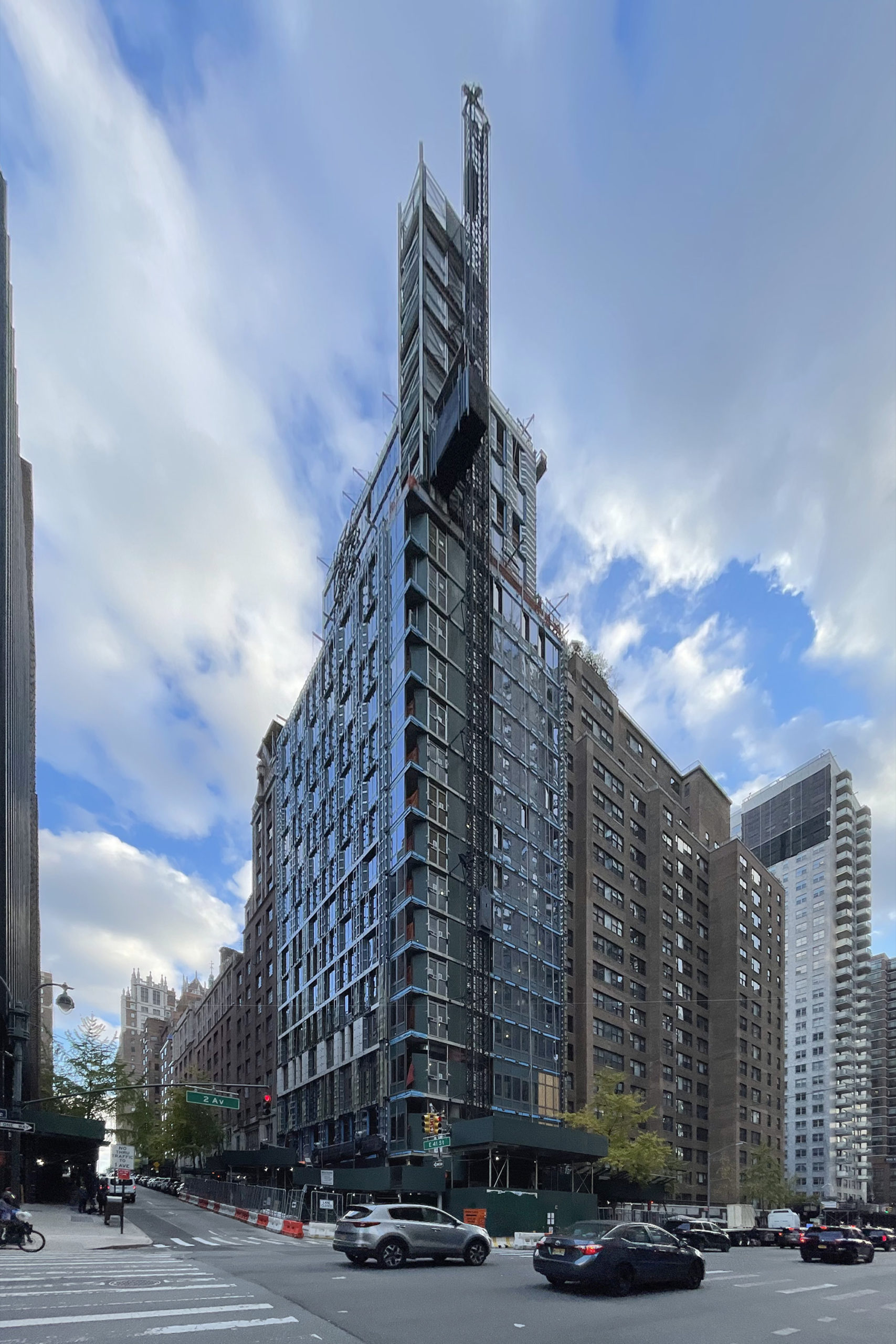
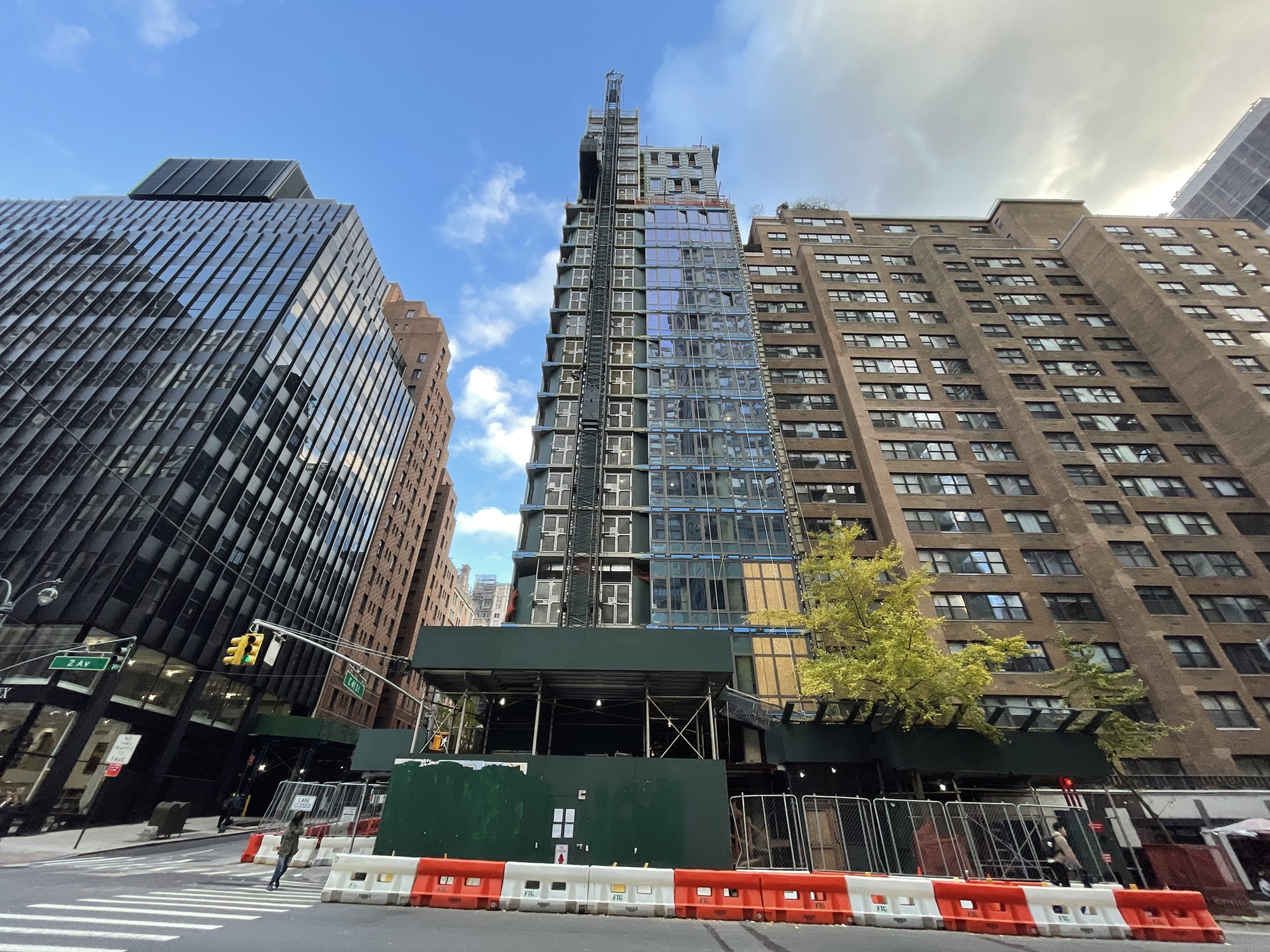
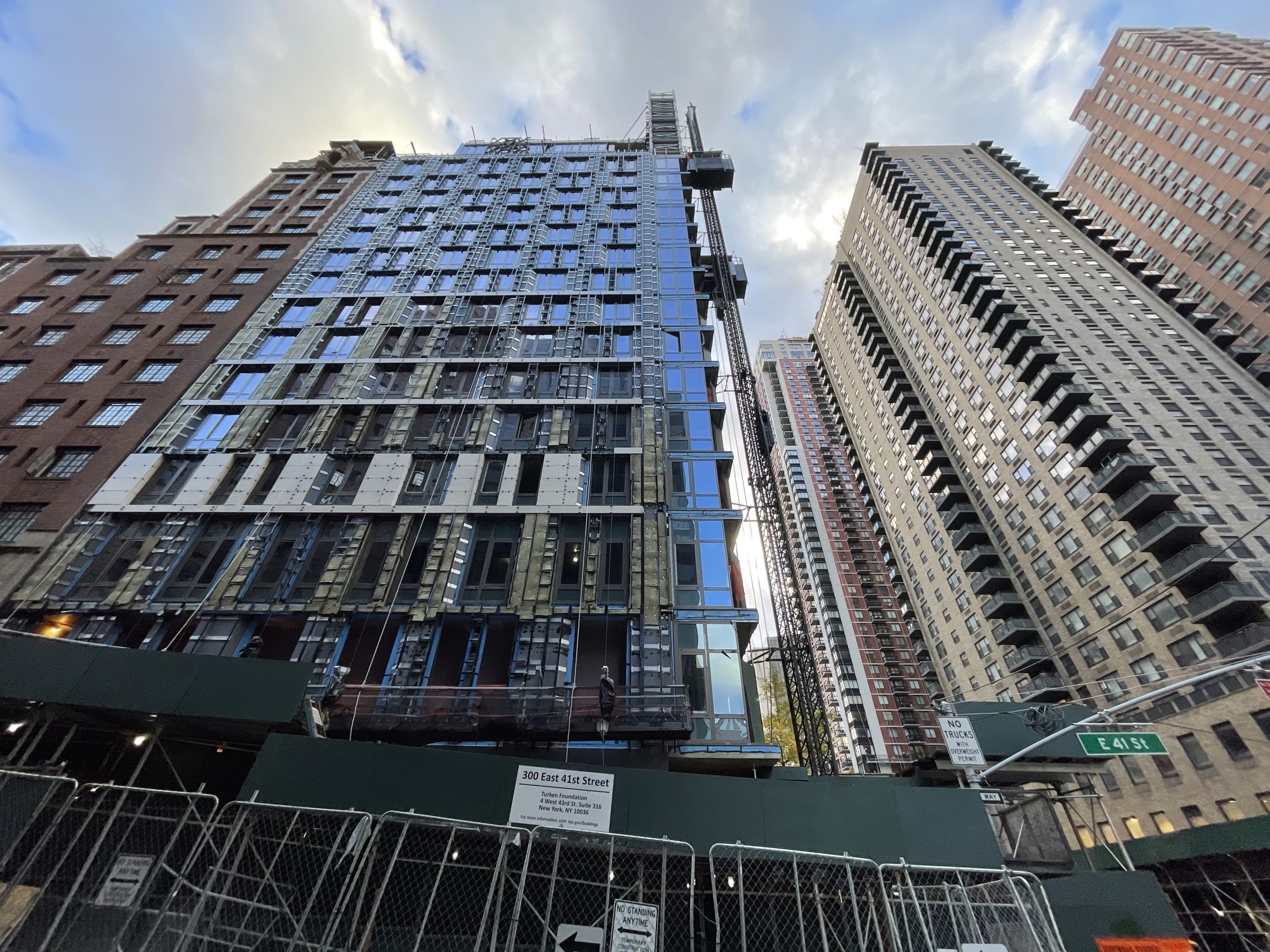
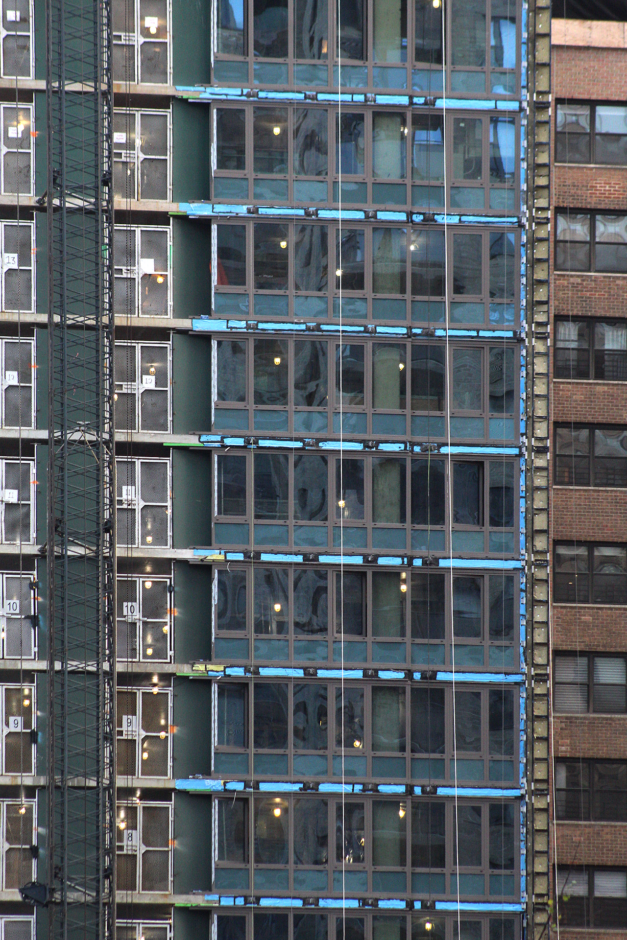
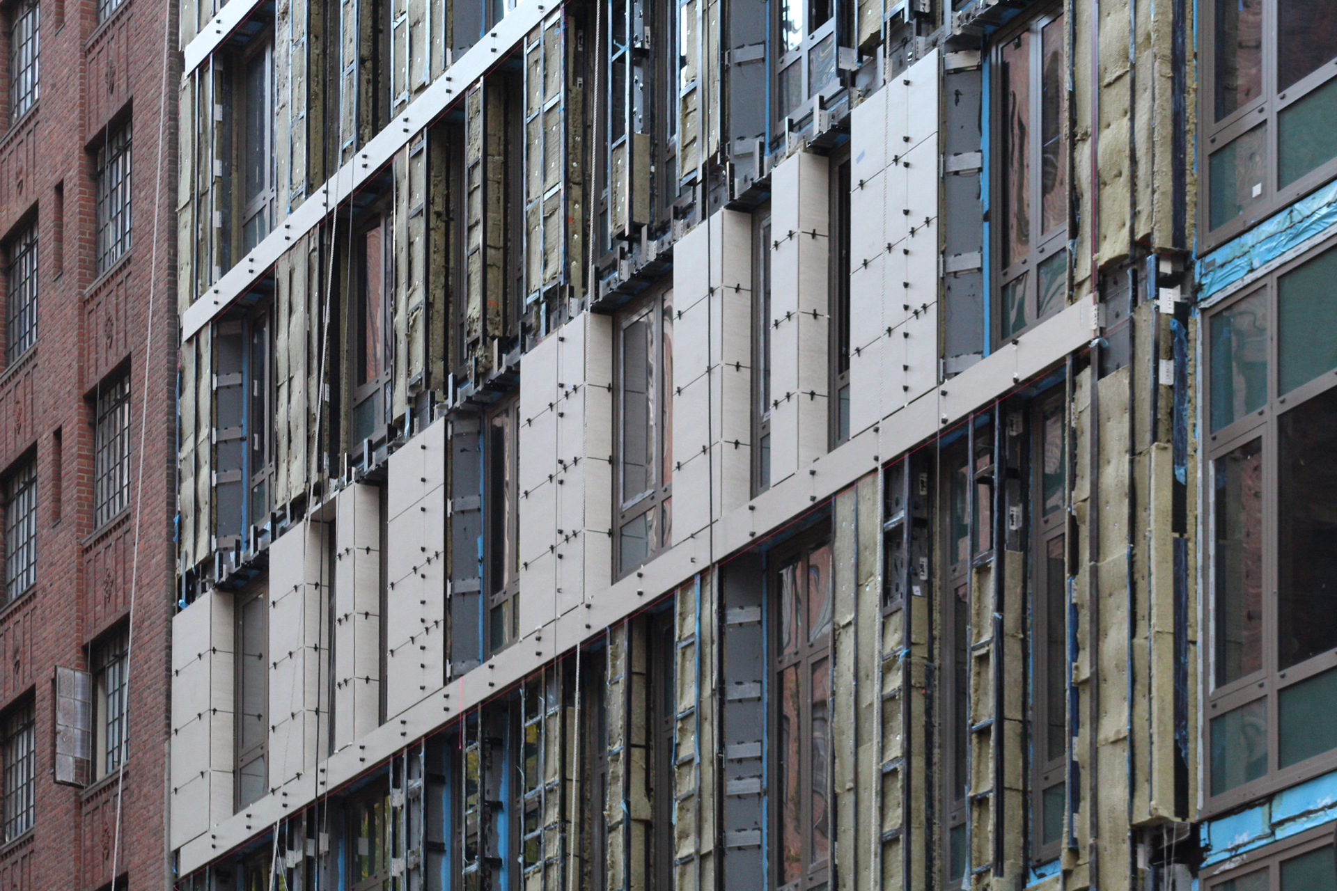
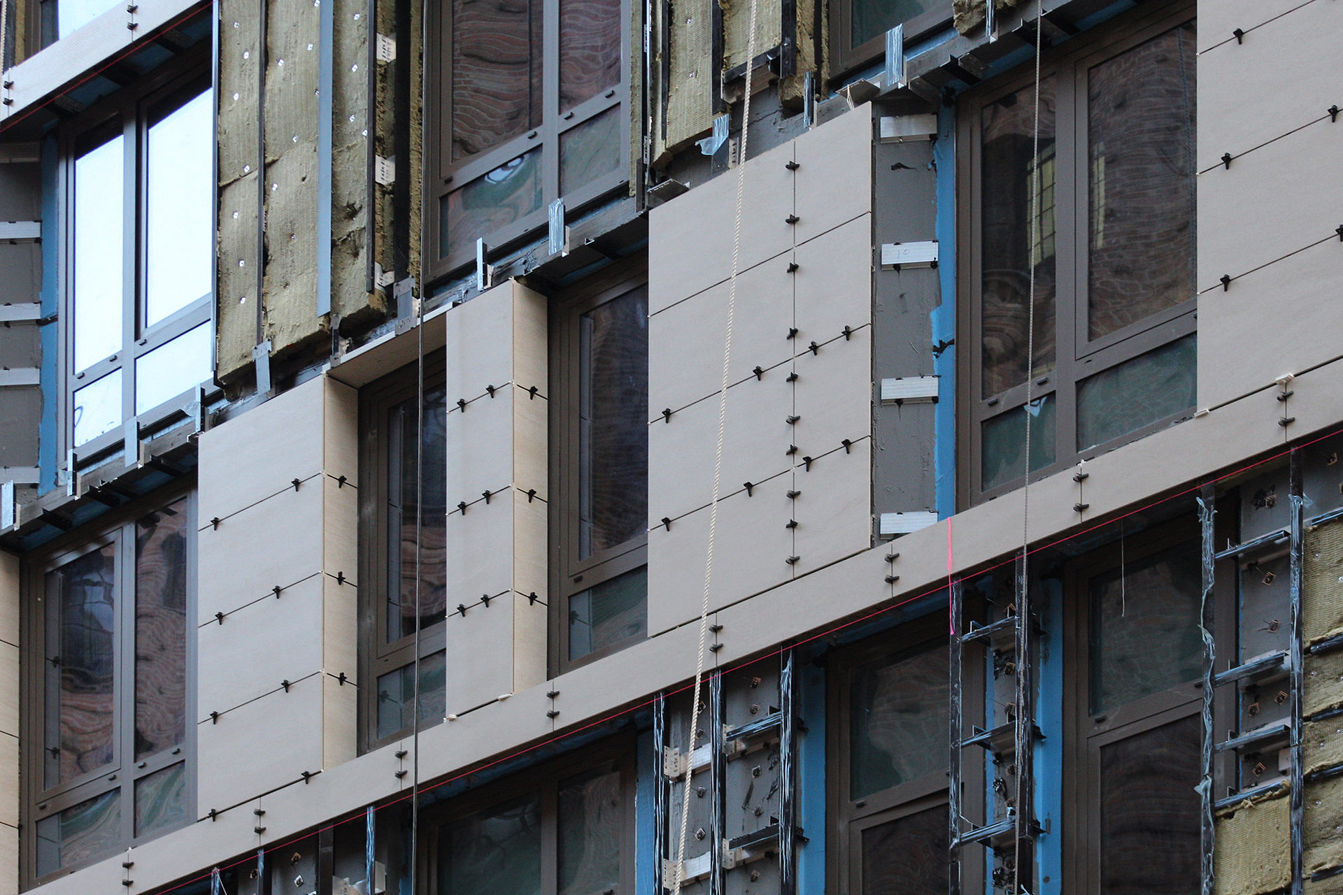
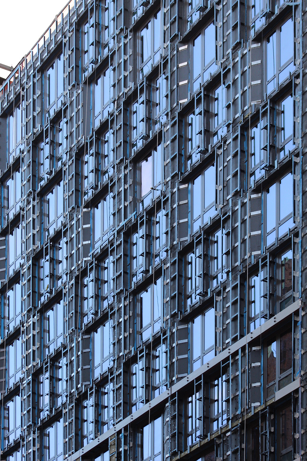
Work has progressed steadily since our last update in September 2021, when the reinforced concrete superstructure was nearing topping out. Since then, nearly all of the floor-to-ceiling windows have been installed, with the exception of the ground floor and the strip on the western profile where the construction elevator is attached. Surrounding the windows is a network of metal clips to which the stone façade has begun to be installed.
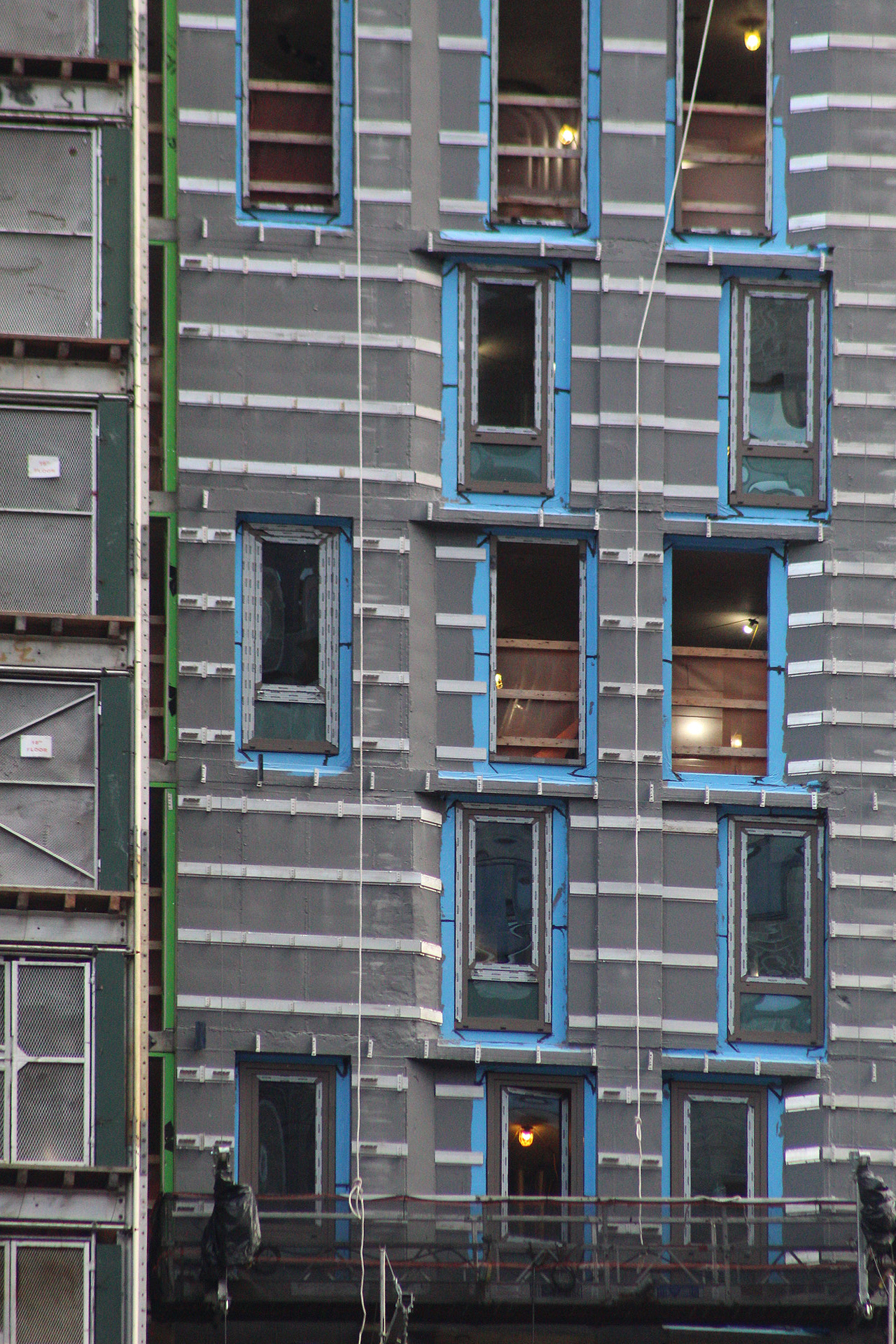
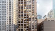
The upper floors above the setback feature a staggered grid of narrower windows.
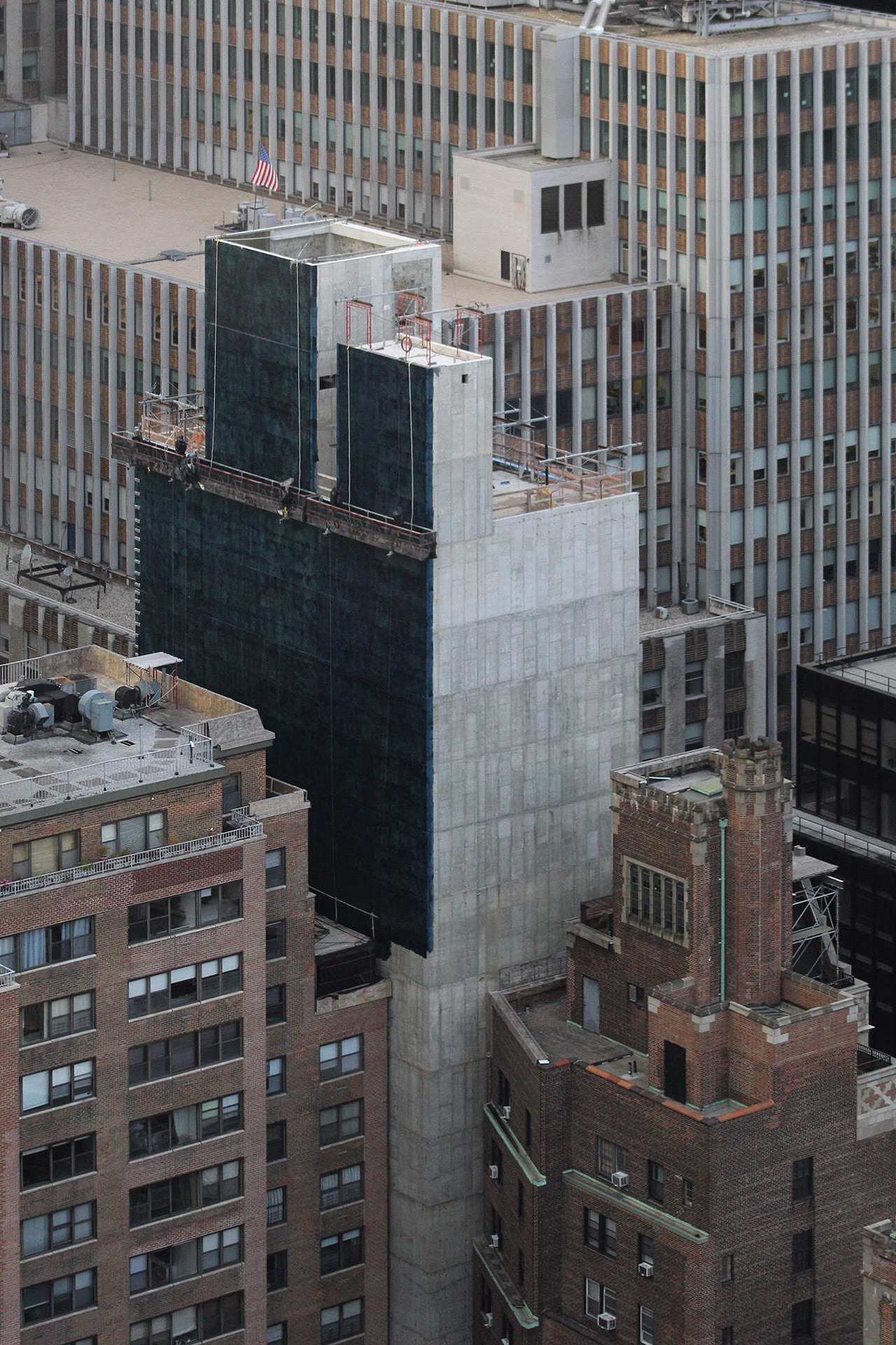
Below is a view of Turken House from above, showing its blank rear elevations.
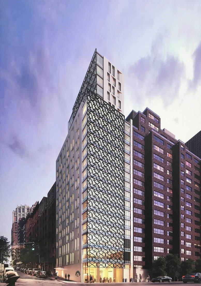
The main rendering showcases Turken House’s final exterior look, with its light stone façade and recessed windows with angled cutouts. The most distinctive elements are the black metal screens that cover the lower levels of the western face and the upper floors of the northern elevation. These flourishes feature an arabesque pattern, and will likely be the final exterior elements to be installed near the end of construction.
It was previously announced that the first floor and basement levels will have a combined total of 4,200 square feet for retail and commercial usage. Residences will occupy floors four through 15, and 17 through 21. Amenities will be located in the basement, on the ground floor, and levels two and 16. These include bicycle storage, study rooms on floors six through 13, a private lounge, a laundry room on the 16th floor, a gym, a concierge, a secured entrance, a common living and dining area, and a private prayer room.
Apartments will come with fully equipped kitchens, free high-speed internet, and cable television. Rents have been listed at $1,300 to $3,000 per month, and two or more people in a room will be charged $800 each.
Turken House had an anticipated completion date of this past spring, but sometime next spring is possible. The developers are aiming for LEED Silver Certification.
Subscribe to YIMBY’s daily e-mail
Follow YIMBYgram for real-time photo updates
Like YIMBY on Facebook
Follow YIMBY’s Twitter for the latest in YIMBYnews



Amazing design on a network of metal clips, it looks messy but very well built that is different from other parts on the same area property. And the stay is subject to additional payment, which is normal to do anywhere, for a variety of services and people can choose: Thanks to Michael Young.
Not bad. It has a real 60s vibe with that grille work.
The construction crane is providing the spire this building needs at its corner location.
The grill work is awesome. The randomly spaced windows? A dreadful design decision that’s affecting far too many modern buildings. I think that sort of thing ruins the entire look.
Tessellations are super cool—wacky fenestration is annoying and a poor trend, indeed!