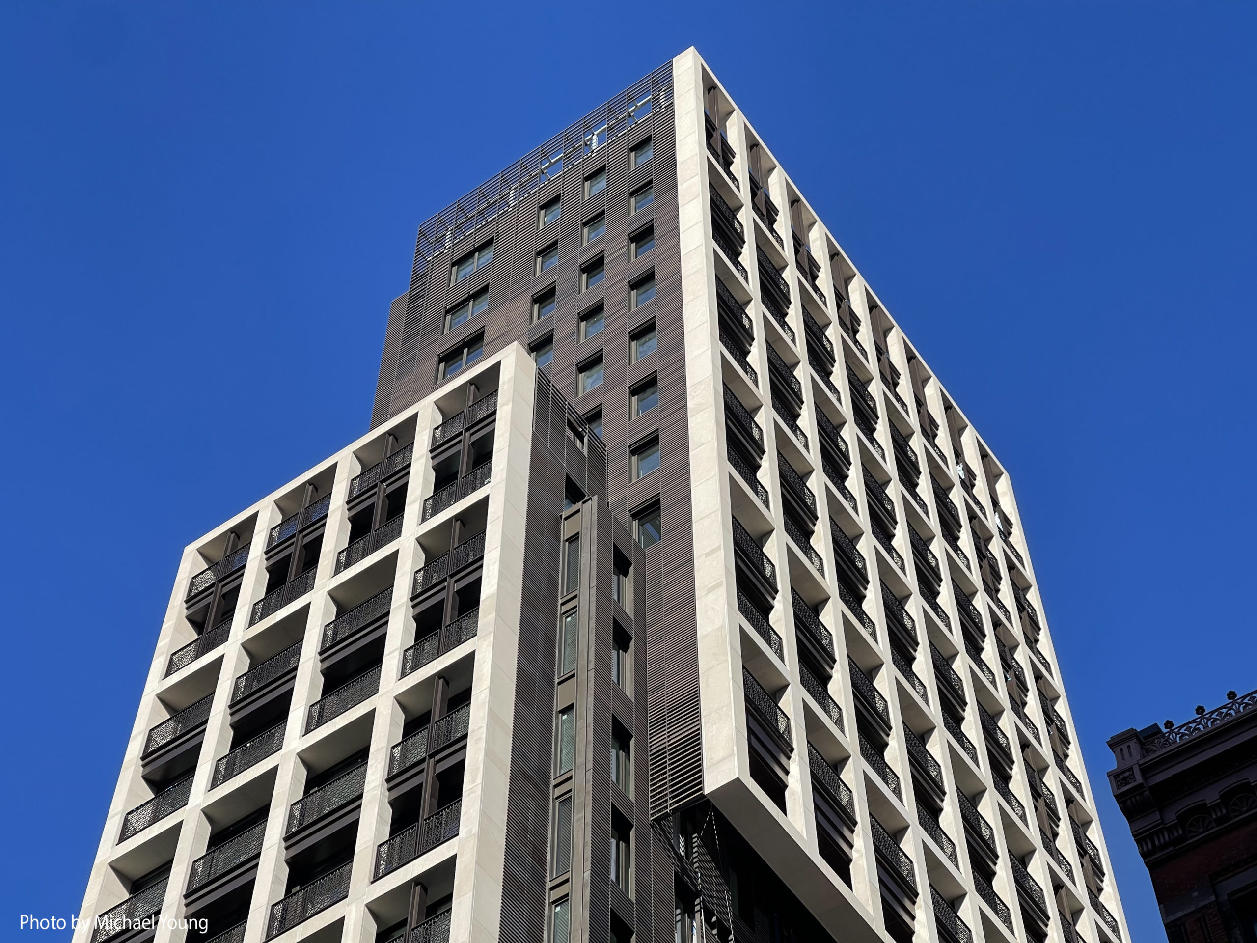
Construction is wrapping up on Flatiron House, a 25-story two-tower residential development at 39 West 23rd Street in the Flatiron District. Designed by COOKFOX Architects and developed by Anbau Enterprises, the 325-foot-tall structure yields 44 condominium units with sales and marketing led by Corcoran Sunshine Marketing Group. Flatiron House’s taller component is called the Tower and features 37 one- to four-bedroom homes with an entrance facing West 23rd Street; the shorter volume is dubbed the Loft and comes with seven one- to five-bedroom residences and a separate entrance to the north along West 24th Street. Ryder Construction is the general contractor for the property, which is located on an interior lot between Fifth and Sixth Avenues.
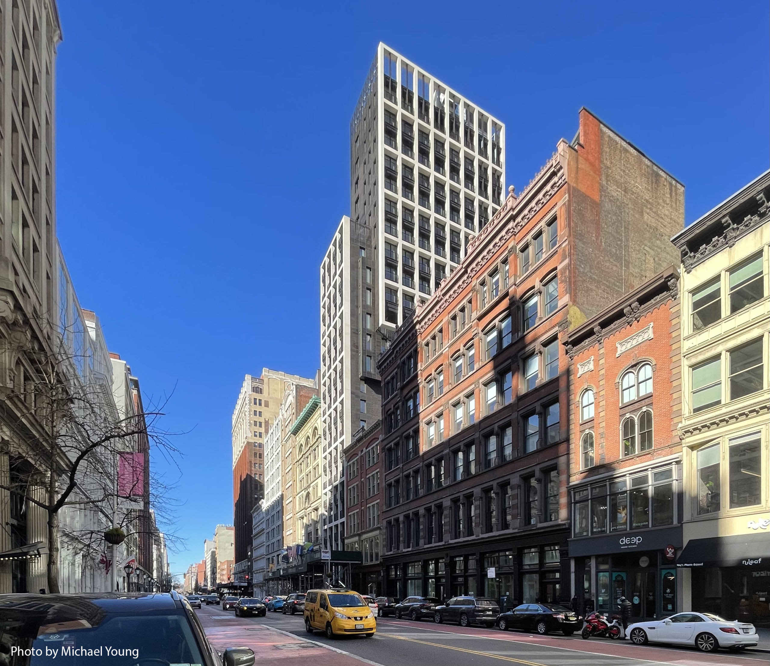
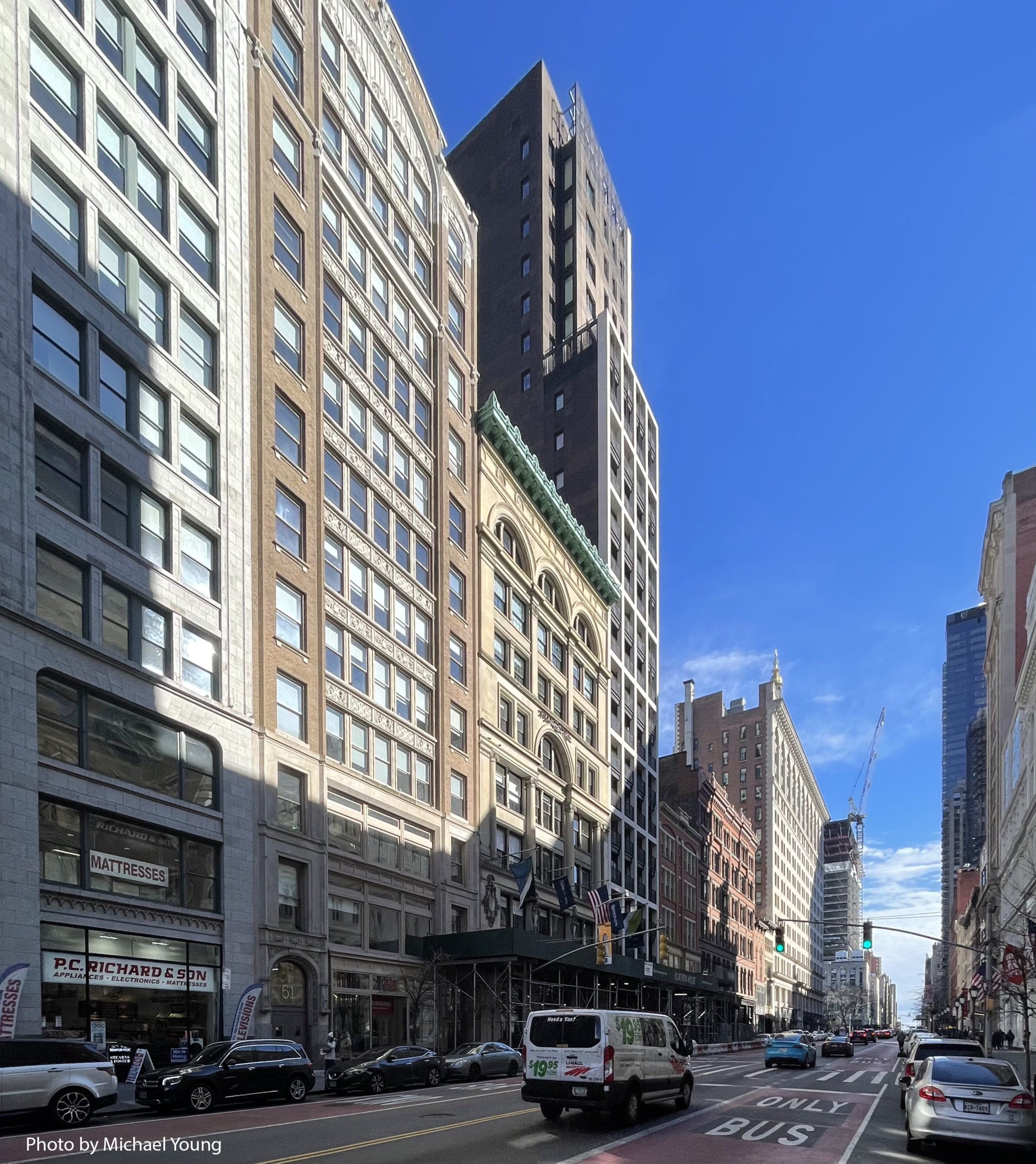
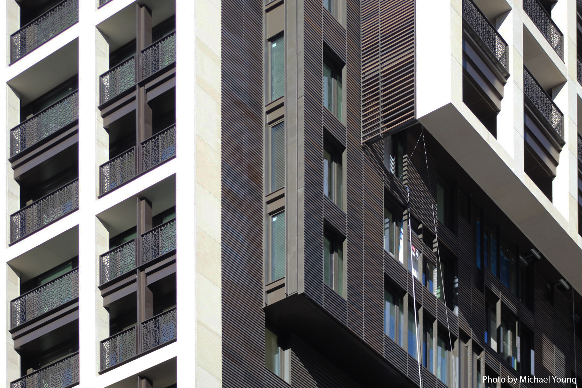
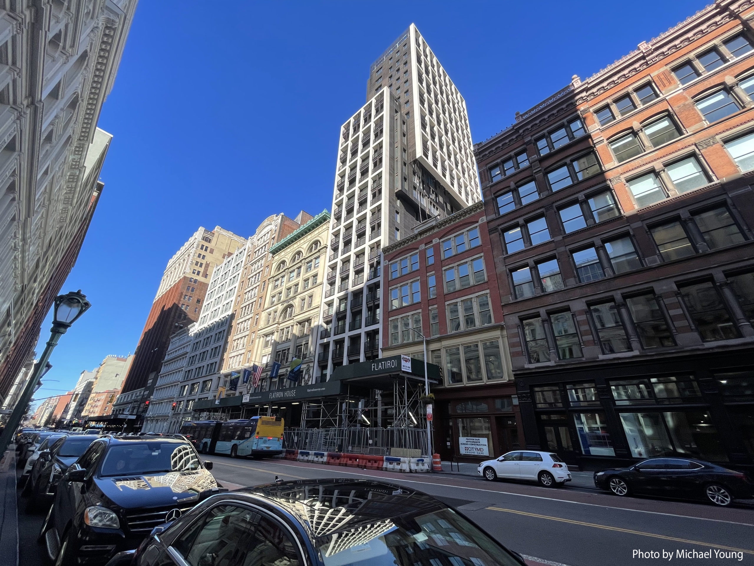
Since our last update in June, façade work has concluded and the scaffolding has been dismantled from the midsection of the eastern elevation. Sidewalk scaffolding remains standing in front of the ground floor, but should be removed in the coming weeks.
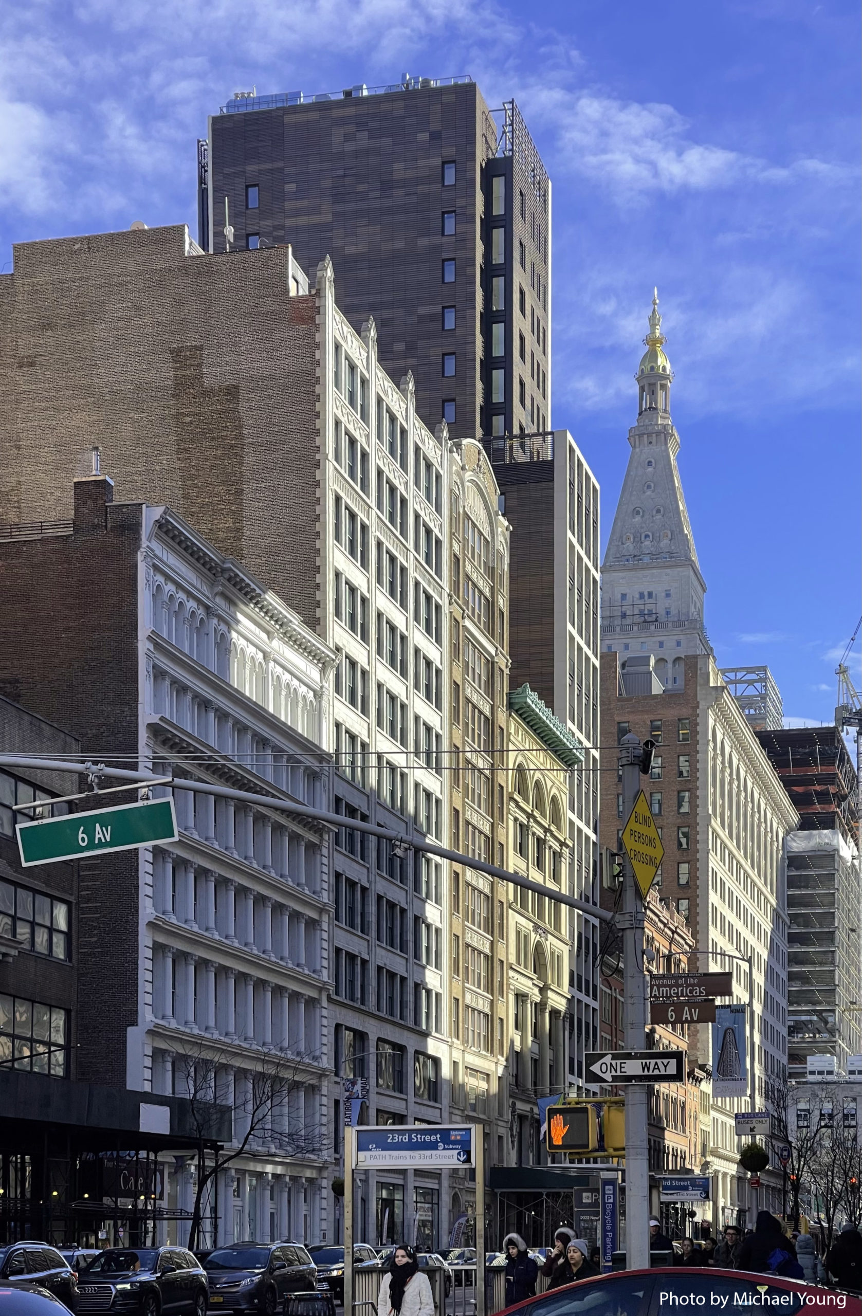
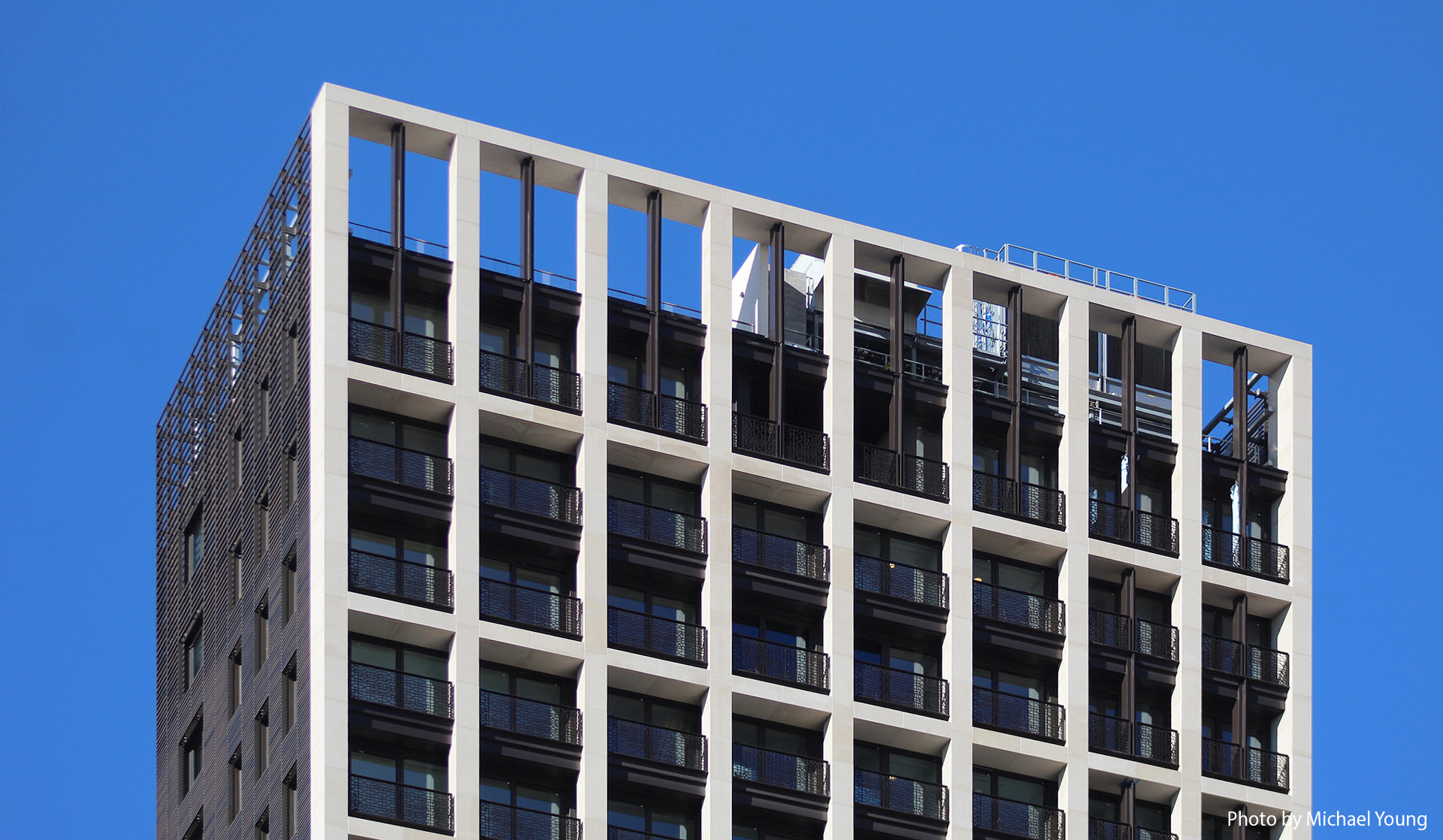
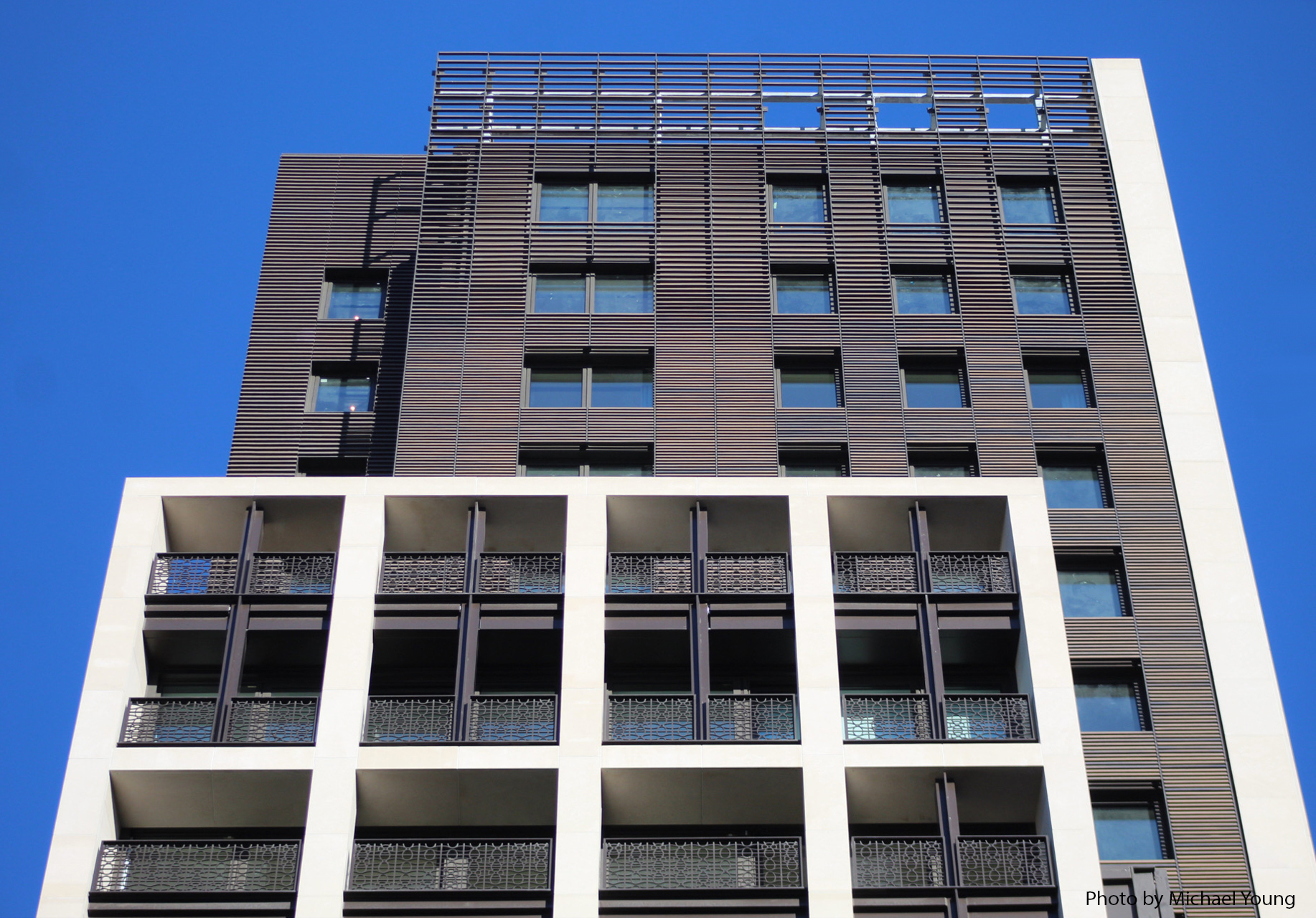
Work has also concluded on the mechanical equipment at the top of the 25-story portion of Flatiron House.
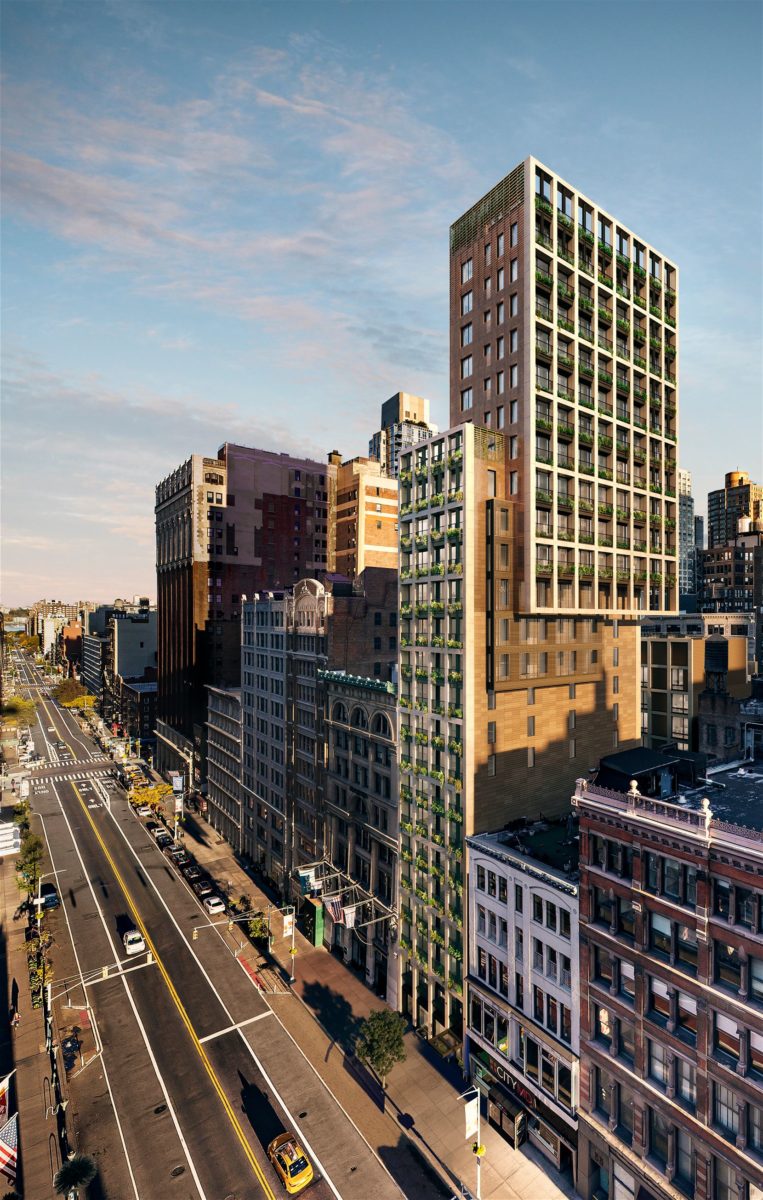
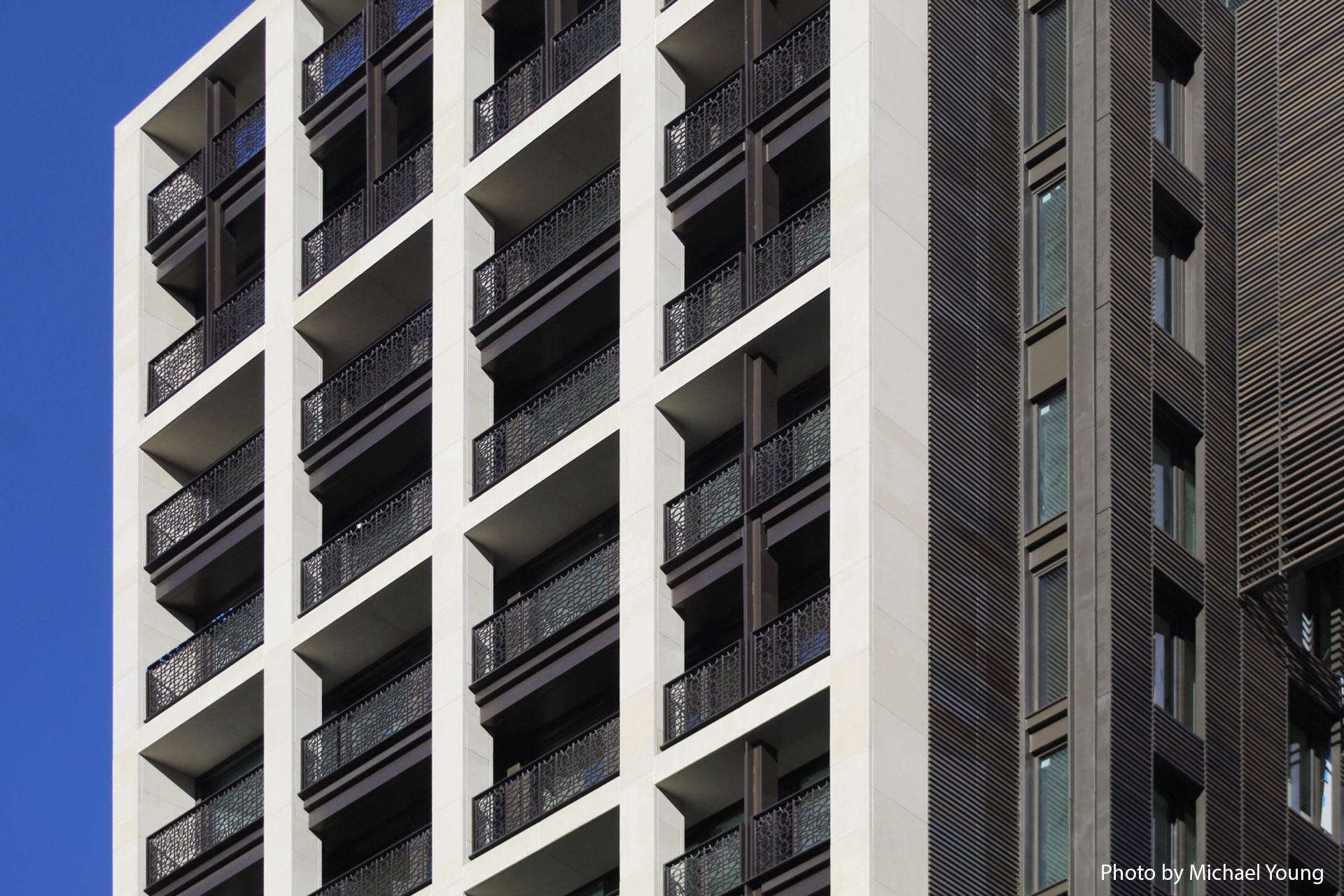
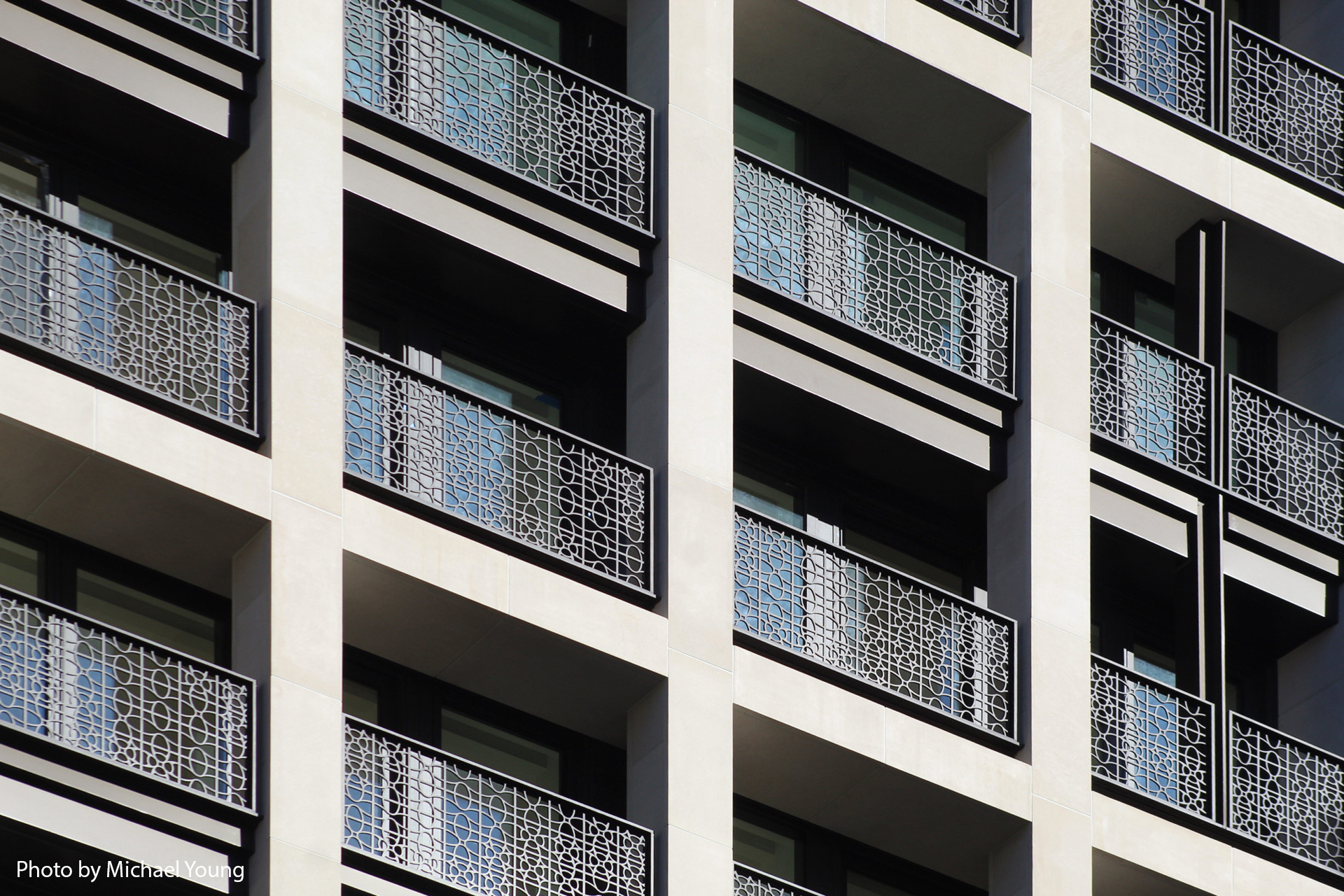
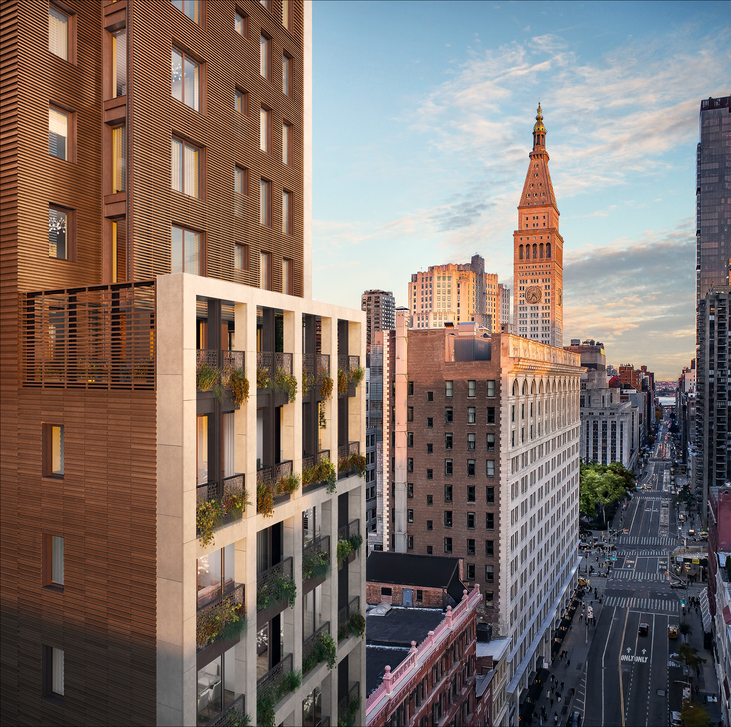
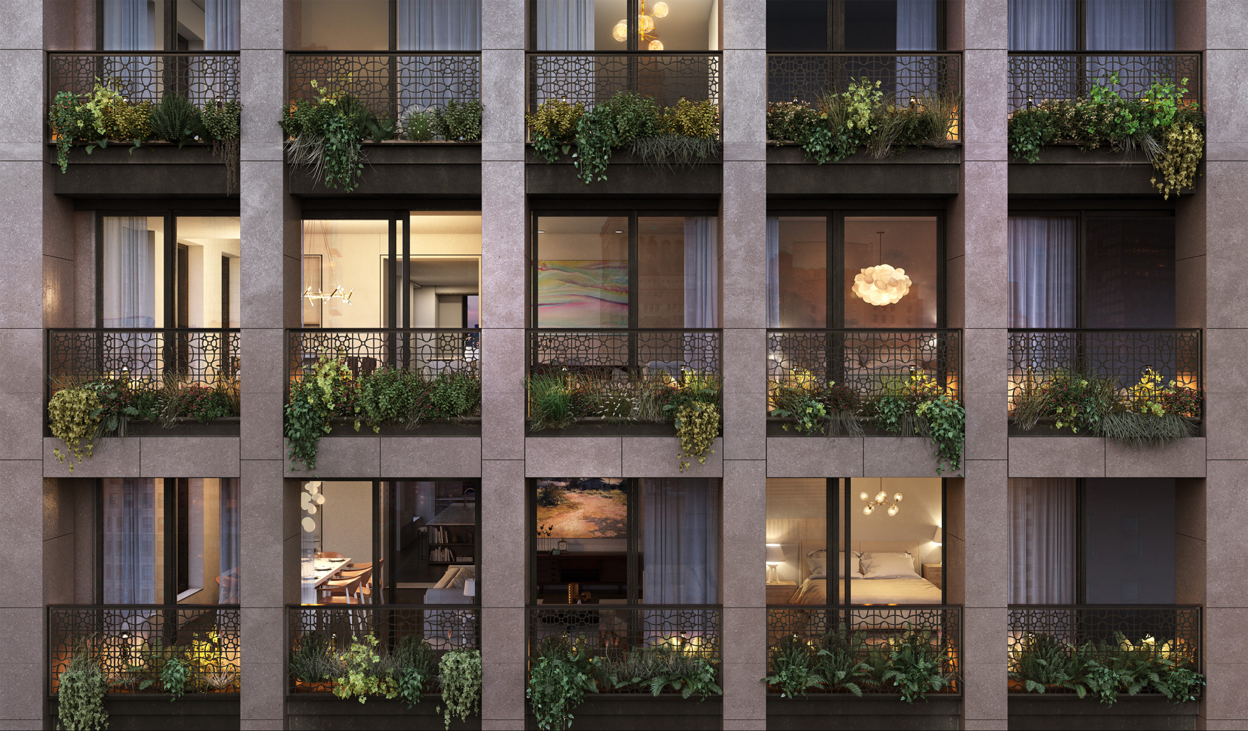
All of the dark metal railings are also in place. Renderings show these covered in hanging vegetation.
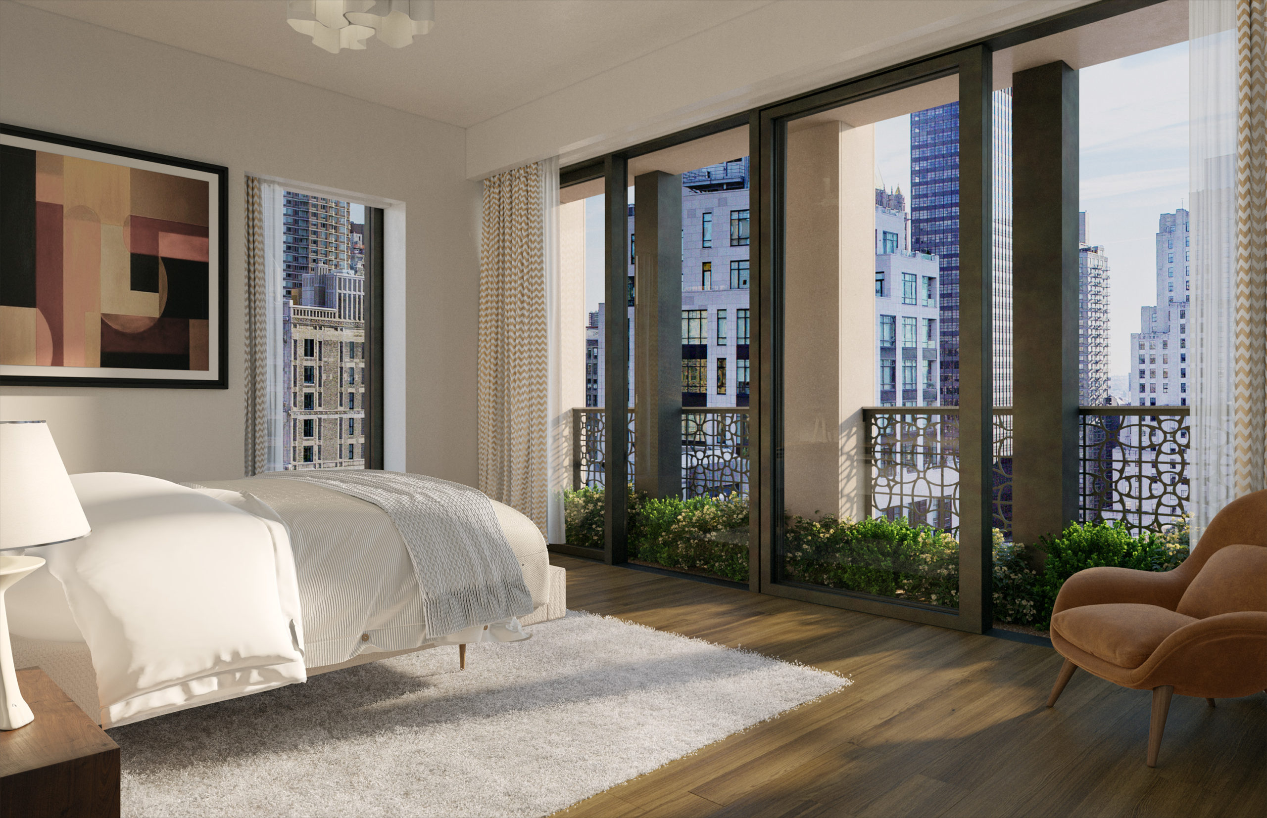
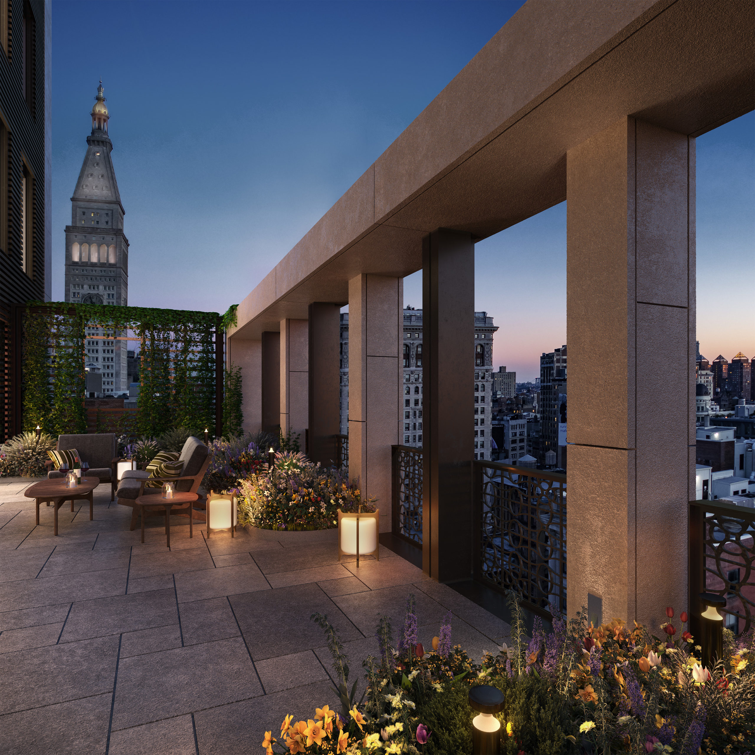
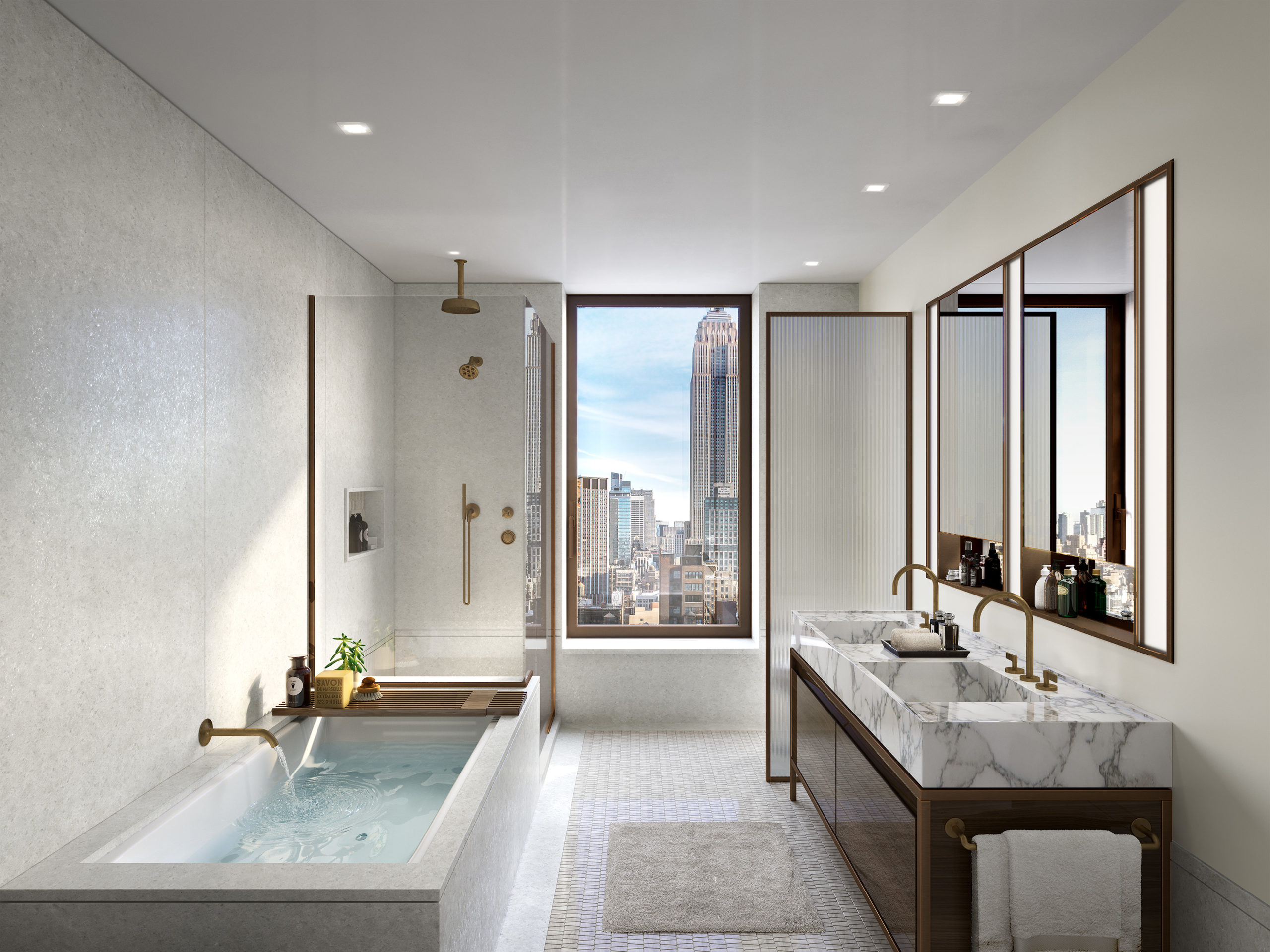
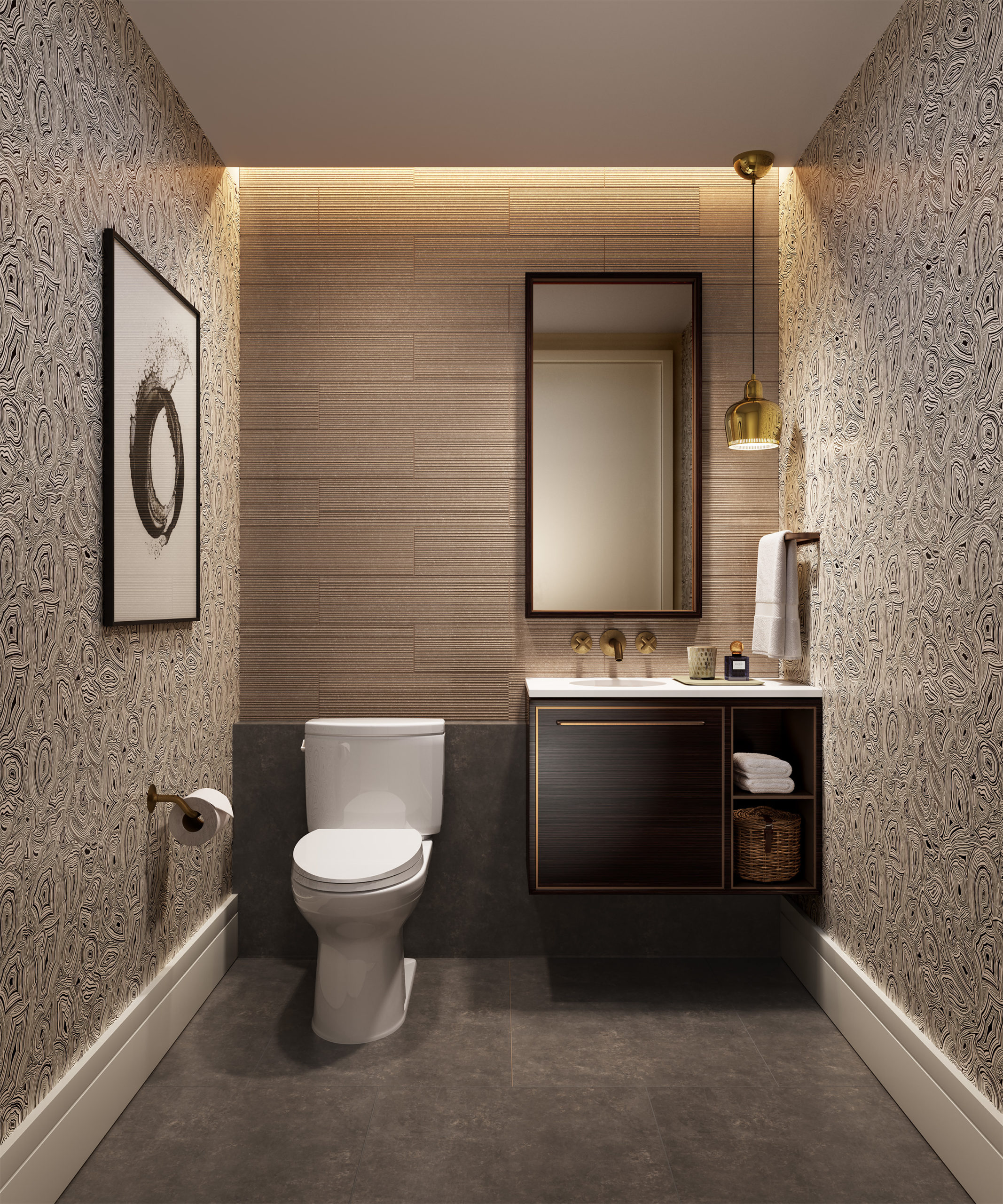
Homes come with lofty ceilings, wide-plank oak floors, custom millwork, and floor-to-ceiling windows. American Walnut is used for the entrance doors with Hamilton Sinkler hardware in an antique bronze finish. Kitchens feature a suite of Gaggenau and Thermador appliances, Dornbracht fixtures, storage spaces, rift oak and white lacquer cabinetry accented with textural ribbed glass, and bronze metal hardware. The primary bathrooms come with Arabescato marble and walnut vanities against a backdrop of Greek Naxos marble, and feature mosaic marble flooring and cast iron tubs. Select homes will have private outdoor terraces.
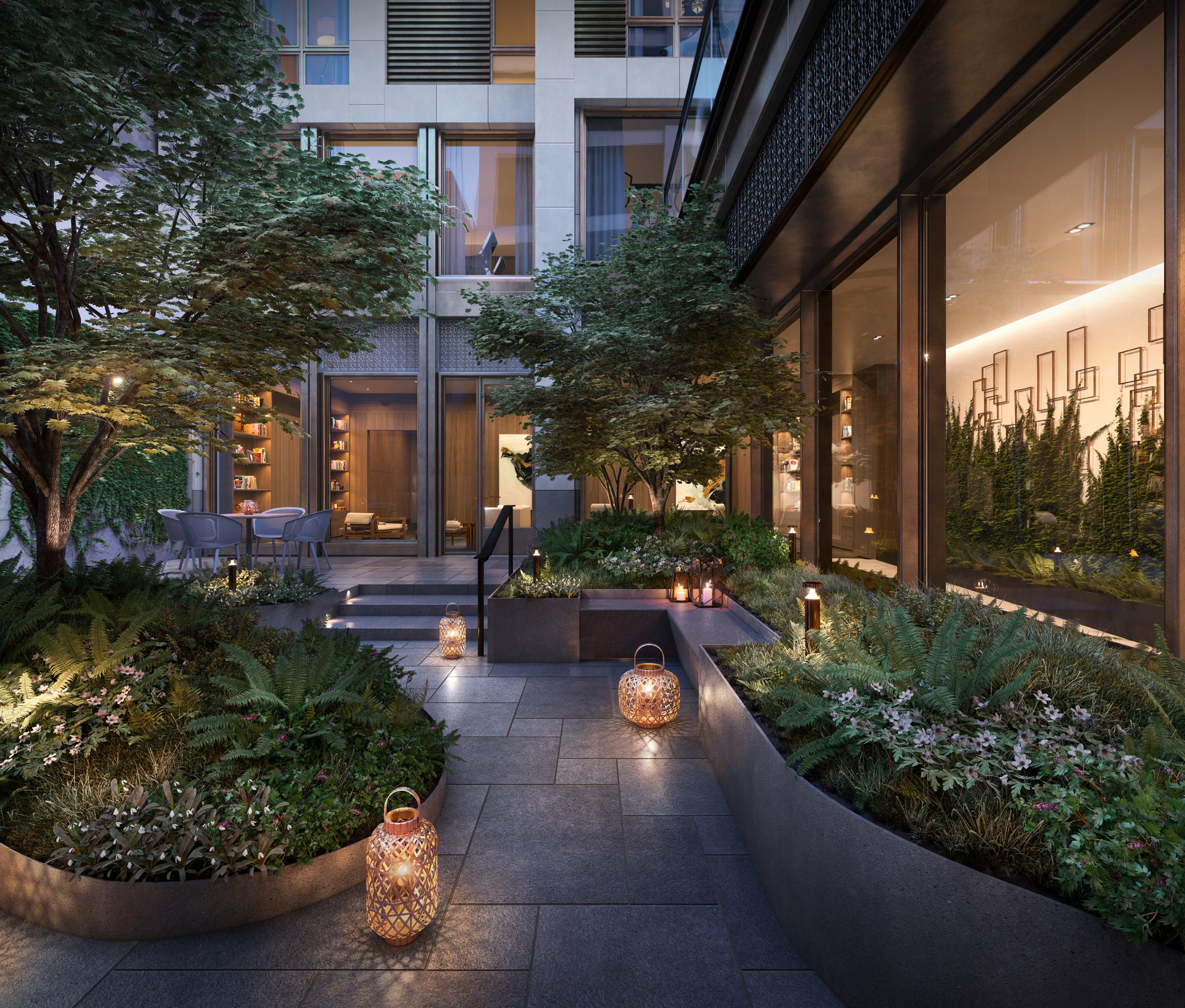
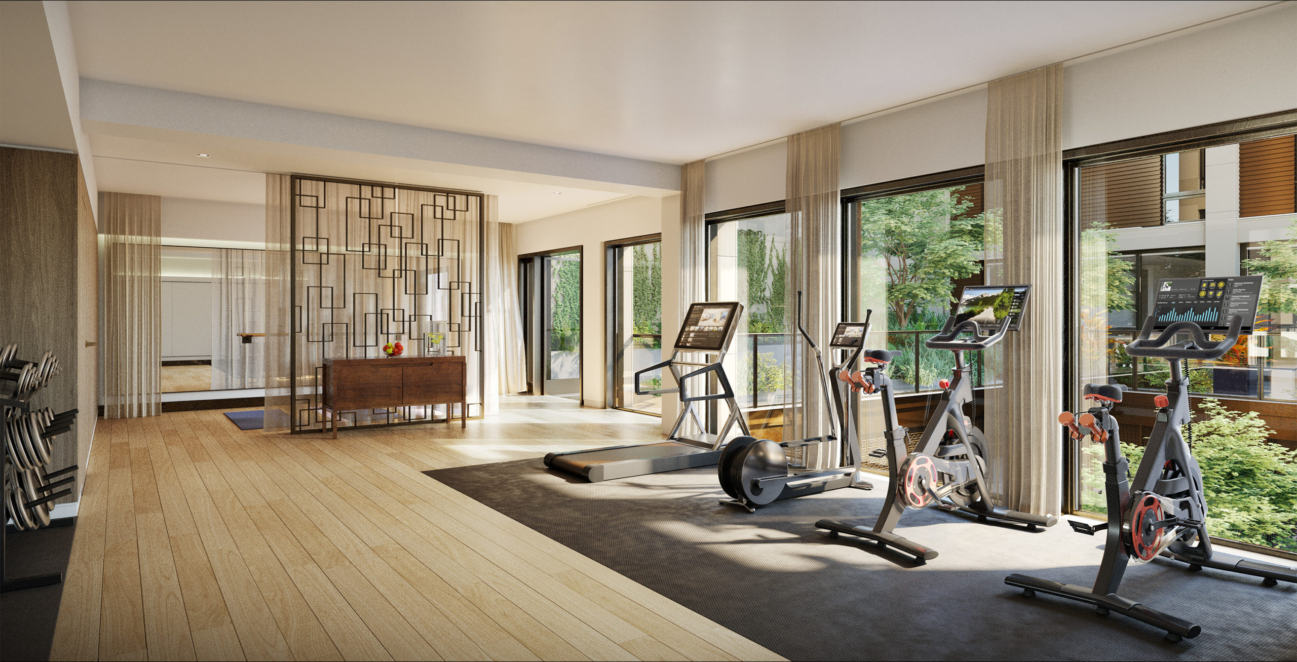
At the center of the project is The Garden, a landscaped central courtyard populated with native flowering plants, trees, and shrubbery. This space will be surrounded by COOKFOX-designed amenity spaces, which include a 24/7 attended lobby with bronzed metal doors and a patterned canopy clad in American Walnut and limestone; a second-level gym and wellness suite with a yoga and stretching studio and an adjoining landscaped terrace; The Game Room, featuring billiards, a film screen, and space for private dining and entertainment; and The Lounge, which offers a space for intimate gatherings. There is also bicycle storage, a commercial laundry room for oversized items, and on-site parking and storage available for purchase.
Subscribe to YIMBY’s daily e-mail
Follow YIMBYgram for real-time photo updates
Like YIMBY on Facebook
Follow YIMBY’s Twitter for the latest in YIMBYnews








Just awful.
Just okay.
The photos of the balcony side are giving me “Holiday Inn” vibes?!
This is one of those things where I suspect the developer and architect tried to pull together a way to maximize what they could out of the air rights that had been acquired. And it’s, well…..damn awkward. I think the building is perfectly fine. And the height is fine as well and if they had stopped there all would have been good: zero lot line for the first several floors and then the setback. Instead we get…..well….damn awkward.
So awkward—looks like one building fell out of the sky and landed on another building! Let’s hope it doesn’t become a trend!
I love the metal railings and hope the vegetation grows in the future and makes it look more green! Nice photos as always!
Looks cheap and horrible
Don’t you love these rendering with lush greenery and then when the project is completed they discover that NYC is not Singapore? I’ve seen too many balcony and building renderings here with weeping plantings that never come to fruition when it built.
See the difference between areas of use, by pointing to the first part and first look which is the interior. Wind and air cannot enter if not open the window, so go to exterior sections it can be seen very clearly that the white frame is raised from the normal level observable: Thanks to Michael Young.
This project stretches through to 24th Street. What does the north side look like? Will it also have balconies with cascading vines?
I like this design exterior. The lower portion respects the streetwall of 23RD Street and brings a modern interpretation to that beautiful assemblage of historic facades. The upper, cantilevered section turns the facade on its side sort of like a Rubik’s cube, giving an interesting solution to this design challenge. One of the few overhangs that really uses the extra volume to its advantage.