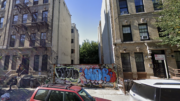
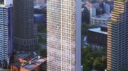
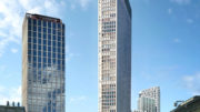
Construction is complete on 169 Huron Street, a six-story residential building in Greenpoint, Brooklyn. Designed by INC Architecture & Design and developed by RedHoek+Partners, the structure yields 11 condominium units in one- and two-bedroom layouts with marketing by Compass, as well as ground-floor commercial retail space marketed by Kassin Sabbagh Realty. Albeco Construction was the general contractor for the project, which is located at the corner of Huron Street and Sgt. Nicholas Aleman Way.
Recent photos show the finished look of the building, which is clad in a mix of white and black floating porcelain rain screen panels from Porcelanosa that are designed to reduce energy consumption by 20 to 30 percent and provide acoustic insulation for the units.
The building houses two homes per level, and each comes with floor-to-ceiling windows with southern and western exposures, 10-foot ceiling spans and 23-foot-long room spans, European White Oak plank flooring, custom European millwork with plentiful storage space, imported Porcelanosa tiled backsplashes, stain- and heat-resistant Quartz countertops, in-unit washers and dryers, and integrated DishDrawer dishwashers. Bathrooms have Porcelanosa vanities and fixtures, textured non-slip tiles imported from Spain, a Smart Line Porcelanosa Noken Cistern, an eight-inch rain shower head, pressure balance bathroom taps, and a hidden Ballast toilet.
A penthouse unit with a private landscaped roof terrace caps the building.
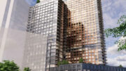
Below is a rendering that shows a cutout section of a lower two-story residence with an adjacent outdoor terrace.
169 Huron Street’s main entrance is positioned along Huron Street. The retail frontage sits along the slimmer western elevation facing Sgt. Nicholas Aleman Way.
The nearest subway from 169 Huron Street is the G train at the Greenpoint Avenue station to the south.
Subscribe to YIMBY’s daily e-mail
Follow YIMBYgram for real-time photo updates
Like YIMBY on Facebook
Follow YIMBY’s Twitter for the latest in YIMBYnews


what a piece of crap
Walked by here yesterday it’s actually a nice little building. Craftsmanship a bit wonky but good massing
Can you really not think of any other word or another combination of words other than “piece of crap,” like ugly, disgusting, or “this design looks incoherent?
Design-wise,the building itself isn’t so bad; however, its base at street level is quite bland,contributes nothing to the surrounding area (in fact, subtracts), and appears soulless.
Add some planters or something/anything.. that gives back to the space you’ve occupied in some way.