Façade installation is progressing on 270 West 96th Street, a 23-story residential building on Manhattan’s Upper West Side. Designed by SLCE Architects and developed by Fetner Properties, the 235-foot-tall structure will yield 171 rental units with 68 dedicated to affordable housing, and 8,961 square feet of community facility space. Urban Atelier Group is the general contractor for the property, which is located between West End Avenue and Broadway.
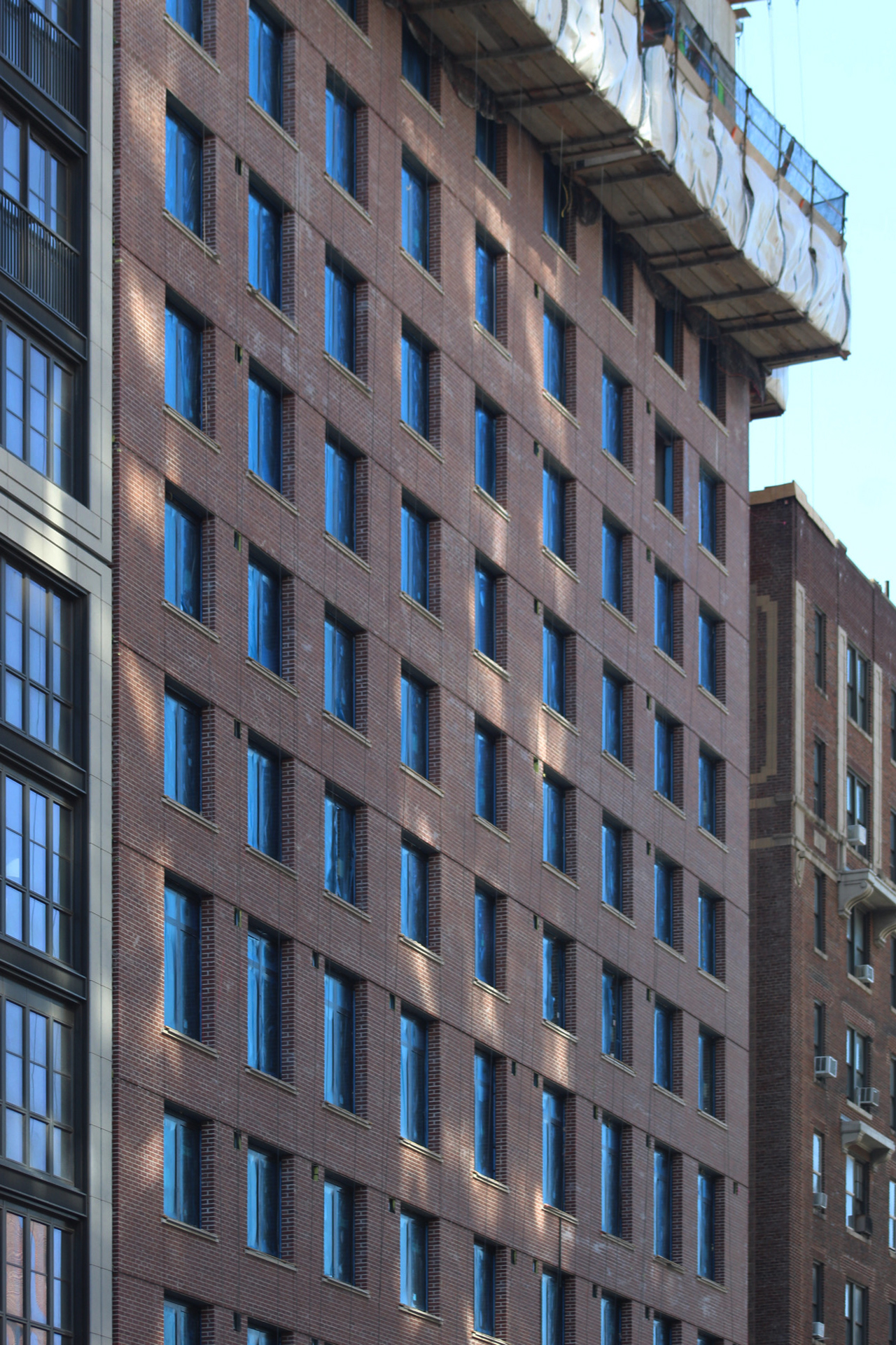
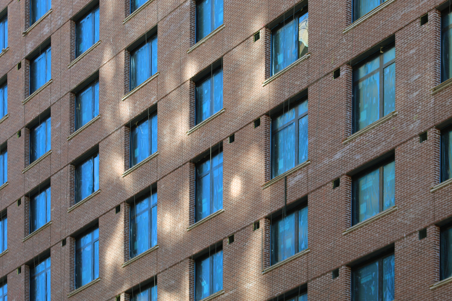
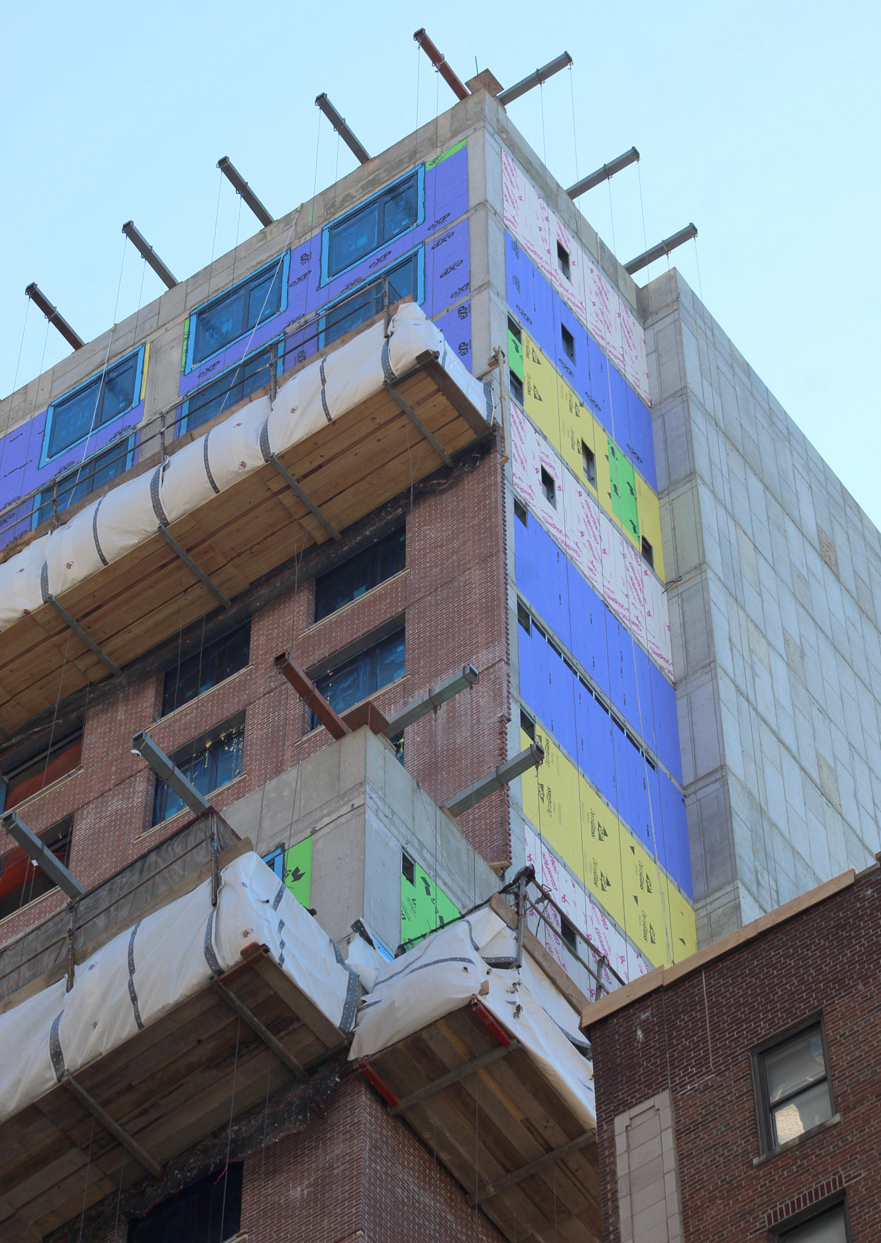
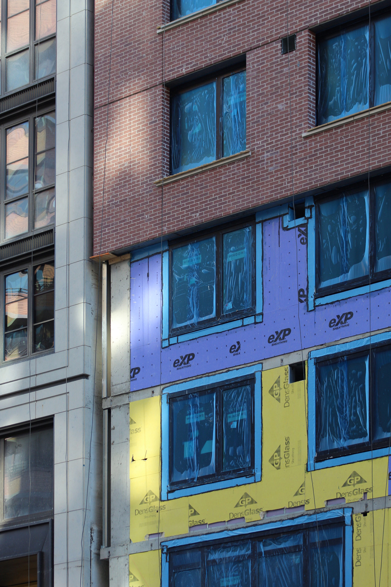
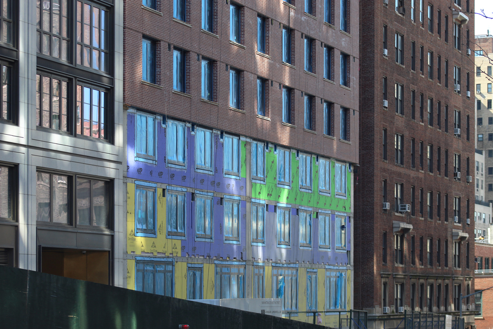
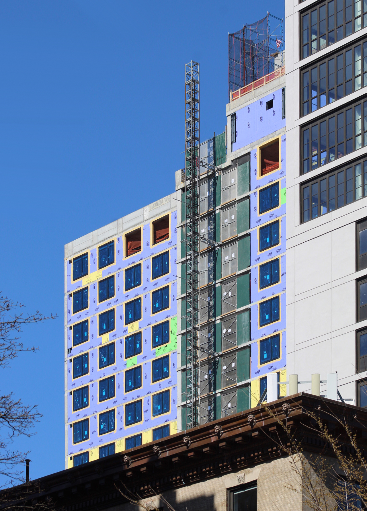
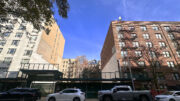
Construction was just preparing to rise above street level at the time of our last update in September. Since then, the reinforced concrete superstructure has been built to its parapet and quickly enclosed in its red brick envelope, which now covers all but uppermost floors of the main northern elevation. The lower three levels also remain exposed, but will eventually be clad in white stone. King Contracting Group is in charge of installing the CMU, EIF, brick, cast stone, and roofing.
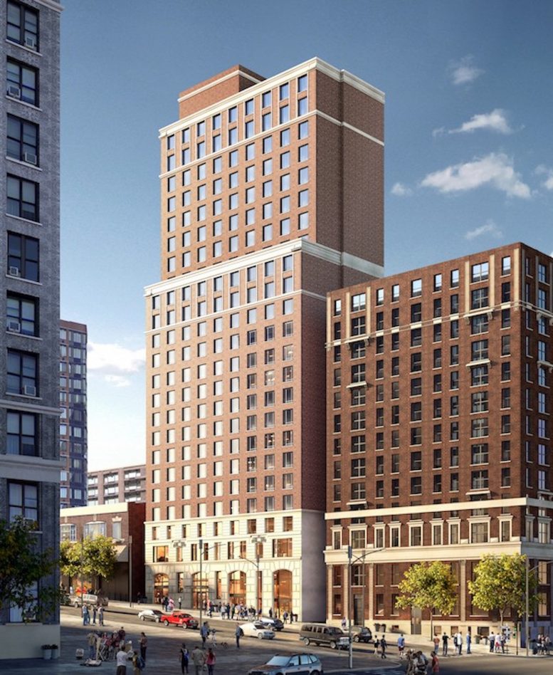
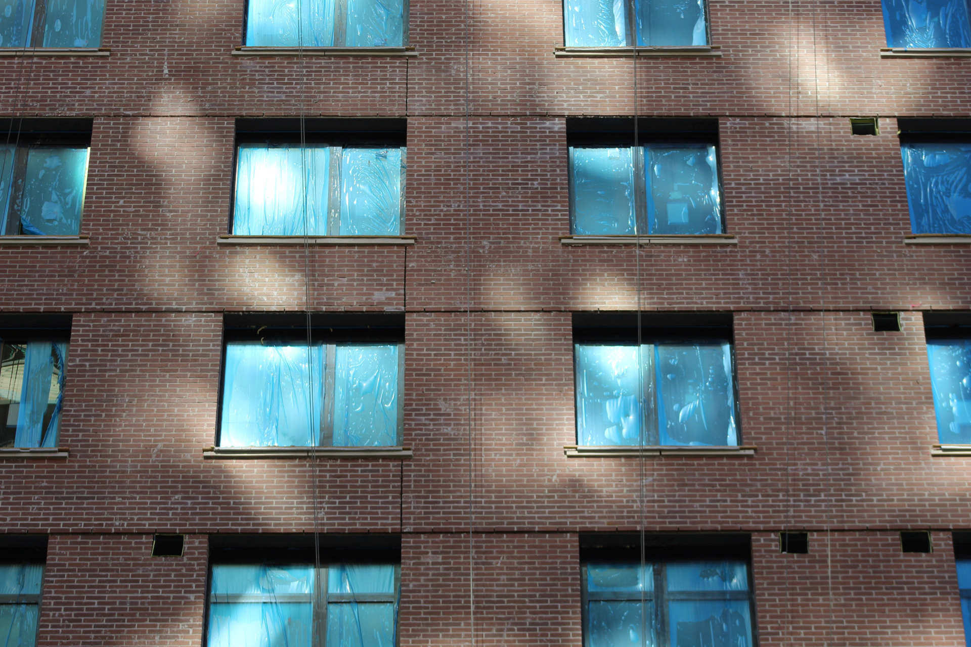
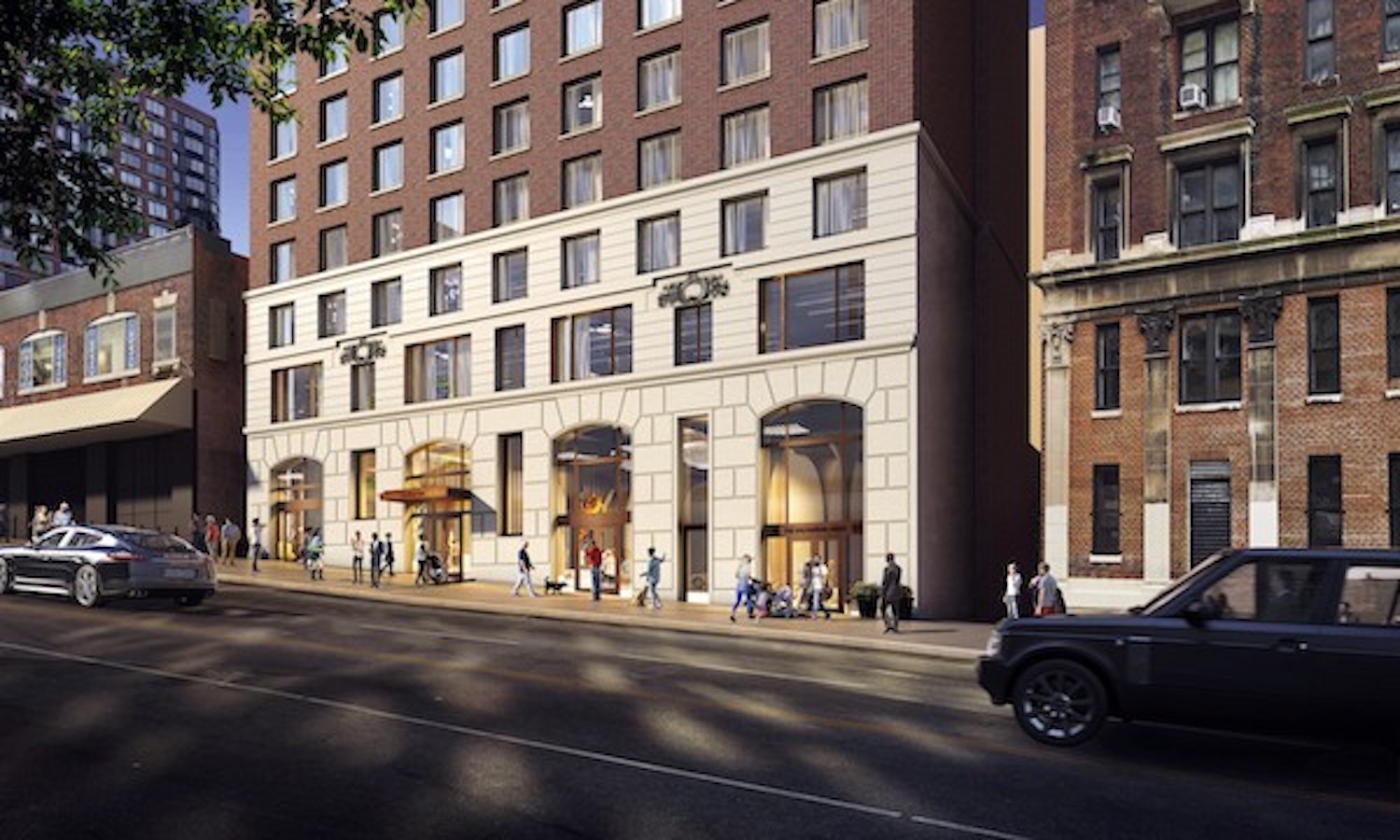
Crews are in the process of laying the brick by hand from suspended scaffolding platforms. As shown in the rendering, the blank western elevation will feature the same red brick envelope. A white stone cornice will encircle the parapet and the 16th-story setback.
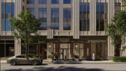
The rendering shows the double-height ground floor clad in larger stone blocks and featuring arched windows for the entrance and retail frontage. A gold-hued rectangular canopy will cover the entryway.
Below is a rendering showing this section upon completion.
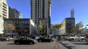
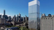
270 West 96th Street stands directly next to 96+Broadway at 2551-255 Broadway. Though nearly identical in height, the two structures present a striking contrast in color and materials.
The construction elevator remains attached to the rear southern side of 270 West 96th Street, and is still awaiting the installation of its final façade.
The development is located directly next to the 1, 2, and 3 trains at the 96th Street subway station. The C and B trains are also nearby along Central Park West.
270 West 96th Street has an anticipated completion date of spring 2024 posted on site.
Subscribe to YIMBY’s daily e-mail
Follow YIMBYgram for real-time photo updates
Like YIMBY on Facebook
Follow YIMBY’s Twitter for the latest in YIMBYnews




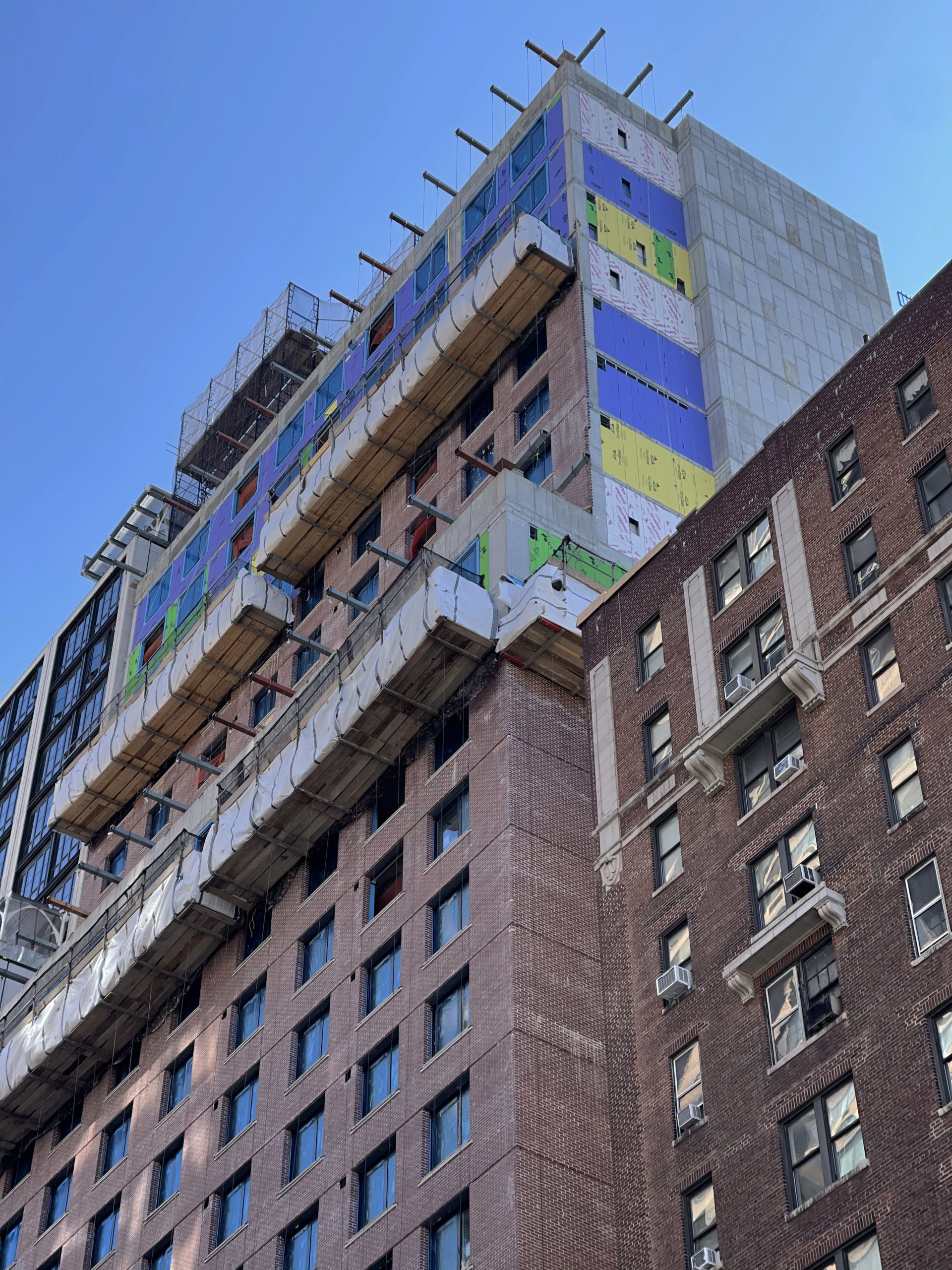
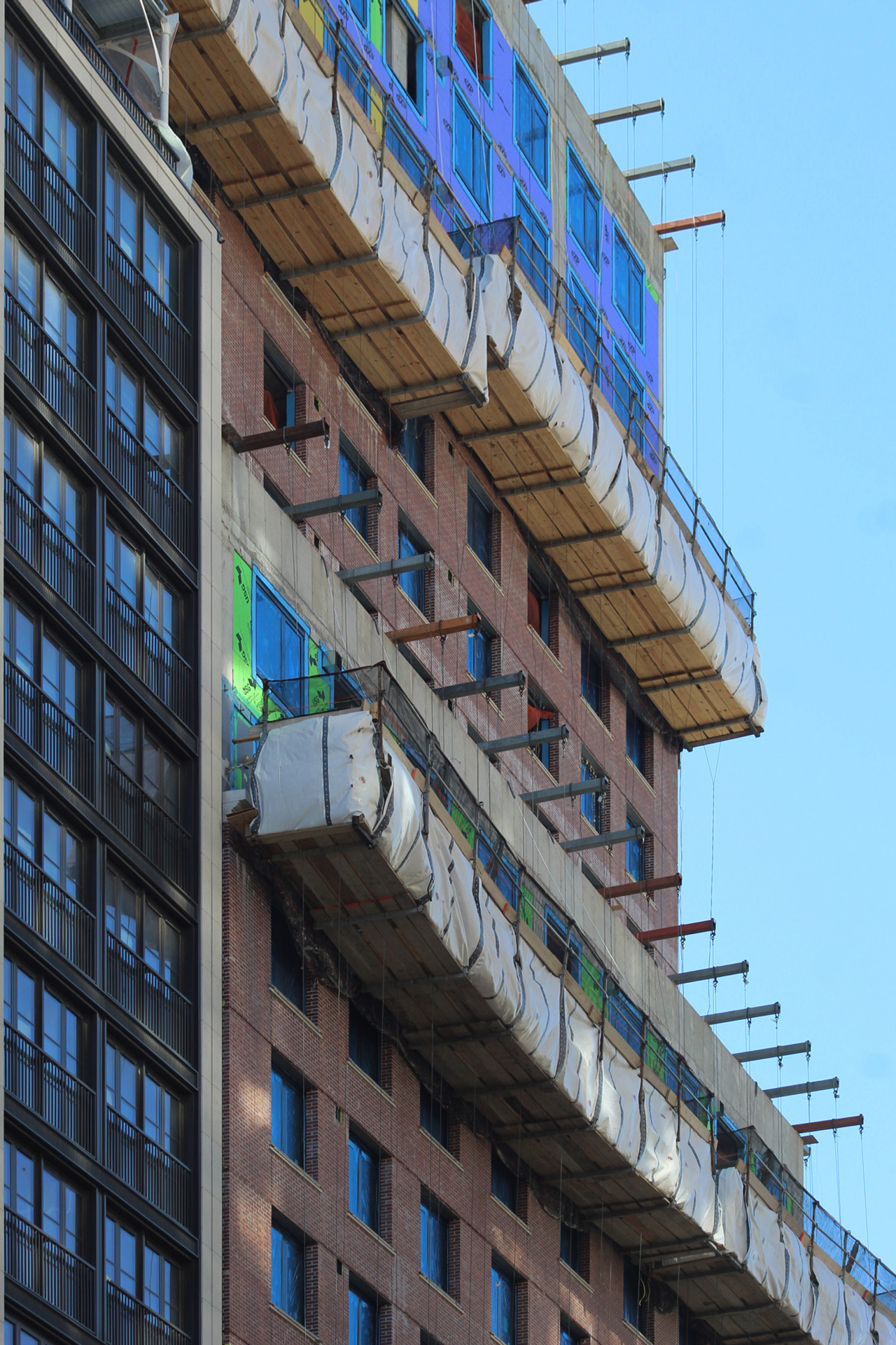
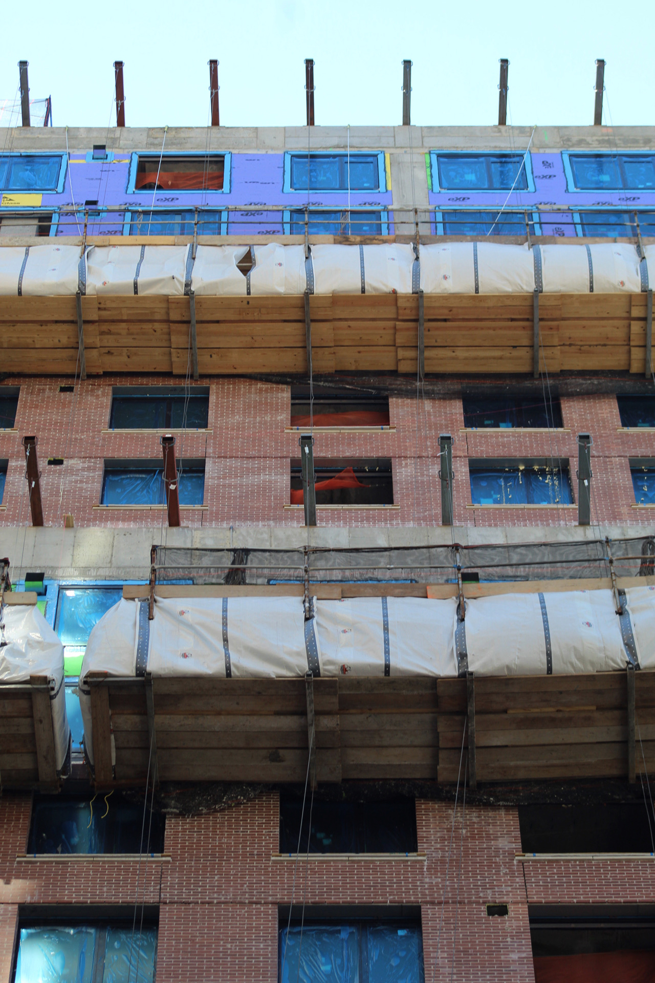
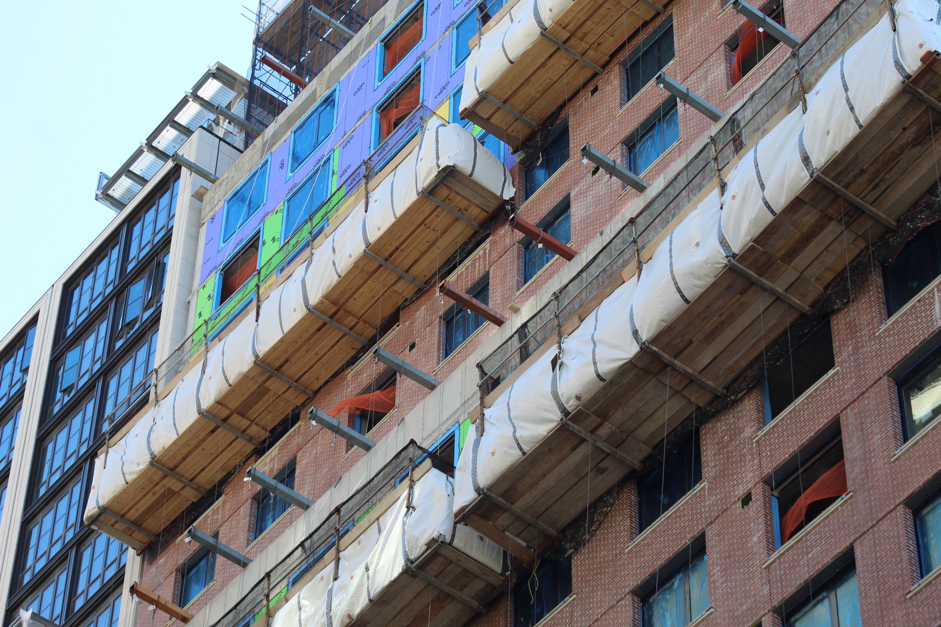
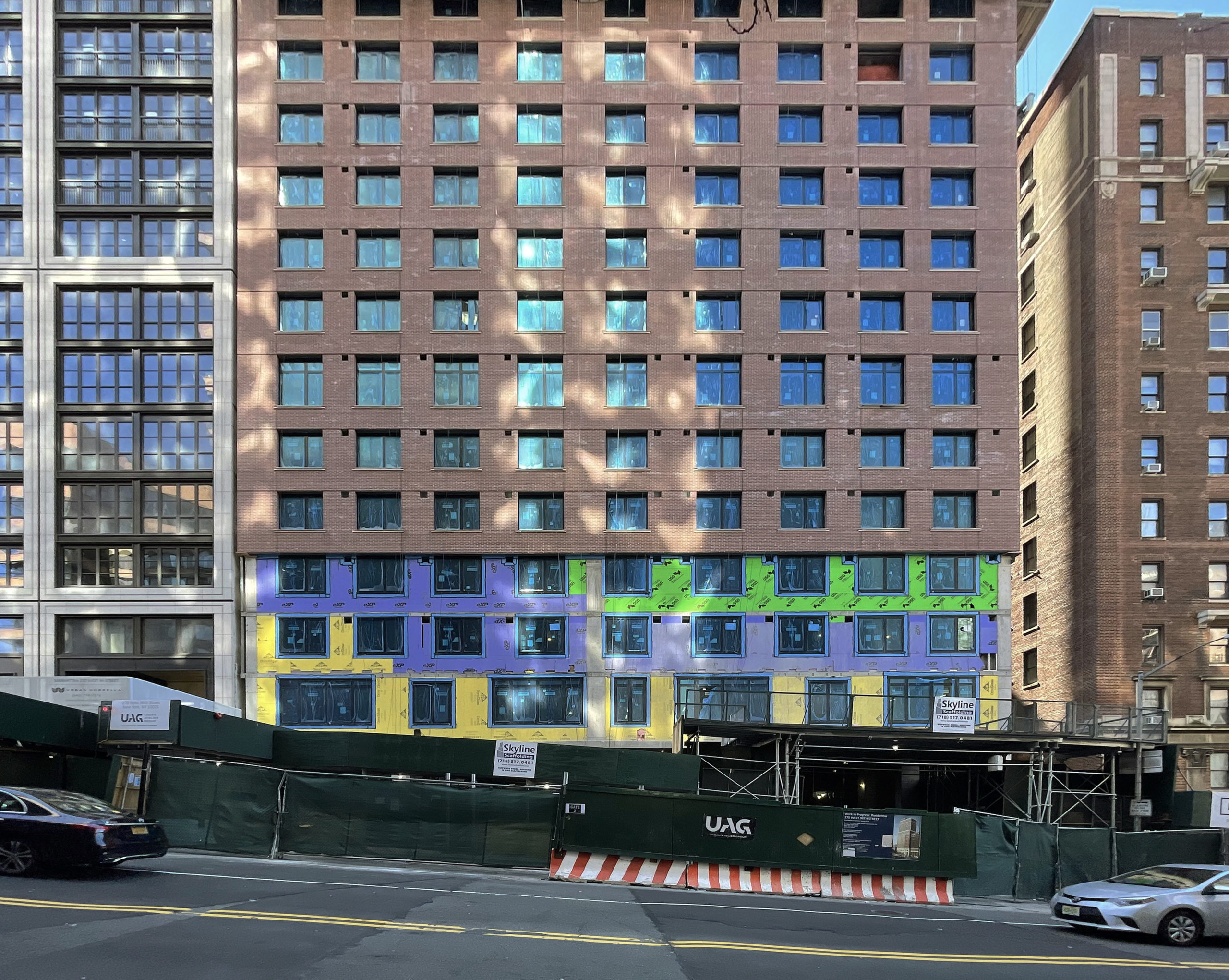

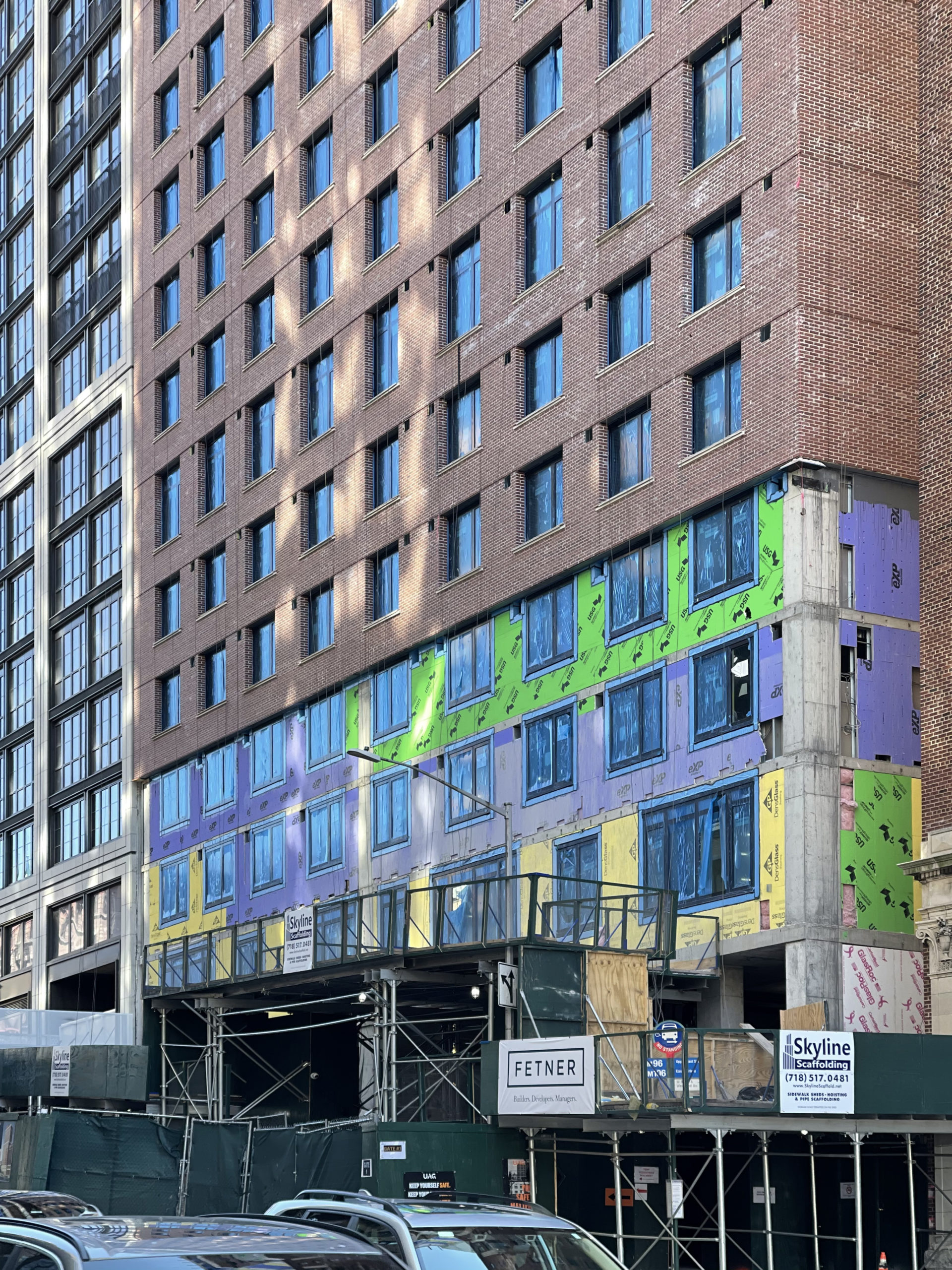
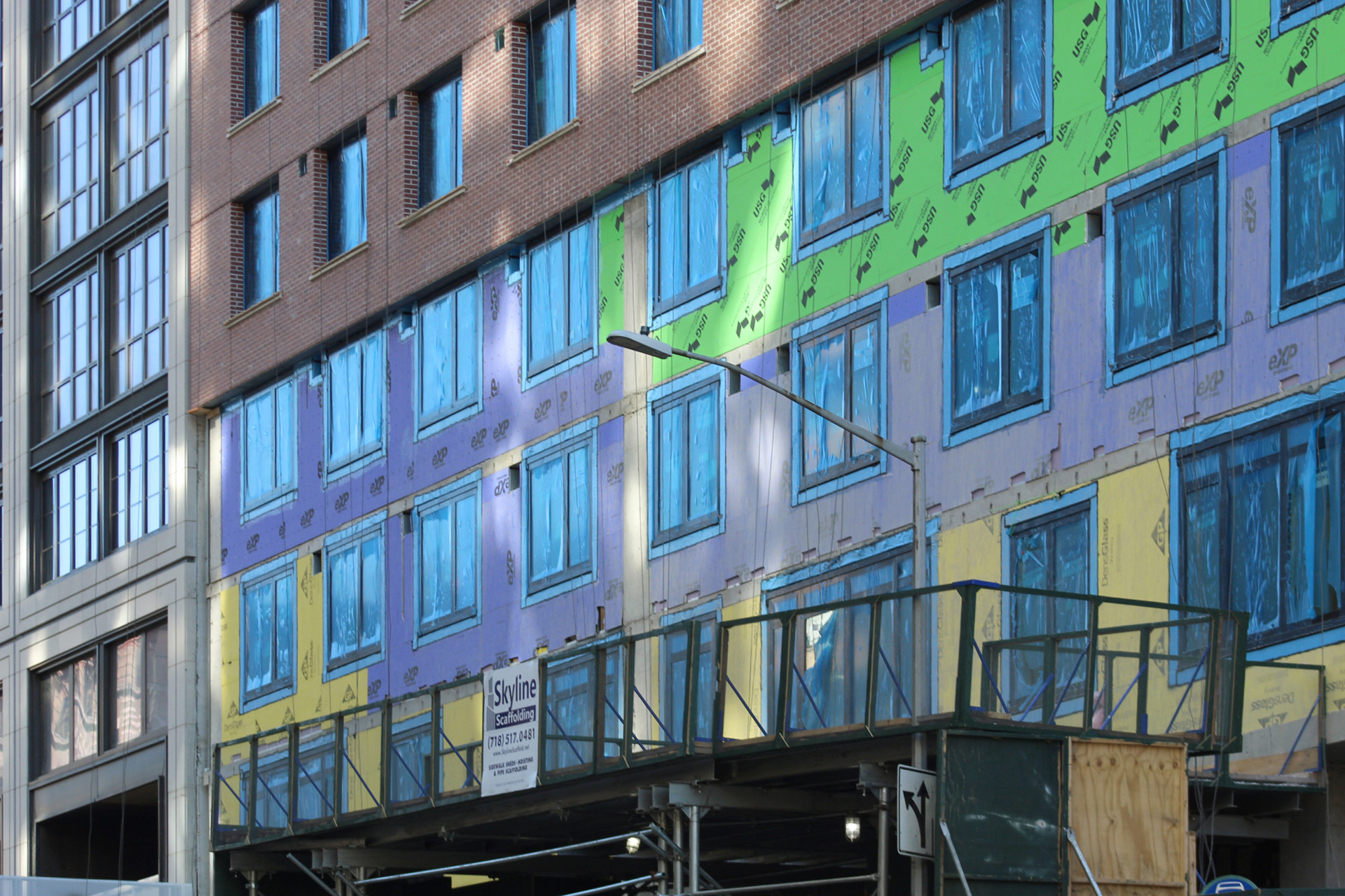

A progress work usually taken in exterior to first look about design, spotted at lower level and upper views. Together lower and upper are beautiful with different types of material especially expressing brick, which is needed for the structure from new windows; I’m getting it to sign an impressive with arched: Thanks to Michael Young.
Looks nice-ish
The base kind of looks like the old building that was knocked down too
Note that the artist rendering leading the story is completely different from reality as this building is not clear of anything on its left. The photos of the work in progress show that it’s dominated by the much larger new construction at the corner of 96th and Broadway.
Why can’t NIMBY go the extra mile and not just reproduce the PR rendering the developer gives it?
Kudos for preserving the character of the building it replaces at ground floor level. but the structure above that is 100% nondescript residential rental.
1) it’s YIMBY, not NIMBY, how can you misspell something like that?
2) YIMBY is not a rendering service.
Your argument is comparable to saying how Foster + Partners doesn’t show SOM’s Project Commodore in their rendering of 270 Park Avenue (see Yimby’s last article on that). Would you accuse Foster + Partners for falsely advertising their project for doing the same thing shown in this article? It’s a tactic that’s been done as old as time and of course some buildings get left out or cropped out to emphasize the project in discussion. Just let Yimby take the photographs and be smart enough to distinguish the reality of what is seen in real life
The building next door went up so fast that the architects of this project probably didn’t bother to redo their rendering in such a short amount of time. And it’s not just Yimby, it’s any and every other website that publishes the same rendering. So don’t pin the blame on Yimby for something they can’t control and weren’t hired to do. Everyone has their own job and role in the construction and real estate industry Paul
I wonder if anyone knows why there are so many varieties of insulation (different colors and manufacturers) seemingly placed at random spots as the building was built.
Those products are composed of and made to the same specifications just by different manufacturers. Therefore aside from temporary looking unusual while it’s exposed, they’re all getting the job done as envelope sheathing before the brick facade covers it up. Why they’re using several different makers probably just comes down to what supply was on hand as it was delivered to the jobsite.
The new luxury building next to it was built much faster and was not even the original renderings.
I just think it should have been taller. Im all YIMBY (Manhattan) for dense, tall residential.
Fetner Properties missed the boat on this one: yes the base is referential to a watered down clasicsm and, the facade is plesant brick…but as the building rises above the cornice of it’s western neighbor, (and I see it multiple times daily), the opportunity to use the west corner/facade to create a bay window overlooking to the river, or a set back from the relentless facade was missed. There is no architectural embellishment up the facade. It’s wallpaper, not architecture and it might have well been designed in a basement in Bombay as no reference to it’s unique location is offered.
Mostly agree with that
Nothing says luxury like “clip on” brick panels?!🤣
Sort of like “Lee Press On Nails”!
And to think a 100 years ago, there were bricklayers who installed them one brick at a time!🤔
These are not panels. The bricks are being installed one at a time.
Those are hand laid bricks not panels as you are suggesting. The outcome is mostly dull either way.
Chris those bricks were hand laid, not panels. If they were modular, you wouldn’t need that much protective scaffolding on the outside
If those bricks are hand laid, how come they work from the top DOWN?
Wouldn’t it be more logical to work UP from the ground floor?🤔