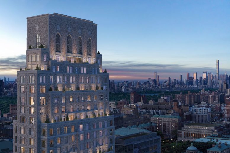
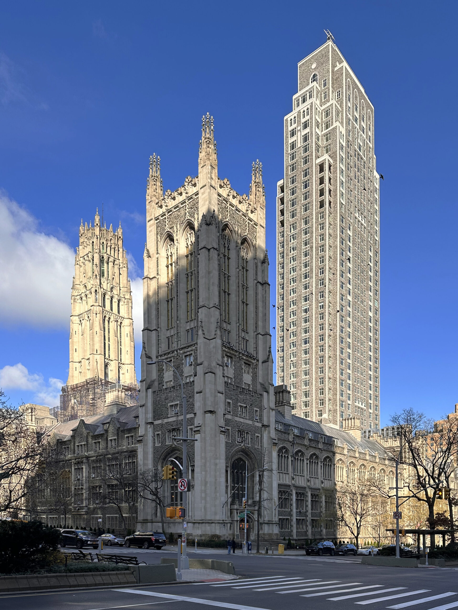
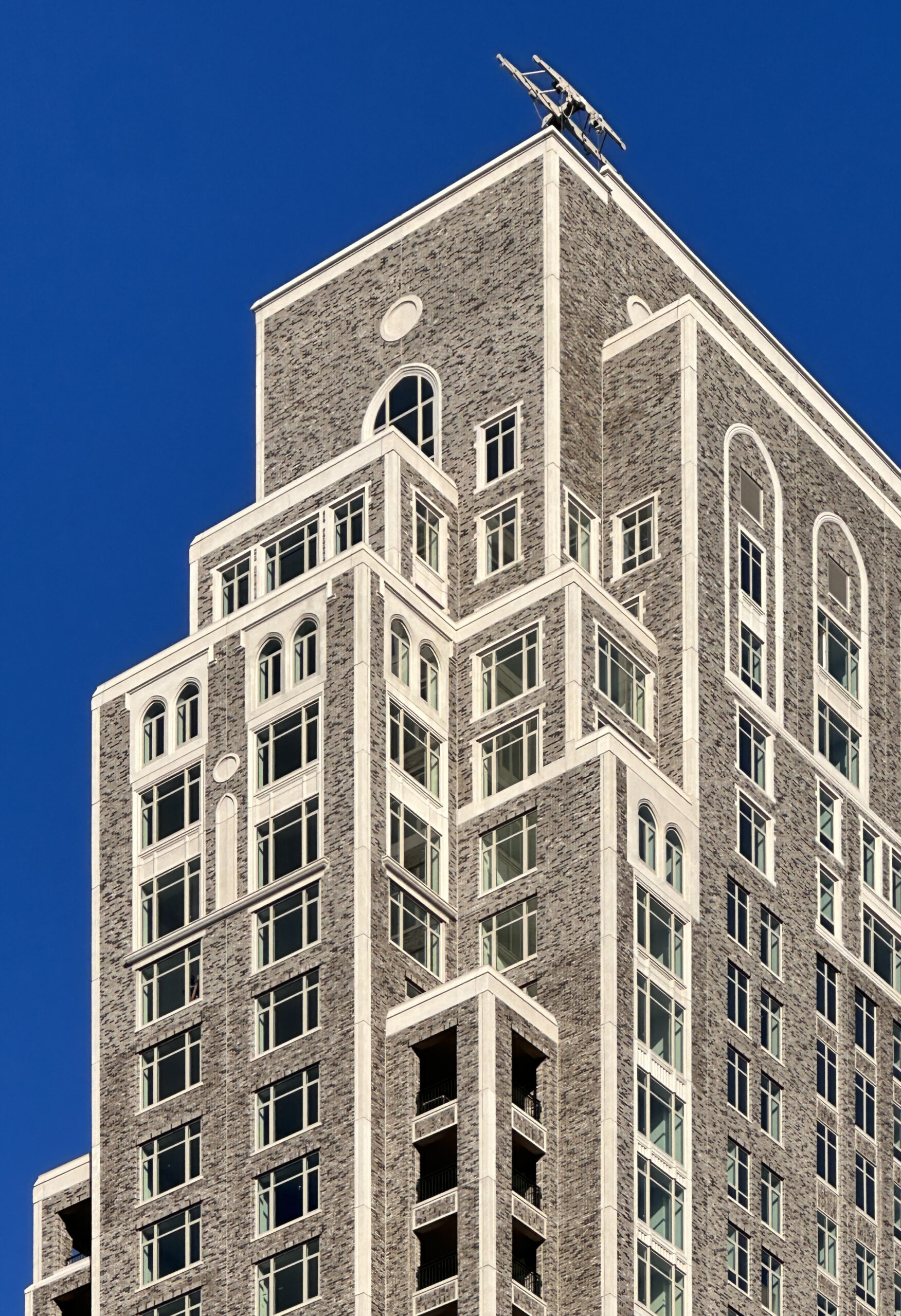
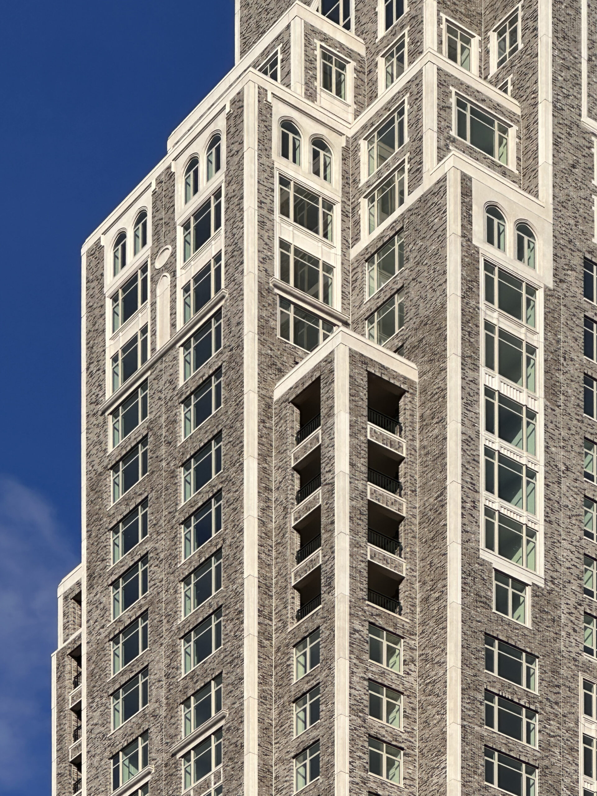
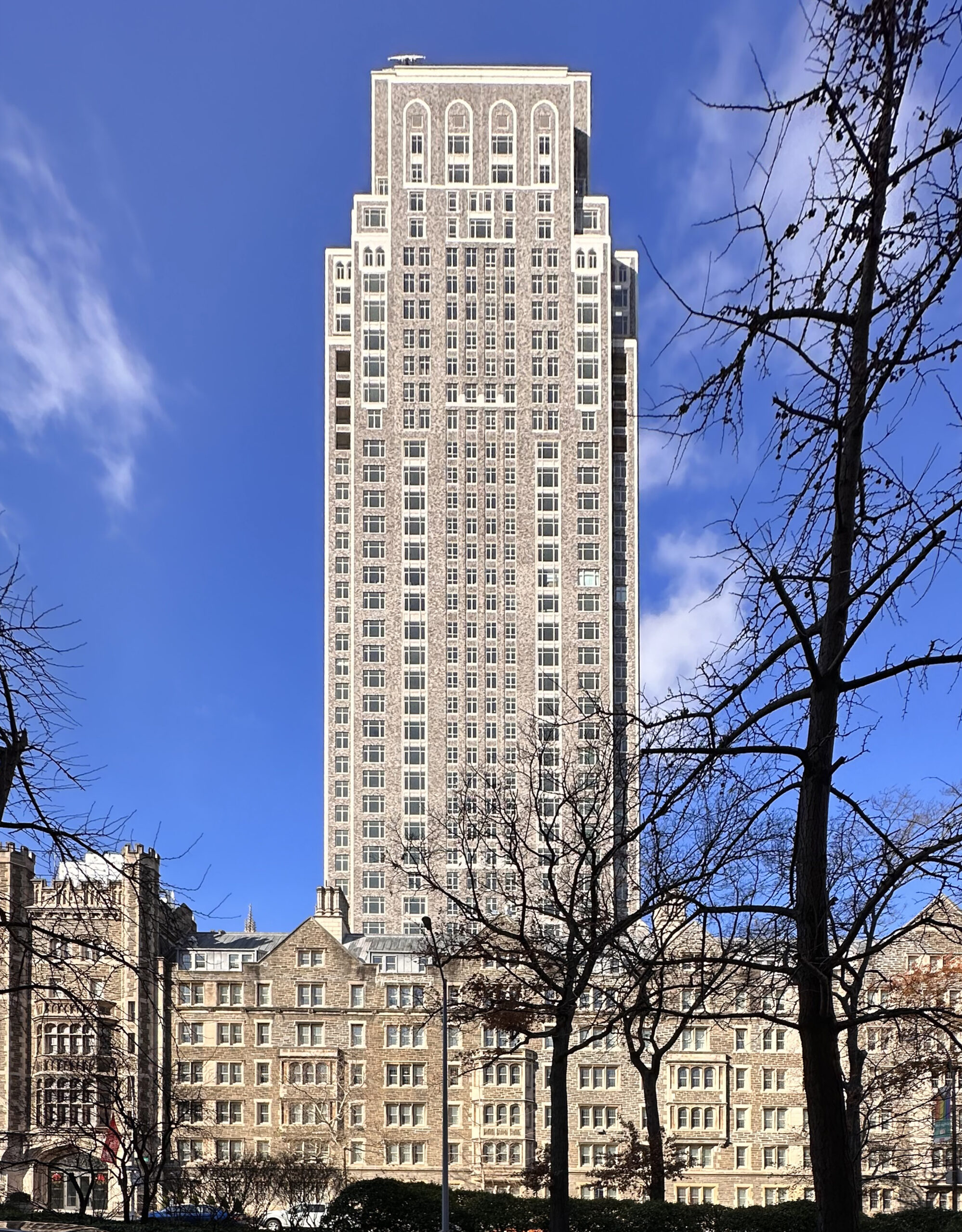
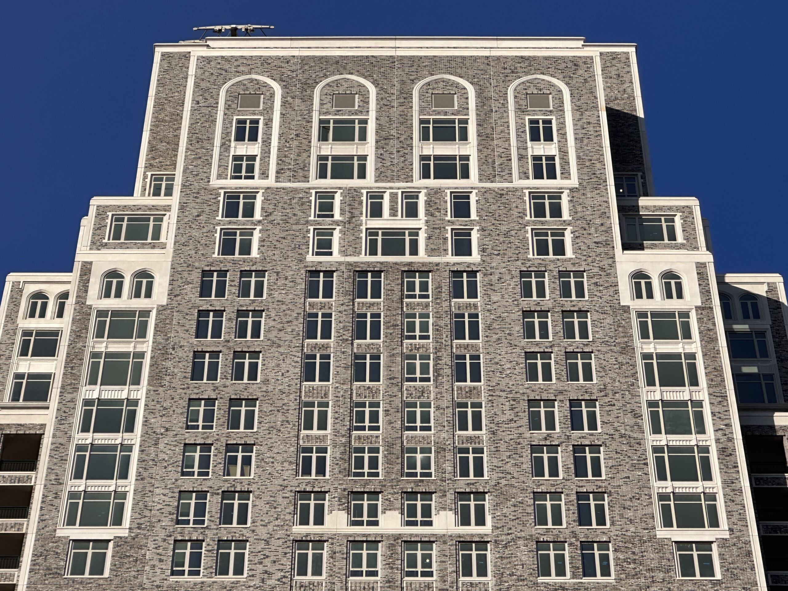
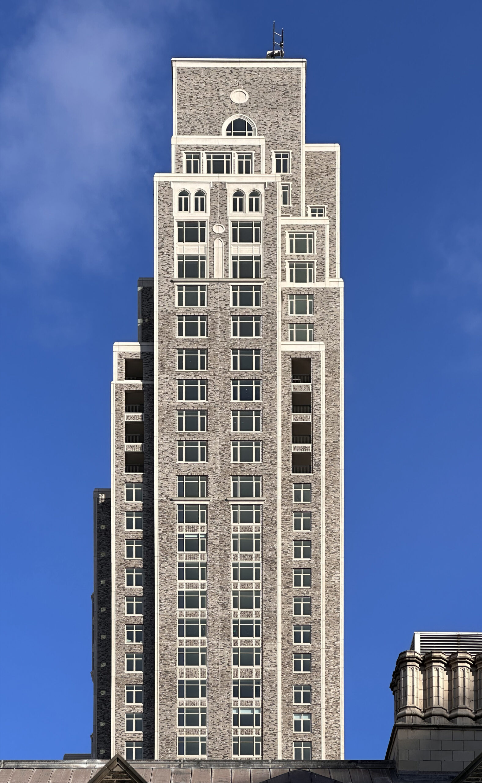
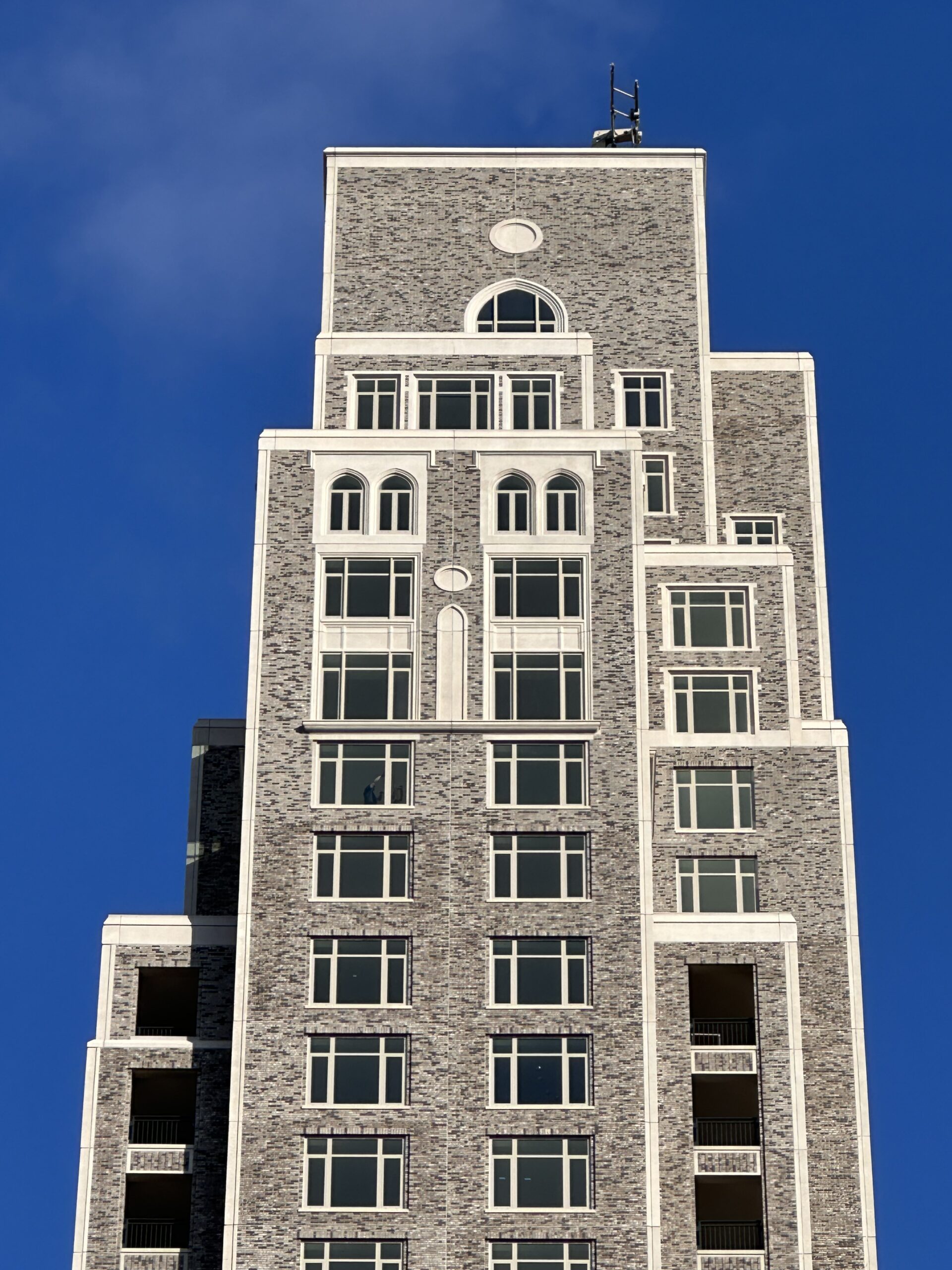
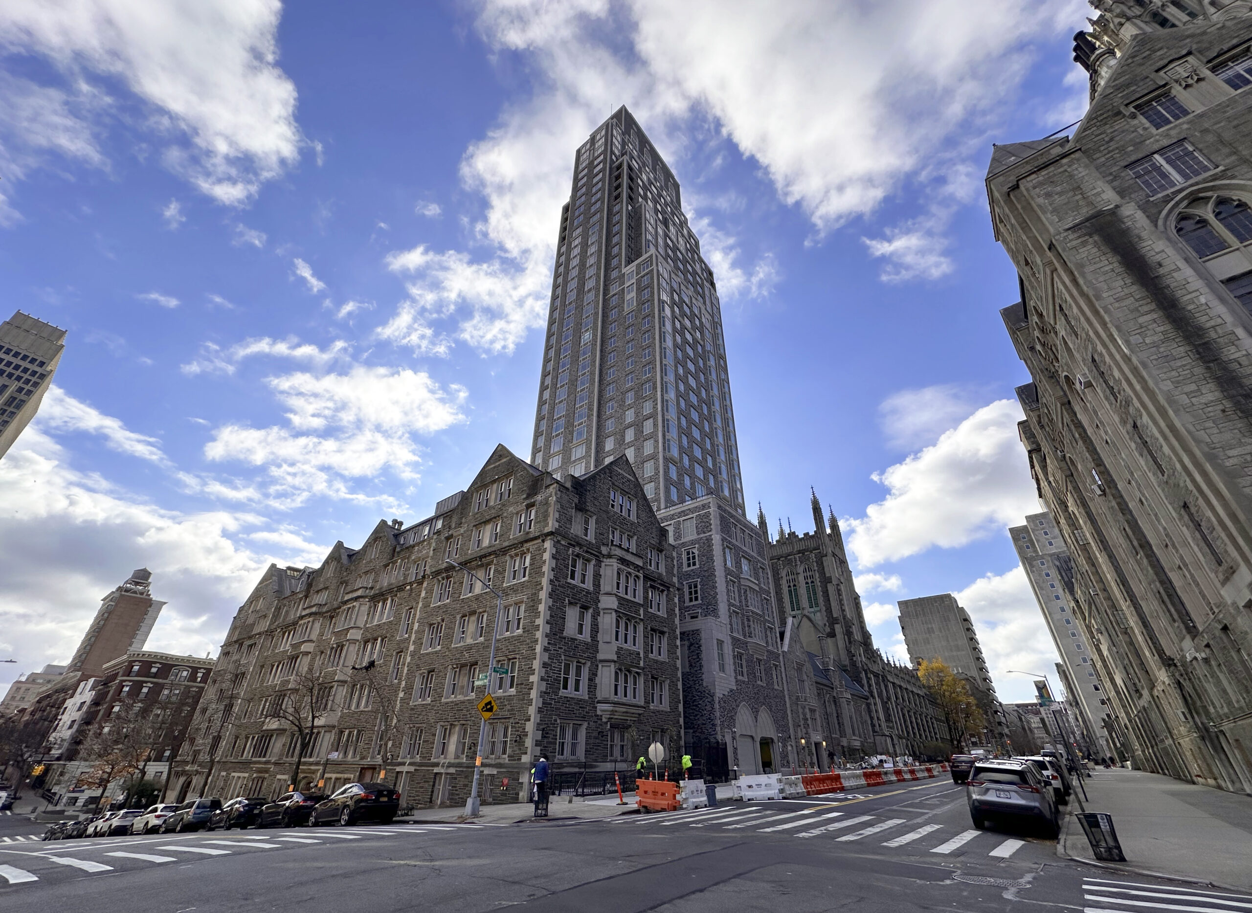
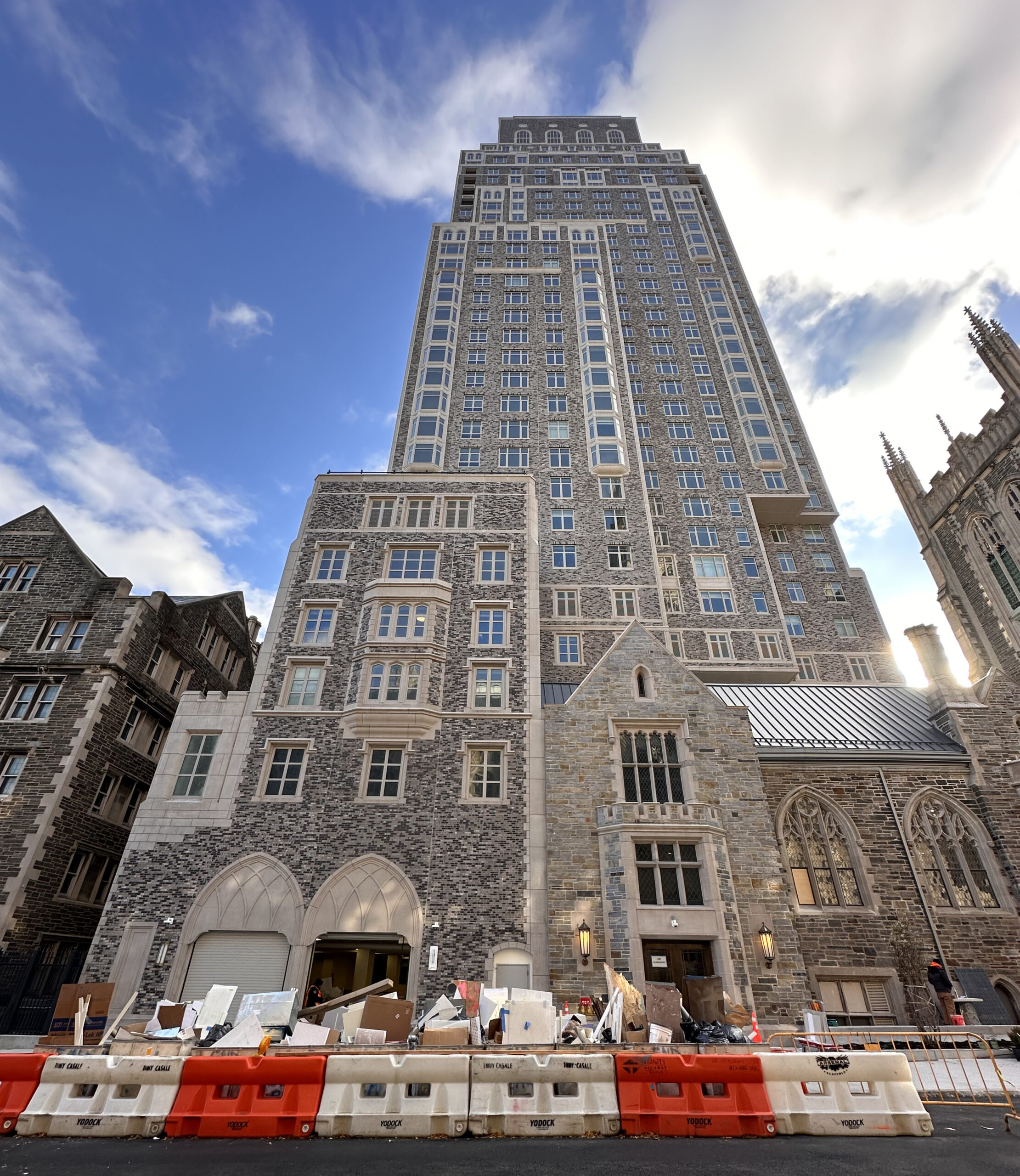
The 22nd-tallest building on our annual year-end countdown is Claremont Hall, a 466-foot-tall mixed-use tower currently completing construction at 100 Claremont Avenue in Morningside Heights, Manhattan. Designed by Robert A.M. Stern Architects along with SLCE Architects and interior designer CetraRuddy Architects, and developed by Lendlease, Daiwa House Texas, and LMXD, the 41-story structure spans 354,000 square feet and yields 165 condominium units in one- to four-bedroom layouts, as well as classrooms, office space, and faculty housing for Union Theological Seminary. The project also involves renovations to the school’s Hastings Hall by Beyer Blinder Belle. Corcoran Sunshine Marketing Group is leading sales and marketing and Lendlease is the general contractor for the property, which is located by the corner of Claremont Avenue and West 122nd Street.
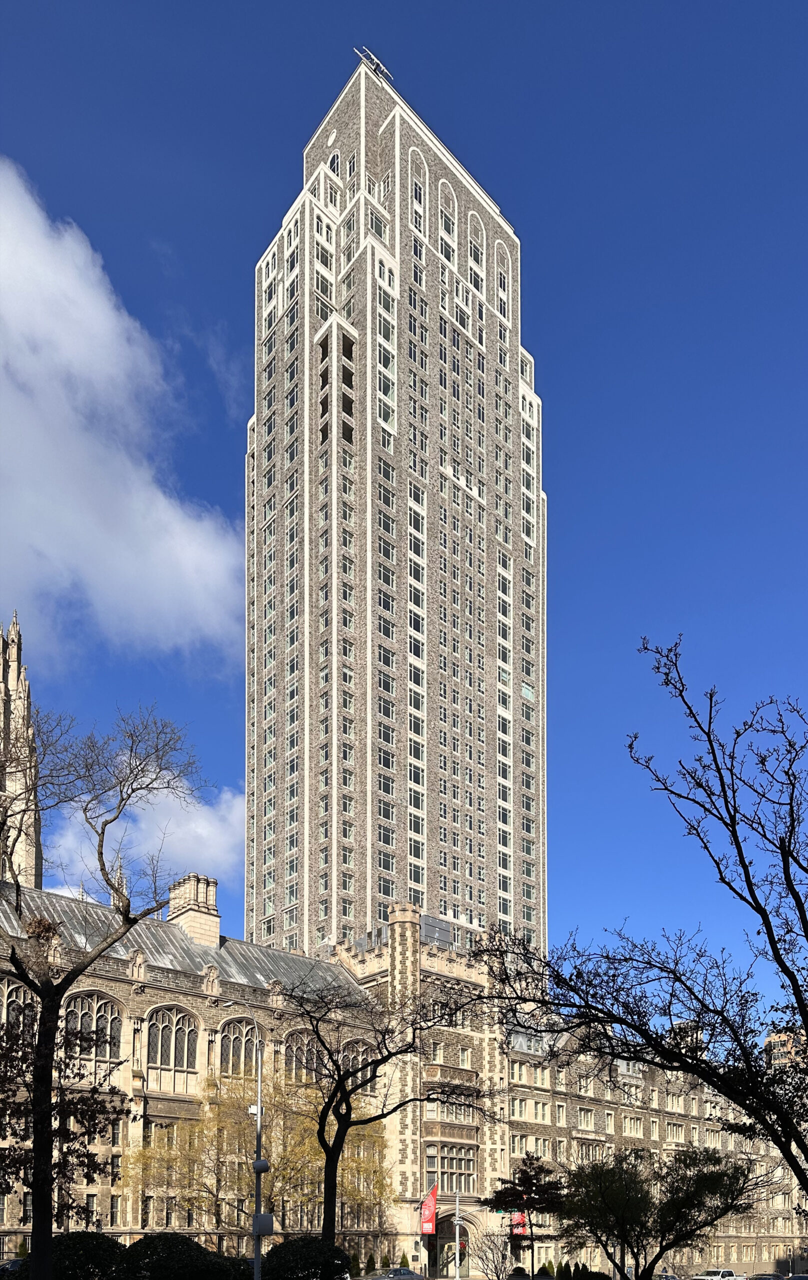
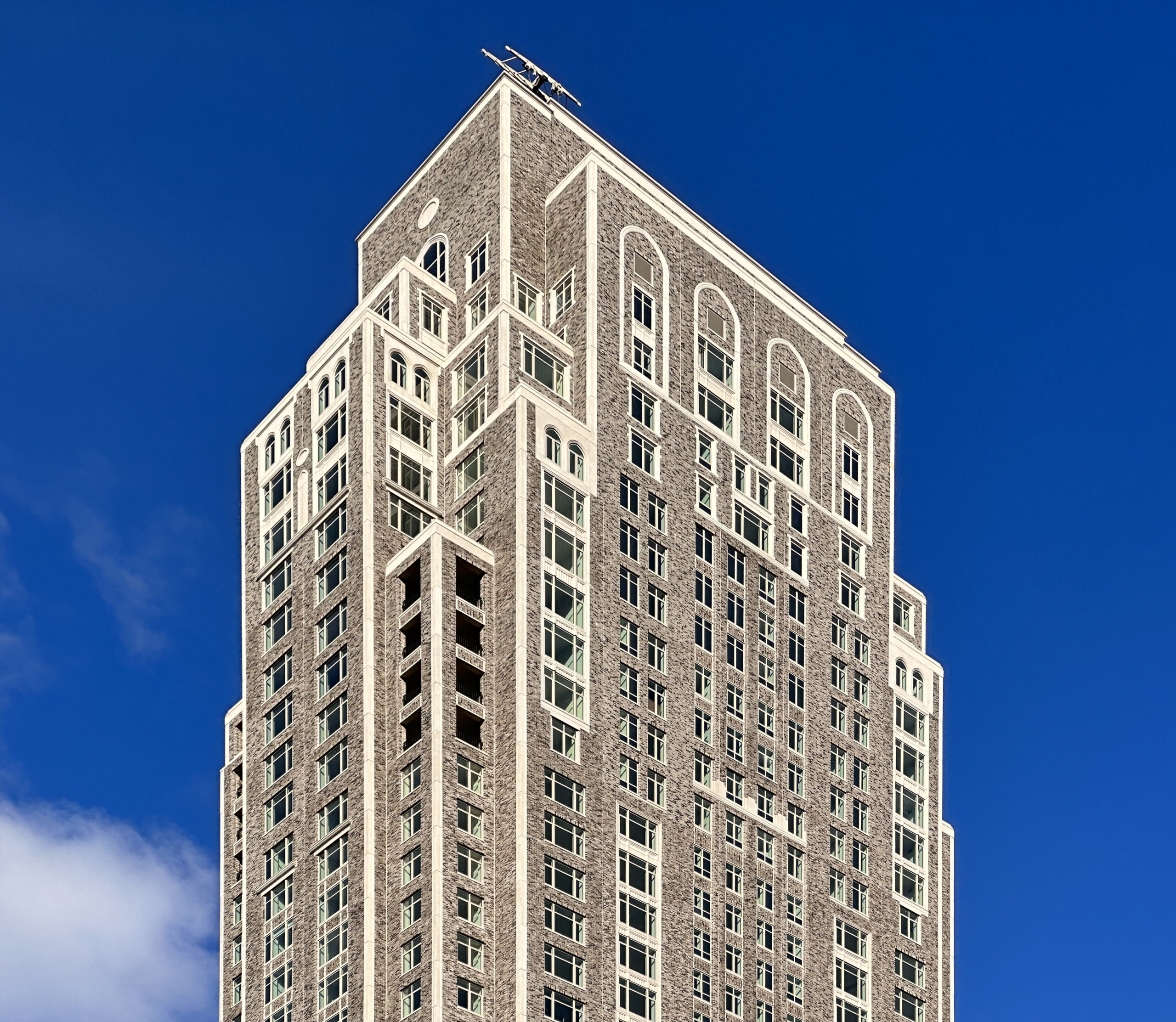
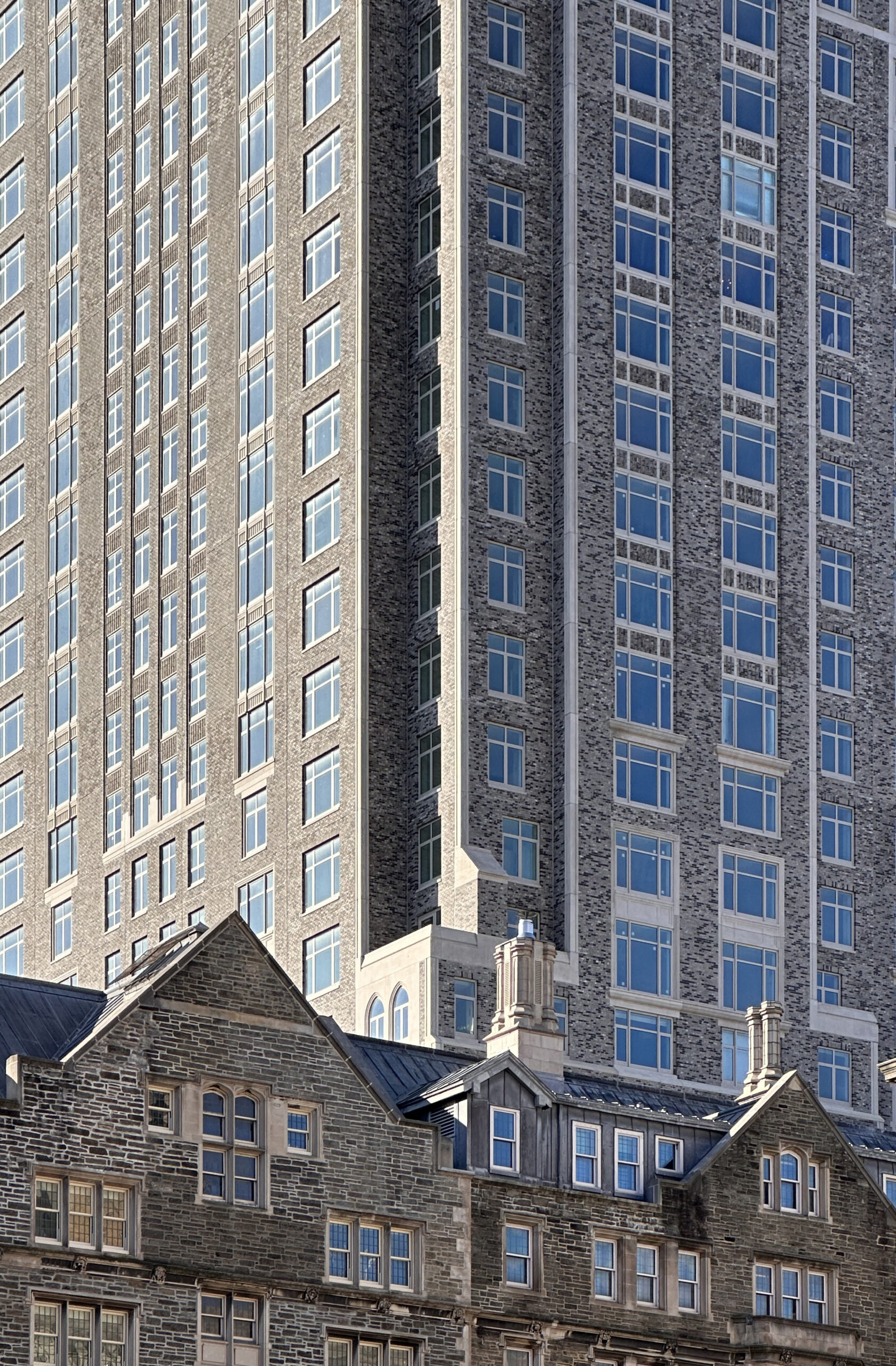
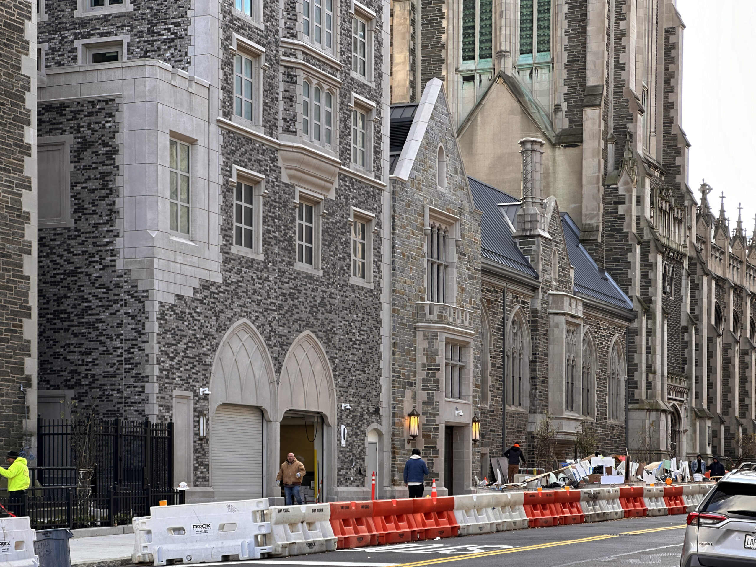
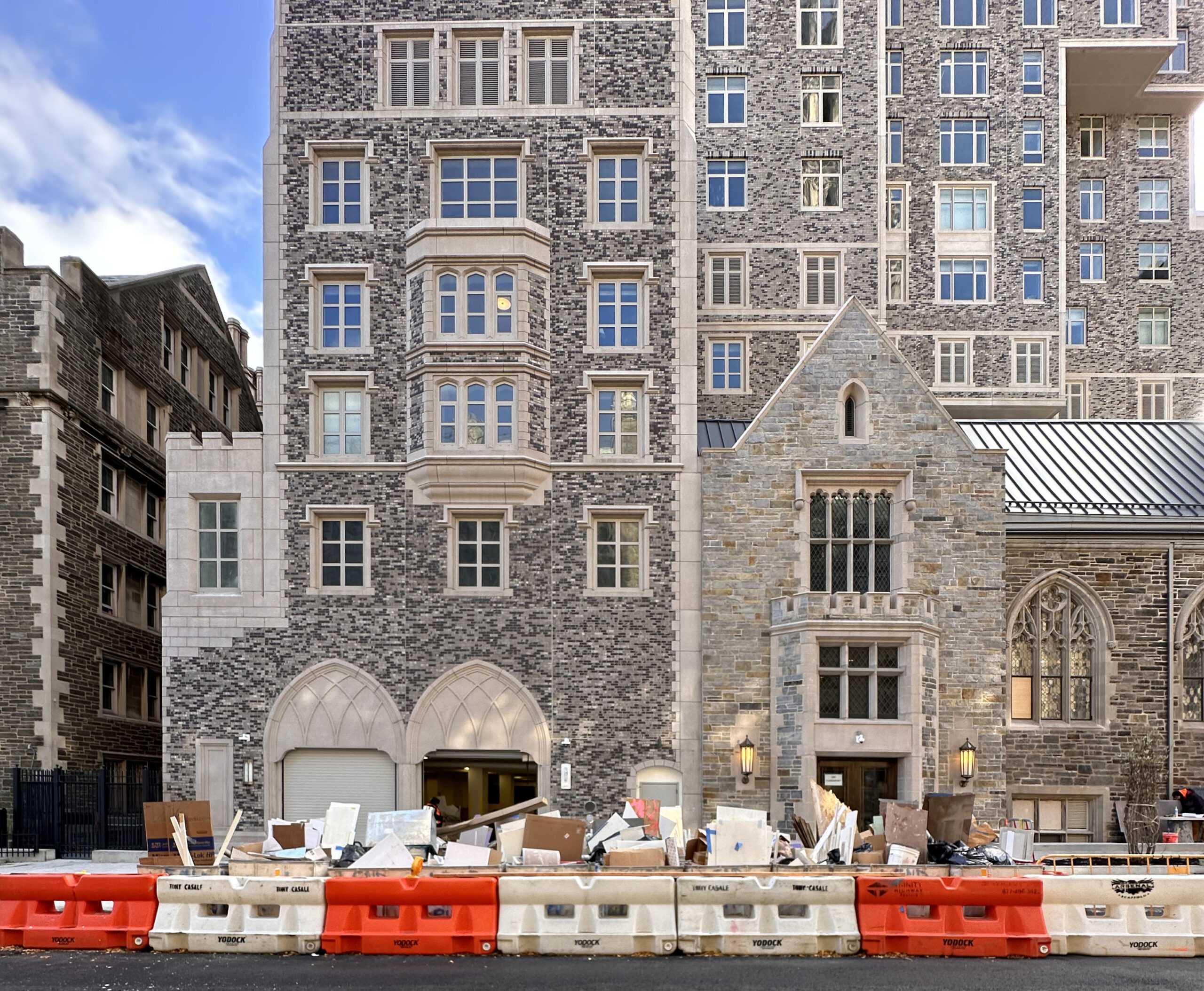
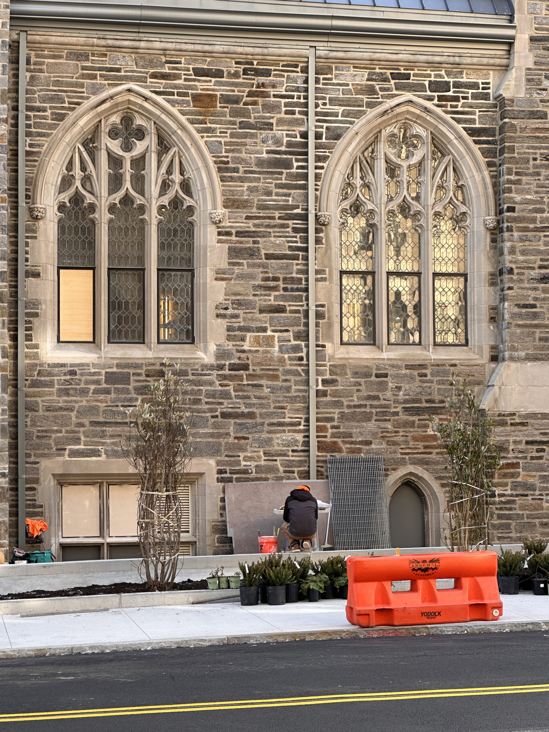
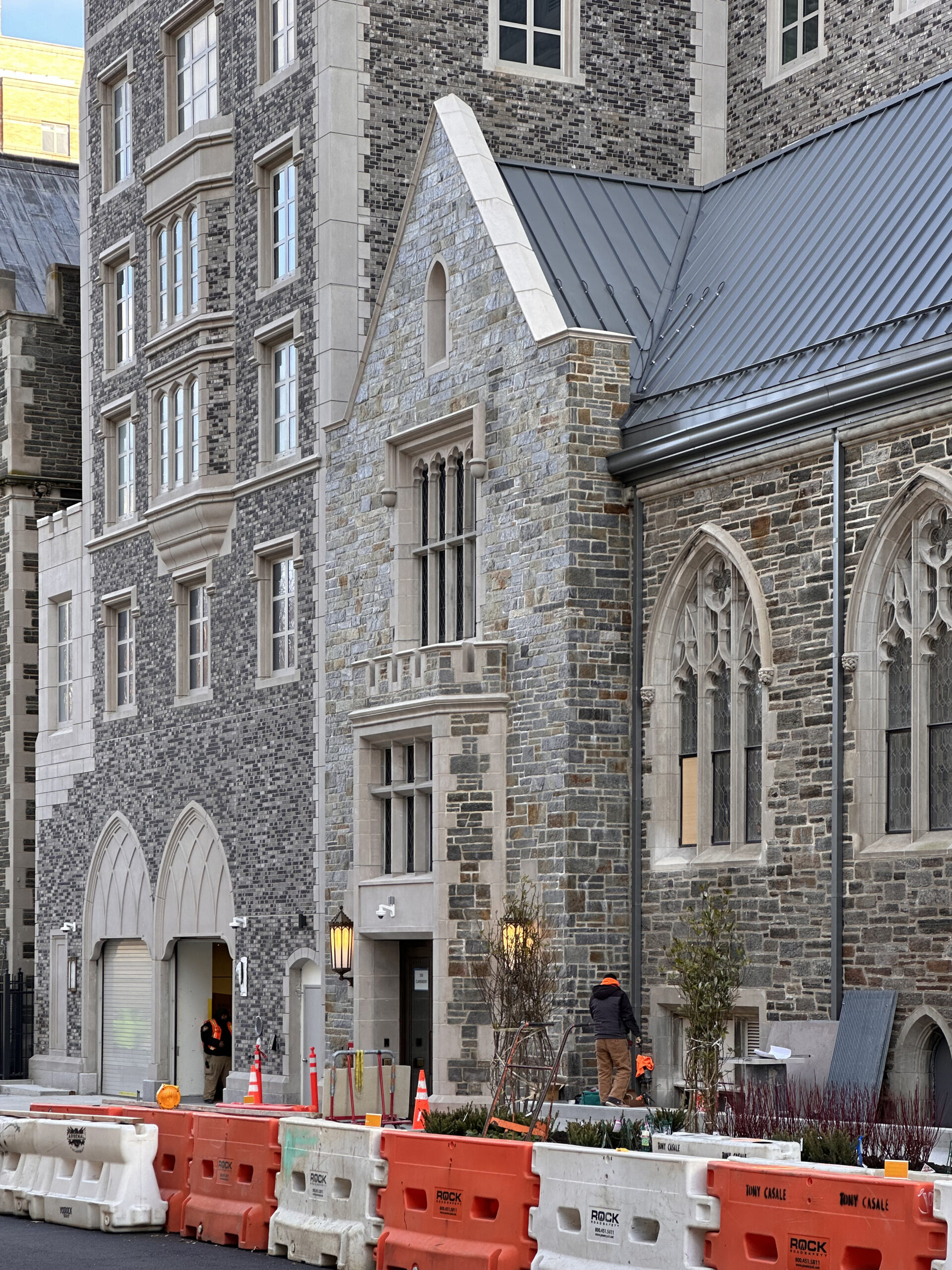
Exterior work has wrapped up since our last construction update in early April, when the construction hoist was still attached to the slender northern profile. The ensuing gap in the façade has since been filled in and finishing touches have concluded on the ground floor along Claremont Avenue. Some minor landscaping work is still ongoing as crews near the finish line on the building’s interiors.
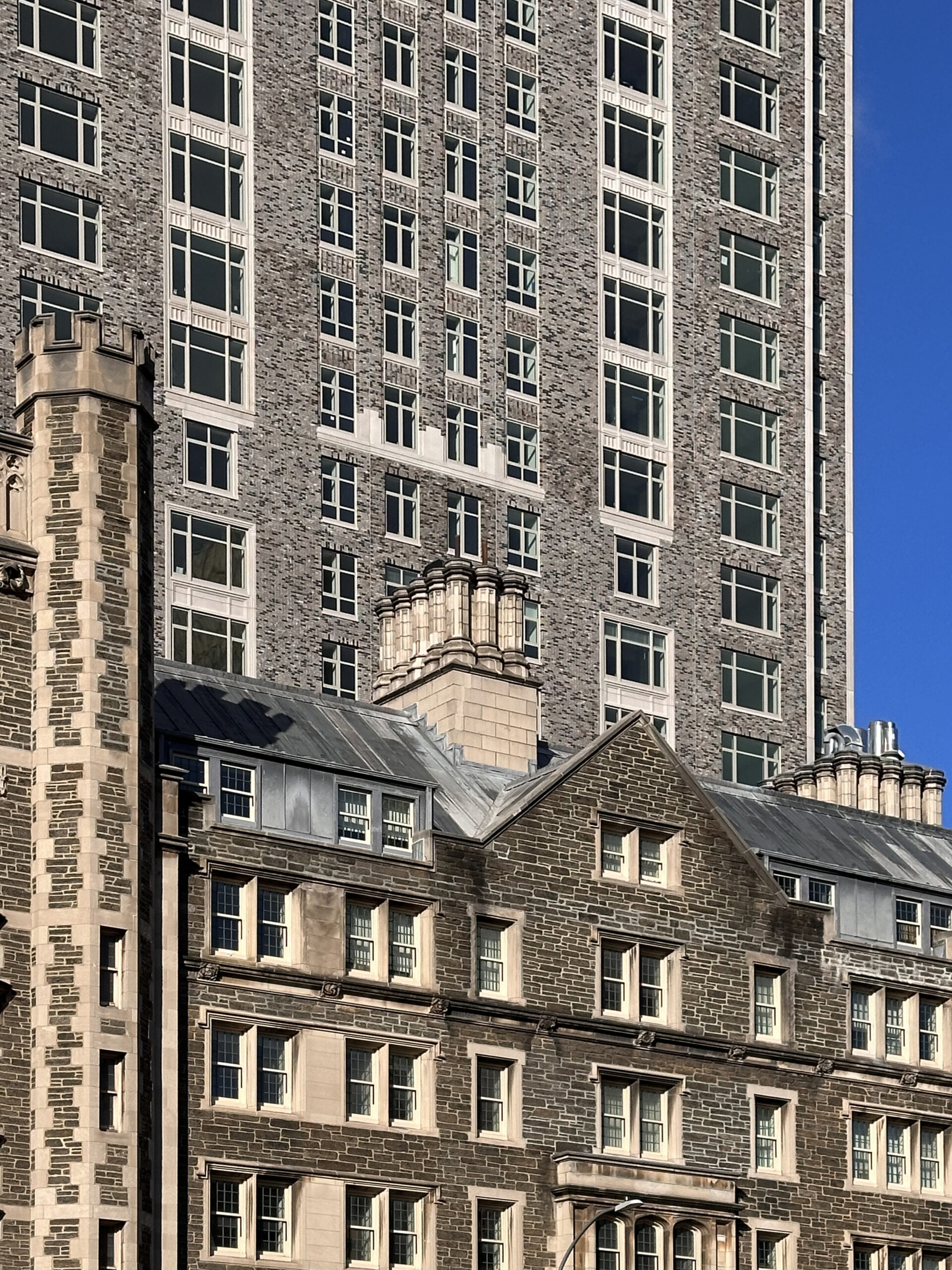
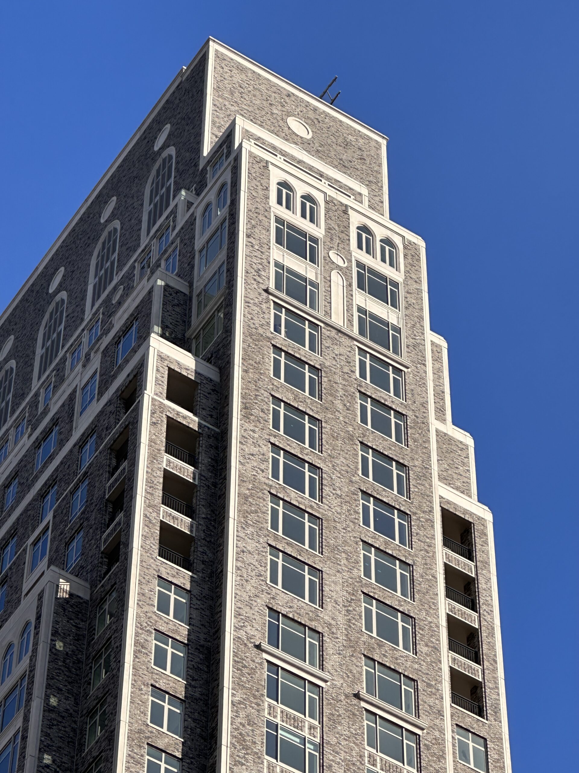
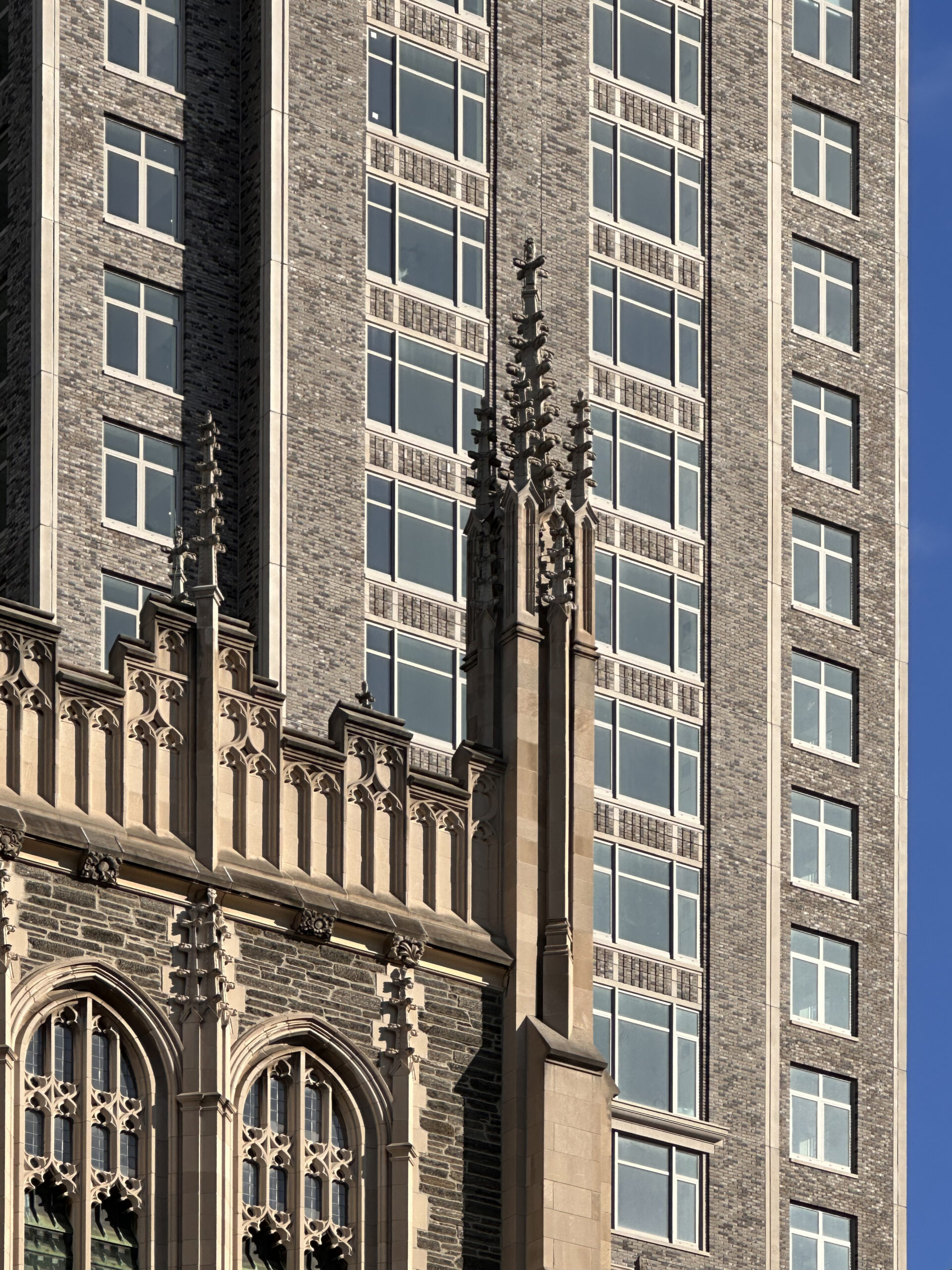
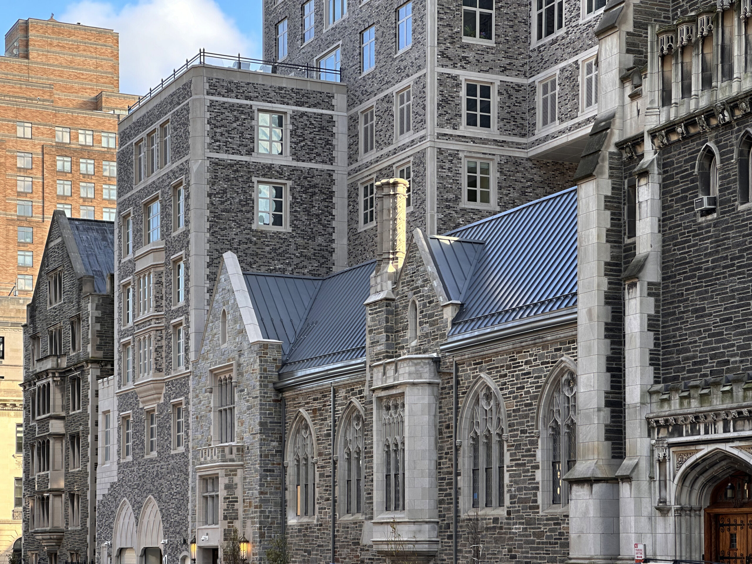
Claremont Hall was built with an acquisition of $61 million in air rights, and is designed in a Collegiate Gothic style that utilized bricks supplied by Belden Tri-State Building Materials, and custom precast panels created to match the surrounding architecture of the Union Theological Seminary and Riverside Church.
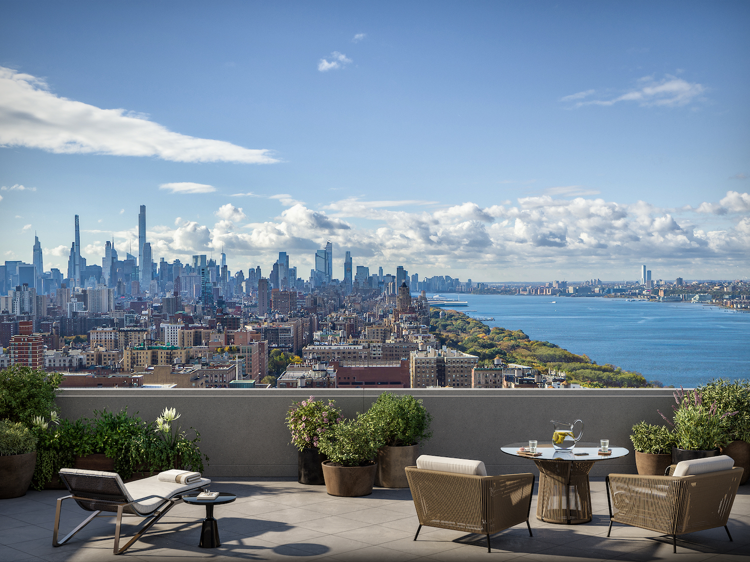
Units begin at $1.195 million with residences varying in size from 700 to 2,765 square feet. Homes come with high ceilings, oversized windows, and European white oak flooring. Open kitchens are equipped with a Bosch appliance package, custom Italian cabinetry, Calacatta Laza quartz countertops, and chrome fixtures and hardware. A select number of units come with private outdoor terraces or loggias.
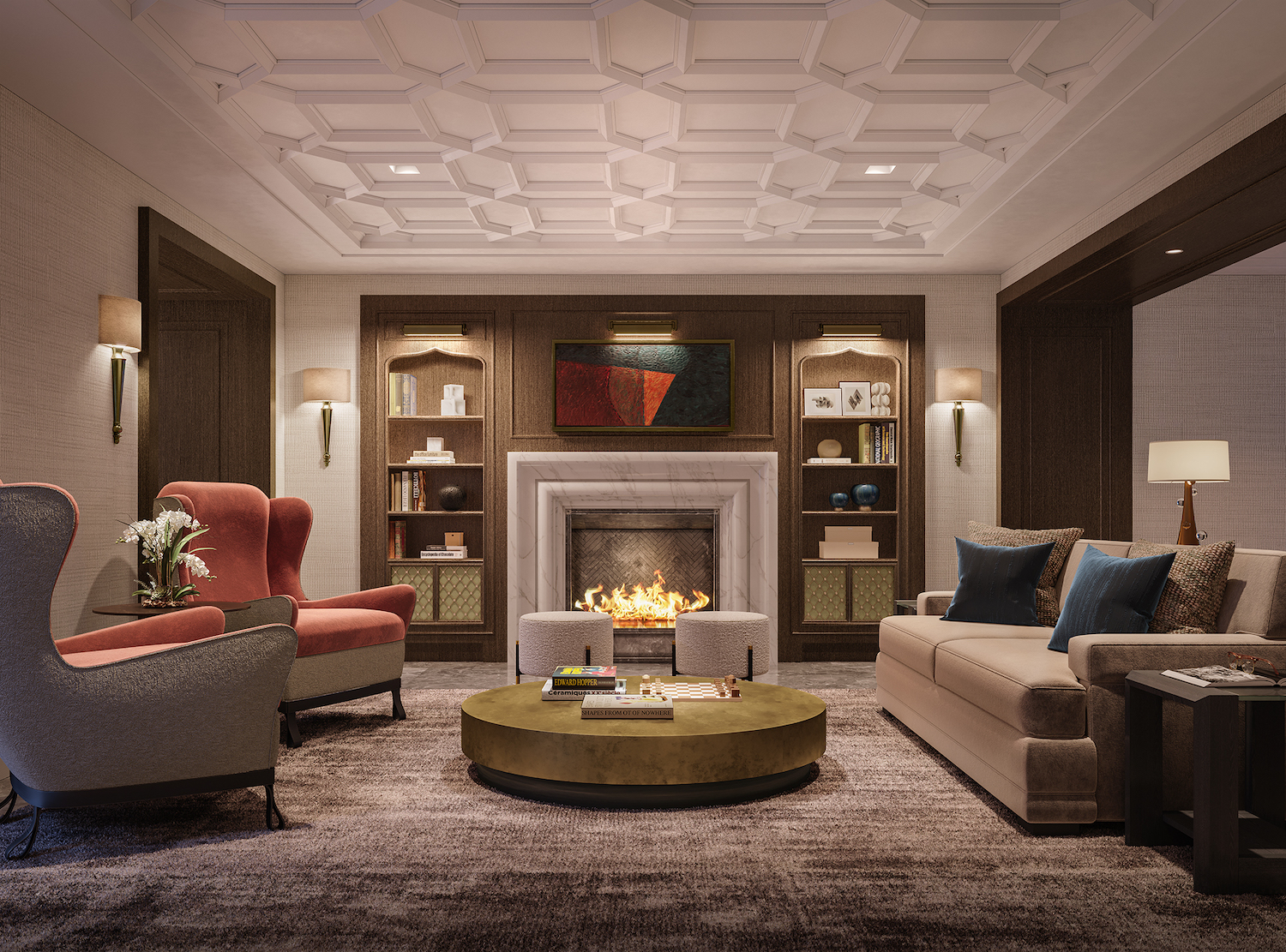
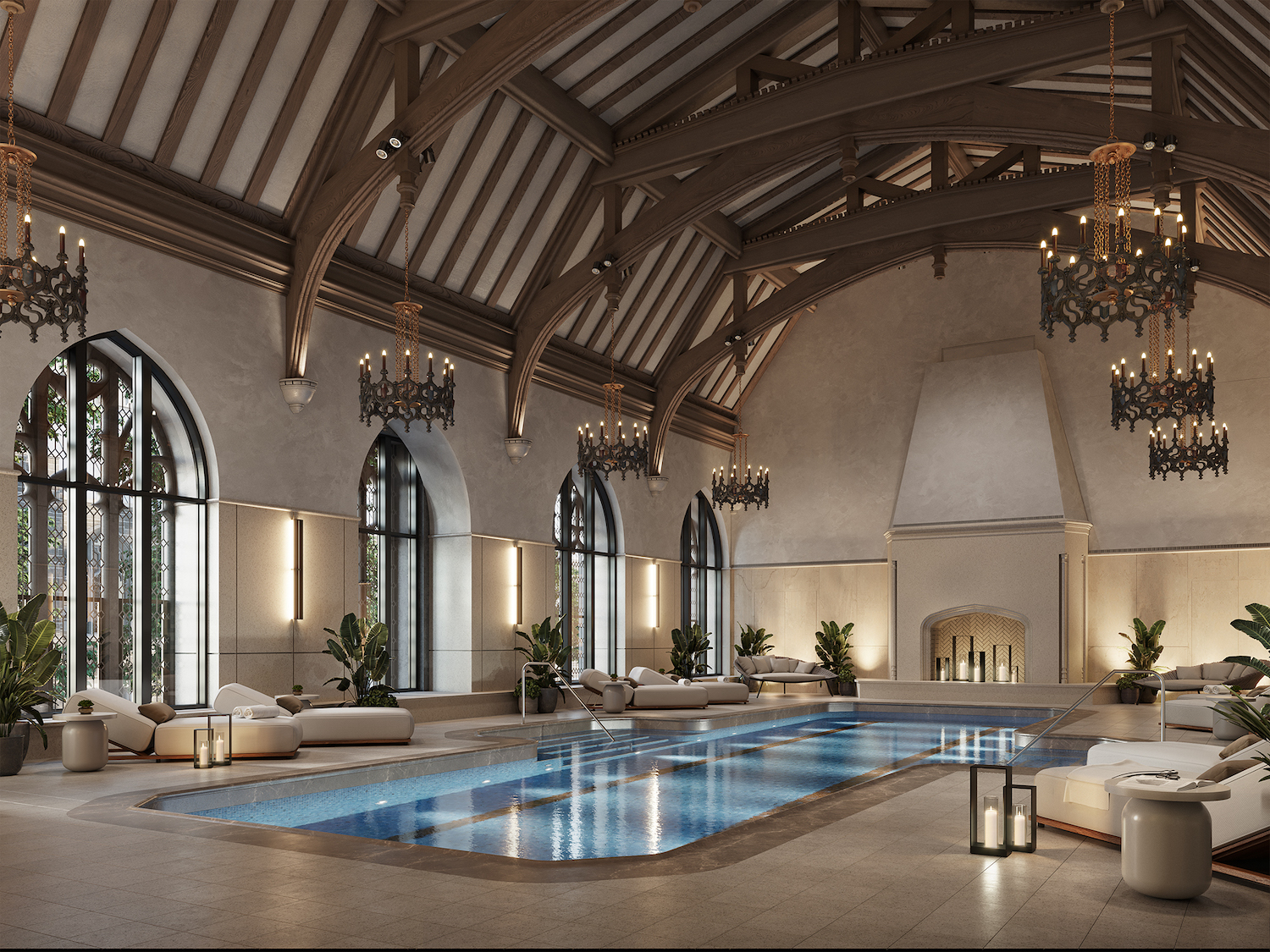
Residential amenities include a lobby, a walnut-paneled library, a grand dining room, a children’s playroom, a creative maker’s room, resident lounge with a terrace, a fitness center, on-site parking, and an indoor swimming pool underneath a Gothic-style vaulted ceiling with original chandeliers and a working fireplace. The refectory space, which was previously used by seminary students, will be available to residents for private events.
Claremont Hall also has 54,000 square feet of new classrooms, academic offices, and faculty-designated apartments for the Union Theological Seminary, and is targeting LEED Gold Certification. Full completion should happen early next year.
Subscribe to YIMBY’s daily e-mail
Follow YIMBYgram for real-time photo updates
Like YIMBY on Facebook
Follow YIMBY’s Twitter for the latest in YIMBYnews

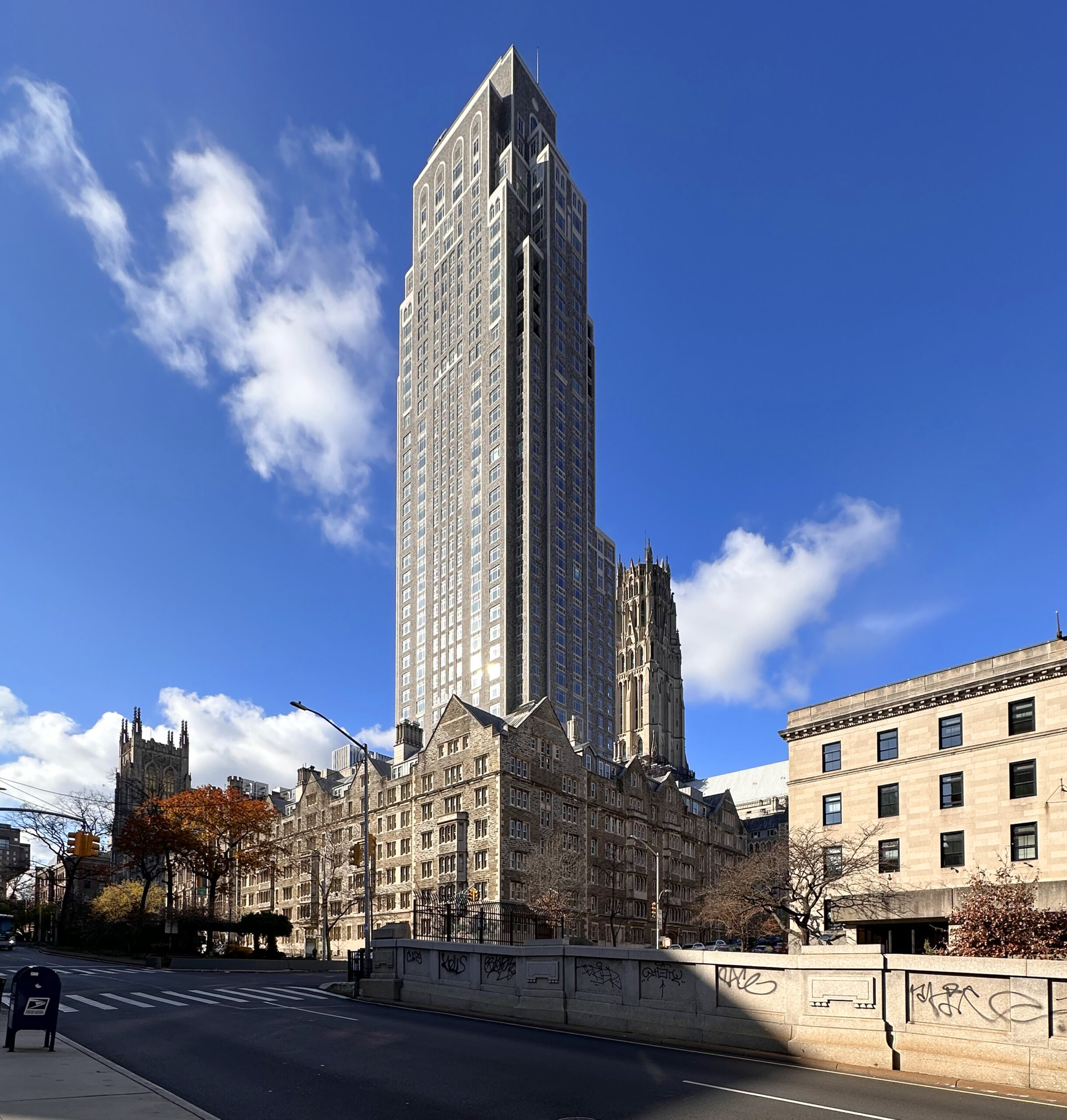
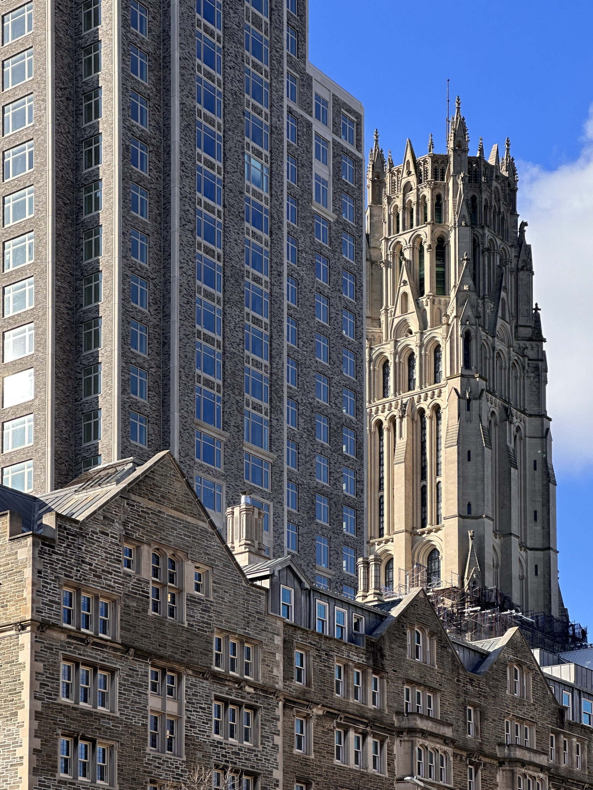
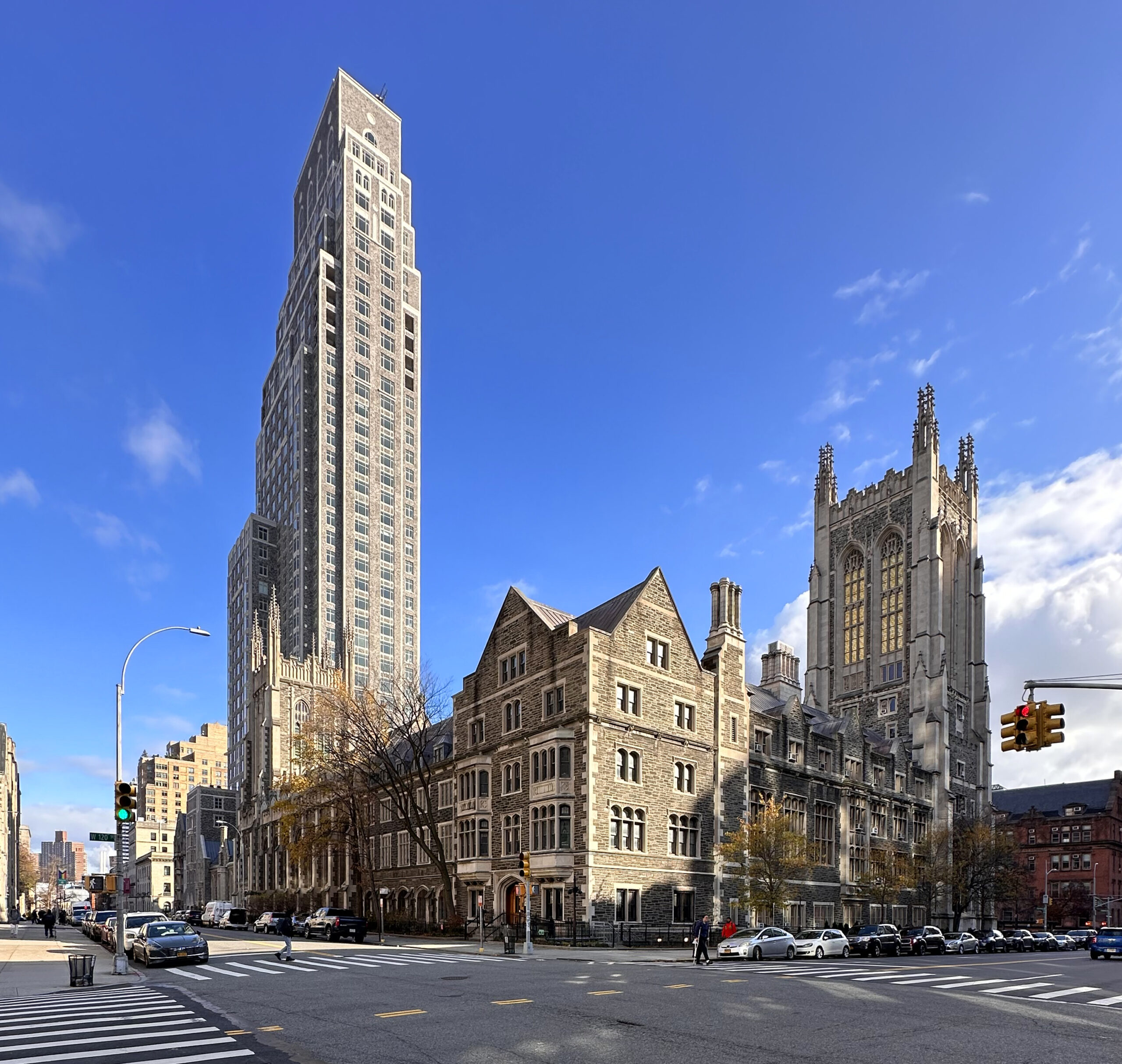
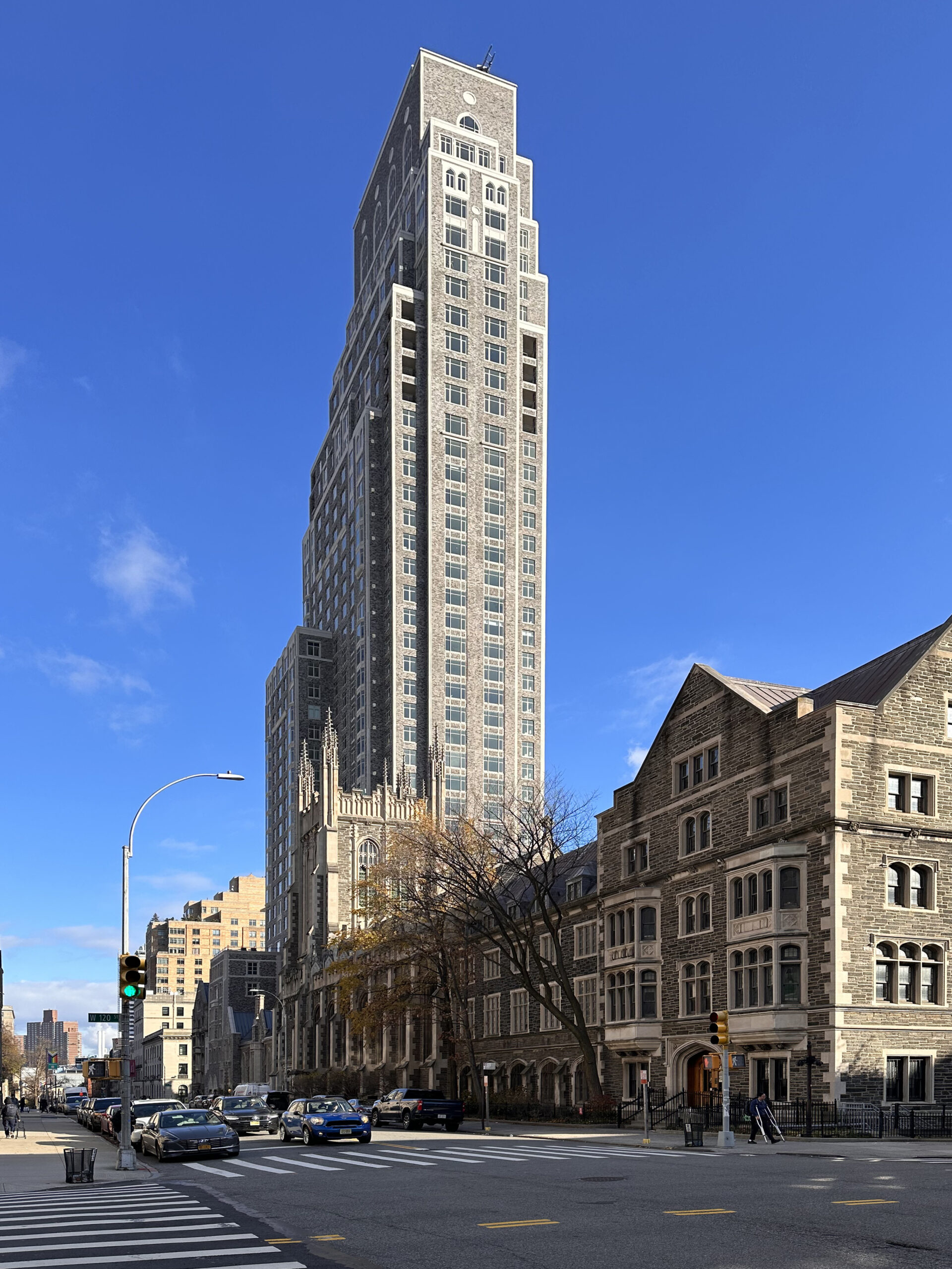



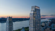
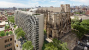
It’s a beautiful building, but for me it’s too close and overpowers the Riverside Church tower, which should maintain its pride of place..
There is harmony both at street level, and looking up at the tower above. I saw lights and shadows on its exterior, yes it was beautiful: Thanks to Michael Young.
Cantilevering done right.
Oh Bravo! This is amazing!
NYC is so blessed to have an architectural practice that has the ability to blend the ego of developers into the existing community. It is impossible to not have the tower impact the church tower due to massing issues, but the finished building shows an attention to materials and detail that makes is obvious an effort was made to blend in. I hope the residents enjoy their new homes. Cheers!
A swimming pool in the refectory? Seriously? I understand the seminary needed the money, but this is very sad.
Very sad indeed for that glorious space to become a gym. But the article mentions it as an event space. It doesn’t look like there’s room for both uses.
Bellissima 🩷 Robert Stern is an American gem and love the photos Mr. Young took!
All new buildings could look like this if millionaire developers weren’t so cheap and greedy .
Instead they demolish brick and cement buildings put up out of context glass cubes.
All they have to do is hire Robert Stern.
I love the photos and this turned out so well!
BRAVO!
Another future “classic” building by RAMSA, that combines the old with the new… designs, materials and “required” luxuries of today’s tenants.
Looking forward to their next projects to be built.
This building is absolutely stunning. I hope they build more.
In America, Money IS religion, so this all makes a lot of sense. Care for a dip in the baptismal pool?
The tower is mostly a good design, but those cantilevers are just terrible.
Work of art. Period.
I like it but I hate the arched limestone panels that don’t line up with the lines underneath. Looks really shoddy. Like they had some panels to spare from another project or something.