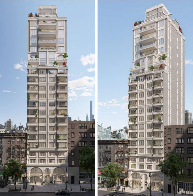
Construction is complete on Arloparc, a 20-story residential building at 126 East 86th Street on Manhattan’s Upper East Side. Designed by Zproekt Architects and developed by Rybak Development and BK Developers, the 79,842-square-foot structure will yield 28 condominium units designed by STUDIO20MIGLIA, as well as 2,700 square feet of commercial space on the ground floor. Rybak is also serving as the general contractor for the property, which is located on a narrow rectangular interior plot between Lexington and Park Avenues.
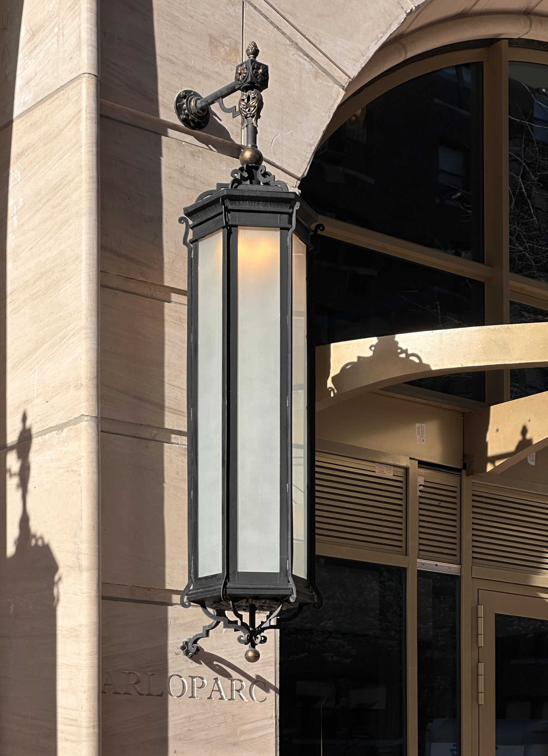
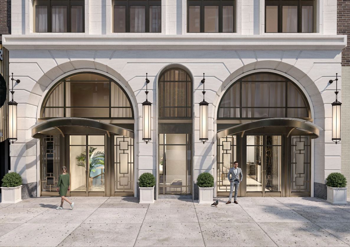
All of the scaffolding has come down since our last update in early November, when much of it covered the rear southern elevation. The sidewalk shed along East 86th Street was also dismantled, revealing the completed look of the entrance and commercial frontage, arched windows, ornamental light fixtures, and rounded bronze-hued canopies along the sidewalk. Some plastic barricades remain in front of the main doors as finishing touches wrap up.
The below rendering depicts the front entrance to Arloparc upon its imminent completion.
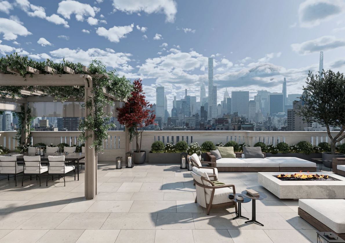
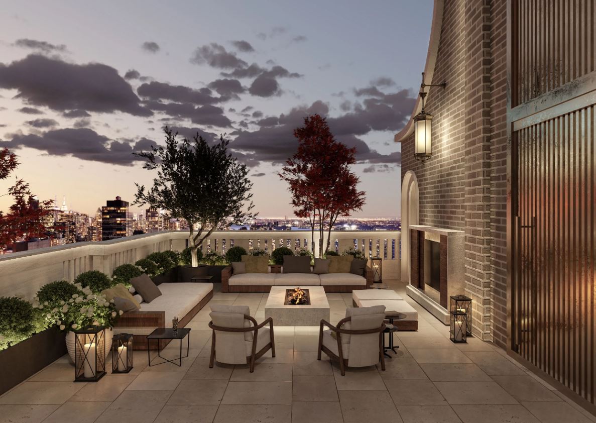
The below renderings depict the upper rooftop terrace space with views of the Midtown, Manhattan skyline.
Homes at Arloparc will come in two- to five-bedroom layouts, including a duplex penthouse with a private outdoor terrace. Residential amenities will include a 24/7 doorman, a fitness center, a spa, a children’s room, a recreation room, and a lounge.
Two-bedroom residences start at $2.7 million, three-bedroom residences start at $3.615 million, and full-floor residences start at $6.45 million. The duplex penthouse is already in contract. Model residences are currently open to view.
YIMBY anticipates Arloparc to fully finish construction in the coming weeks.
Subscribe to YIMBY’s daily e-mail
Follow YIMBYgram for real-time photo updates
Like YIMBY on Facebook
Follow YIMBY’s Twitter for the latest in YIMBYnews






Nice looking building. Hopefully this is the new standard for the Upper Easr Side rather than the schlocky taller building a few doors a way.
That’s surprisingly not bad.
The architecture is undeniably convoluted, but to their credit the materials and executed construction appears to be high quality and looks remarkably like the rendering. I don’t know if I can say I’d prefer a little bit of silliness and inauthenticity like this too often but I can’t help but think it’s more interesting than a cheap and banal glass job.
Beautiful building !! Guess the only way to see the interior is to be employed there because that is not a building for the working class folk! Funny thing is I grew up at 1275 lex the developer tore down that building also ! The rich keep getting richer, the people who build it and maintain it are being forced out! And I got news for the new tenants MTA is not going to care when you complain that the building shakes from the trains running !
BLAH!….. The street-level is the best feature of this building to Me. It’s unimpressive above there.
90% of stone/brick buildings “cheap out” and use the granite only at the bottom few floors (which do make economical sense). Only very high-end bldgs like 220 Central Park West or 30 Park Place (some RAMSA bldgs) can afford using the granite throughout
The idea is there, but it really could use some fine tuning and a bit of editing. The closeup at the street level shows the slapdash detailing. It’s better than average.
The building is finished, it’s not going to be edited….it’s a matter of someone in a decision making position’s taste. The arches at the ground are funky, materials a bit cheesy, and if you look at the floor plans: for a full floor apartment, the galley kitchen is also the main, (only) route to the bedrooms….walking through the Kitchen to get to the bedrooms for $6million. Bad plans, bad building. It could have easily been better.
You start out pedantic and then agree. Delightful…
Well, the lamps are nice. Looks like the old corner building is not long for this world
Stay tuned! I know the beautiful building is yearn for its availability: Thanks to Michael Young.
Upper East Side wins for most boring buildings in the city.
More pluses than minuses. Especially like the front entrance.
The front looks good but why are there soo few windows on sides of the building??
A) They don’t own the air rights
B) They are expecting the likelihood that those older building(s) may be redeveloped into taller structures thus covering up lot line windows and making these homes much less desirable to live in and resell.