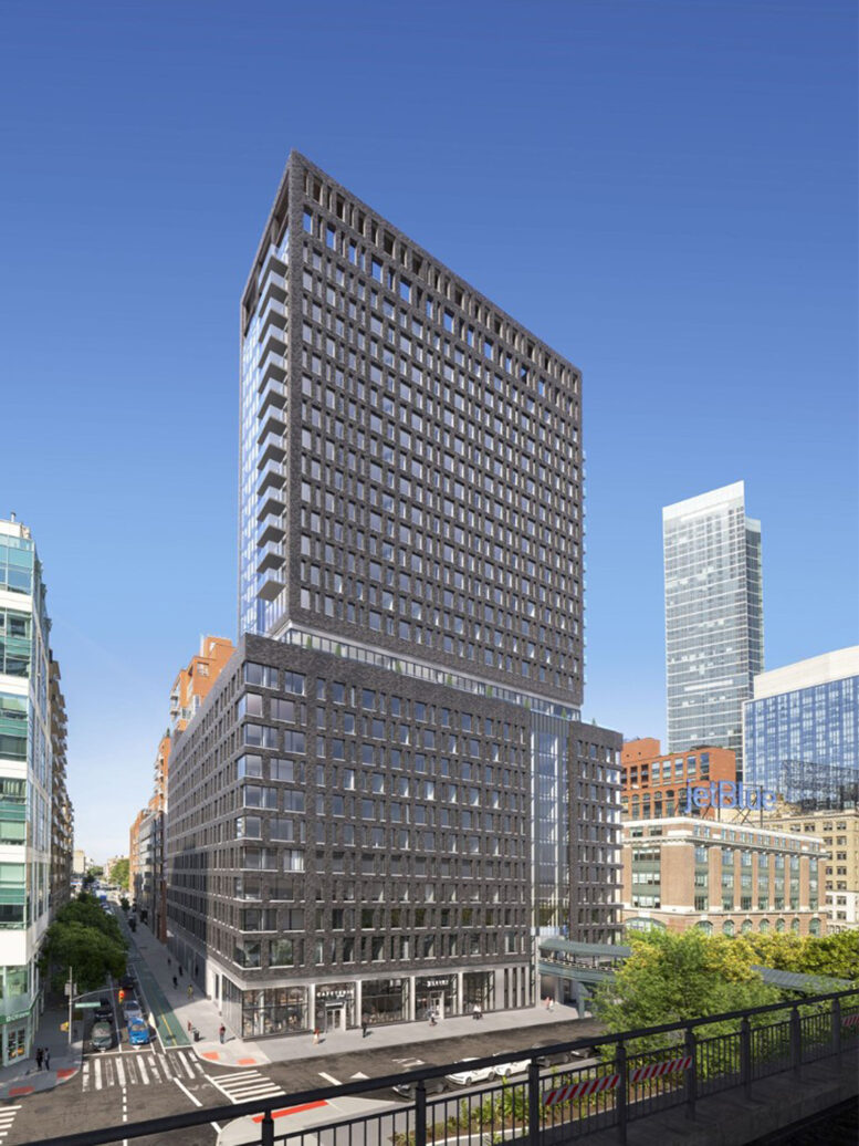
Construction has topped out on 25-01 Queens Plaza North, a 28-story residential building in Long Island City, Queens. Designed by Handel Architects and developed by Grubb Properties, which purchased the property for $63 million in 2021, the 311-foot-tall structure will yield 417 rental units with 124 reserved for affordable housing, as well as 7,000 square feet of ground-floor commercial space. The project is located between Crescent and 27th Streets, directly adjacent to the elevated Queensboro Plaza station serving the 7, N, and W trains.
Crews reached the roof parapet last week on May 2, when Consigli Construction and Grubb Properties held a topping out ceremony. Recent photos show the final scale of the reinforced concrete superstructure and progress on the exterior since our last update in late March, when workers were closing in on the final floors and installation of the dark gray brick façade was just getting underway. In the intervening months, the brick envelope has risen to enclose the lower half of the multi-story podium, while the grid of windows on the broad northern and southern elevations and sheer glass curtain wall on the narrower eastern and western elevations of the main tower have progressed considerably, as well.
Based on the pace of progress, the window grid and glass curtain walls could complete installation by the end of the month. Renderings originally showed a series of balconies lined with glass railings on the side elevations, but these appear to have been omitted from the final design.
Meanwhile, the remaining voids on the upper levels are being framed out with CMU blocks in preparation for their final exteriors.
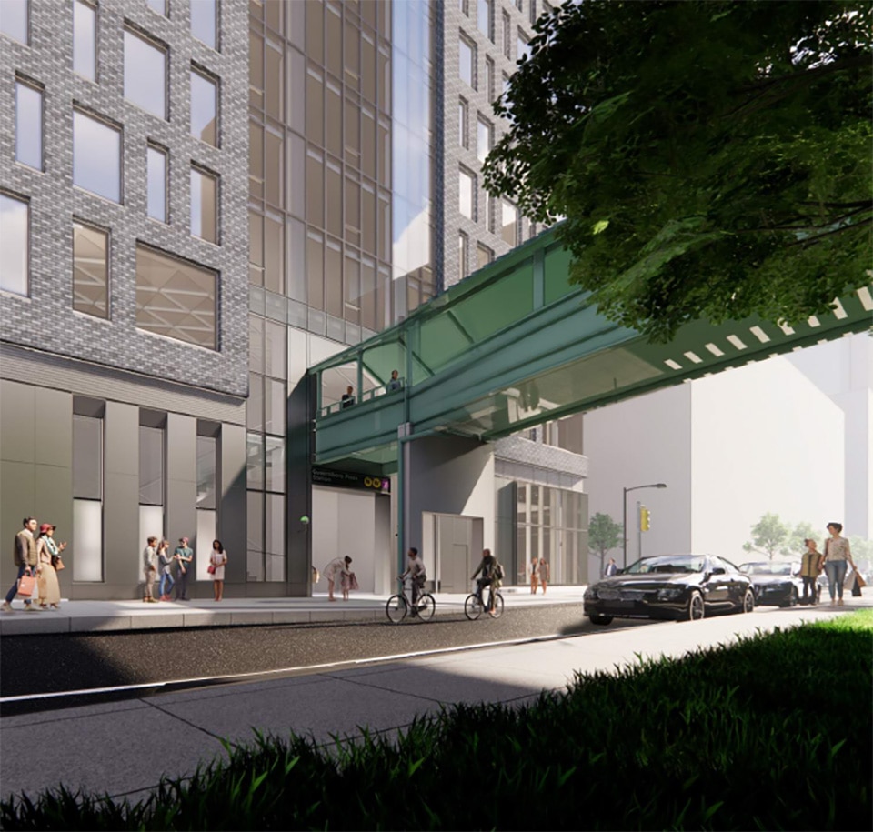
Grubb Properties secured a 20-percent floor area bonus for 25-01 Queens Plaza North in exchange for upgrades to the Queensboro Plaza station entrance. The scope of this work includes an expansion of the existing staircase and construction of a street-level elevator to comply with ADA accessibility requirements. The MTA is also planning to construct two additional elevators connecting to the station’s mezzanine level and the 7 train platforms above.
The below rendering from the City Planning Commission gives a street-level perspective of the subway entrance’s reconfiguration and expansion for Queensboro Plaza with the staircase and elevators tucked within the footprint of the podium.
25-01 Queens Plaza North is aiming for a completion date in the first half of 2025.
Subscribe to YIMBY’s daily e-mail
Follow YIMBYgram for real-time photo updates
Like YIMBY on Facebook
Follow YIMBY’s Twitter for the latest in YIMBYnews


This is a nice project. It appears to be coming out just as nice or even better than the rendering suggested. My only gripe – and there has to be one – is that I think it would have looked better in a lighter brick like a buff yellow or even off-white/white.
Mark my words, all this gray brick of the last decade will not age well. People will be thinking “what were they thinking?” just like we do about some of the previous decades “hot trends”. Not only that, in many cases the gray masonry is undeniably dreary and does a piss poor job of complimenting anything around them.
yeah, I notice that grey is so common for new construction and I don’t get it
It doesn’t blend in with prewars and it’s not exciting like bright colors
Lots of glass on this building will reflect everything, that are at the same height: Thanks to Michael Young.
Looks like Brutalism is making an unwelcome comeback. This building is almost next to an elevated station with multiple train lines, making it convenient, but very noisy.
Not even remotely similar to Brutalism. Also lots of buildings are next to elevated lines. There’s some amazing building materials now like insulated windows that through alchemy somehow make loud noises be much less loud.
I work across the street from this building and I’m concerned about how fast they built it. I don’t think the quality can be that good. Also, it’s an ugly building. I think it has too many windows and it looks like a prison.My job moved here in 2011 and all these buildings have been built since that time. The architects and developers have no creativity since the buildings are basically the same: tall and all glass, with no character to distinguish them. I’ll be glad when this era of architecture is over.
Sounds like you’re a real expert on architecture and construction.
“Too many windows” and “looks like a prison” are two contradictory ideas, man.