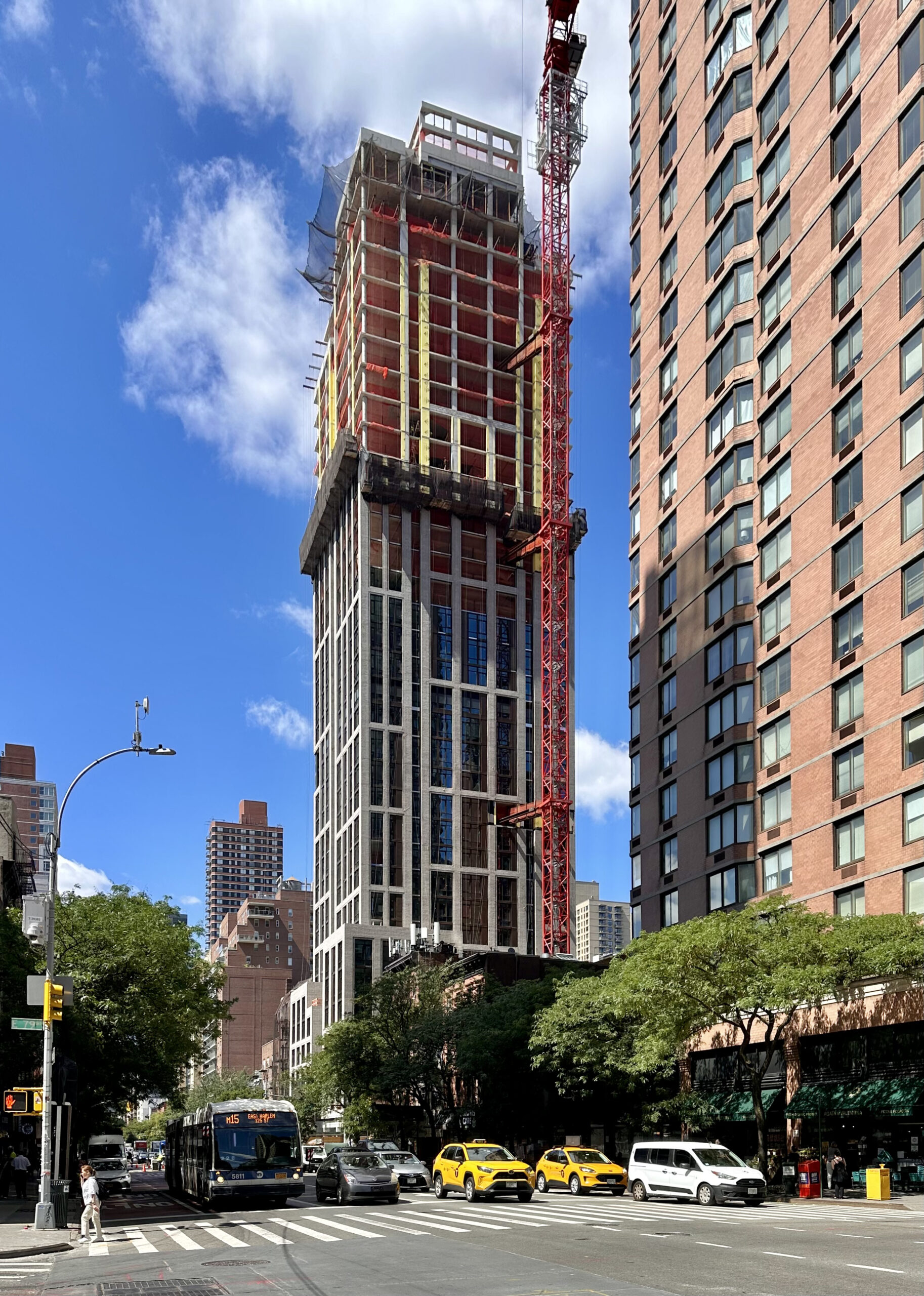
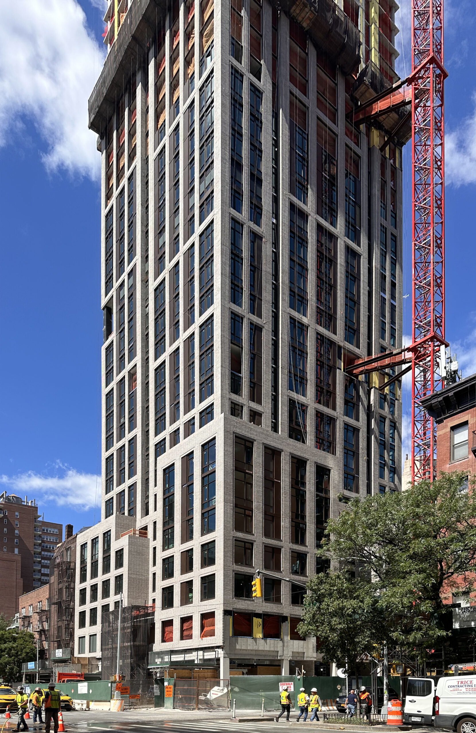
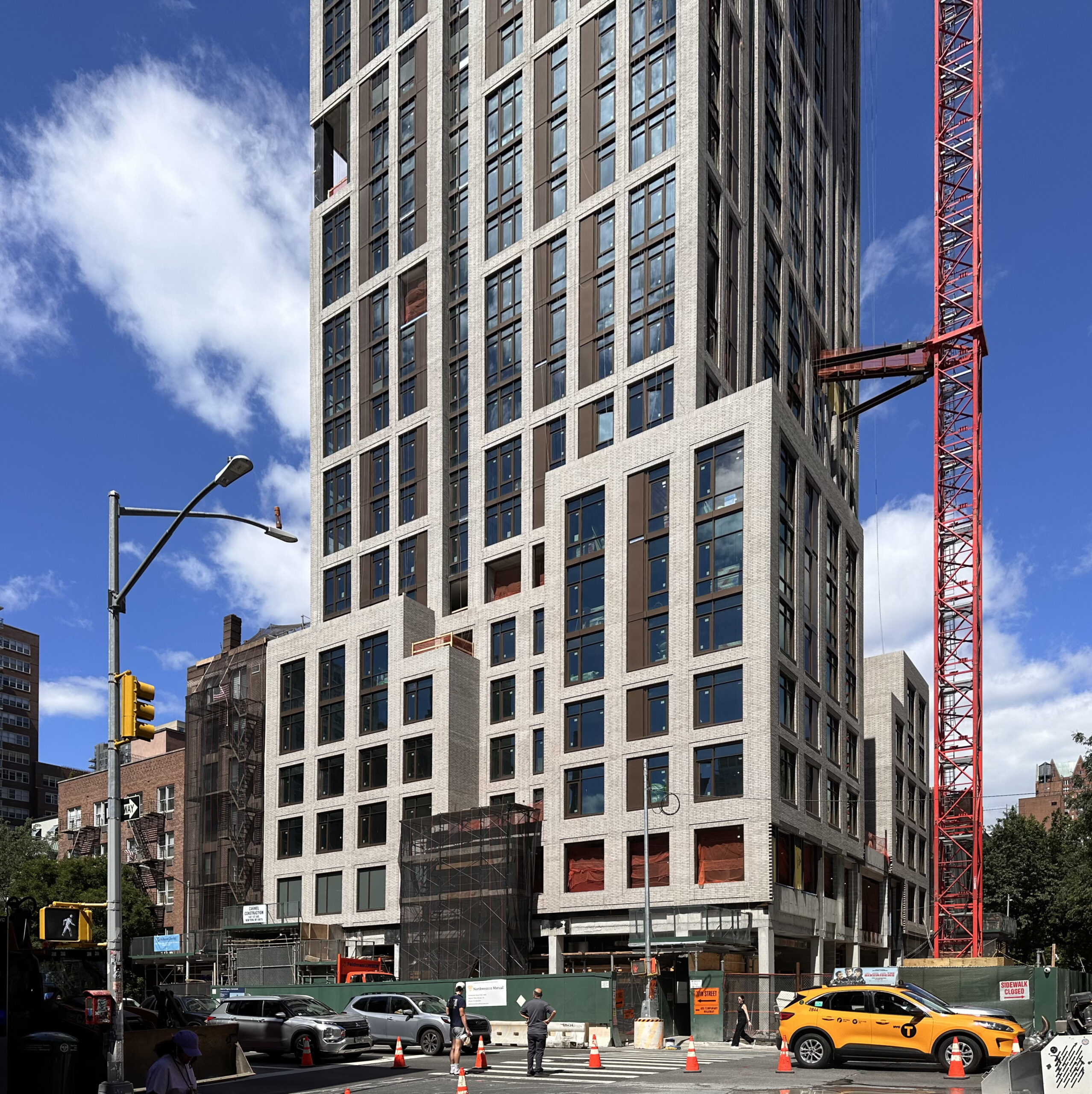
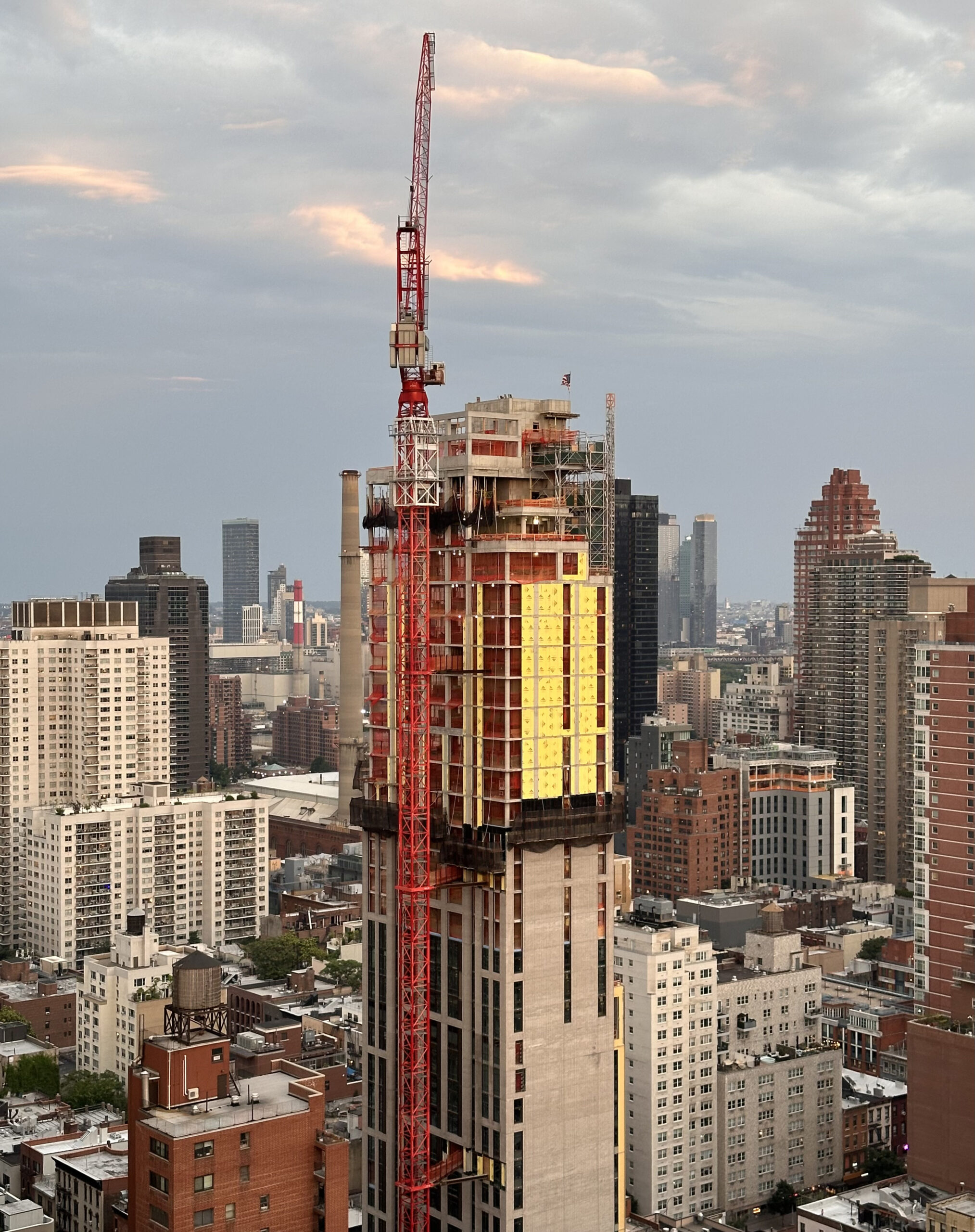
Construction has topped out on 1487 First Avenue, a 35-story residential building on Manhattan’s Upper East Side. Designed by Hill West Architects and developed and built by Carmel Partners, which purchased the property from Robert Chou for $73.5 million in early 2022, the 404-foot-tall structure will yield 206 condominium units, 7,120 square feet of ground-floor retail space, and a cellar level. CP VII 78th Street Owner is the owner of the property, which is located at the southwestern corner of First Avenue and East 78th Street.
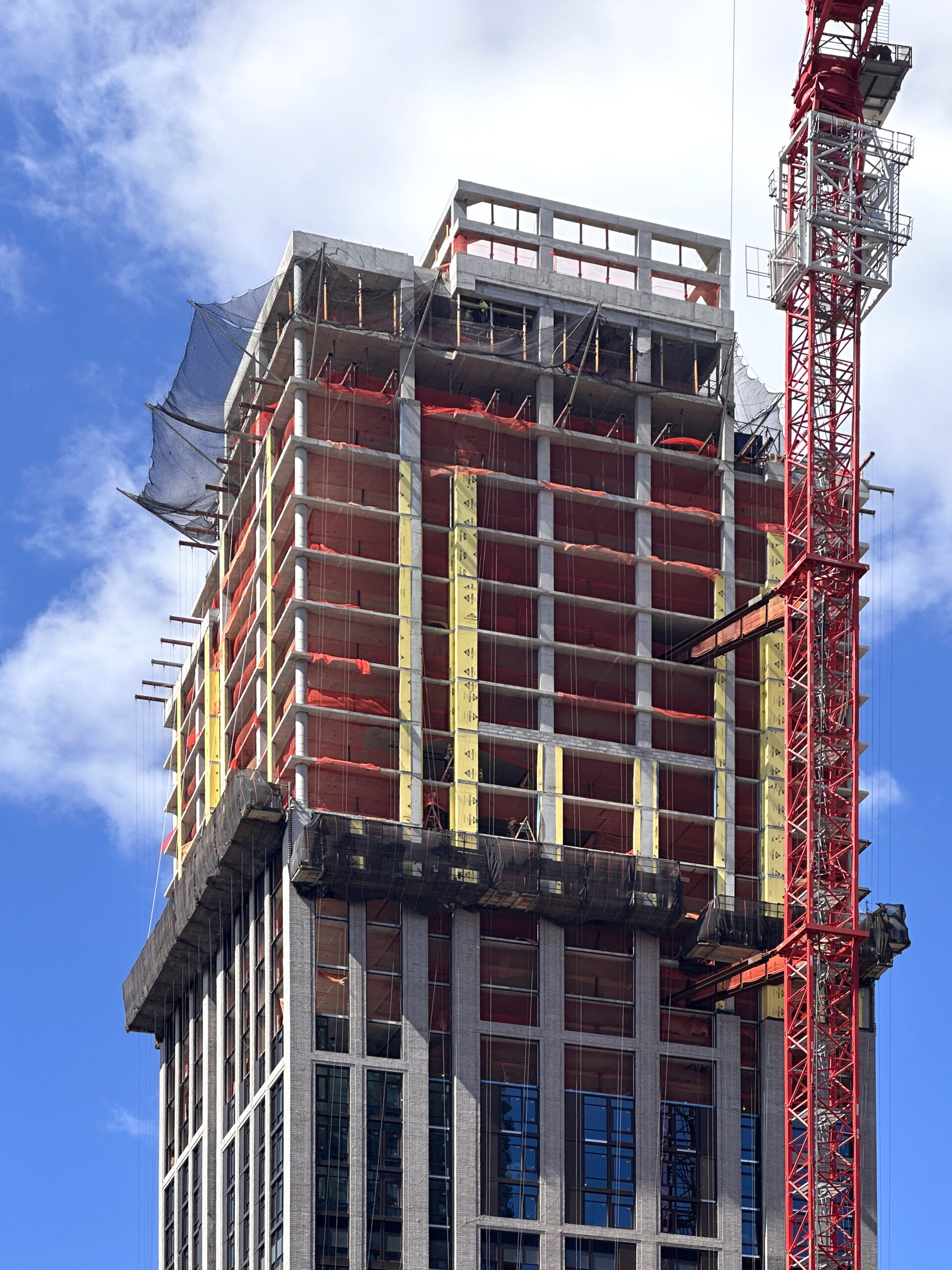
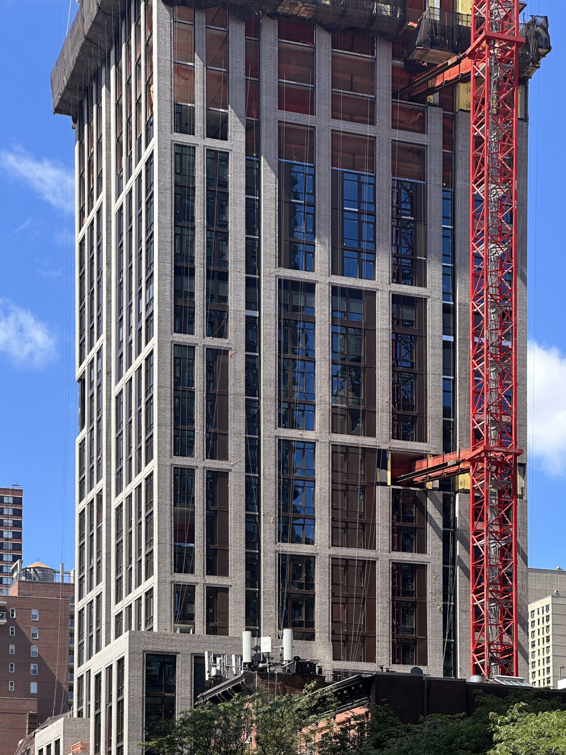
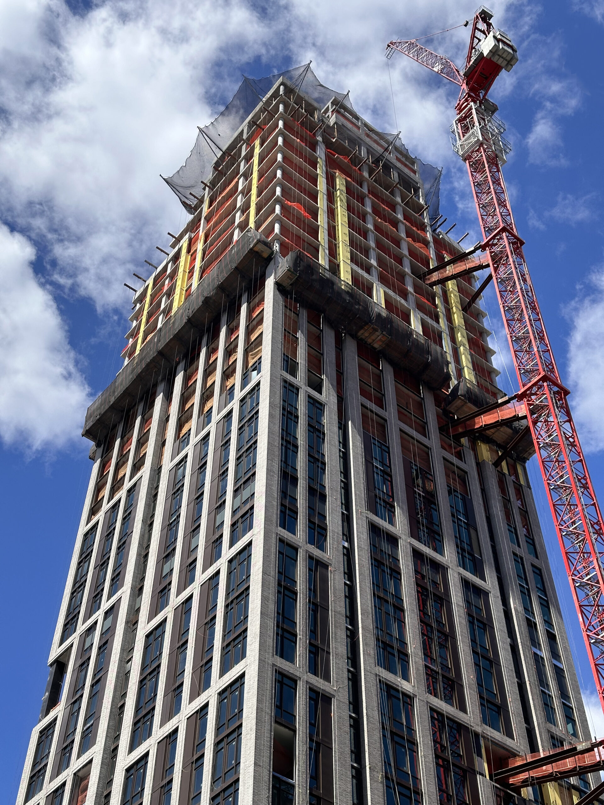
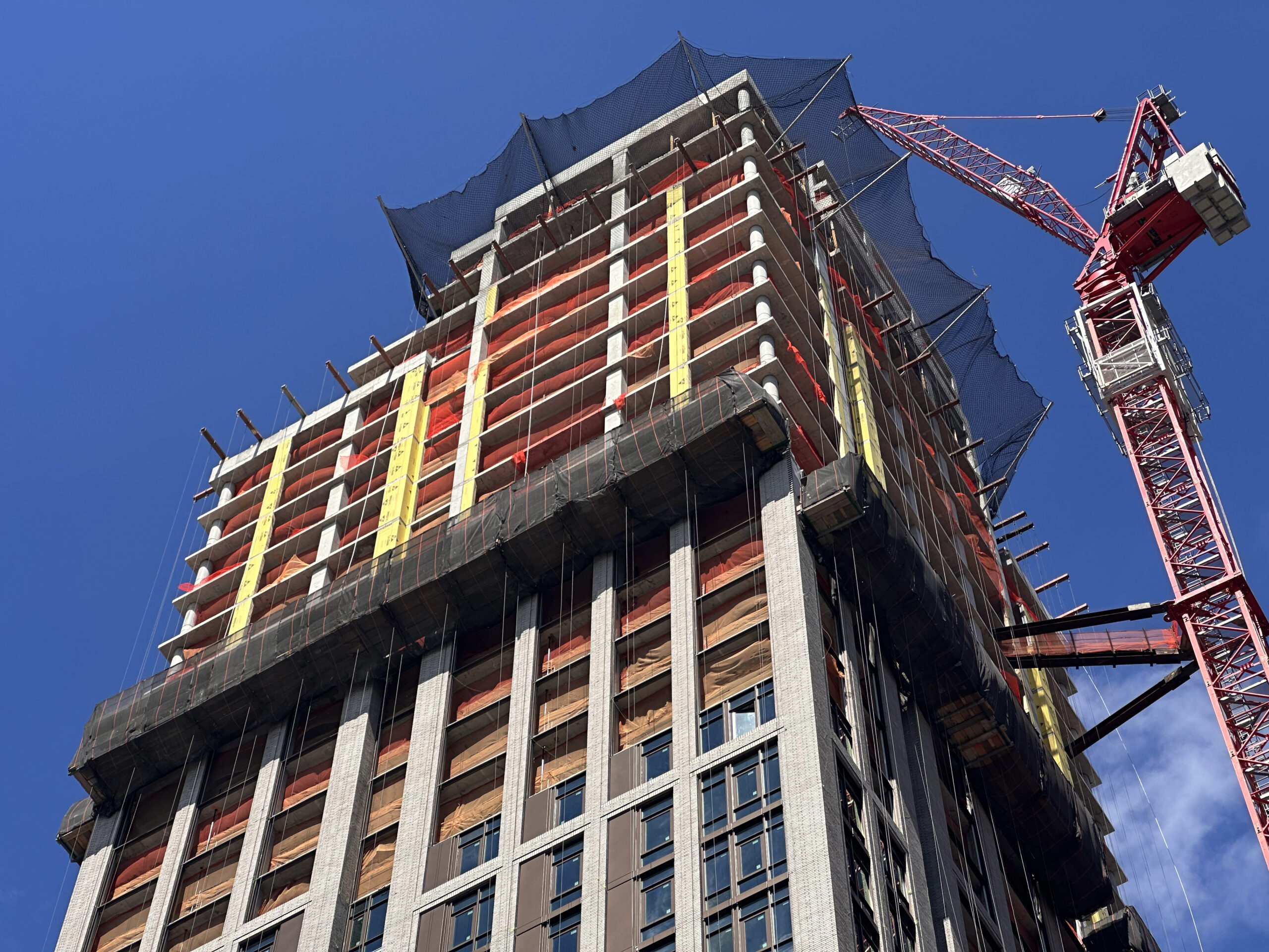
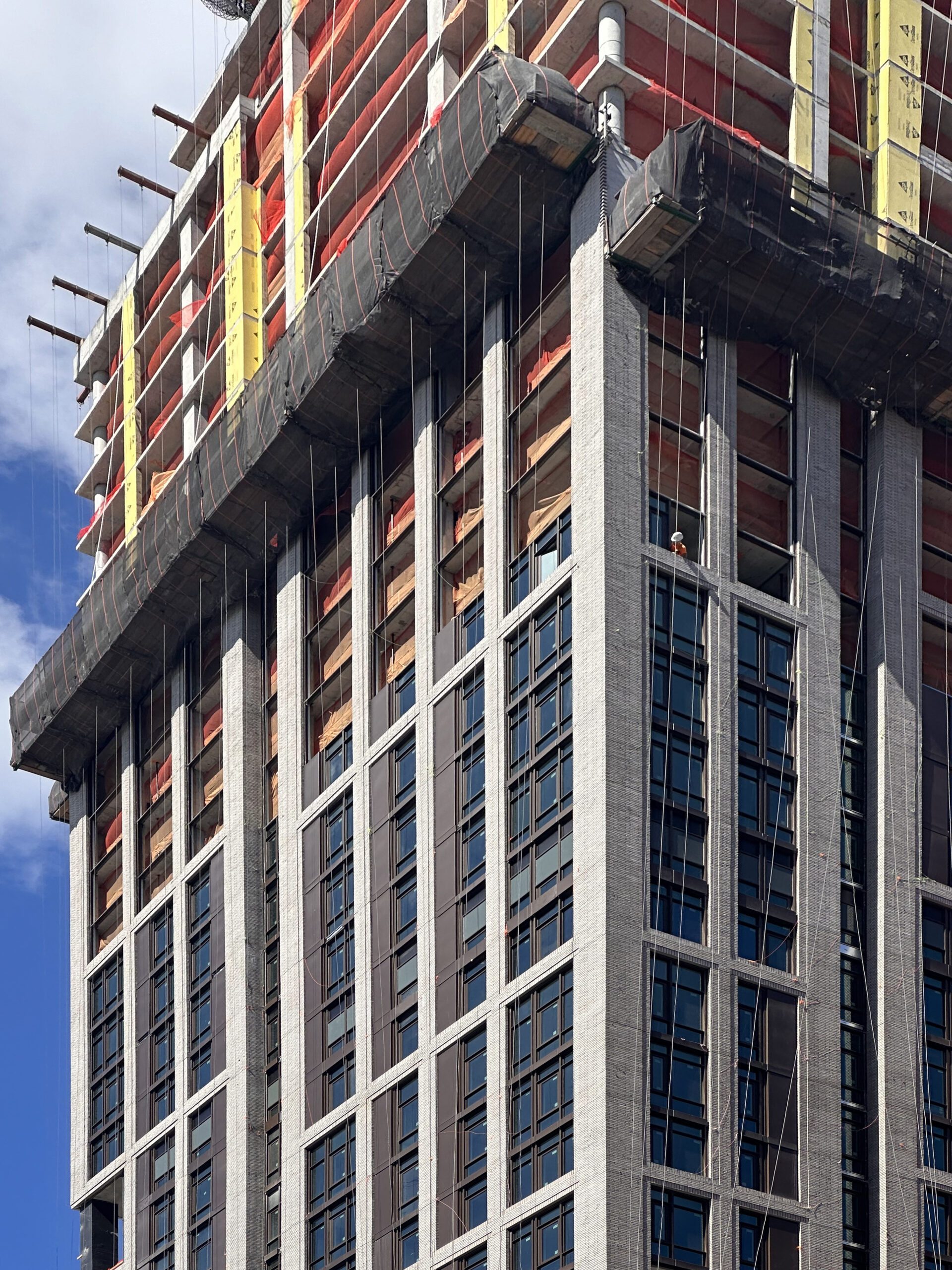
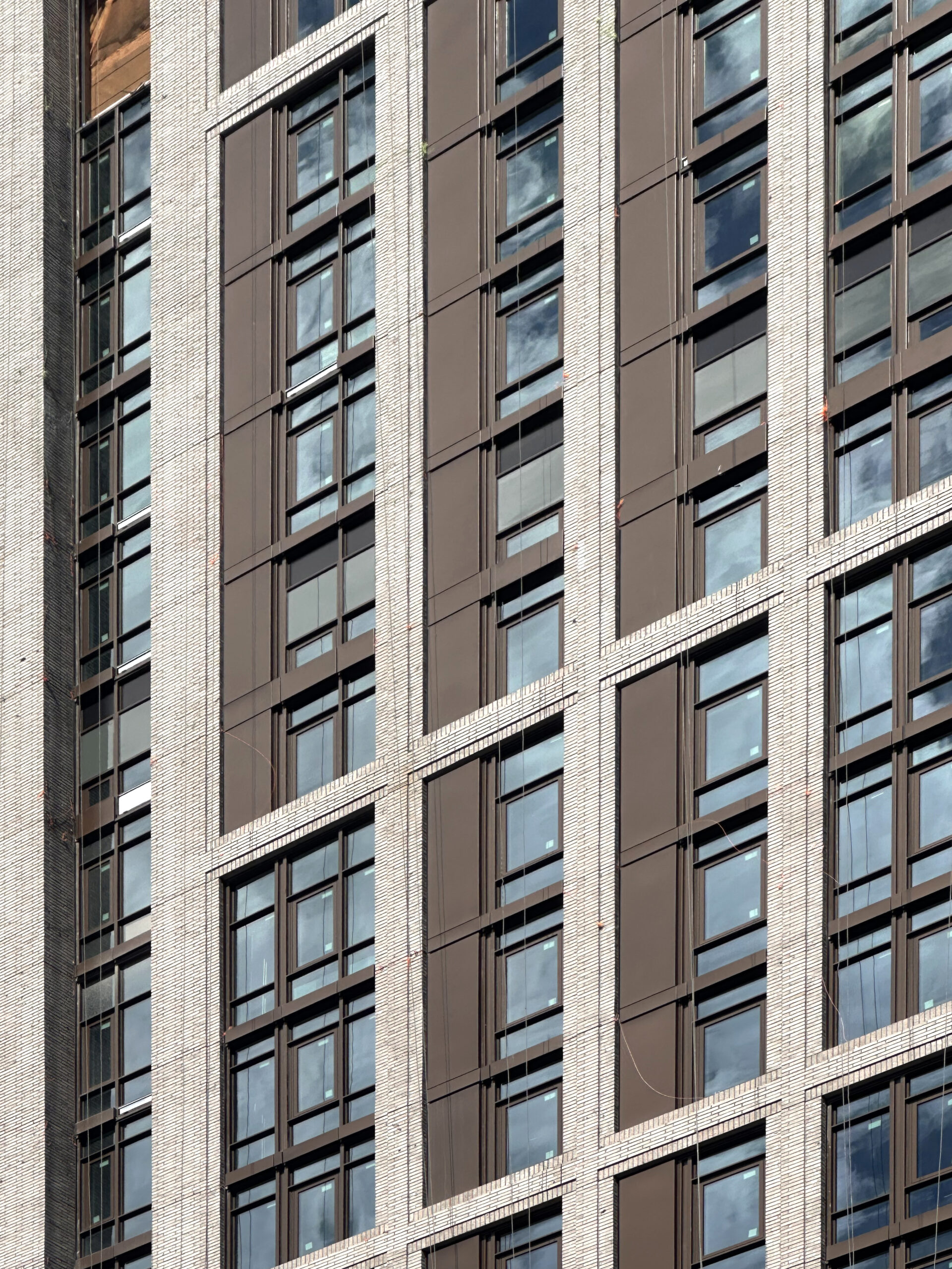
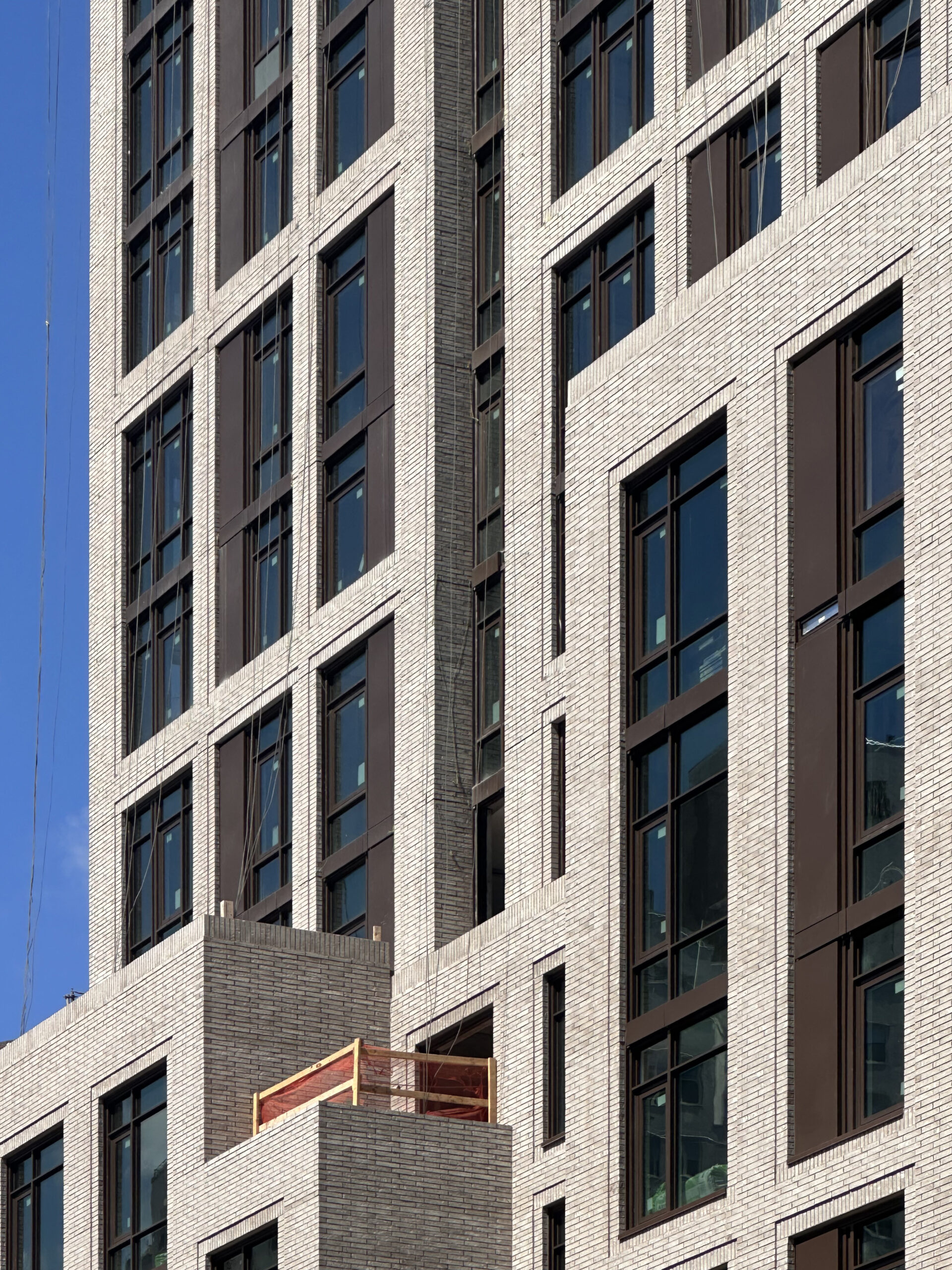
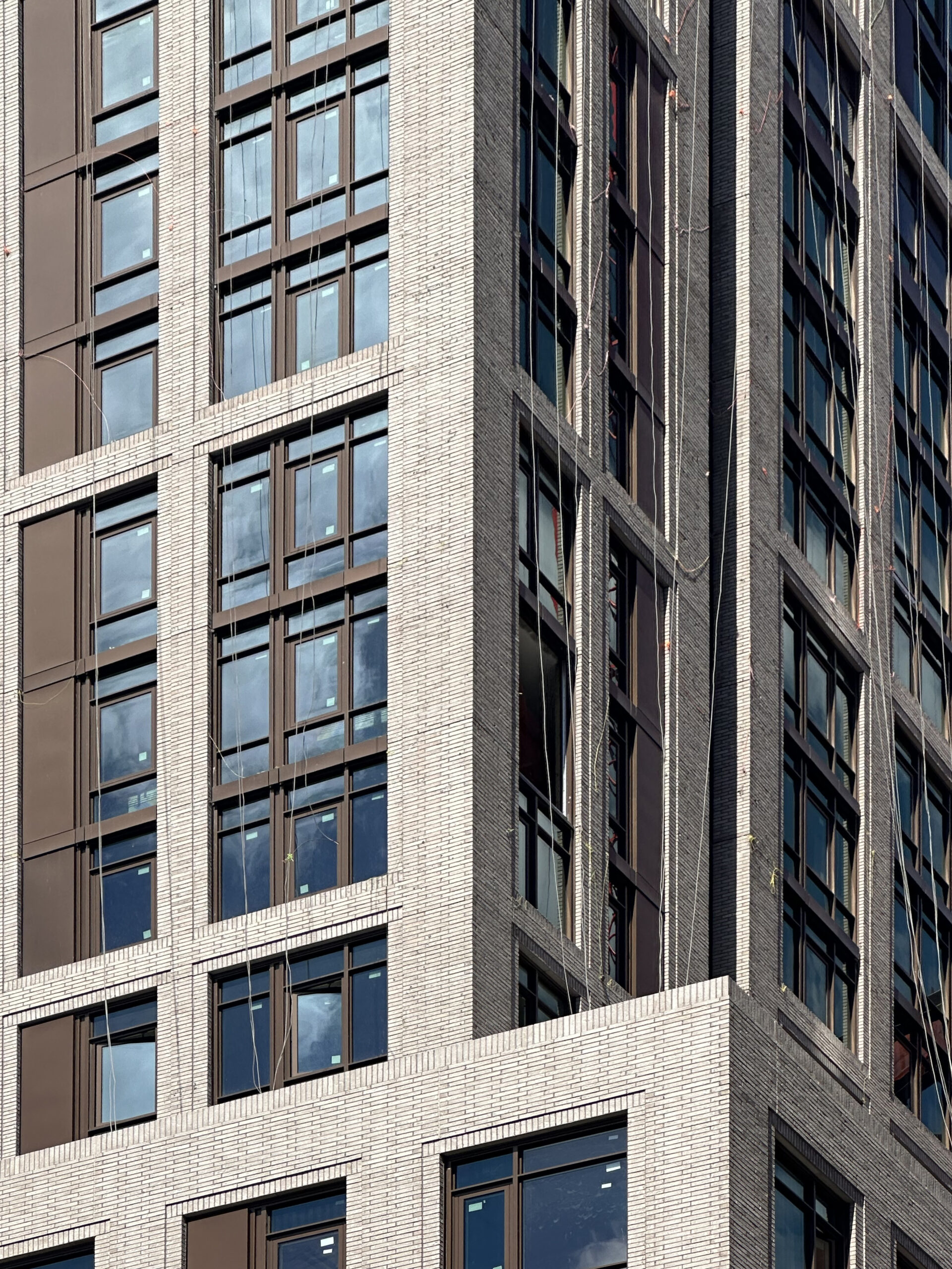
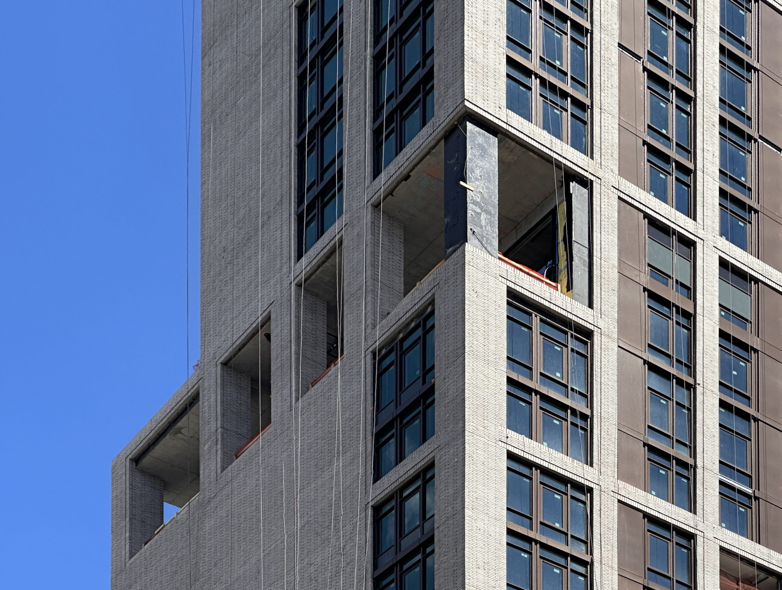
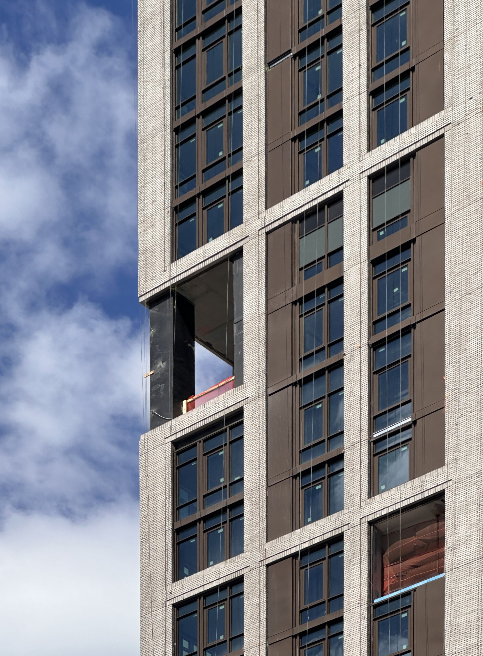
The reinforced concrete superstructure has reached its pinnacle since our last update in April, when construction had just reached the halfway mark. In that span, the façade of gray brick and floor-to-ceiling glass with dark earth-toned paneling has continued to rise up the tower and now encloses it up to its midpoint.
One architectural detail not visible in the renderings is the outdoor loggia on the southern lot line wall, seen below. The feature is located around the midpoint of the tower behind a set of thick perimeter columns.
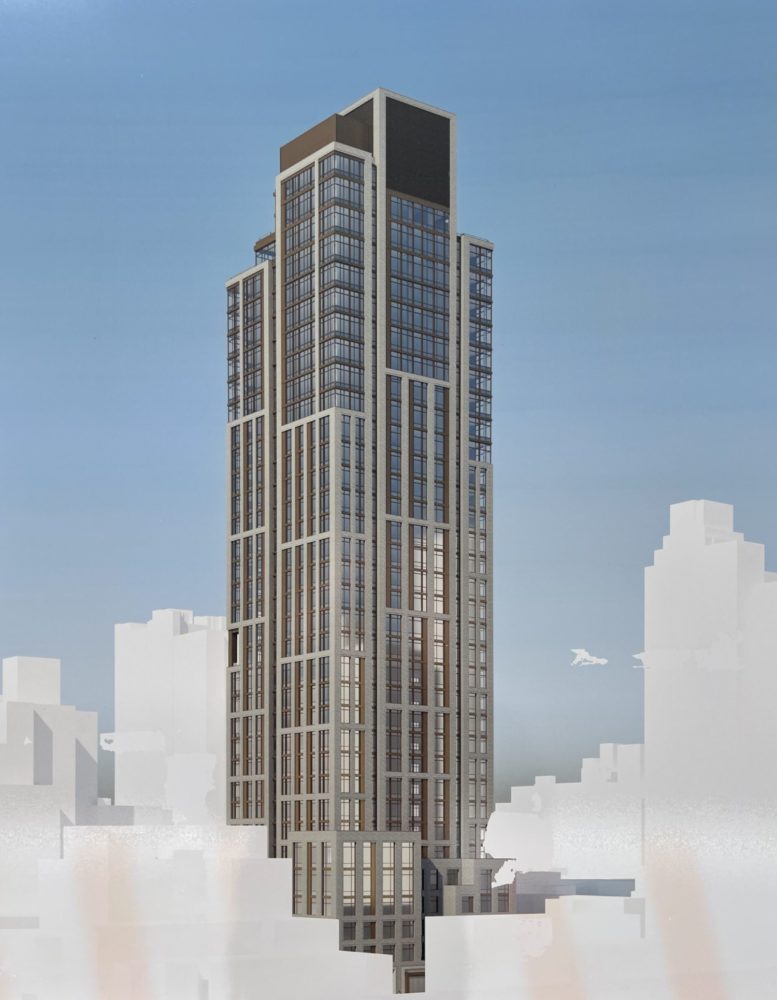
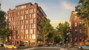
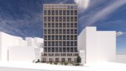
The main exterior rendering for 1487 First Avenue shows the tower’s fenestration gradually transitioning from a tight grid of brick surfaces to more expansive stretches of glass near the crown. There are several setbacks on the upper levels that will be topped with terraces for a select few units, and the structure culminates in a multifaceted mechanical bulkhead clad in dark metal paneling.
The closest subway from the development is the 6 train at 77th Street station along Lexington Avenue. Also nearby is the Q train at the 72nd Street station to the southwest on Second Avenue.
1487 First Avenue has a completion date of summer 2025 posted on site.
Subscribe to YIMBY’s daily e-mail
![]()
Follow YIMBYgram for real-time photo updates
Like YIMBY on Facebook
Follow YIMBY’s Twitter for the latest in YIMBYnews

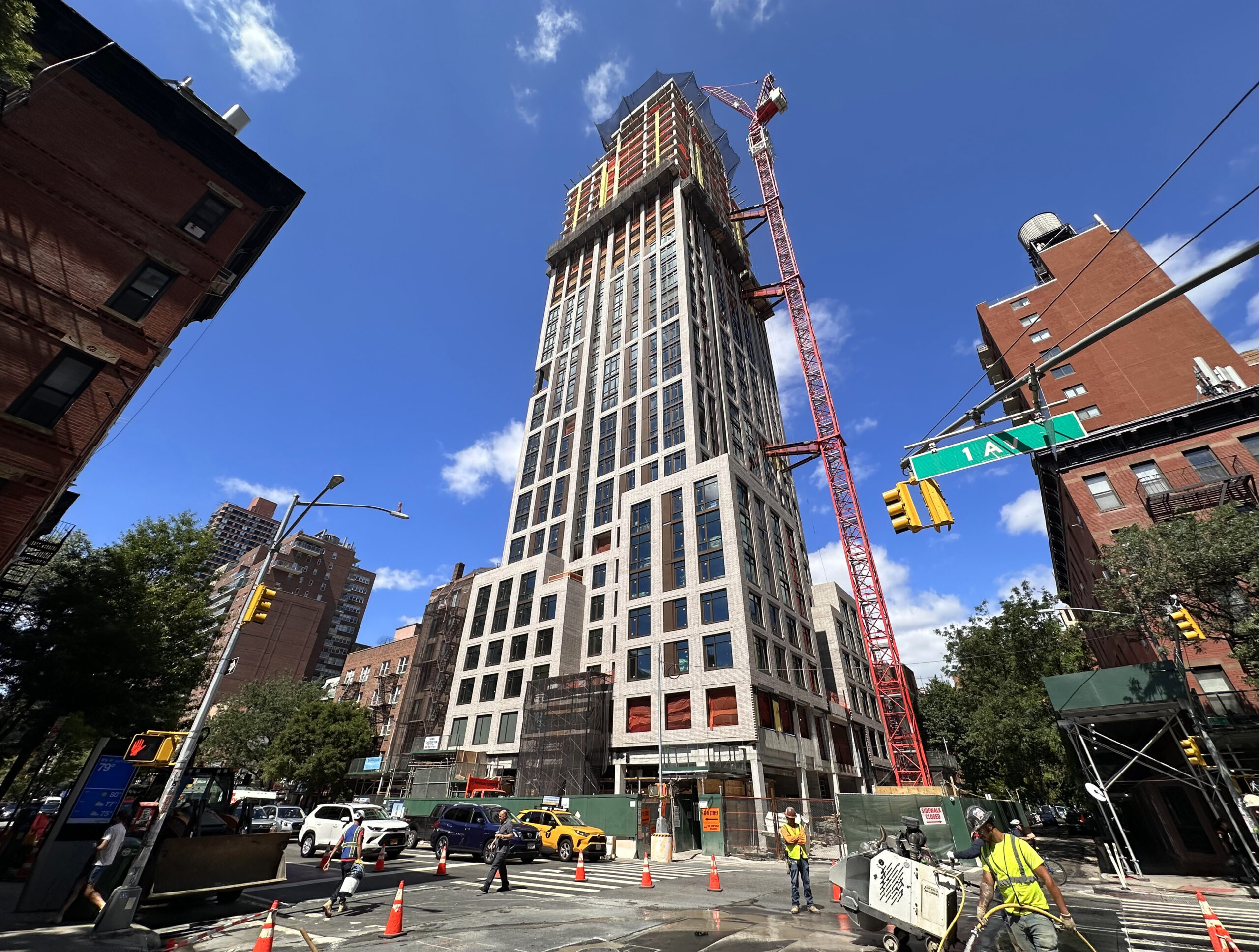
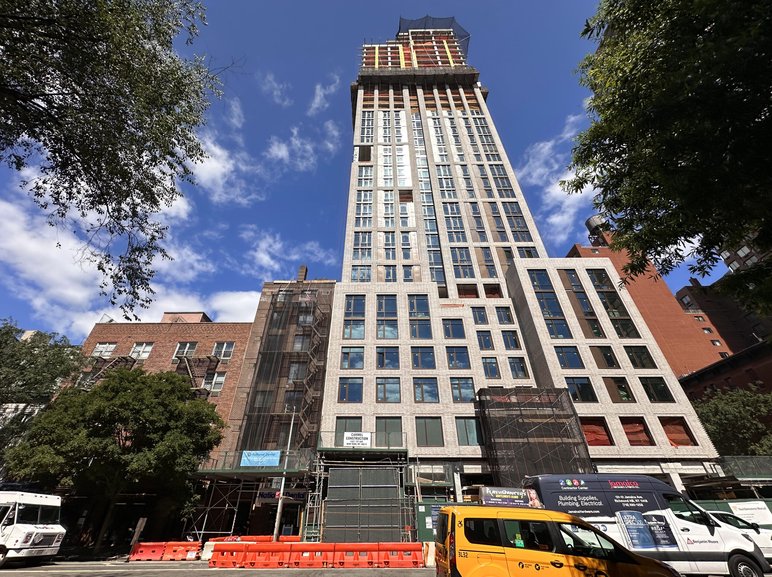
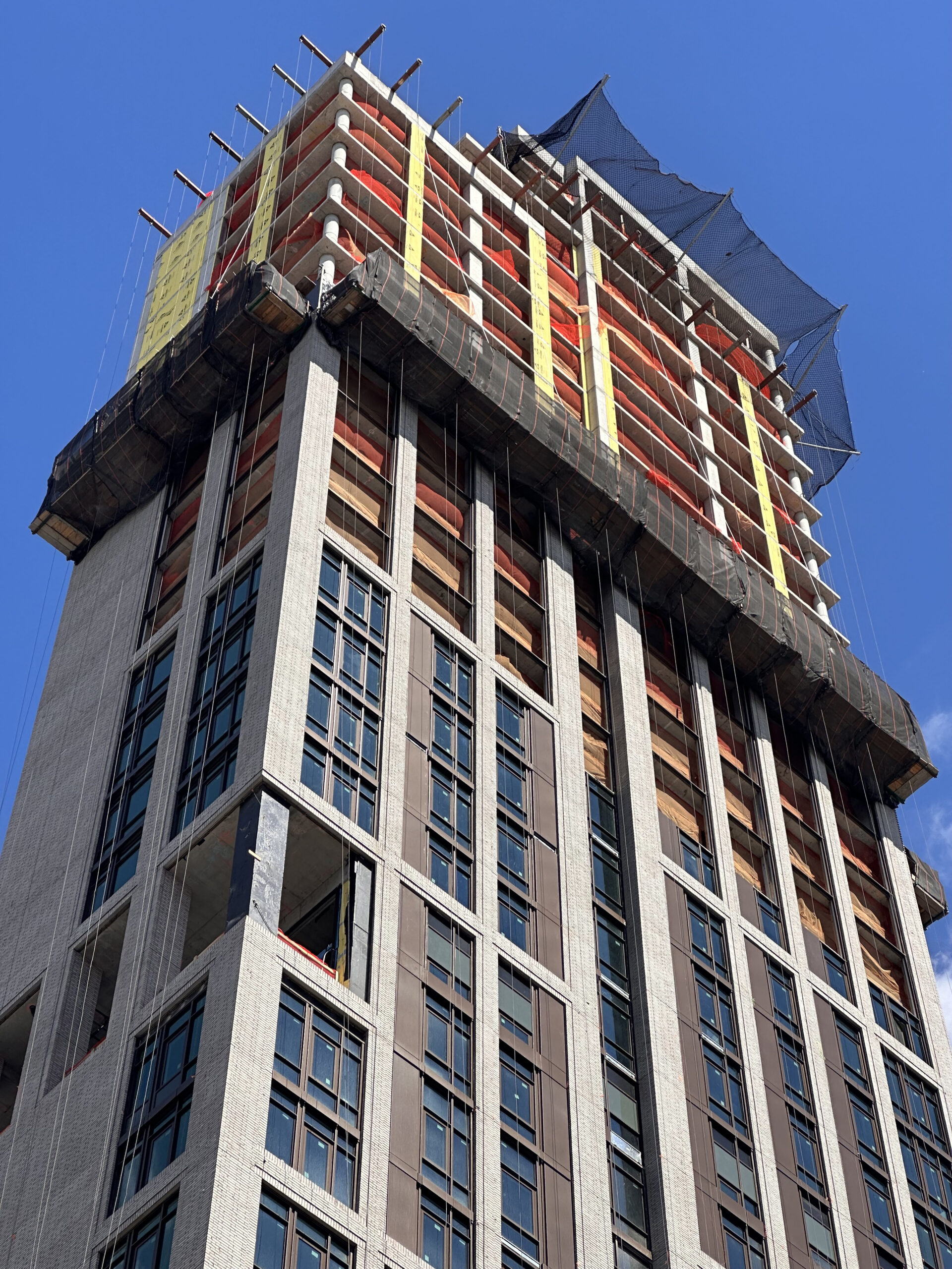
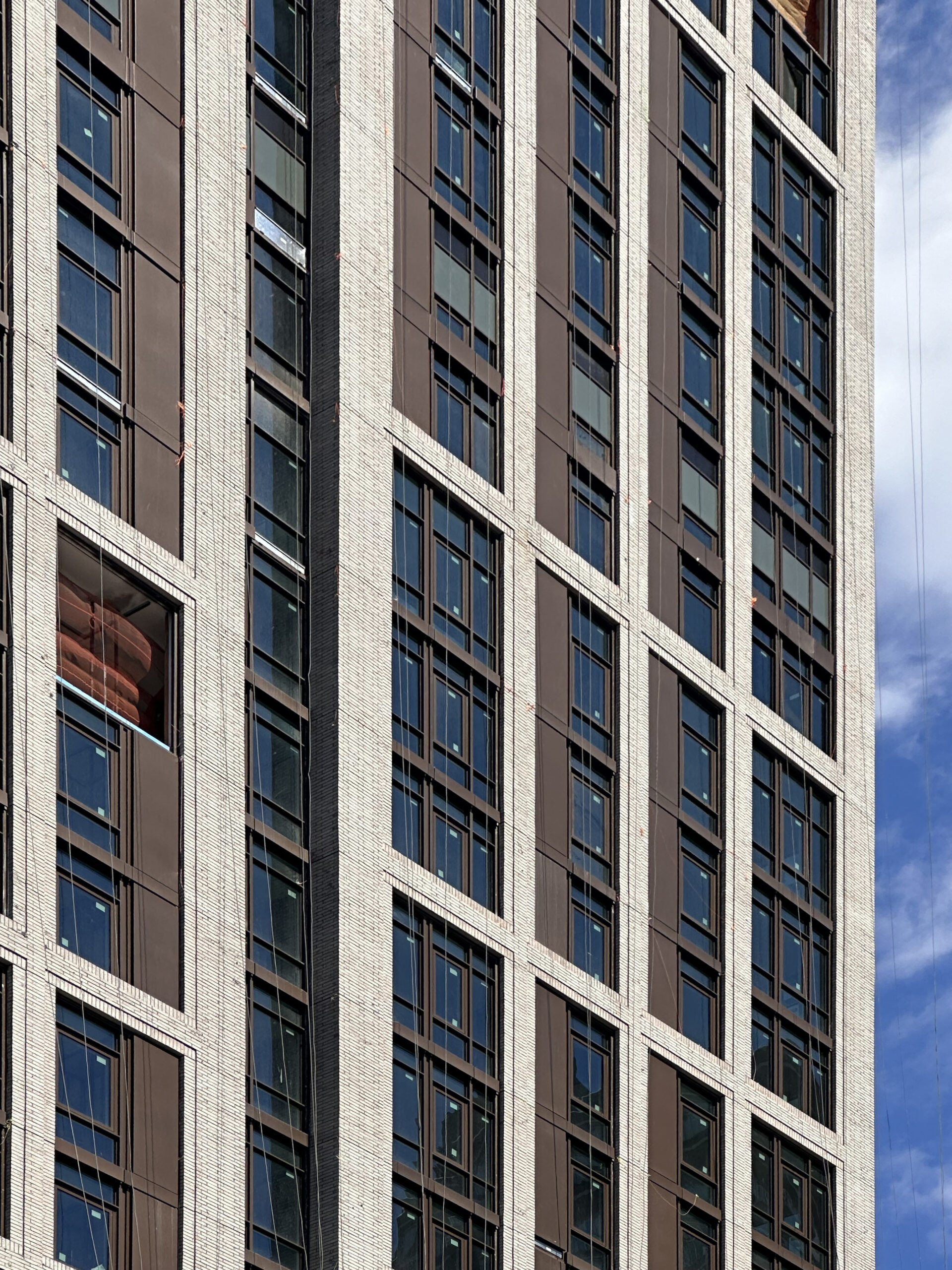
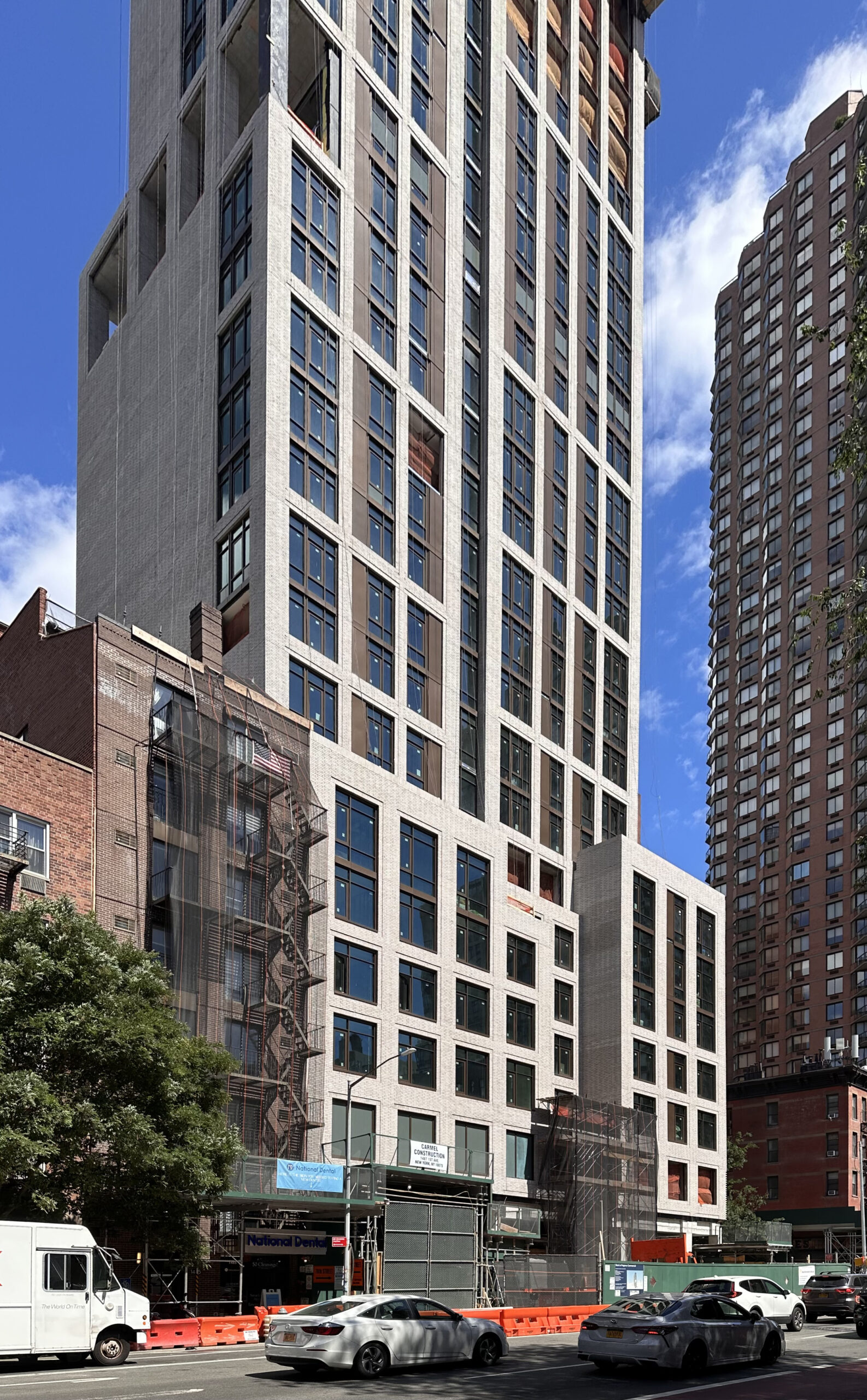
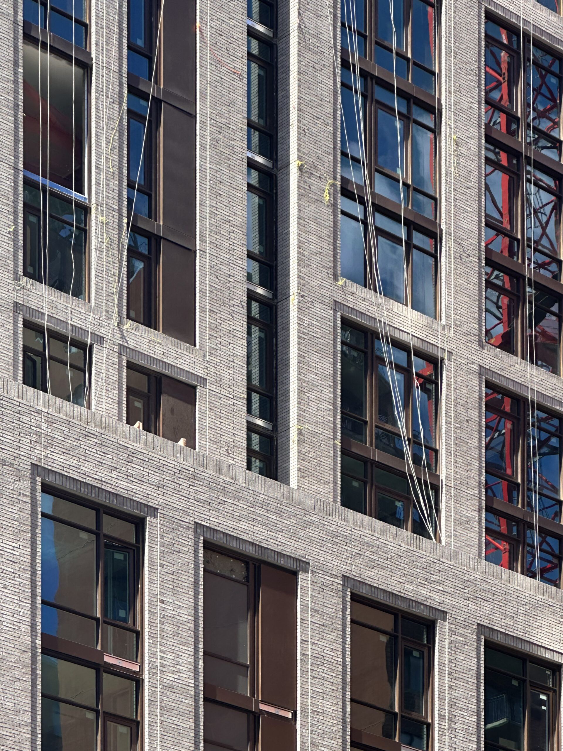
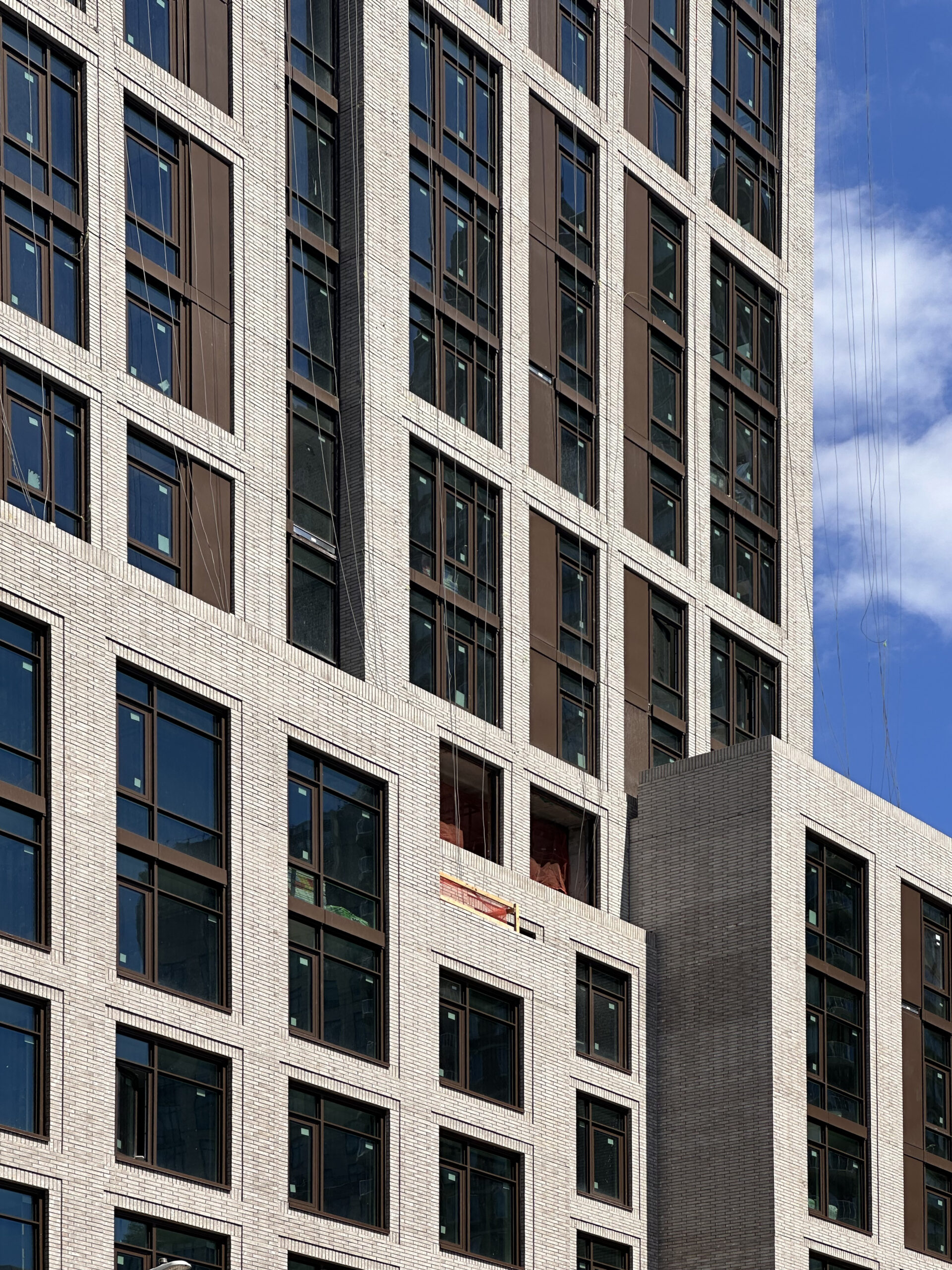
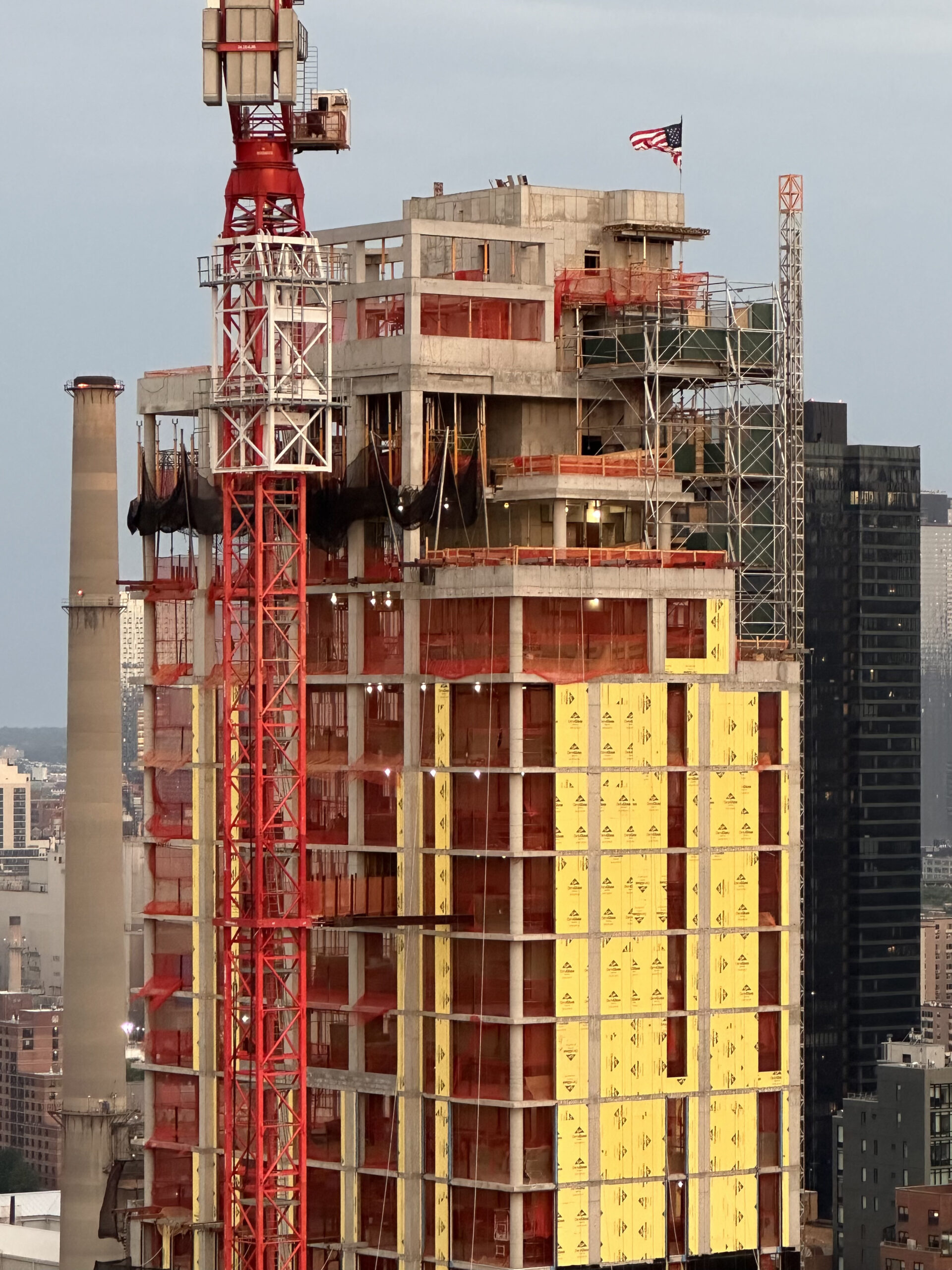
A tight grid of brick surfaces to more expansive glass, this view is showing what the design to do even: Thanks to Michael Young.
Not my favorite design, but it’s better than the rendering.
Yes, the texture of the brickwork gives it some character. That doesn’t come through in the rendering.
Aesthetically, the base of the tower before the first setback looks too short.
Just walked by the building it looks much better in person!!
I walk by this building daily and it looks much nicer IRL. Great addition to the UES and seems to be one of the nicest buildings in the hood.
All these buildings on the far east side are leading to improvements to the street scape particularly on 1st. 2nd, and 3rd. IMHO, a lot better than much of the post-war claptrap that went up.
The worst are those buildings from the late 1960s to 1980s that break the streetwall and are completely ugly
Somehow this building fits in to its neighborhood. In an odd sorta way.
I live on that block on the same Side. Just a few buildings down. It’s not blocking the sunlight going into my garden on the ground floor. It’s been interesting watching it go up. Attractive with the light colored brick and big windows.