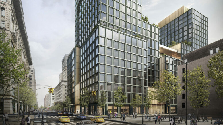
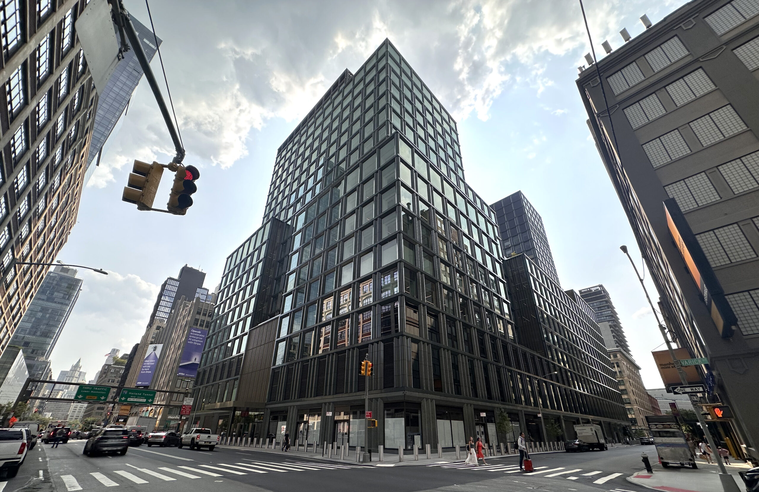
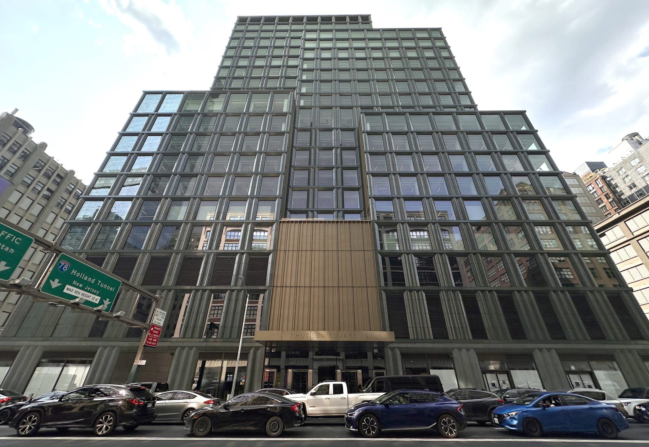
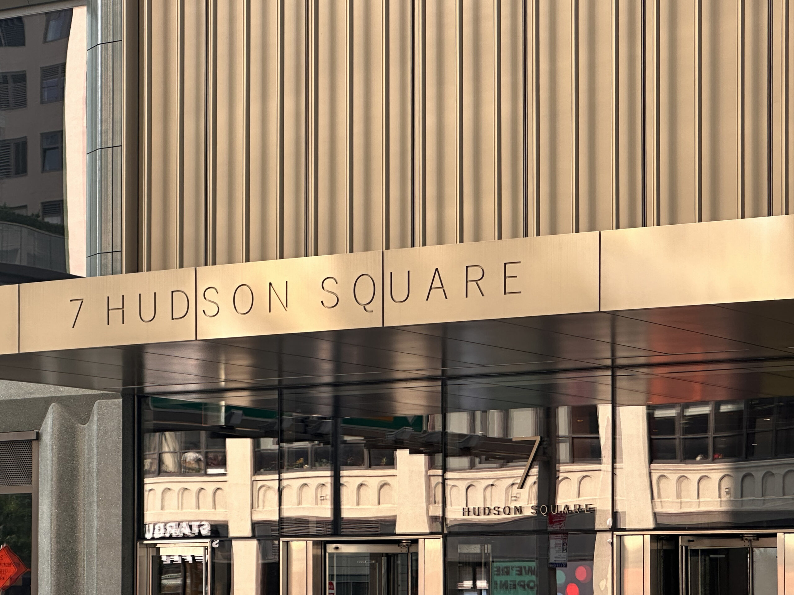
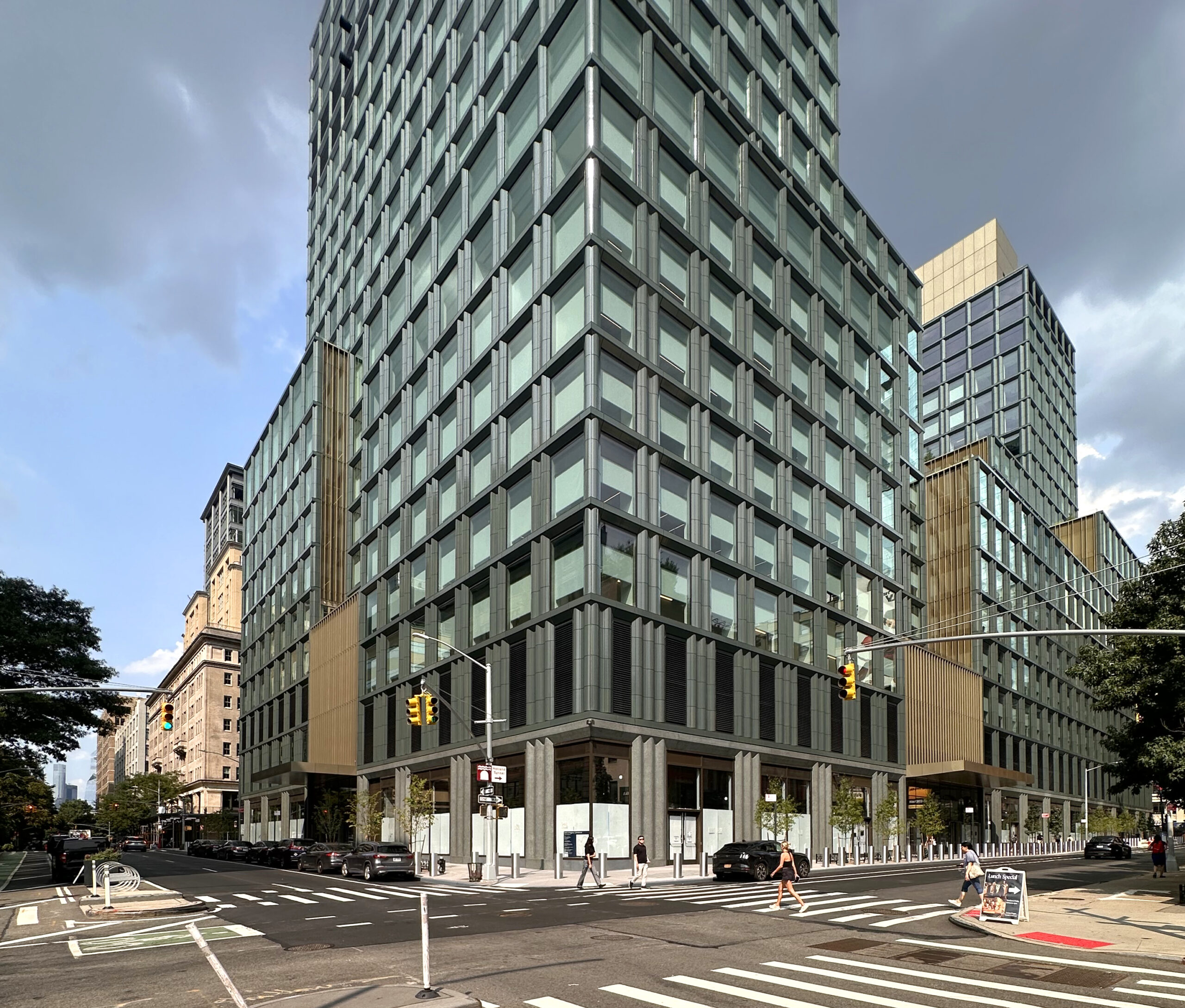
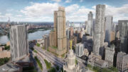
Construction wraps up on The Walt Disney Company’s 22-story New York headquarters at 7 Hudson Square in Hudson Square, Manhattan. Designed by Skidmore, Owings & Merrill and developed by Silverstein Properties, the 338-foot-tall structure yields a total of 1.2 million square feet for new offices, film and production studios, and ground-floor retail space. Gensler served as the interior designer, and Lendlease served the general contractor for the ground-up project, which is alternately addressed as 137 Varick Street formerly addressed as 4 Hudson Square, and stands on an 85,600-square-foot full-block plot bound by Vandam Street to the north, Spring Street to the south, Varick Street to the east, and Hudson Street to the west.
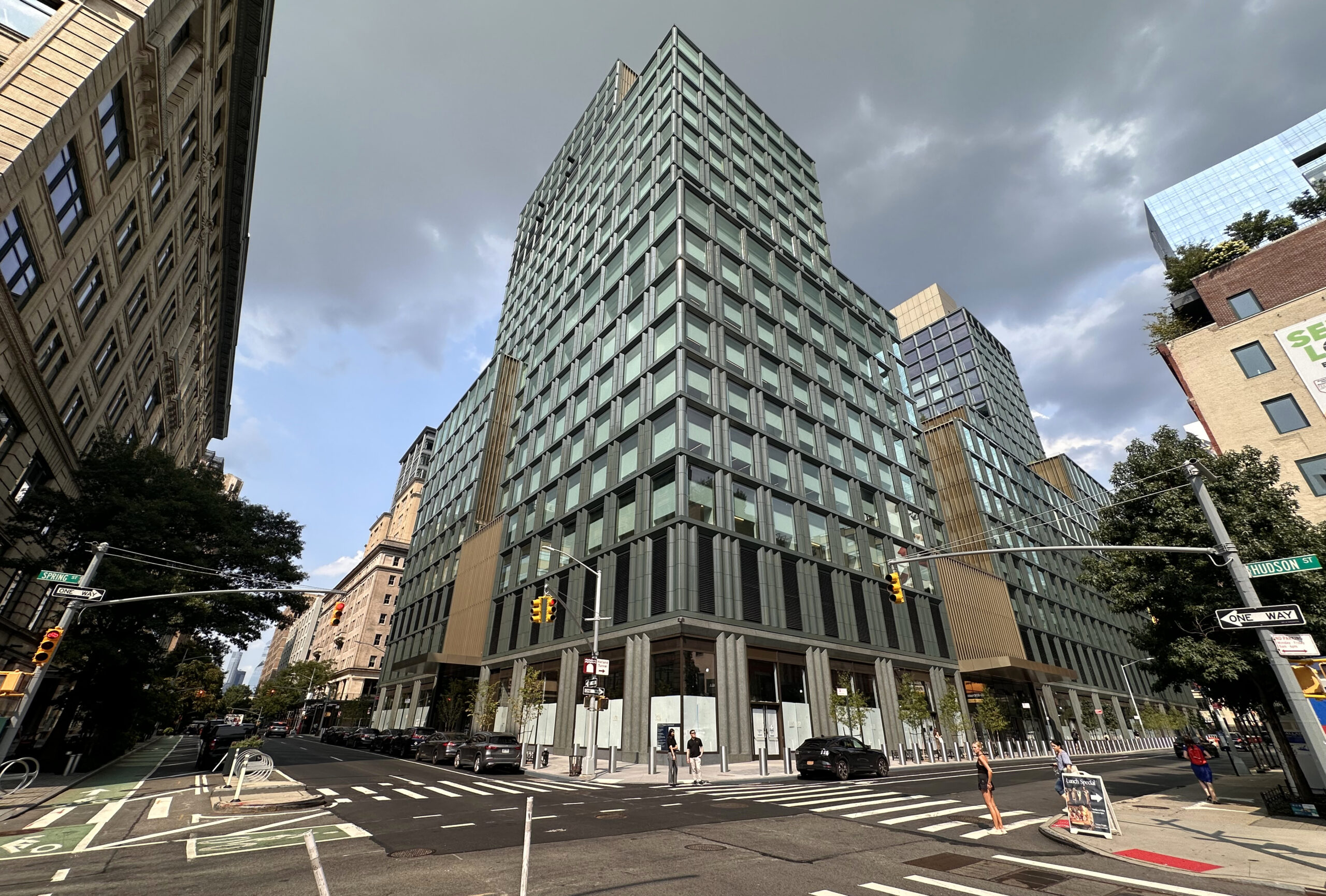
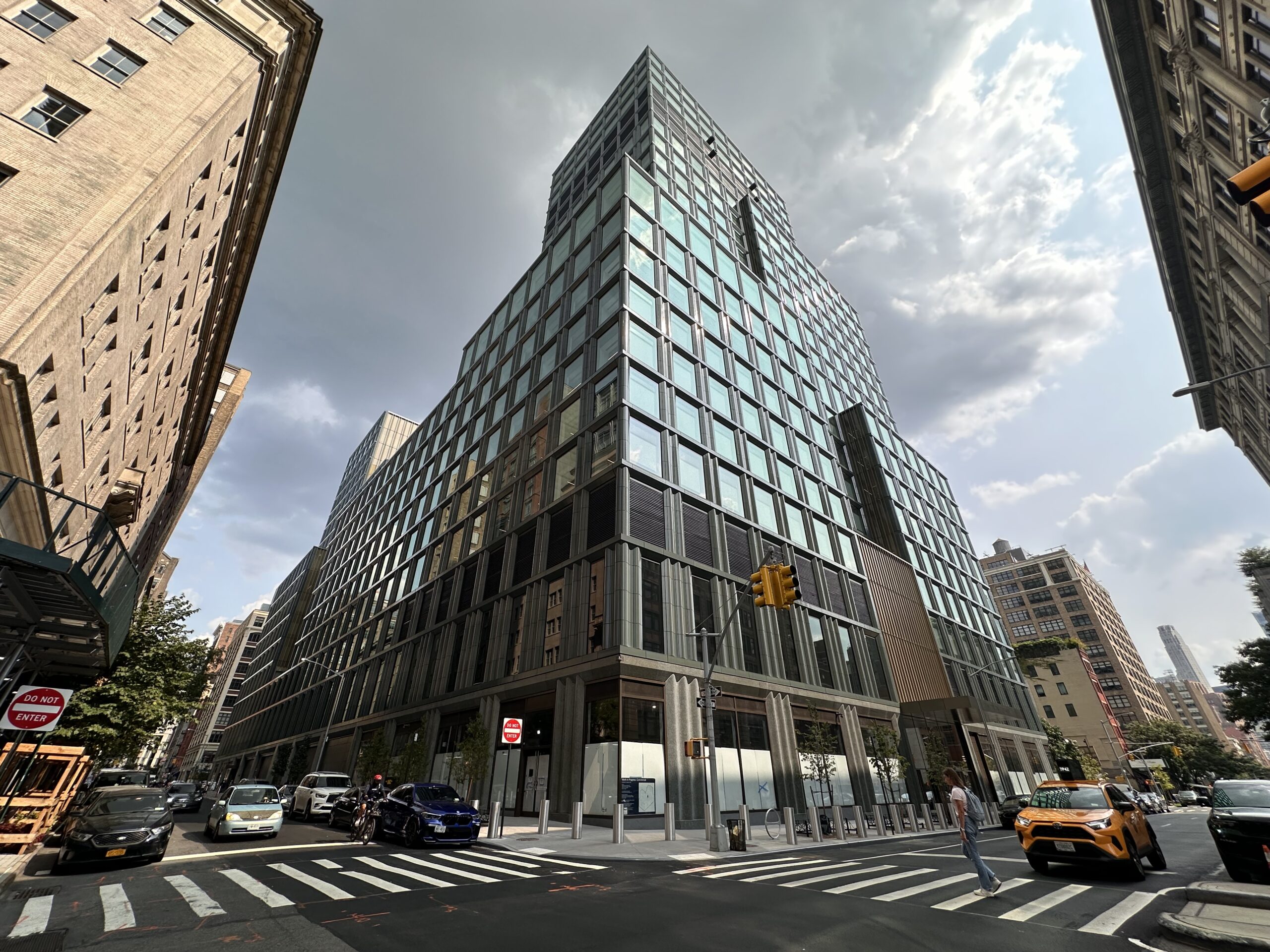
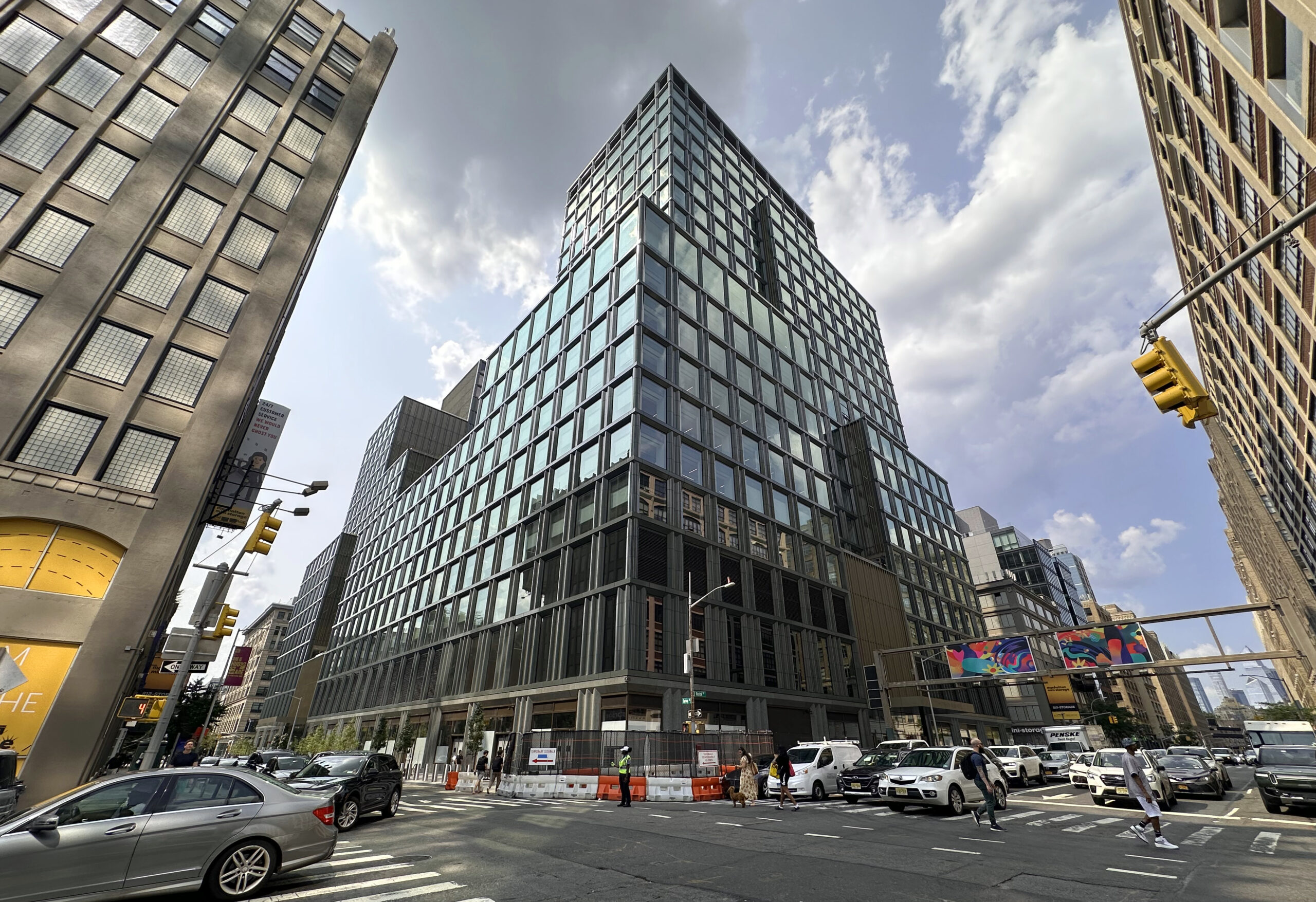
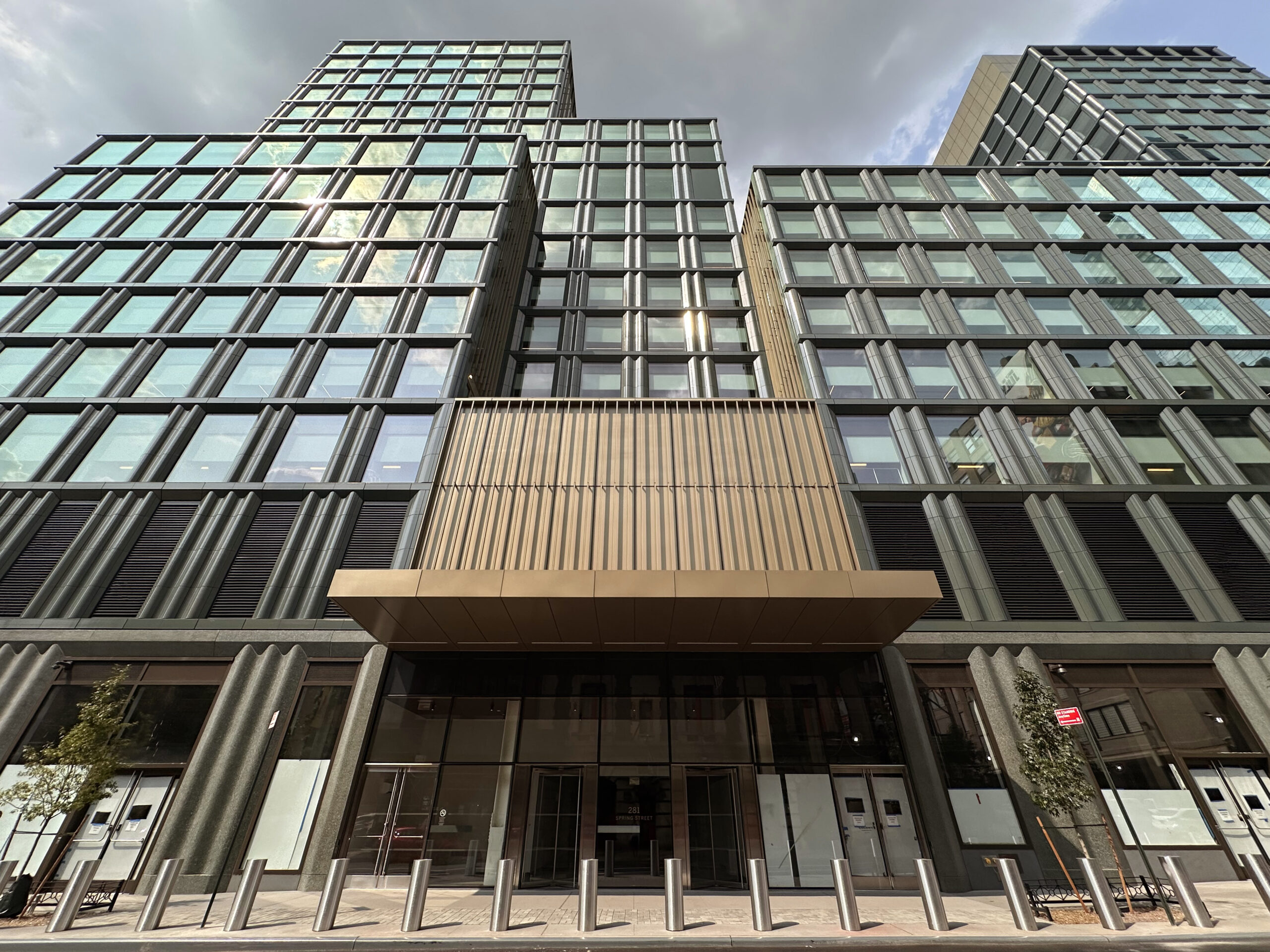
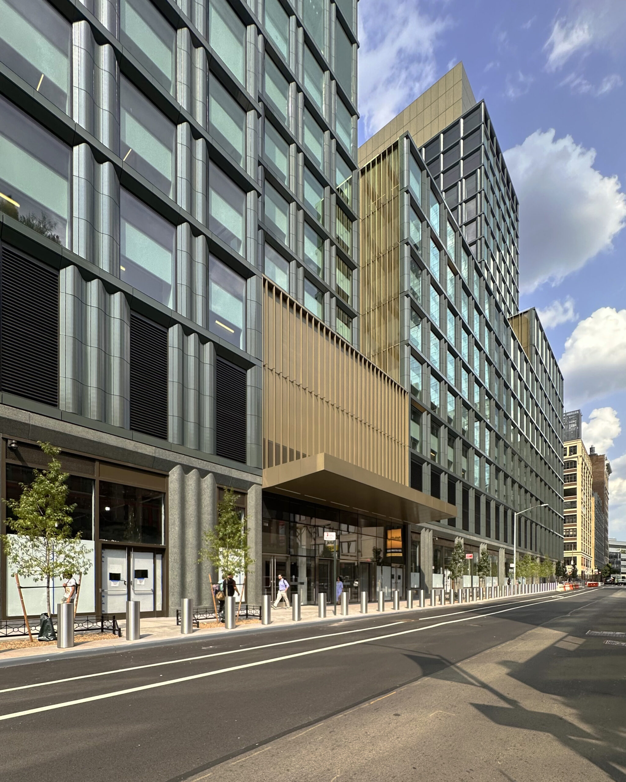
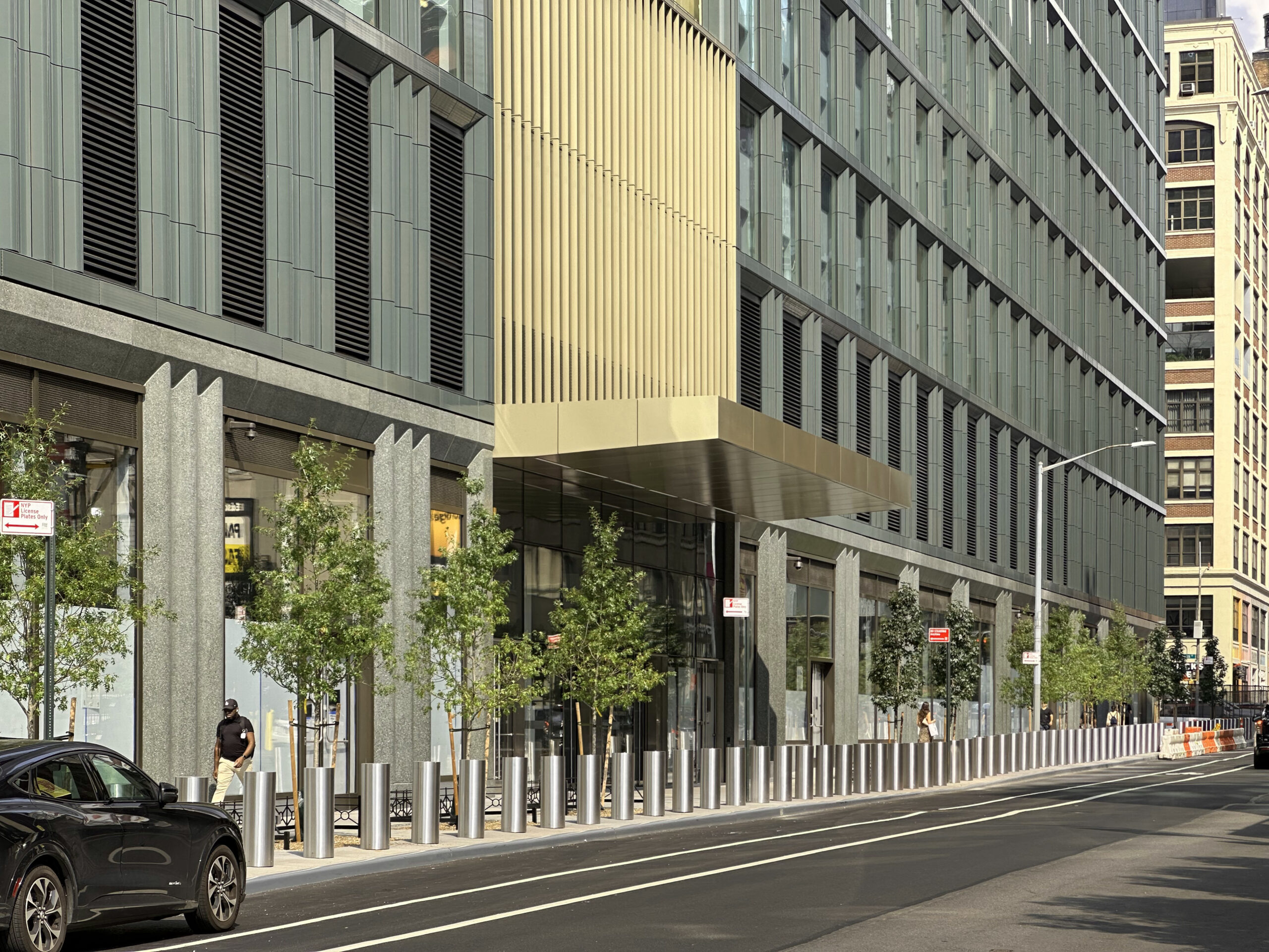
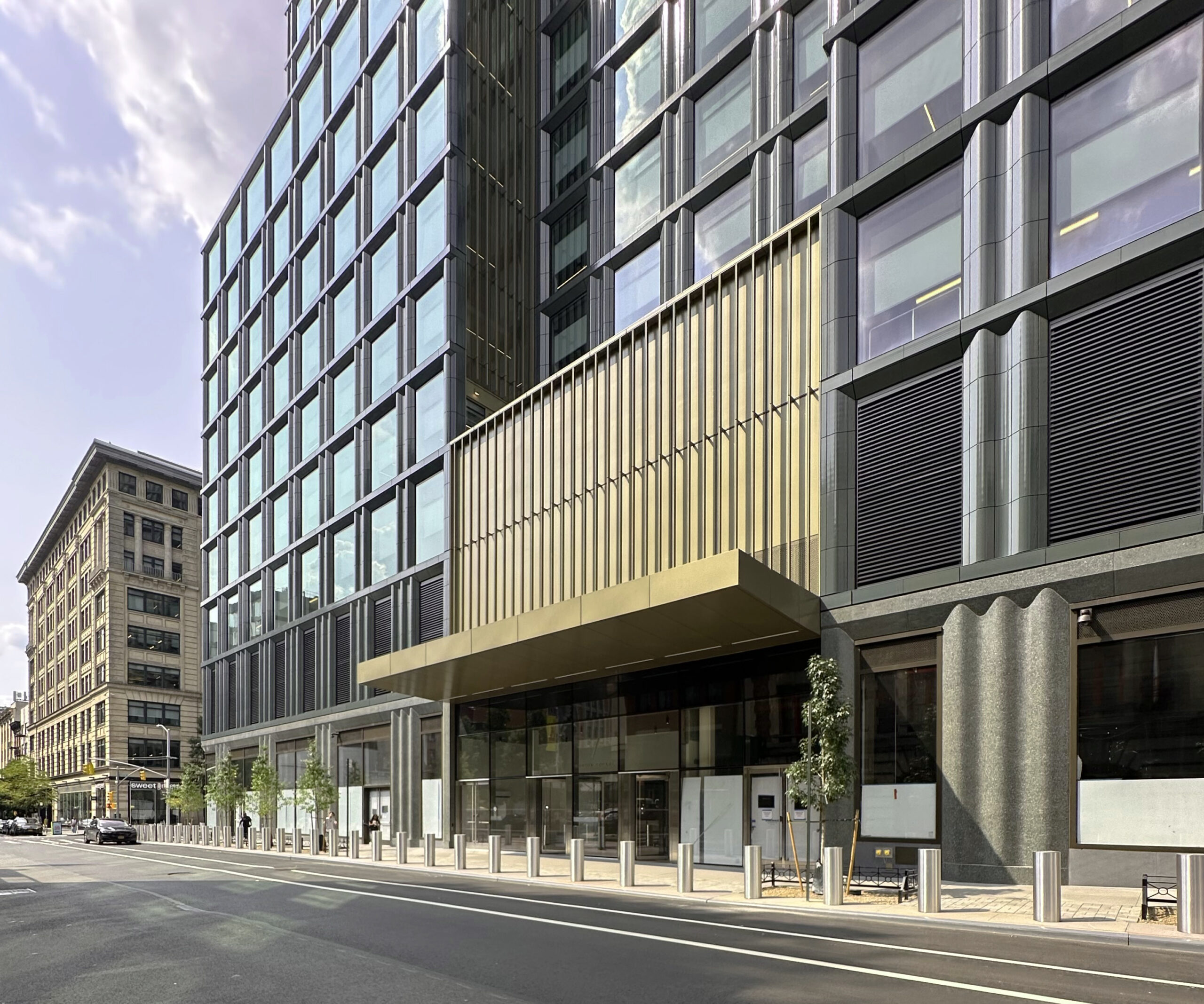
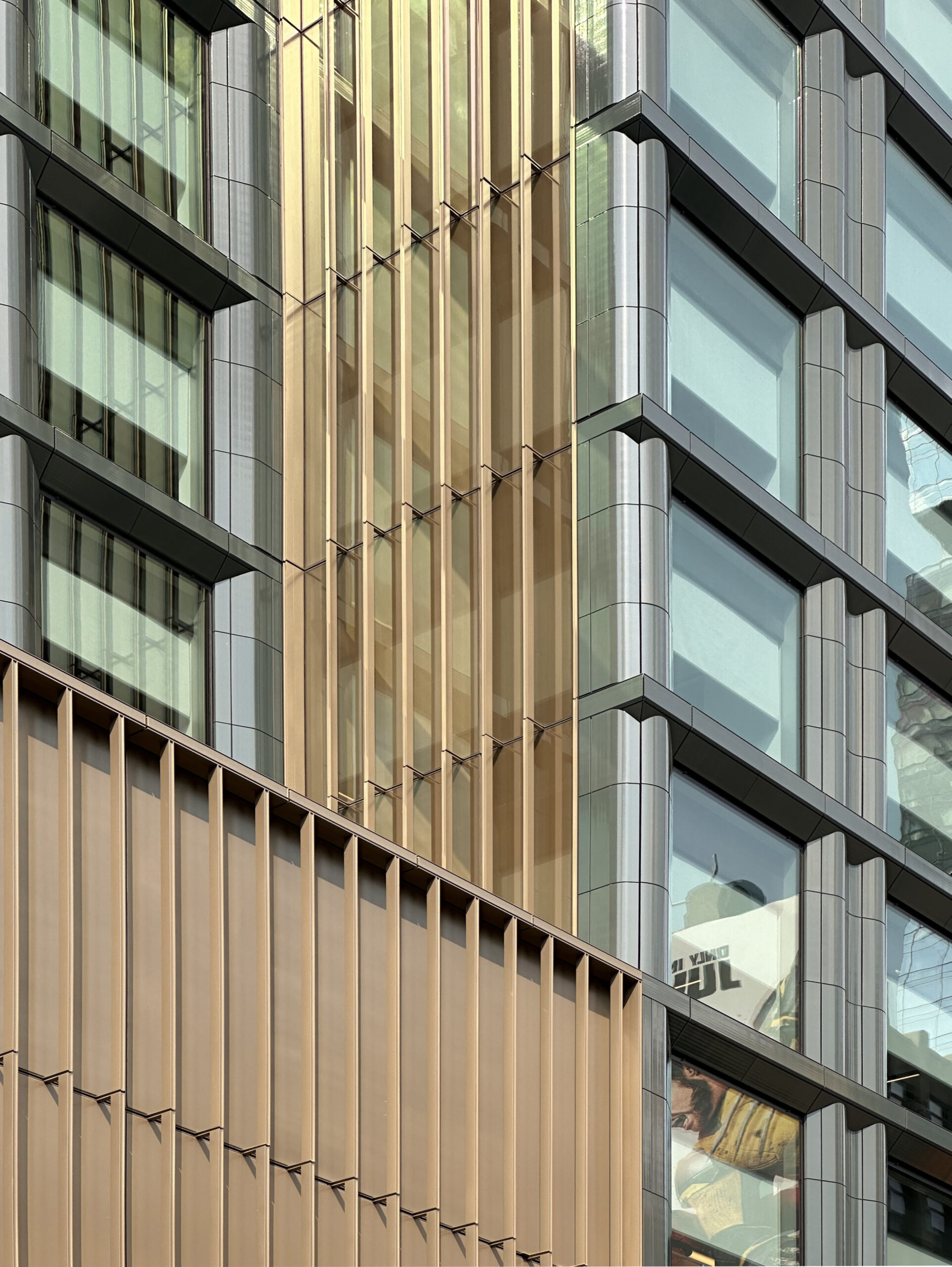
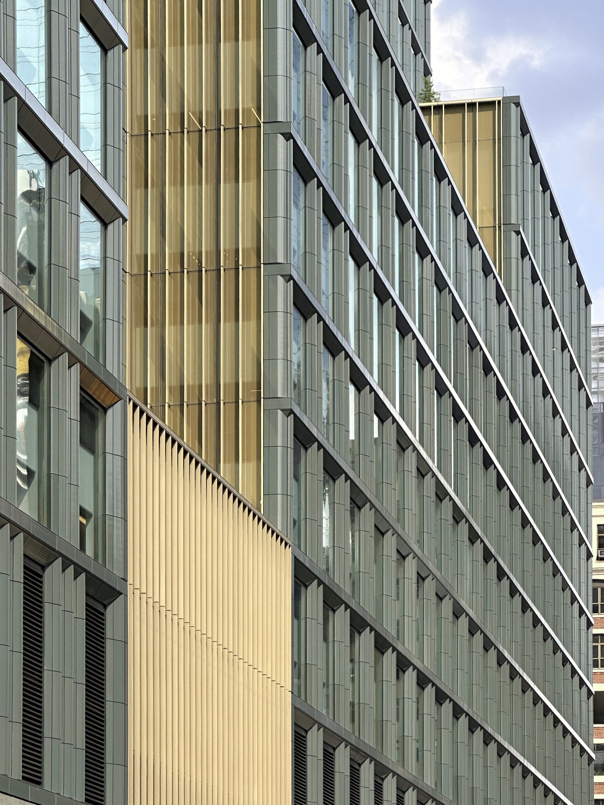
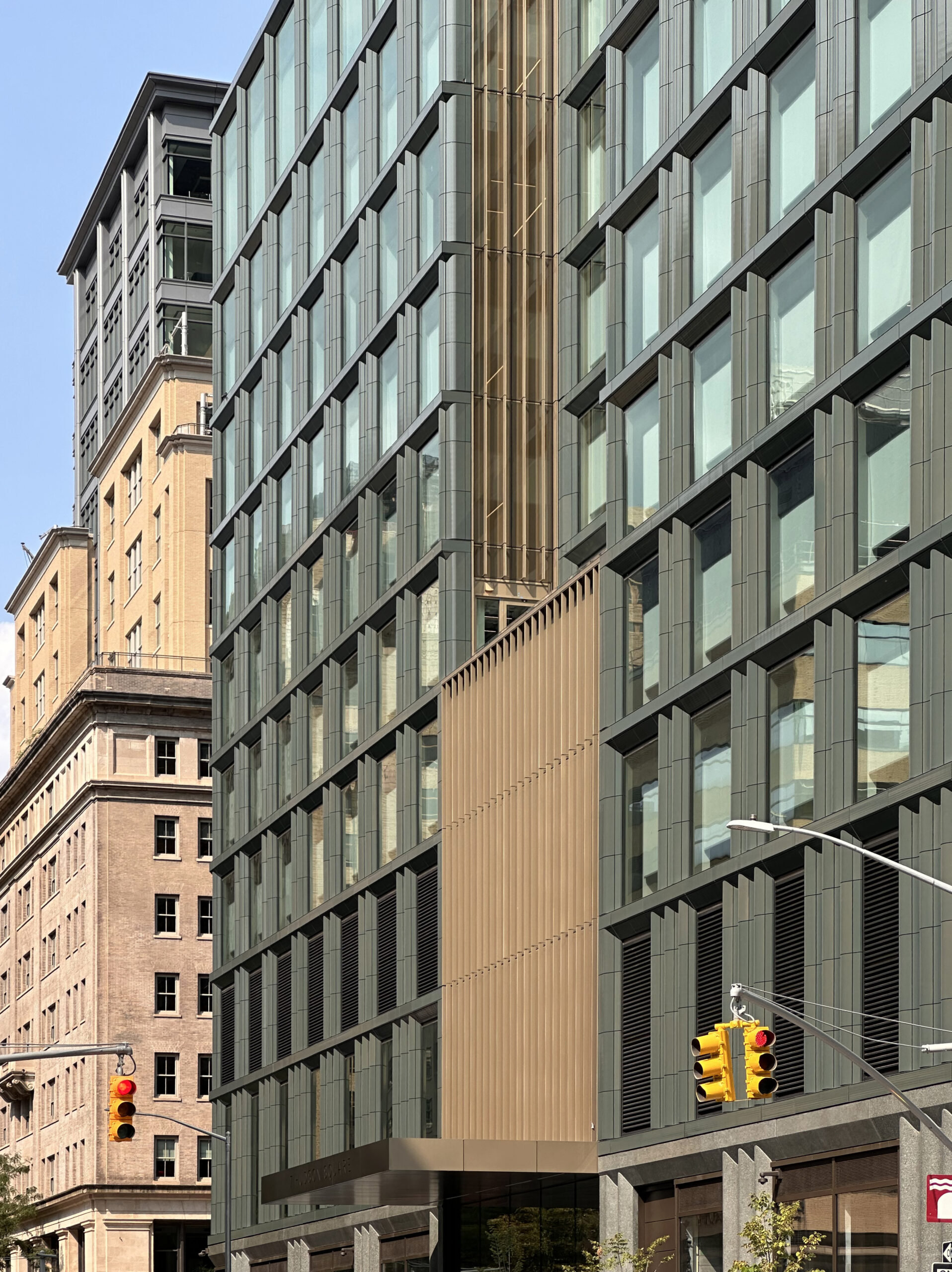
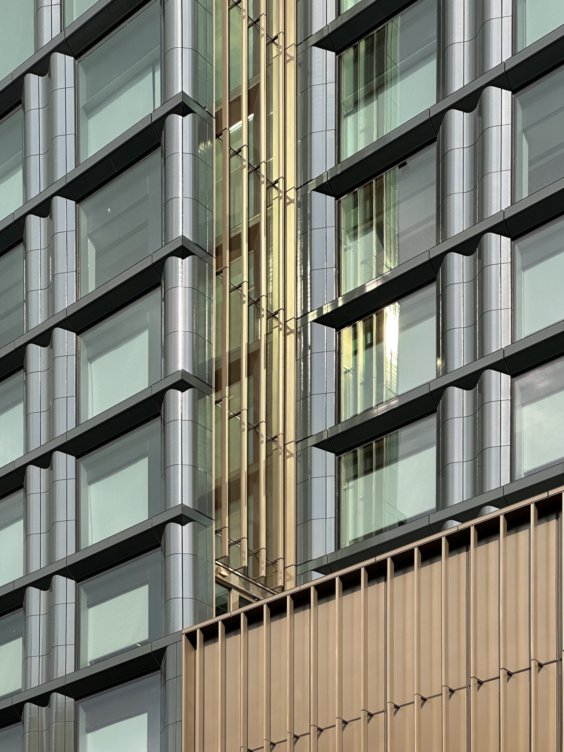
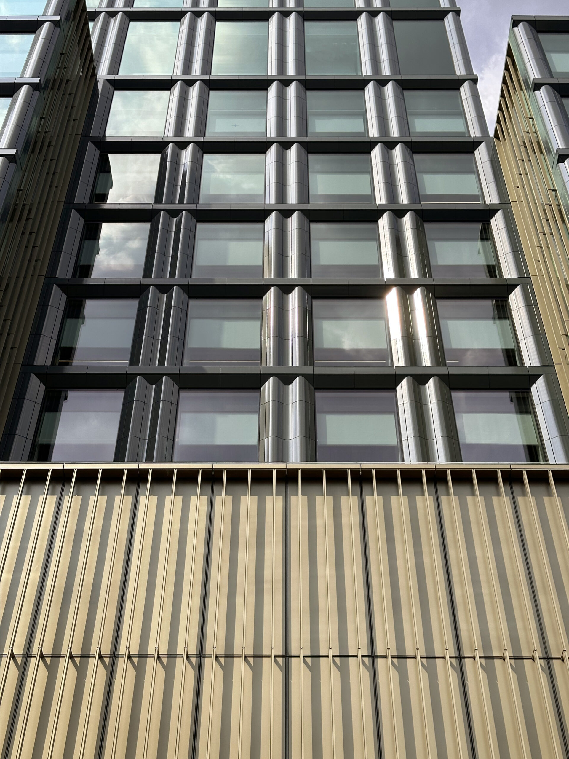
All of the sidewalk sheds, scaffolding, and constructor barriers were removed from the massive site since our last update at the end of February, when much of the ground floor was still largely hidden and obscured. Since then, recent photographs show the finished state of the exterior facade, multiple entrances, and completed sidewalk landscaping with additional bollards going around the eastern, southern, and western elevations.
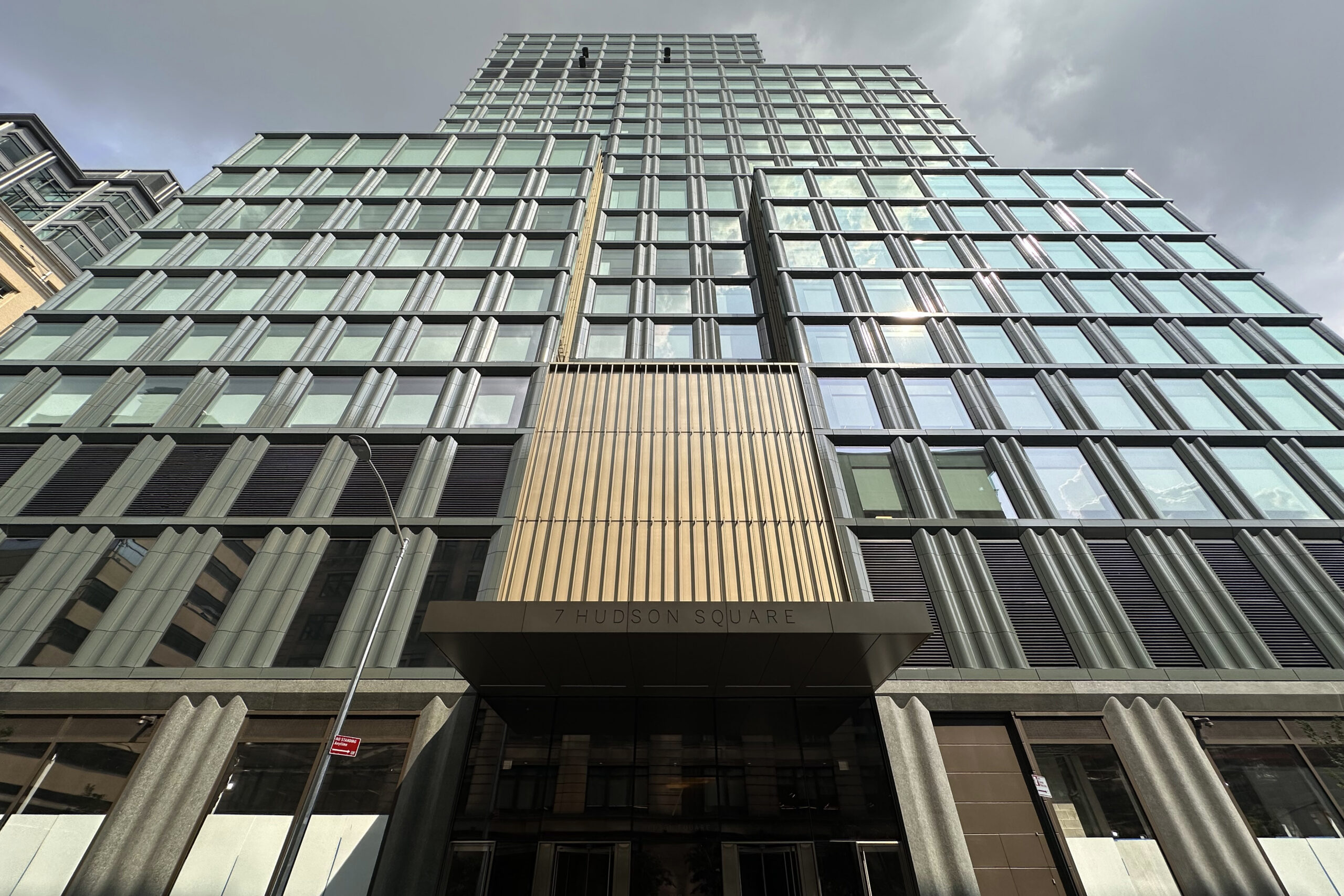
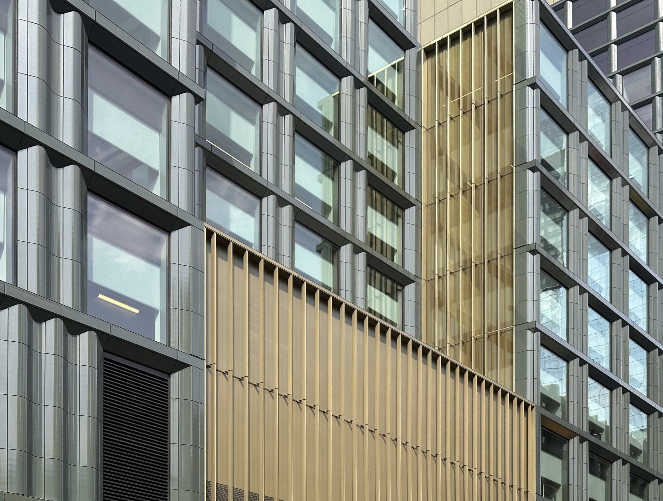
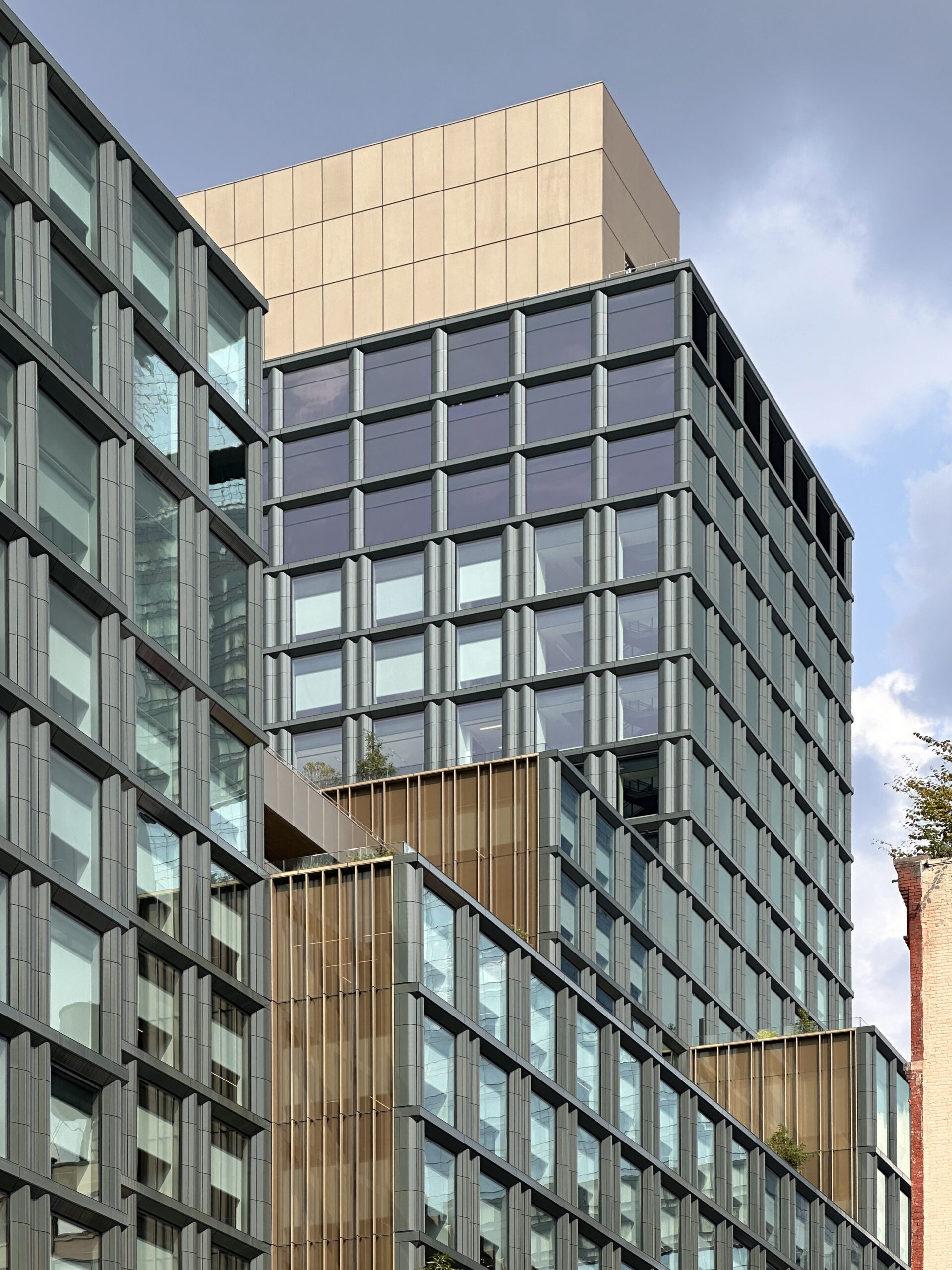
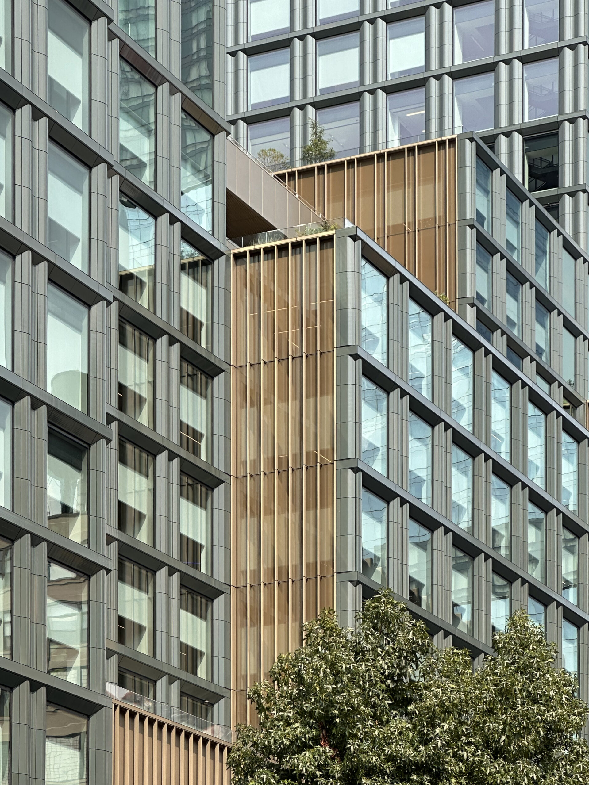
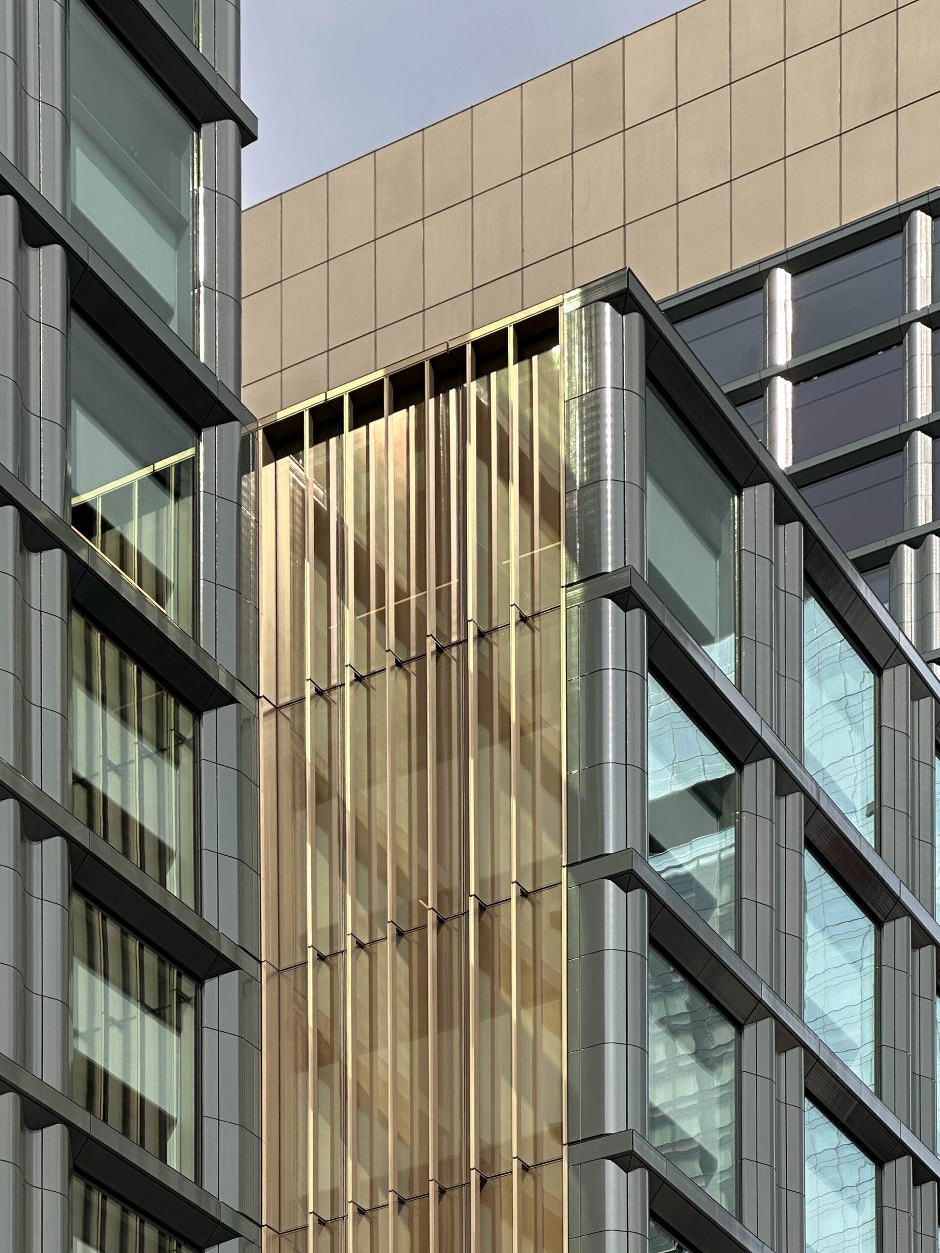
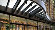
The base of the eastern, southern, and western sides feature the upcoming retail frontage and multiple points of entry tucked beneath identical sets of large canopies composed of bronze paneling. The base of the northern facade is home to multiple loading docks.
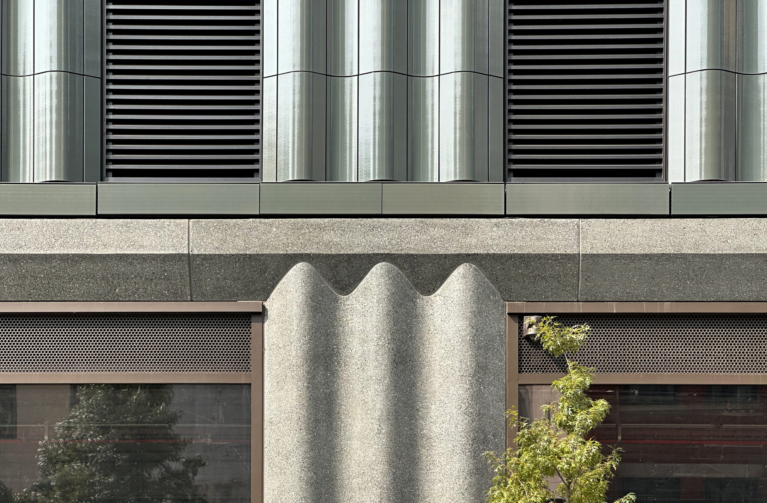
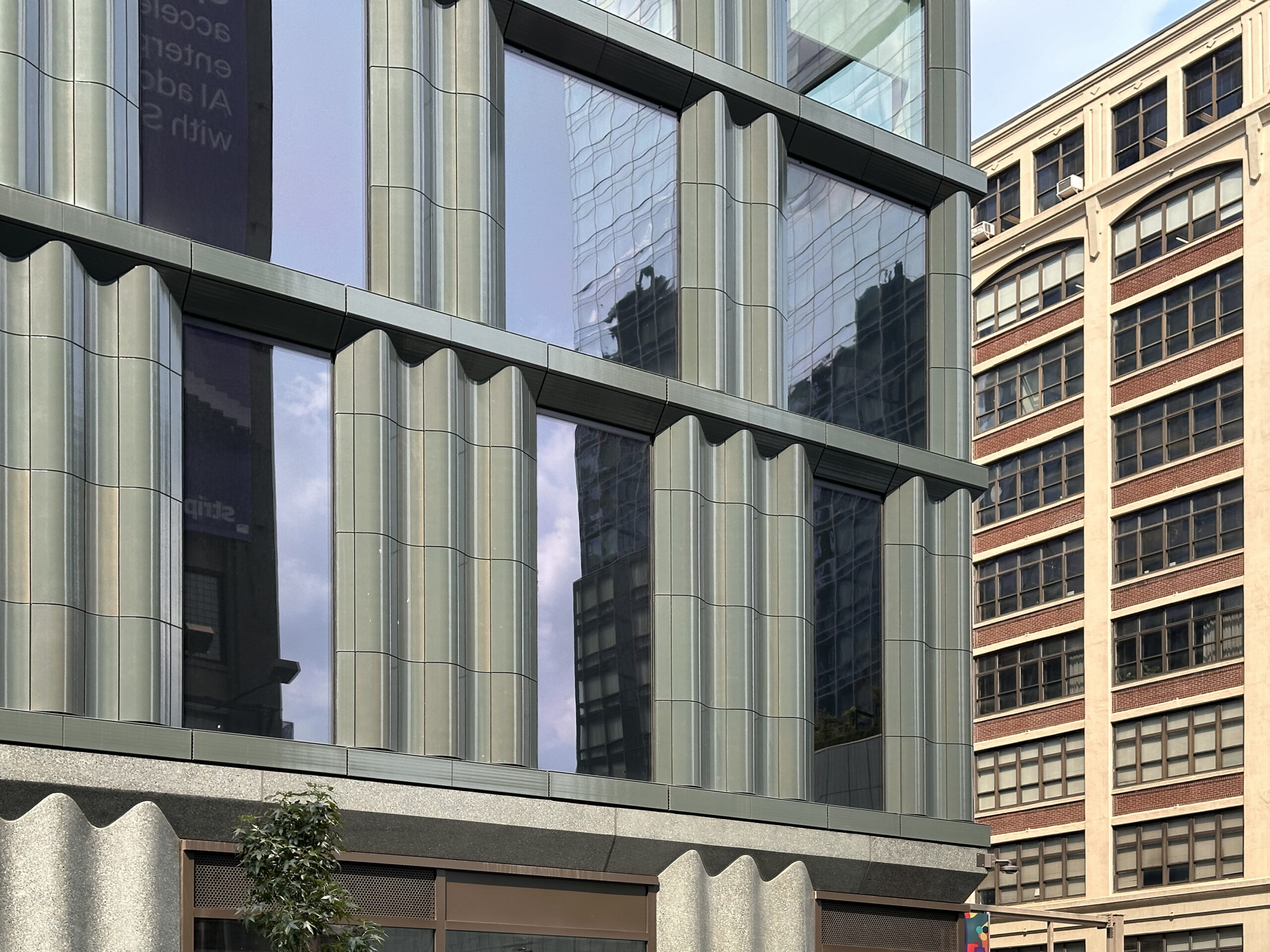
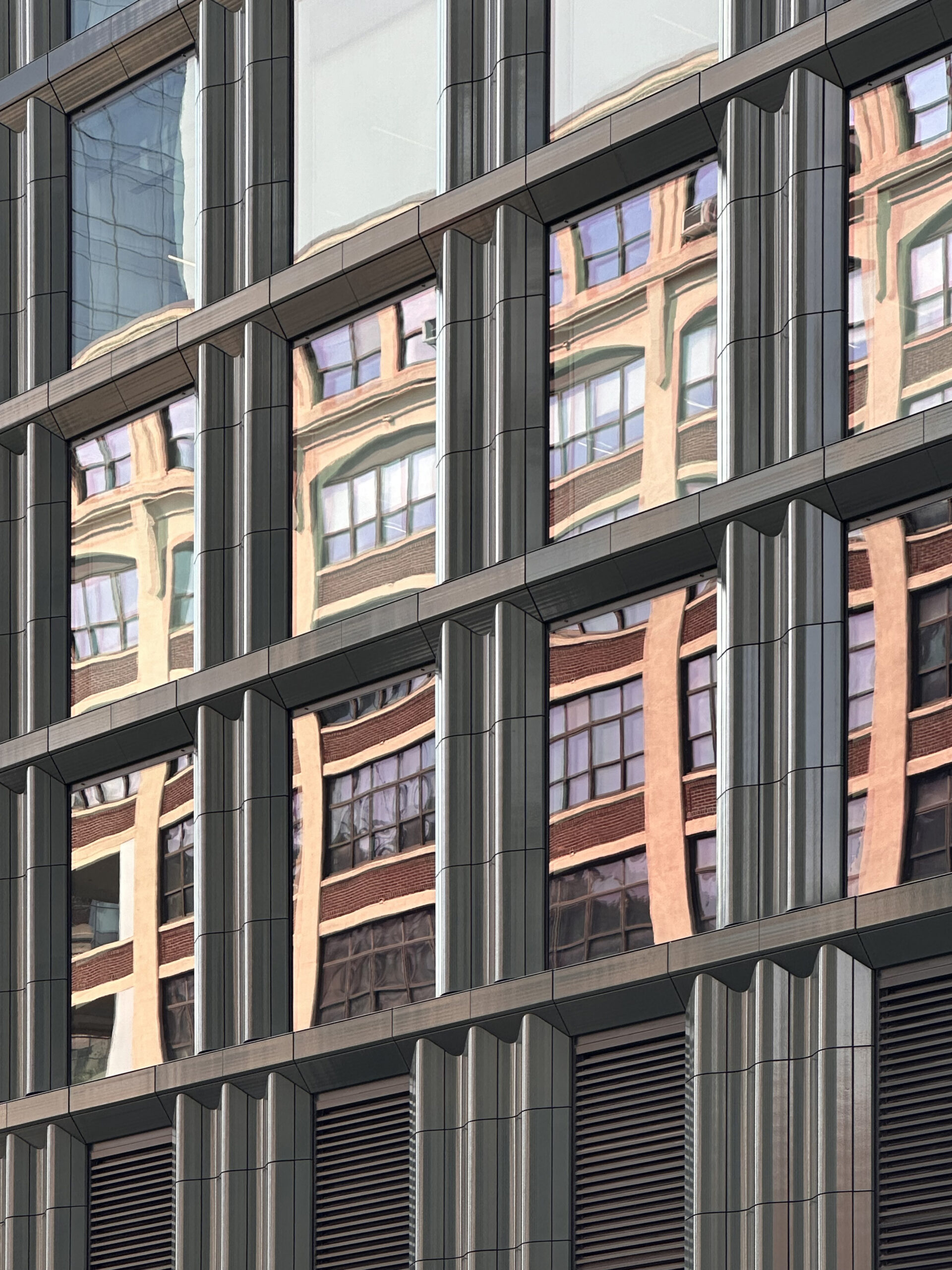
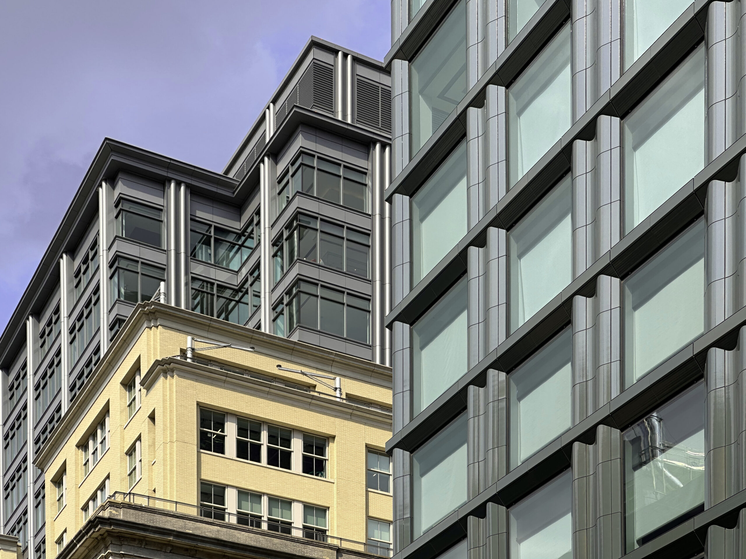
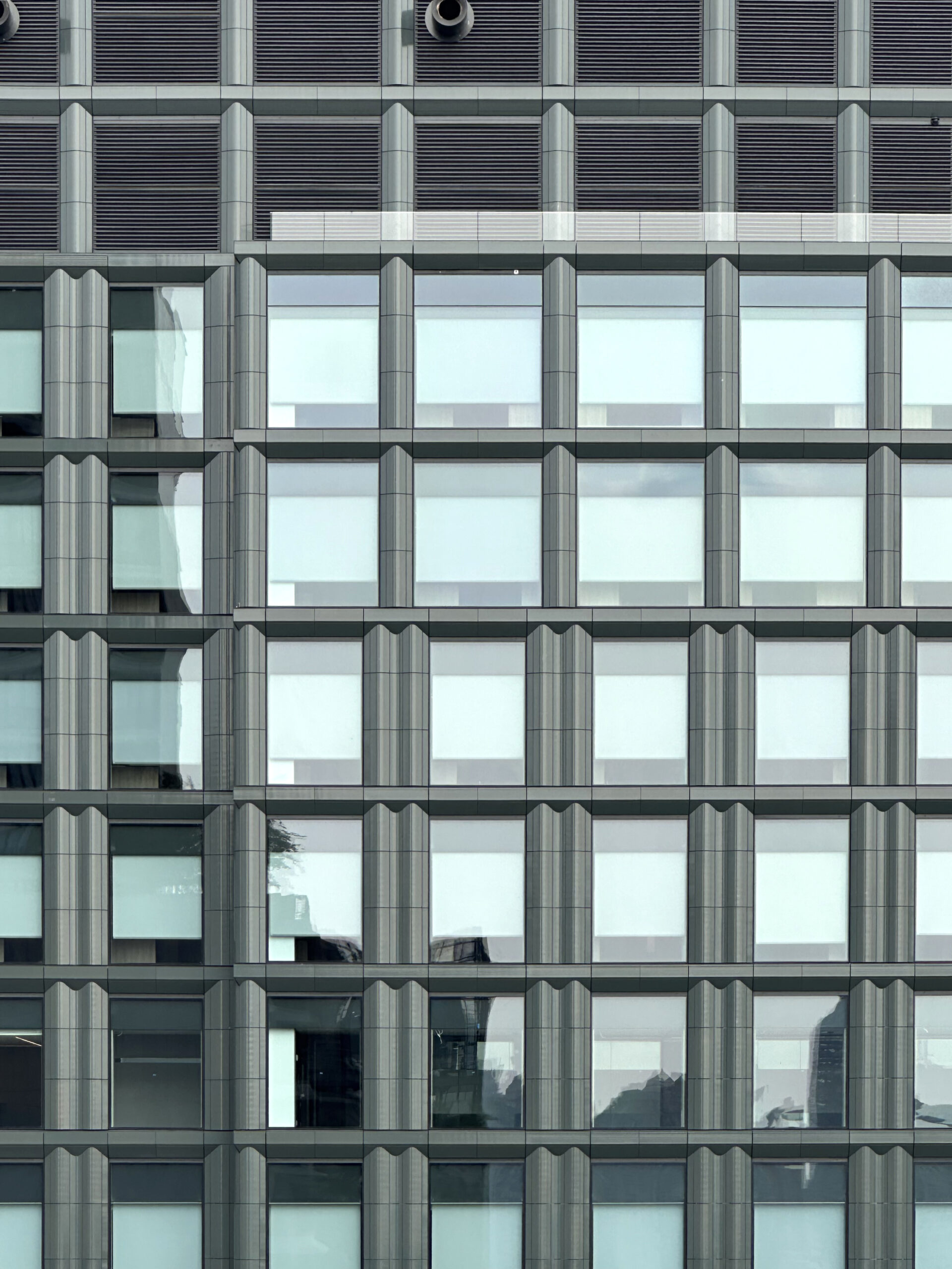
The majority of the fenestration is made up of a uniform grid of oversized floor-to-ceiling punched glass windows, and double- and triple-columned green terra-cotta panels.
The nearest subway stations from the new corporate office building include the Spring Street stop to the east, servicing the C and E trains, and the Houston Street stop to the northeast, servicing the 1 train.
7 Hudson Square is aiming to achieve LEED and Wellness certification. It remains to be seen as to the exact move-in timeline for Disney and ABC staff.
Subscribe to YIMBY’s daily e-mail
Follow YIMBYgram for real-time photo updates
Like YIMBY on Facebook
Follow YIMBY’s Twitter for the latest in YIMBYnews


And as an added benefit, when you step over the threshold, you automatically agree to the terms of service for all Disney affiliates. Trip as much as you like, it’s all on you.
It looks a little blah for a company that is so animated.
Maybe they will do some special effects on certain occasions, they’ve got the tech no doubt! otherwise, you are correct!
it matches their soullless corporate culture these days
I work for TWDC and I can assure you that I, along with my fellow cast members, do indeed have souls. You should appreciate that our company is investing in jobs in the State of NY when that can’t be said about our home base in California.
Beautiful building, even more so in person. Just need those street trees to grow in and this’ll be a tremendous addition to the neighborhood.
It’s a beautiful building. It just doesn’t look like it belongs to Disney. One would imagine a Disney headquarters would be fun… whimsical…
Come to think of it, in another era it probably would have been designed by Michael Graves… So maybe we did dodge a bullet?
I like Michael Graves
Yes, this seems a bit tame for Disney given their architectural preferences elsewhere.
I like the building but again, Disney Headquarters in this building? It looks like a new condo structure. I thought that at least there would be a large, somewhat elaborate “Disney” sign somewhere. There may be a sign in the works that hasn’t been erected yet.
The design is not meant to create a visual centerpiece or conspicuous landmark like Cinderella’s castle in Magic Kingdom; the building is not meant for public use. But yes, at least have one piece of signage to know the main tenant like what Google has in their building by the water
That green terra cotta is absolutely beautiful. Great building.
location location location
where are the grid lock cars on Varick in your pics
LOL
Well duh, anyone who knows the city and Hudson Square knows its always busy on Varick Street because of the entrance to the Holland Tunnel.
Why would Michael bother to take a pic of a giant truck or SUV right in front of his camera and block the view of the building? You clearly didn’t see the cars lined up in the third and seventh pic
LOL
to be fair, other than commuting hours (+ wknd meal time), the area gets dead quiet
JohnG, you know there’s such a thing called red lights, which explains the periodic absence of cars in Michael’s photos? Hope you abide by them and not the kind to run them
It’s beautiful – refined whimsy!
Yes, I would have expected something a bit less ‘corporate’ from Disney, but I’m naive..
Everyone is complaining about the unimaginative corporate office for Disney. Have any of you seen the main Disney headquarters in Burbank California? Look it up.
Love the closeup shots showing the details!
I’m glad the architecture doesnt scream Disney though. A whimsical design might look too garish for the neighborhood and surrounding buildings
And nothing, not even a Mouse to identify the building as Disney on the exterior. What gives?
Messy.
Part of the Building should’ve been used as a Family Homeless Shelter. Mickey and Minnie Mouse could’ve visited the families.
why do we need homeless shelter in the middle of one of the most expensive neighborhoods in the whole world
Holy bollards!
It’s quality materials and detailing, but all that green becomes a bit monotonous and it would be nice if a different accent color was thrown in.
Walt Disney is not only about a Mouse in the House. They also are ESPN, FX, ABC, Marvel, HULU, National Geographic and many more entities. If you want color and some whimsy take a look at the colorful artwork located on the Traffic Gantry on Varick Street side in the middle of the Disney building. Thank you Hudson Square Bid and the hard working staff for the difficult job of accomplishing this. It was often said that it would never happen due to the difficult hurdle of resistance from an alphabet soup of Agencies like NYPD, Port Authority, Homeland Security, DOT and contrarians in general
HQ of Credit Suisse? Sleek.
HQ of Walt Disney? Dour.
Are the ABC studios on 66th Street moving here as well or just the offices? I have heard that the Disney/ABC/ESPN offices on 66th have now emptied out, but the studios (The View/Live With Kelly and Mark) remain up on 66th for the time being. Silverstein was going to re-develop that as condos, but sold the studio buildings to Extell. I wonder what the future holds for West 66th Street?
I was watching “The View”, and they announced they are moving into their new studios at the beginning of new season, first week of September. I also believe that “Live with Kelly and Mark”, and the “Tamron Hall” show are also moving. Not sure about ABC’s “Good Morning America” or “World News Tonight”? I read somewhere they will move into a basement level studio space?!
As for this new building, I’ve seen MOUSE TRAPS that had more creativity and whimsy!
This building is a remarkable architectural achievement, seamlessly blending into its historic neighborhood while making a distinct, modern statement. The use of terra-cotta pays homage to a timeless material, but it’s the innovative curvature that reinterprets this classic element, offering a fresh perspective on traditional architecture. The building’s design does not overly emphasize its exterior, instead integrating it as a cohesive part of the neighborhood’s fabric. This subtlety allows the structure to adapt to its surroundings, aligning with the needs of its corporate occupants.
Inside, the building houses several broadcasting facilities, a feature that is nearly imperceptible from the outside—a testament to the thoughtful design. Congratulations are due to the architects and developers at Disney for their vision in placing such an iconic company within this tranquil neighborhood. Their work has introduced a touch of whimsy to Hudson Square, adding to the area’s charm and enhancing the livability of the city.
It is a very handsome building. And it was developed (built) by Silverstein in collaboration with Disney and with Disney as at least the major tenant. As is happening now, should Disney’s needs change and the building seeks a new tenant, it will be acceptable to other types of users.
It literally reflects well the adjacent existing buildings.
Bravo SOM and Silverstein.
The terra cotta is swell.
This is shockingly unimaginative for a Disney project. Or it would have been in the old days, before Disney turned into just another bland corporate money machine. Oh, wait! This design is appropriate after all!
Terra cotta does swell as the owners of the Woolworth Building discovered to their grief. This was a very slow process, but resulted in the bulging of some of the panels from the 3,400 psi pressure which was discovered in 1983. That is unlikely to happen in newer buildings with expansion joints.
Exterior facade is a masterpiece.
There’s a hint of Walt Disney to be seen here, on green terra cotta and bronze panel: Thanks to Michael Young.
Only someone like Bob Iger, the top producer of the View and ABC news would name a building after himself.