It was back in January that the Landmarks Preservation Commission approved exterior modifications that will allow 1 Wall Street, the 1931, 50-story-tall, Ralph Walker-designed office building at the corner of Broadway in the Financial District, to be converted to residential use. Well, almost all of the modifications. One sticking point was signage, and on Tuesday, the LPC approved that.
The building initially served as the headquarters for the Irving Trust Company, later Bank of New York and BNY Mellon. They moved over to Brookfield Place and their now former home will be 524 apartments, plus two retail spaces (one in the magnificent Red Room), developed by Macklowe Properties and designed by Robert A.M. Stern Architects and SLCE Architects.
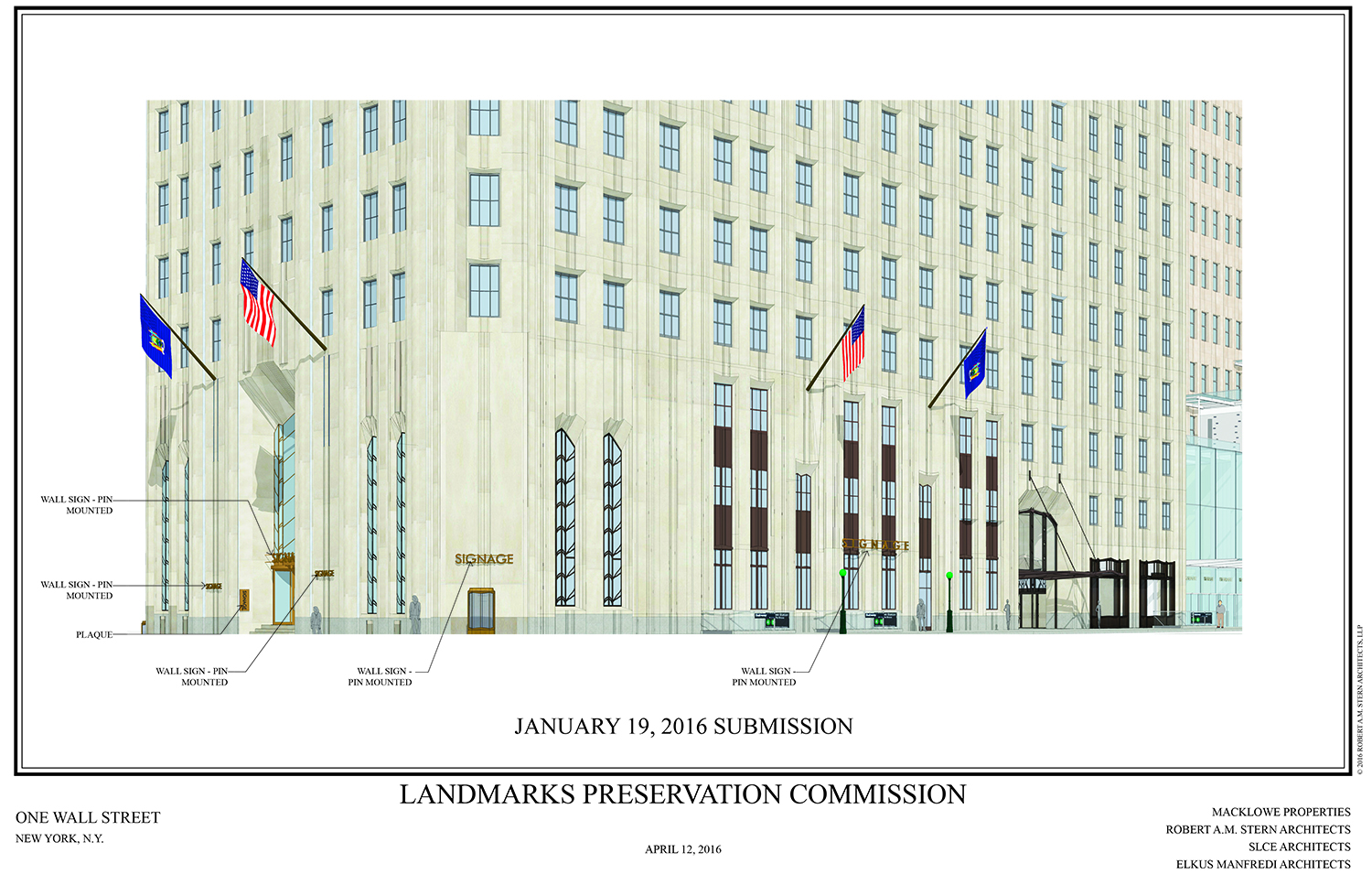
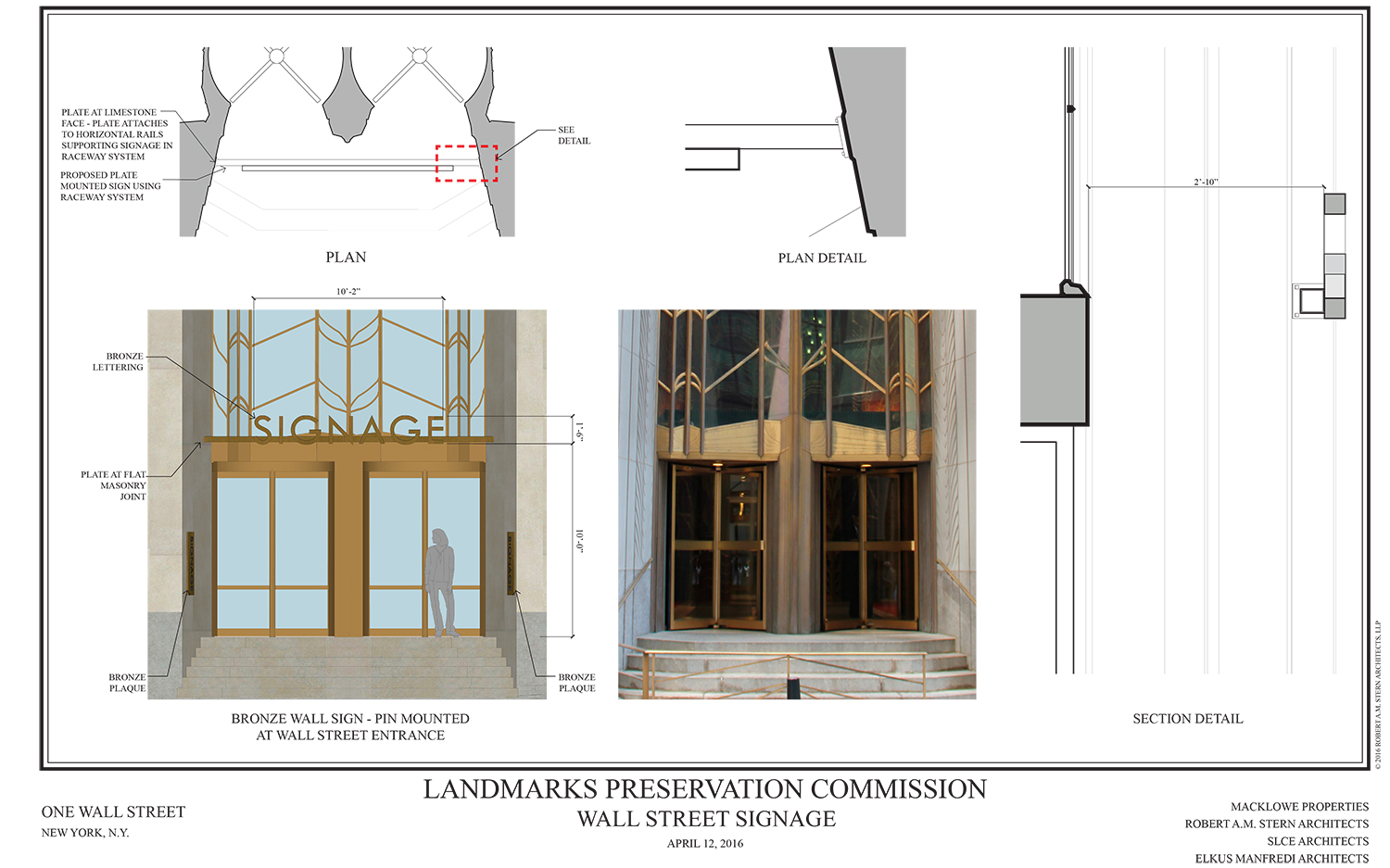
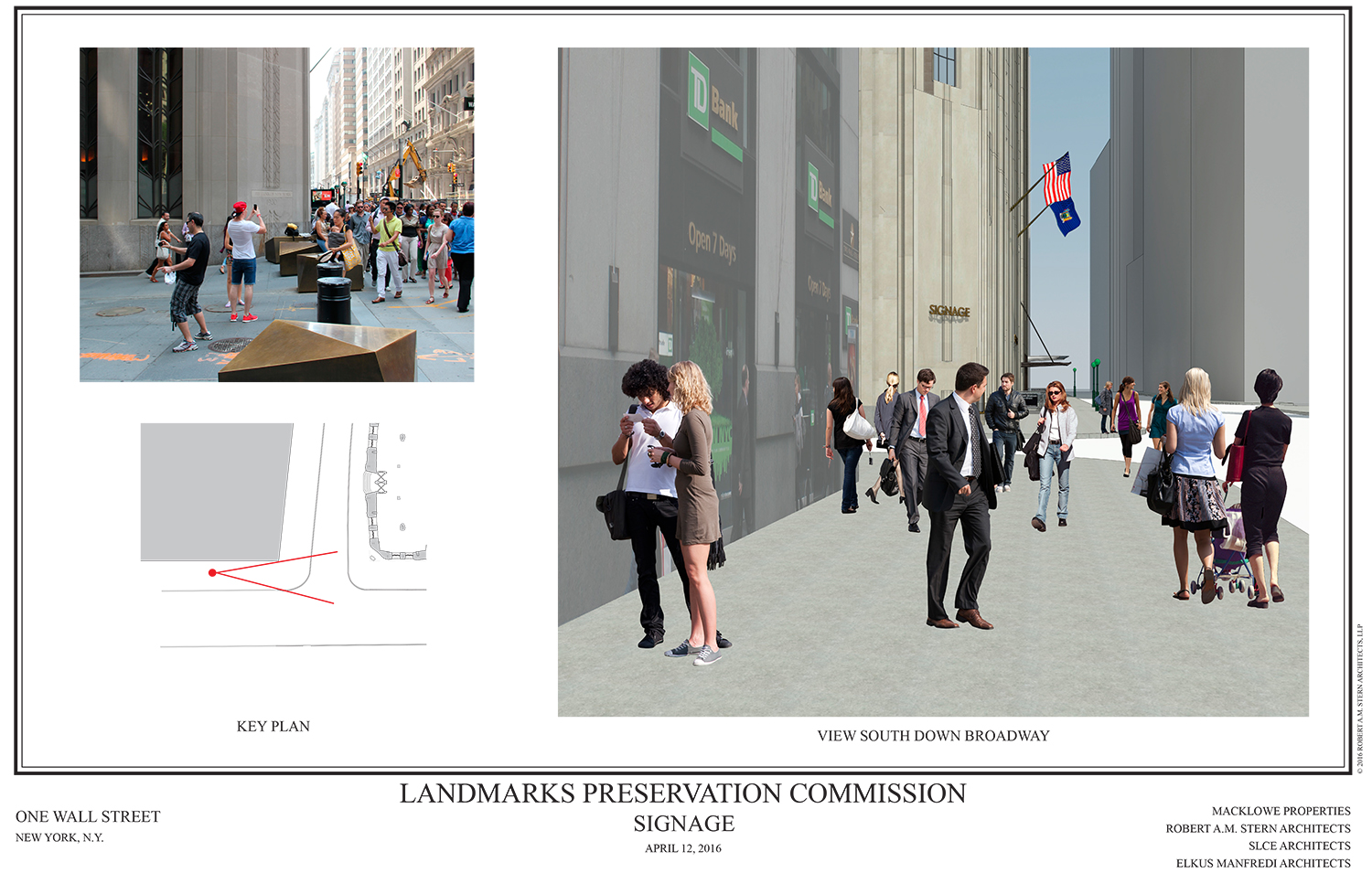
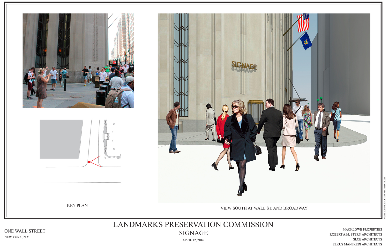
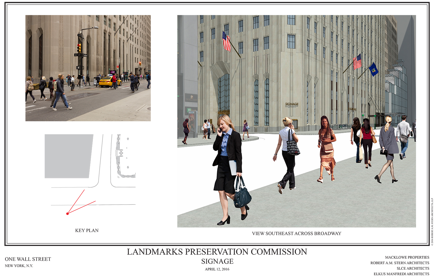
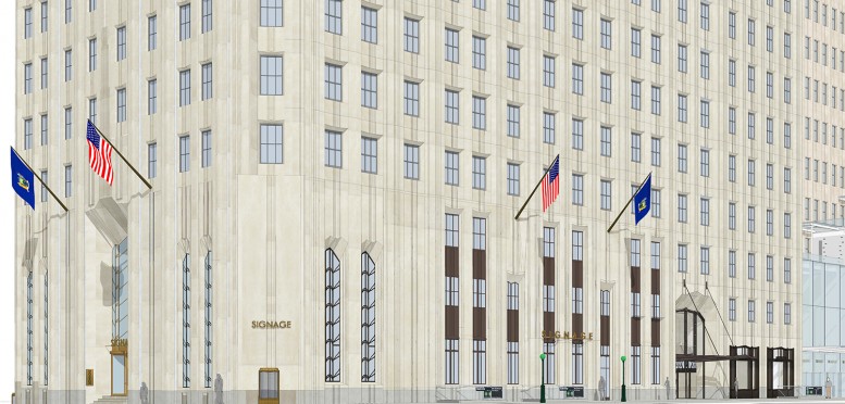
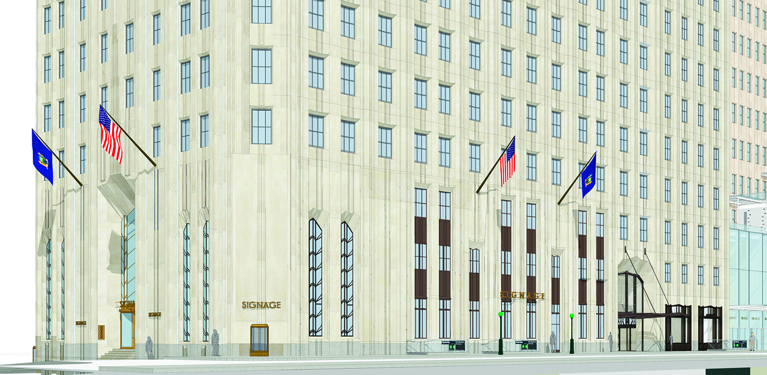
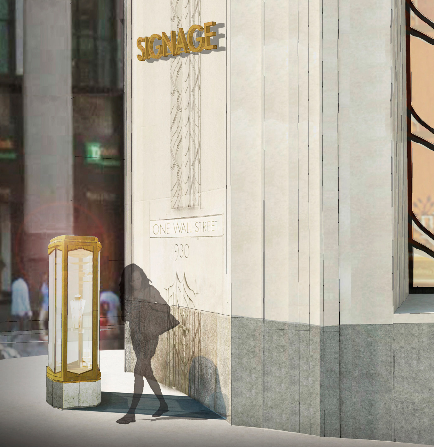
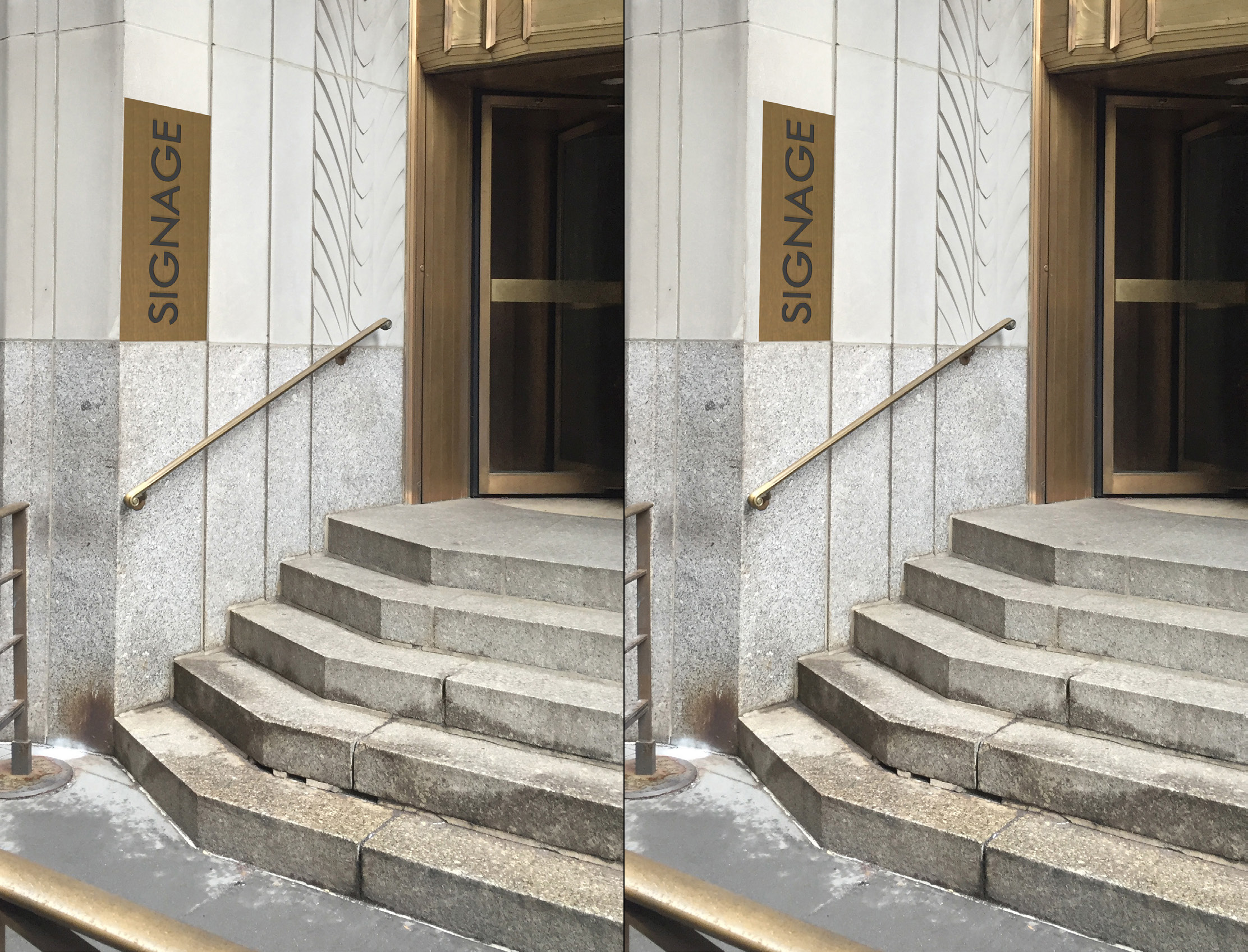
In the January submission to the LPC, the plan was for one sign along Broadway, another on the corner, one on each side of the Wall Street entrance, one at the Wall Street entrance, and two plaques alongside the Wall Street entrance. Also planned are flags on both faces and a vitrine on the corner.
The new submission eliminated the signage on each side of the Wall Street entrance.
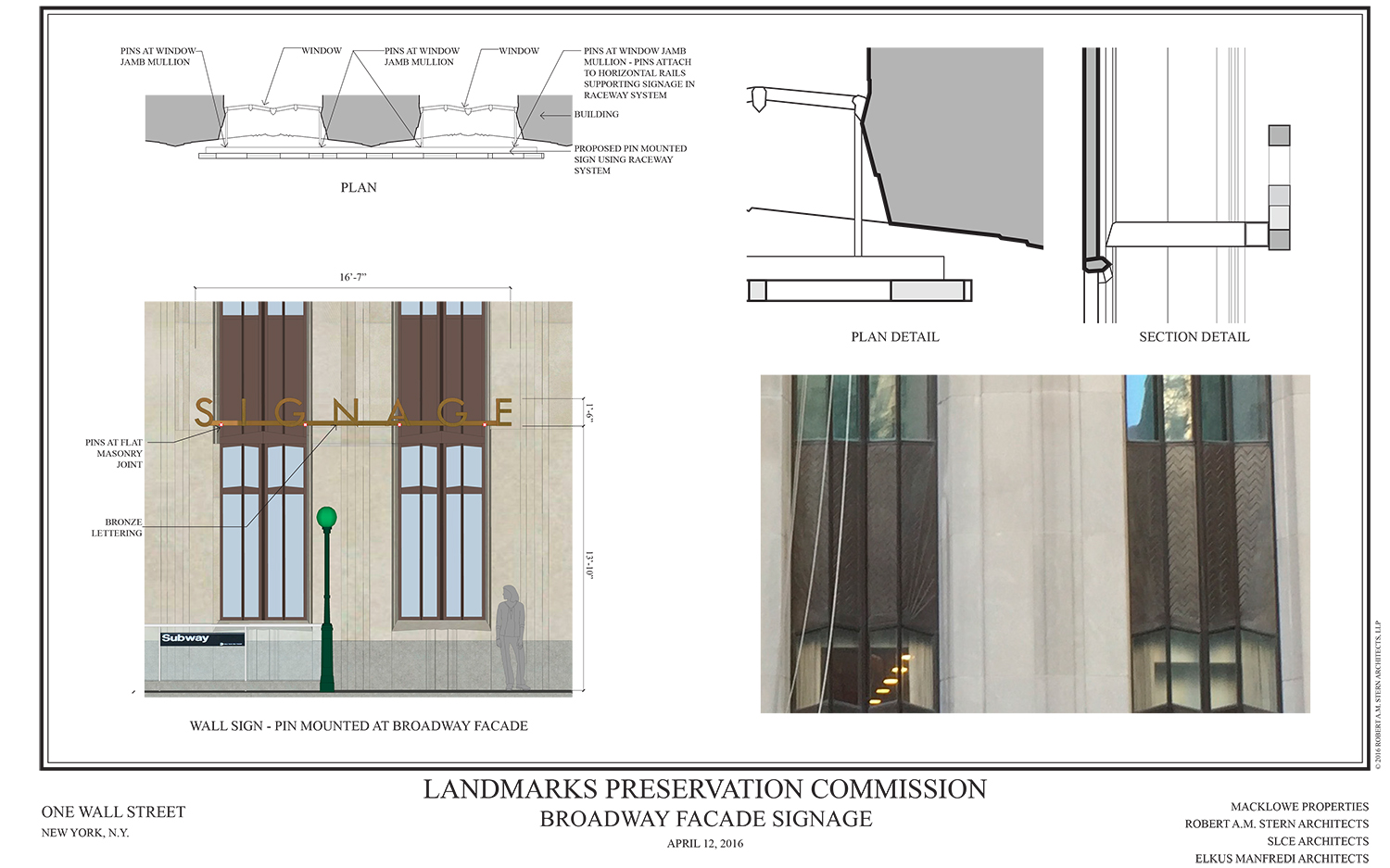
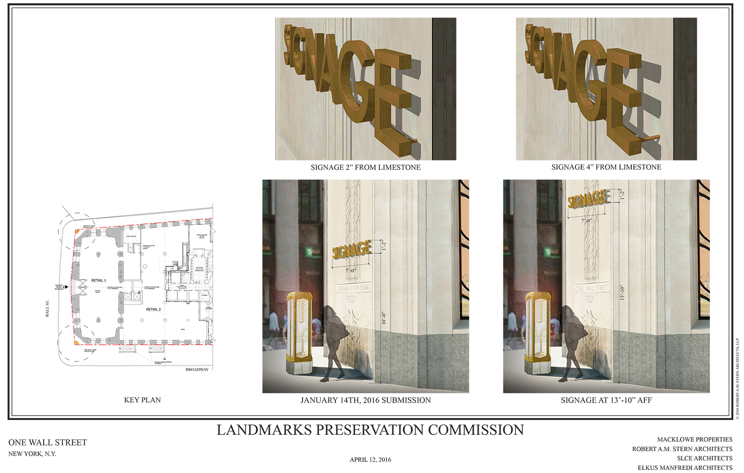
The new submission raised the pin-mounted corner sign from 10 feet off the ground to 13 feet, 10 inches, plus it took it from two inches off the limestone to four inches off the limestone. Additionally, the carved sign below it would be changed from “BANK OF NEW YORK” to “ONE WALL STREET.”
Finally, the plaques on wall Street would be shrunk from one foot, five inches in width to one foot, two inches in width, so as to better show off the corner there.
LPC Chair Meenakshi Srinivasan called the revised submission “much improved,” but said the corner sign was not appropriate. Commissioner Michael Devonshire voiced his agreement with her.
Several commissioners voiced their displeasure with the proposed retail vitrine on the corner. Commissioner Frederick Bland said he liked it, but believes the developer will eventually have to remove it because too many people will run into it.
In the end, the commissioners voted to approve the signage proposal, but without the pin-mounted sign on the corner of the building. That will better show off the beautiful moulding.
View the full presentation slides here:



Subscribe to YIMBY’s daily e-mail
Follow YIMBYgram for real-time photo updates
Like YIMBY on Facebook
Follow YIMBY’s Twitter for the latest in YIMBYnews

Premium and shapely design on the building, this mountain of concrete is shine.