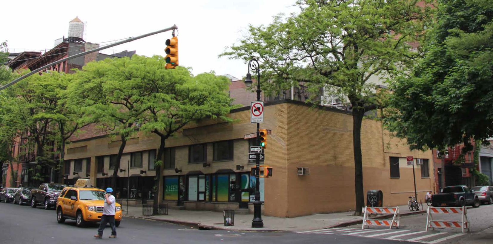
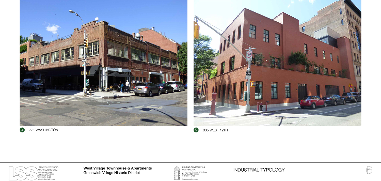
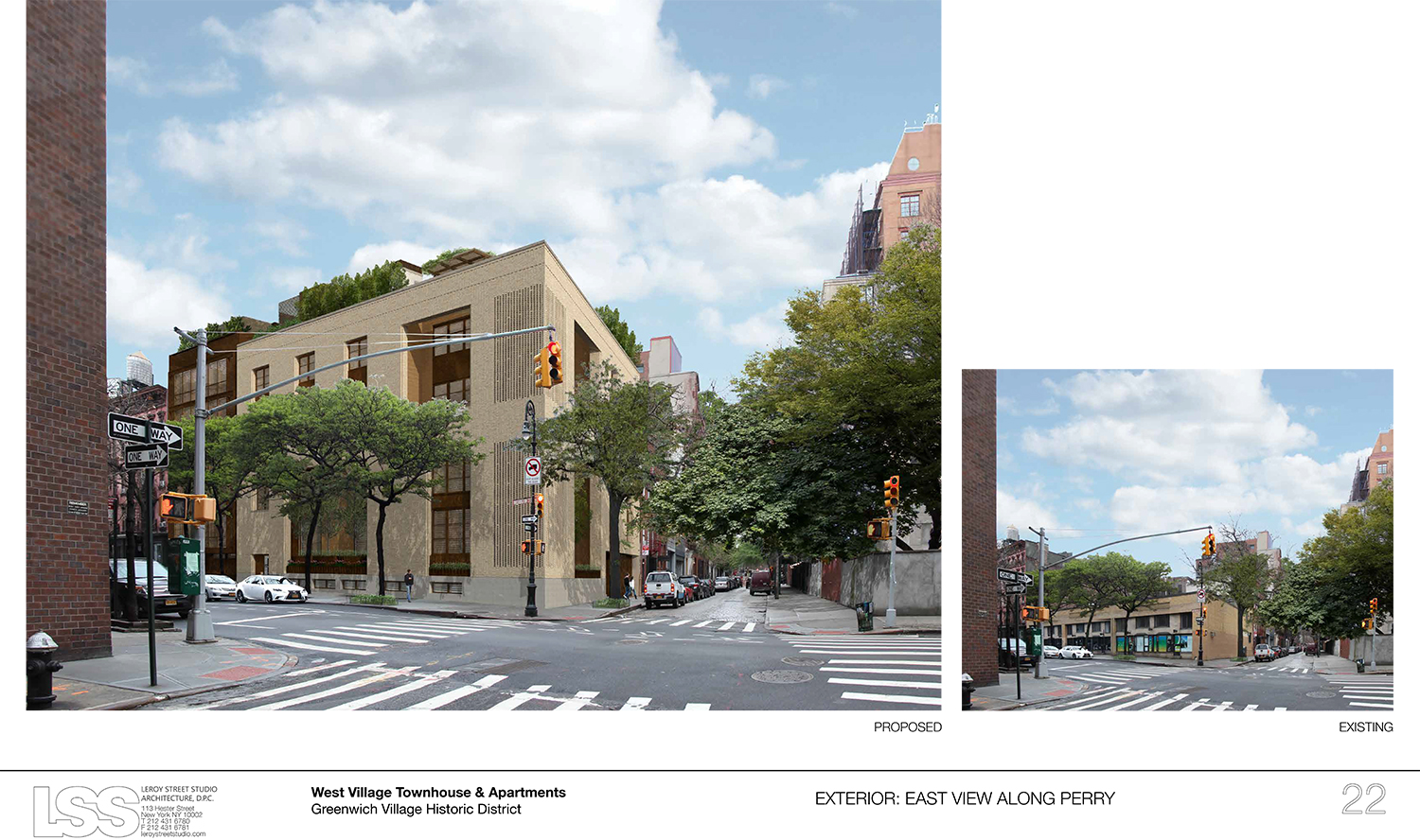
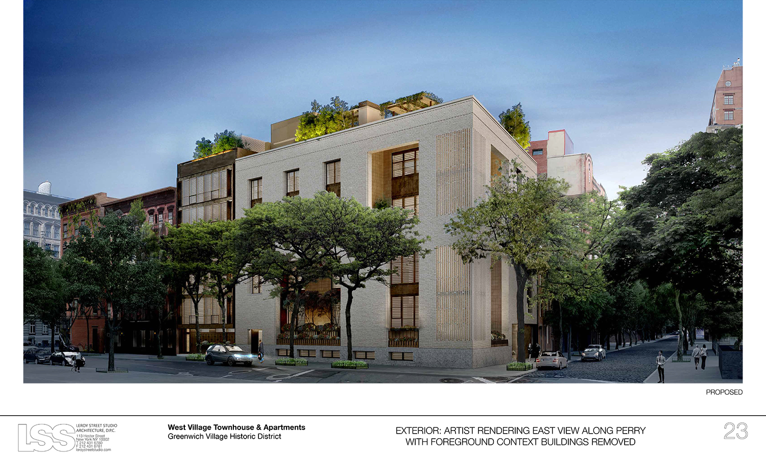
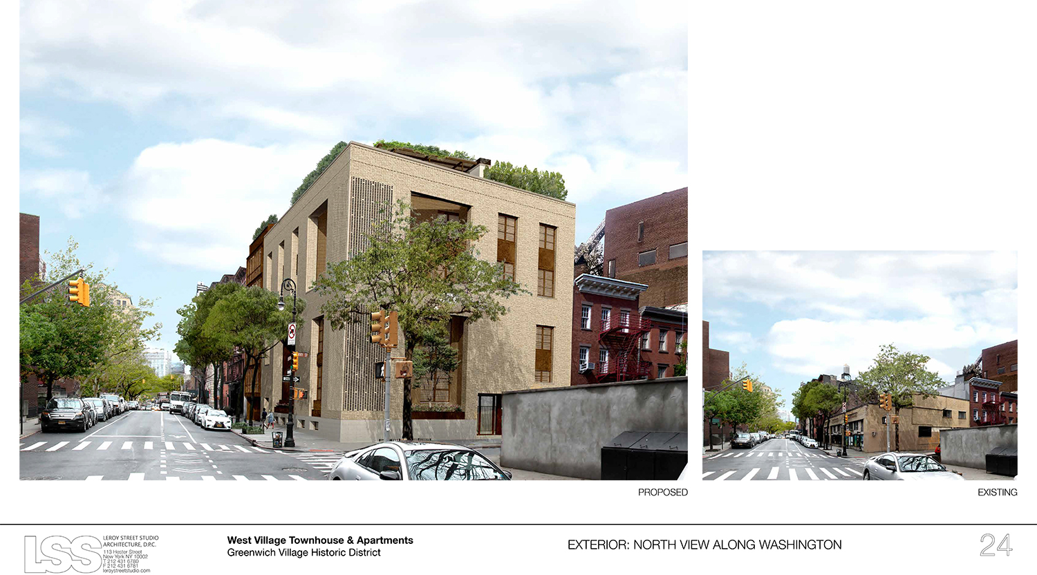
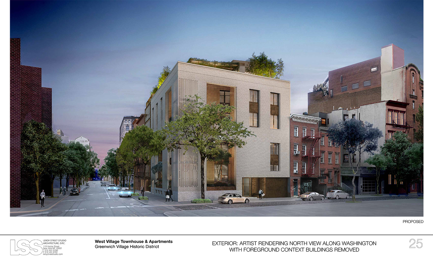
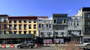
A former garage in the West Village is yet again set to make way for new development. On Tuesday, the Landmarks Preservation Commission approved the demolition of the two-story building at 145 Perry Street, a.k.a. 703-711 Washington Street. In its place will be an apartment building and a mega-mansion.
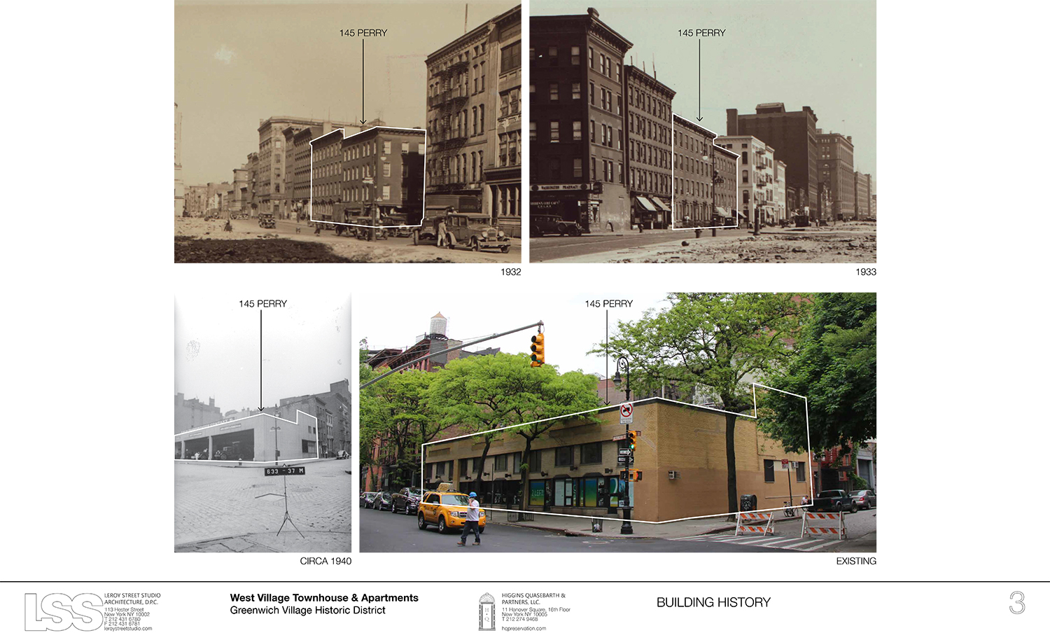
Before we go on to the new building, here’s a few words about the garage. It was built in 1937 and fell under the LPC’s jurisdiction in 1969, with the designation of the Greenwich Village Historic District. In 2008, the commission approved a hotel for the site. In 2009, it approved a residential building. Neither came to fruition.
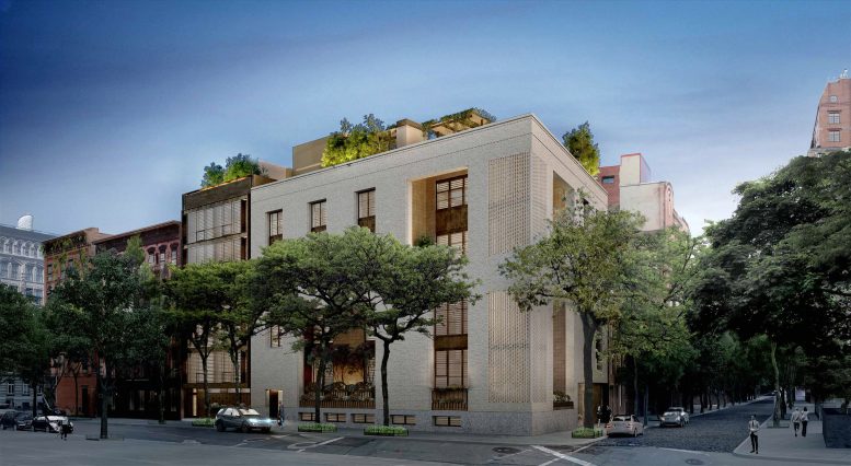
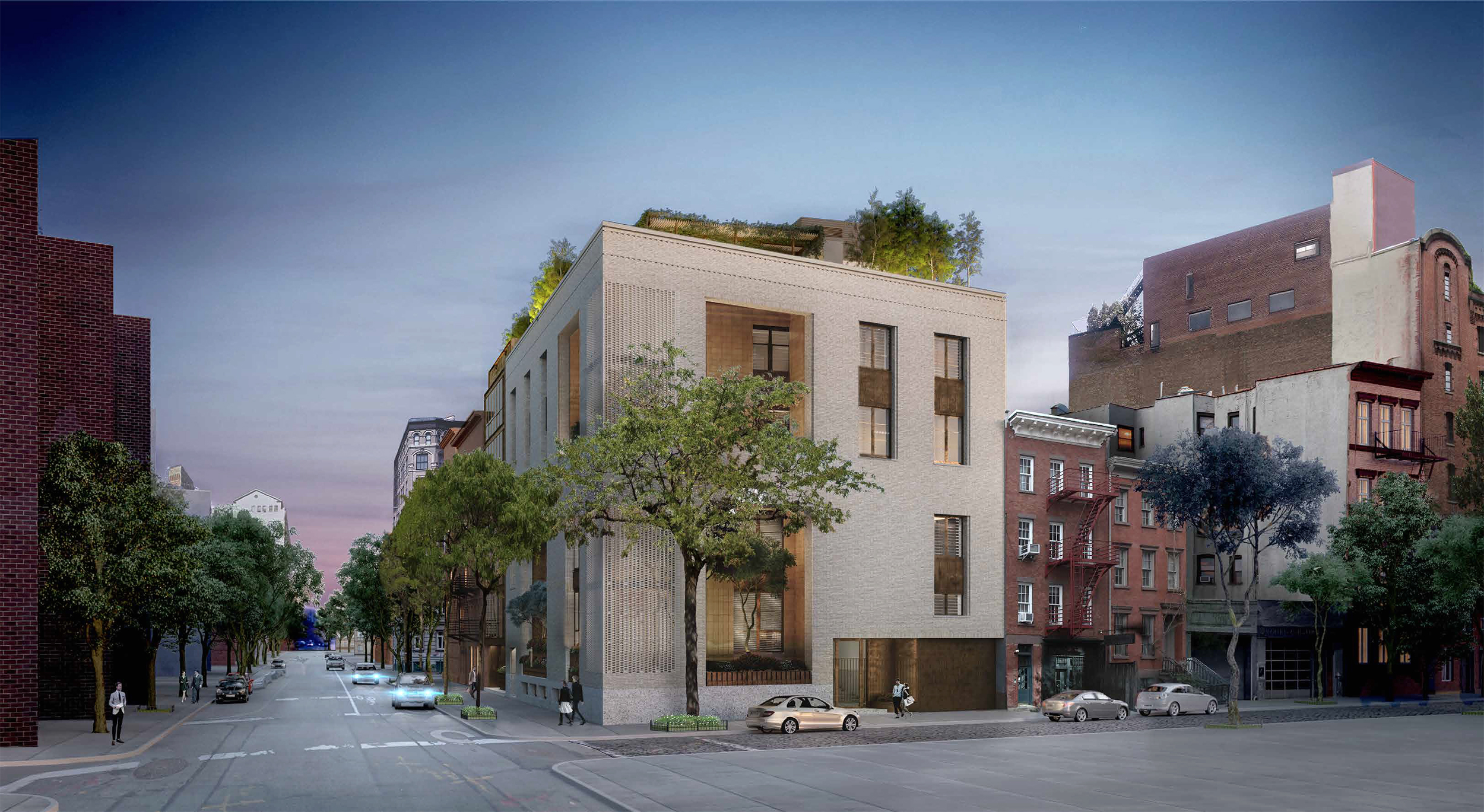
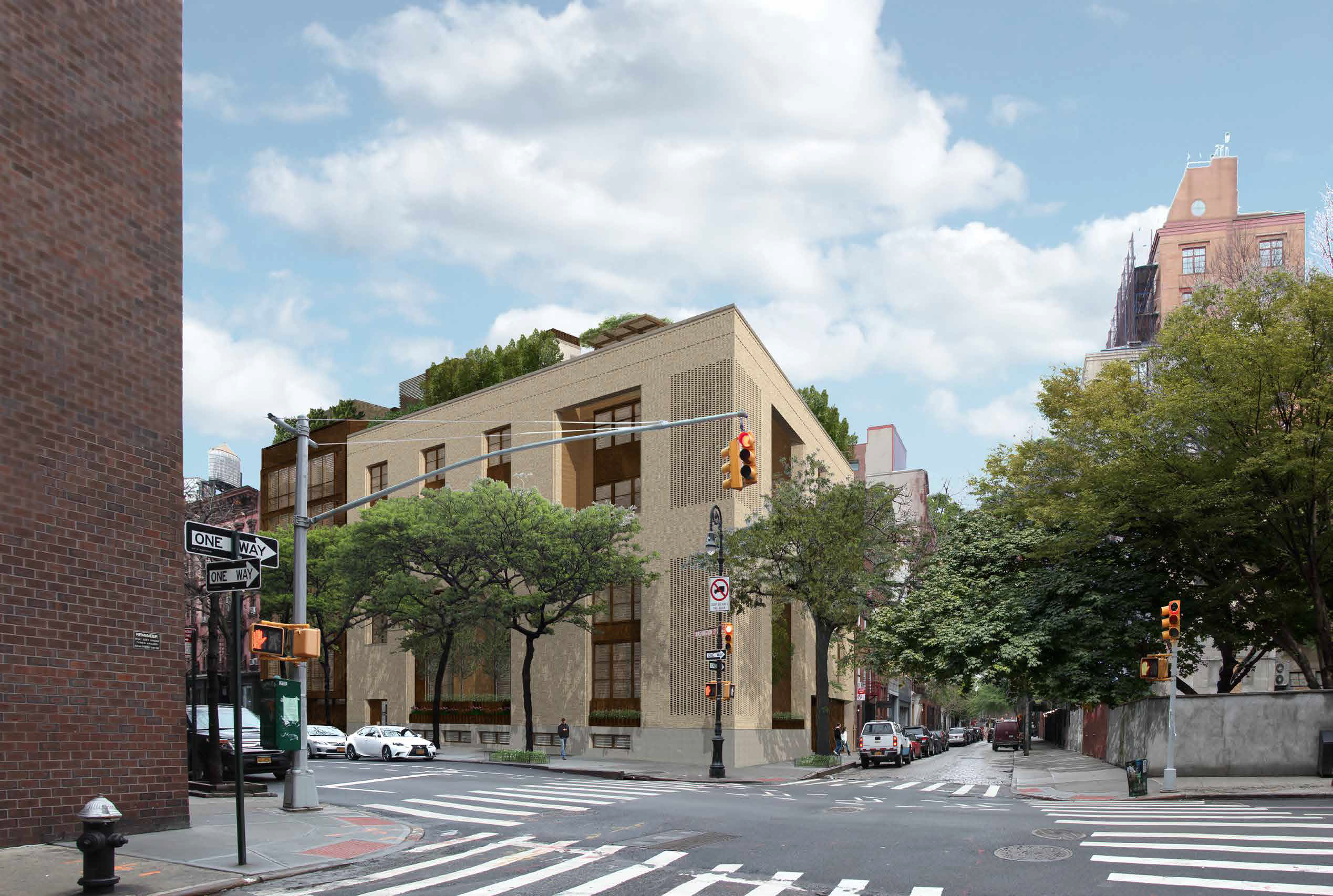
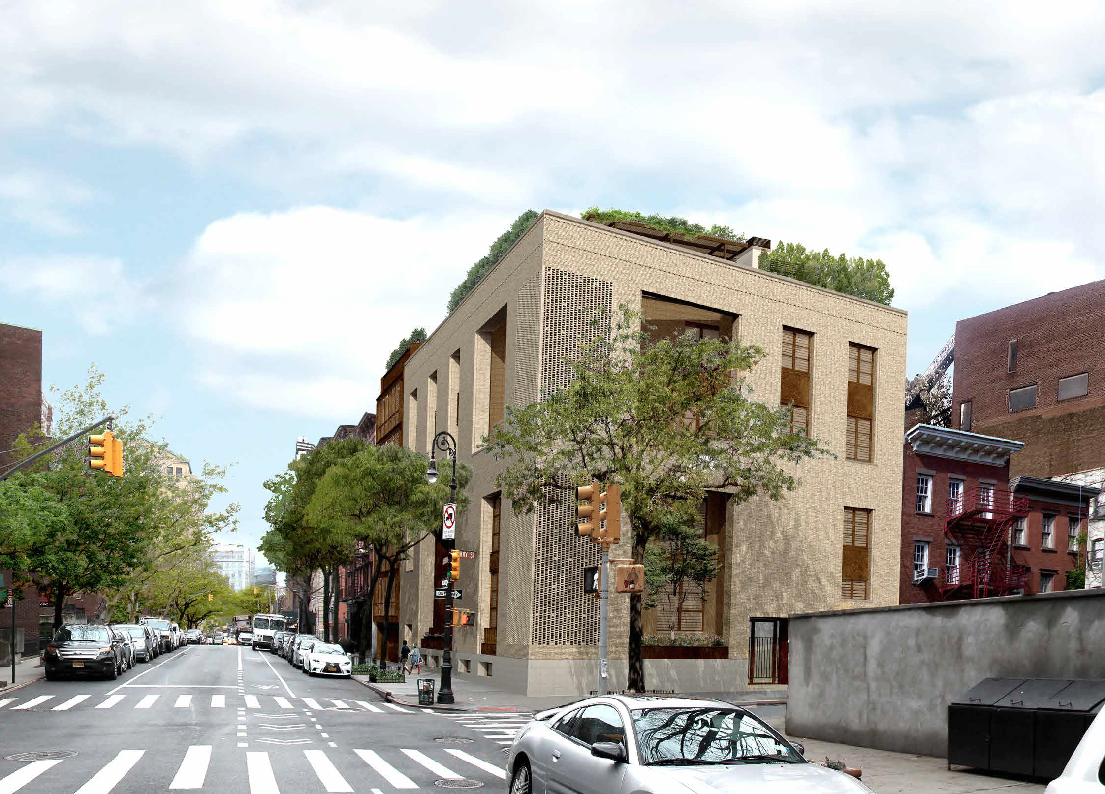
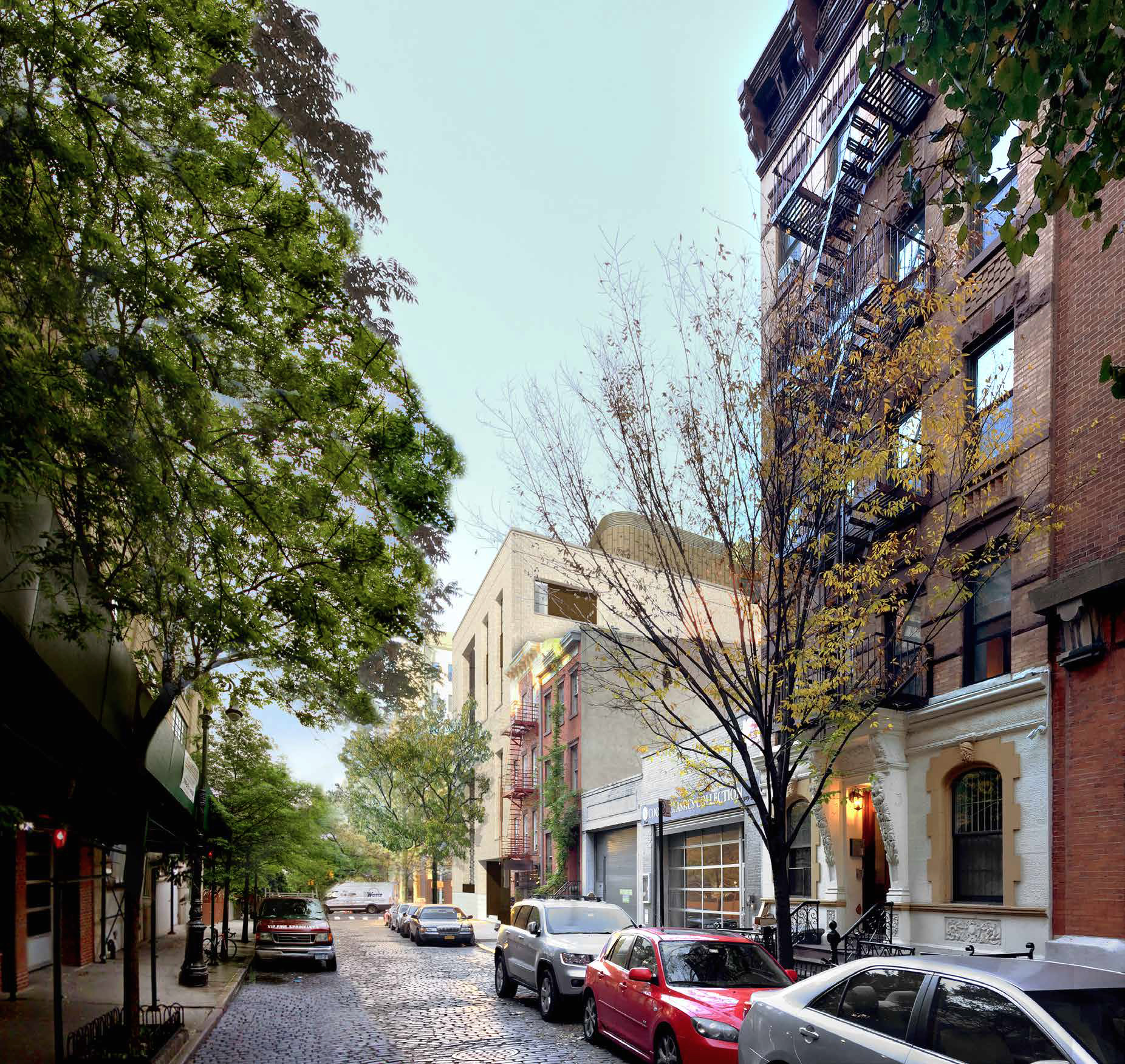
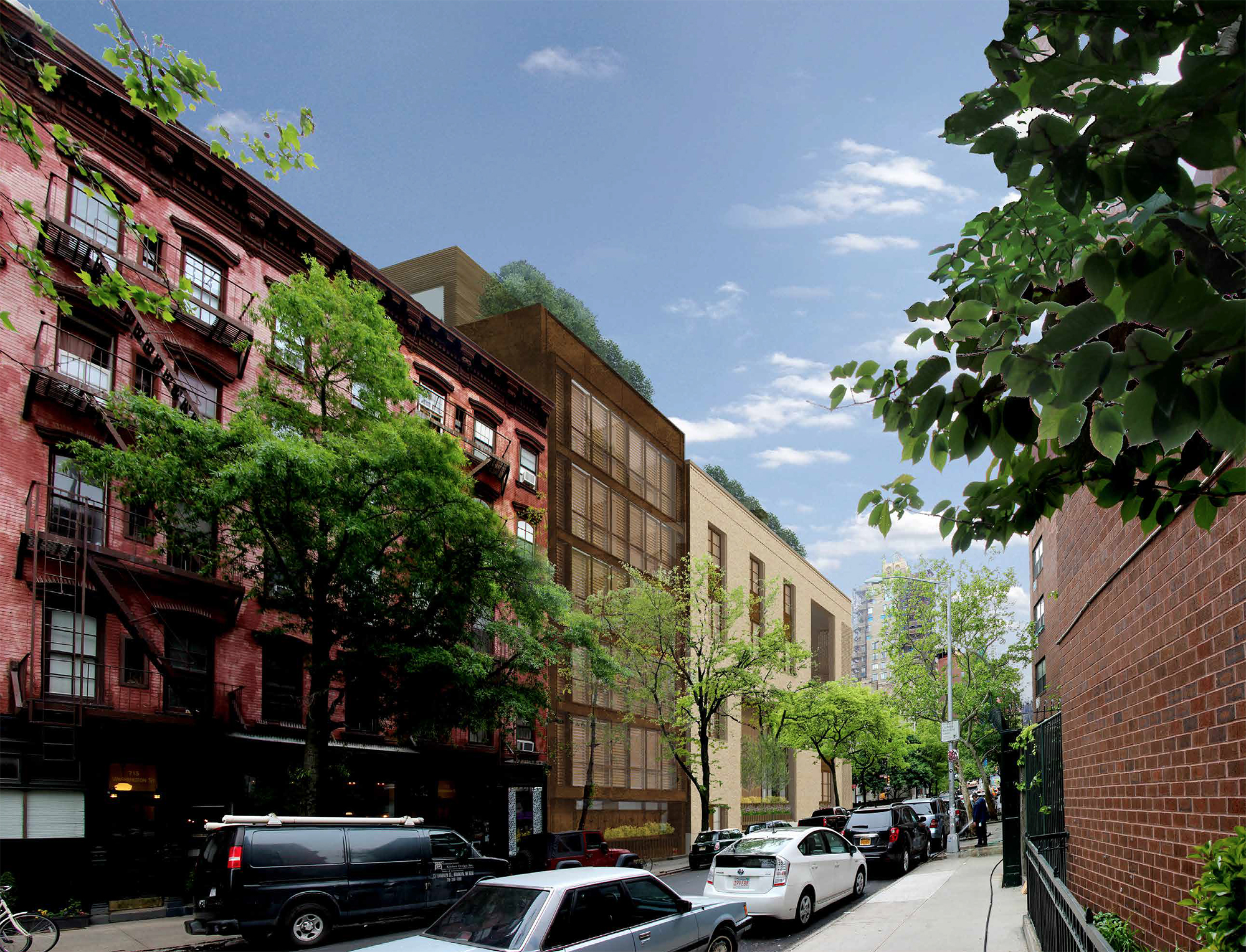
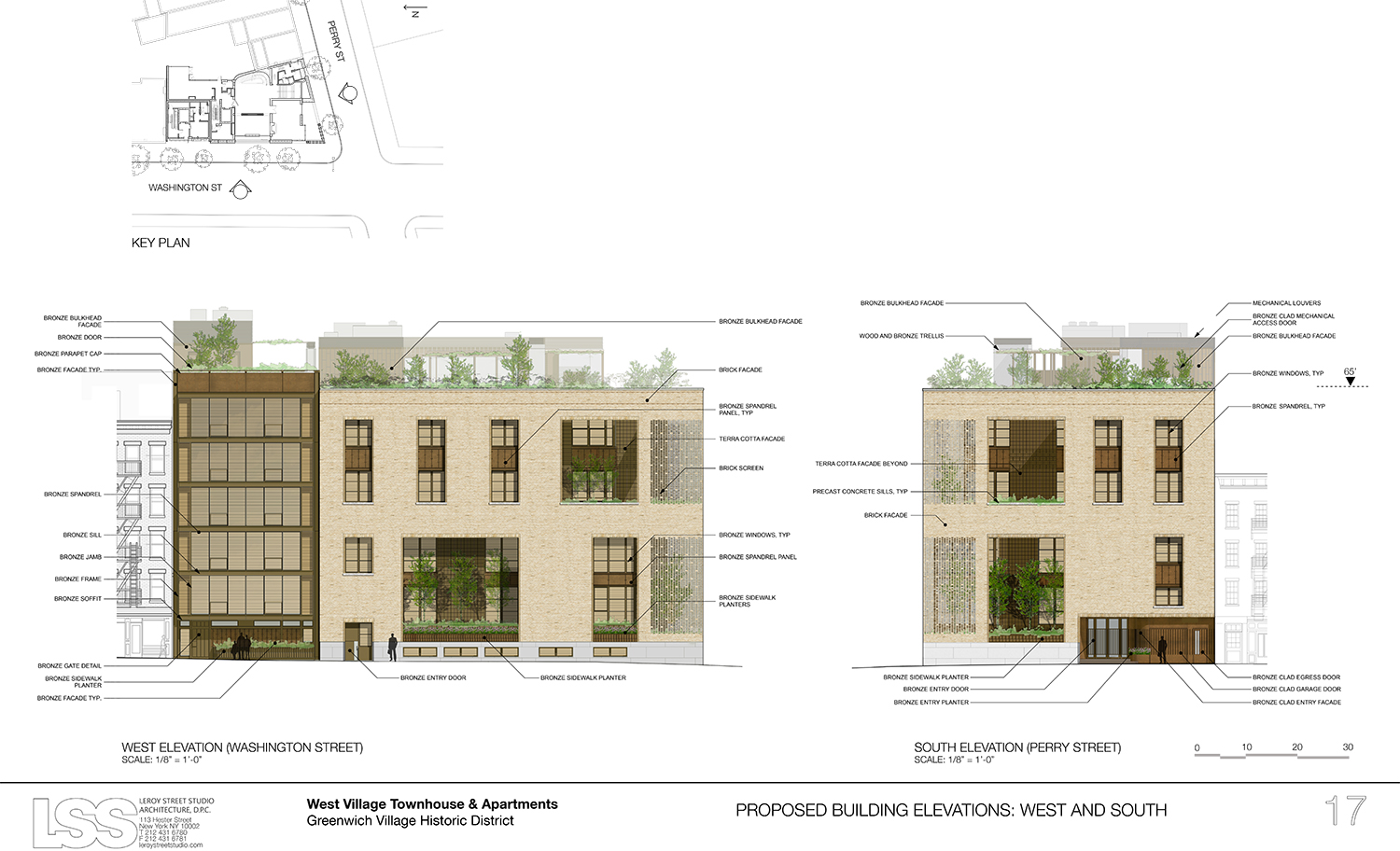
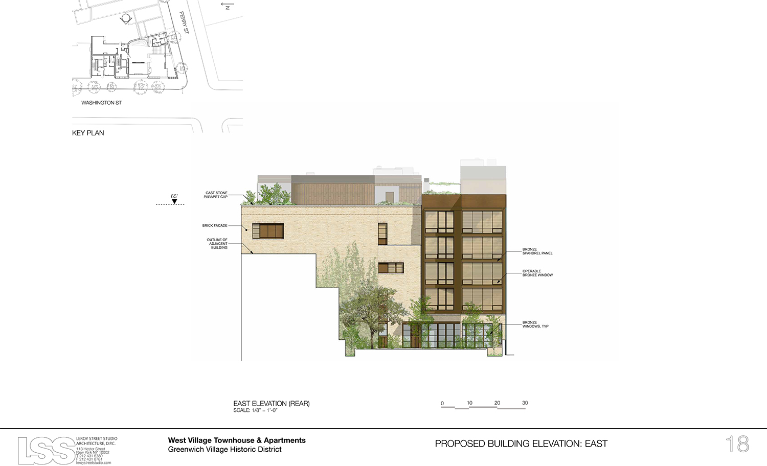
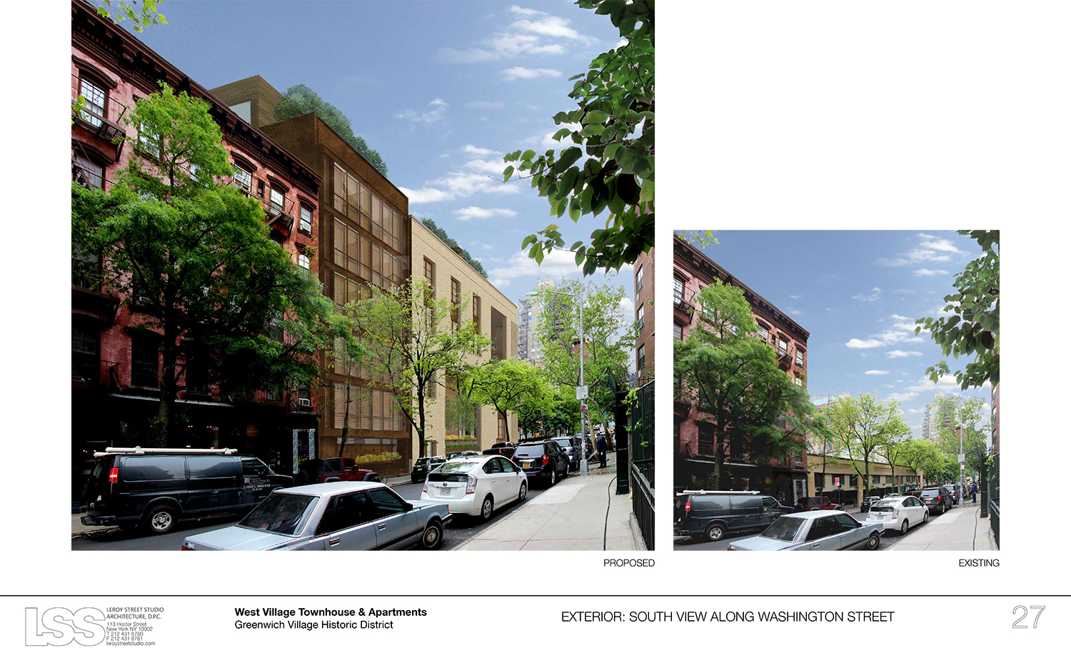
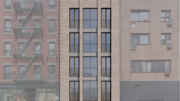
Now, the plan is for a four-story mega-mansion on the corner and a six-story, five-unit apartment building to its north on Washington Street. The proposal was presented by preservation consultant Bill Higgins of the Financial District-based firm Higgins Quasebarth & Partners, project architect Mark Turkel of Lower East Side-based Leroy Street Studio Architecture, landscape architect Edmund Hollander of Hollander Design Landscape Architects, and structural engineer Nat Oppenheimer of Robert Silman Associates Structural Engineers.
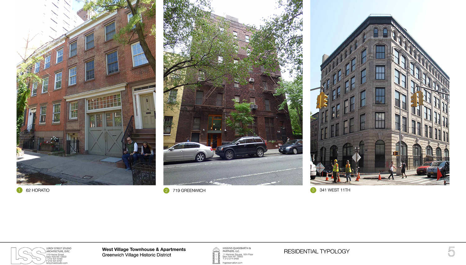
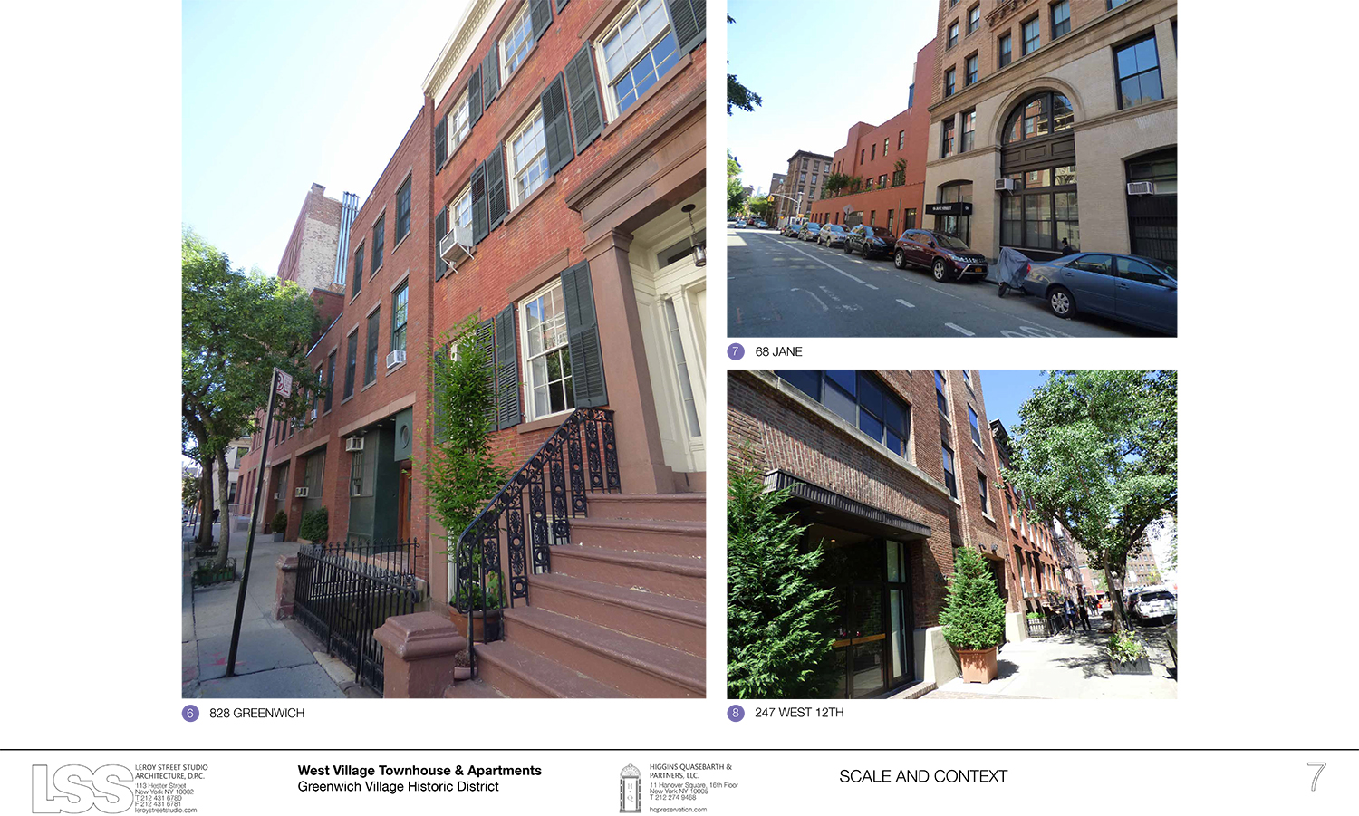
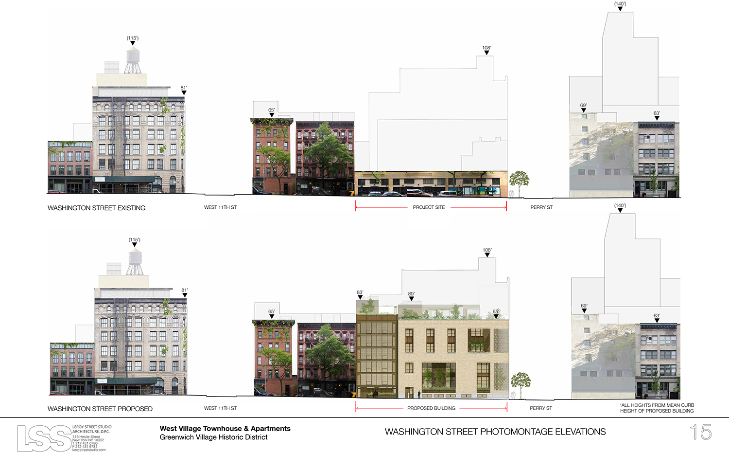
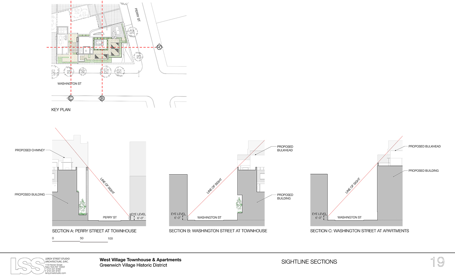
While the neighboring structures will be of different story counts, they will both be about the same height. Higgins said the mansion, also referred to as a townhouse, will be occupied by the parents of the adult children residing in the apartment building. That building will have a duplex across the first and second floors, followed by one unit each on the third through sixth floors.

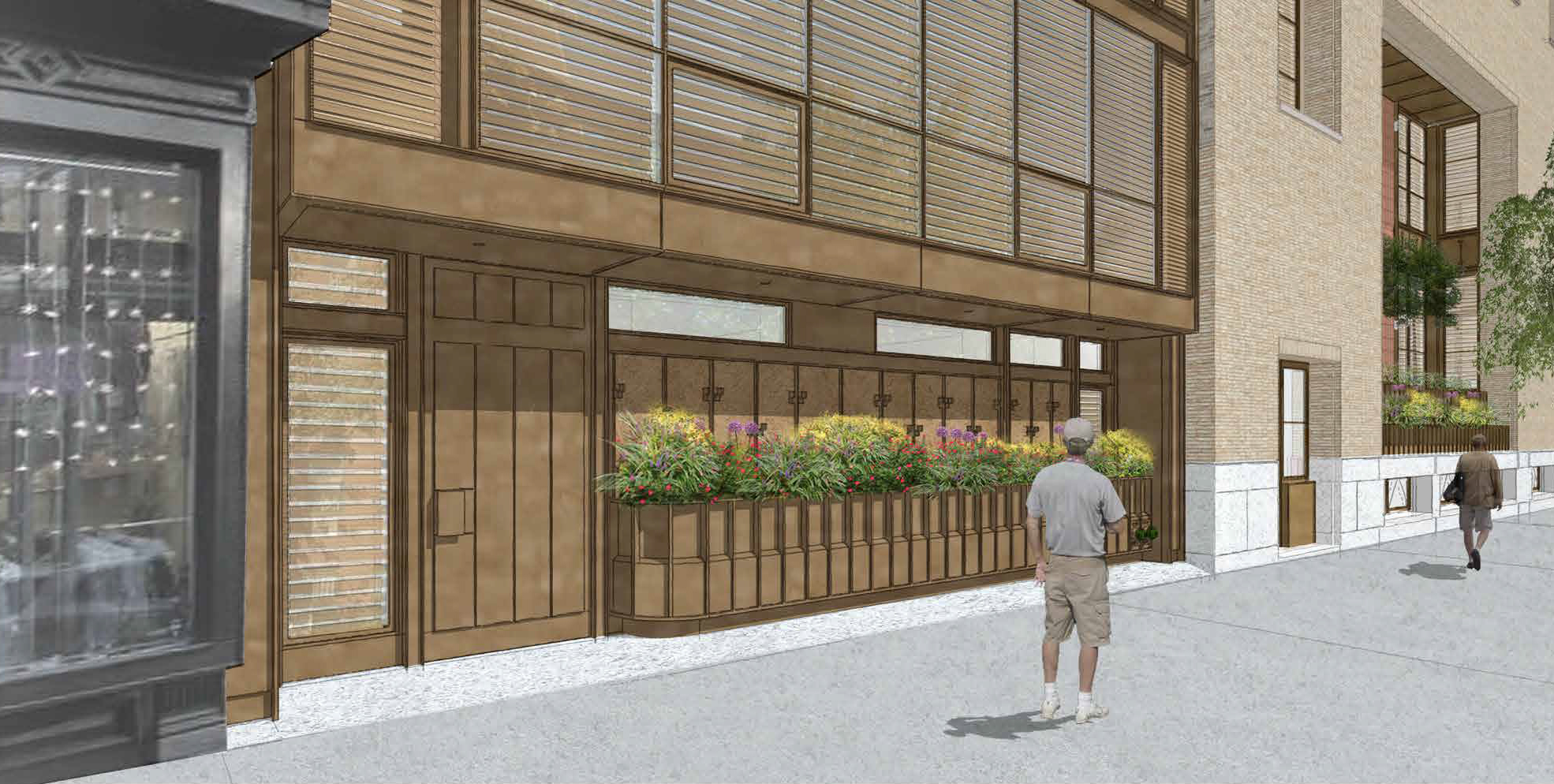
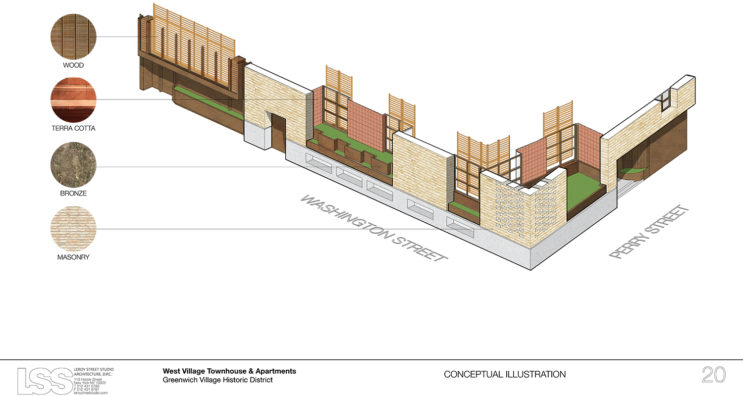
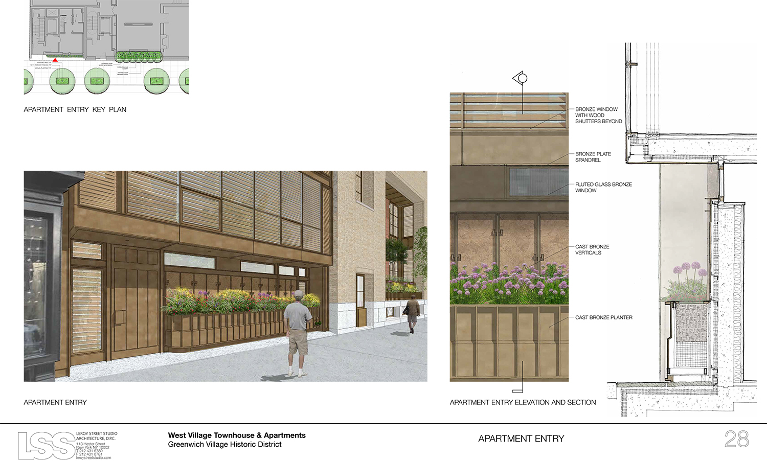
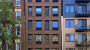
Proposal for 145 Perry Street (a.k.a. 703-711 Washington Street). Seen here are the planters along Washington Street and the primary townhouse entrance on Perry Street.
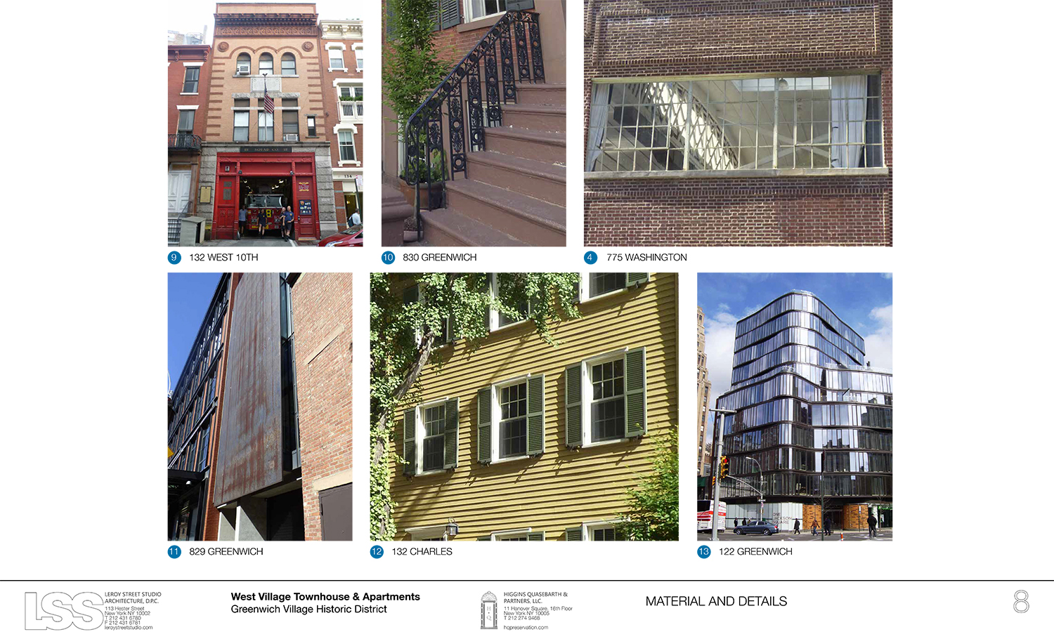
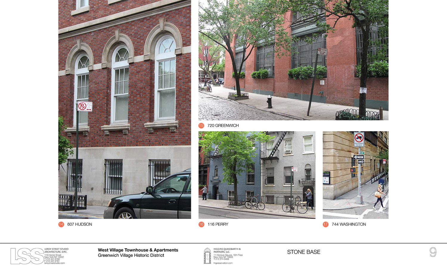
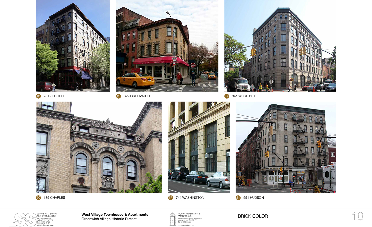
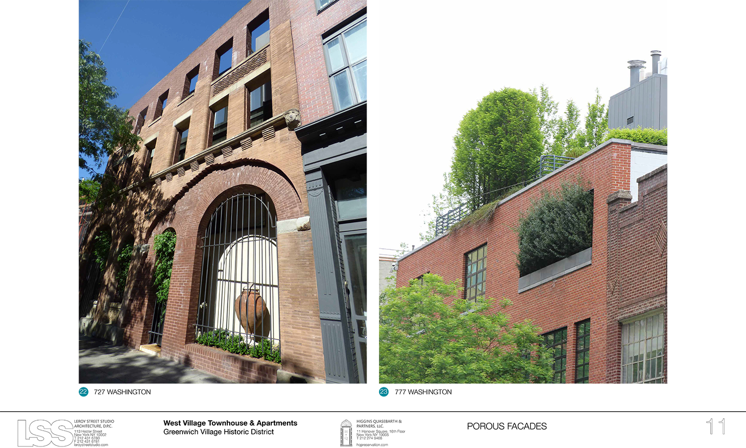
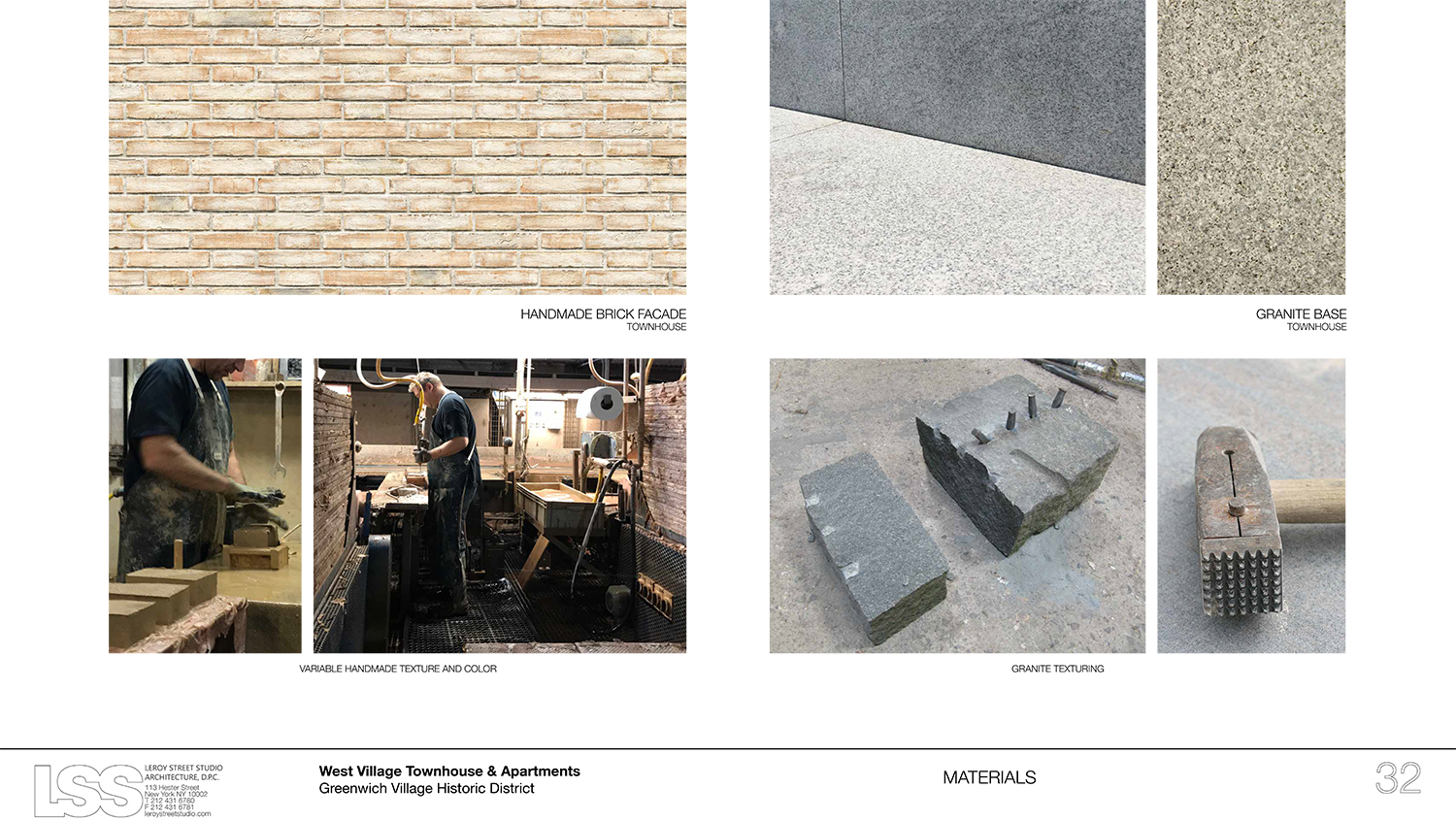
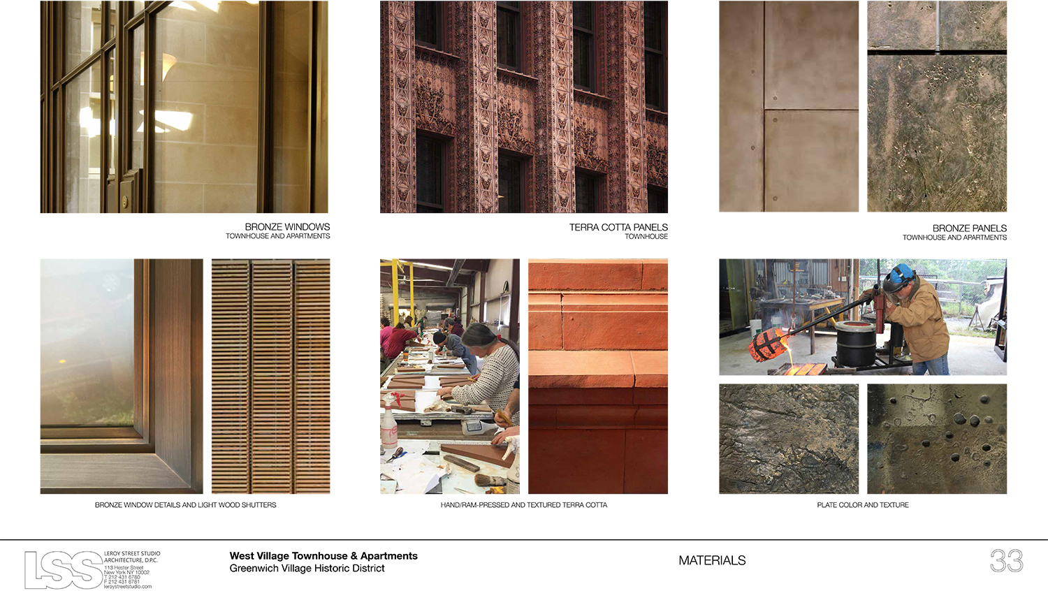
Higgins said the design team used a multi-layered approach to the townhouse, with handmade brick from Europe, then landscaping, followed by a bronze window system and terra cotta. Then the apartment building will be a bit like the outer layers of the townhouse were removed, revealing more of the bronze underneath.
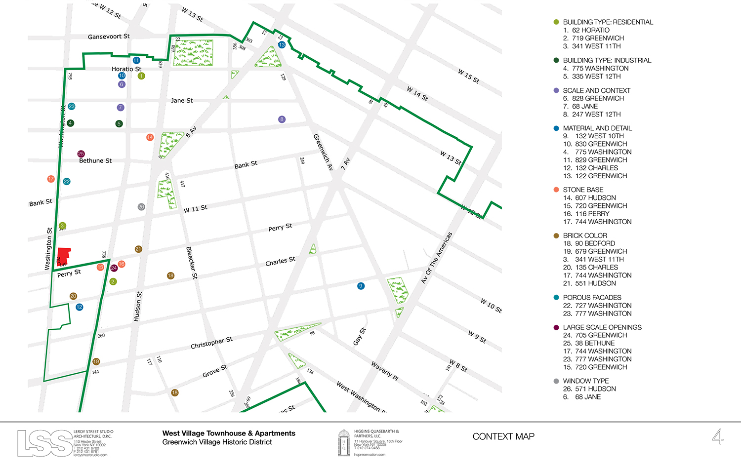
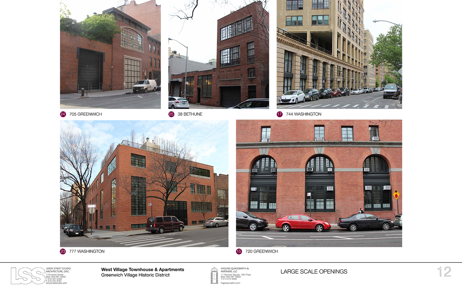
He said they looked for inspiration in the other large-scale openings in the district, as well as the distinct building bases. He noted that the proposal is smaller than the 100-room hotel proposed and approved in 2008.
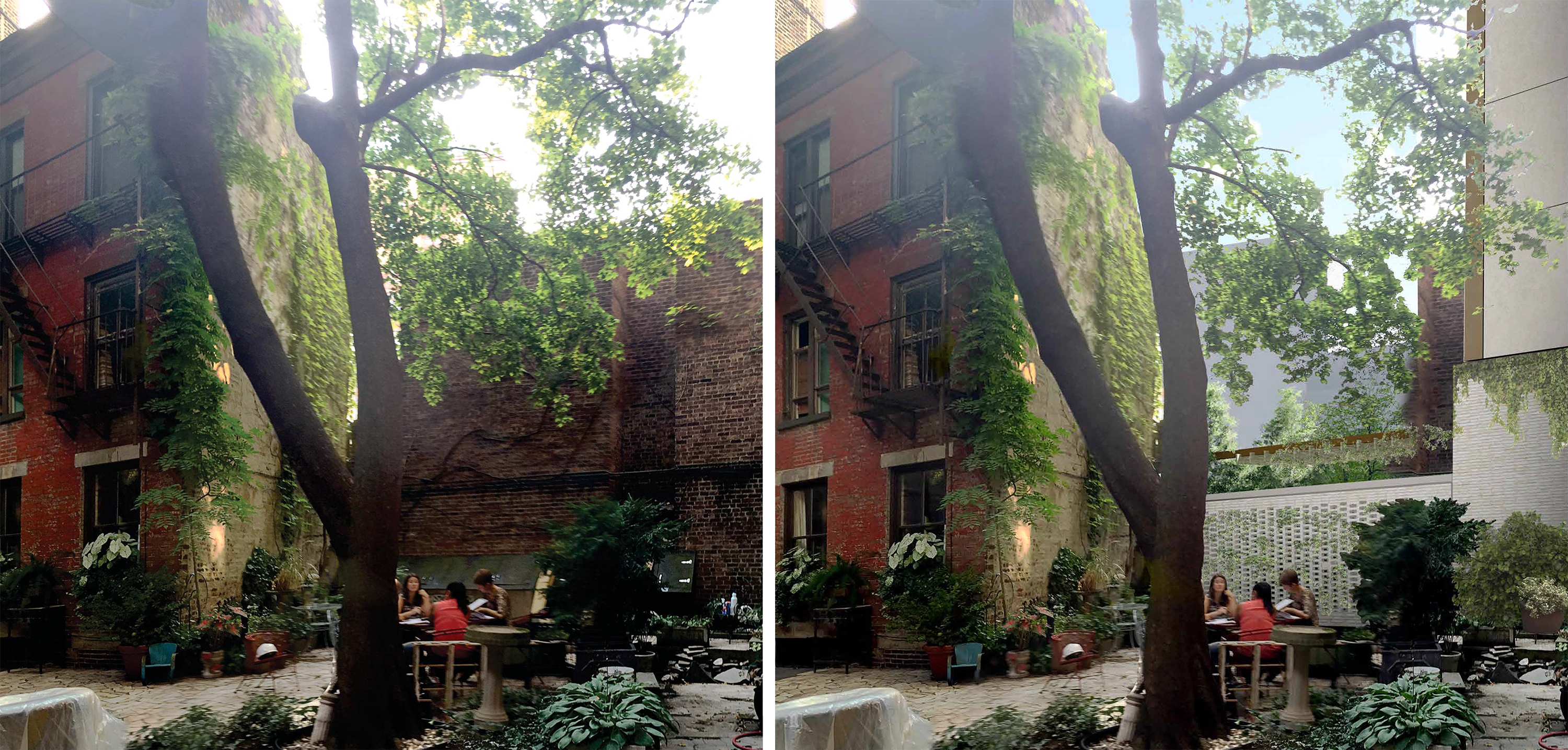
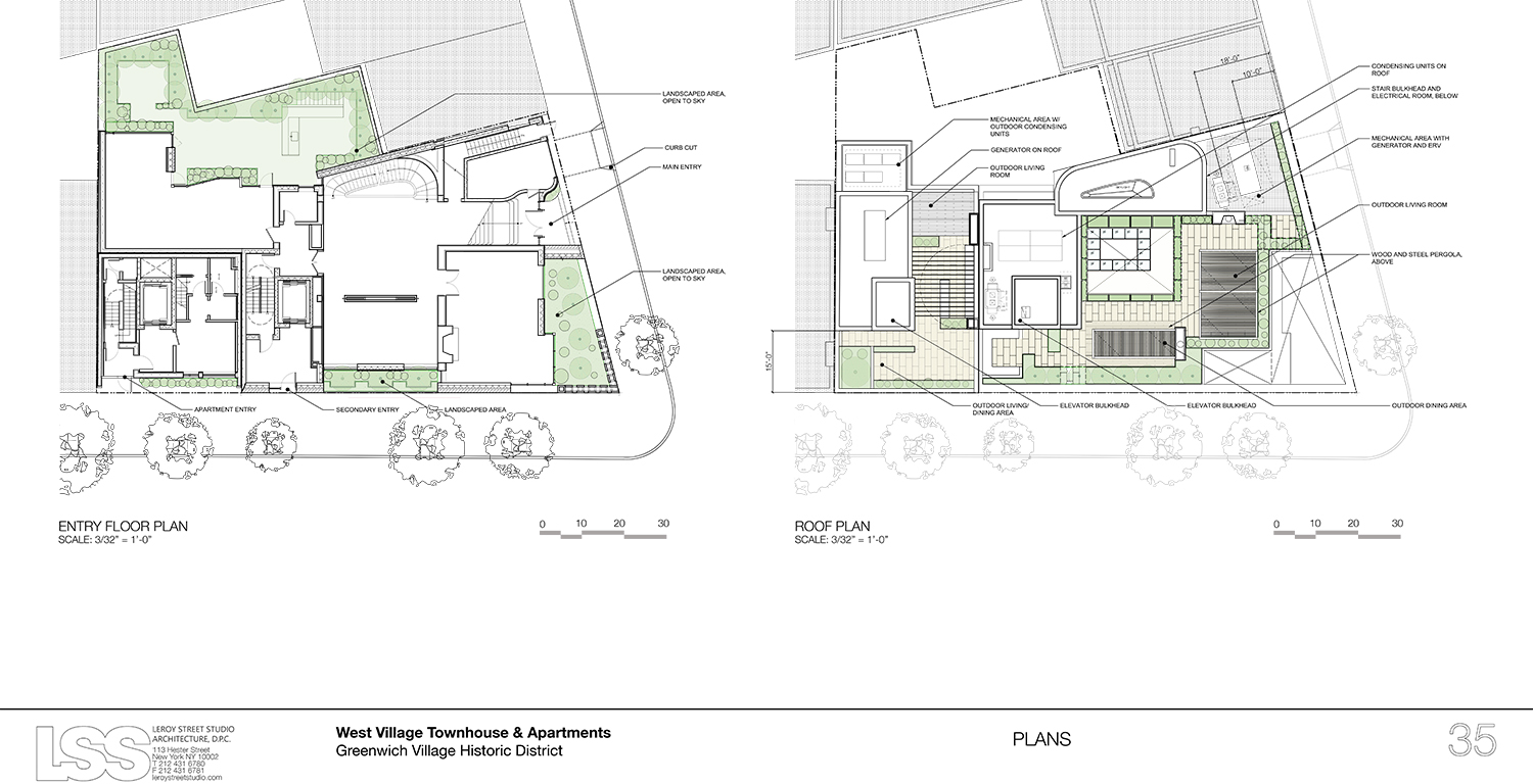
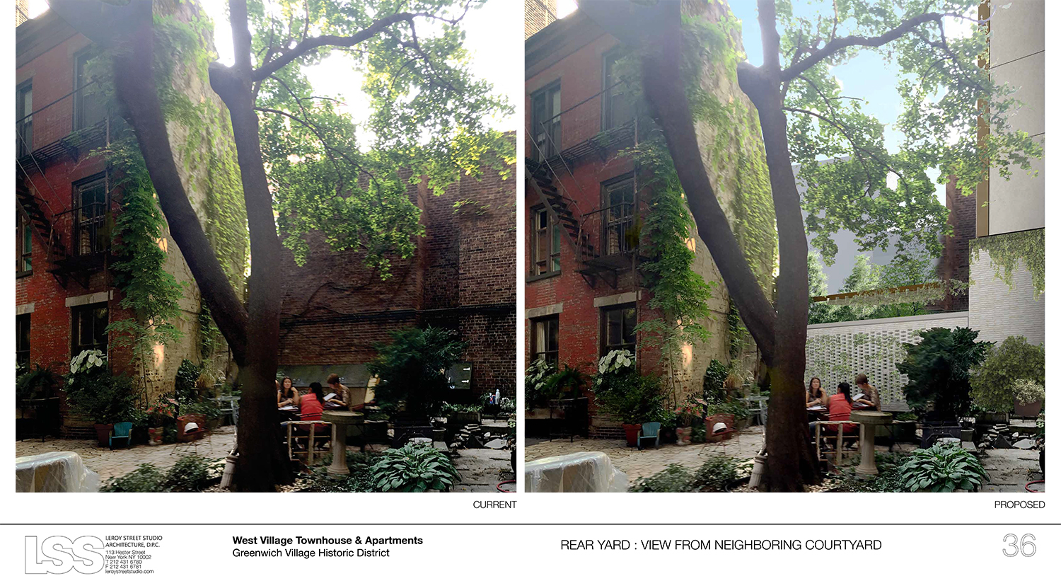
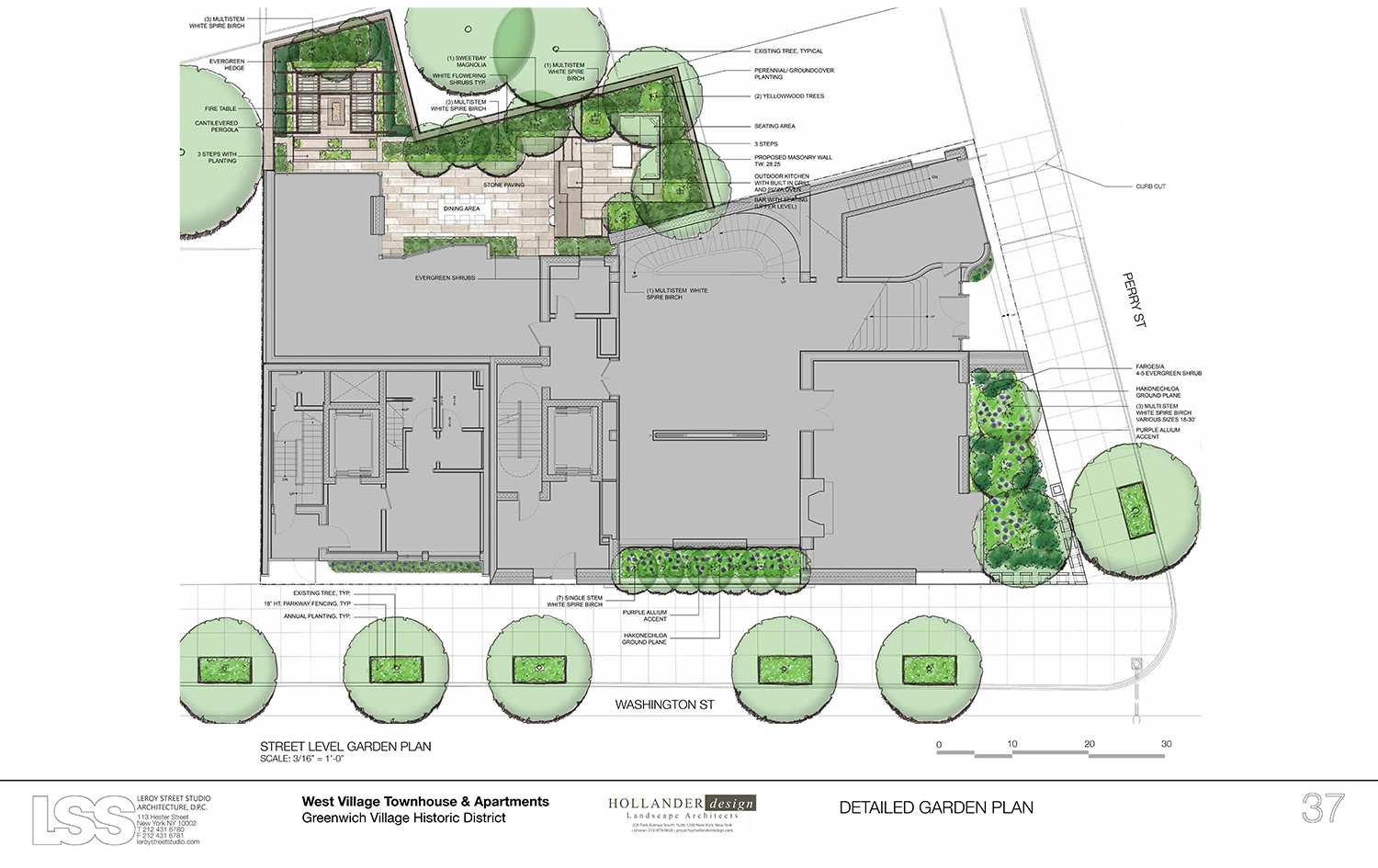
Turkel said that “repairing the corner of the historic fabric” was another part of their concept for this two-part residential complex. He also said the removal of the garage building will actually mean more sunlight for the existing courtyard behind it. Hollander also noted that the plantings will total about 1,000 square feet and also help with rain runoff.
The commissioners were mixed in their reactions to the proposal.
LPC Chair Meenakshi Srinivasan, who often waits for her fellow commissioners to speak before weighing in herself, led off the discussion. She called the proposal “quite marvelous” and said she was persuaded by the analysis of context presented by the design team. She said she could support the layered approach, that the design can break away from the residential language, and also felt that the fact that there would be two buildings would help to break down the scale.
Commissioner Frederick Bland said he was unhappy with the trend of West Village mega-mansions. He went so far as to use the word “perversely” when referring to single families living in such large structures. Of course, he conceded that that isn’t the LPC’s purview. They just have to assure the structures fit in. He called the design “very inventive,” but found the size of the openings worrisome. He wasn’t sold yet, but, following more discussion, he said, “I’m there now.”
Commissioner Adi Shamir-Baron commented that the previously approved structures, both of which predate her time on the commission, were not jarring, but this was. “Is there a way to break up that horizontality?” she asked, somewhat rhetorically, adding that the design “makes a leap that loses a step.”
Commissioner Jeanne Lutfy, on the other hand, said, “This is very refreshing.” “What they have done with the façade is quite incredible,” she added.
“I would like to have liked it,” said Commissioner Michael Goldblum. “But I don’t.”
Commissioner Kim Vauss’s initial reaction was to call it “something like a factory building” that doesn’t fit in the Village. She called the two entrances for the mega-mansion – a primary one on Perry Street and a secondary one on Washington Street – confusing. Still, she eventually called the building contextual.
Commissioner Diana Chapin liked the materials, layering, and texture. However, she said the scale was not at all residential. She wondered what its typology was.
“Greenwich Village is probably the most difficult place to design for,” said Commissioner Michael Devonshire, but he said this works, calling the mansion “extremely rich and appropriate.” The apartment building, on the other hand, he found very “bland.” That garnered chuckles as he directed his voice at Commissioner Bland.
Commissioner John Gustafsson said the question here was whether or not it fits, and his answer was yes. “I don’t really care if there is the right symmetry or if it fits a typology,” he said. “I’m in.” Commissioner Wellington Chen also joined in support of the project.
Reaction from the public was less supportive. Manhattan Community Board 2 was okay with the footprint, but not the design.
Glen Umberger of the New York Landmarks Conservancy testified that the proposed structures were “carefully and exquisitely detailed” and “sumptuously designed,” but would stand out and were not appropriate.
Glenn Coleman, a resident at 340A West 11th Street, said the new building would actually decrease the quality of the experience in the courtyard.
“While the height and size of the proposed new buildings is in keeping with surrounding buildings, the design is not. The south building appears fortress-like and, in spite of its relatively modest scale, imposing and forbidding,” testified Sarah Bean Apmann of the Greenwich Village Society for Historic Preservation (GVSHP). “The proposed designs for both buildings use handsome materials and have some thoughtful and interesting details. But the design misses the mark in terms of a compatible and appropriate addition for this corner and this district.” (You can read her full testimony here.)
Jordan Schapps of the Perry Street Crusaders said the design represents “ego and hubris at its worst.” He said the Village already has some historic yellow building and doesn’t need a new one. “This is Greenwich Village, not Greenwich Beverly Hills,” he added.
The Historic Districts Council’s Kelly Carroll said there was actually something the existing building added to the landscape, but conceded its demolition. “Regarding the proposed new building, HDC finds its materials refined and its overall concept original. The issue here is scale and proportion,” she testified. “Simply put, the architectural elements proposed for this building are too big for the cube that they occupy. HDC requests that these details be refined and we look forward to seeing the next iteration at a future public meeting.”
In the end, the commissioners approved the proposal without modification. There was one vote against it.
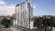
Following the hearing, GVSHP Executive Director Andrew Berman sent out a statement. “We are disappointed that the Landmarks Preservation Commission chose to approve a design which is so unprecedented for, and would be so out of place within, the Greenwich Village Historic District,” he said. “The overly grand, fortress-like proposed single-family mansion, which will seem like a proverbial moated castle in the West Village, along with the attached glass and metal apartment building for the owner’s children, will stick out like sore thumbs.” He pointed to the design of a recently-approved Louis Vuitton store in Miami.
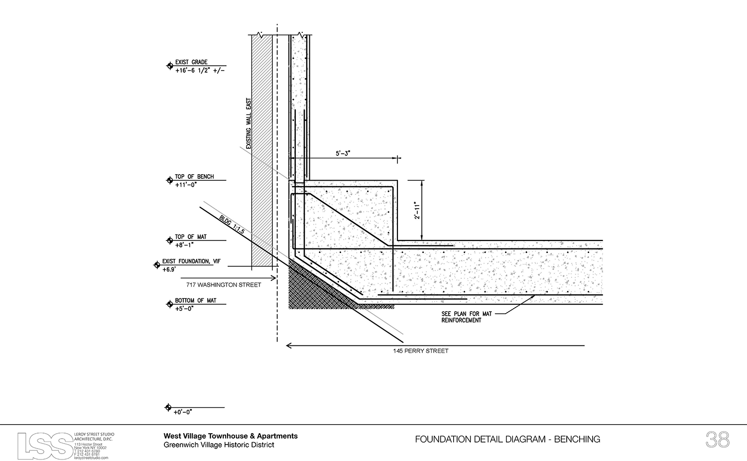
View the full presentation slides here:
Subscribe to YIMBY’s daily e-mail
Follow YIMBYgram for real-time photo updates
Like YIMBY on Facebook
Follow YIMBY’s Twitter for the latest in YIMBYnews

