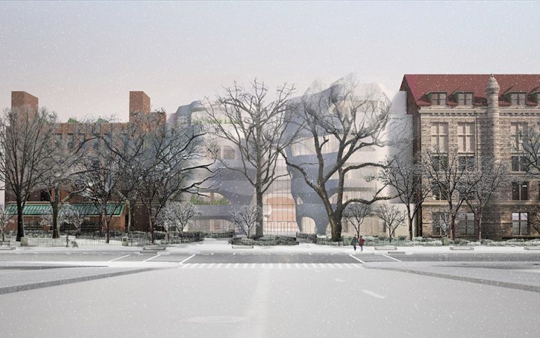
Last week, the state appeals court dismissed an appeal, effectively greenlighting the American Museum of Natural History’s plans for a new educational center on the Upper West Side. According to West Side Rag, the removal of trees outside of the Museum has already begun in preparation for the 230,000-square-foot Richard Gilder Center for Science, Education, and Innovation. The Gilder Center will include new exhibition and learning spaces with state-of-the-art technology and access to the museum’s world-class collections. The five-story addition is designed by Jeanne Gang of Studio Gang Architects with Ralph Appelbaum Associates designing the exhibition experiences. Reed Hilderbrand will be responsible for the landscape architecture.
Roughly 80 percent of the project will be located within the area currently occupied by the museum, and will require the removal of three existing buildings. An area of 11,600 square feet, about a quarter acre, of the development’s footprint will come from the Theodore Roosevelt Park, and another three-quarters of an acre of park space will be altered for improvements and connections to the building. It was this transformation of green space that prompted community groups to attempt to block the development in the form of an appeal.
The museum expects to open the center by 2021.
Subscribe to YIMBY’s daily e-mail
Follow YIMBYgram for real-time photo updates
Like YIMBY on Facebook
Follow YIMBY’s Twitter for the latest in YIMBYnews


Please pardon me for using your space: Check in its design. (Thank you)
This was a lesson in how not to communicate with the community. The museum’s communication with the neighborhood about these plans was sorely lacking, creating unnecessary opposition. Also, in the early planning stages, Councilmember Helen Rosenthal did not notify the community, until it was revealed by others, that she invested a healthy sum of taxpayer funds to get the project going. She, too, created unnecessary opposition.
Looks like a crumpled up paper bag – an homage to garbage?
Don’t like this pseudo-organic design, specially the inside as seen in other renderings. Looks dated already, and not even built yet.
A more conventional shape would give more usable spaces.
The interior is actually very interesting. Swooping archways and landings at various levels. It kins of reminds me of the TWA flight center, but more organic. Studio Gang is a talented firm
why is it snowing
I grew up in the neighborhood so MONH is a beloved friend. This makes me want to cry. Not even a vague attempt to integrate the look of this new structure with the buildings around it. What were they thinking? Or not thinking??