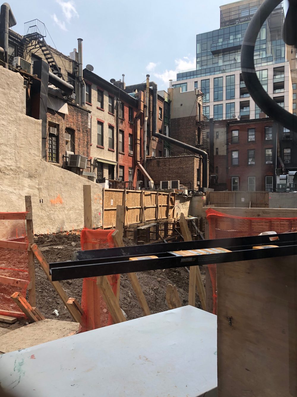
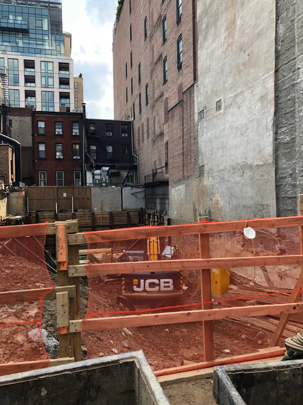
Excavation is underway at 128 East 28th Street for a proposed eight-story, ten-unit building. The NoMad property will eventually feature a 21,038-square-foot residential structure that will rise 80 feet tall. Sinha Development is the developer of the 4,246-square-foot construction site while TRA Studio is the designer of the project.
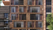
The featured image shows the final look of 128 East 28th Street. The main eastern elevation has a symmetrical mix of floor-to-ceiling glass and warm-colored undulating metal panels. The seventh floor sits back to the north, while the eighth and final level will also be pushed back from the property line and the dark cornice.
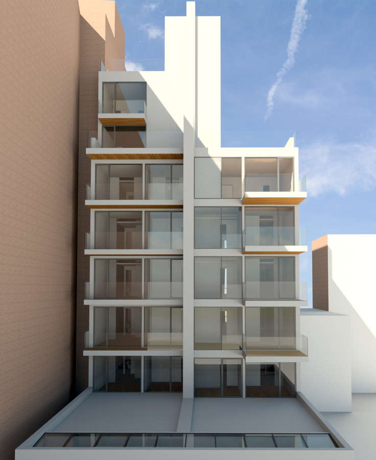
Units will yield just over 17,300 square feet and occupy the second to eighth floors, with an average of 1,734 square feet apiece. A full-floor home will take up the sixth story with a duplex on the top two floors. Both will have a private outdoor terraces. Nearly 3,100 square feet will be dedicated to retail space on both the ground floor and cellar level. The rear western elevation has a simpler design and will include balconies on every floor.
The site is located among the NoMad section of Rose Hill and sits close to the edge of Kips Bay. The closest subway is the 6 train at the 28th Street subway station on Park Avenue South. Madison Square Park is a short ten-minute walk.
A completion date for 128 East 28th Street has been posted on the construction fence for 2020. We estimate a topping off of the reinforced concrete superstructure by the end of 2019 and full completion sometime within the first half of next year.
Subscribe to YIMBY’s daily e-mail
Follow YIMBYgram for real-time photo updates
Like YIMBY on Facebook
Follow YIMBY’s Twitter for the latest in YIMBYnews

White – black – blue – red – yellow – green – brown – grey – sky blue – dark blue – hexagonal prism – hexagonal pyramid – light blue – gold – silver – light purple – purple – beige – pink – orange – aubergine – blond – crimson – thanks to Michael Young – triangular-based pyramid – square-based pyramid. (Help me to find it)
Please pardon me for stinking up the place: Periwinkle – Bananas and Oranges – Organic Mustard – Battleship Gray – Cookies and Cream – Just plain old Red – Triangular Base pyramid on my head. Help find my brain. (You’re welcome).
I don’t know which I like more, the graceful robust design by TRA studio or the deep colored backs of those buildings on an adjacent street. Are those backsides circa 1850s?
I lived there for a number of years. It’s interesting to see it all open from the rear now. Our building was dated 1910. The black is a corrugated iron cladding, installed approx 3yrs ago.