Chan Ascher Architecture has delivered proposals to construct a two-story vertical expansion and an exterior facelift at 16 Leroy Street in Greenwich Village, Manhattan. Located within the Greenwich Village Historic District, the plans require approval from the city’s Landmarks Preservation Commission (LPC).
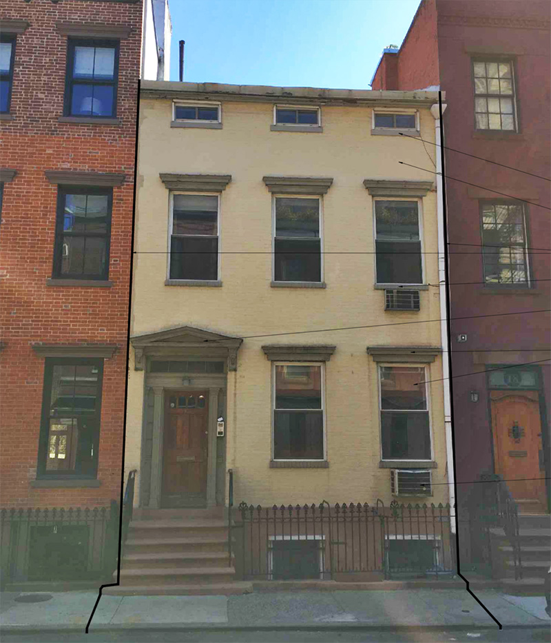
Beginning at the front of the building, alterations include upgrades to the existing windows, the replacement of stone window sills with brick masonry, and the removal of through-wall air conditioning units.
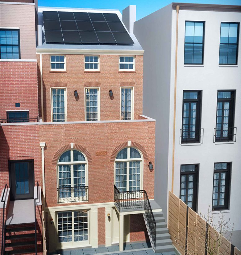
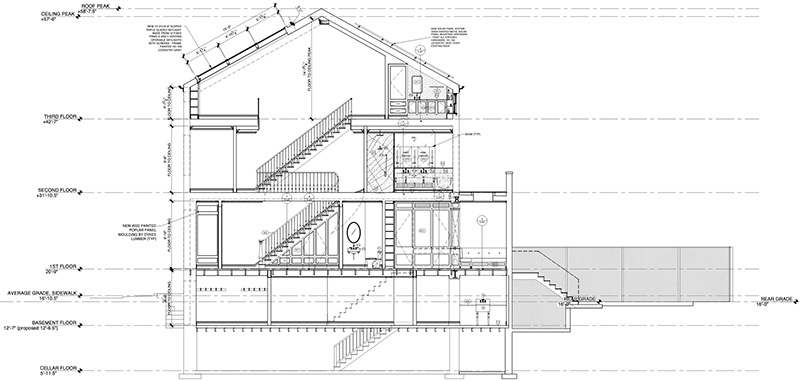
The rear of the building, which contains both a terrace and garden, would receive the most comprehensive alterations as revealed by the proposals. This includes replacement of the warped vinyl façade with brick veneer, new windows, an expanded terrace level at the second floor, doors that open out into the rear garden, and a sloped roof. The new roof level will include a south-facing skylight and north-facing solar panels.
Within, the architects have proposed the conversion of the structure from a multi-family dwelling to a single family home. The new residence would contain three bedrooms, three bathrooms, a library, fireplaces, as well as a butler’s pantry and work area.
Permits are currently pending review by the LPC.
Subscribe to YIMBY’s daily e-mail
Follow YIMBYgram for real-time photo updates
Like YIMBY on Facebook
Follow YIMBY’s Twitter for the latest in YIMBYnews


“north-facing solar panels”? Please learn to read drawings and maps before posting.
It’s a rather pedestrian / terrible design …. the arch windows have nothing to do with the original architecture…..sadly uninspired….come on – you can do better than this.
That is clearly the backyard of the building
North facing solar panels?