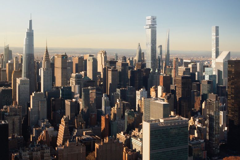
Though it appears that demolition preparations have been put on hold for Tower Fifth, a proposed 1,556-foot-tall office skyscraper by Macklowe Properties, a new batch of renderings offers greater detail on the structure, which would become New York City’s tallest by roof height. Gensler is speculated to be the designer of the supertall project, which is located along East 51st Street between Madison Avenue and Fifth Avenue, directly to the north of St. Patrick’s Cathedral.
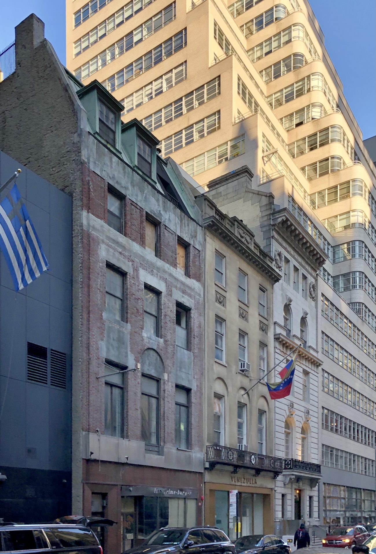
Recent photos show the two low-rise structures that were slated for demolition still standing between Olympic Tower to the west and the Look Building to the east. Both are largely vacated with the exception of the Consulate General of Venezuela at 7 East 51st Street.
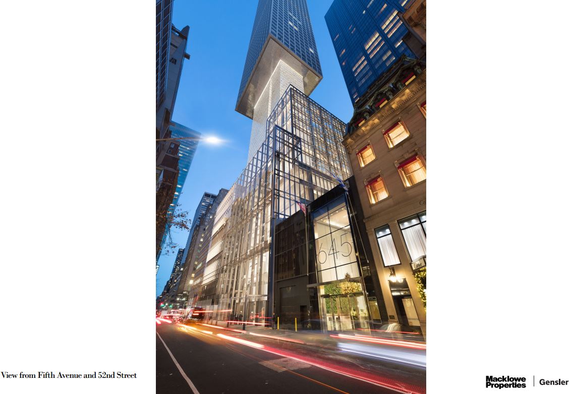
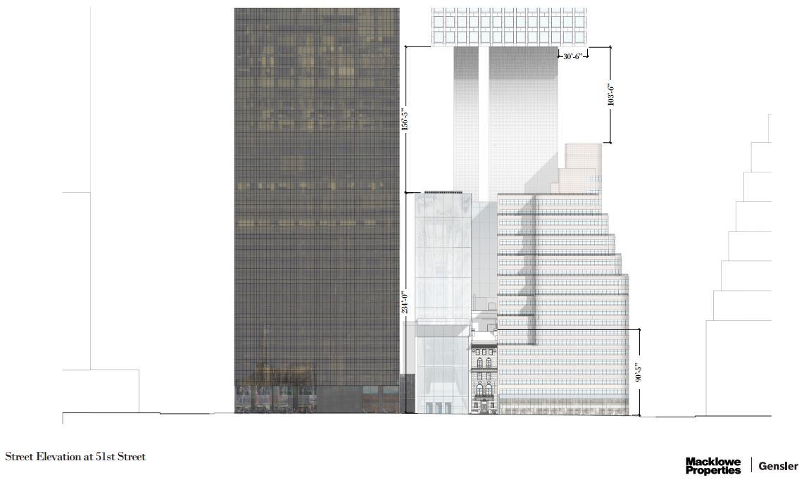
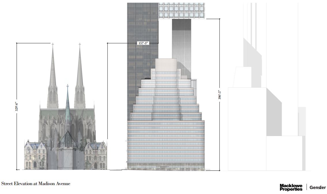
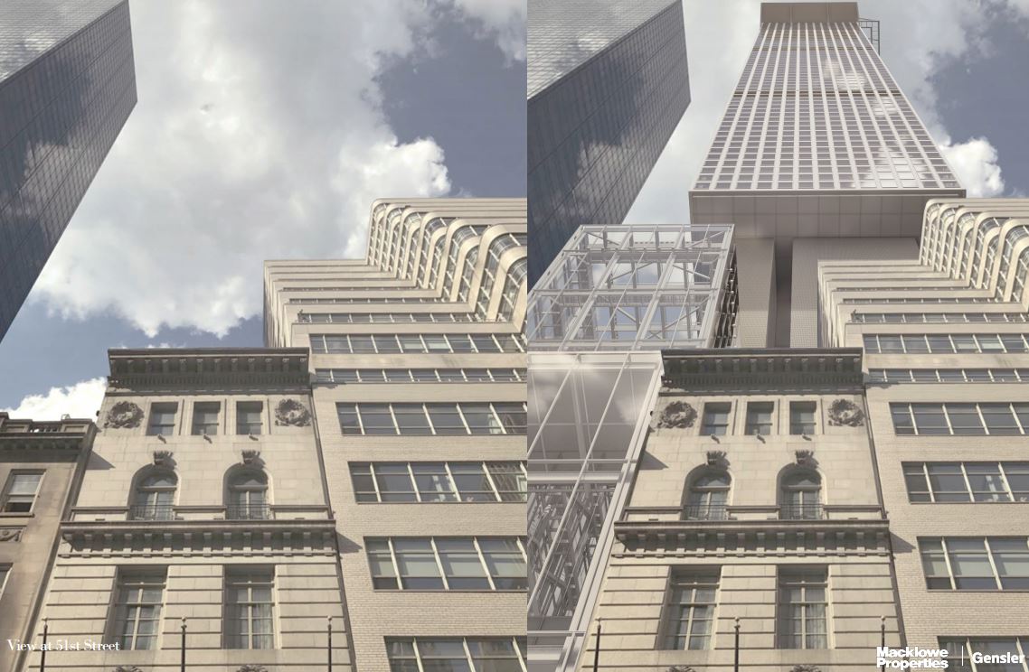
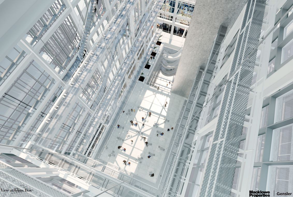
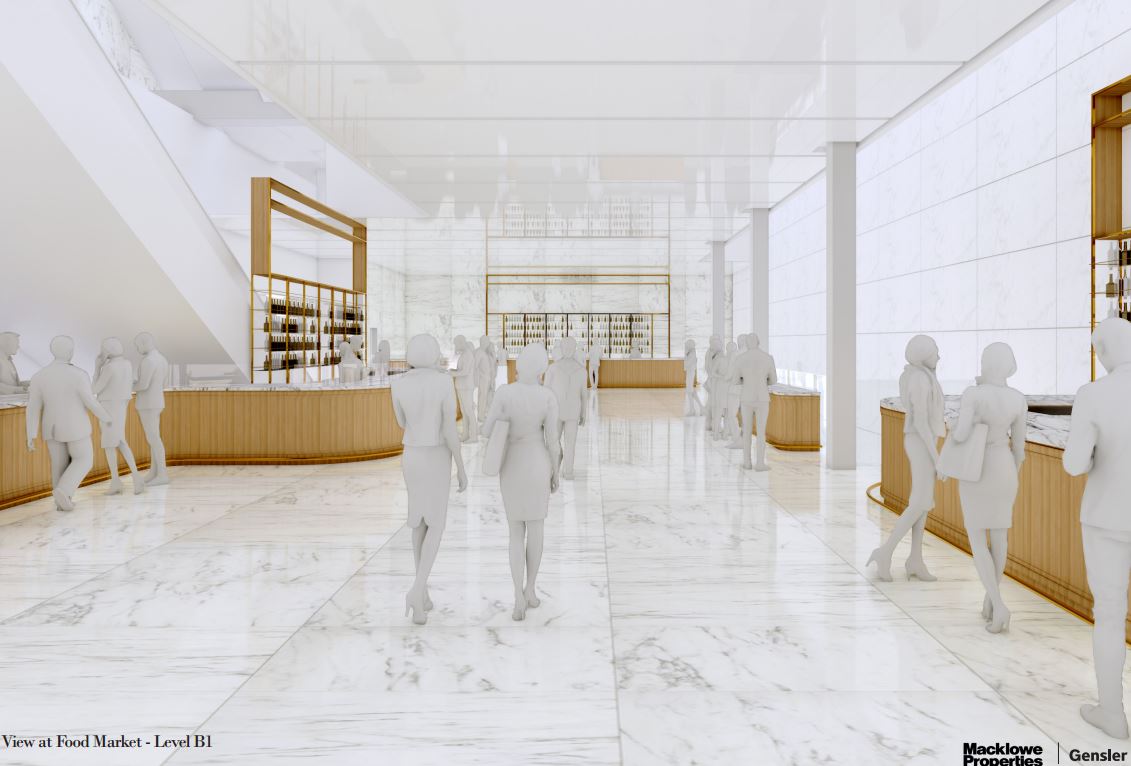
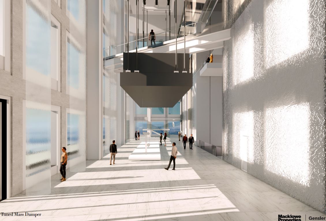
The following renderings illustrate how Tower Fifth will rise from the parcel. The main lobby at ground level will feature a through-block hallway lined with white marble spanning the depth of the lot. In a striking design flourish, the tower will sit atop a narrow pedestal that rises nearly 400 feet above the street, higher than the spires of the nearby cathedral. The balancing of the tower above this pair of structural cores calls to mind the architecture of the Citigroup Center.
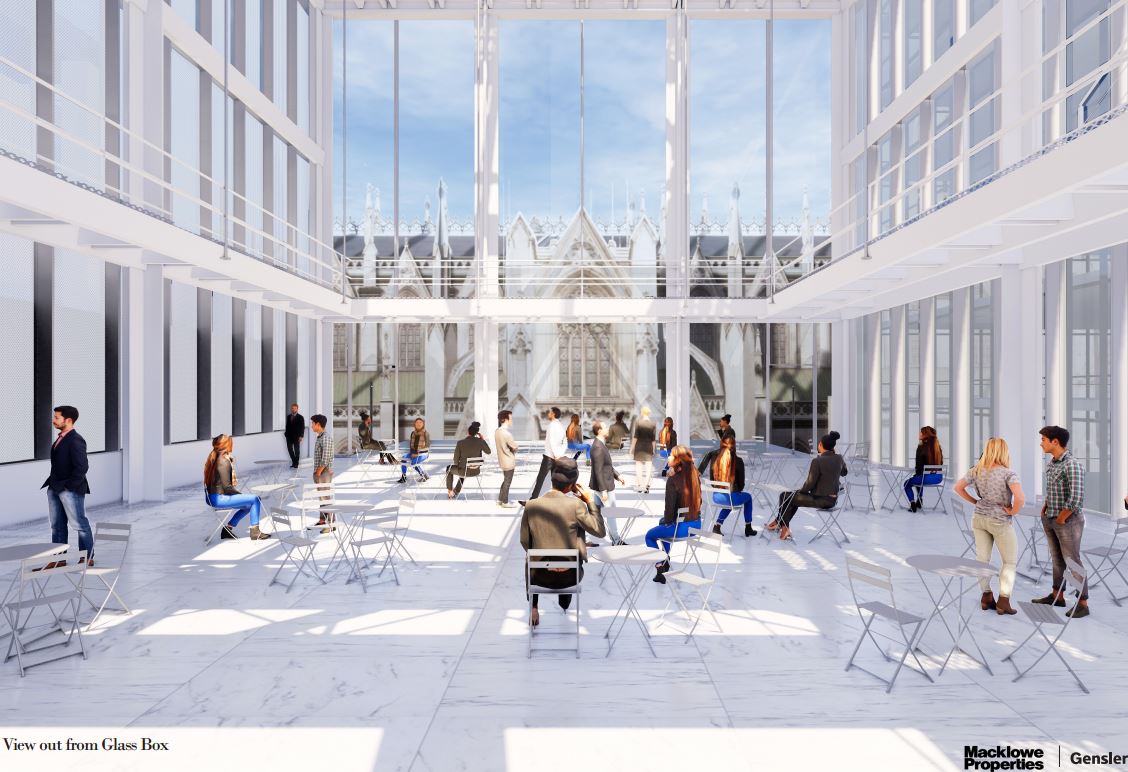
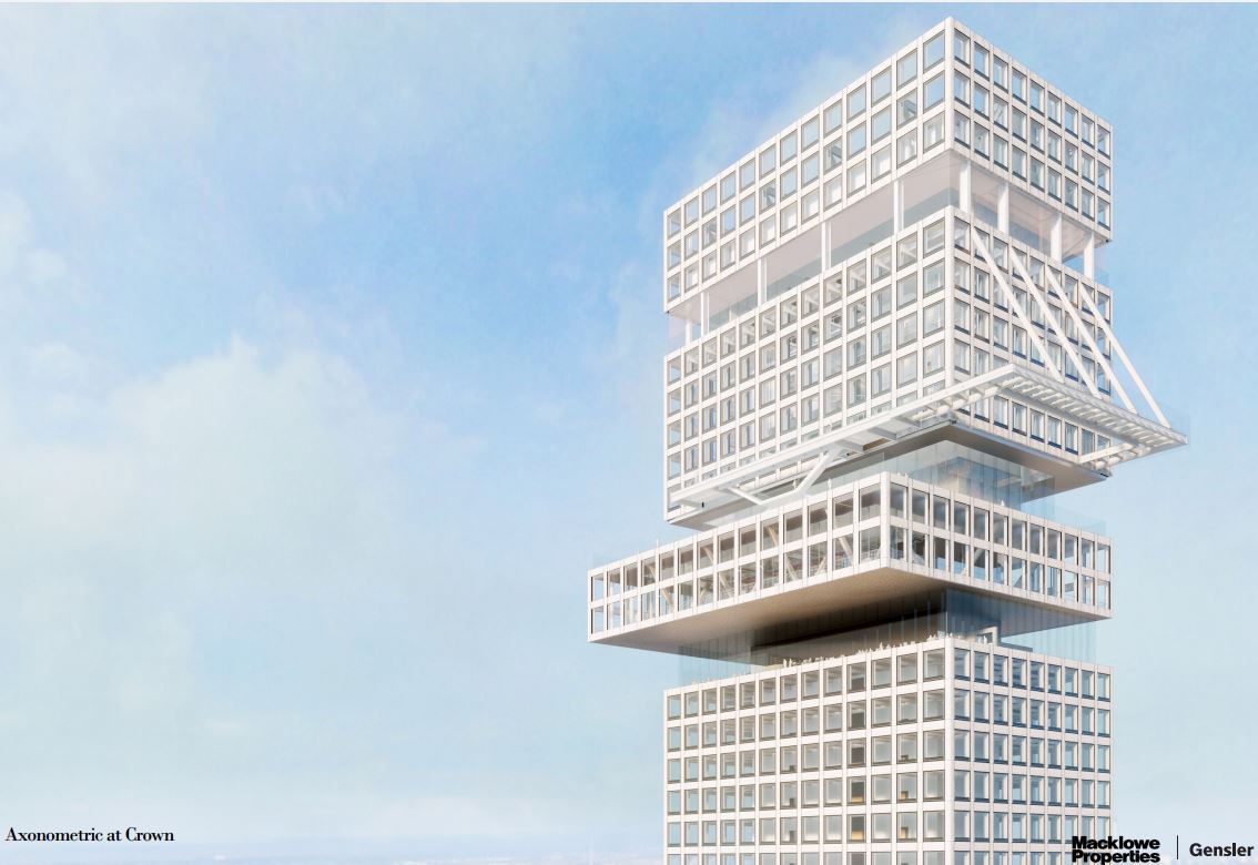
The main portion of the tower then features a regular grid of windows measuring about 15 feet wide with nine in a row on the northern and southern sides and 13 on the eastern and western. The podium would house the entrances to the elevator cores, a retail and food market in the cellar levels, an atrium that spans the whole height, expansive seating areas, and a three-story auditorium.
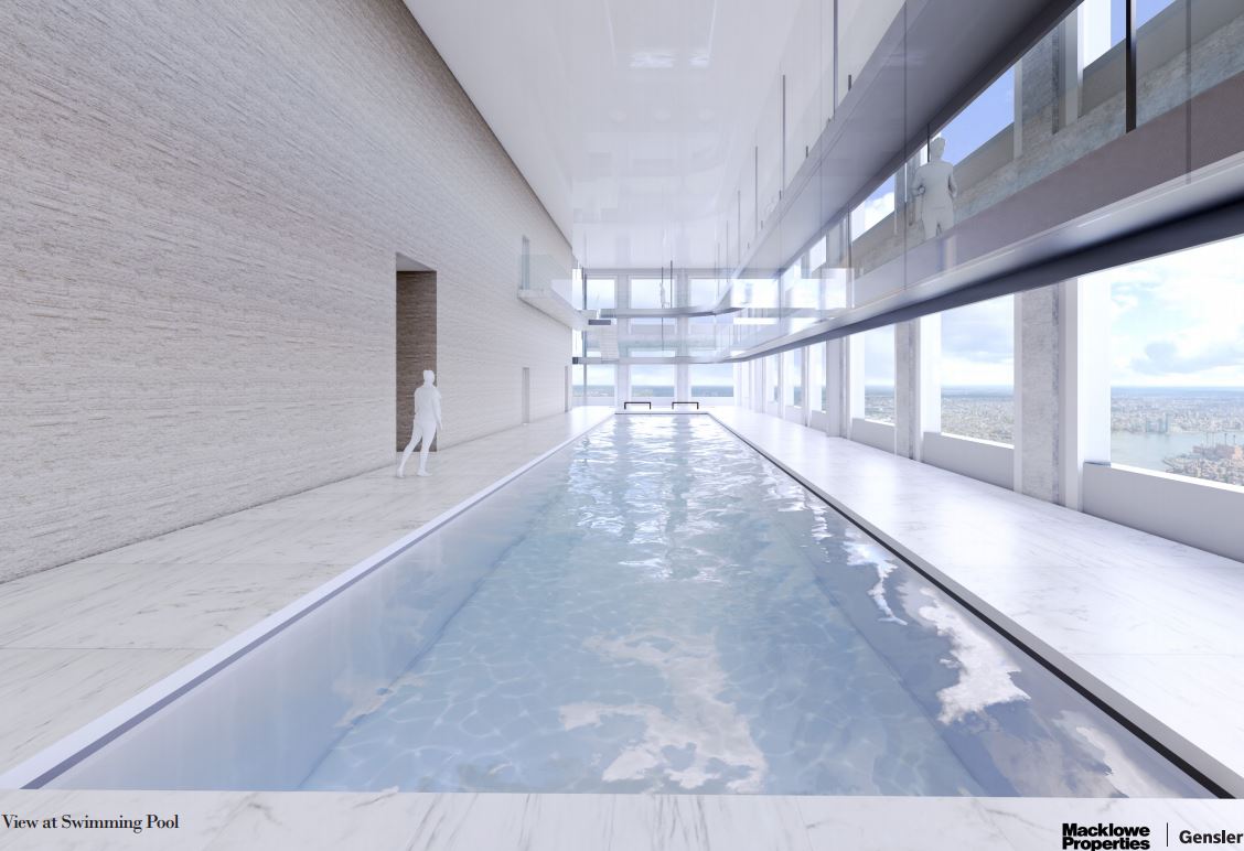
Going up the structure are floor plates spanning 19,800 gross square feet with column-free floor plans and a line of windows much like the fenestration of 432 Park Avenue. The eighth floor would house a wellness center with an indoor swimming pool and running track, while the 40th floor would house a sky lobby.
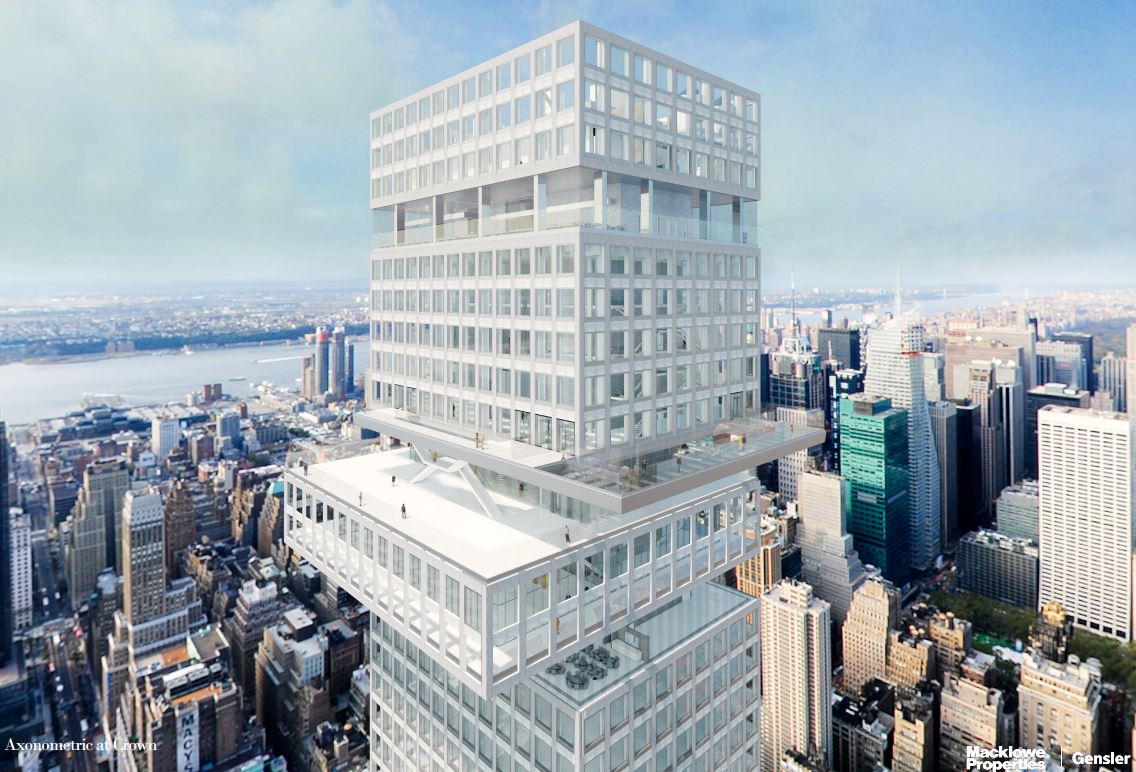
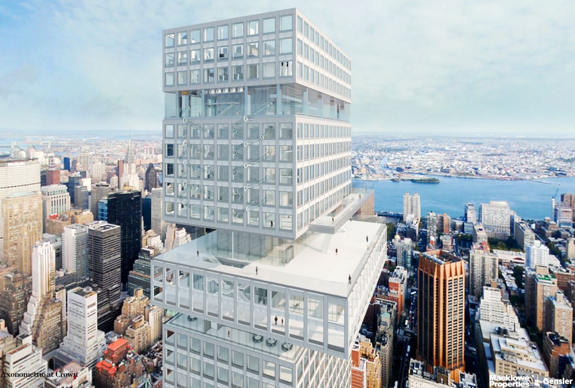
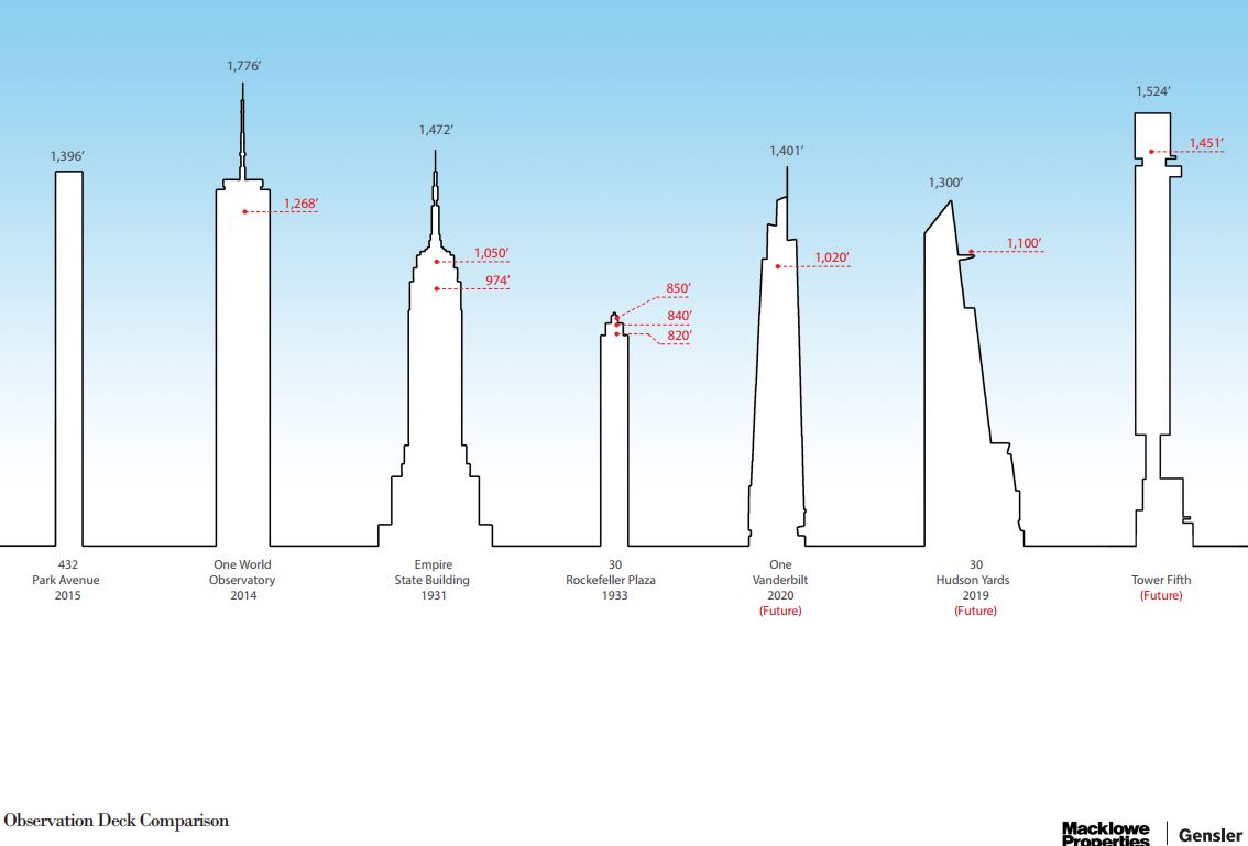
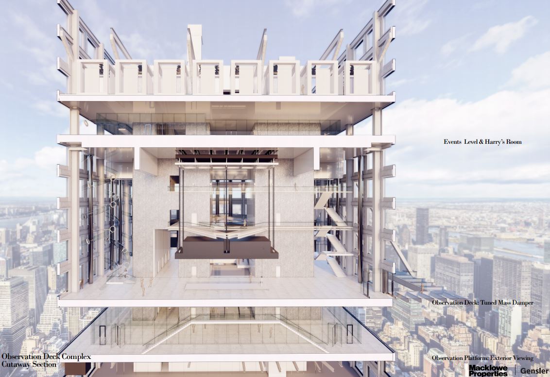
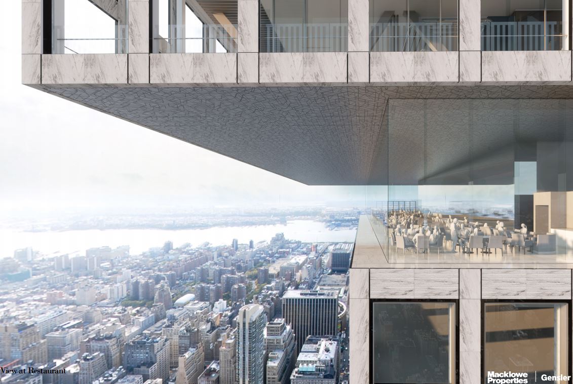
The most notable detail of Tower Fifth is the planned observatory, called “Sky of The Americas,” that will sit 1,451 feet high, making it the highest such attraction in the United States and the second-highest in North America, only 14 feet lower than the CN Tower’s upper observation deck. Renderings show a large open-air platform, a restaurant with a wrap-around floor-to-ceiling glass wall, and a vertigo-inducing rectangular U-shaped glass floor like the protruding Skywalk at Grand Canyon. Another interesting feature is a pair of tubular glass slides that spiral down multiple stories, taking visitors out over the side of the building. Also planned inside would be a chapel and a roof sculpture garden.
No word on when demolition of the existing small buildings will resume and construction of Tower Fifth will begin.
Subscribe to YIMBY’s daily e-mail
Follow YIMBYgram for real-time photo updates
Like YIMBY on Facebook
Follow YIMBY’s Twitter for the latest in YIMBYnews








Wow! This sure gives some more insight about the soon to be tallest building by roof height in the USA. First I’ll admit that I actually kind of favor Tower Fifth, even though it has a very weird column-like structure holding up the building, and is also just way too tall. This part of the building is probably going to be its greatest drawback design-wise. However, the rest of the skyscraper is actually pretty cool. I think its location on the skyline is really good and with that the observatory in this building is going to be absolutely epic. True, it may make Tower Fifth look weird on the outside, but that view will probably be the best in the City. So, I’m kind of mixed opioned about this tower, but the majority of me is saying that this could potentially be pretty cool. But, that is just my opinion.
Of course now the plans for 175 Park are for it to be even taller…such a travesty that we’ve been cheated out of full-scale rebuilding at the World Trade Center on the phony pretext that people would never be comfortable building that tall again!
Please just keep this as a fantasy. This is the worst building I’ve ever seen. It doesn’t need to be built.
Change from office space to middle income and low income housing .
The city has no need for more office space.
In the agecof COVID demand for office space has decreased
by 33% conservatively..
Wow… So much to love about this supertall. First, the location is ideal in regards to contributing to the skyline (centered in midtown north rather than on the far edges like Billionaire’s row or Hudson Yards). As the husband of a concert pianist, I’d also love to see my wife performing with St. Peter’s in the background… Stunning.
While the design is a bit awkward, it’s really growing on me with all of the additional details. Fingers crossed!
“The Look Building to the East..”
When was the last time anyone of us read a Look Magazine?
I still call MetLife the Pan Am Building. When was the last time anyone flew Pan Am ??? Lol
Oops… Didn’t mean to post as a reply.
There is still a demand for office space. Telecommuting does NOT work long-term for everyone, or every job. (Especially on a new, permanent basis.) Many jobs require people to be physically together for better efficiency. I believe it was Barry Diller who said “Working at home isn’t working (out)” and “You cant run a giant global corporation from everyone’s homes.” BTW Current night photos of Manhattan skyline show many lights on in the towers. A very good sign.
The city needs MUCH more office space.
There’s no excuse for treating the temporary effects of COVID as permanent.
A disgusting, unnecessary display of hubris and greed. This ungainly blot on our city has no real purpose or benefit other than making the developers wealthier.
This overbearing, hideous mistake must not be allowed to happen.
David! How dare you rail against the unbridled “greed and hubris” of developers seeking to become ever wealthier at our social expense? Tsk, tsk. That’s like asking a tiger to bleach away its stripes.You want “purpose” and “benefits” my friend? So sad. Your yet-undefeated idealism is painful to hear. Probably because the truth hurts.
I have no problem whatsoever with people getting wealthy. As long as it is not through illegal/unethical means.
So Yimby, if someone does not agree with the design of a proposed project, their comments are forever stuck in moderation. Interesting.
Perhaps this section should be called Positive Only Comments. Just sad…
I don’t know why your comment was stuck in moderation, however, I do not have time to spend all day approving the comments that are not automatically approved.
On hold? Thank our lucky stars! There is a god after all. A little nip here, a kick upside the head up there, all balanced on a dizzying en pointe in a cracked glass slipper. Let’s hope for a quick death of the worst possible dreck of steroid-pumped over-design.
awful.
a grab-bag (trash bin?) of every cliché of ‘distinction’ used to try to disguise utter banality.
a tricky contextual site, a complicated build, an ambitious program…
hire a better architect.
Agreed. The architect is throwing in every modern design cliche in a misguided attempt at originality.
Am starting to get a strong
“Bladerunner” vibe about the
NY skyline! What’s next flying Ubers and jet packs? ?
Perhaps, just perhaps, you should not rush to compare Mackowe’s Midtown Mishmosh Madness to the nearby CitiCorp-On-Stilts building. For the latter had to undergo some quick fixes done when it was discovered that its unique architectural massing had design flaws that needed to be repaired and reinforced quickly to prevent a tragic structural failure …. before the next NYC hurricane …and all done in secret!
Please Google the following for more information: The Design Flaw That Almost Wiped Out an NYC Skyscraper,
Fake news. It wasn’t a design flaw. It was a construction flaw. If it had been built exactly as the architect intended you wouldn’t be having this discussion. It wasn’t and we are.
Fake News? Really?
If the Citicorp building had collapsed in a windstorm, it would not have mattered whether it had been a design flaw or a construction flaw. That would have simply been real , very real, and sad, news….
The podium is kind of interesting. The rest is miserable, and I hope it doesn’t happen.
Yes. Keep the atrium and put a much better tower on top.
I am all for supertalls, but they are awkward and frightening when they look like popsicle sticks.
Popsicle sticks you say?
Be not afraid. Dr. Freud’s diagnosis for this sick building is that these poor architects were denied & deprived of popsicles when they were young, by their overly strict parents. Revenge is sweet! Even sweeter than missed popsicle sticks!
Oh well, at the very least this Midtown Meshugana MishMosh, no matter how grotesque, will be a slight change from all the compensatory phallic symbolism that continually ejaculates from our overwhelmingly male architectural cabal, a cabal that was likely denied & deprived of Legos or Erector Sets (remember them?) when were young. So sad….
I like having the mass damper exposed. Also, it looks like one of those large townhouses will be saved. I can’t tell if they are a holdout or this is an esthetic decision. I wish they would save the facades of all three and somehow make them part of the main entrance.
Wow… So much to love about this supertall. First, the location is ideal in regards to contributing to the skyline (centered in midtown north rather than on the far edges like Billionaire’s row or Hudson Yards). As the husband of a concert pianist, I’d also love to see my wife performing with St. Peter’s in the background… Stunning.
While the design is a bit awkward, it’s really growing on me with all of the additional details. Fingers crossed!
Tearing down beautiful century old buildings for this MIDBLOCK monstrosity is the last thing New York needs.
this thing is awesome. was getting vertigo just looking at some of the pictures. sure hope it gets built.
Quit stalling and build it.
We should all be lucky to live long enough to see this building, or a version of it completed.
Kronos…giant alien robot sent to destroy NYC
The design of the building looks like a the barrel of a gun’s silencer.
Are buildings with 156′ mechanical gaps still allowed? I thought the city council passed a zoning text amendment to prevent that sort of waste of space.
Beyond that, it looks unstable. Maybe that is the “dare” in the design, but as someone else pointed out, with the Citicorp building, it spectacularly backfired and if the original architect hadn’t been honest and open to a much less experienced colleague out of grad school, who was right, it could have ended in epic disaster on an almost unimaginable scale. We do get small earthquakes here, and hurricanes and even occasional tornadoes, probably more in the warmer future. I hope they know what they’re doing.
And really, we should be building living space, not just working space that may not be needed.
Can you tell us more about the status of the negotiations with the cash-strapped government of Venezuela to buy from them the townhouse that needs to be removed to allow for the erection of this super-tower? Is there a “When Harry Met Nicolas” story here?
Kudos to Gensler on the rendernigs,they are beautiful. Not so sure about the building itself. Lots of interesting pieces put together in a way that looks clunky at the top and frightening at the bottom.
1. Famous last words: “ I hope they know what they’re doing”.
2. “Living space” you say?? My, what a quaint notion.
I assume you mean something more than merely building more havens for the money laundering “investors” in our real estate market?
Why more office space? There is a gross over supply of office space all through the city. It is not needed.
Having in consideration risking the cathedral landmark across the street built in 1878..
Where is the common sense of this project?
Is just going to be another empty office building. Blocking the natural light on the streets.
Brilliant building, packed with innovation, revolutionary architecture, and functional/fun design, build it!
The location is simply amazing.
Thank you for sharing these most exquisite and descriptive renderings from Gensler. What an exciting and stunning project!
Looks like IG-88 from Star Wars.
About the design: It has some interesting flourishes. But don’t expect it to stay as drawn. If he can empty the third building it will mistakenly be demolished like 3 brownstones 30 years ago in the theater district had midnight demolition done. Better to ask for forgiveness than permission. Old habits die hard. I like it. Let’s see what transpires.
Wonderful design! Love it!
The renderings give a nice sense of how this leviathan relates to everything around it. The Look building looks great in them (however dwarfed). The view of St Patrick’s north transept from the auditorium is uplifting. Particularly like the exposed damper at top (horizontal alien monolith!) There’s an instability to this whole conception that might reflect the time we’re living in — billionaire hubris or iconic building of the 2020s?
Two beautiful old buildings need to get demolished for yet another glass and steel monstrosity that looks like a game of Jenga gone awry. NYC shouldn’t turn into a museum, but can we please keep the old architecture that is beautiful and demand truly great new architecture?
The aerial view the penthouse section, looking east with the East River in the distance, shows the distinctive shape (a tower turned 45 degrees) and color (red brick) of 3 Park Avenue to the east of the project. That building is located on 34th Street and Park Avenue, to the south of this project. It looks like they shifted the background south 17 blocks, to avoid showing the clutter of buildings on the proposed site.
Looks like Central Park Tower’s US roof height record will last but 5 years or so. And then Tower 5th’s will last roughly the same time when it is beat by Project Commodore.
There are some very nice details, but taken as a whole, this building is so tired looking. Looking at it as a whole, this giant Pez dispenser has no beauty to it. New York and Gensler deserve better.