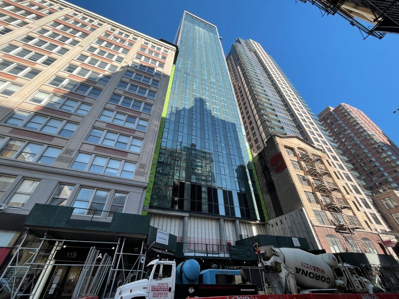
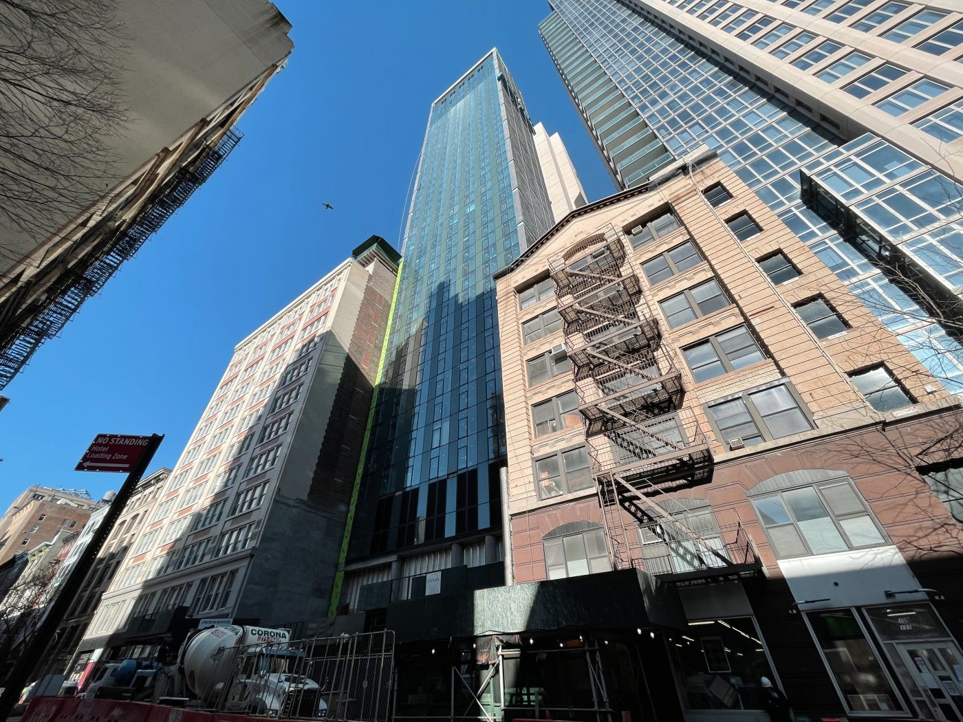
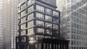
Façade work is wrapping up on 113 West 24th Street, a 39-story Marriott hotel in Chelsea. Designed by Stonehill Taylor and developed by Lam Generation, the 420-foot-tall tower sits between Sixth and Seventh Avenues and is planned to yield 360 rooms averaging around 380 square feet apiece.
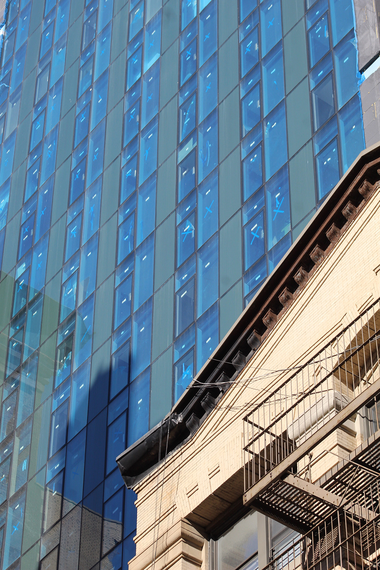
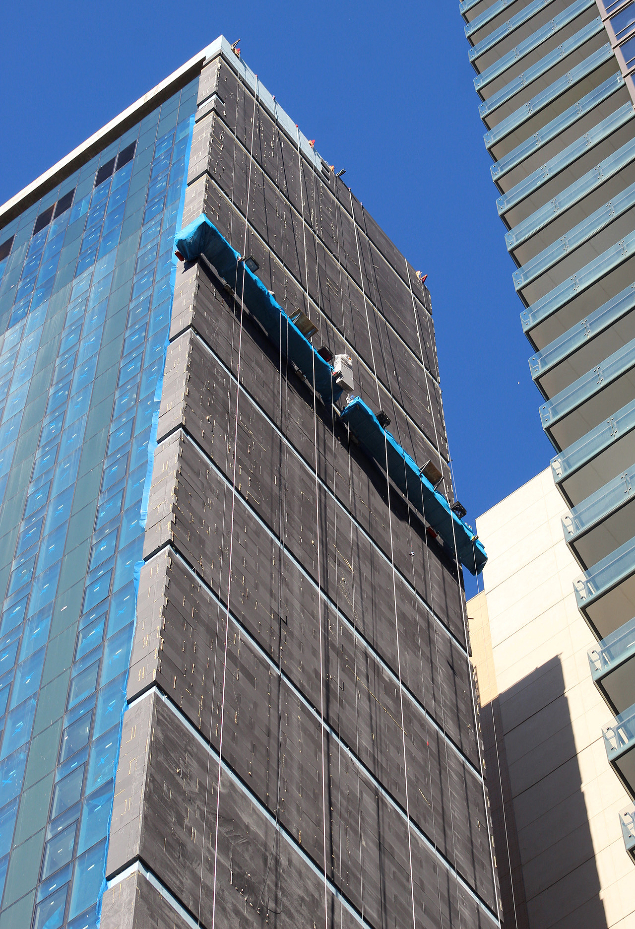
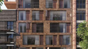
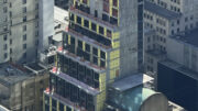
Recent photos show the glass curtain wall fully installed on the main southern elevation. The eastern and western walls are being wrapped in a dark gray finish made up of individual rectangular tiles arranged in a brick pattern with breaks in the uniform surface every few floors.
The primary area awaiting completion is the double-height ground floor with its tall ceiling and series of round concrete columns that line the perimeter. It looks like temporary walls are placed between the columns and will stay up until the final layer of the envelope goes up. It’s likely to be a wall of floor-to-ceiling glass. Directly above appears to be mechanical levels covered with black metal grilles and opaque panels. From there are the hotel floors that continue up to the flat roof parapet and upper set of mechanical floors with the same façade composition. A void in the southern wall facing West 24th Street can be seen at the top just below where a rectangular concrete beam separates from the flat curtain wall.
113 West 24th Street will span 136,700 square feet, with 129,590 square feet devoted to commercial use. There will be ten rooms per floor from the fourth floor to the 41st floor, followed by a rooftop bar with views over Chelsea, Midtown, and Lower Manhattan.
113 West 24th Street’s previous completion date, as stated on the construction fence, was December 2020, though it looks like sometime in the latter half of 2021 is likely.
Subscribe to YIMBY’s daily e-mail
Follow YIMBYgram for real-time photo updates
Like YIMBY on Facebook
Follow YIMBY’s Twitter for the latest in YIMBYnews




This is not even good filler. Devoid of any joy. This is like bad Gene Kaufman garbage. This is a misery.
Good greif! What is Marriott thinking all the time?! This looks exactly like the work of Gene Kaufman. That being said, this building is crap and it should be flushed down the toilet immediately. ?
Scourge
Any low income tenants.
Thank you,
B.N
It works
What a disaster
it will be another homeless shelter in no time
HOPE THE LOW INCOME ARENT PUSHED OUT OF THE AREA
Your reporting program on progress I had played, and I had shown my interesting to speak out of its facade: Thank you.
Termination of prism base is bungled and makes it look like a joke. Fix it
Please send me an application for a two bedroom affordable apartment by email
Thanks