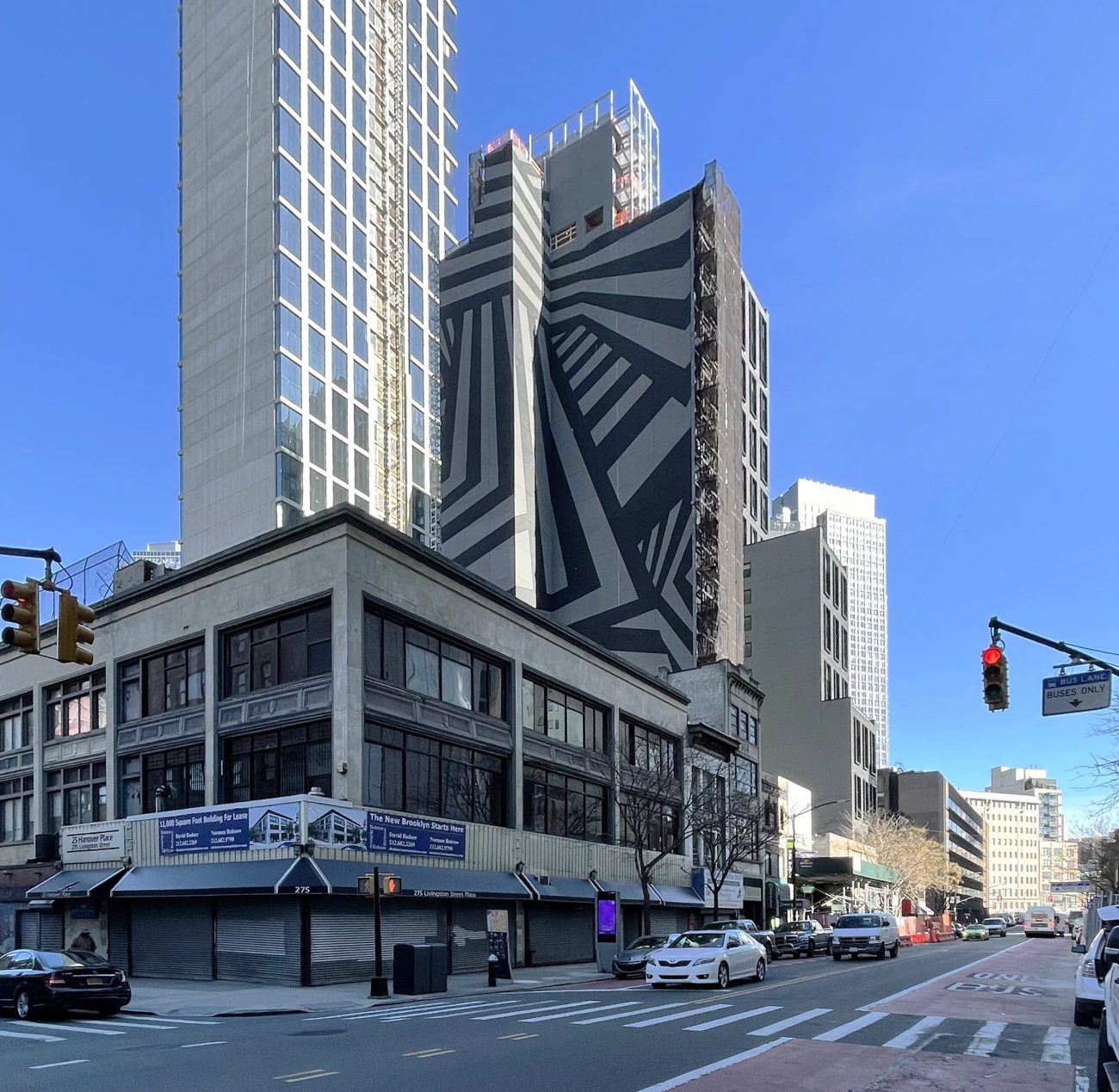
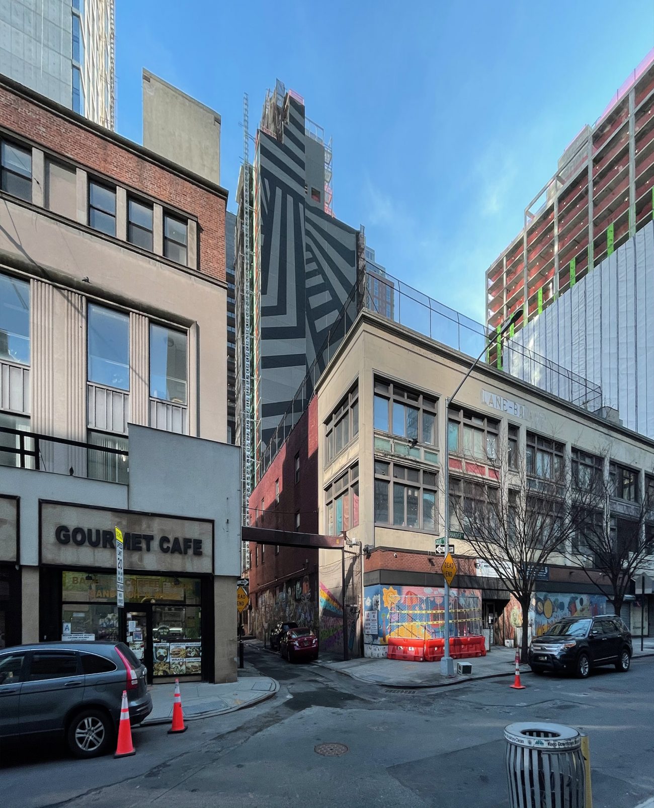
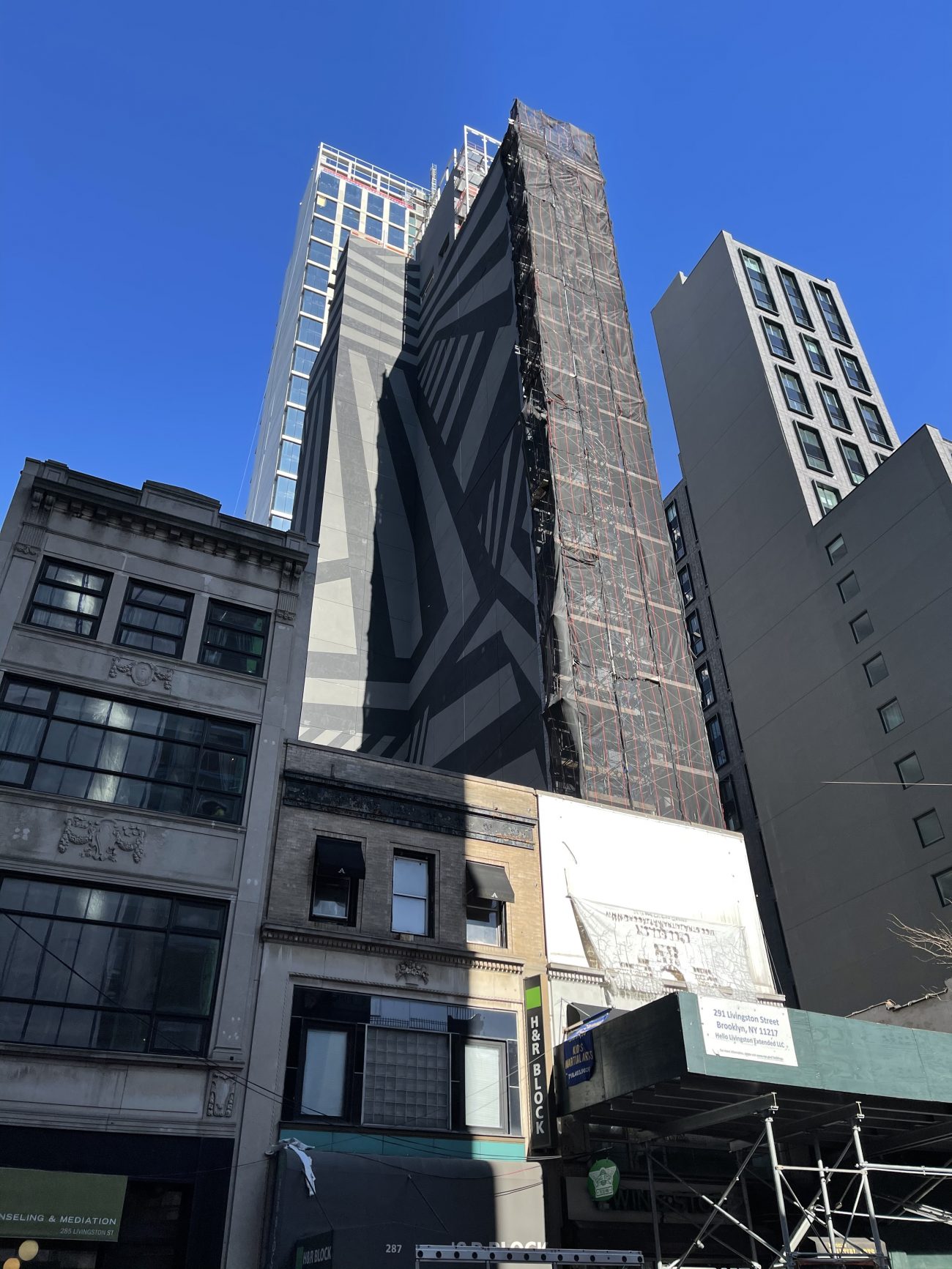
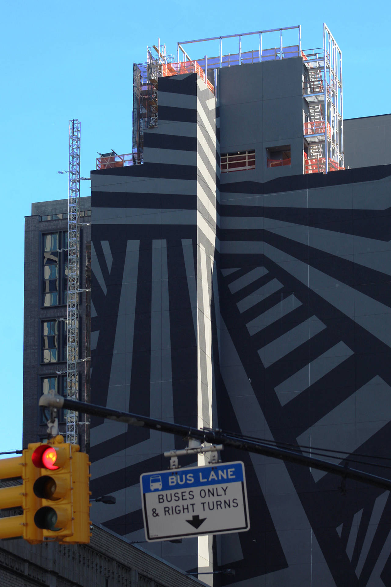
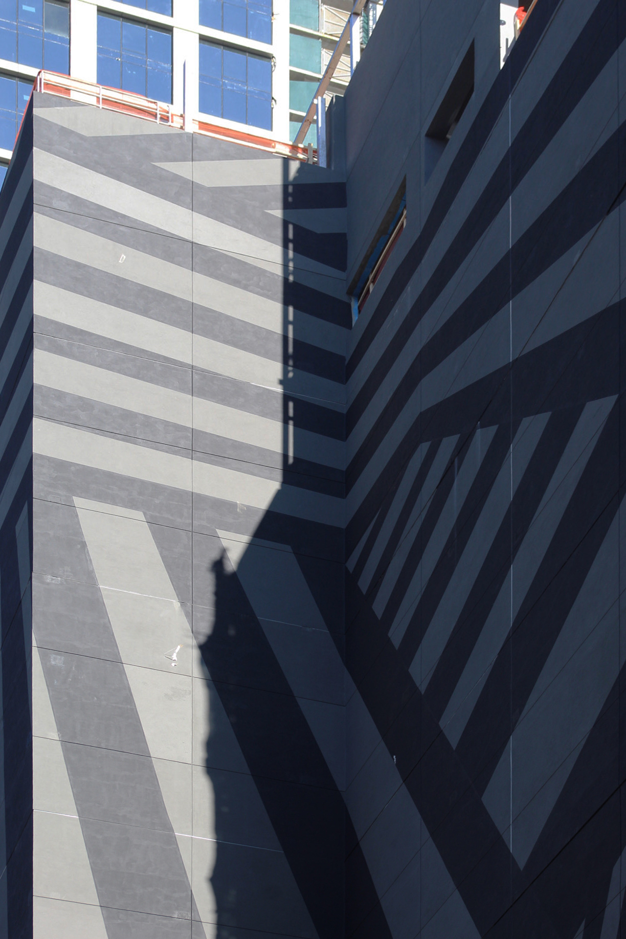
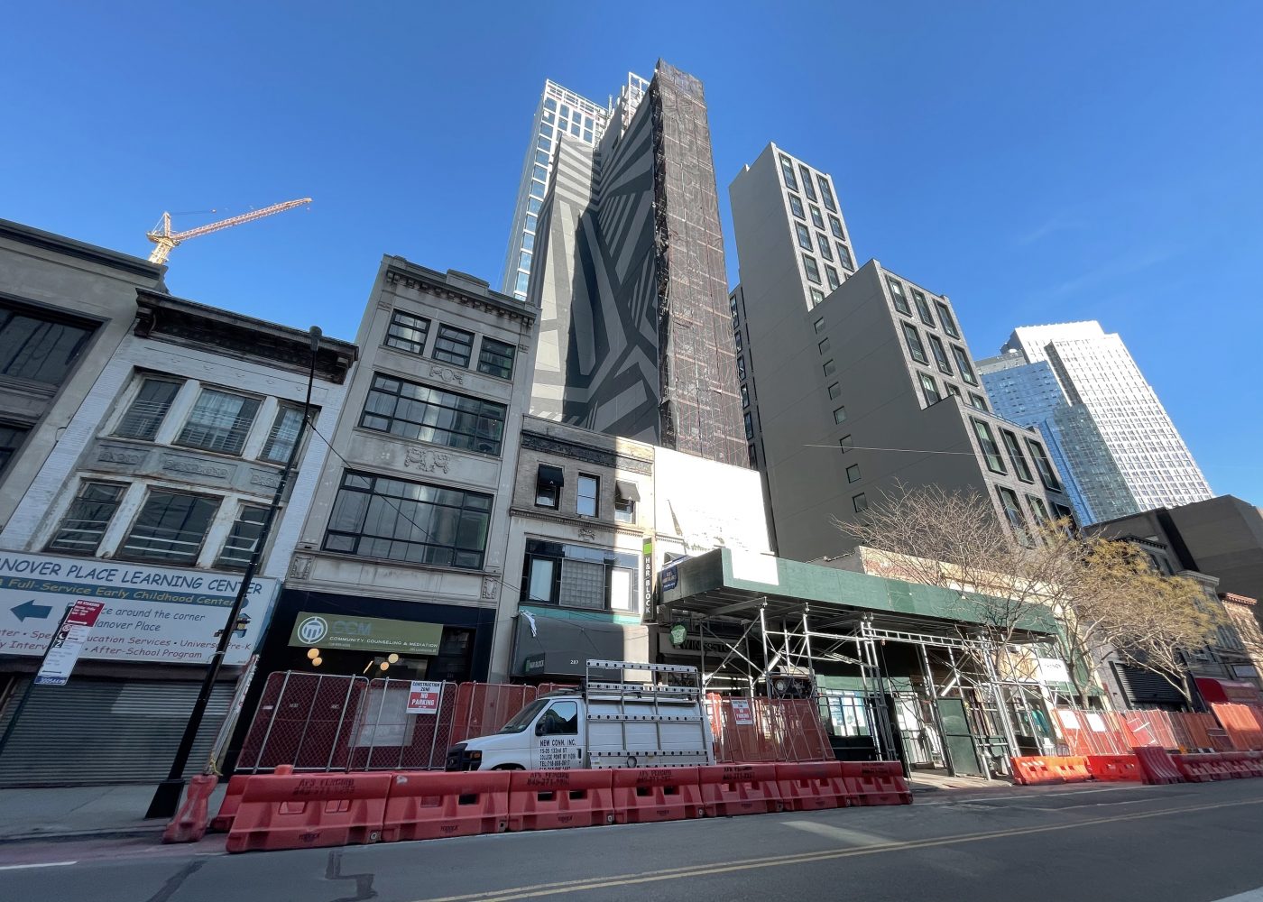
Scaffolding has been removed from 291 Livingston Street revealing the large mural on the western elevation of the 22-story hotel in Downtown Brooklyn. The 189-foot-tall project is designed by Gene Kaufman Architect and is being developed by Aview Equities and Hello Living, which purchased the plot for $11.1 million. Located between Nevins Street to the east and Hanover Place to the west, the property will yield 100 hotel rooms and a ground-floor beer garden.
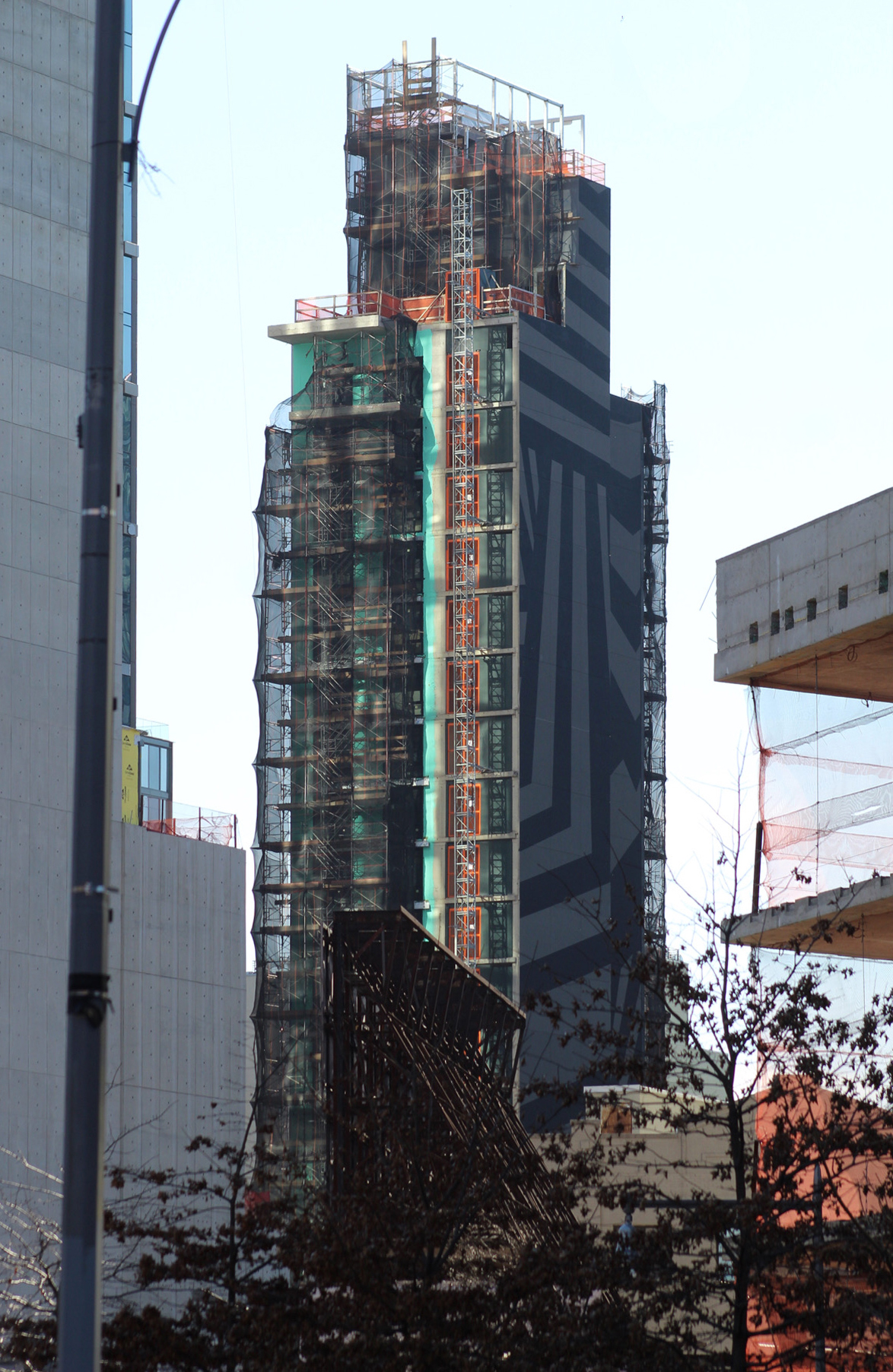
Recent photos show the exterior partially revealed since our last update in late November, when dense scaffolding and netting enshrouded the entire structure.
The general aesthetic of the black-and-white dazzle pattern has been retained from the rendering, albeit in a more muted and form, with gray replacing the white backdrop. The exterior hoist remains attached to the rear elevation, and scaffolding still covers the remainder of the structure, obscuring views of the progress on the windows and stacked balconies, which are rendered to span the southeast corner.
A completion date for 291 Livingston Street has not been announced, though sometime before the end of this year is conceivable.
Subscribe to YIMBY’s daily e-mail
Follow YIMBYgram for real-time photo updates
Like YIMBY on Facebook
Follow YIMBY’s Twitter for the latest in YIMBYnews





I think that it was because of crew’s work, when you showed the progress and everybody just calls it: The design: Thanks to New York YIMBY.
What a jumbled, incoherent mess that particular block in downtown Brooklyn is. What is needed is a well-designed in-fill project to fix the blank walls of two neighboring buildings and block this hideous mural.
That is simply atrocious. Just because you can doesn’t mean you should.
Seeing this design on the way to work in the morning will bolt the viewer awake better than a cup of joe!
Hey! At least Kaufman kept his word this time. But, in a seriously bad way. Man, this is SO ugly.
Ughh,,, I live 1 block away & this ugly “design” is coming ?What happened to keeping it classy, modern chic & aesthetically pleasing(like most buildings being built dwntn). This architect is trying to stand out & bring something different to the table but instead we’re left with some tacky black & white design.
based on the famous painting ‘dazzle ships in the gene kaufman junkyard.’
I’m unable to discern the speed or heading of this battleship…
It turned out better than the rendering.
I saw this in person the other day and relieved to see that the garish white in the rendering had been replaced by a neutral grey. It is still awful,but not nearly as bad as I feared.
“What’s the address again?”
“Just look for the completely out-of-place mural eyesore on the side of the building. Can’t miss it!”
Everyone associated with this monstrosity should hang their collective heads in shame.
I am continually fascinated how developers are their own worst enemy. what a weak attempt at art MC Escher and all the other brilliant surrealist are gagging. But hey there was open sky being wasted might as well fill the hole in the sky with a bldg. Wonder if they have learned anything from Covid? The denser the area the weaker the market. The areas with open space,sky, trees there are bidding wars. Hmmm … think they will get the message?!