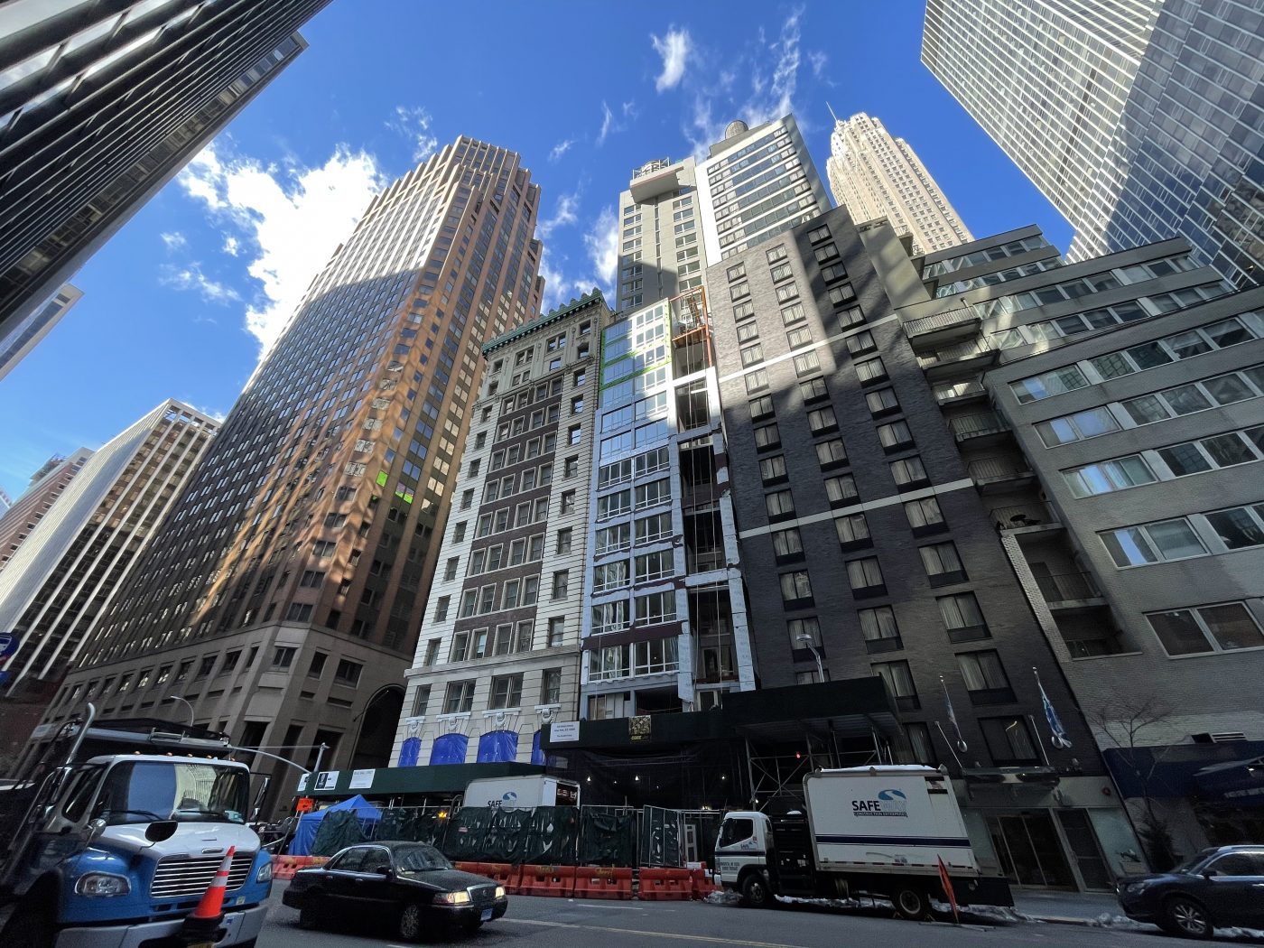
Exterior work is nearing completion on 120 Water Street, a slender 28-story tower that will house a Hotel Indigo in the Financial District. Designed by Gene Kaufman Architects and developed by Atlas Hospitality, the 52,000-square-foot structure will yield 28 rooms managed by Fortuna Realty Group. The site is located along Water Street between Pine and Wall Streets, and is tightly wedged between two abutting buildings.
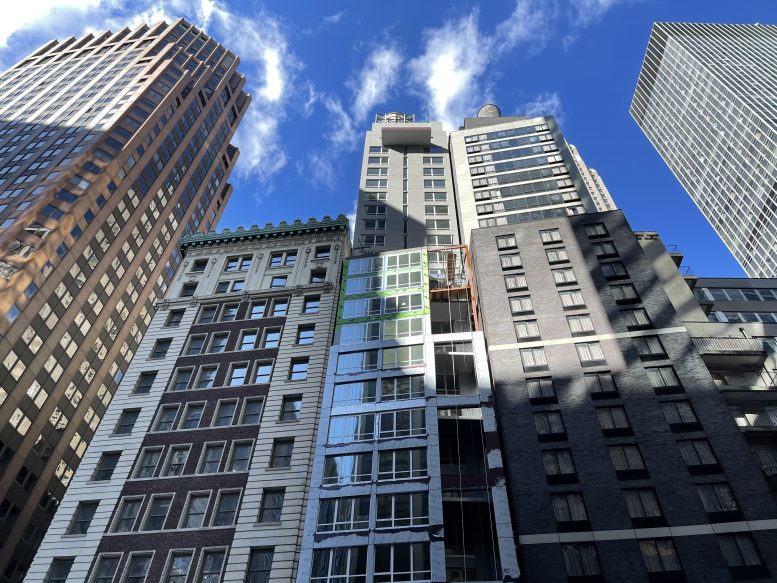
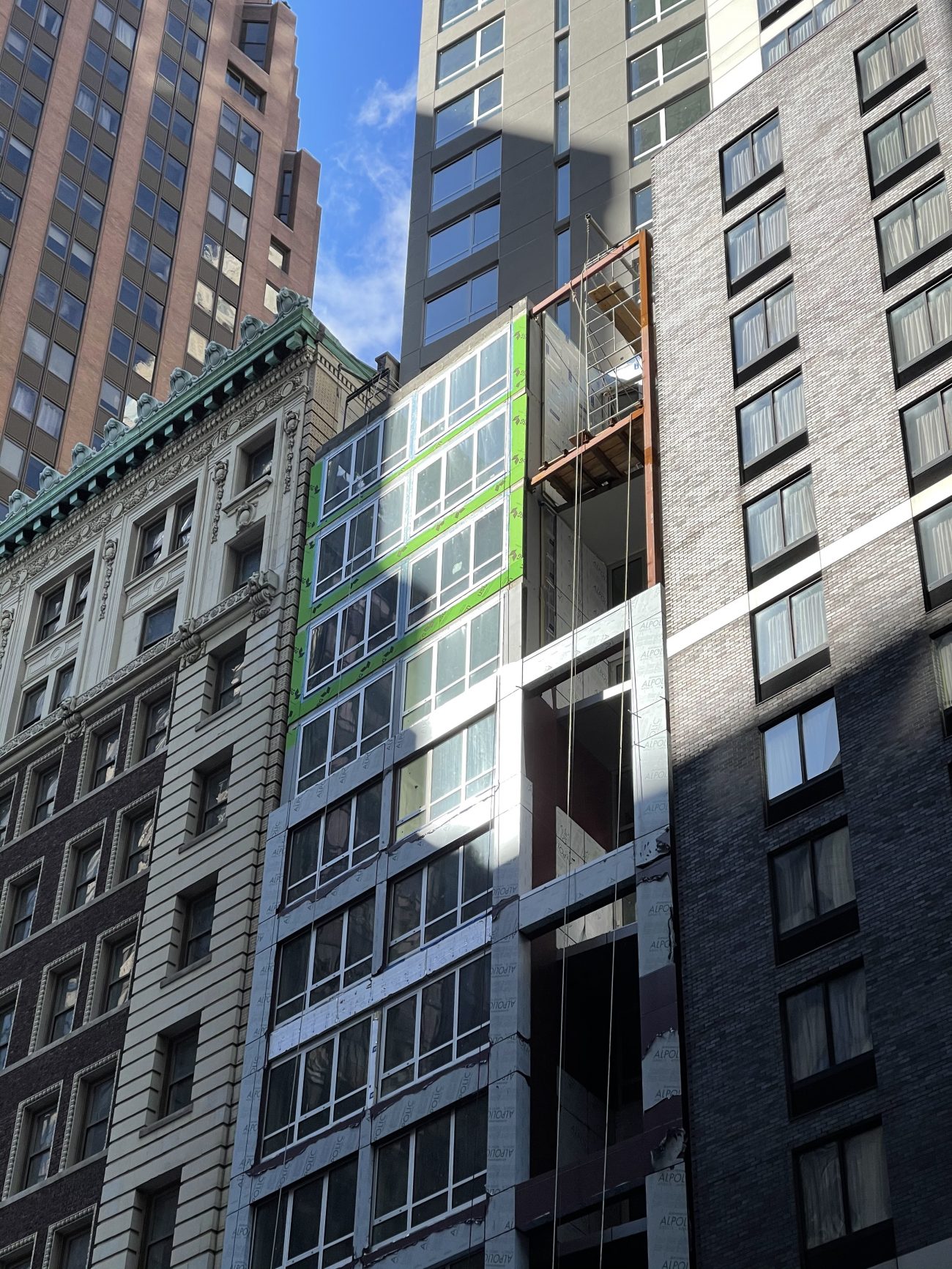
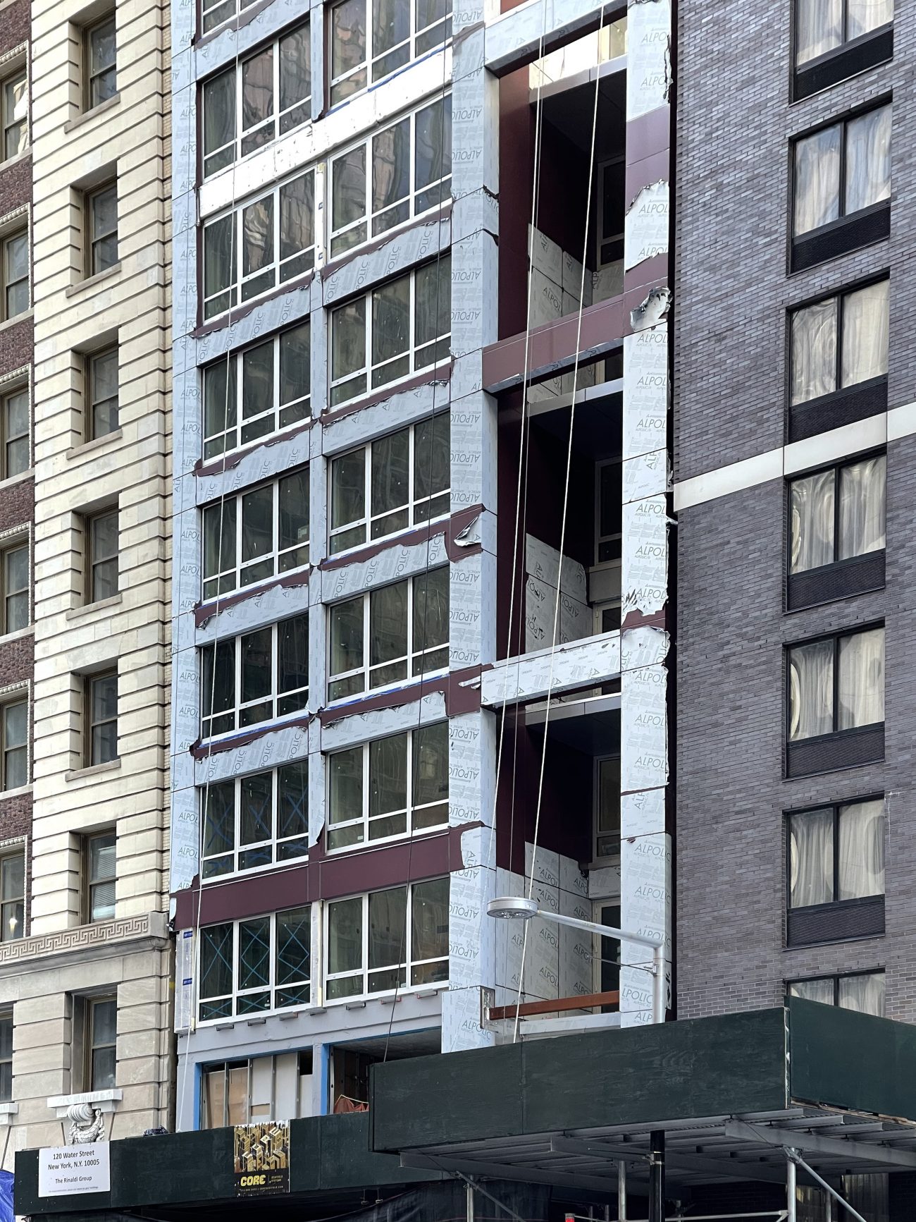
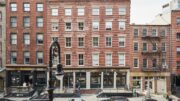
Recent photos show the gray façade paneling on the lower half of the hotel approaching the main setback. The panels are mostly covered in temporary protective plastic film and surround the columns of windows and double-height openings on the northern end of the front profile. The upper half of 120 Water Street looks largely finished with only minor details remaining around the rectangular cantilevering platform on the final level, as well as on the mechanical extension holding the wooden water towers.
Amenities for hotel guests include a cellar-level fitness center, a ground-floor restaurant, and a 25th-floor venue space, which is noted by the protruding balcony. The nearest subways are the 2 and 3 trains at the Wall Street station, accessible via the nearby interior public atrium at 60 Wall Street to the west. The J and Z trains are also a short walk away, located in front of the New York Stock Exchange at the intersection of Broad Street and Wall Street.
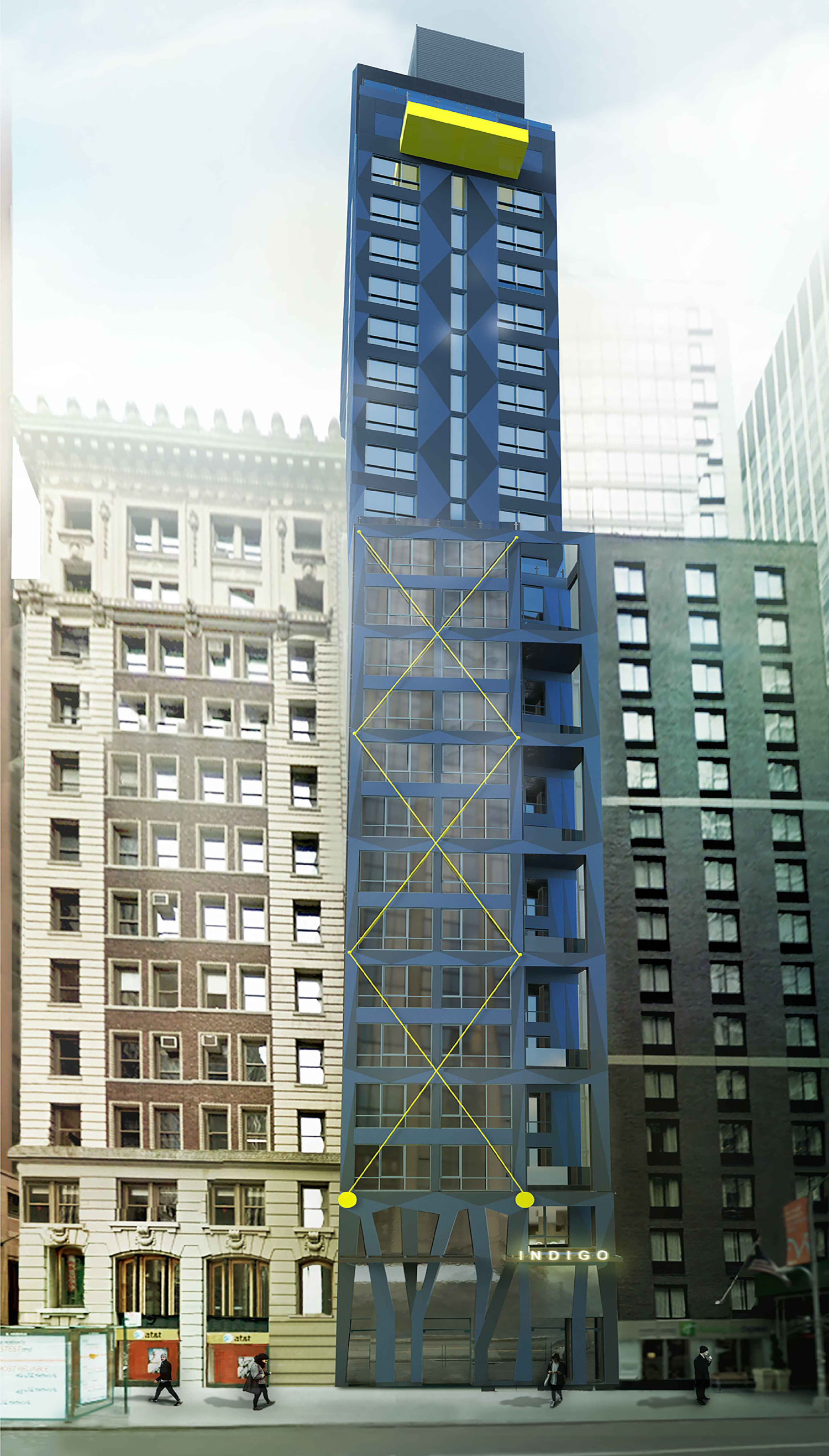
Below is a rendering of the hotel’s initial design, revealing the simplification the project has undergone in terms of color palette and texture, as well the removal of architectural details such as the yellow cross braces and diagonal ground-floor columns.
A formal completion date for 120 Water Street has not been publicly announced. We can speculate that the Hotel Indigo will be finished sometime later this year given the majority of work appears close to being done.
Subscribe to YIMBY’s daily e-mail
Follow YIMBYgram for real-time photo updates
Like YIMBY on Facebook
Follow YIMBY’s Twitter for the latest in YIMBYnews


Of course they had to drop the “weirdness” of the building and make it all grey and drab. Sometimes I wish Gene Kaufman Architects would actually create what they propose in the renderings. At least it’d be more interesting and lively!
I like the colored version better. Too many glass and blah buildings in NYC already. Indigo should be indigo…
The most charitable thing that can be said about this is that Gene Kaufman has designed worse buildings.
My thought exactly.
At least it’s not set back twenty feet from the streetwall.
In terms of the original blue and zigzaggy features, I think we actually dodged a bullet. I cant imagine less competent hands to craft a funky futurist building than Gene.
“My Eyes, My Eyes”!! ?
Make him stop please… is his goal to blight block after block with these hideous things?
I prefer the historic building on the left, that proves like a fine wine in a barrel, it gets better with age, compared to the stuff made by crushing the grapes with your feet! ?
What a shame the exterior has now been made anonymously dull. The original blue and yellow design was a refreshing change for Kaufman, but the disappointment continues.
Come on David, you should be aware of this by now: Gene Kaufman can’t do anything that achieves better than “painfully dull.” Indeed, for him, that’s a huge improvement over what he usually produces.
And the first scheme was both pathetically inept and a clown-show. The guy’s an awful hack.
I wonder if Kaufman ever sees our critical
comments here and whether they register even an iota with him? Is the value engineering his clients’ decision, or is he simply this inept? Or both?
This building isn’t bad at all, and is superior to the Holiday Inn Express building to its right.
Gene?
His work with McSam is generally a blight, but with other developers he’s capable of good architecture.
Your buildings are atrocious Gene, stop it.
More urban blight from Kauffman