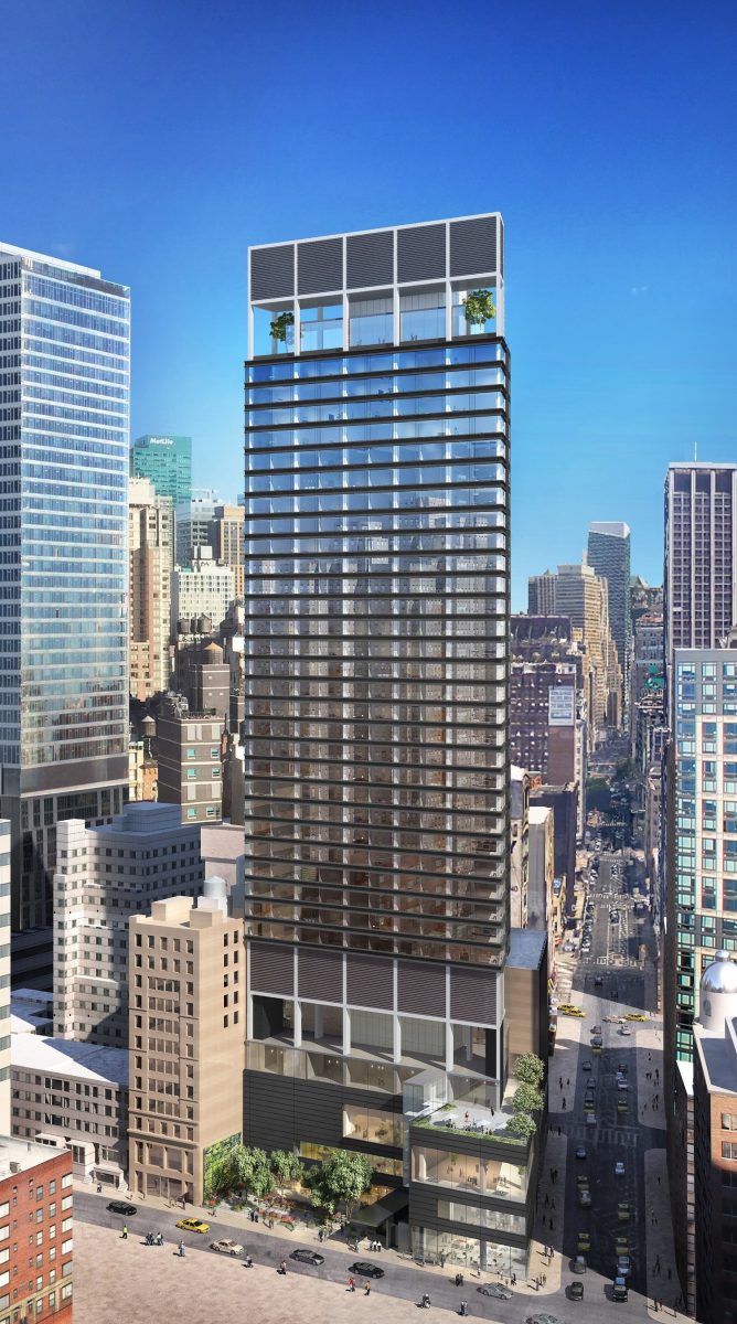
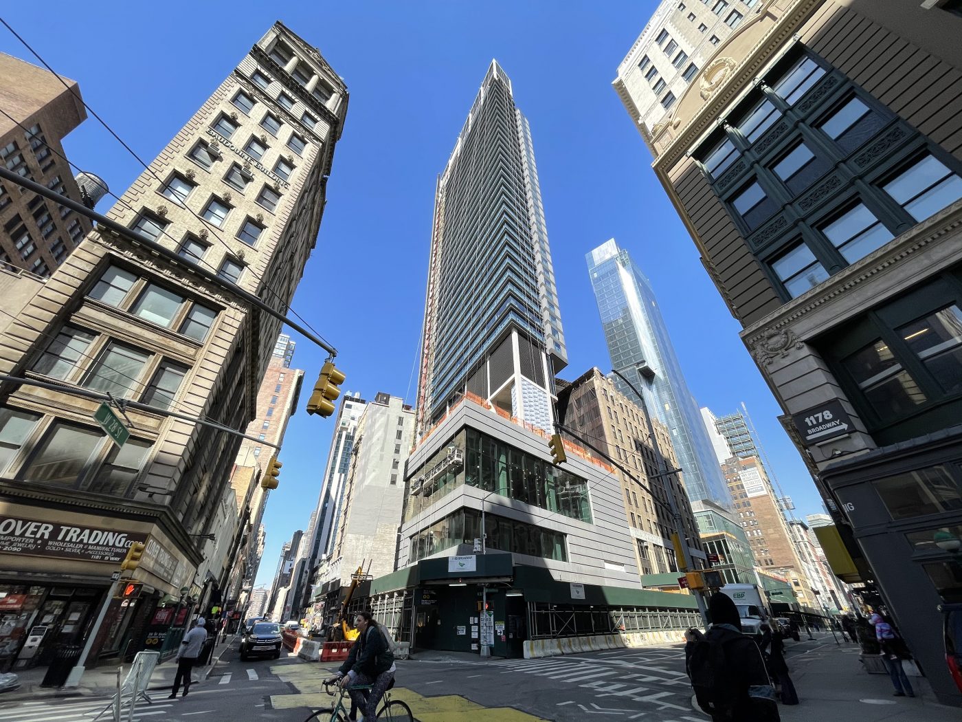
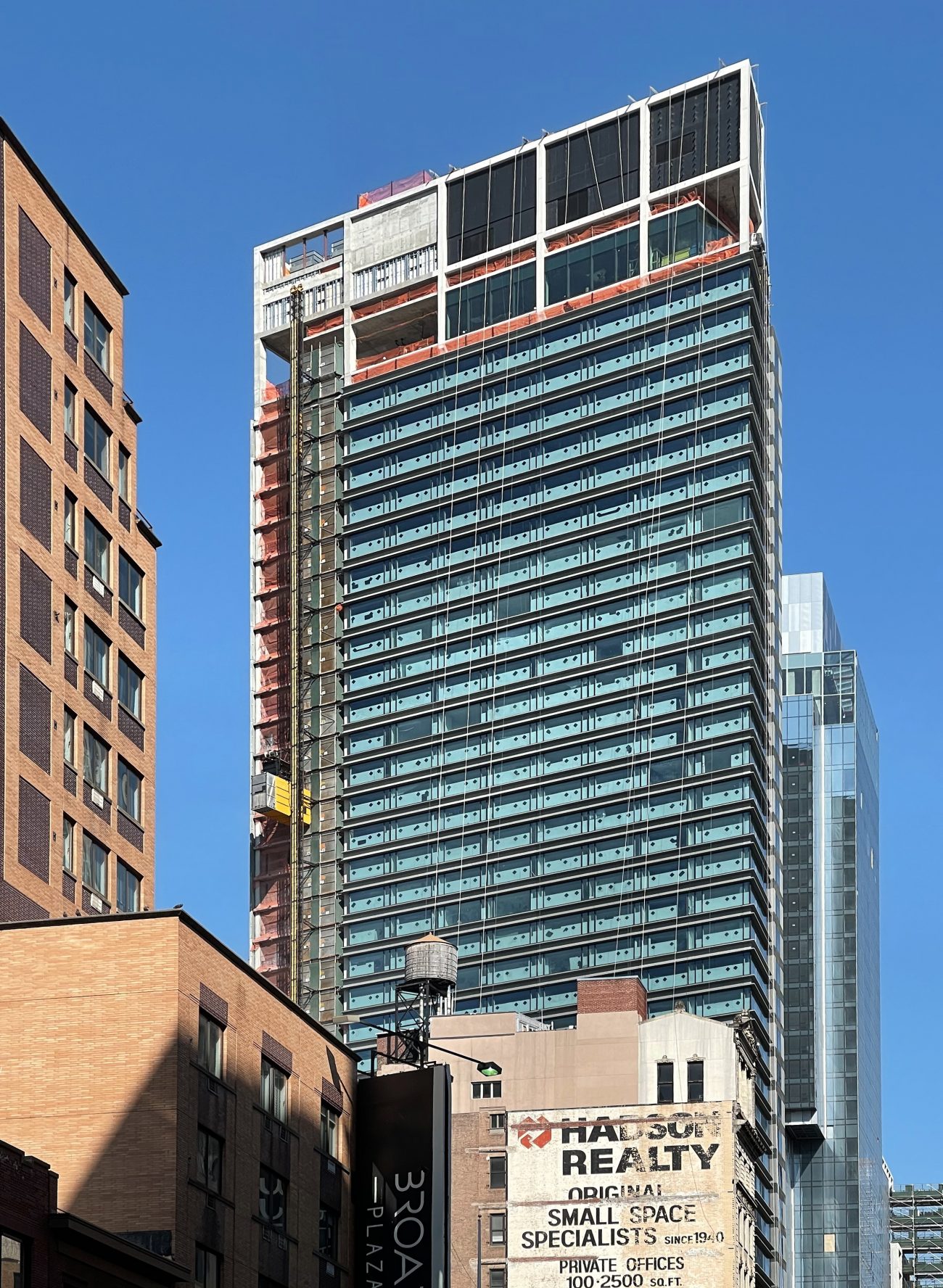
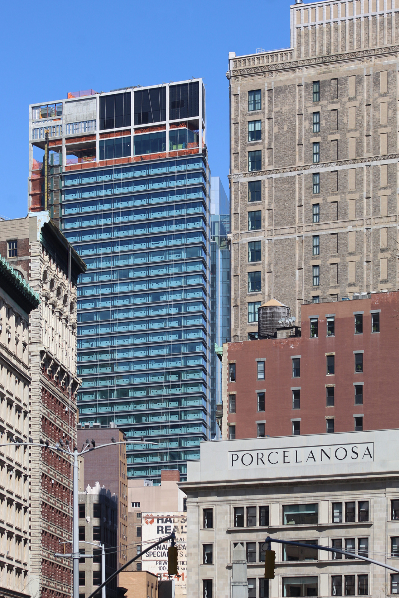
Façade work is getting closer to completion on the NoMad Ritz Carlton, a 580-foot-tall hotel skyscraper at 1185 Broadway. Designed by Rafael Vinoly and developed by Marriott, Ritz Carlton Hotels, and Flag Luxury Properties, the 40-story tower will yield 250 guest rooms across 150,000 square feet at the corner of Broadway and West 28th Street.
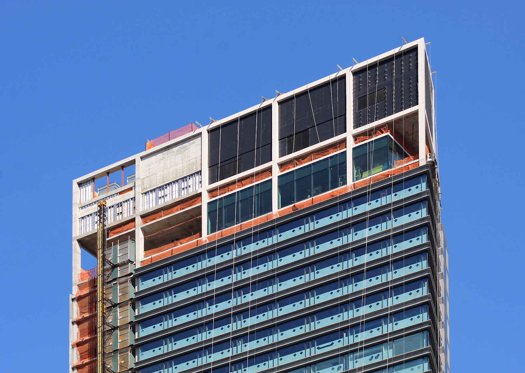
Recent photos show the progress on the exterior since our last update in December. Since then, work has moved along on the large mechanical levels above the podium and at the crown.
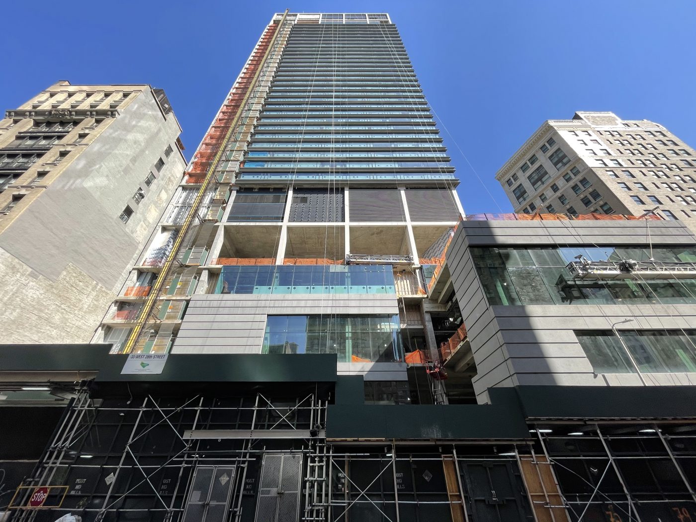
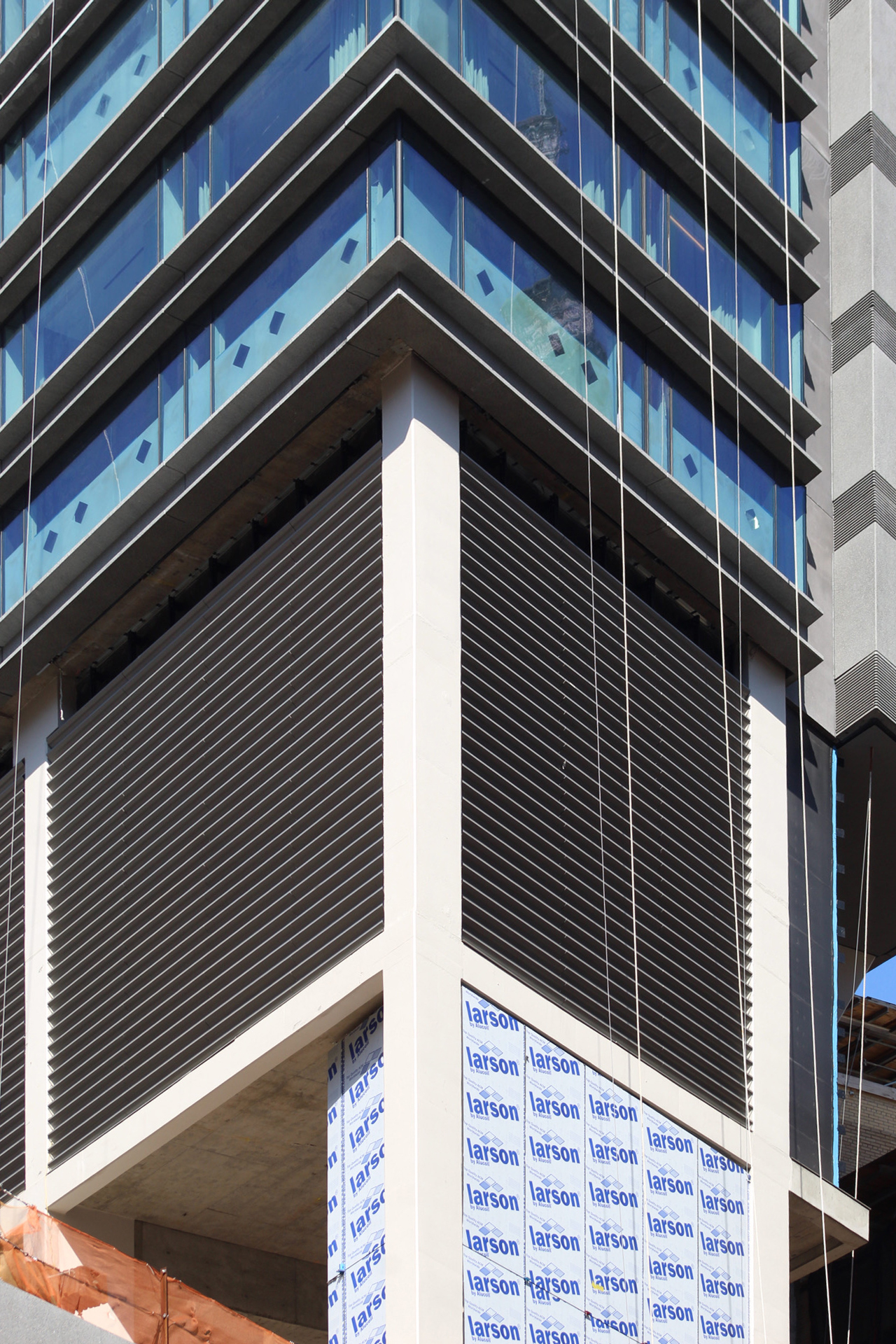
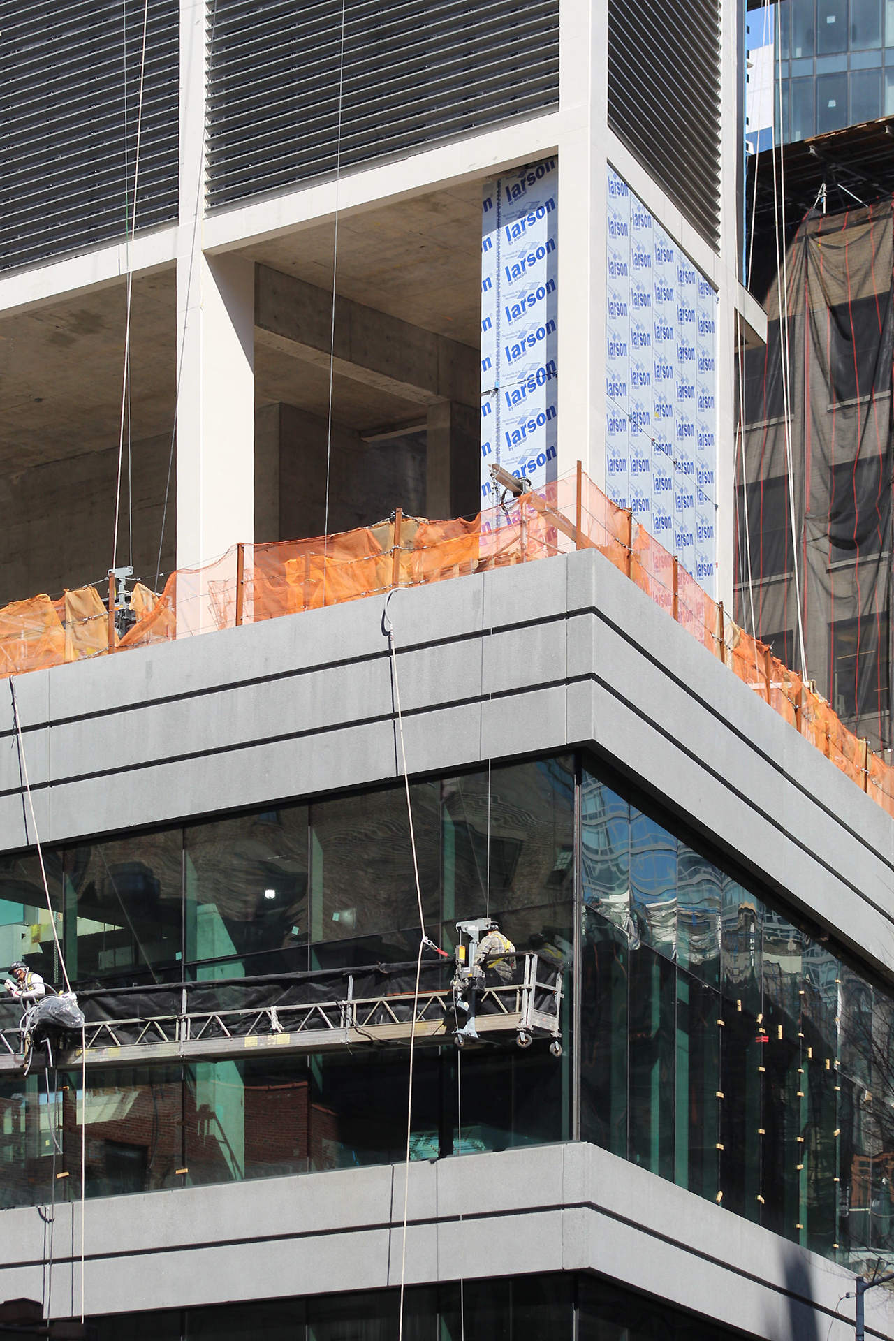
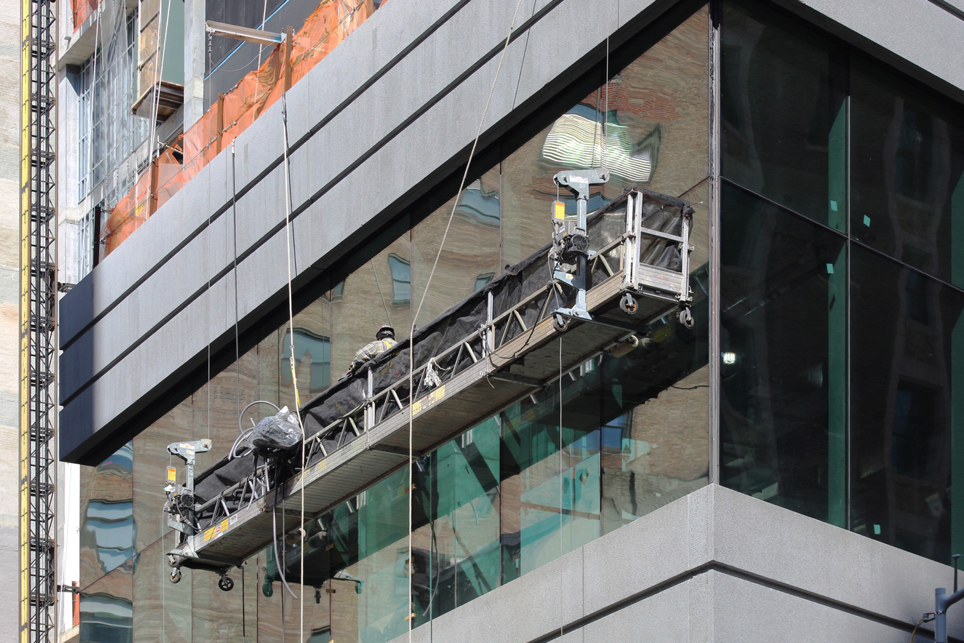
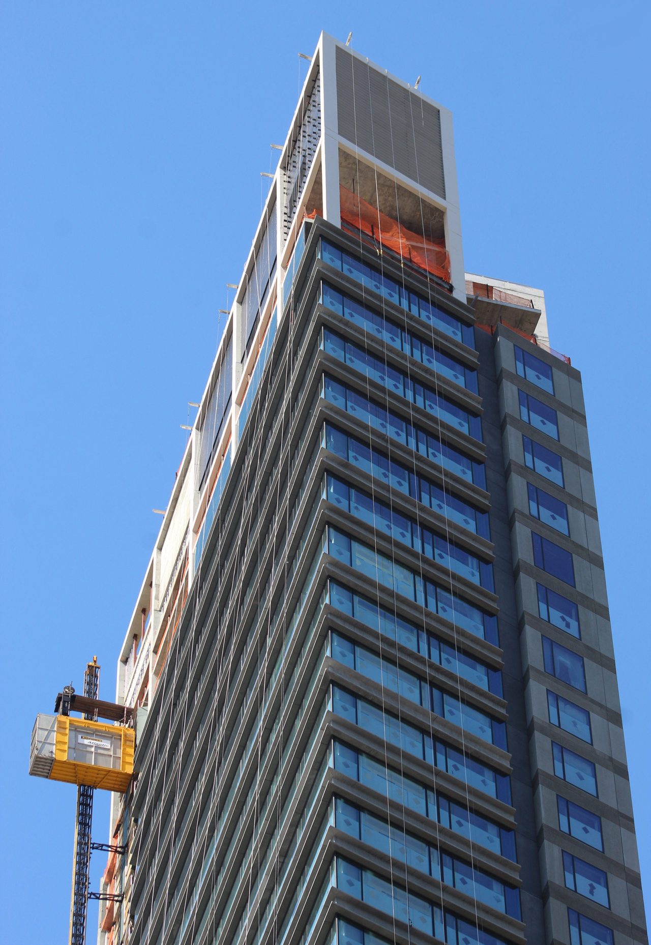
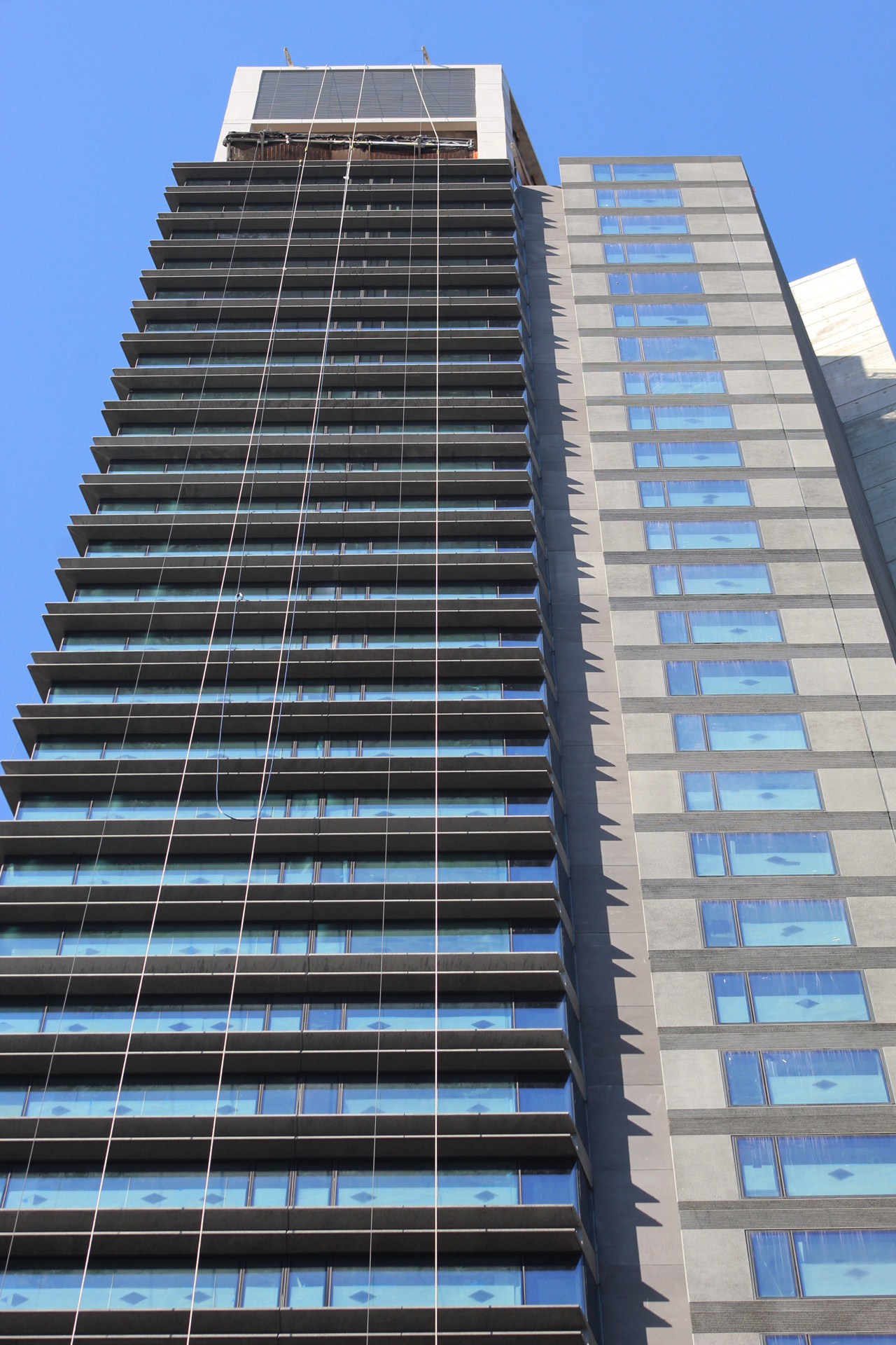
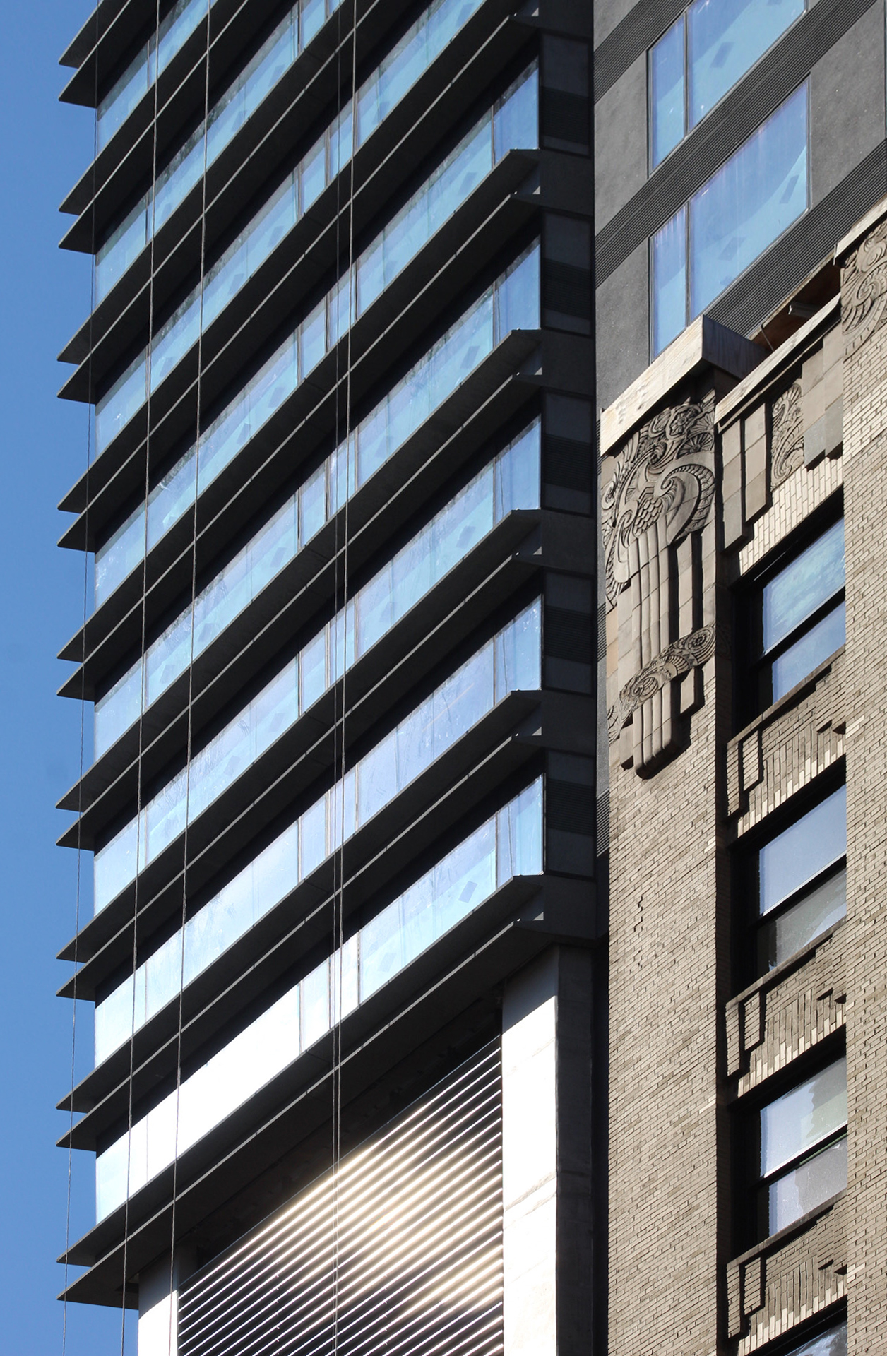
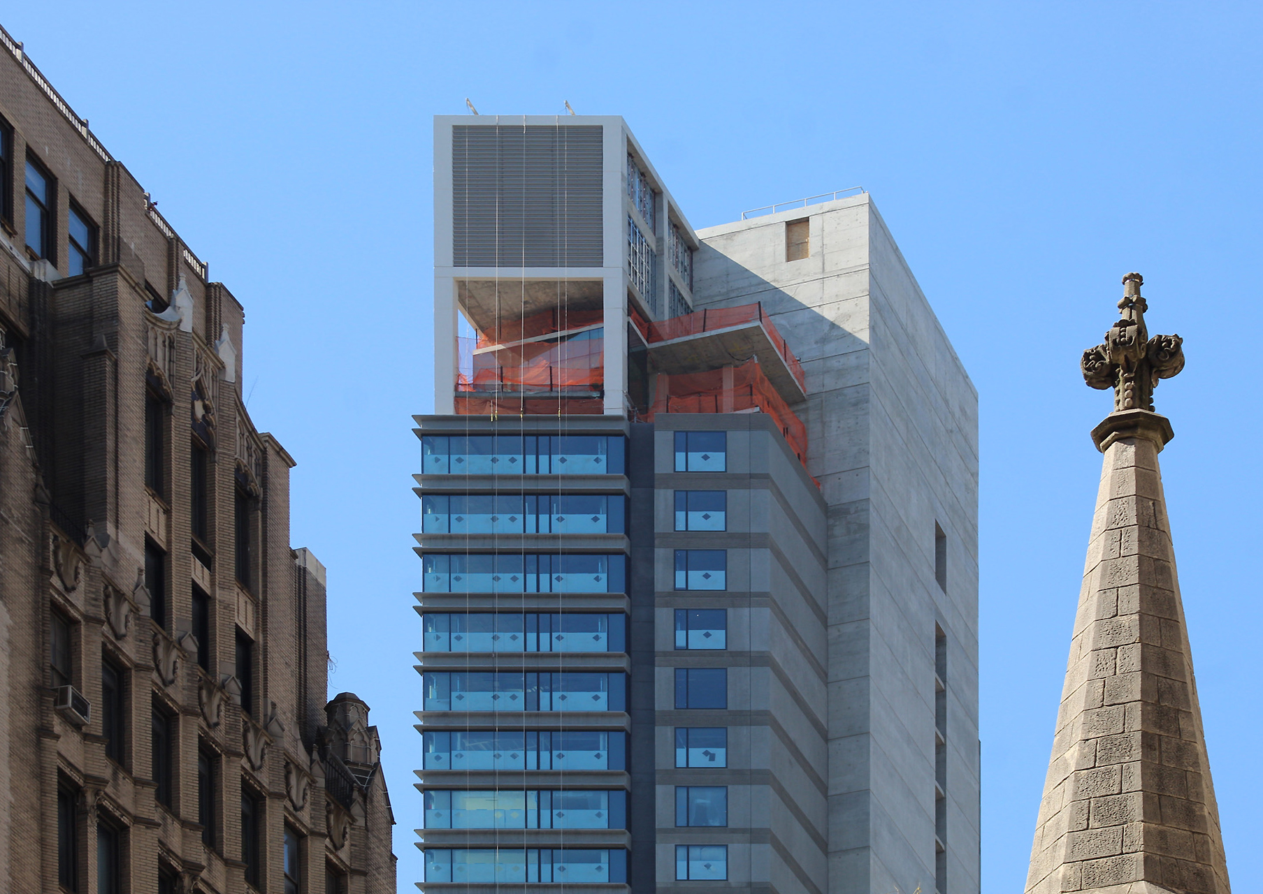
The podium and hotel portion is substantially complete, with its thin strips of gray panels between the floor-to-ceiling glass. These parallel elements break up the fenestration horizontally and add texture to the overall exterior. The mechanical hoist remains attached on the western end of the southern elevation, but should be dismantled over the coming weeks.
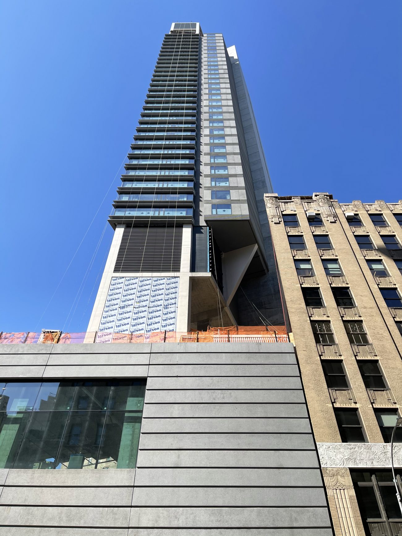
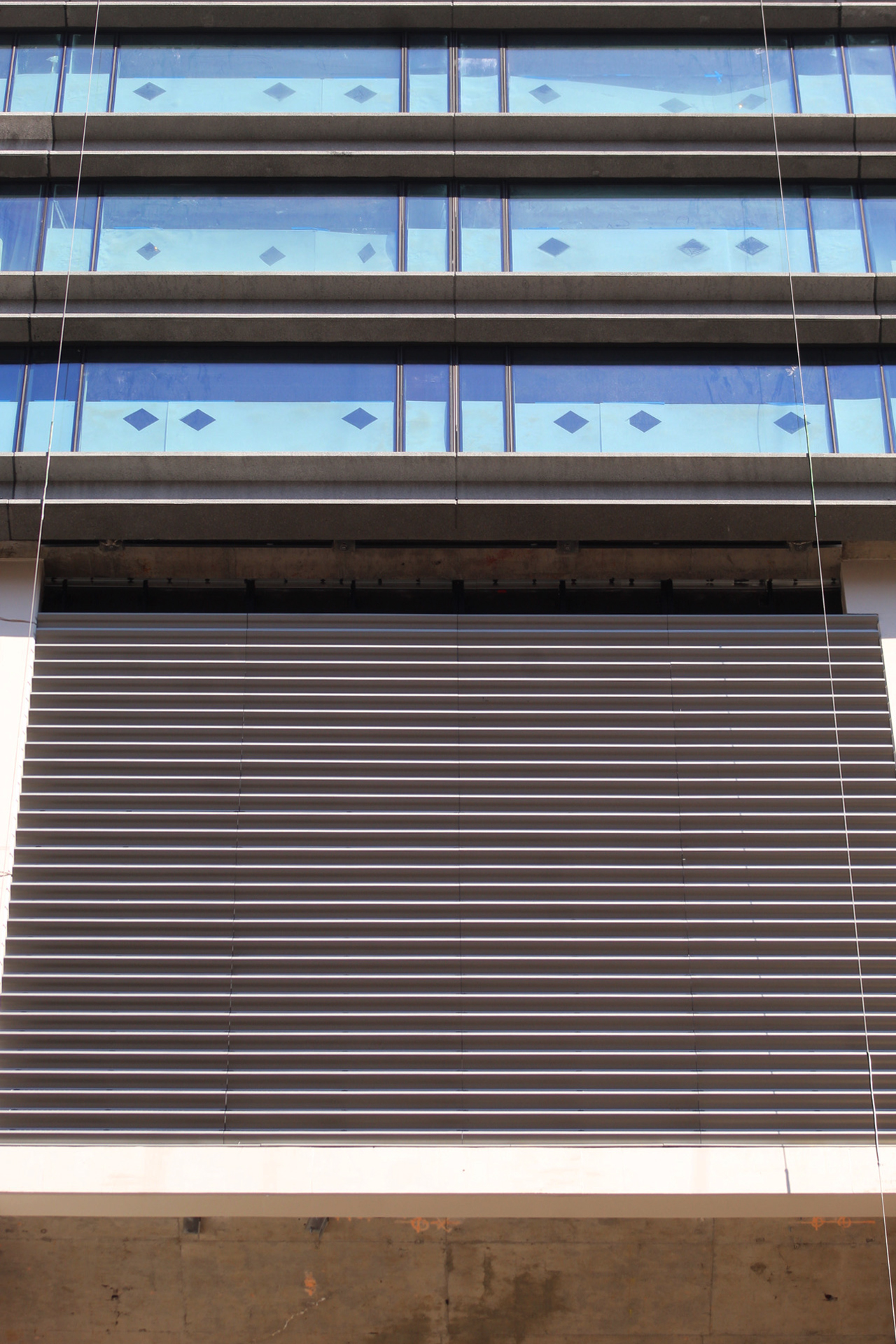
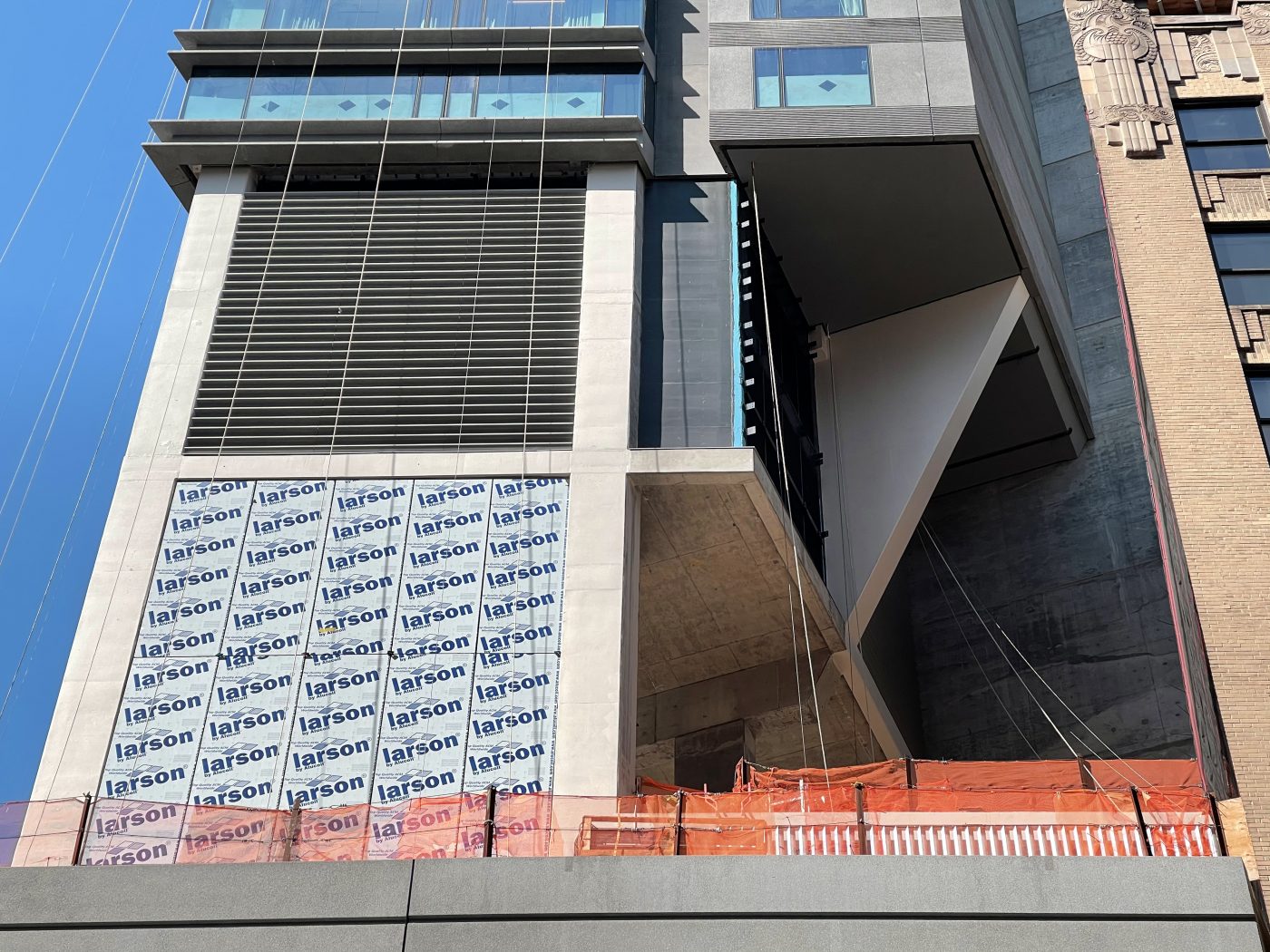
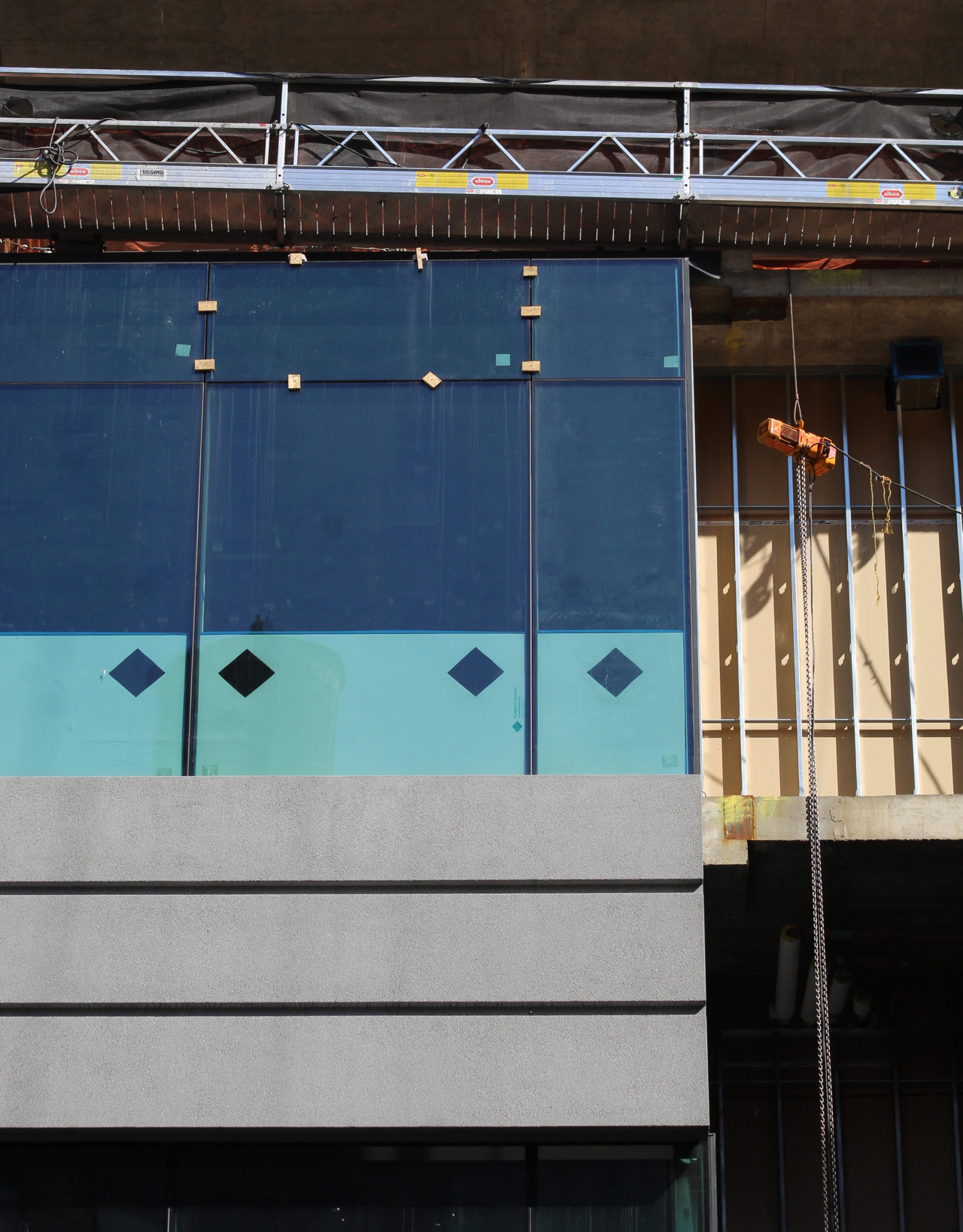
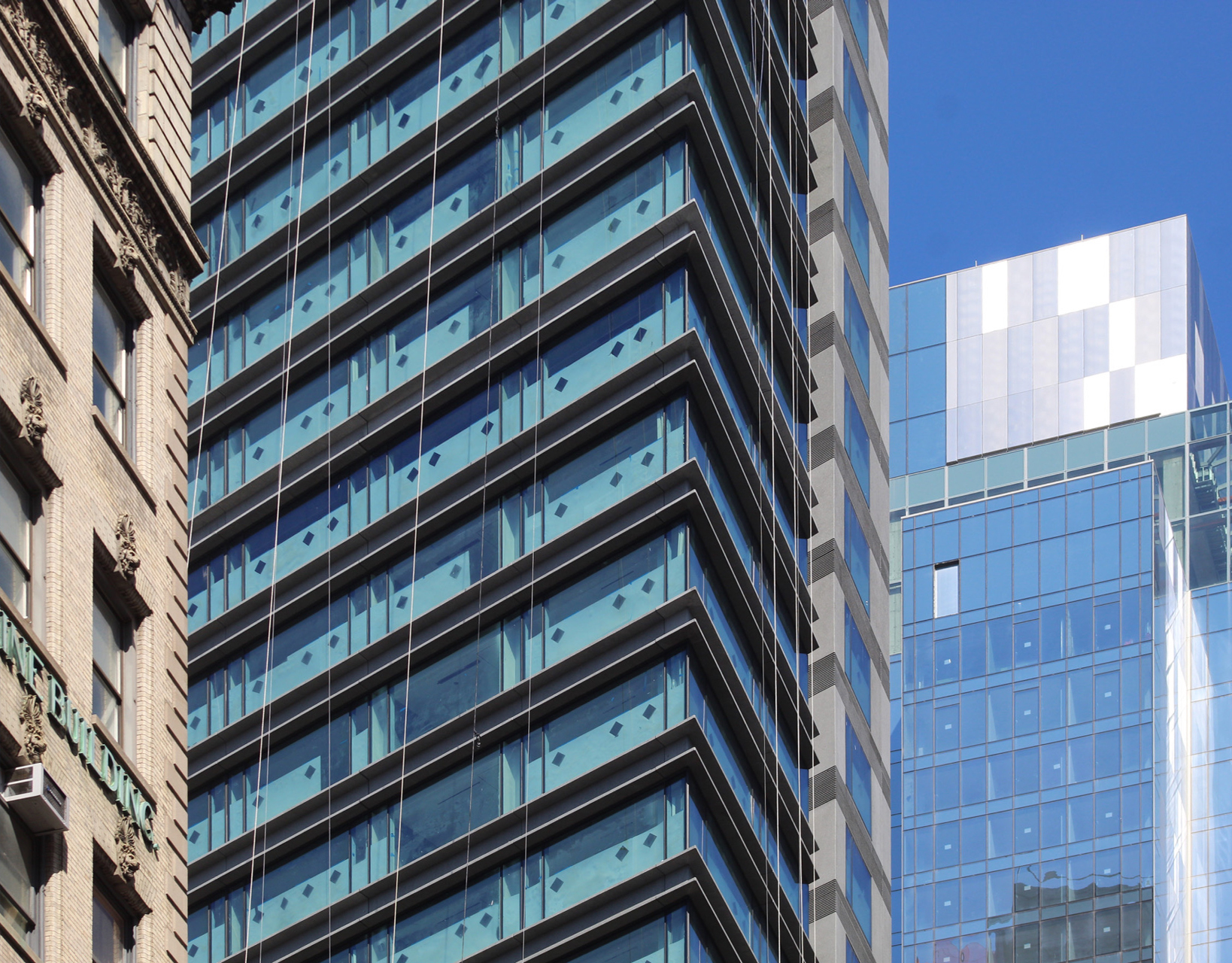
Photographs show metal grilles installed around some of the square-shaped volumes located between the perimeter columns. Metal clips are attached to the outer walls and are responsible for hanging these members up. They would go in front of black painted walls, which we can see an example of near the pinnacle. They await the same identical horizontal grilles as its lower counterpart in order to create a cohesive and identical appearance.
Below is an example of the metal clips laid out in a tight grid.
The northern wall is largely composed of blank reinforced concrete, with only one strip of windows down the centerline. This side of the structure is mostly dedicated to the elevator cores and egress shafts.
YIMBY last reported that the Ritz Carlton Hotel will likely finish construction by the end of the year.
Subscribe to YIMBY’s daily e-mail
Follow YIMBYgram for real-time photo updates
Like YIMBY on Facebook
Follow YIMBY’s Twitter for the latest in YIMBYnews







amazing that the arrangement of clips are featured…..when the facade along Broadway is relentless and undistinguished……can anyone imagine what a city of grey boxes like that would be to inhabit. No excuses for that kind of imposition on the city’s urban landscape…..
and you feature the grid of clips?!?!
A solid 5 on a 1 to 10 score. The base is a f***ing disaster.
The Broadway side of the base is worst. It probably needs a mural to make some sense of it.
Won’t be done until we get those award-winning lollipop trees at the top.
Guess nobody is going to mention that setback on the left, featuring 12? floors of another building? The architects must have been inspired by the reknowned “Kaufman” for details in the final design! ?
Thats included under “the base is a f***ing disaster.”
It’s almost as if context wasnt considered at all.
another glass box that will soon be a homeless shelter
Why can’t they use bricks to match the surrounding area??
Your hatred for the homeless and love for bricks is truly bipolar.
“Your hatred for the homeless and love for bricks is truly bipolar.”
Poetry
This is a hotel whose primary selling point is going to be “BIG MIDTOWN VIEWS” from as many of the rooms as possible. That is why floor to ceiling glazing is being provided for the upper floors.
However I do agree that the lower pedestal is pretty dull and uninspired. It would have made much more sense to add some masonry facades to match the adjacent buildings and provide a more regard street presence; especially for a Ritz-Carlton. That would have been a homage to the other Ritz Carlton on 59th street adjacent to the park.
One of the more betterly designed New York hotels out there! I even sort of like the base…?
The area was getting cleaned up until Cuomo and DeBlasio decided to destroy New York.
Now it feels like a homeless shelter.
The south facade is nice. The north is a concrete wall.
Interested in a 1 bedroom
[email protected]
Good luck!
There’s supposed to be a hyphen in “The Ritz-Carlton,” by the way.