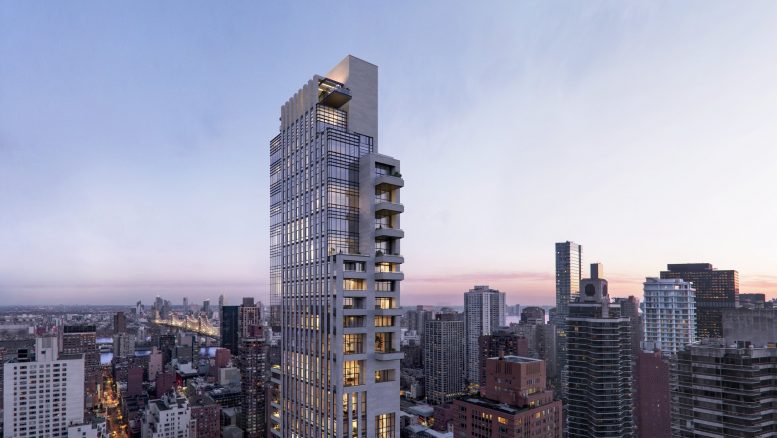
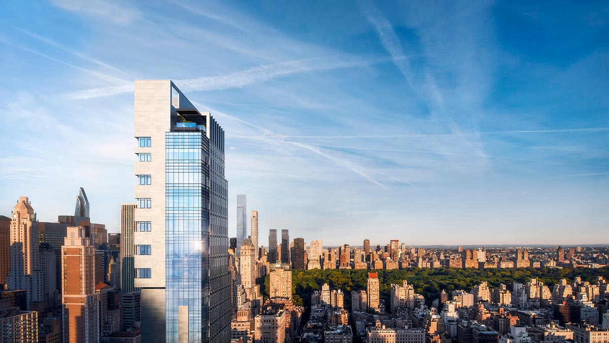
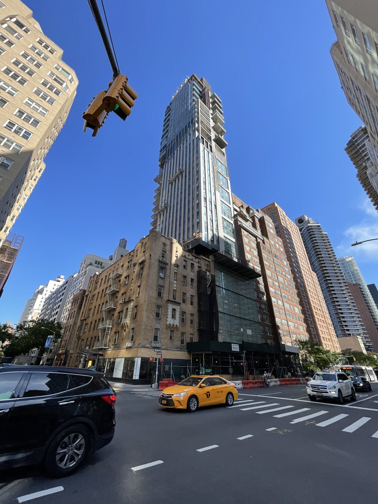
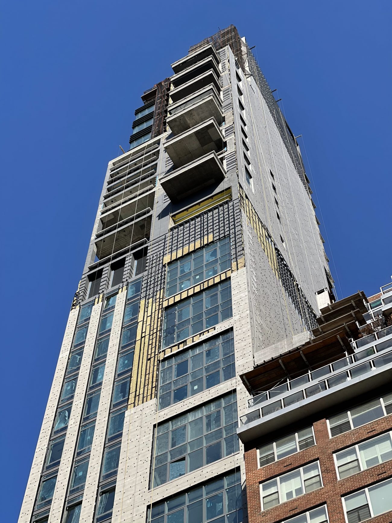
Work is continuing on the stone and glass exterior of The Leyton, a 30-story residential tower at 1059 Third Avenue on Manhattan’s Upper East Side. Designed by Manuel Glas Architects for Real Estate Inverlad and Third Palm Capital with interiors by Frampton Co. and Champalimaud Design, the 127,000-square-foot structure will yield 38 residences with sales and marketing led by Brown Harris Stevens Development Marketing. The inventory includes ten full-floor homes and one duplex. 1059 Third Avenue is located by the intersection of Third Avenue and East 63rd Street.
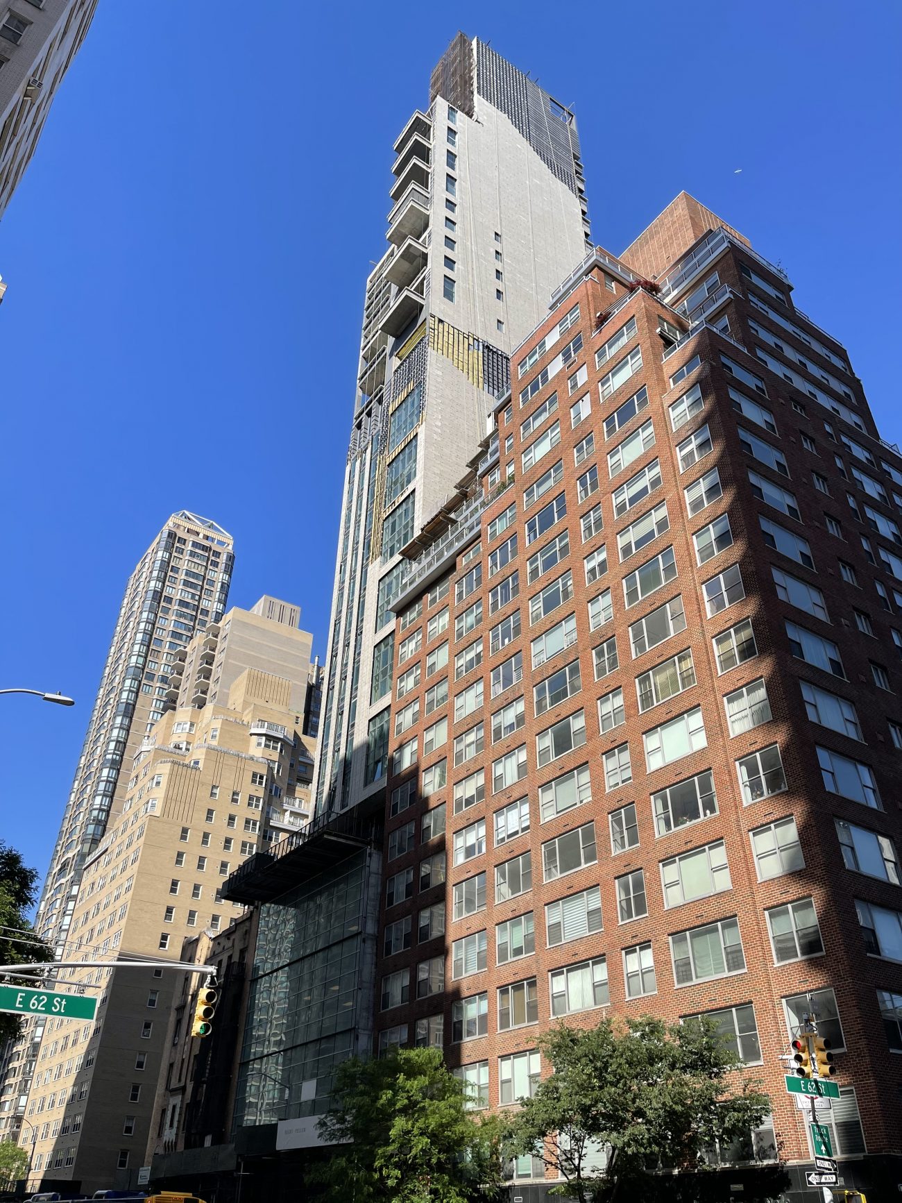
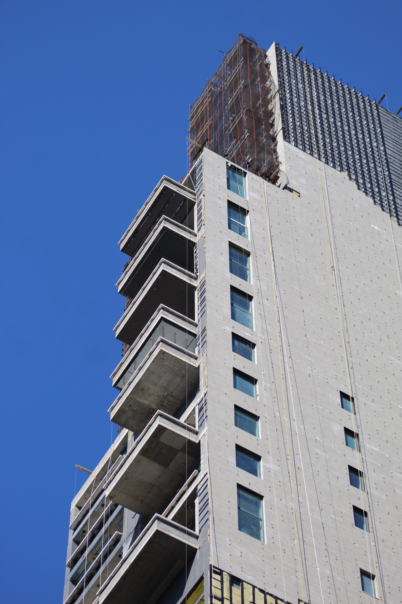
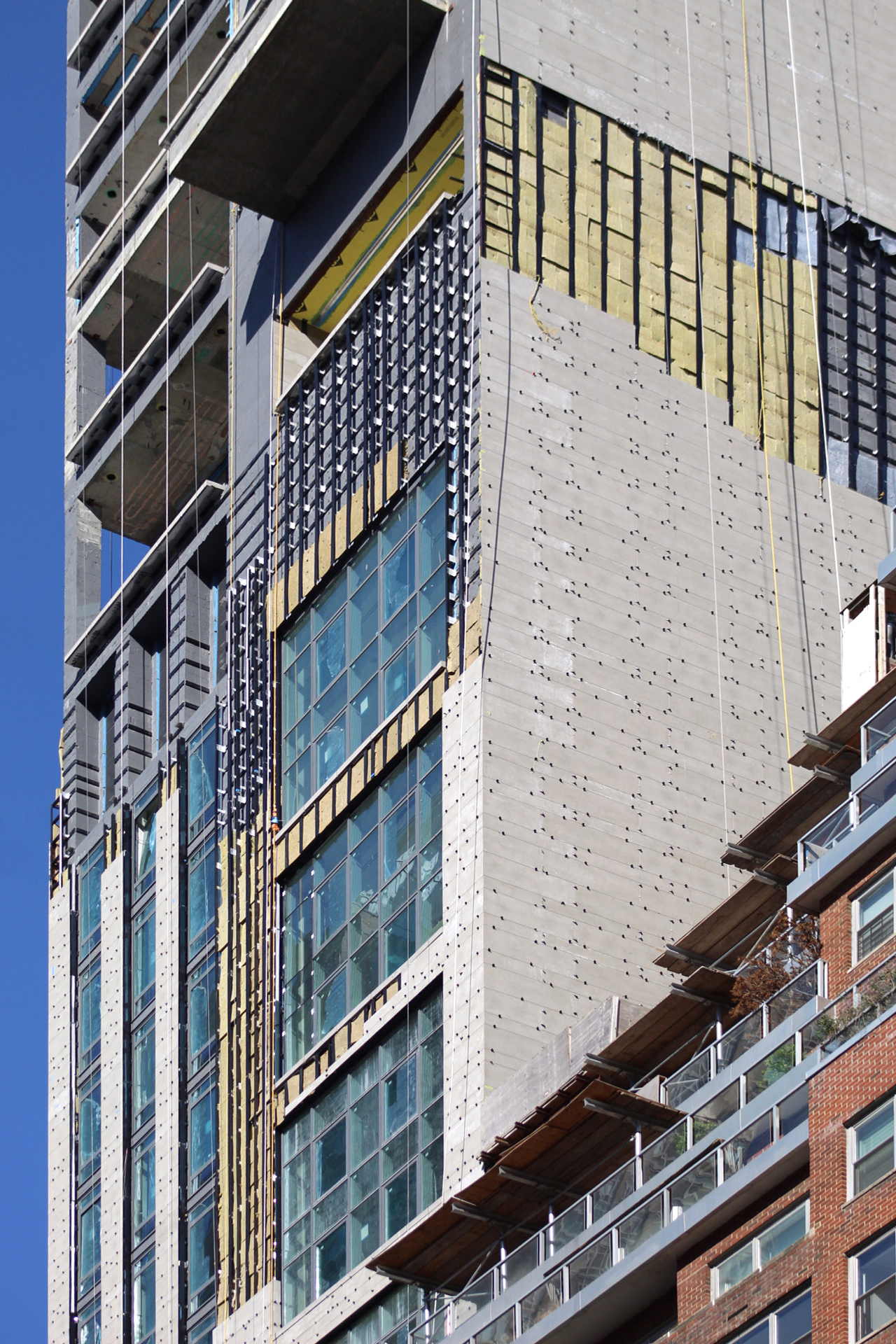
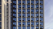
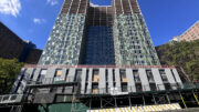
Photographs show the progress on the envelope since our last update in November, when much of the underlying metal framework was still exposed. Now the façade encloses most of the tower, and the mostly blank concrete wall on the wider southern elevation is substantially covered in neutral-toned stone slabs with only a couple gaps in the envelope left to be filled.
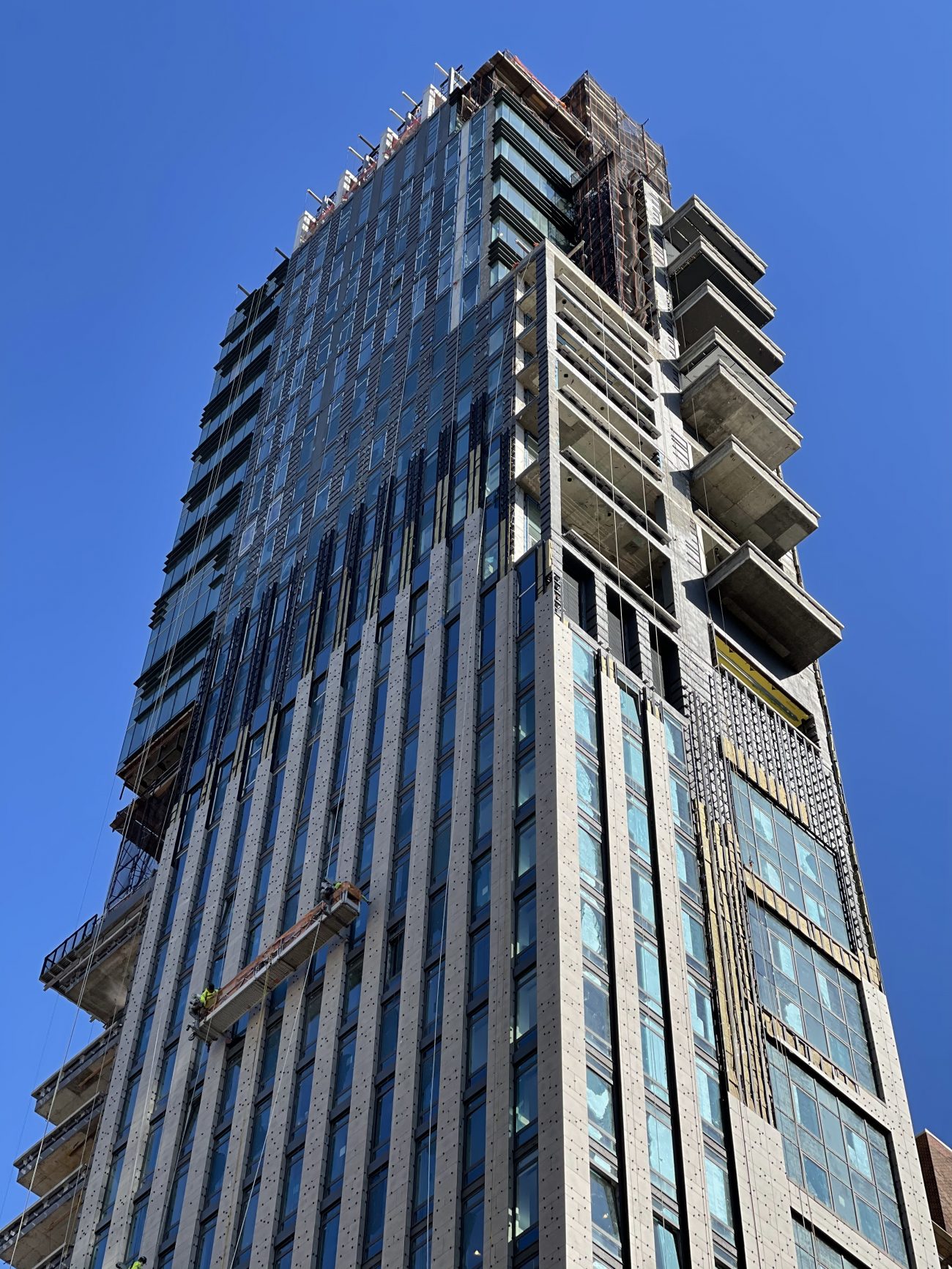
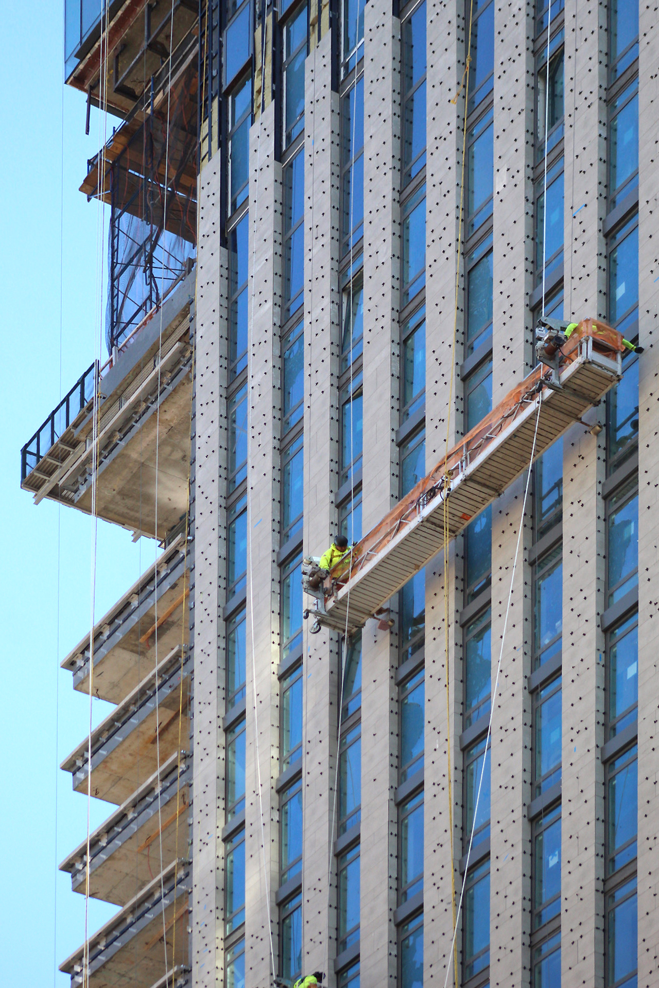
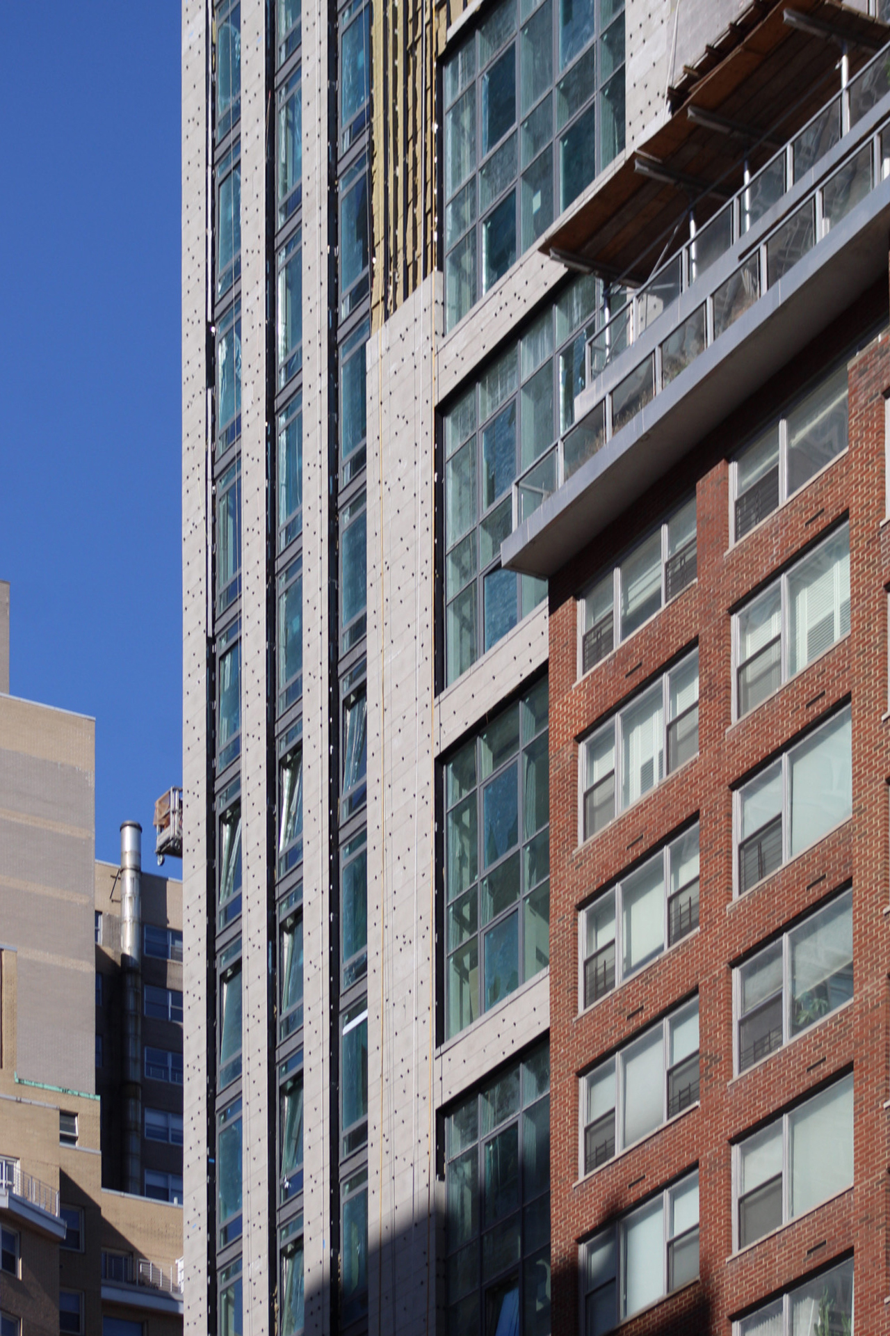
On the opposite northern side, there is a vertical emphasis thanks to the array of interspersed stone columns between the grid of floor-to-ceiling windows.
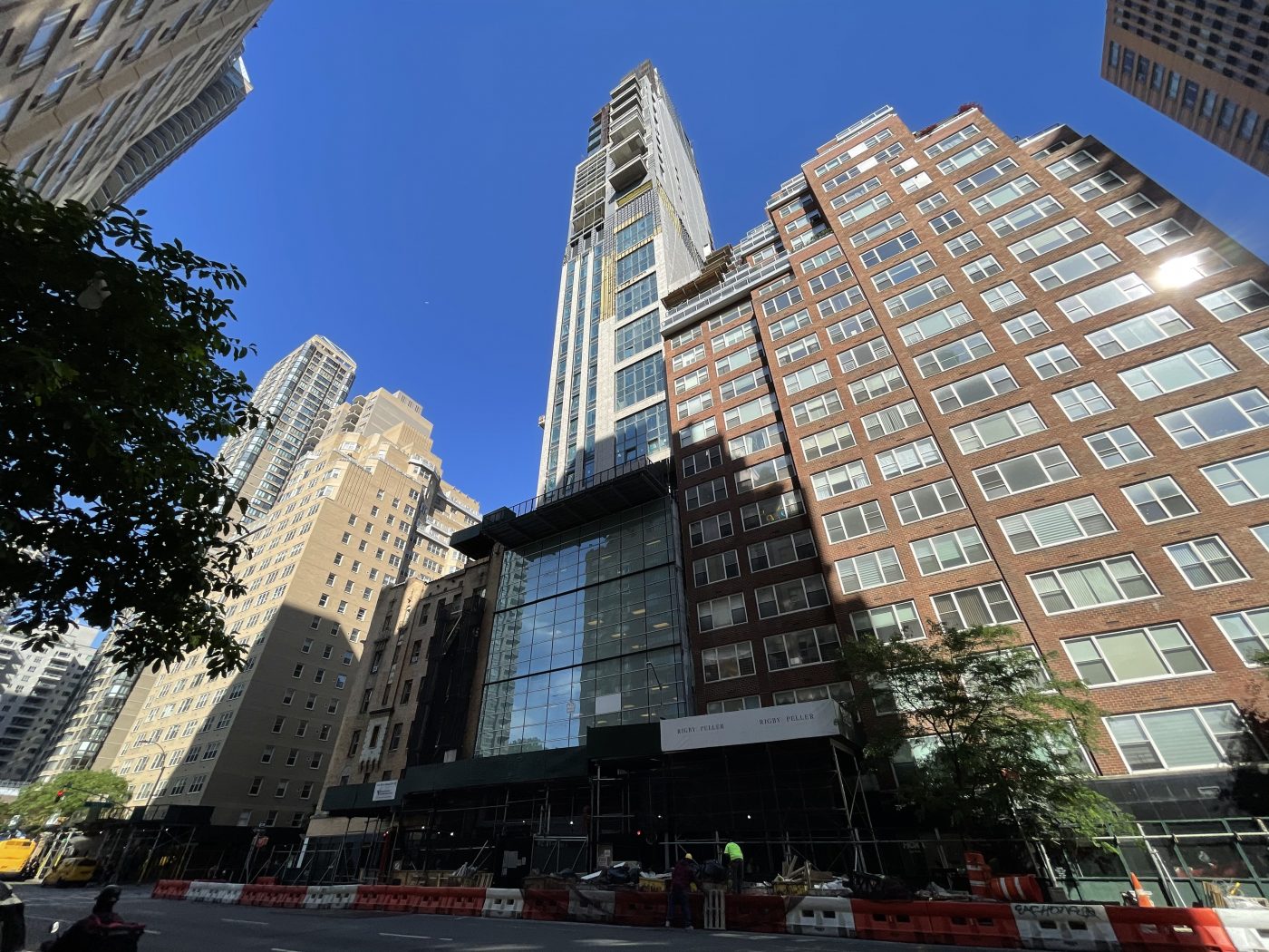
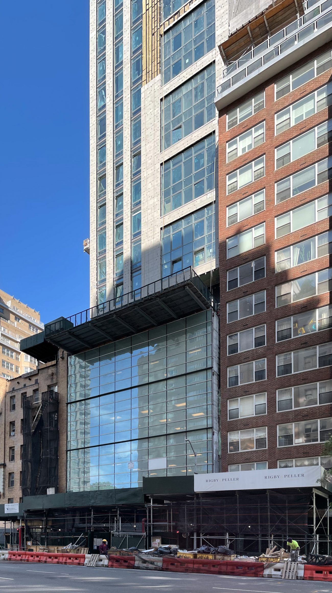
The slender western side facing Third Avenue features a more dynamic exterior with overlapping materials, a multi-story podium wrapped in glass, setbacks near the roof parapet and mechanical extension, a rigid mix of vertical and horizontal linear geometry, and stacks of balconies on the upper levels of the reinforced concrete edifice. We can also see the metal bracing attached to the outer walls that is designed to hold up the remaining stone panels.
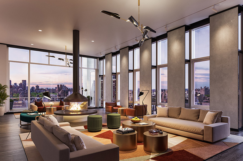
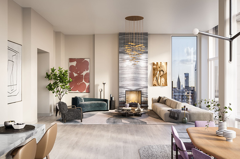
YIMBY previously revealed a set of renderings from Real Estate Inverlad and Dart Interests that showed the interiors of the Leyton. One of the anticipated spaces is the 24th floor Brandy Room, offering both outdoor and indoor lounge spaces with views of Central Park, the East River, and the Midtown skyline.
Occupancy at the Leyton was last reported to begin this summer.
Subscribe to YIMBY’s daily e-mail
Follow YIMBYgram for real-time photo updates
Like YIMBY on Facebook
Follow YIMBY’s Twitter for the latest in YIMBYnews


I think it looks quite nice. It’s too bad it has a silly bland concrete wall on one side of it.
Is it possible the developer doesn’t fully own the air rights on that side?
Could be.
Why is the south side of the building the “blank wall”, since it would have provided more sunlight than the north side?
Missed opportunity for tenants!
I can only guess that they might be concerned any windows built on the south side might end up being “lot line” windows. If in the future a skyscraper rises next to the southern side of this building, the lot line windows will be required to be bricked up, thereby eliminating those windows. If a bedroom has a window that gets bricked up, then that room can no longer be legally called a bedroom. Not just that, but bricking up a floor-to-ceiling window would be a real bummer!
Interior decoration from its renderings of a building, regarding to colors combination and artistic effect on beautiful design: Thanks to Michael Young.
Developers on a mission to destroy the charm and the nice old buildings on the UES.