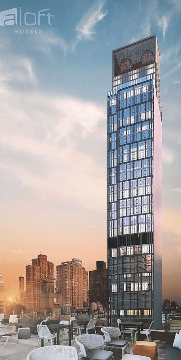
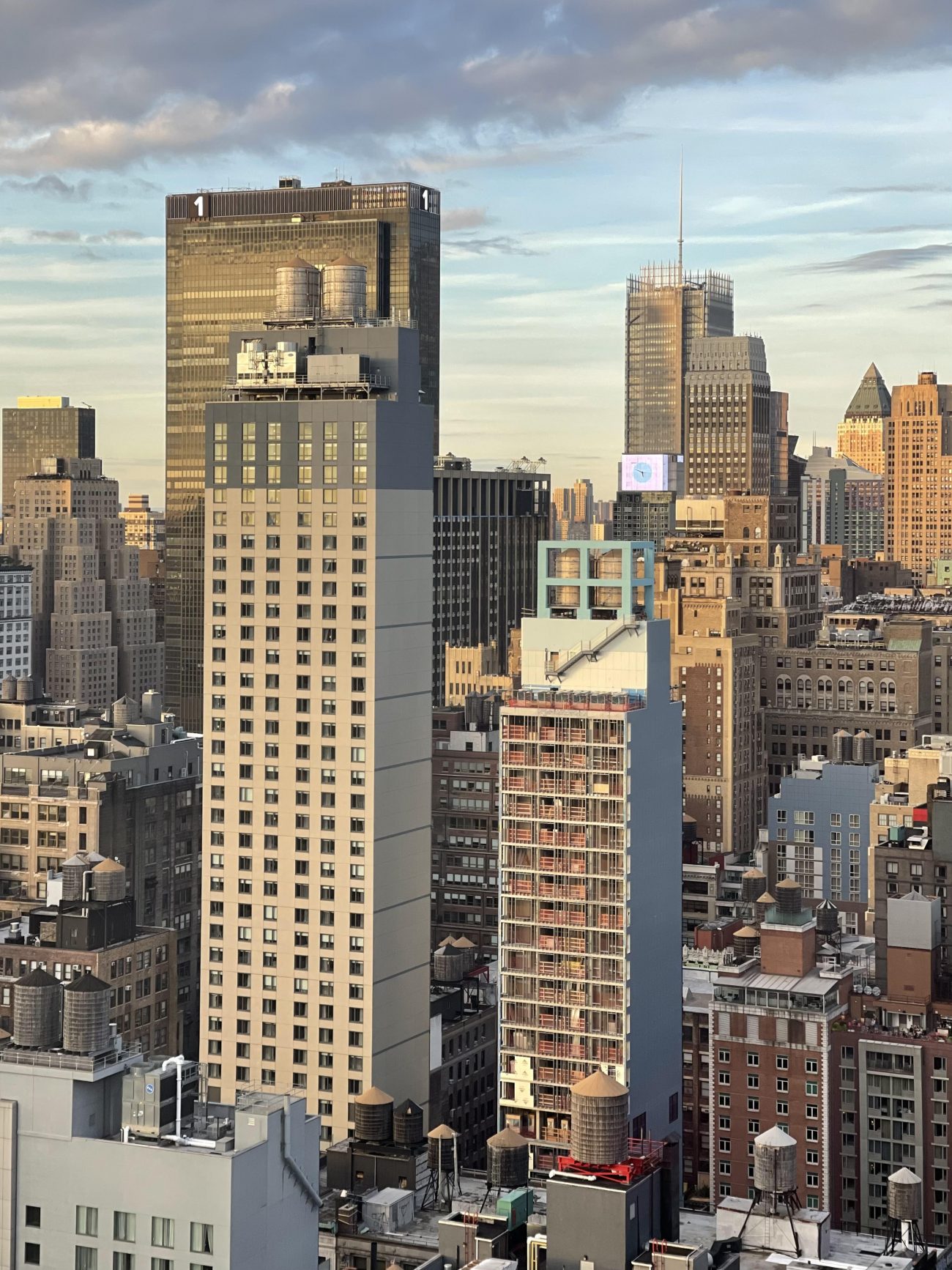
Façade work continues on the Chelsea Aloft Hotel, a 32-story tower at 132 West 28th Street. Designed by Peter Poon Architects and developed by Frank Ng, the 326-foot-tall reinforced concrete structure will yield 203 guest rooms. Milestone Construction Corporation is the general contractor for the project, which is located between Sixth and Seventh Avenues in the Flower District.
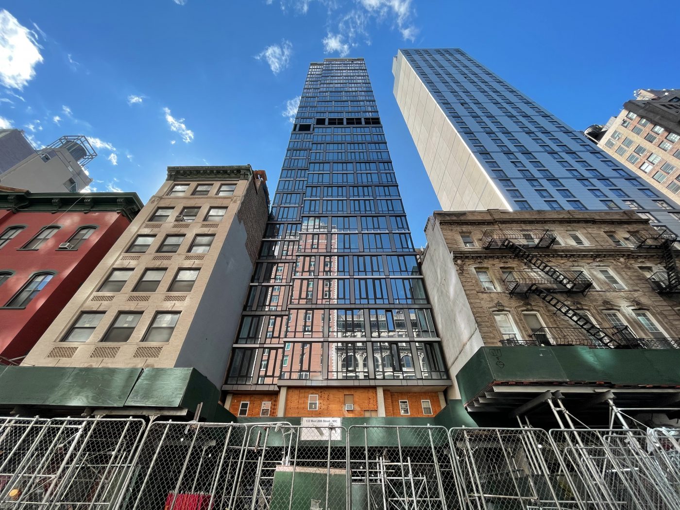
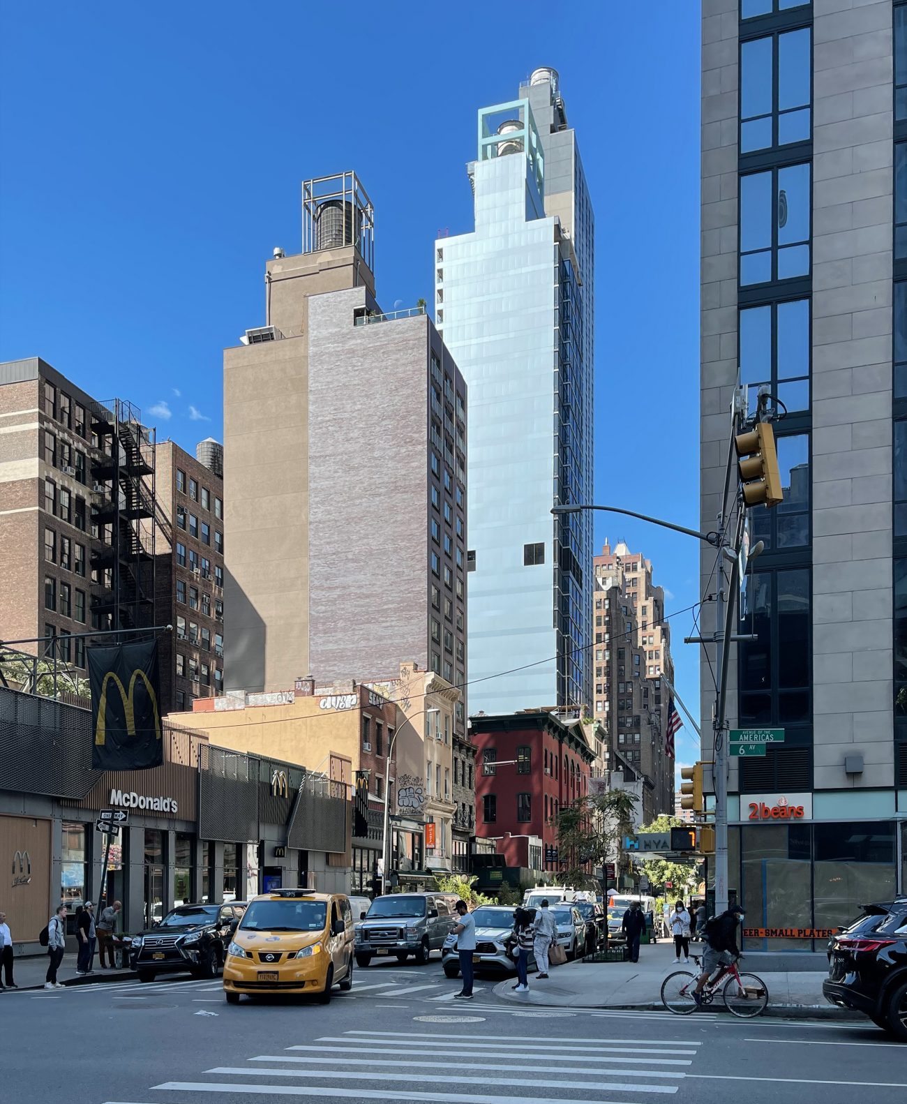
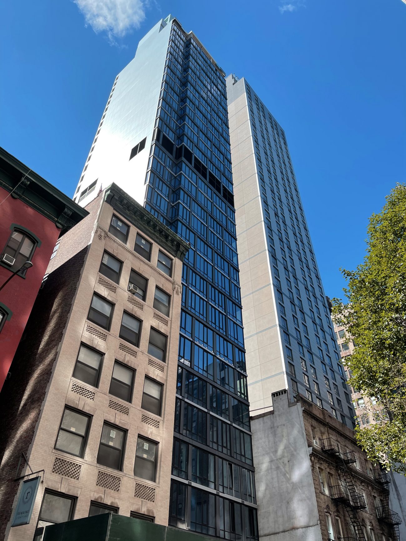
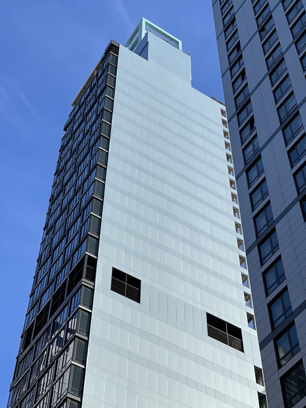
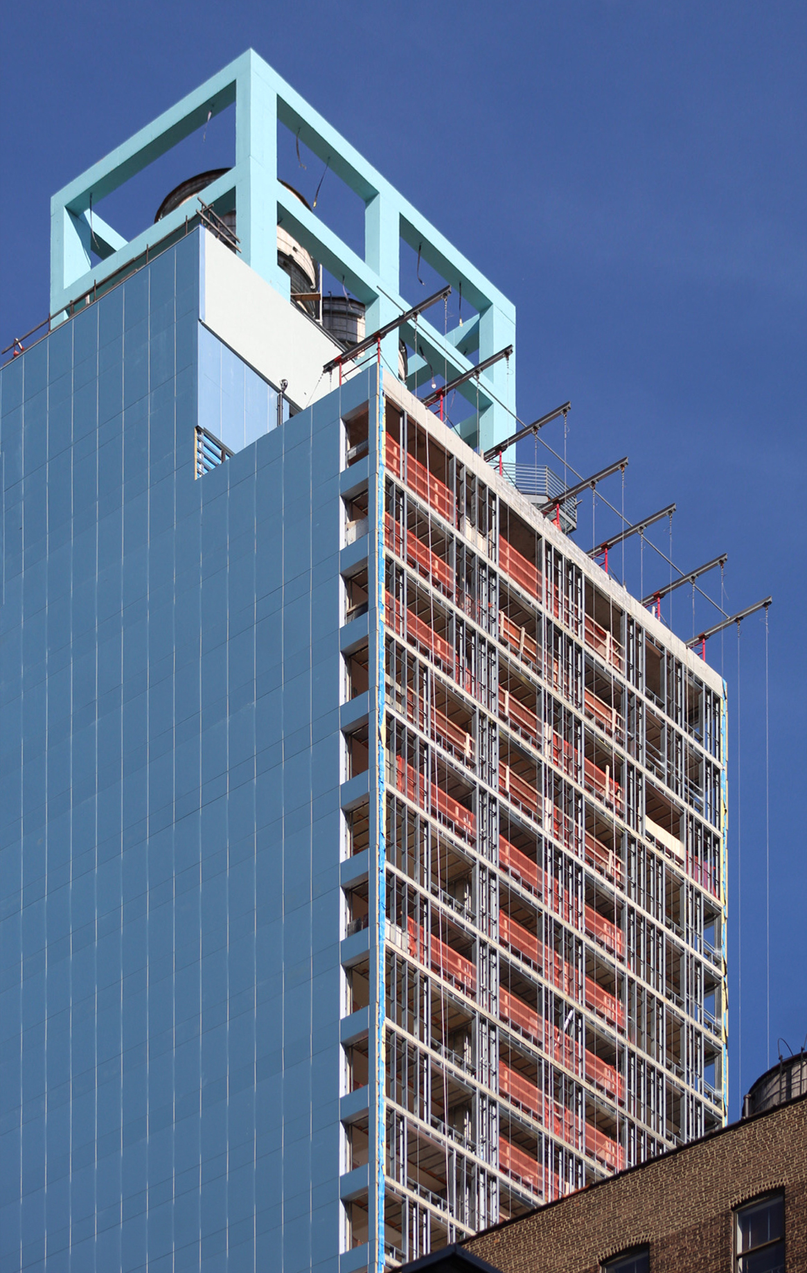
Since our last update in July, the remaining gaps in the main northern elevation have been filled in and the eastern and western sides have been fully clad in their final paneling. However, the southern face is still largely exposed.
The main façade facing West 28th Street is composed of both floor-to-ceiling glass and gray metal panels, and covers the majority of the edifice with the exception of the ground floor tucked behind the sidewalk scaffolding.
Dark grilles cover the midway mechanical levels.
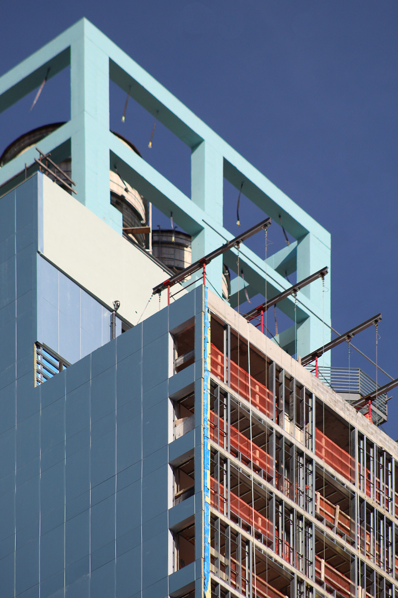
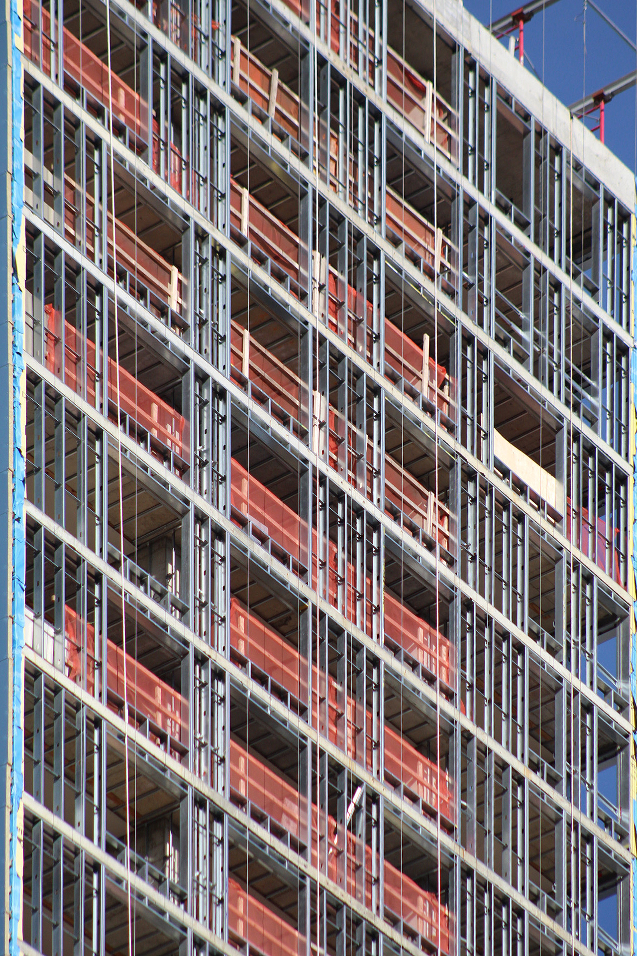
The back southern façade is the last portion of the outer walls awaiting completion. Metal studs frame the grid of square voids for the large windows.
It was last stated that guest amenities for the Aloft Hotel will include a fitness center, a ground-floor bar and lounge, an outdoor terrace on the second floor, and a business center on the third floor. In addition to this location, there is another Aloft hotel in the works in the Financial District at 50 Trinity Place. The closest subways are the 1 train at West 28th Street and Seventh Avenue and the R and W trains at Broadway, while Herald Square is a short walk to the north with access to the B, D, F, M, N, Q, and PATH trains.
A completion date of fall 2021 was stated on the construction board, though sometime in the early months of 2022 is more likely.
Subscribe to YIMBY’s daily e-mail
Follow YIMBYgram for real-time photo updates
Like YIMBY on Facebook
Follow YIMBY’s Twitter for the latest in YIMBYnews






The best thing that can be said about both of the “setback twins” is the 4 story building with fire escapes between them! 🤗
there is really nothing to be said about either of them….yeah, it’s a better curtain wall, but so what. At least the stepped masonry buildings of the garment district offered some kind of NY romance….these erections offer not much of anything except a fairly ugly plastic to spend a night in NY.
It’s a bit unoriginal and unanimated, but at least it has a somewhat interesting facade. It definitely beats its neighbor.
what two pieces of crap buildings soon to be homeless shelters in no time.
Out of context, glass boxes with blank walls on either side
so sad
destroying the neighborhoods for garbage like this.
Looks like it belongs in Bejing or concrete gulags like in Russia.
Horrible. Time for a borough design review board with actual teeth?
why do Sam Chang and Frank Ng along with the architect Peter Poon build crap, cheap out of context buildings that look like they belong in the Beijing slums or the concrete prisons in Russia?