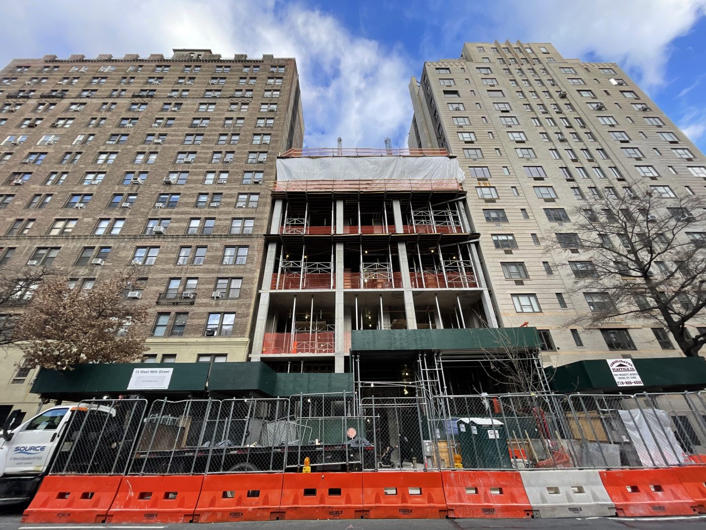
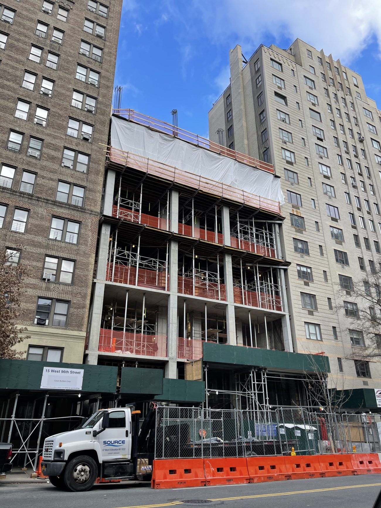
Construction is rising on 15 West 96th Street, a 22-story residential building on Manhattan’s Upper West Side. Designed by SLCE Architects and developed by Sackman Enterprises, the 321-foot-tall structure will yield 17 units. West 96th Development LLC is the owner and Cavan Builders Corporation is the general contractor for the property, which is located between Central Park West and Amsterdam Avenue.
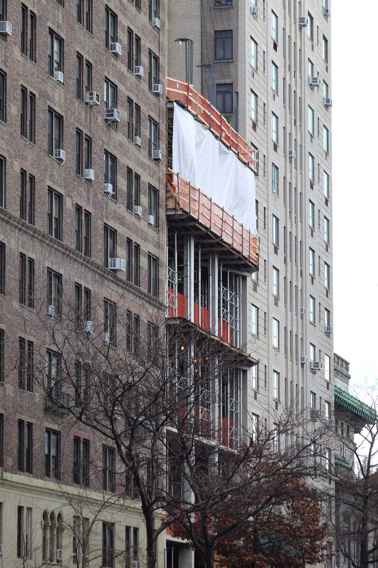
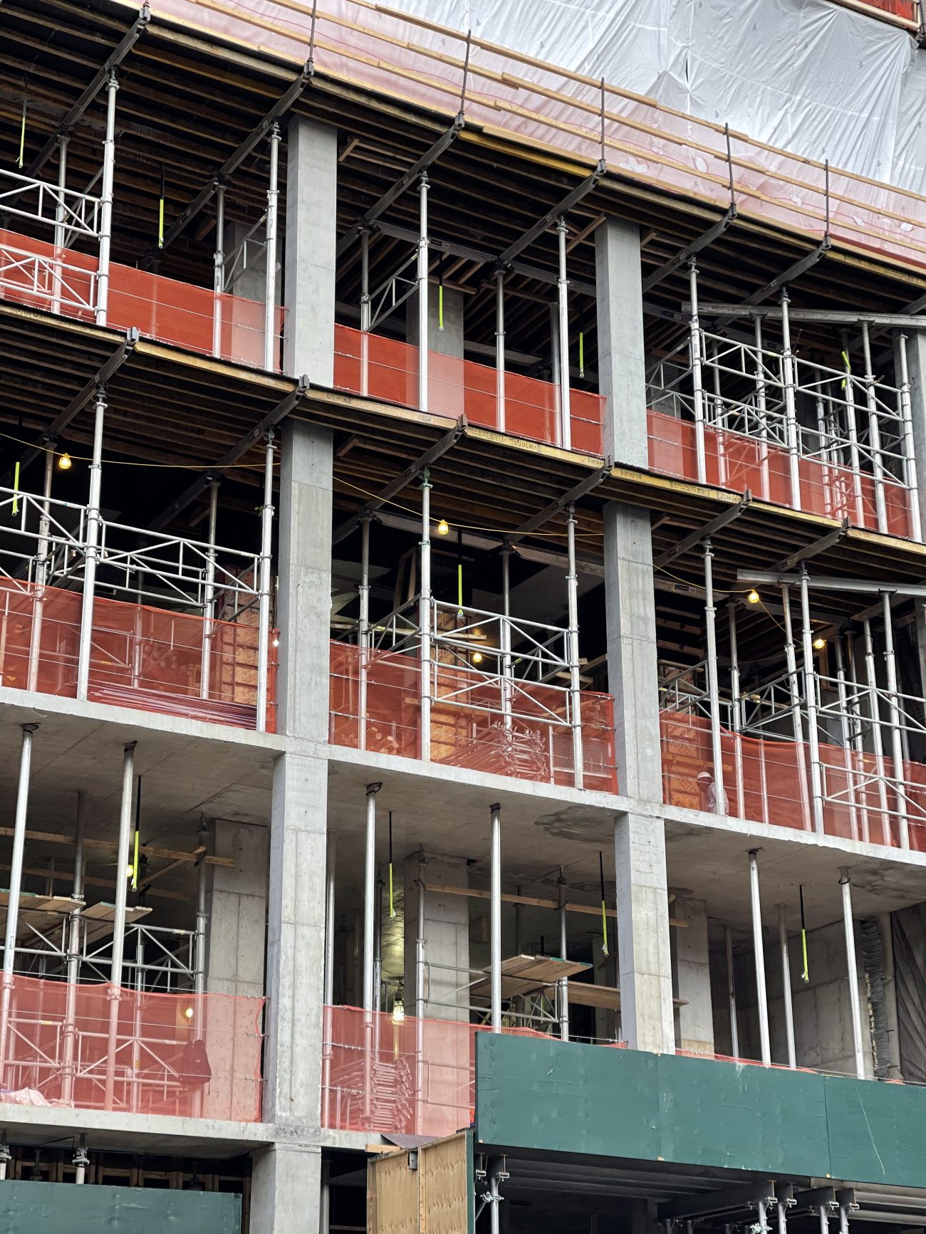
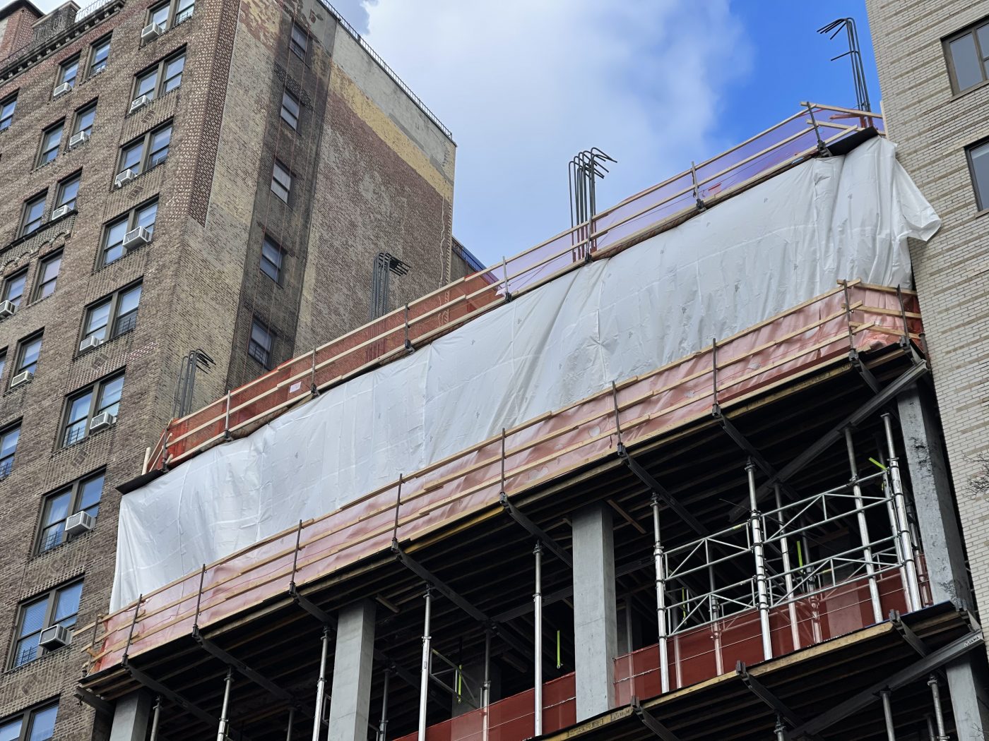
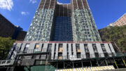
Photographs taken in late December showed vertical progress having reached the sixth floor with steel rebar along the edges of the floor plates for the future concrete columns. Metal scaffolding holds up the floors below and the edifice should rise at a fairly quick pace due to its rectangular shape with only one setback around the ninth level.
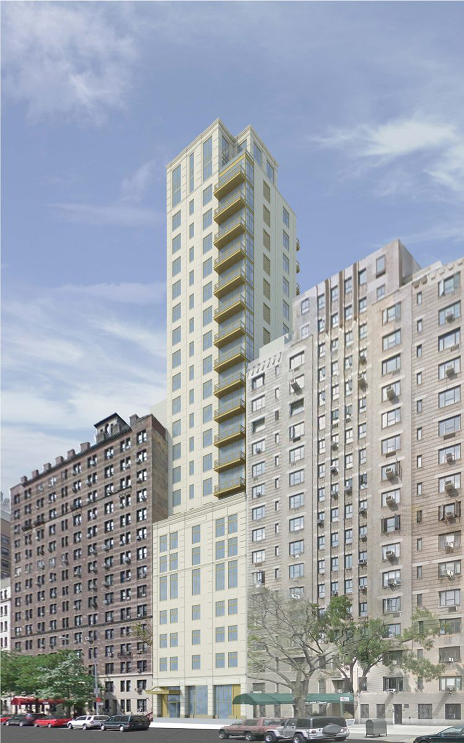
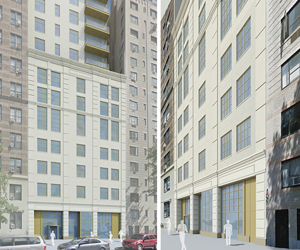
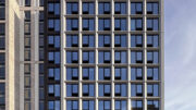
Renderings depict a light-colored façade with a grid of large windows and a stack of corner balconies along the southern edge above the high podium floors. The envelope appears to be made of a stone paneling system and the tower culminates with a subtle cornice and flat roof parapet. The unit count suggests that there should be roughly one apartment per floor with a select few conceivably taking up two levels. 15 West 96th Street’s height and proximity to Central Park West will also allow occupants to have views of Central Park.
Residential amenities will include a fitness center, a children’s playroom, bicycle storage, and a lounge. The closest subways are the B and C trains at the 96 Street station, as well as the 1, 2, and 3 trains along Broadway to the west.
A completion date for 15 West 96th Street is stated on site for spring 2023.
Subscribe to YIMBY’s daily e-mail
Follow YIMBYgram for real-time photo updates
Like YIMBY on Facebook
Follow YIMBY’s Twitter for the latest in YIMBYnews


The design has a cheap flare which is sort of odd for SLCE. I hope it turns out better than the renderings.
I was thinking the exact same thing!
Yeah, it looks like a cheap imitation of Robert Stern. Do it right, or don’t bother.
Exactly right!
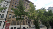
I like it. You can see the obvious challenge with the zoning. It would have been nice if the facade could have met the other buildings up to the their top floors and have the tower extend from there. I’m sure the air rights/setback requirements/FAR wouldn’t allow for it. Always a challenge. I do think that at the ground level this will feel like an addition to the streetscape vs. a separate, setback structure.
It isn’t just about massing and cornice alignment (which has NEVER been a guarantee of anything): it’s about the klutziness of all aspects, from the oddness of the window proportions to the vapid “stone coursing” to the overall meh of the massing. If one pulled a first-year arch student from a bad school, let them flip through New York 1930 for ten seconds and then asked them to design something in the spirit of that work, you might get something this weak.
And whoever does these “renderings” ought to be ashamed. Though they did make the competent buildings to either side look rather good.
Our built environment would be so much better if mediocrity wasn’t considered aspirational.
Would have been nicer if the base met the roof levels of the next door buildings, but probably to get the extra height they had to do the ugly setback and it ruined the look.
On the bright side, at least this building won’t be marred by window air conditioners.
On the dark side… this building will block windows on each of the neighboring buildings, thereby creating amazing CONCRETE BLOCK views while lying in bed! 🤤
There was a building there already. The sides of those buildings don’t have any windows.
Recessed balconies would look much more interesting, but no one really does it that way anymore. Meeting the street wall of the existing pre-wars all the way up to 15 or 16 stories would also have been much nicer. If only the City Planning Commission insisted on more contextural zoning.