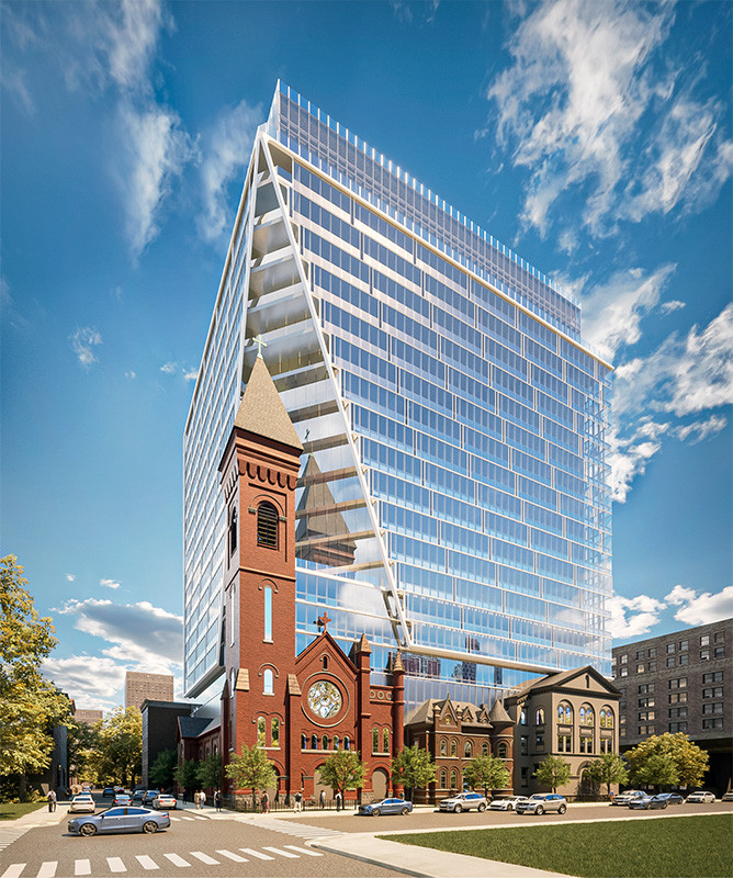
Claremont Development has shared new renderings of a project that will incorporate Jersey City‘s historic St. Lucy’s Catholic Church into a new high-rise residential tower. Located at 619 Grove Street in New Jersey, the 23-story property will have 431 market rate rentals, 13 affordable housing units, an unspecified collection of amenity spaces, a 251-vehicle parking garage, and 5,600 square feet of ground-floor commercial space.
The design team includes Michael Graves Architecture & Design and Premier, a Dallas-based design studio. The project will be named after the historic church and is scheduled to break ground in 2024 and be completed in 2026.
“The driving force behind the design is the preservation and integration of the existing St Lucy’s Church,” said Jose Carballo, principal at Michael Graves Architecture & Design. “The streetscape of the block was preserved and maintains its character that provided neighbors a place to congregate for over 130 years. The simple, yet elegant façade of the building celebrates the church’s bell tower as the main focal point of the development while creating an iconic ensemble of modern and historical components.”
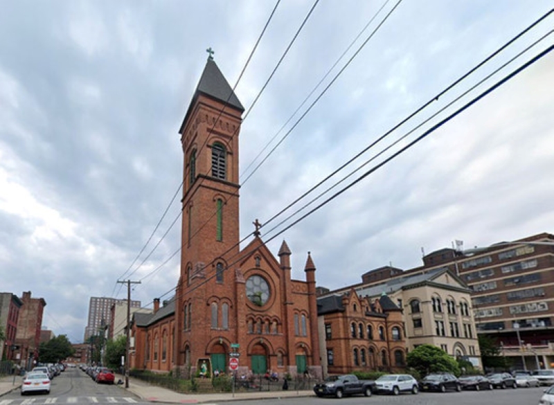
Constructed in 1884, the St. Lucy’s Catholic Church features a red brick façade, prominent stained glass windows, a bell tower, and a pitched roof. This adaptive reuse project will incorporate historical remnants of the existing structure into the new building.
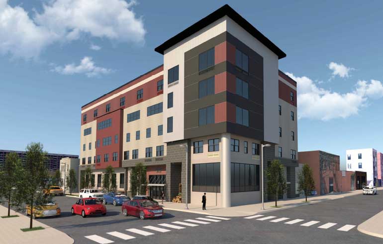
When complete, the residential tower will feature a reflective glass façade and a form that will cantilever over the historic church. The development will also replace and relocate an existing homeless shelter that is connected to the church. The shelter’s new home across the street will include 165 beds, 15 supportive housing units, five transitional housing units, and on-site services administered by the Catholic Charities of the Archdiocese of Newark.
Construction on the shelter broke ground in 2021 and is expected to wrap up later this year.
Subscribe to YIMBY’s daily e-mail
Follow YIMBYgram for real-time photo updates
Like YIMBY on Facebook
Follow YIMBY’s Twitter for the latest in YIMBYnews


This sadly just doesn’t work for me. It’s a beautiful historic church being nearly swallowed by the modern box.
Michael Graves is probably rolling in his grave now that his firm is producing dreck like this.
I’m a Graves fan, but I wonder what he’d make of this thing! You’d think a firm would change its name when the principal passes, but I guess it’s a brand! Is FLW still doing work?
Skidmore?
Owings?
Merrill?
The best part of this hideously overscaled and massive glass tower, is that while the congregation is attending Sunday service inside the historic church…

they can’t see it!
vulgar design in concept and resolution.
Why, serioulsy, why?
A very bittersweet compromise.
I’m a bit confused at the hate on here, I think this looks great (certainly an improvement on the original rendering). It’s not groundbreaking design-wise but very tasteful & solid. The whole point is to focus on the gorgeous church structures, which are people forgetting wouldn’t be preserved without this development? There are far more poorly designed glass boxes out there.
This revitalization is a huge win in the underutilized area around the Holland Tunnel, and the homeless shelter is now new, modern & expanded for those most vulnerable.
Be confused not. In an earlier time, not so long ago, a competent architect might have tried a more contextual approach, relocating the tower to the property behind the parish house not the church to not diminish the church structure/ steeple and perhaps, used complimentary materials such as brick and limestone, (at least for the base three/four or five floors) and then added a tower that receded instead of overwhelmed the church and adjoining properties…the gymnastics of the mirrored cantilever is so unsubtle, so heavy handed that is makes the existing proud but diminutive 19th C structures look silly to remain.
The proposed building would make a fine office structure in downtown Des Moines or Kansas City.
Agreed. A lot of overreacting here.
A bit jarring. Seems more like area maximization than contextual respect. It is nevertheless a more artful cantilever than most.