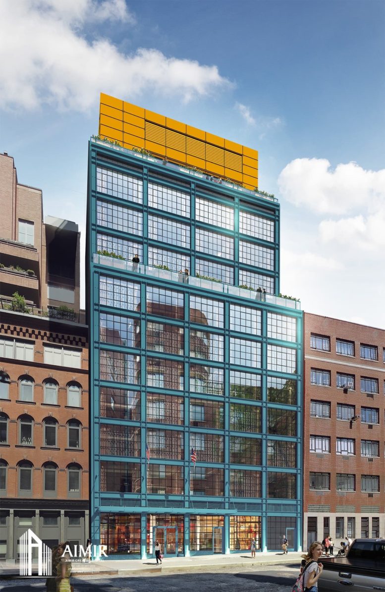
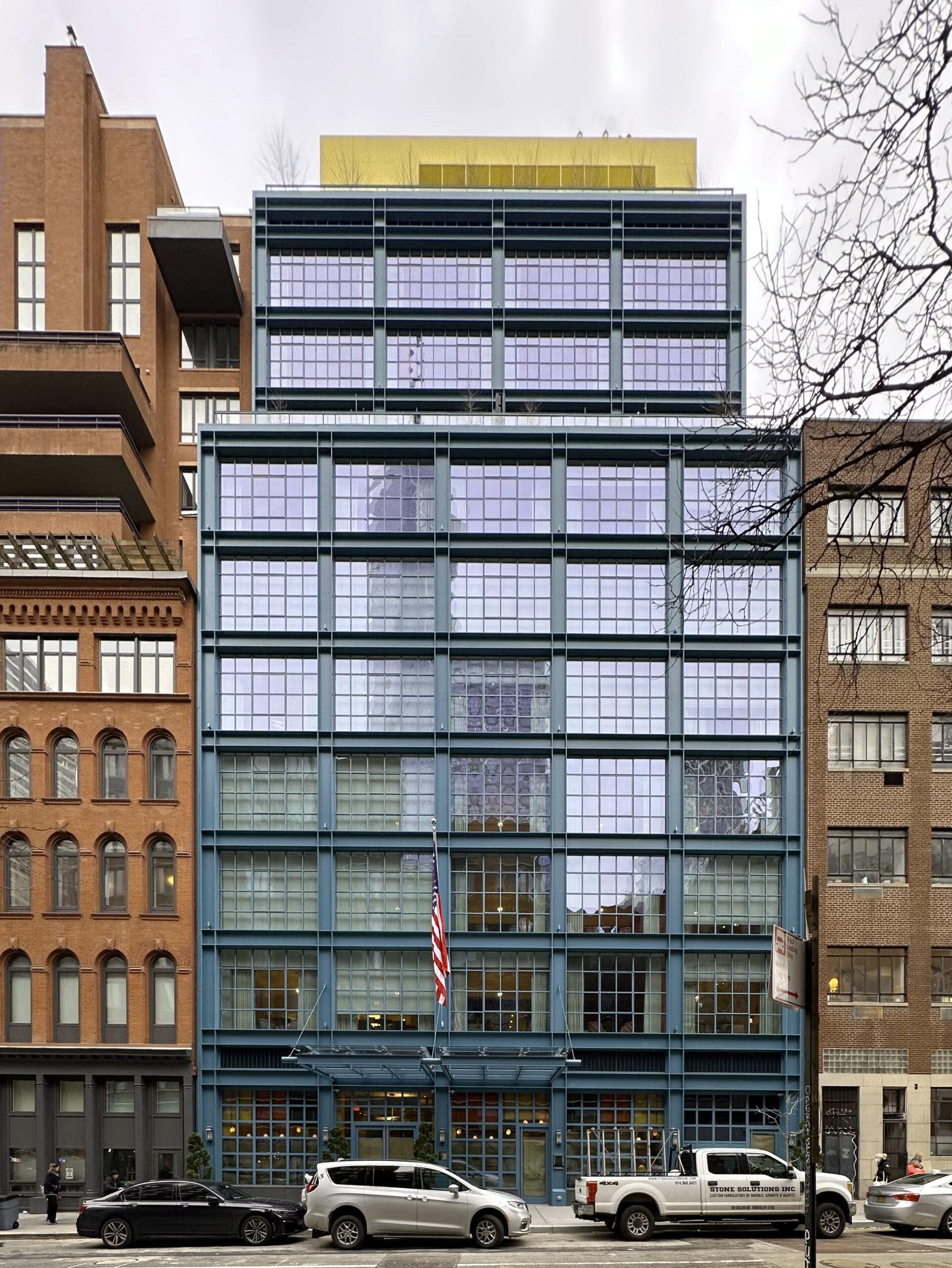
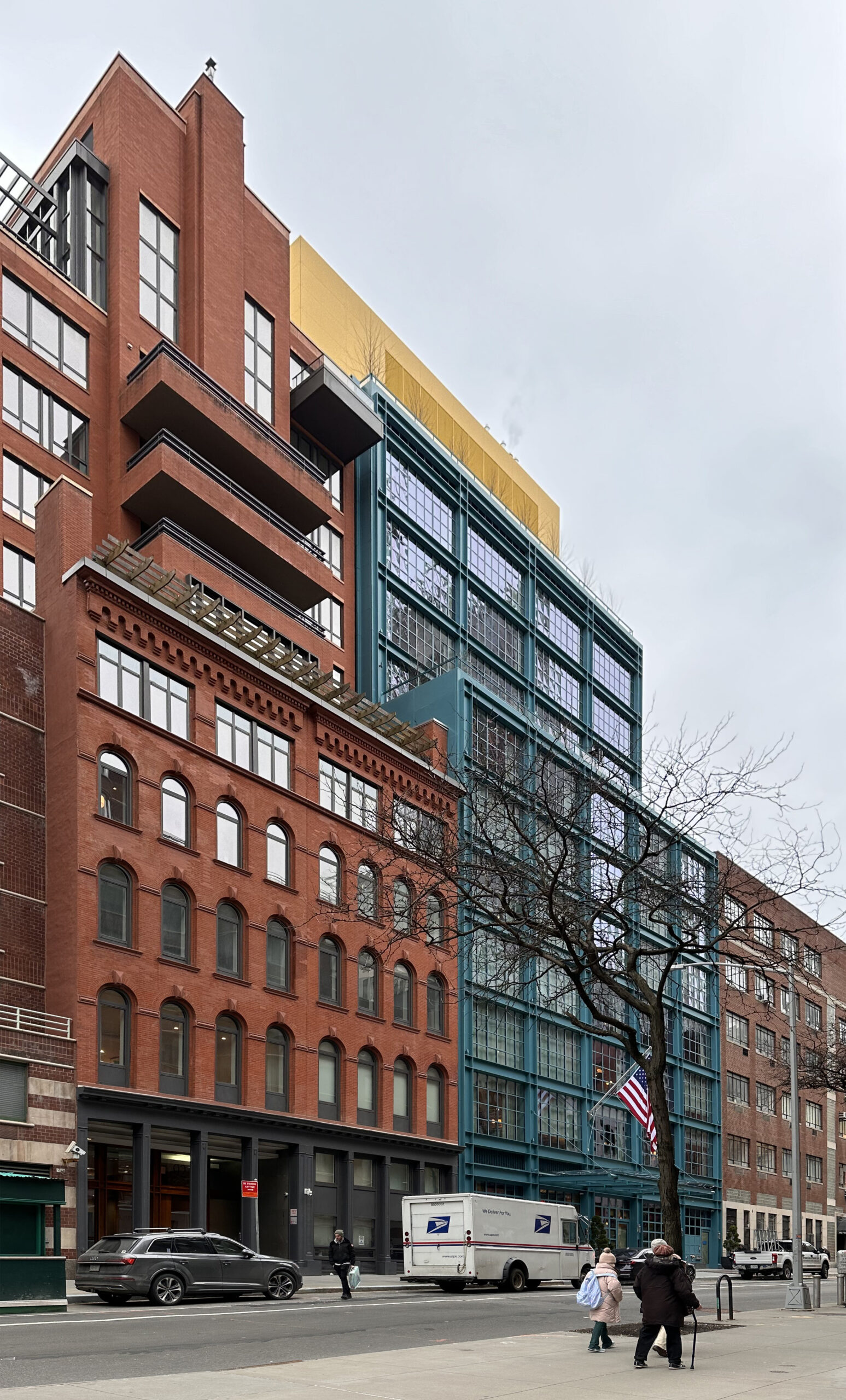
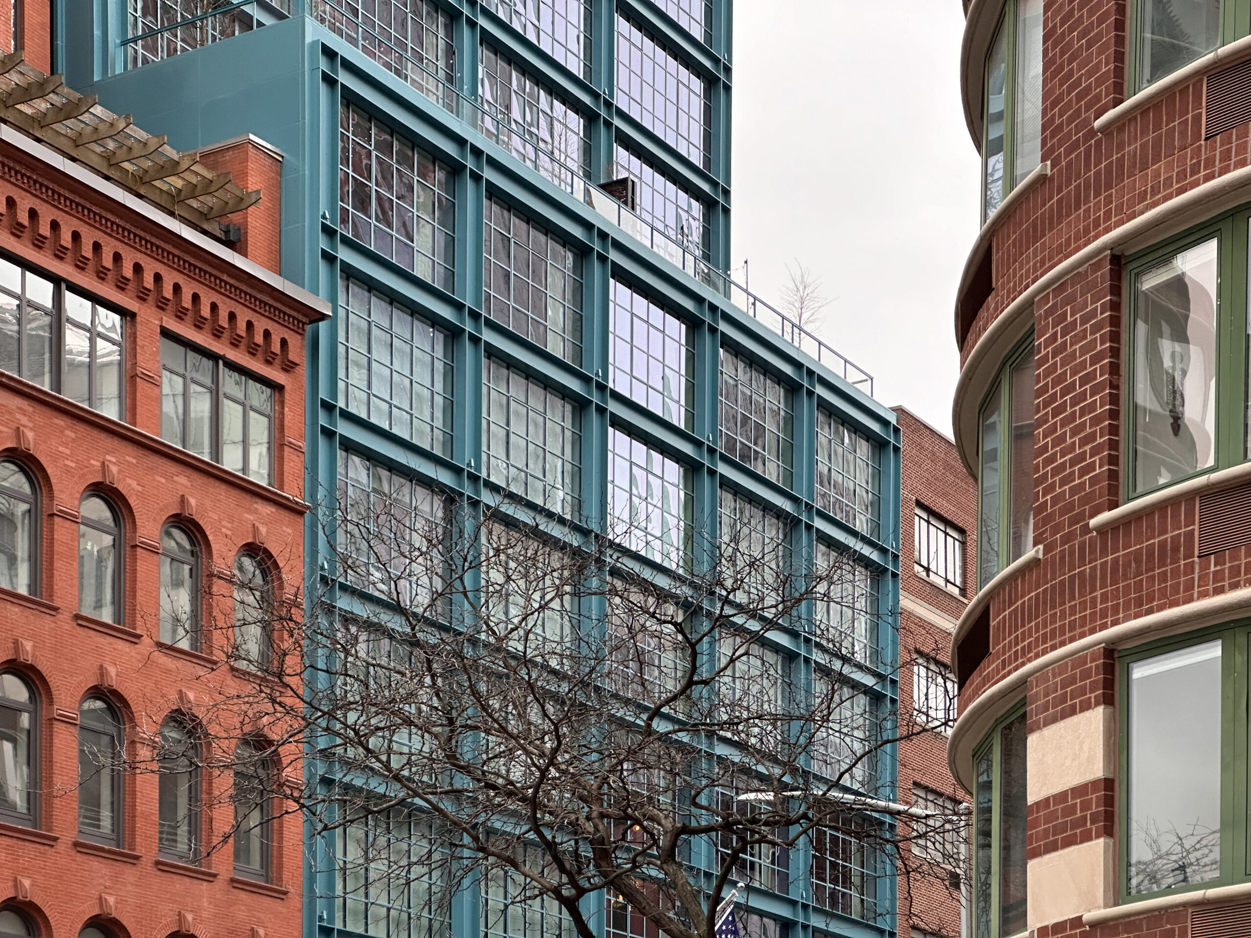
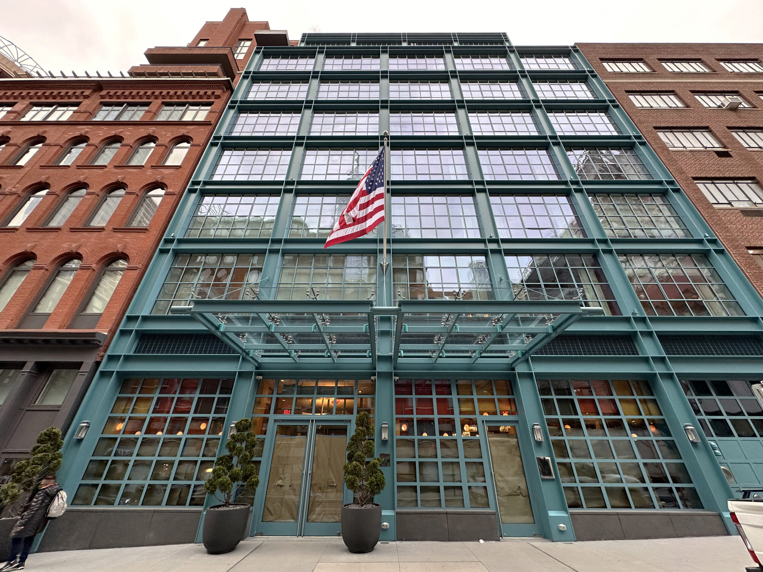
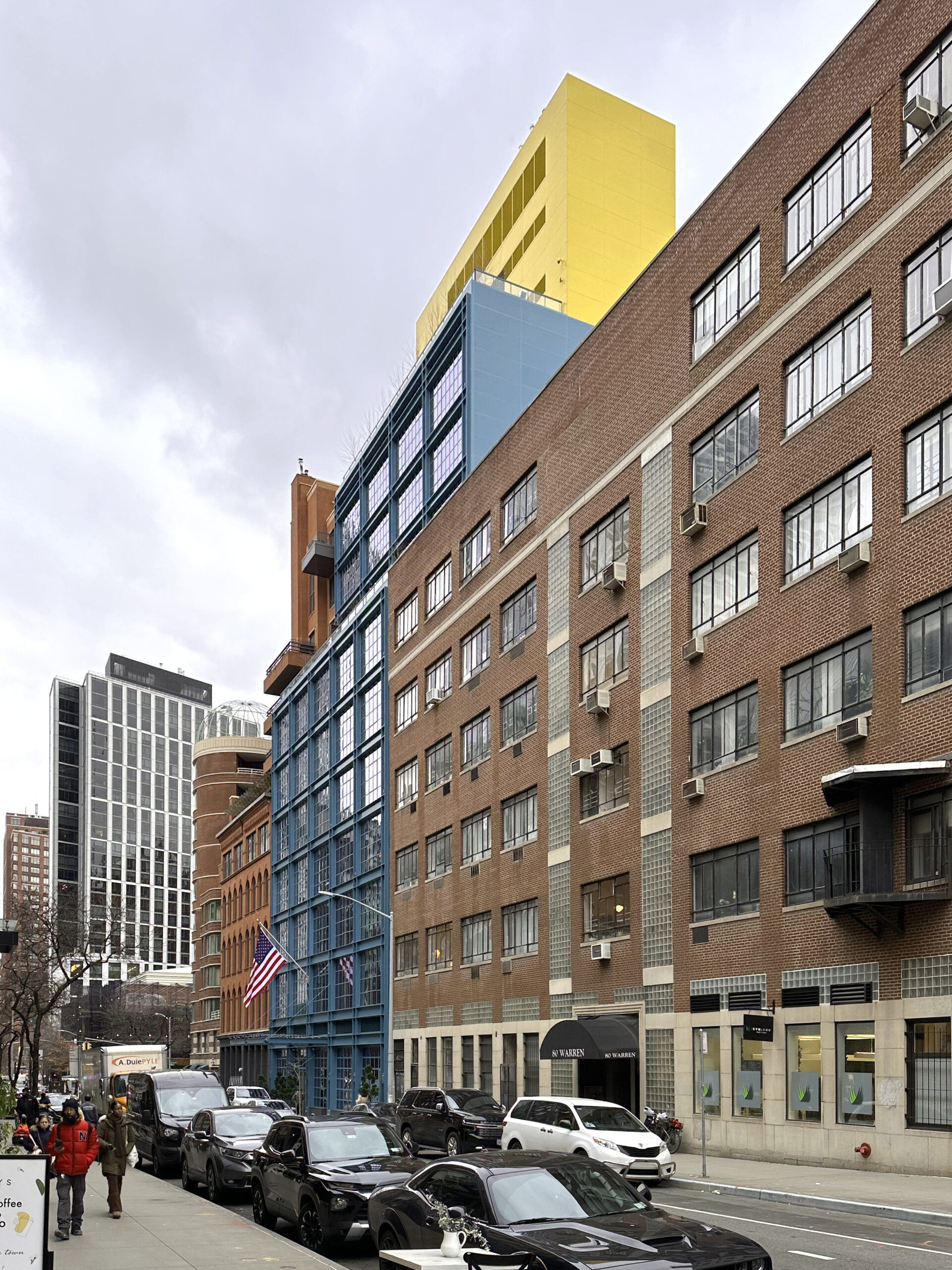
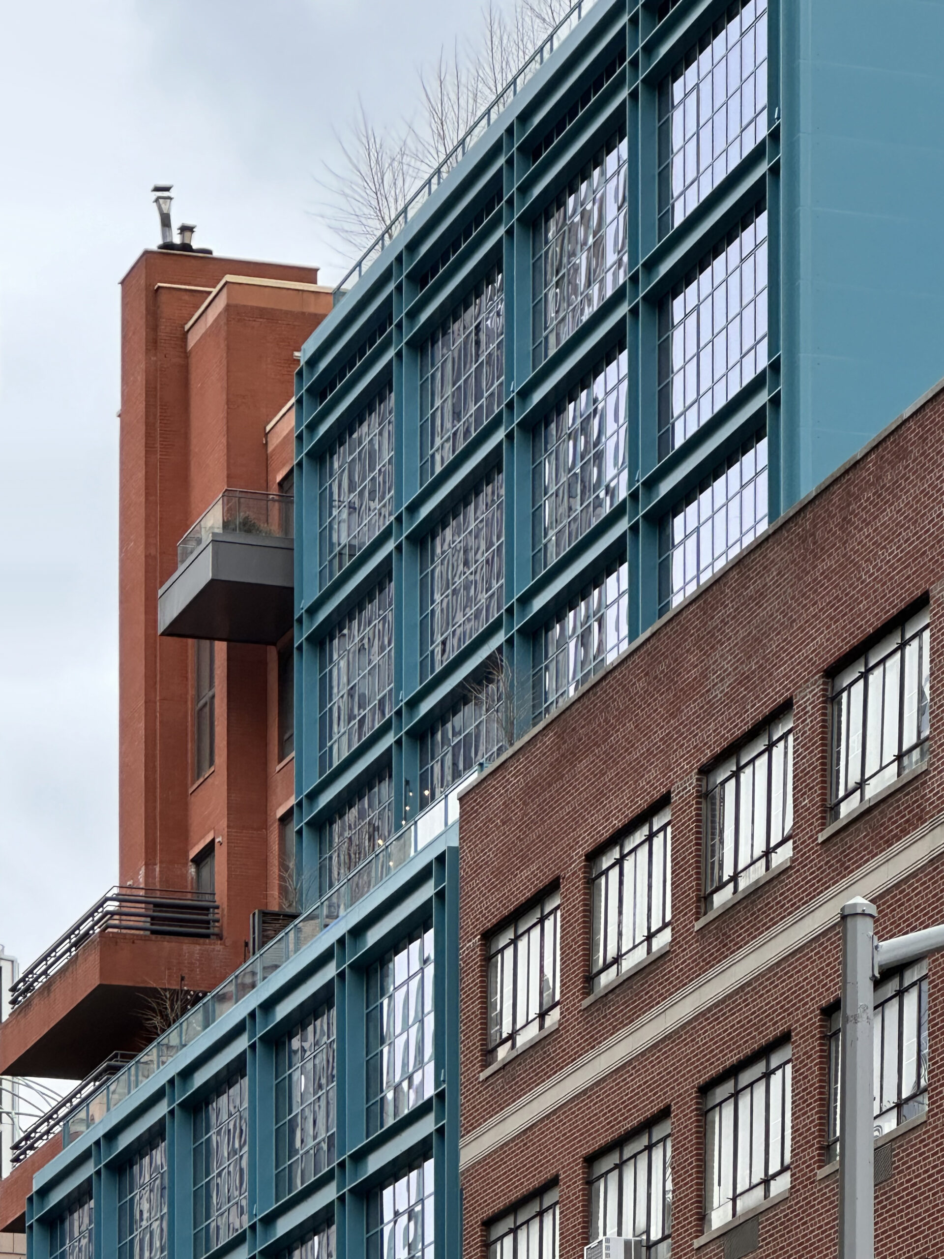
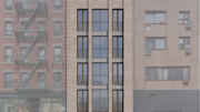
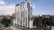
Construction is complete on the Warren Street Hotel, an 11-story building that celebrated its grand opening yesterday at 86 Warren Street in Tribeca. Designed by Paul Taylor with Stonehill Taylor and developed by Firmdale on a land lease from Solil Management, the 135-foot-tall structure spans 44,000 square feet and yields 69 guest rooms operated by Firmdale Hotels, as well as the 150-seat Warren Bar and Restaurant, a drawing room, an orangery, and a private event space. Pavarini McGovern was the general contractor and Kit Kemp was the interior designer for the ground-up project, which stands on the former site of an open-air parking lot between Greenwich Street and West Broadway.
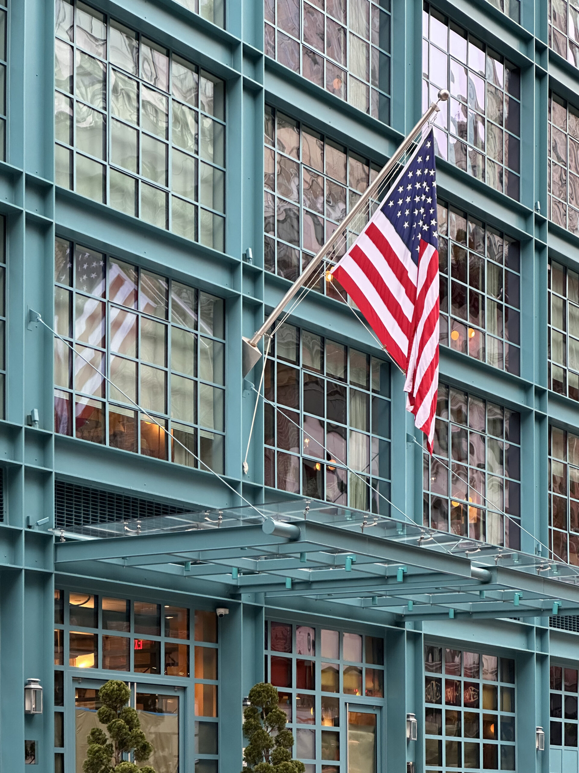
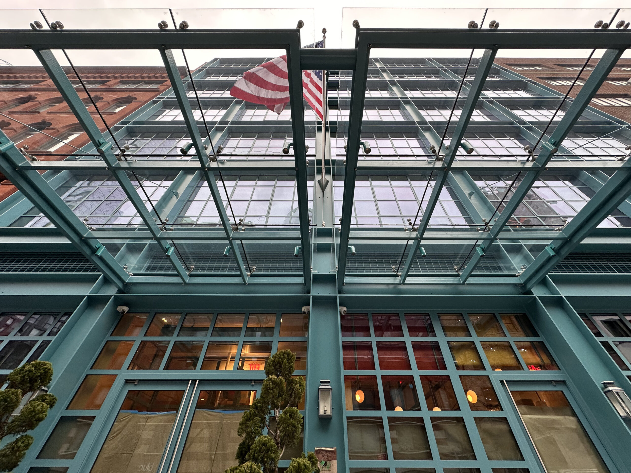
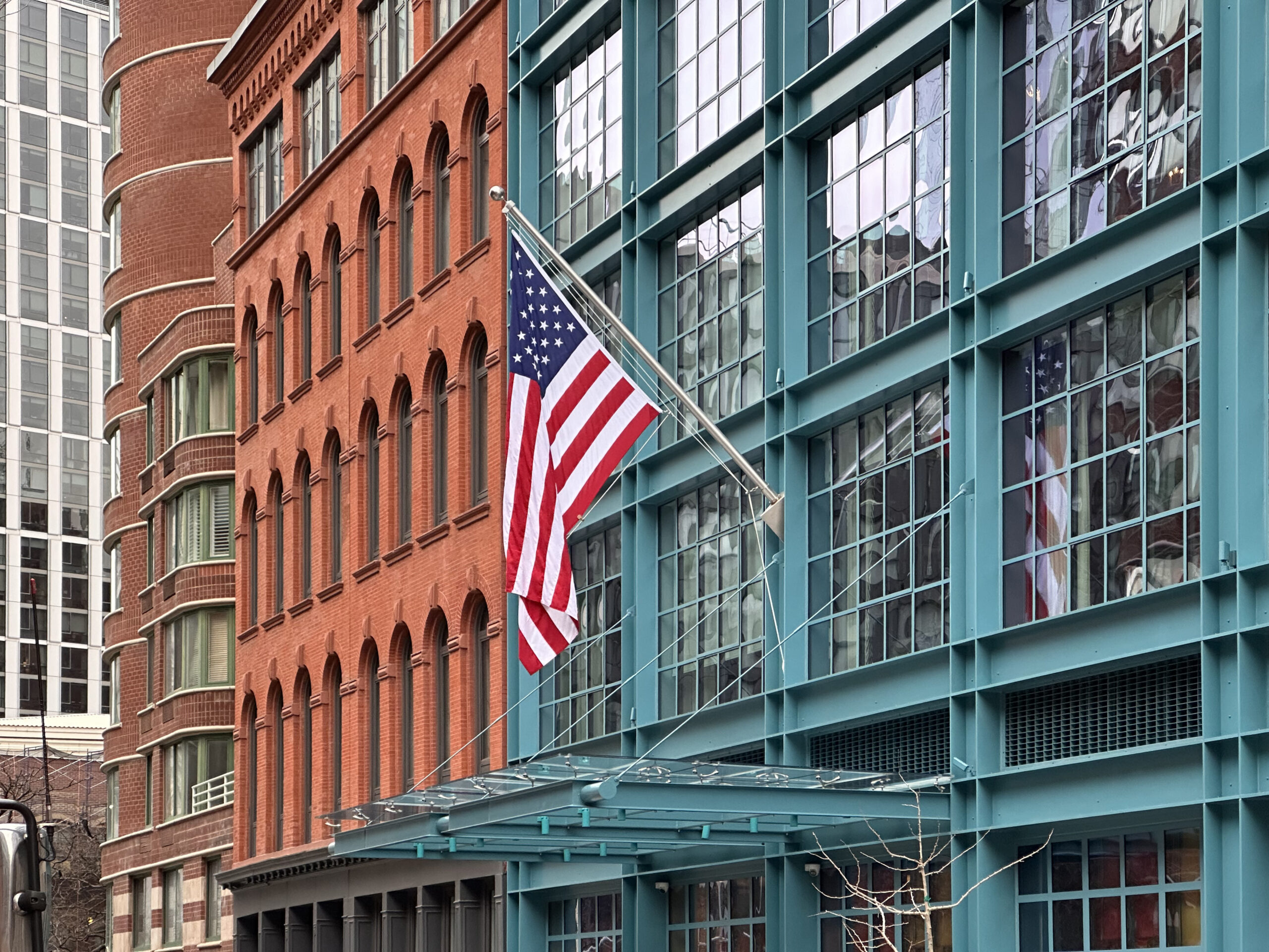
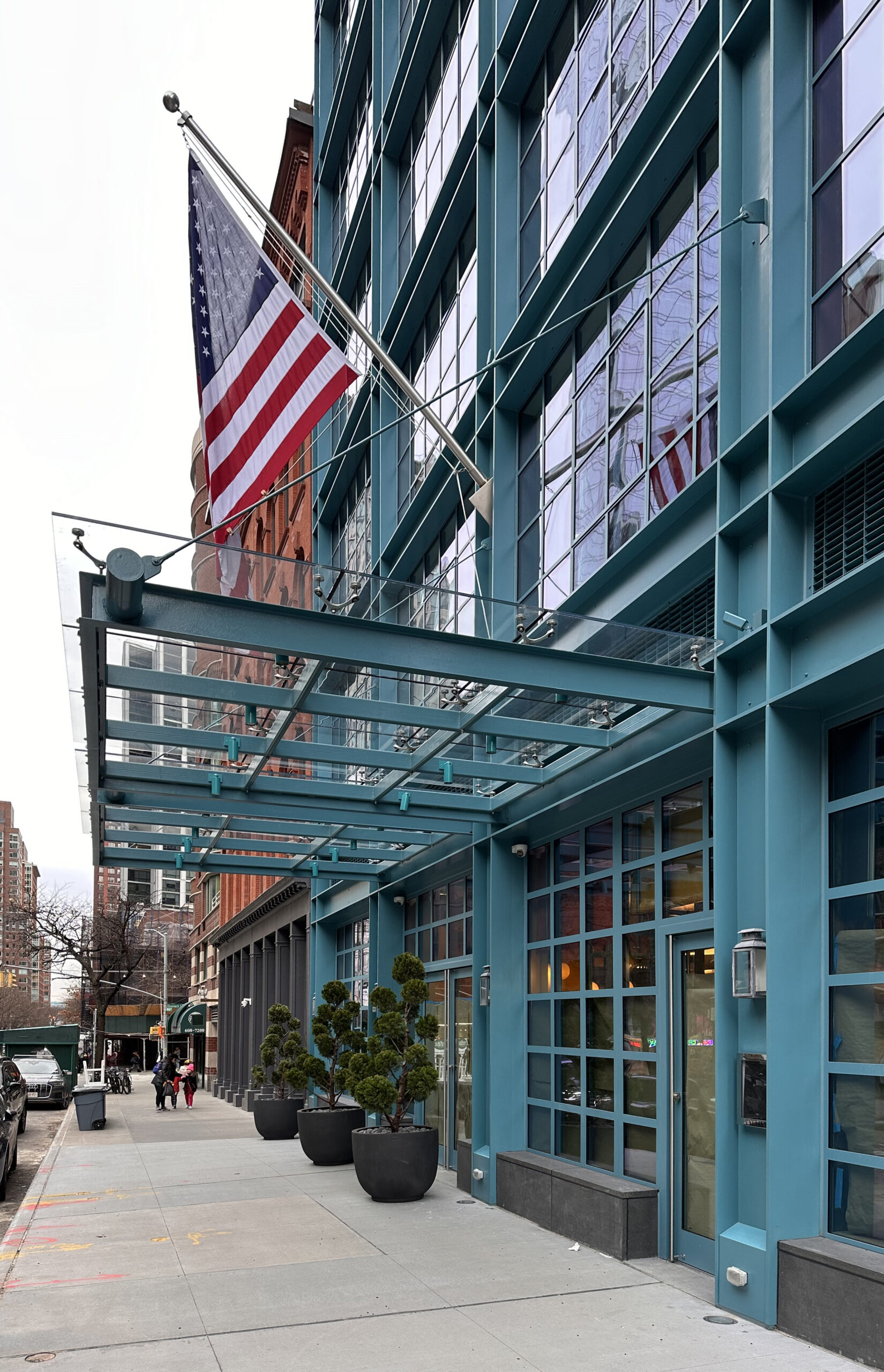
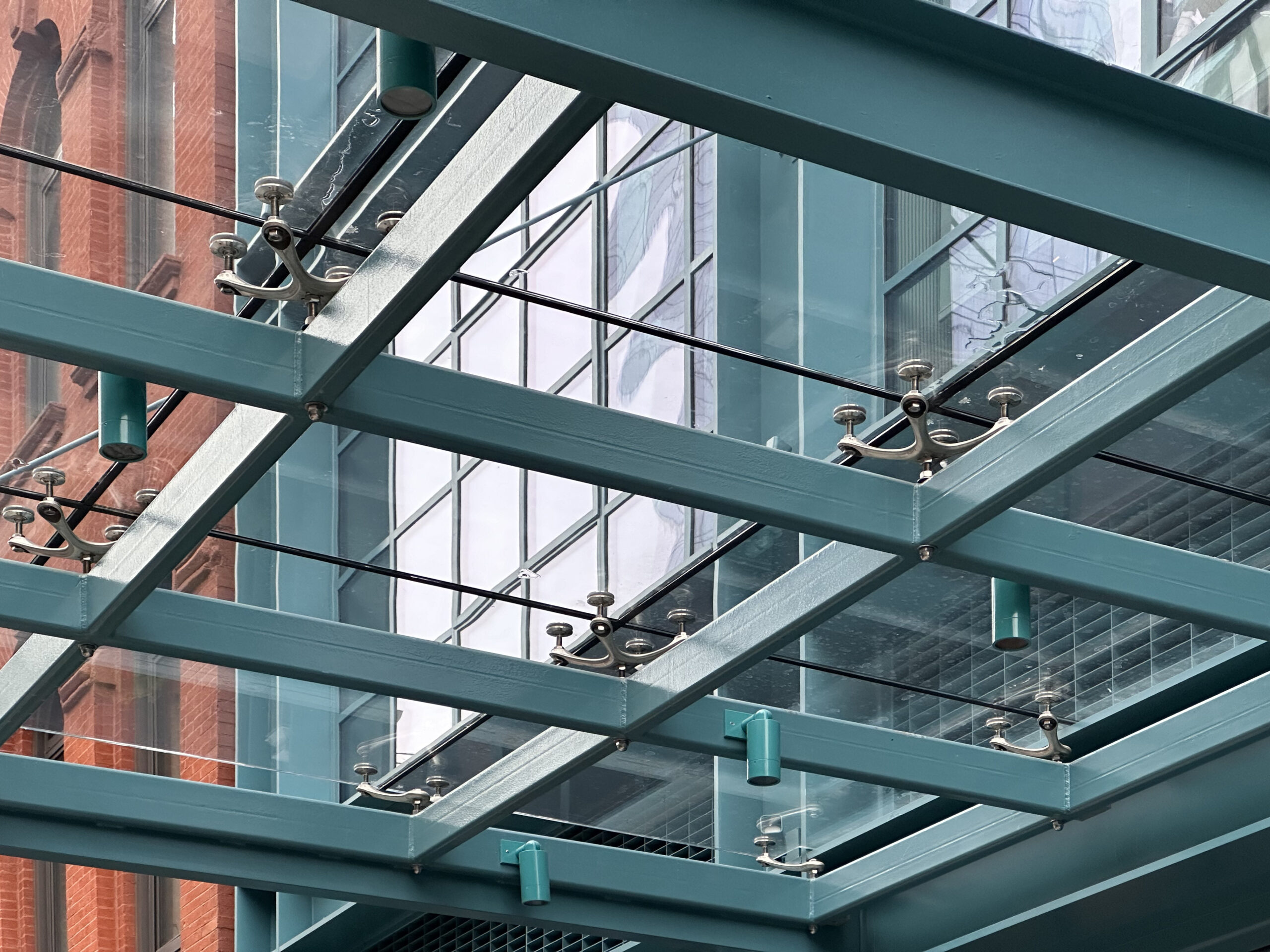
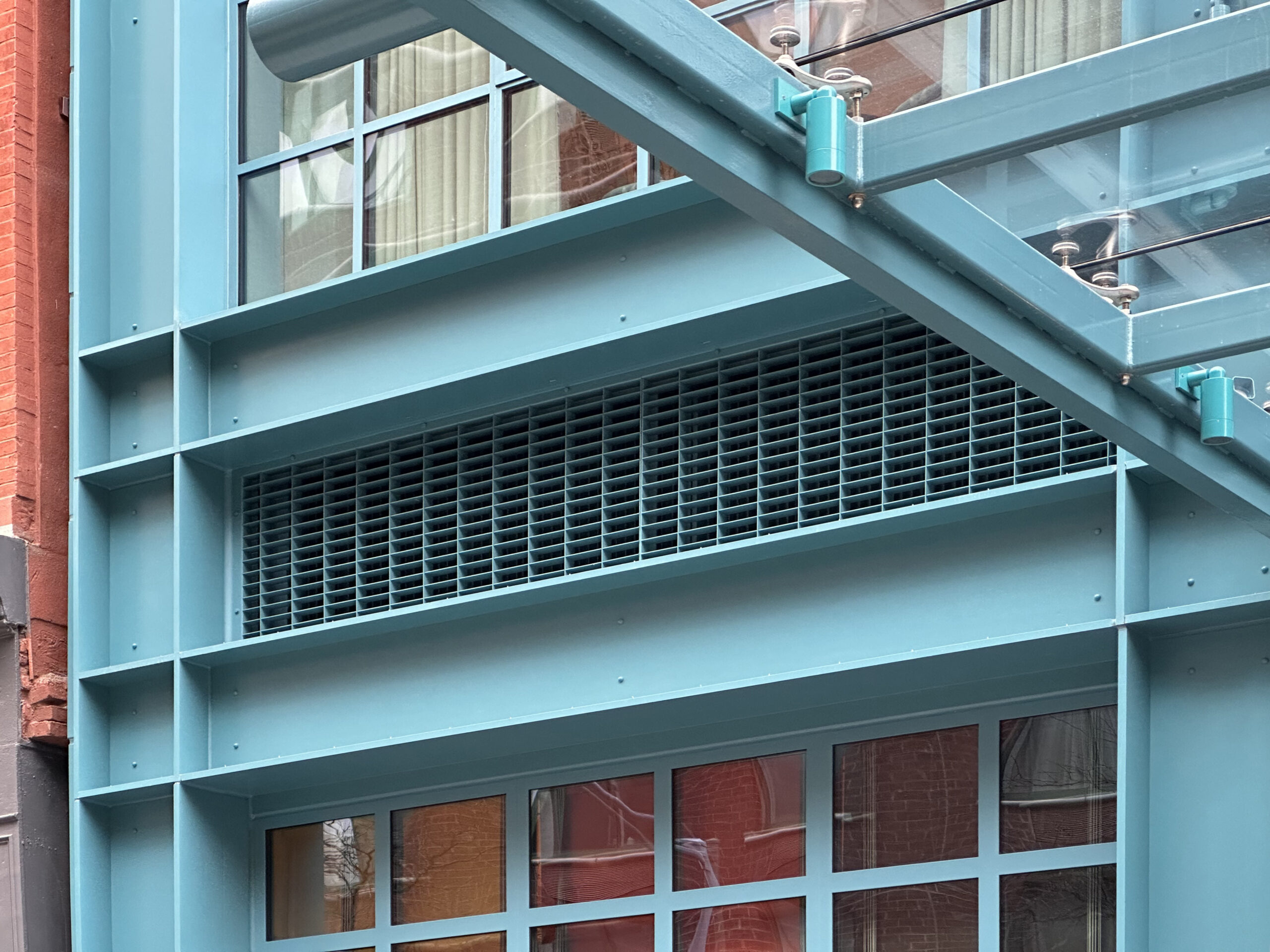
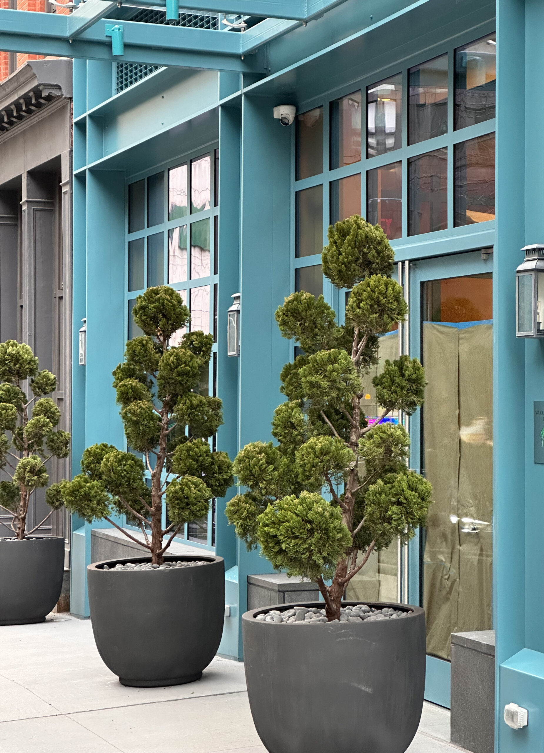
All of the remaining upper scaffolding and the sidewalk shed along Warren Street have been dismantled since our last update in August, when the ground floor was still unfinished and obscured by wooden fencing. Recent photos show the final appearance of the hotel entrance, which sits underneath a metal canopy lined with clear glass panels. There is also a new flag pole attached to the building and planters surrounding the doorways and ground-floor frontage, which were temporarily covered with sheets of brown paper as crews were making the final touches on the interior spaces earlier this week.
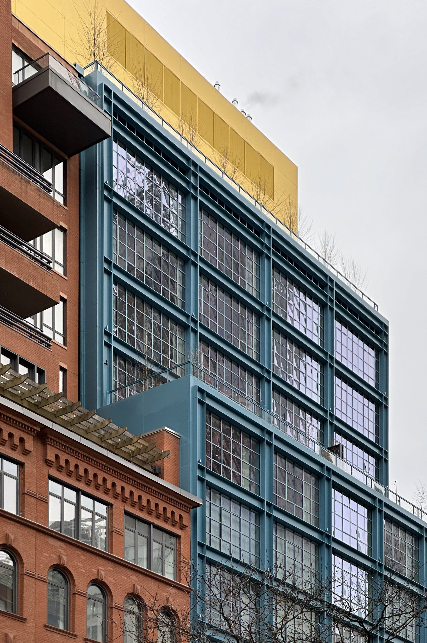
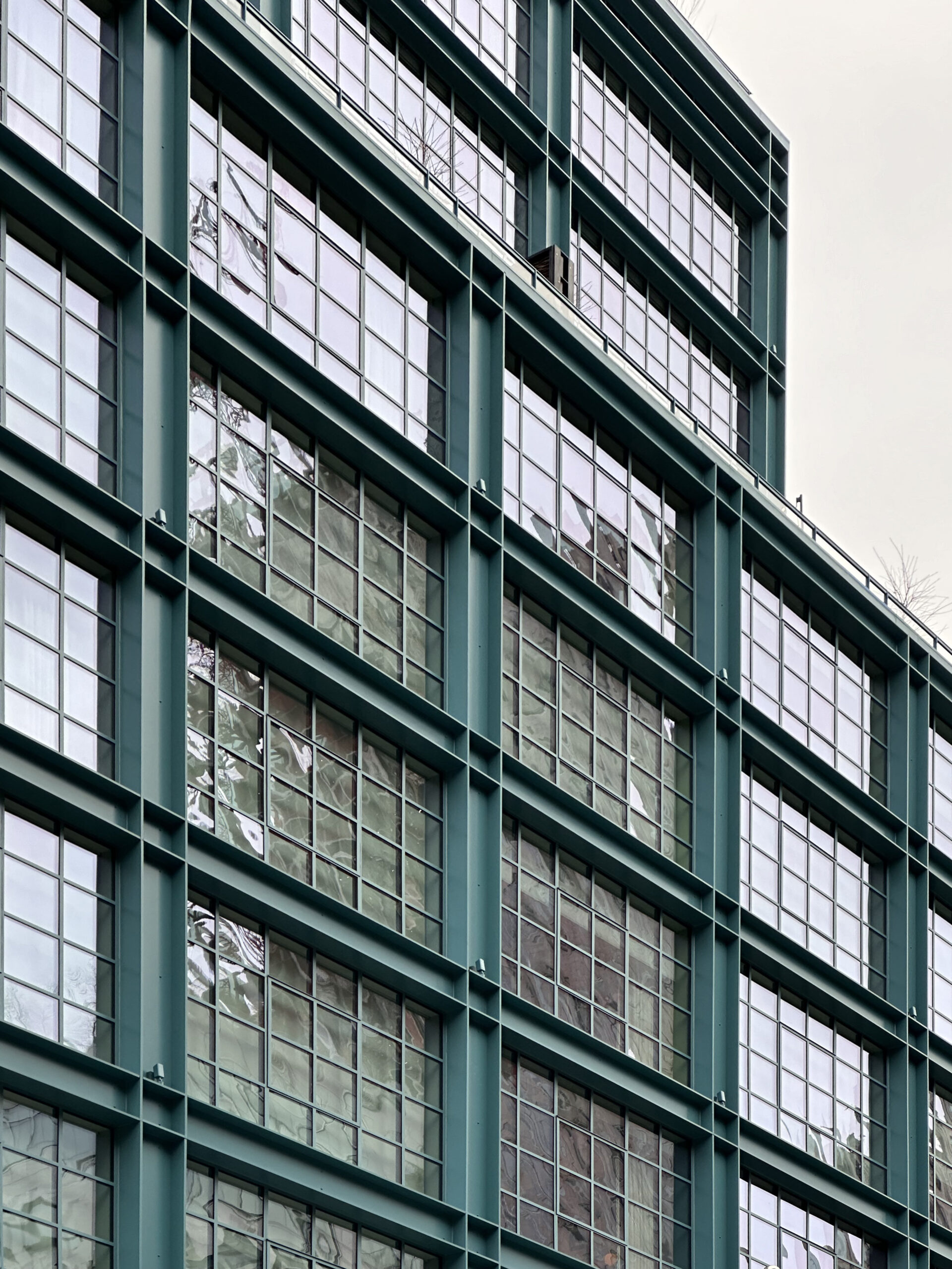
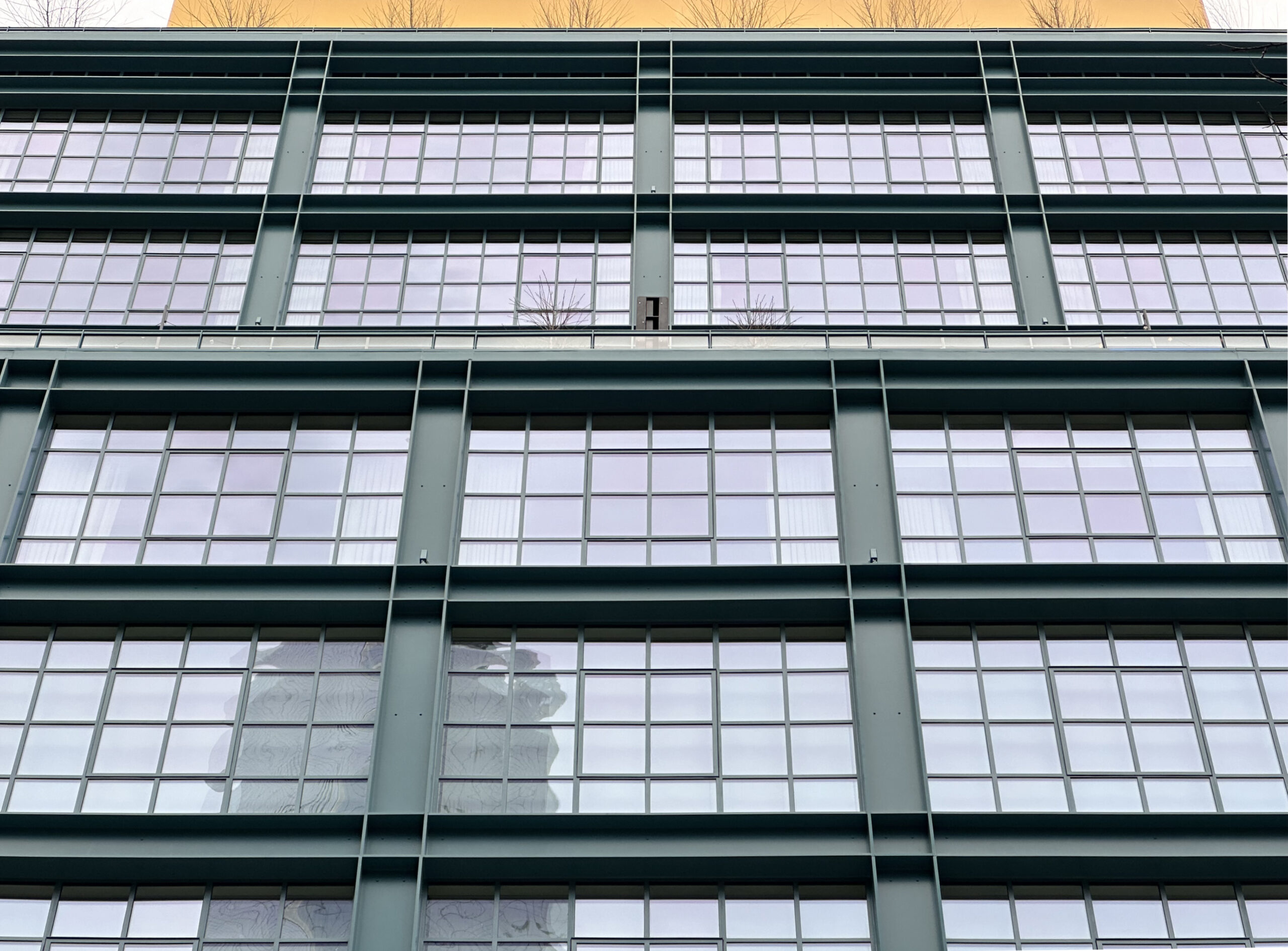
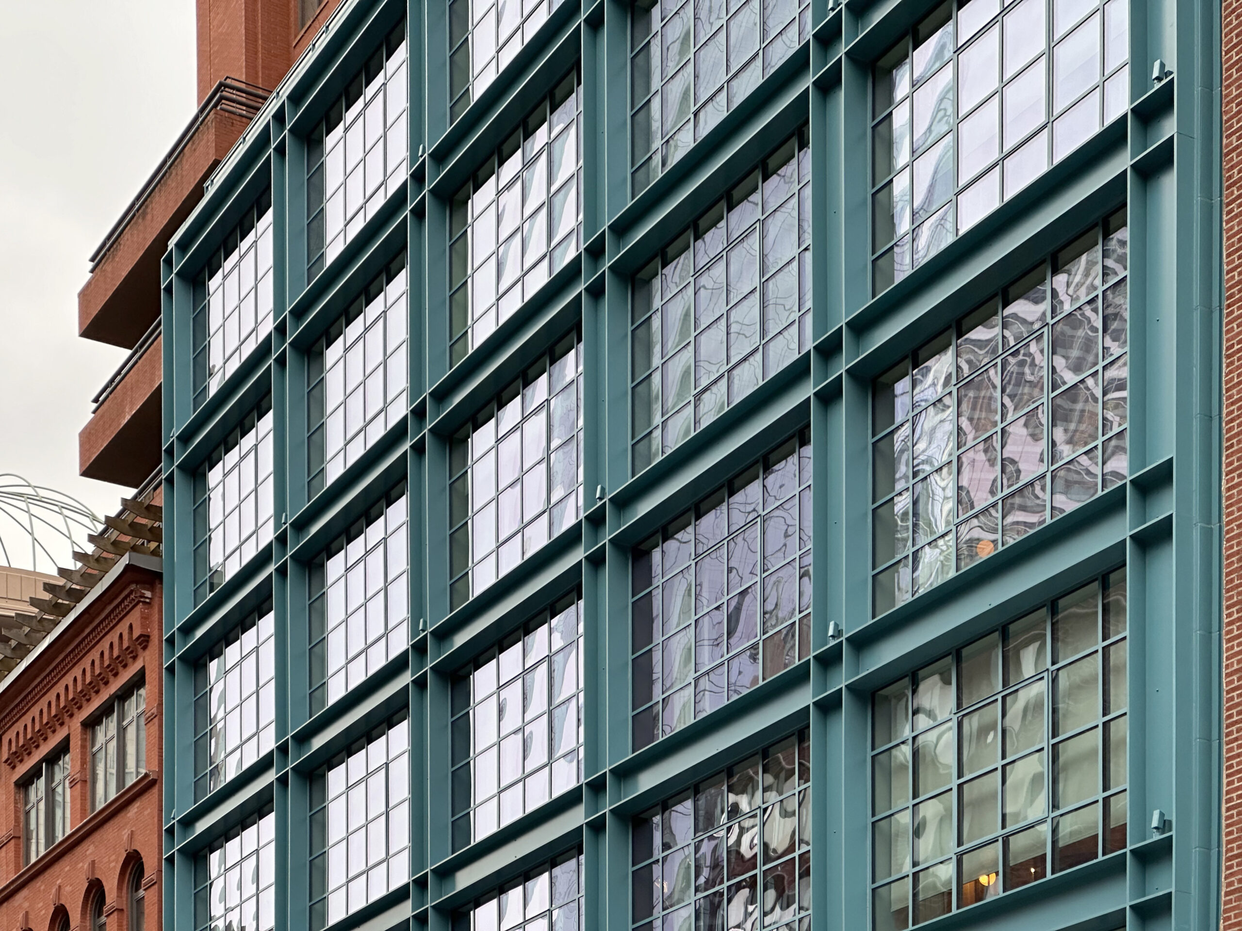
The Warren Street Hotel has 69 individually designed bedrooms and suites, as well as 12 exclusive residences on the top levels. Each room, ranging from 330 to 665 square feet, comes with expansive floor-to-ceiling industrial-style windows, while some offer landscaped private terraces that measure up to 334 square feet. South-facing rooms on the upper floors have views of the World Trade Center complex, the Financial District, Battery Park City, and the Hudson River. The ground-floor Warren Bar and Restaurant will be open to both the public and hotel guests for breakfast, lunch, tea, cocktails, and dinner.
86 Warren Street is a short walk from the World Trade Center complex and is in close proximity to the 1, 2, 3, 4, 5, A, C, E, R, W, and PATH trains.
Subscribe to YIMBY’s daily e-mail
Follow YIMBYgram for real-time photo updates
Like YIMBY on Facebook
Follow YIMBY’s Twitter for the latest in YIMBYnews

The yellow at the top is just hideous. It looks like they really tried to not blend in in the neighborhood.
Beautiful building except for the top
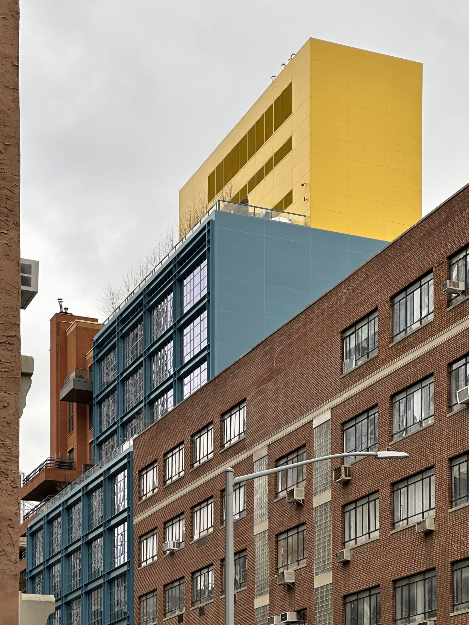
Love the photos of the industrial style windows. I think the yellow bulkhead is a nice contrast with the red buildings ne5 door and the steel color below
Boy this hotel is going to require alot of Windex and paper towels to clean all those little glass panes?! 🤔🤣
The tight orthogonals of the green lower facade remind me of I.M. Pei’s very great 88 Pine Street. The harsh yellow box on top — what is that?
This building looks terrific, even with the questionable yellow top. I love the uniform geometry of the window grid. Such a nice change from all the mismatched windows sizes and spacing that seems to be popular with some new developments.
Great looking building minus the mustard yellow top. Maybe they will eventually spray over the yellow with the same color paint as the rest of the building.
Great looking building…minus the mustard yellow panels at the top. Maybe they will eventually spray it the same color as the rest of the building so it looks more cohesive.
Absolutely wonderful design from bottom to top.
I think that yellow is pretty unique and makes the streetscape more colorful. Also easier to spot the hotel from a distance which I think was the idea 💛
I think you really nailed it—tourists walking around all day, trying to ‘home’, and BAM—yellow roof! But, also, I hate it.
Color is the main issue with this building, as New Yorkers are not used to the primary colors of Legoland. But I think a little bit can brighten up the streetscape and I think that this building looks terrific. The blue is more muted than in the rendering and that is a big improvement. The touch of yellow on top is a plus for me. I too wonder about keeping the clear glass of the canopy looking clean, will they be cleaning those horizontal slabs weekly?
Is the yellow thing at the top the “orangery?” It seems more of a lemon. The lanterns at the sidewalk level seem too refined–something more industrial would be more in keeping.
Colors selection are beautiful and potted plants can be moved away, if it doesn’t fit industrial-style windows: Thanks to Michael Young.