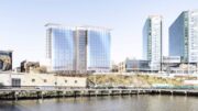
New renderings have been released for 20 Long Slip, a proposed 50-story residential skyscraper along the Hudson River waterfront in the Newport section of Jersey City, New Jersey. Designed by Arquitectonica with Hill West Architects as the architect of record, the 526-foot-tall structure will yield 529 apartments and 2,364 square feet of retail space on the lower floors. Dresden Robin is the civil engineer and landscape architect for the property, which is currently occupied by an open-air parking lot at the end of Park Lane North, with the Hudson River and dog run to the east, Washington Boulevard and 18th Street to the west, and the rail lines for the Hoboken-Bergen Light Rail system to the north.
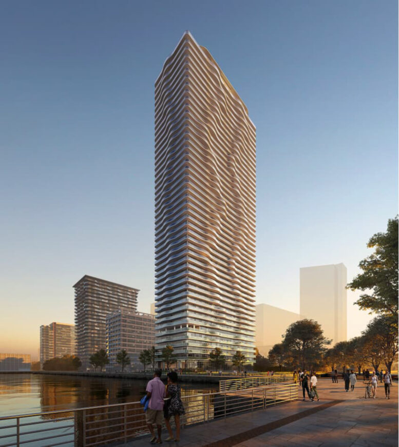
The main rendering depicts a sunset perspective of 20 Long Slip’s northeastern corner, highlighting the series of curving, glass-lined balconies that surround every floor in a rippling pattern reminiscent of Studio Gang’s Aqua skyscraper in Chicago. Behind the balconies, the façade consists of a glass curtain wall.
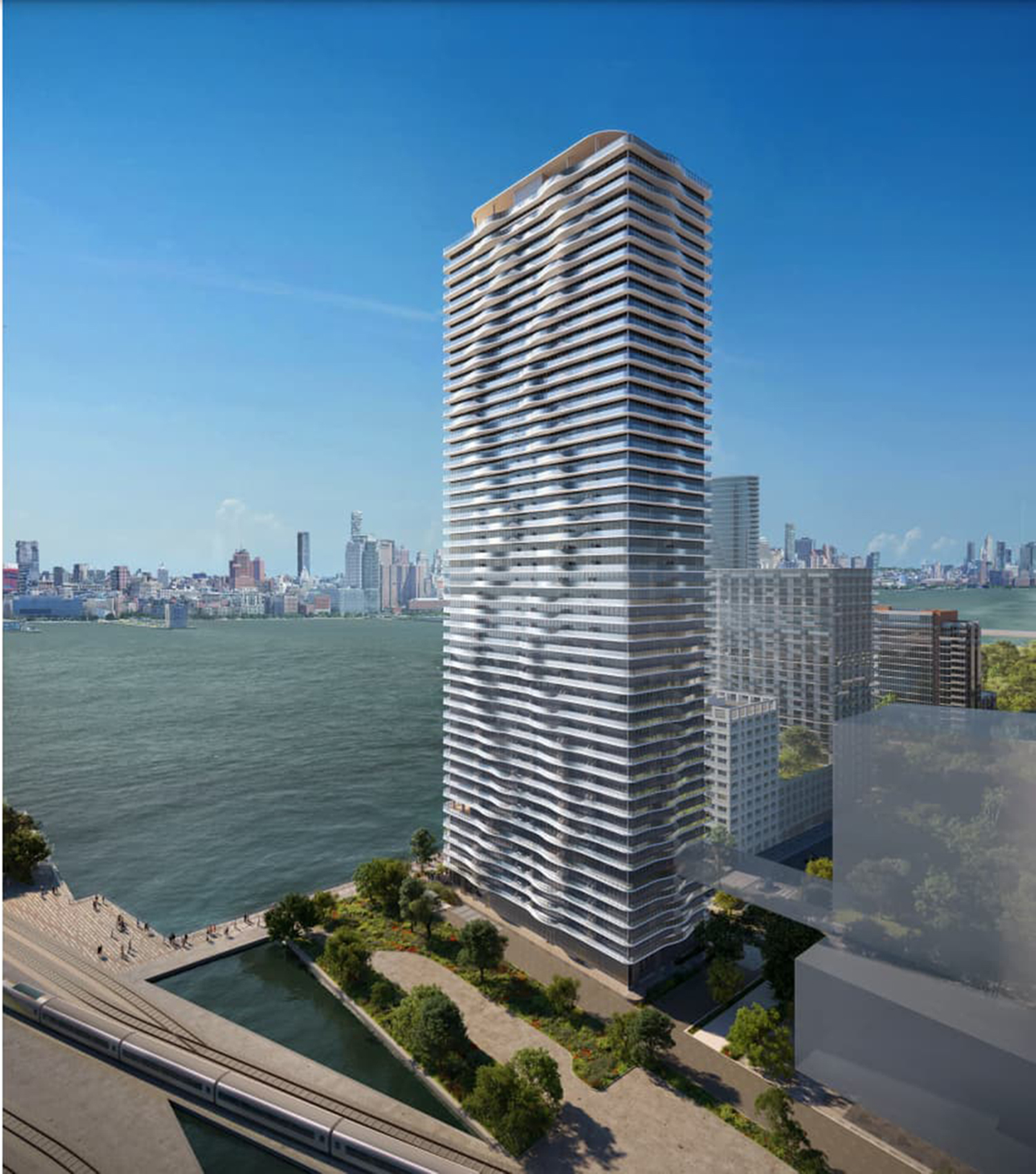
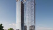
The second rendering is an aerial view of the northwestern corner, looking east toward Lower Manhattan across the Hudson River. A small green space will separate the site from the Hoboken-Bergen Light Rail tracks to the north. The building culminates in mechanical bulkhead with a floor-to-ceiling glass exterior with exposed columns, topped with a flat slab with rounded corners. Around the edges are glass railings for an outdoor rooftop terrace. The rendering also shows a shorter structure with a skybridge connecting to 20 Long Slip directly to the west. Further details about this separate structure have yet to be revealed.
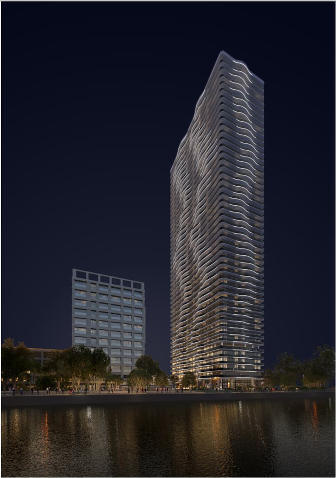
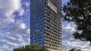
The third rendering is a nighttime perspective from the Hudson River looking west, showing the building illuminated with LED strips along the curving balconies.
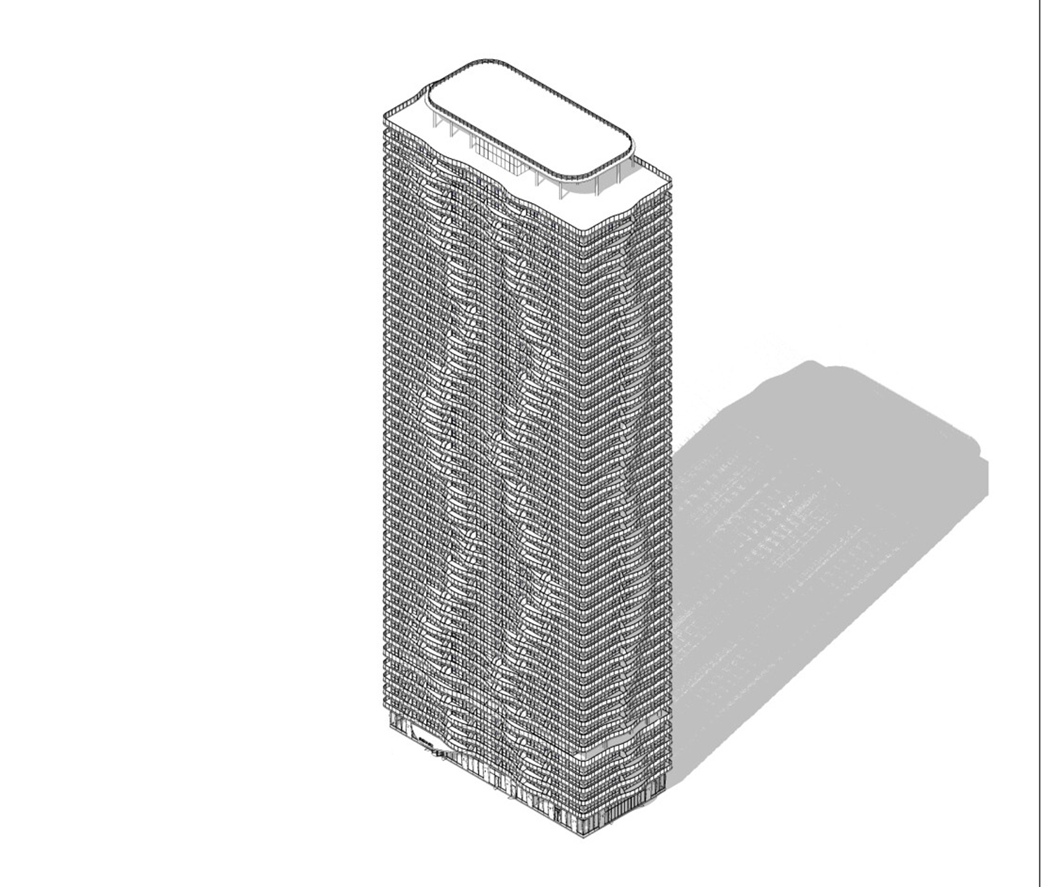
Here we see an axonometric diagram of 20 Long Slip’s southern elevation, showing a much clearer view of the rooftop. The ground floor has an extended canopy for the main entrance.
Residential amenities will include a package room, a fitness center, a coworking space, a game lounge, a clubhouse, and a children’s playroom.
A start and completion date for 20 Long Slip have yet to be disclosed.
Subscribe to YIMBY’s daily e-mail
Follow YIMBYgram for real-time photo updates
Like YIMBY on Facebook
Follow YIMBY’s Twitter for the latest in YIMBYnews

Kind of loving the Miamification of JC
Absolutely! Jersey Shore is so Miami, it’s a great fit.
Nighttime view is the right time.
This high-rise design is a familiar sight in Chicago, if I put these renderings in the main conference room. It must be beautiful for sure: Thanks.
Very nice.
Arquitectonica embraces technological advancements to create innovative building envelopes and integrate sustainable features. Researching their use of glass and facade systems in other projects could provide insights into their approach for 20 Long Slip.
Studio Gang’s Influence: The comparison to Aqua skyscraper suggests a potential influence on the design of 20 Long Slip. Here’s a deeper dive:
Studio Gang’s Biomimicry Inspiration: Aqua’s wave-like facade is inspired by natural rock formations. It would be interesting to see if there are any biomimicry influences in the design of 20 Long Slip’s curved balconies, or if the curvature serves a purely aesthetic purpose.
Sustainable Design Integration: Studio Gang is known for its focus on sustainable design principles. While the renderings don’t reveal specific sustainability features, it would be worth investigating if 20 Long Slip incorporates similar strategies in its design alongside the extensive use of glass.
Exterior Look: Deep Dive
Materiality: While the renderings show a glass curtain wall facade with curved glass balconies, it would be valuable to explore if there’s a variation in materials used across different elevations or sections of the building. For instance, the mechanical bulkhead appears to have a different material treatment.
Color Palette: The renderings depict a reflective glass facade. Investigating the use of color accents or variations in the glass tint could provide further insights into the overall aesthetic composition.
Lighting Design: It’s unclear from the renderings if there’s an integrated lighting design for the exterior. Researching the use of architectural lighting on the facade could reveal how the building might appear at night and contribute to the streetscape.
Dynamism and Movement: Curved glass balconies can create a sense of movement and fluidity on the facade, especially when employed in a rippling pattern as seen in 20 Long Slip. This can make the building appear more dynamic and visually interesting compared to a traditional rectilinear facade.
Curved Balconies as Kinetic Elements: The rippling pattern of the curved balconies creates a sense of movement on the facade, especially when viewed from different angles or as light reflects off the glass. This dynamism can be amplified by:
Varying the depth or curvature of the balconies across different floors, creating a wave-like effect.
Strategic use of transparent and opaque glass panels within the balconies, creating a sense of visual rhythm and movement.
Integrating lighting design that accentuates the curves and plays with light and shadow throughout the day and night.
Structural Design for Dynamic Expression: While curved glass introduces engineering challenges, it can also be an opportunity for innovation:
Advanced fabrication techniques can be used to create lightweight and structurally sound curved glass panels.
Hidden support structures can be integrated behind the facade to provide stability for the balconies without compromising the visual flow of the curves.
Wind tunnel testing can be crucial to ensure the building can withstand wind forces and maintain the desired level of movement in the balconies.
Functionality Meets Dynamism: The curved balconies can offer both aesthetic appeal and functional benefits:
Enhanced Views: The curvature can provide residents with a wider viewing angle, potentially offering more expansive vistas compared to straight balconies.
Microclimates and Sun Shading: The varying depths of the balconies can create pockets of shade and wind protection, improving occupant comfort on different floors depending on the sun’s position.
Potential for Usable Outdoor Space: Depending on the depth and design, the curved balconies could offer usable outdoor areas for residents, promoting a connection with the outdoors.
Aesthetics: Beyond the Initial Impression
The dynamism created by the curved elements goes beyond a striking first impression. Here’s a closer look:
Harmonious Relationship with Surroundings: The curves can be designed to complement the surrounding architecture or create a distinctive contrast. For instance, the curves could echo the lines of the nearby waterfront or create a dynamic counterpoint to a more rigid grid pattern in the cityscape.
Evoking a Sense of Place: The use of curves can evoke a sense of movement and fluidity that resonates with the dynamic nature of a waterfront location.
Ever-Changing Facade: The play of light and shadow on the curved glass throughout the day and under different weather conditions can create a constantly evolving aesthetic experience.
By considering these aspects, we gain a deeper appreciation for how the curved glass elements in 20 Long Slip contribute to a dynamic and visually engaging architectural expression.
Project Details: I can incorporate details about the project, including:
Location: Jersey City waterfront, Newport section
Design Team: Arquitectonica (architect), Hill West Architects (architect of record), Dresden Robin (civil engineer and landscape architect)
Building Specifications: 50 stories, 526 feet tall, 529 apartments, 2,364 sq ft of retail space
Current Site: Open-air parking lot
The aerial view reveals a small green space separating the building from the rail tracks. This green space could be analyzed for its role in urban design and aesthetics, mitigating the impact of the rail line on residents, and potentially contributing to stormwater management.
The presence of a skybridge connecting to a shorter structure is interesting. If more information becomes available, it would be valuable to understand the function of the connected structure and how the skybridge contributes to pedestrian flow and overall site design.
Curved Glass Elements: Aesthetics and Functionality
Aesthetics:
Dynamism and Movement: Curved glass balconies can create a sense of movement and fluidity on the facade, especially when employed in a rippling pattern as seen in 20 Long Slip. This can make the building appear more dynamic and visually interesting compared to a traditional rectilinear facade.
Light and Shadow Play: Curved glass reflects and refracts light differently than flat panels, creating a more nuanced play of light and shadow on the building’s exterior. This can add visual depth and textural variation.
Enhanced Views: Curved balconies can provide residents with a wider viewing angle, potentially offering more expansive vistas of the surrounding cityscape or waterfront.
Functionality:
Structural Considerations: While aesthetically pleasing, curved glass elements can be more complex and expensive to engineer and install compared to flat panels. The design needs to ensure the structural integrity of the balconies while maintaining the desired curvature.
Wind Resistance: The curvature of the balconies can influence wind patterns around the building. Careful engineering is required to mitigate potential wind effects, especially at higher floors.
Maintenance: Curved glass panels may require specialized cleaning techniques and considerations compared to flat panels.
Arquitectonica’s Design Philosophy and Studio Gang Comparison
Arquitectonica’s Approach:
Contextual Sensitivity: Arquitectonica is known for its focus on integrating design with the surrounding environment. Their projects often respond to the specific context of a site and its cultural influences. It would be interesting to explore how 20 Long Slip reflects this philosophy in its design for the Jersey City waterfront.
Technological Innovation: Arquitectonica embraces technological advancements to create innovative building envelopes and integrate sustainable features. Researching their use of glass and facade systems in other projects could provide insights into their approach for 20 Long Slip.
Studio Gang’s Influence: The comparison to Aqua skyscraper suggests a potential influence on the design of 20 Long Slip. Here’s a deeper dive:
Studio Gang’s Biomimicry Inspiration: Aqua’s wave-like facade is inspired by natural rock formations. It would be interesting to see if there are any biomimicry influences in the design of 20 Long Slip’s curved balconies, or if the curvature serves a purely aesthetic purpose.
Sustainable Design Integration: Studio Gang is known for its focus on sustainable design principles. While the renderings don’t reveal specific sustainability features, it would be worth investigating if 20 Long Slip incorporates similar strategies in its design alongside the extensive use of glass.
Exterior Look: Deep Dive
Materiality: While the renderings show a glass curtain wall facade with curved glass balconies, it would be valuable to explore if there’s a variation in materials used across different elevations or sections of the building. For instance, the mechanical bulkhead appears to have a different material treatment.
Color Palette: The renderings depict a reflective glass facade. Investigating the use of color accents or variations in the glass tint could provide further insights into the overall aesthetic composition.
Lighting Design: It’s unclear from the renderings if there’s an integrated lighting design for the exterior. Researching the use of architectural lighting on the facade could reveal how the building might appear at night and contribute to the streetscape.
Oh, hell no.
Similar design that has been repeated many other places
Chicago did it better.
A little bit of Miami in JC… Love it!
I am a current resident of The Beach, building next door. My only concern with 20 Long Slip is the potential nuisance of idling NJT locomotives directly adjacent to this site. At times we are subjected to VERY loud low frequency noises depending on where the trains are parked, and our unit is positioned probably a quarter mile away. Have to imagine the noise will be even more intense at this location. Perhaps improved materials/construction technique could help mitigate?