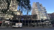
Construction is in full swing at One Vandam, which was designed by BKSK Architects; YIMBY sat down with the firm’s George Schieferdecker to discuss the project’s specifications, context, and overall design concept.
YIMBY in bold.
How many floors is One Vandam?
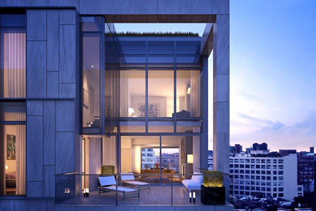
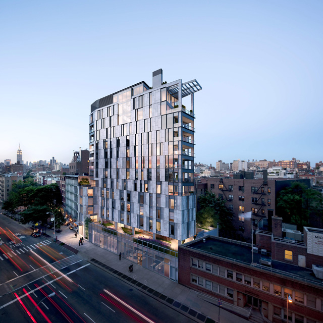
The building has fourteen floors, and the first floor is double-height. The building has three penthouses — including a triplex — which are all located on the upper floors.
And how did you balance the development with its ‘historic’ surroundings?
Well that’s an interesting discussion; sometimes the press tells us that we’re very tall, compared to our surroundings.
Which is ridiculous. The building across the street is fifteen floors tall.
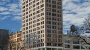
That to me is really obvious. We’re on the fourteenth floor [of the sales center across the street], and we’re going to be level with their penthouses — or maybe lower. So what it’s doing I think, is sort of modulating the scale of the city. What is historical about this area is kind of difficult to pin down; I mean you’ve got some SoHo, which is a wonderful neighborhood, but we’re on the edge of SoHo. And you’ve got where we’re sitting right now — which is Avenue of the Americas —
Which is also ‘Hudson Square,’ yes? What exactly is the neighborhood here?
And that’s the thing; I think we’d like to think we’re part of SoHo, but we’re at the edge of SoHo. We’re also a part of the Village a little bit, sort of bleeding down Sullivan Street, and we’re also on Avenue of the Americas, which has a different scale. It’s what you might call a cusp neighborhood, or a boundary, and so I think it draws inspiration from all of those. But at the end of the day it’s kind of itself. Its massing tries to be — it’s kind of locked into the neighborhood, but it’s going to be taller than the adjoining buildings because of the FAR.
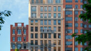
If you look around Hudson Square, you look back at the square itself; you see a lot of buildings with a cream color to them, a lot of limestone vocabulary. And then if you go to SoHo you see cast iron, and I think, to that degree, there are rhythms of cast iron architecture in our design. It’s about the scale encompassing SoHo, and it’s epitomized by the generous floor to ceiling windows.
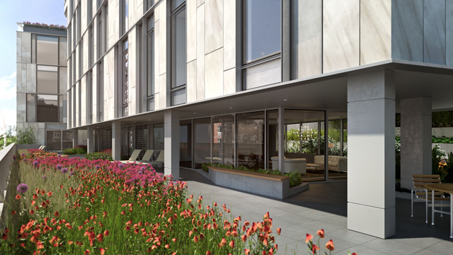
Then, massing-wise, what people tend to miss is that there’s a scale on Avenue of the Americas that is slightly lower except for [One Vandam], but we pick up that scale with the first portion of our building, which comes out from the street-face, and is roughly the same size as the adjoining tenement — and then we lock this mass into the tower, and rise up. So I think it plays off the immediate scale of the neighborhood and then rises up.
What are the facade materials?
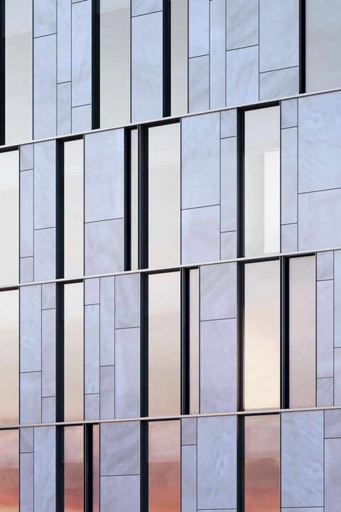
The facade materials are metal, glass, and stone.
And where is the stone from?
It’s limestone, and it’s from a quarry in Alabama. We chose it specifically because it has a lot of activity; there are a lot of limestones that don’t have graining — limestone is generally more prized for its consistency.
So basically it adds depth that other stones could not.
It’s got a lot of pattern; the panels are arranged in three types for most of the facade. There’s stone, which is exposed to the weather, and then there’s glass — and then we have an in-between panel, and that panel has glass in front, and stone behind. So it’s what we call a back-pan panel.
What does [the back-pan panel] do?
It mediates between the two [glass and stone]. If you slide the stone behind the panel, the appearance shifts depending on if the sun is hitting the glass. The idea was to have a kind of continuous pattern of glass and stone and metal that had various different readings to it — and a sort of dynamism. And in order for the stone to really read, we wanted it to have a certain level of activity.
Have you had to modify anything with the building next door — they had some leaning issues when drilling began?
It had never leaned — at one point they had an alarm because someone’s door didn’t shut. There was concern over it, and the laws in New York are very strict now — and the Buildings Department monitors it on a daily basis — so there are a lot of protections in place to make sure everything is done properly.
How did you accommodate the subway — what are the noise-dampening measures?
That was done in the very beginning; there are all sorts of ways to mediate that noise, but it turned out not to be an issue with the mass of our structure and the configuration of the base.
What about the God’s Love re-design; have you seen the renderings, and do you wish you could have had input?
At one point in time we were actually thinking of switching sites, and there was a scheme that had everything linked in together. But that can’t happen because there are certain regulations in place regarding God’s Love’s deal with the city, that don’t allow a move to any other location.
Overall, what was the biggest design challenge?
There were a lot of logistical issues making sure everything worked with God’s Love; they’re a very respected institution in the neighborhood and have to make sure they do right by what they contribute to the area. The challenge of the building and its site were what we worked on all the way through — the interior folks, ourselves, the broker, and the client — to take advantage of the opportunities of this site, which are a lot.
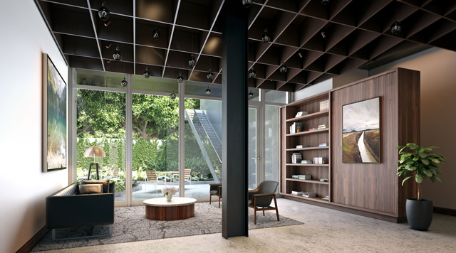
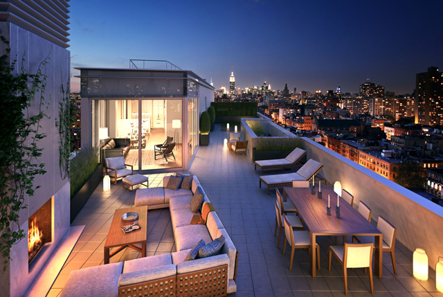
It’s a narrow building, which means you’re forced into a configuration that’s interesting — at every level, there are different views — so how do you design a structure that takes advantage of that? The whole facade expression came from a desire for each unit to be different, and the need to accommodate those differences.
Who else is involved with One Vandam at BKSK?
We are a six partner firm, including two partners — Todd Poisson and Julia Nelson — who are not in the initials. We’re teams of people, and our firm — and the product we’ve produced — has come from many hands. There are a lot of people involved in this particular project; we like that collaborative approach both with our clients and brokers, and amongst ourselves.
What are the common themes between One Vandam and your other recent projects?
We really try to do buildings that are very individual, that are about taking the problems that exist with a particular site and making them into advantages. That’s what produces individuality; if you recognize the particular issues of an individual site and turn them to your advantage, you create a unique product.
Are there any skyscrapers in the near-future for BKSK?
We don’t have a skyscraper — not on the horizon. I think one of our specialties is smaller scale, where it’s a complex formula between zoning and client relationships — in this case, with God’s Love and landmarks — which often pushes you into looking at a site in an innovative way.
Subscribe to YIMBY’s daily e-mail
![]()
Follow YIMBYgram for real-time photo updates
Like YIMBY on Facebook
Follow YIMBY’s Twitter for the latest in YIMBYnews

