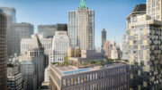
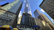
Back in May of 2014, One Wall Street was acquired by Harry Macklowe from BNY Mellon for $585 million, with plans to convert the building from office to residential use. The Ralph Walker-designed tower is one of the most iconic skyscrapers in the Financial District, from its limestone exterior, to the vulcan-inspired Red Room, all the way to the former executive smoking room/observation lounge at the tip-top of the building. And now YIMBY has the first renderings of what the building will eventually look like, courtesy of a tipster, who sent along CetraRuddy-designed plans that transform the building’s base into a major retail destination, and its upper floors into condominiums and a hotel.
CetraRuddy is certainly the most experienced with Walker’s buildings, having already helmed the transformation of both Walker and Stella Towers. Their credentials will come especially handy for One Wall Street, which is substantially larger than either of the aforementioned projects, totaling 1.1 million square feet and 50 floors.
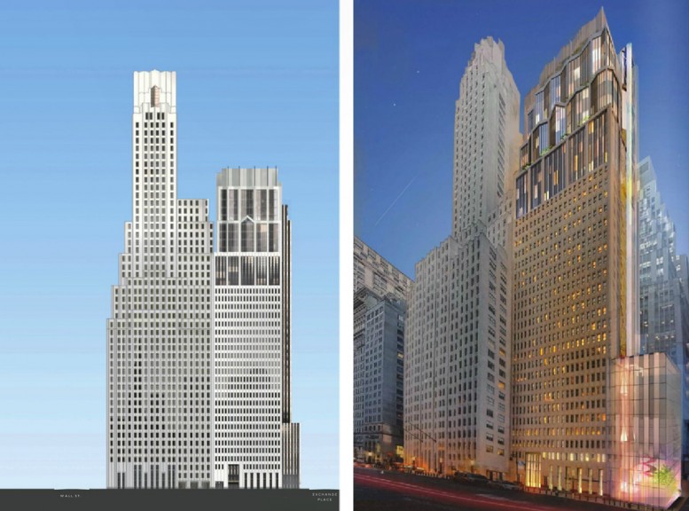
The main tower will be converted to condominiums, although we have been unable to obtain a specific unit or square footage breakdown. Still, the division between condos and hotel is obvious enough; the add-on annex to One Wall Street will house the hotel component, and it will also see a vertical expansion.
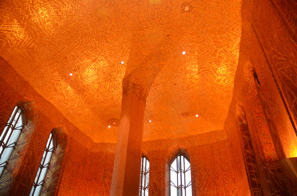
The Red Room, image via Evan Bindelglass/Curbed
While most of the older office buildings in the Financial District have relatively unremarkable interiors, One Wall Street is a major exception. The Red Room, which was the original lobby, is covered in a tiled mural designed by Hildreth Meière, as an homage to the Roman god Vulcan, and the walls quite literally look like the inside of a volcano.
The building was completed in 1931 for the Irving Trust Company, and besides the stunning lobby, the executive smoking lounge occupying the tower’s top floor also offers a magnificent spectacle of pre-war interior design. Enormous windows offer views spanning much of New York City and its suburbs, and the ceiling is covered in shells, offering a magnificent and truly one-of-a-kind spectacle.
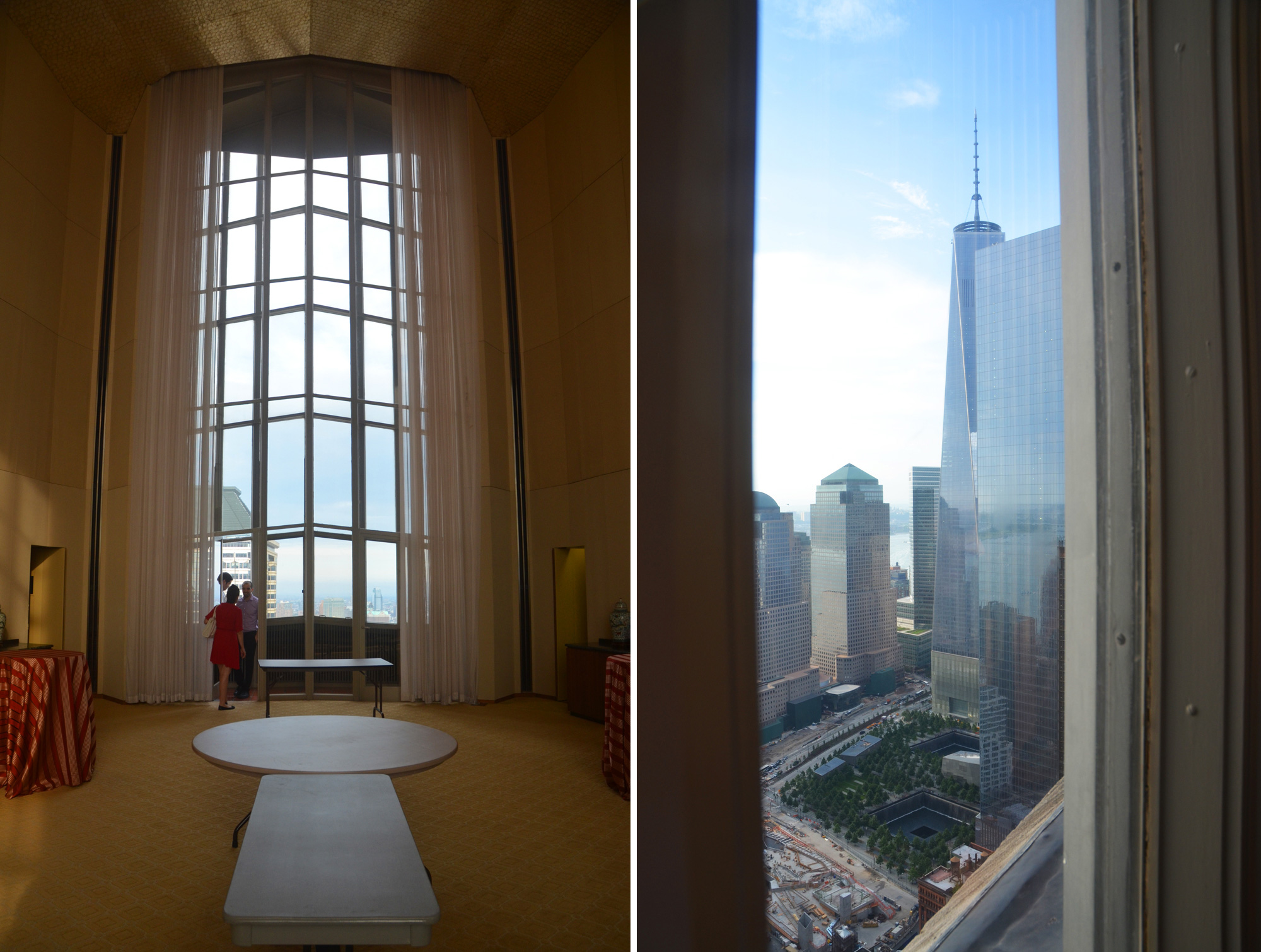
One Wall Street, image via Evan Bindelglass/Curbed
The annex to the main tower is less spectacular, and was built as a relative afterthought in 1963-65 (although it’s still quite handsome, and faced in the same limestone as the original building).
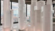
CetraRuddy’s addition to the annex will complement the original tower quite nicely. The facade will initially rise with the same rectangular profile, and after a few floors, it will yield to a more angular profile, with its form derived from the massive windows atop the main building next door.
As with CetraRuddy’s previous conversions of Walker-designed buildings, the expansion will feature a crown that respects and improves upon the original design. Re-configuration of existing floor-space will allow for the addition of FAR up top, similar to what happened at Walker Tower, and a new elevator core will rise along the southern facade of the hotel component.
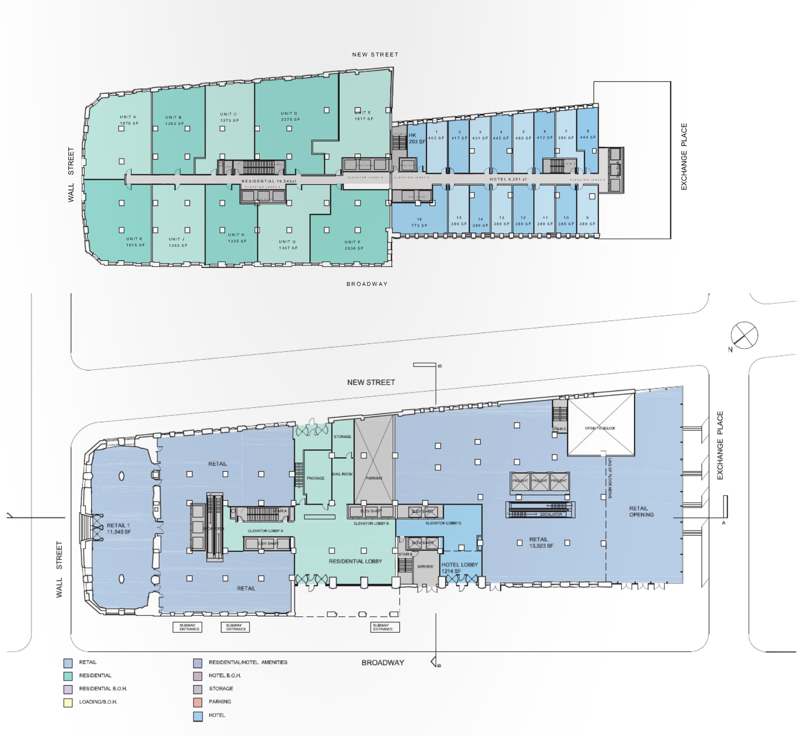
Floor-plans illustrate the future changes to the base of the building, which will house 350,000 square feet of retail space. The residential and hotel lobbies will bisect the retail in two, likely yielding an opportunity for a flagship location, especially as the Red Room will be used as retail rather than a lobby.
While we only have ideas for two levels, it appears the default layout for the tower’s mid-section will yield about ten condos per floor, with that side totaling approximately 20,000 square feet per level, while the hotel side will be split between 17 rooms over approximately 9,300 square feet.
No completion date for the project has been attached to the renderings, and the New York Daily News previously reported that Macklowe was planning condos and rentals rather than condos and a hotel, which means the plans could still be changing.
Subscribe to YIMBY’s daily e-mail
Follow YIMBYgram for real-time photo updates
Like YIMBY on Facebook
Follow YIMBY’s Twitter for the latest in YIMBYnews

That looks…horrible. I usually love CetraRuddy’s work but you just don’t do THAT to Ralph Walker’s greatest masterpiece. The should lower the height to highest setback, continue the same layered language, and use similar, complementary materials. It’s just too much of a sore thumb in it’s current state. I’d love to see them pull off something similar to their classical revamp of Walker’s Verizon Tower.