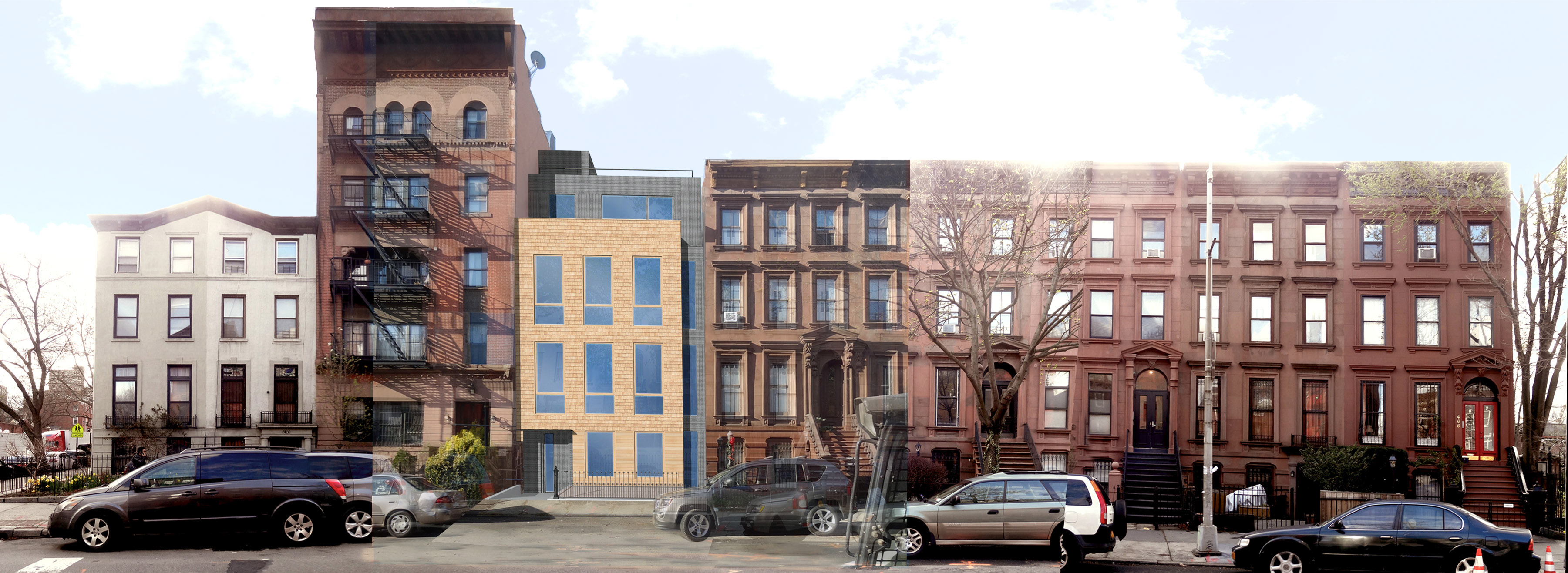
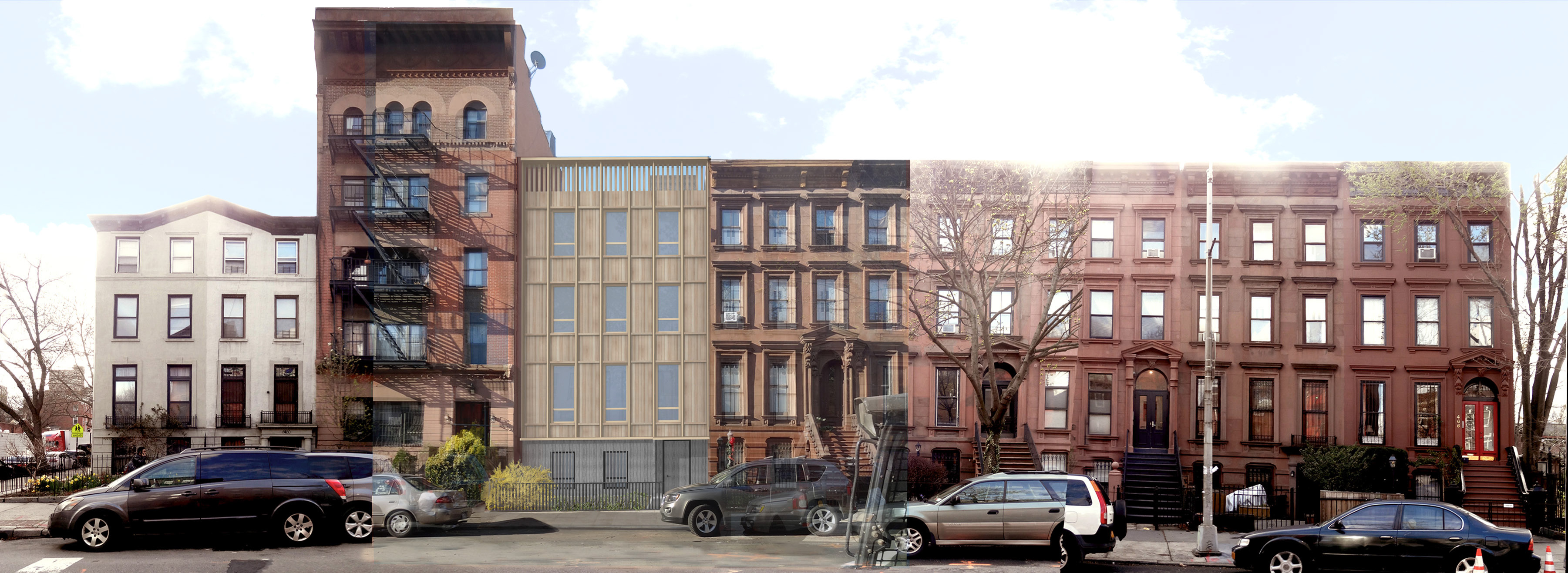
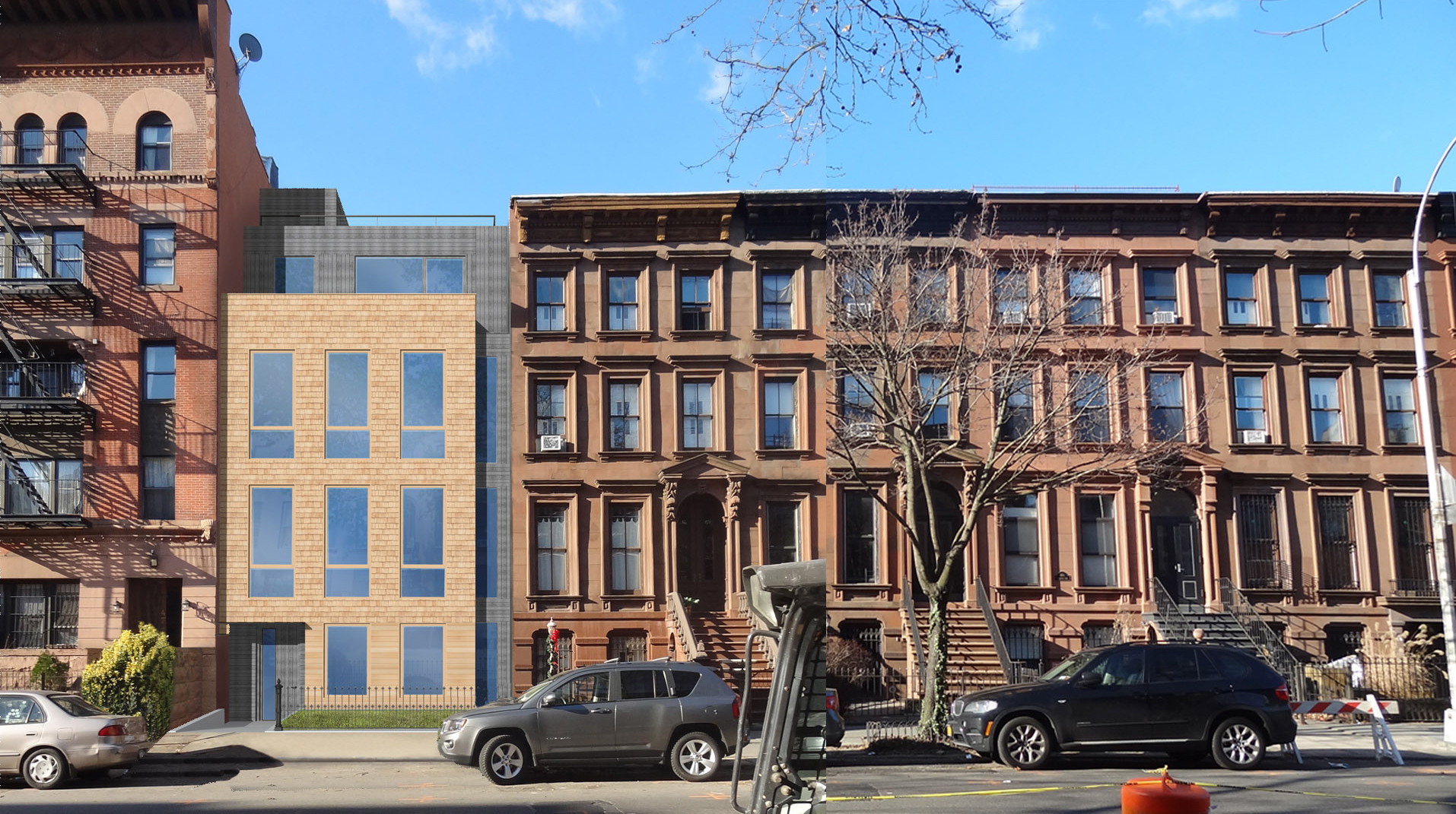
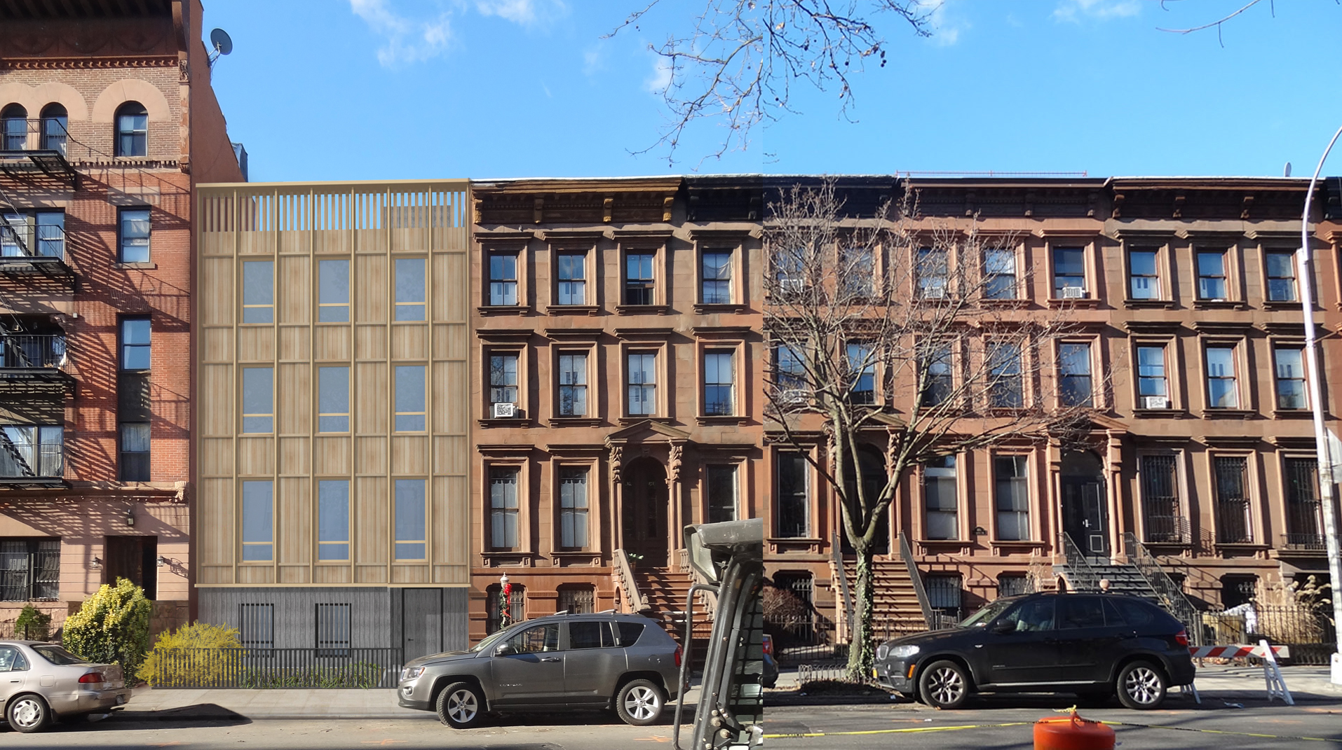
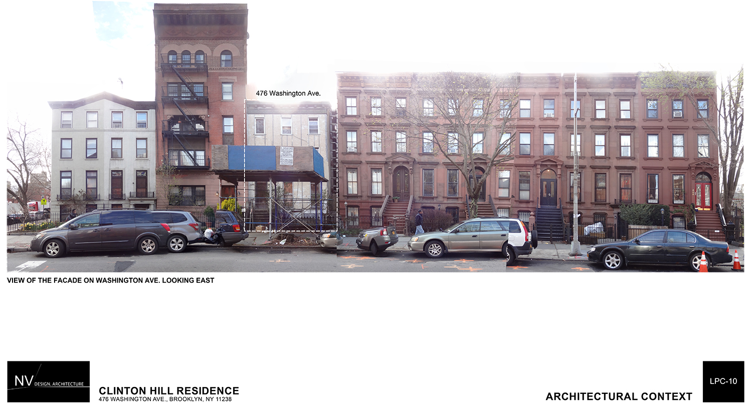
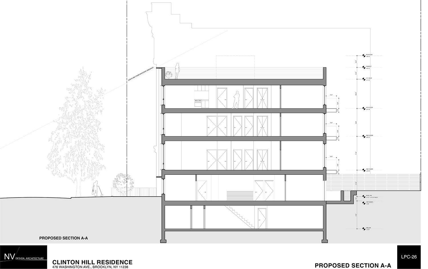
What remains of a 19th century house in the Clinton Hill Historic District will finally be replaced. On Tuesday, the Landmarks Preservation Commission approved construction of a new four-story, four-unit residential building at 476 Washington Avenue.
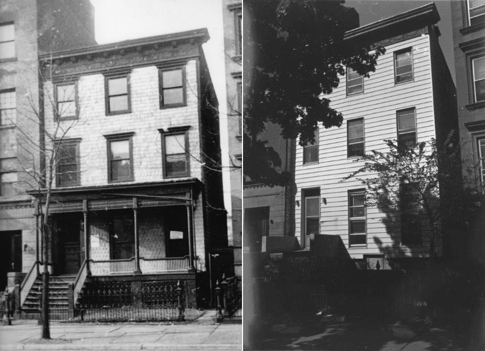
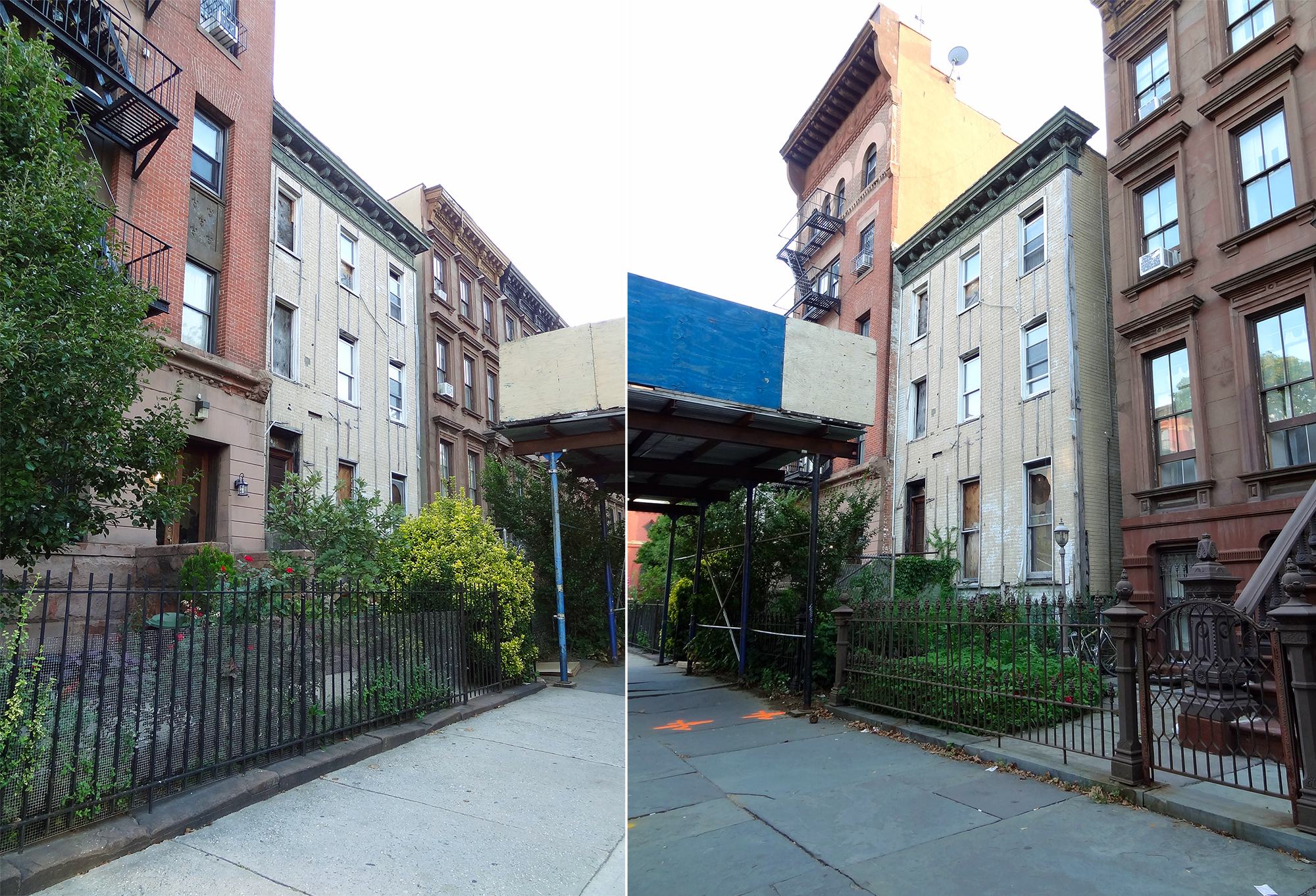
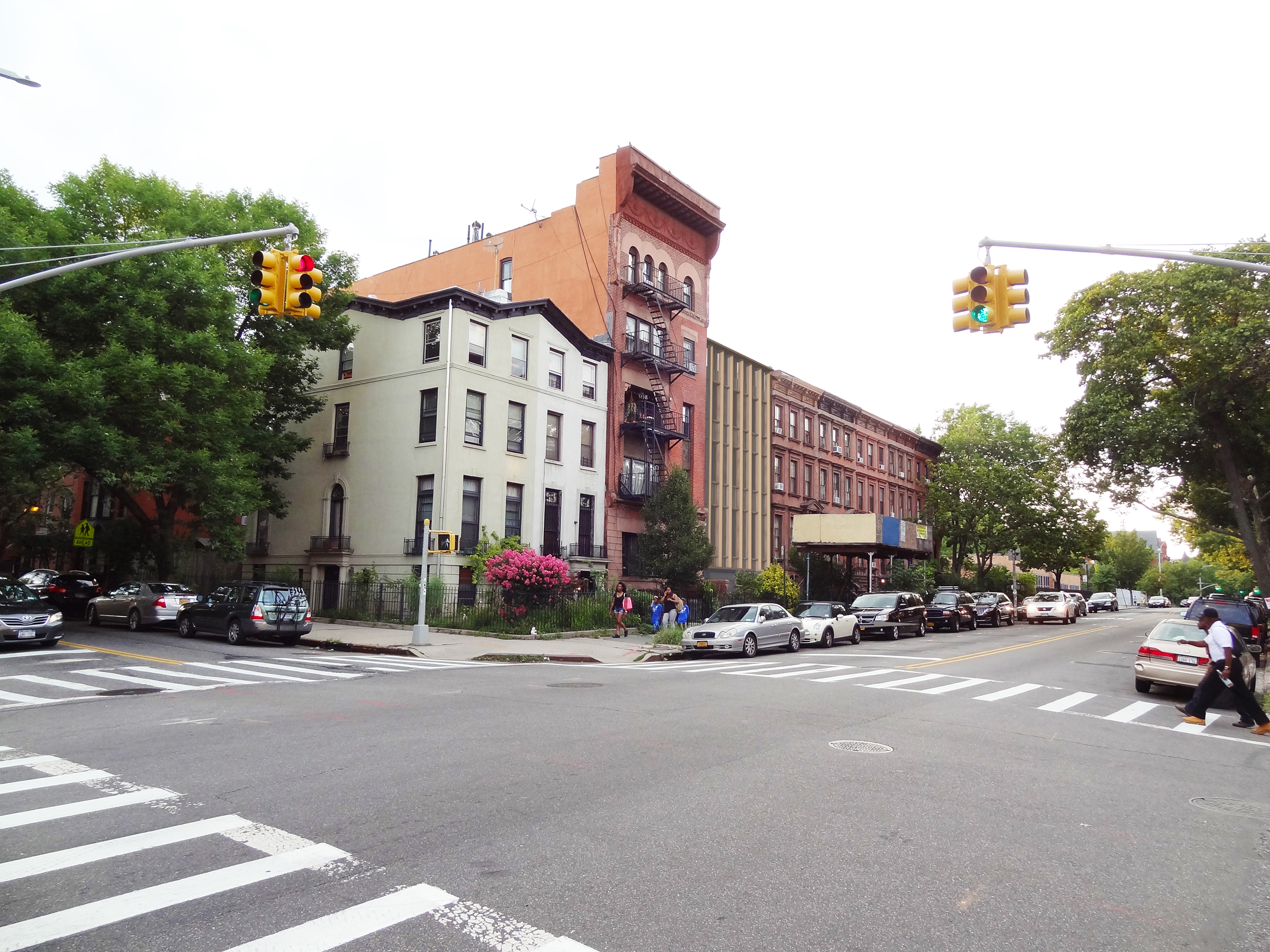
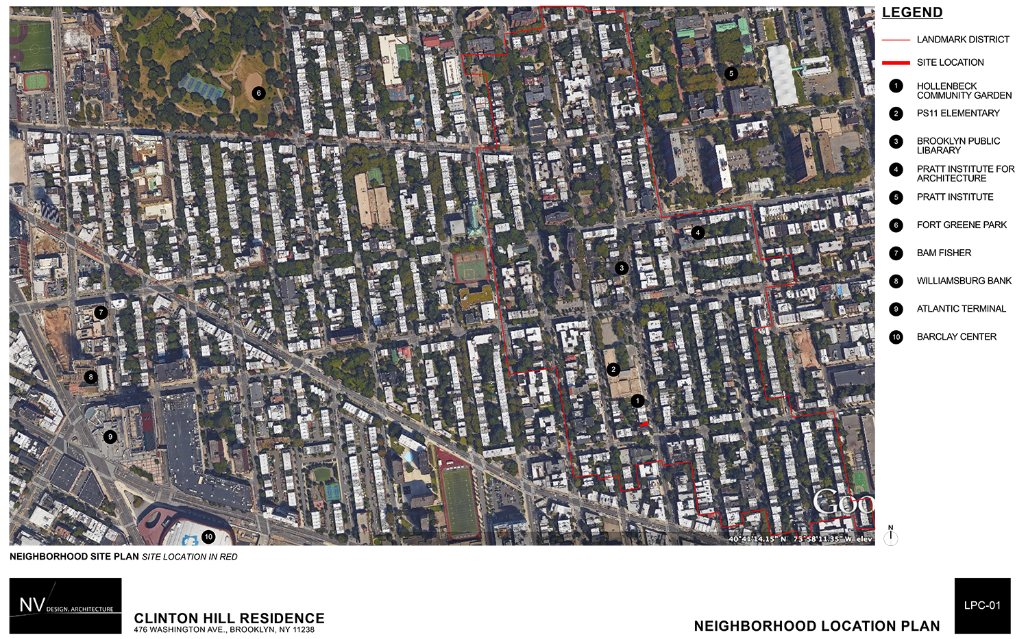
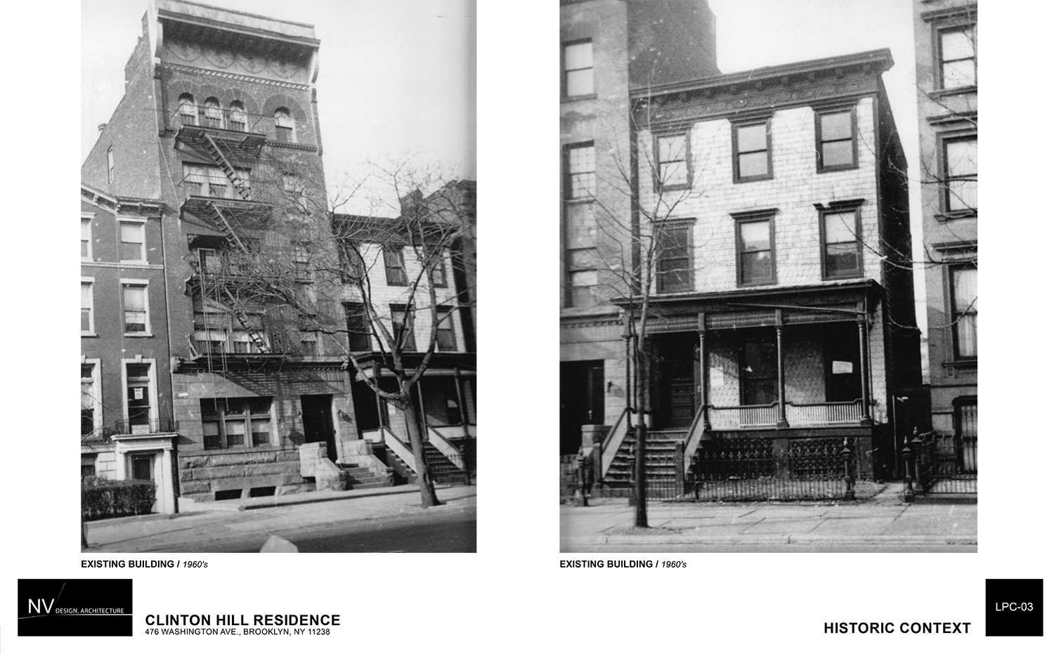
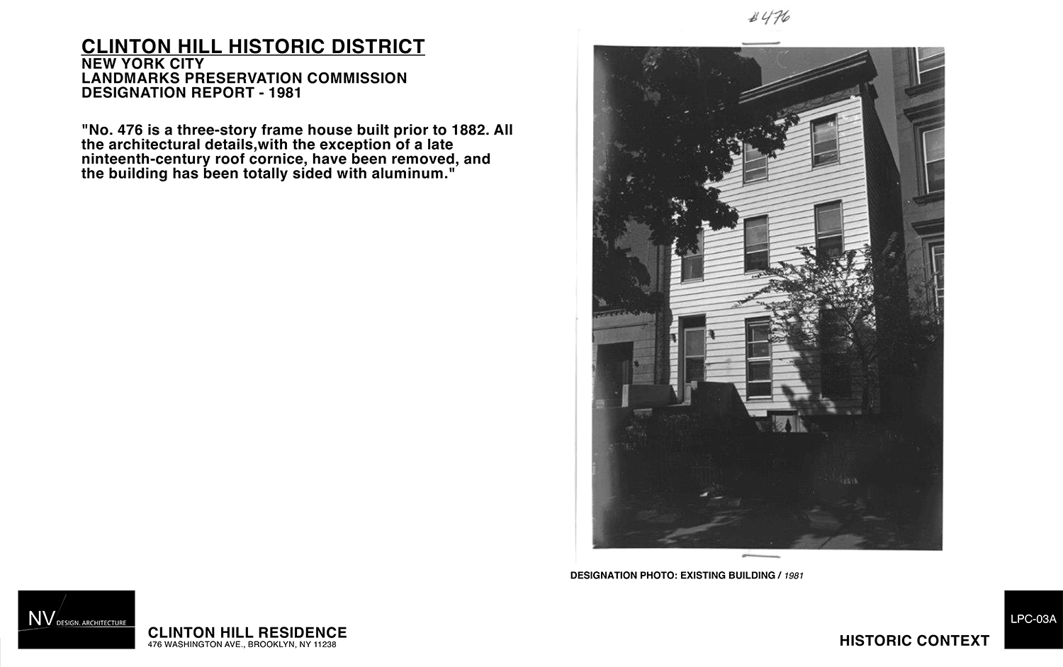
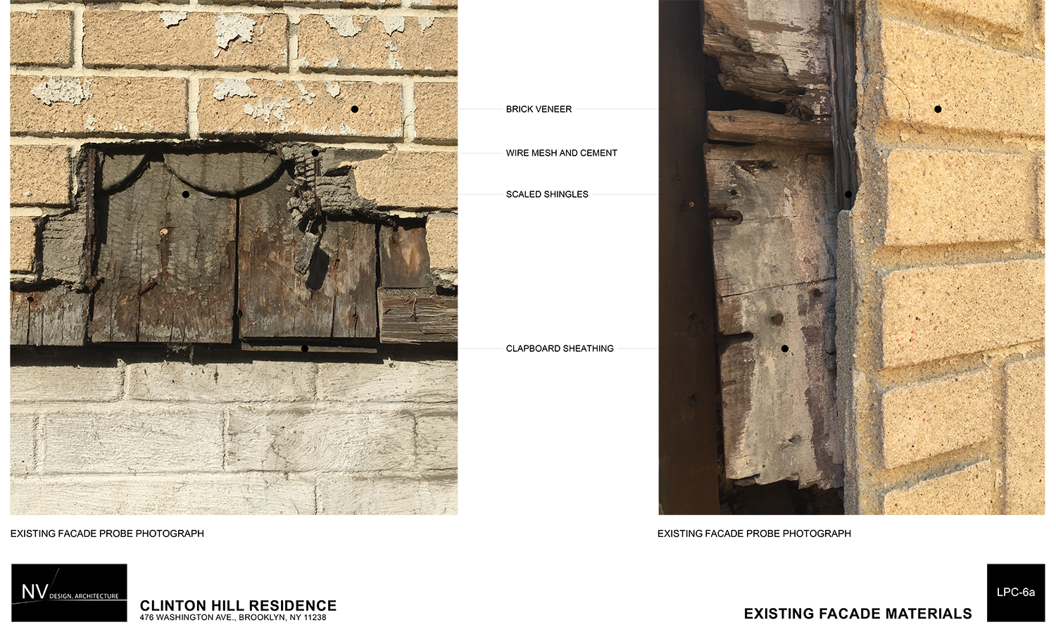
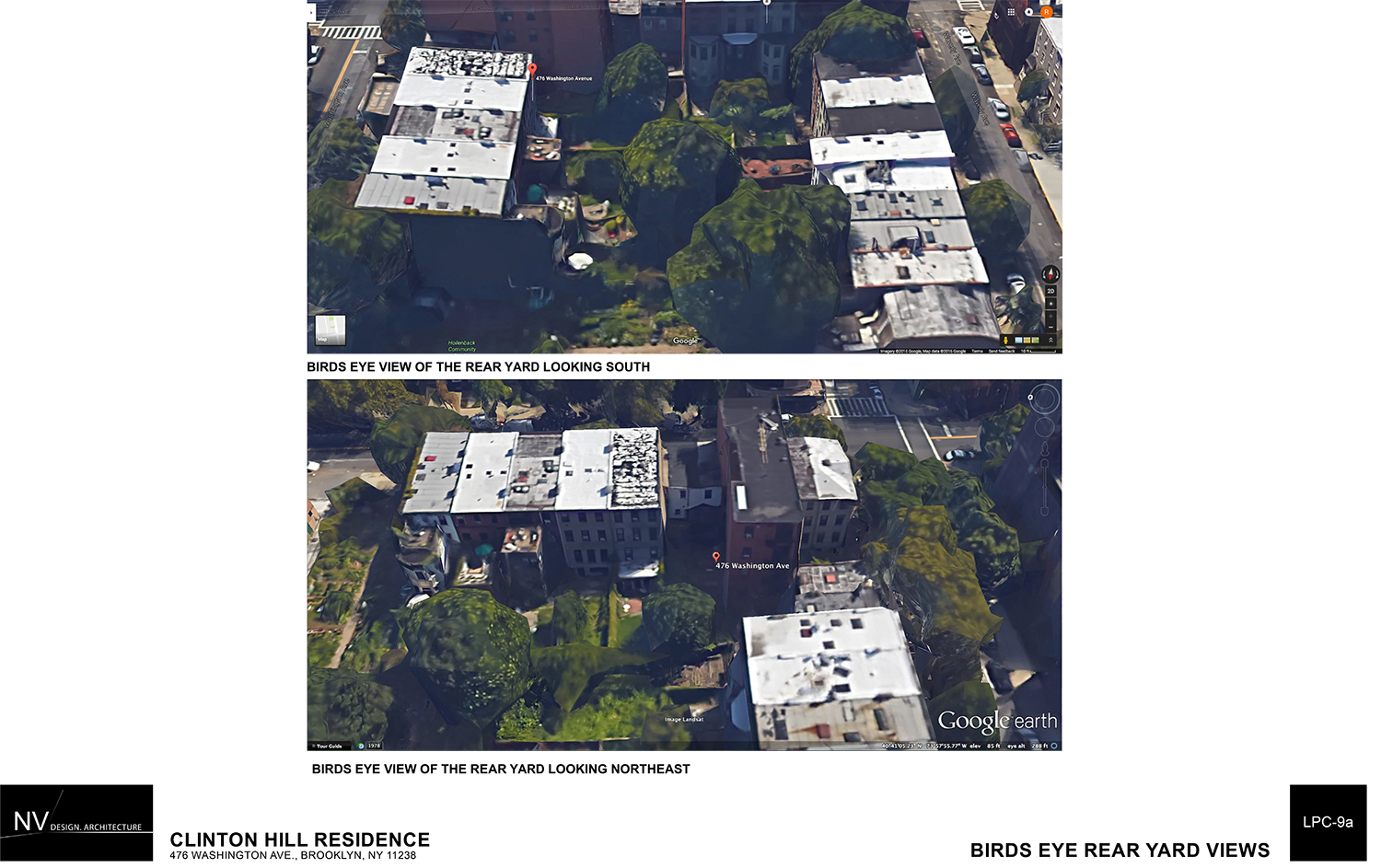
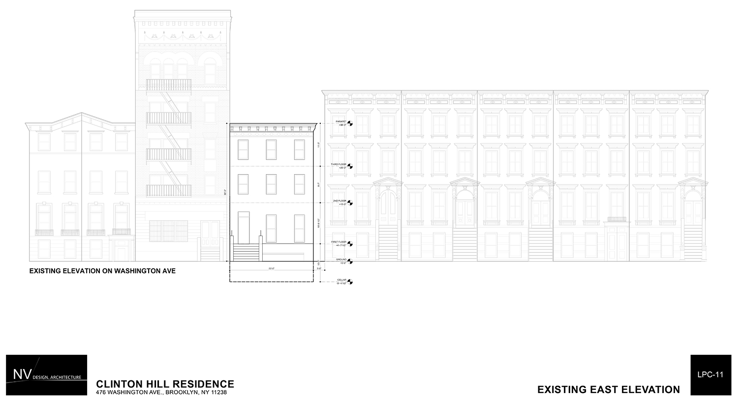
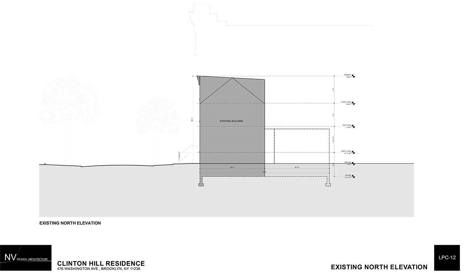
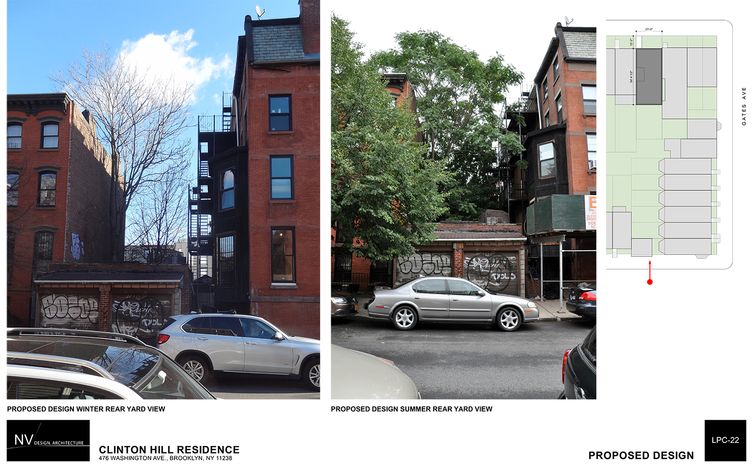
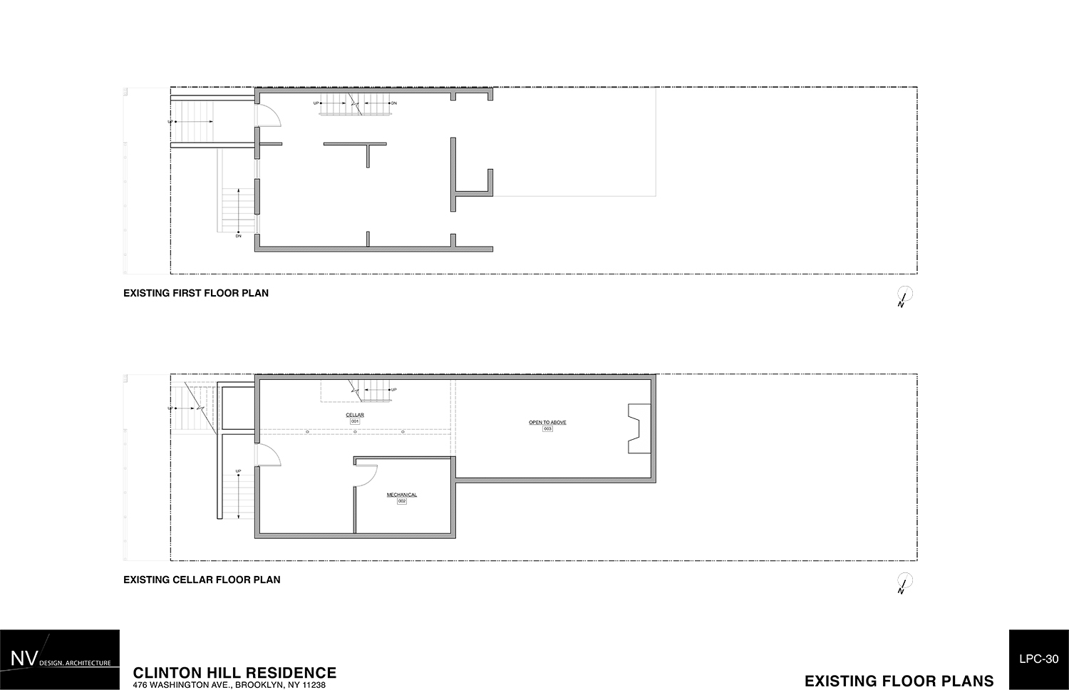
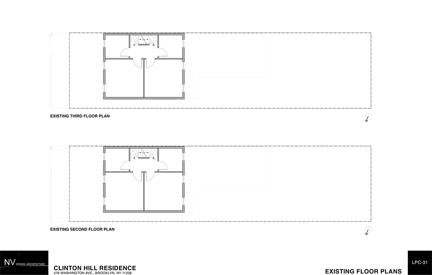
The site, between Gates and Greene avenues, hosts an existing three-story wood-frame house that was actually quite charming when it was constructed sometime before 1882. It even had a porch. Sadly, by the time of the district’s designation in 1981, it had been abused and left with aluminum siding, which has since been stripped to reveal brick added in the 1940s. The only architectural detail left is the cornice, and that is quite possibly not original.
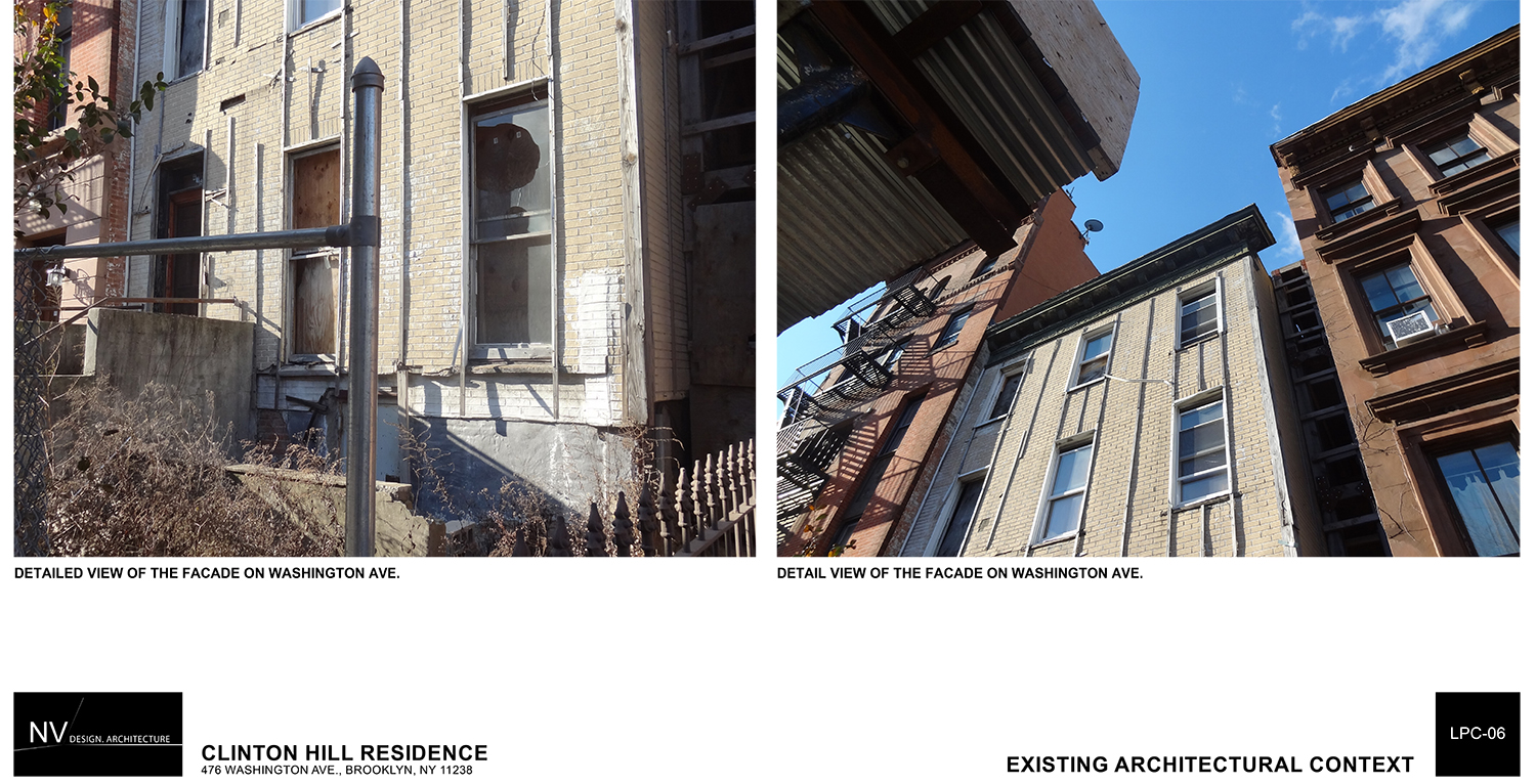
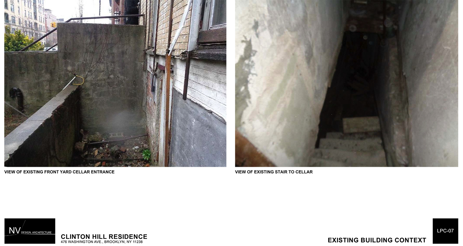
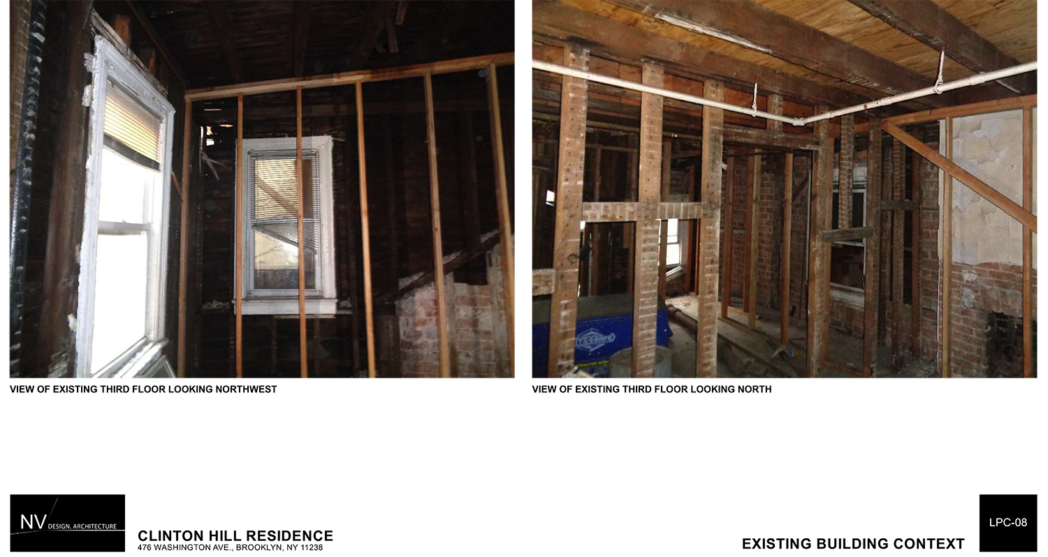
The story gets even worse. The house has fallen into deep disrepair over the past eight years. Large portions have collapsed, and what remains stands only because it has been shored up. The Department of Buildings is quite wary of the site. When the initial proposal for the site was presented in September, Kelly Carroll of the Historic Districts Council called this a case of “demolition by neglect.”
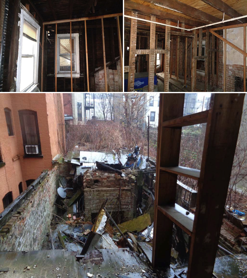
Existing conditions on the third floor (top) and at the rear extension (bottom) of 476 Washington Avenue
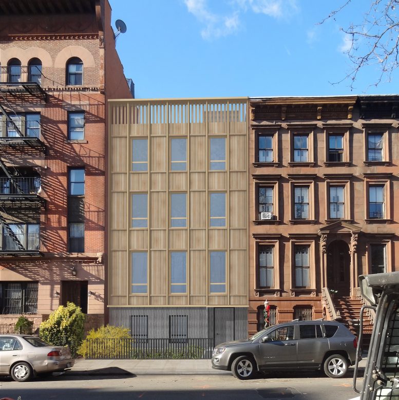
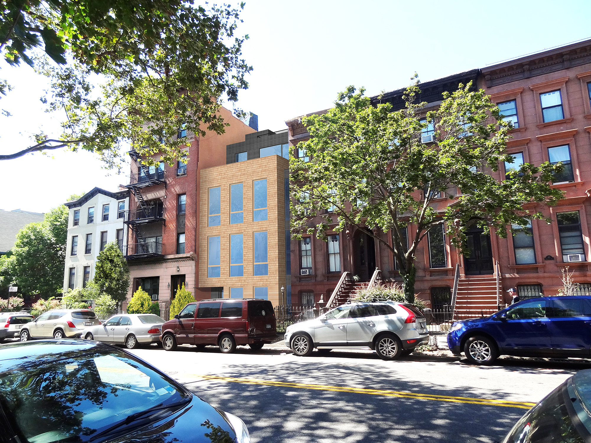
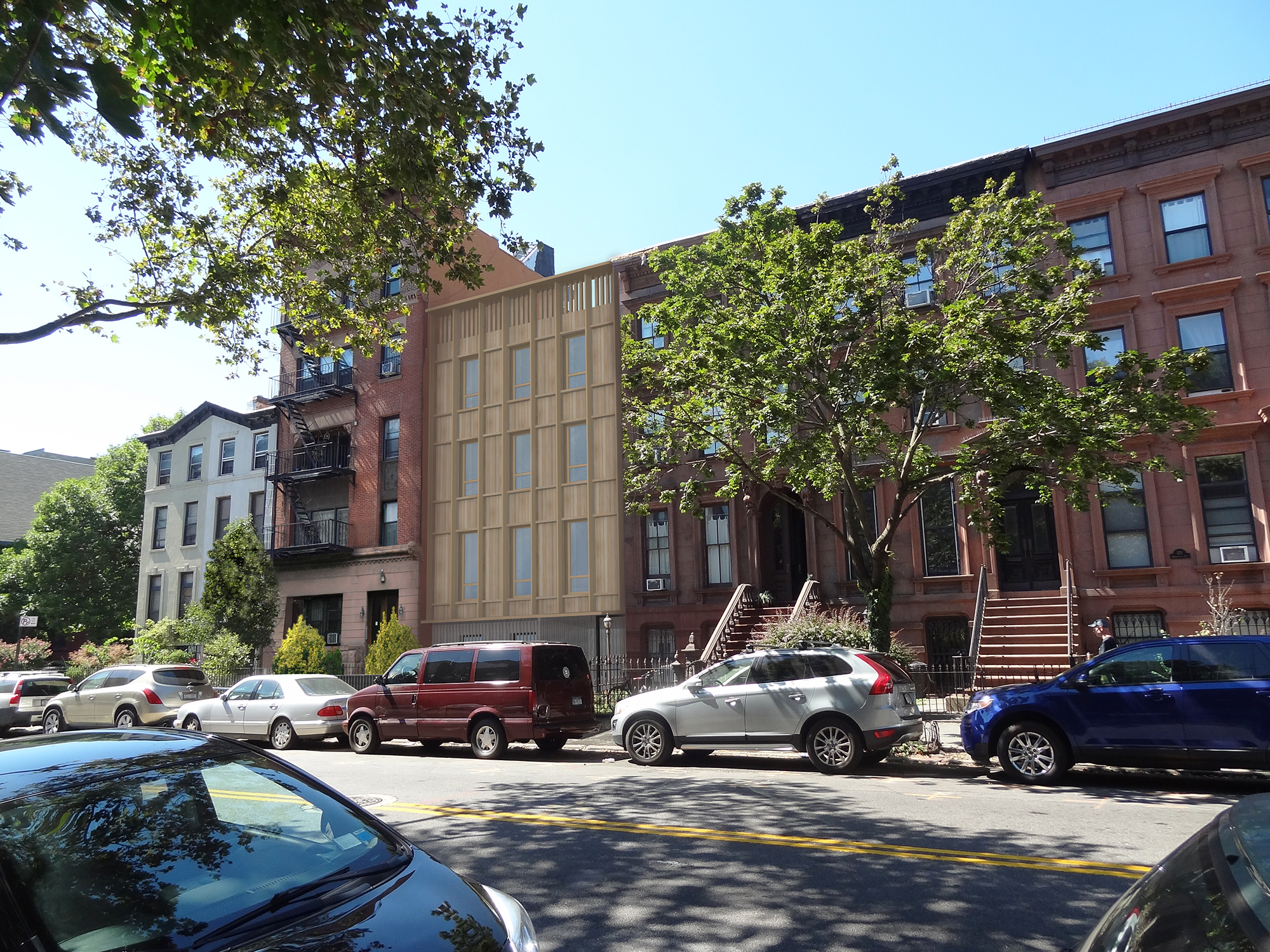
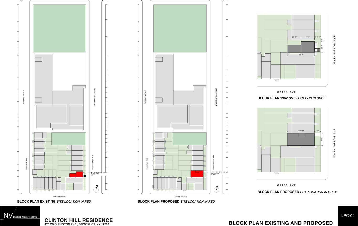
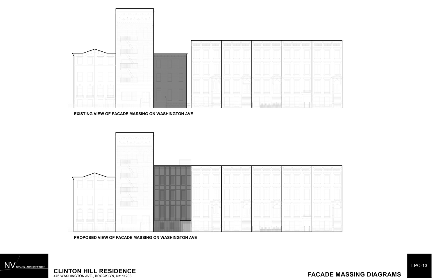
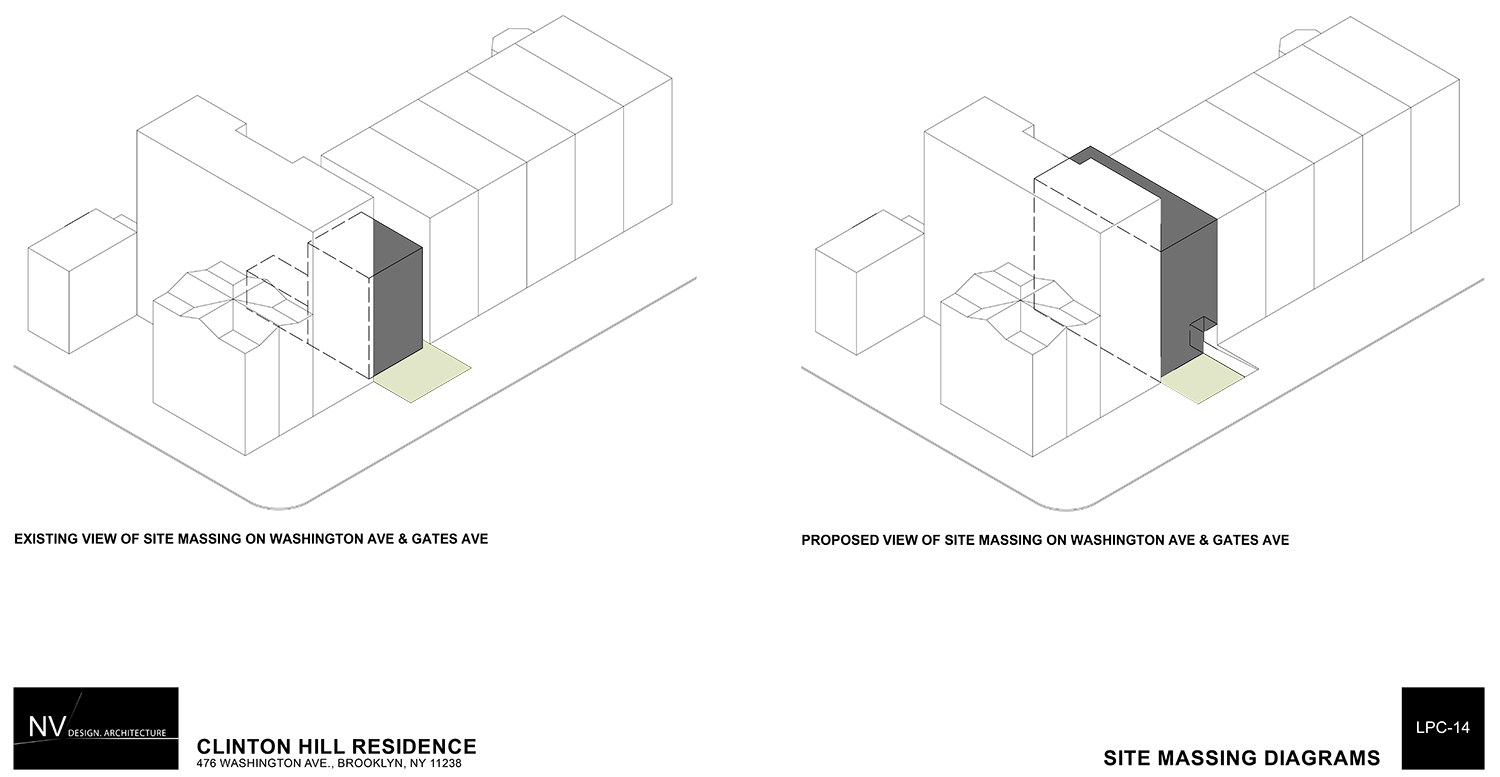
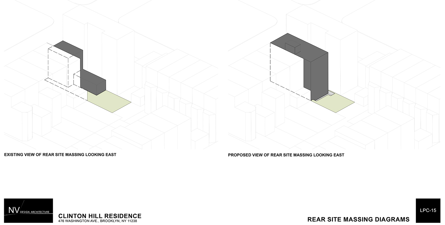
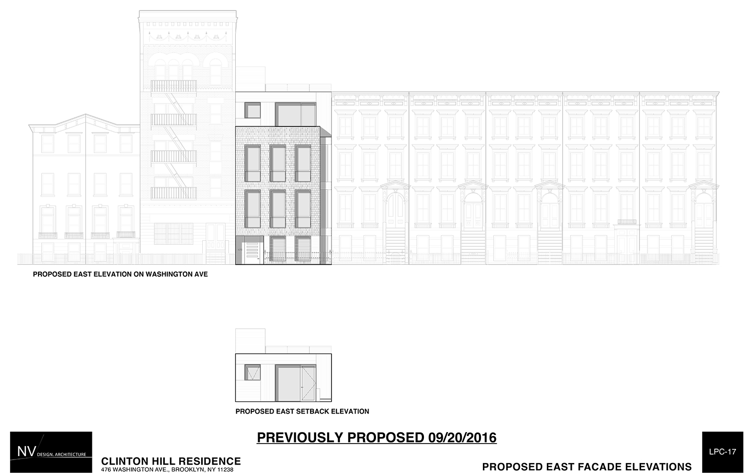
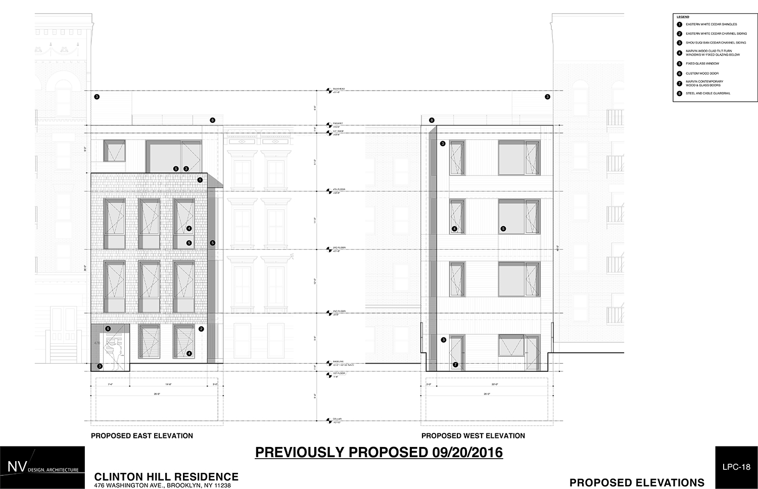
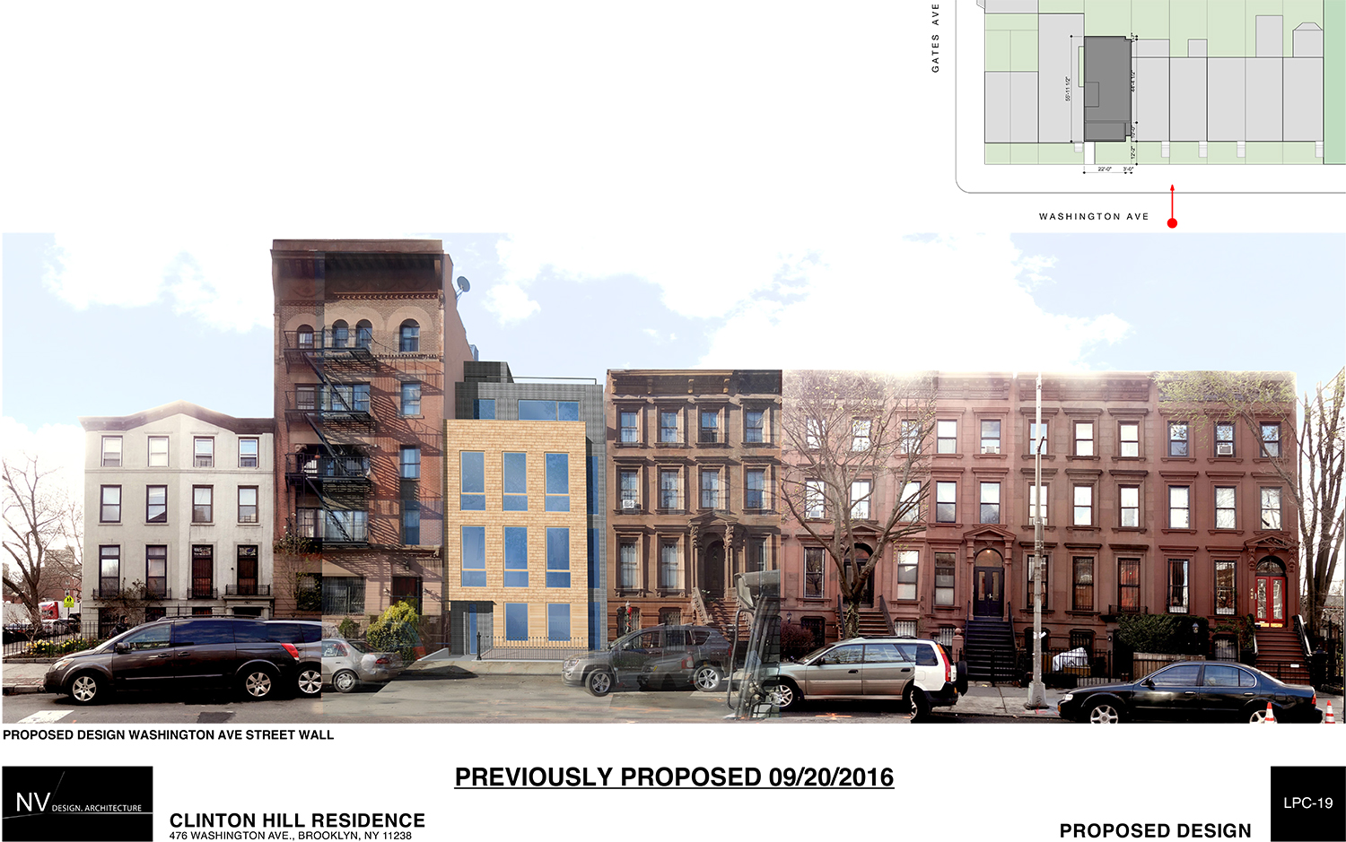
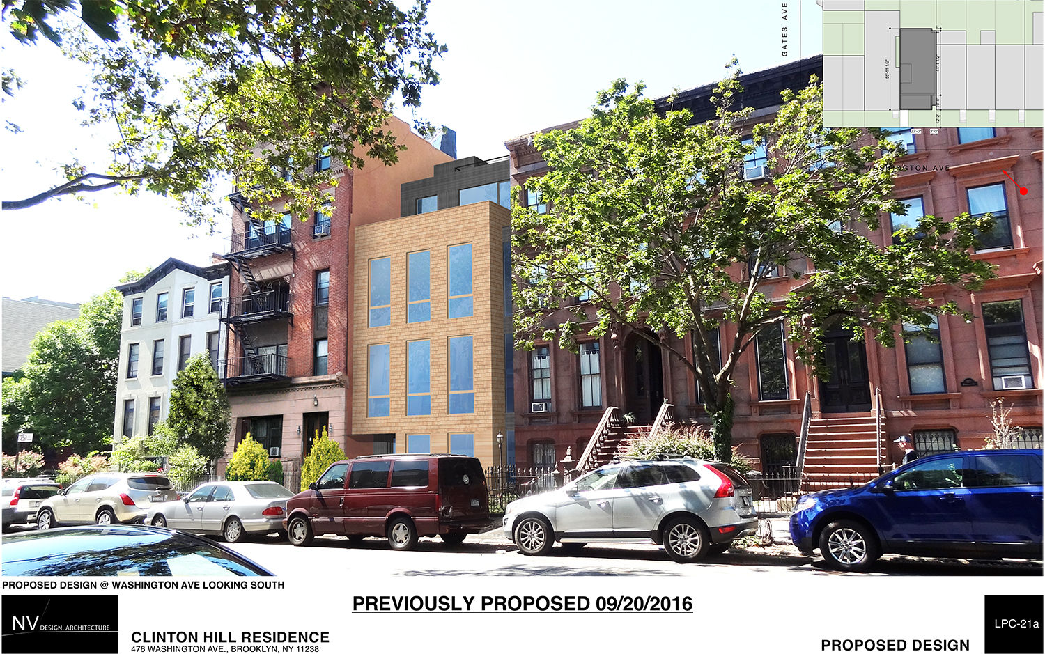
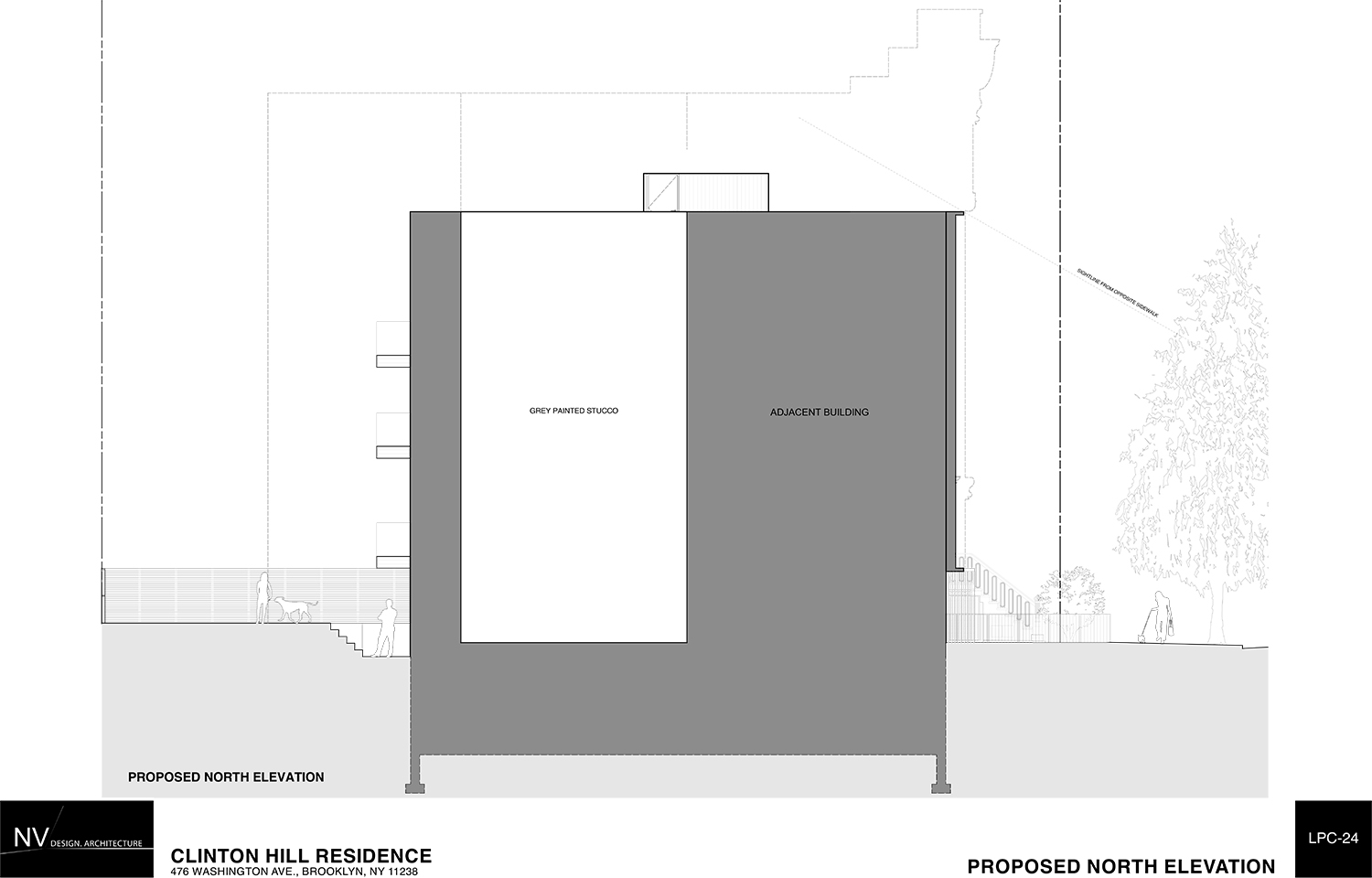
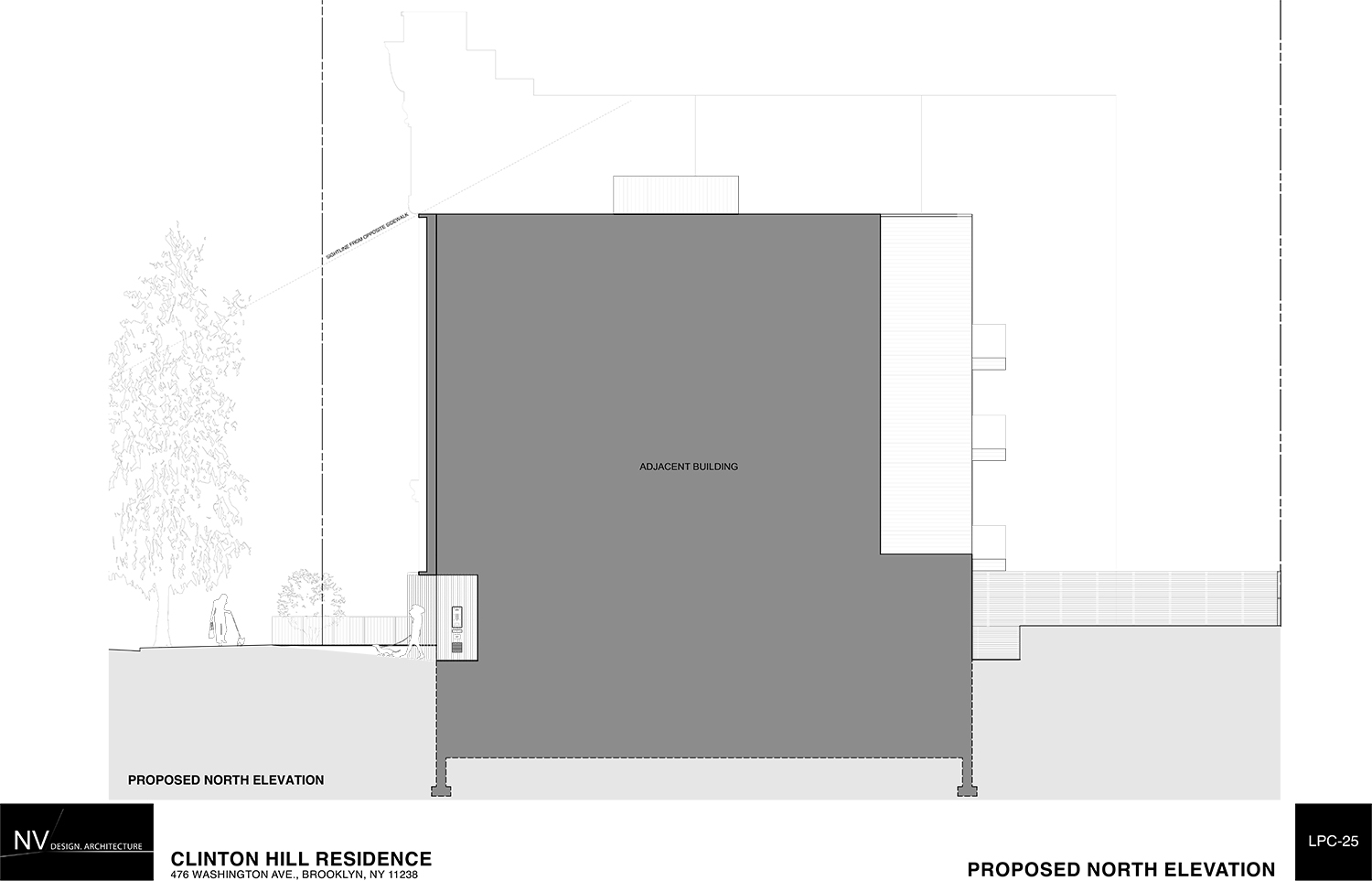
The initial proposal came from Tom Van Den Bout of Financial District-based NV/design.architecture. He hoped to keep an echo of the existing massing by setting back the fill for the gap between 476 and 474 Washington Avenue, which Van Den Bout said is required by zoning. The proposal also set back the fourth floor. That design was not enthusiastically received by the commissioners and Carroll called it a “yuppie magnet.”
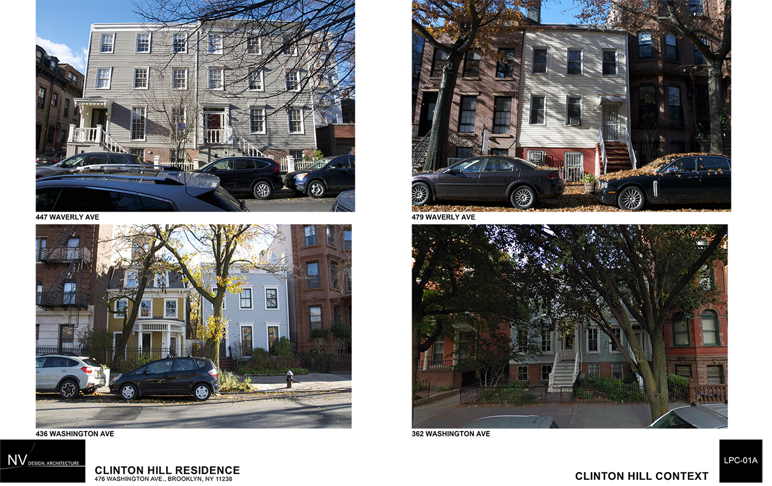
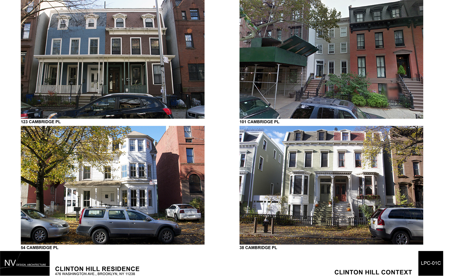
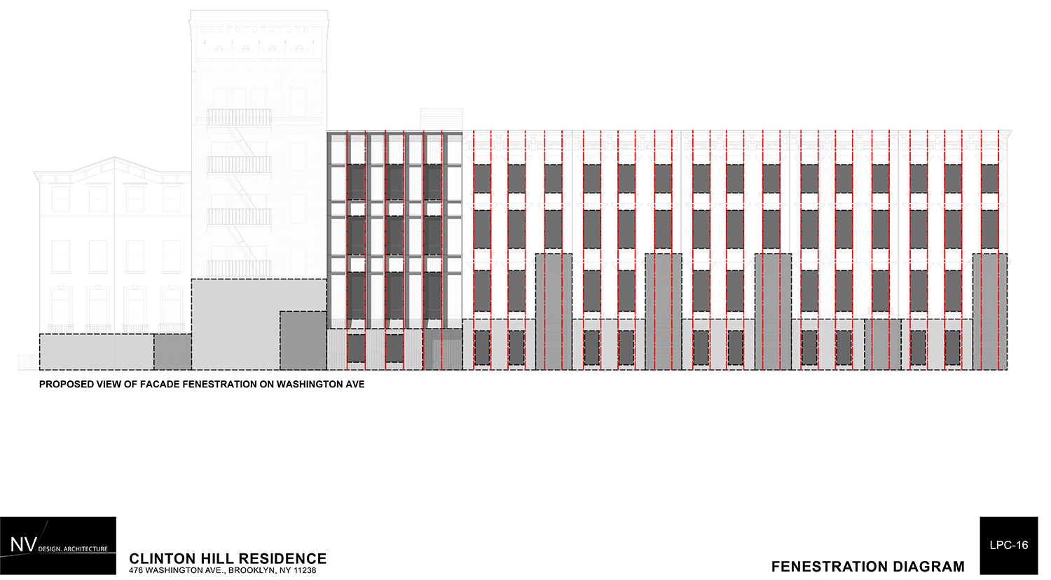
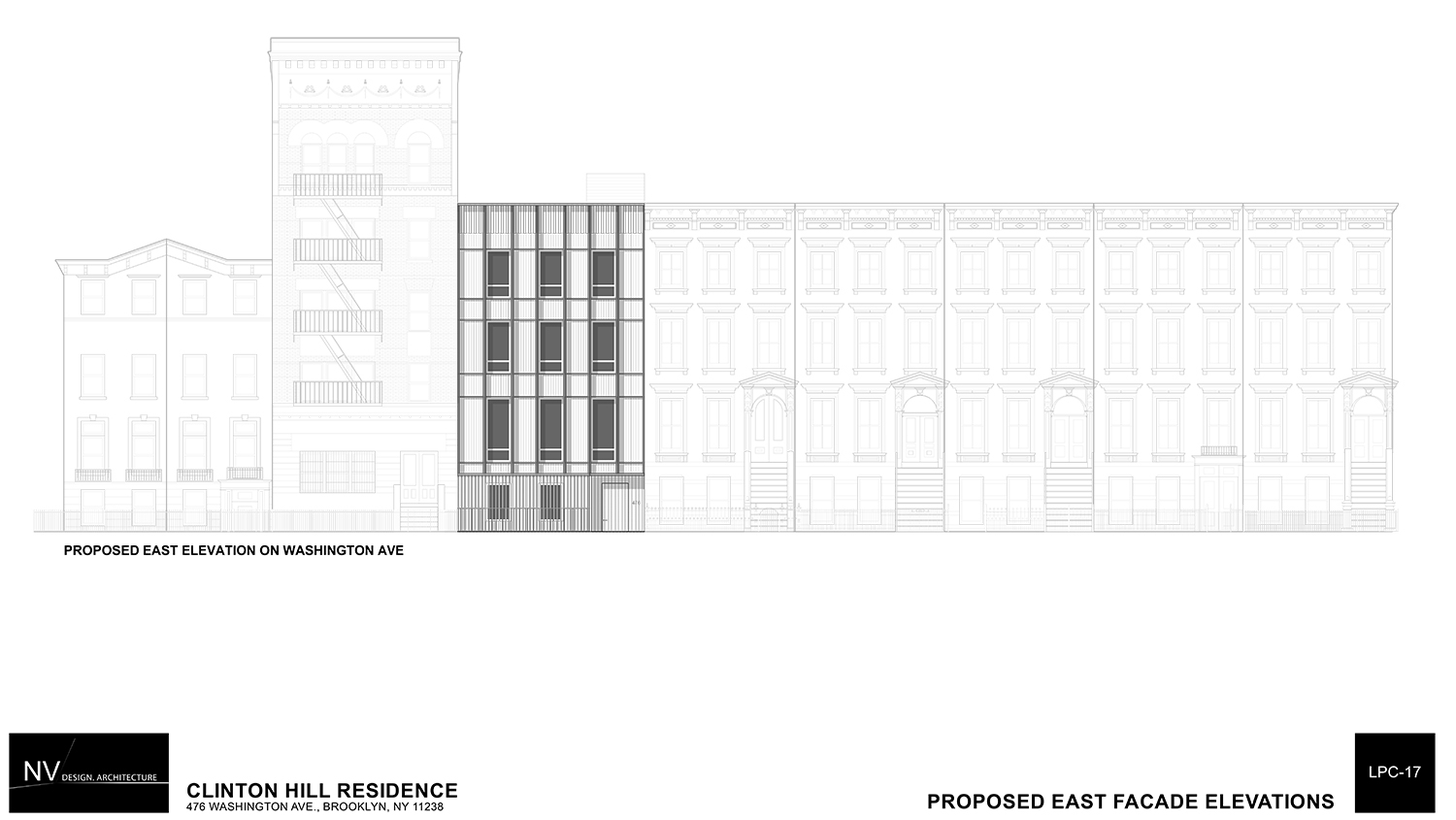
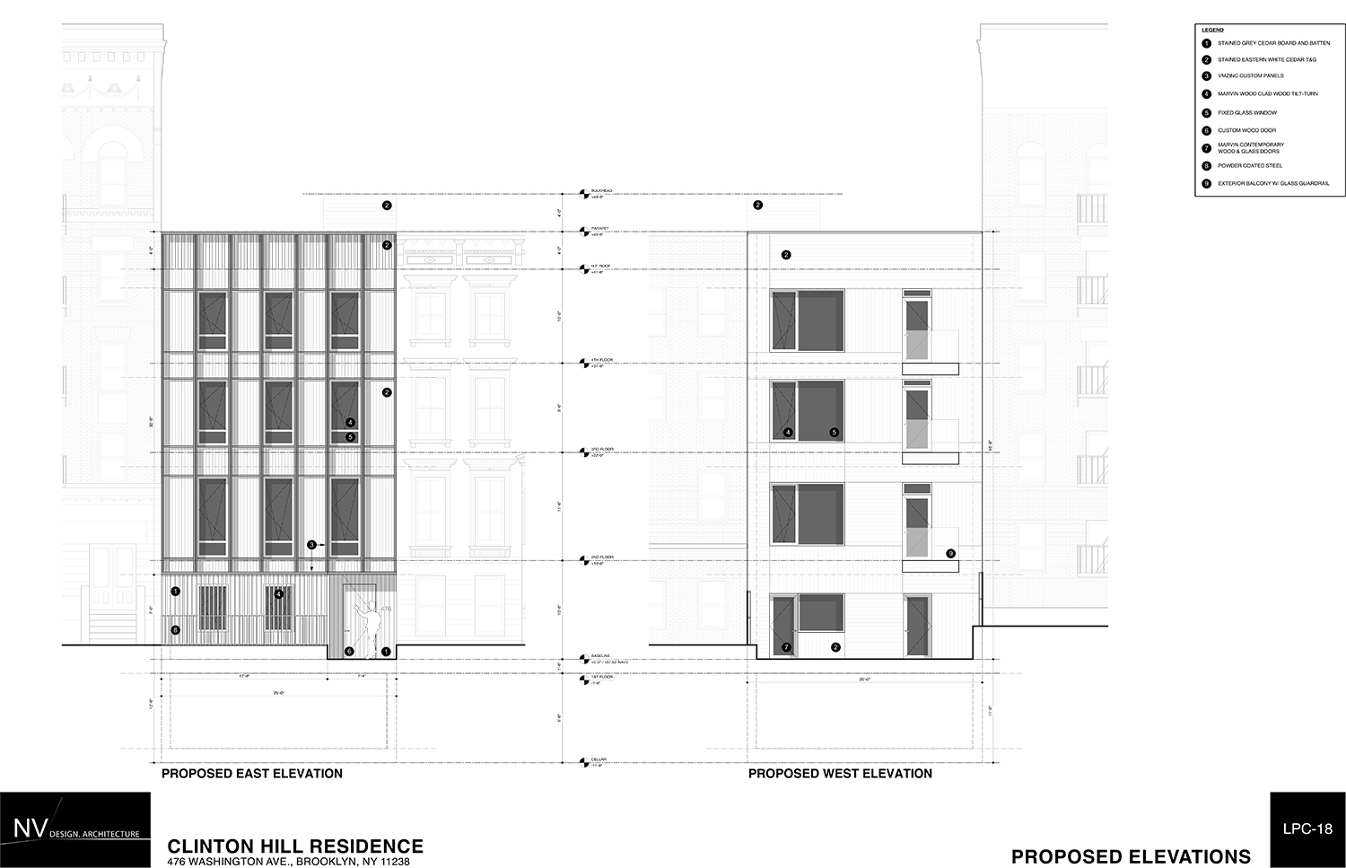
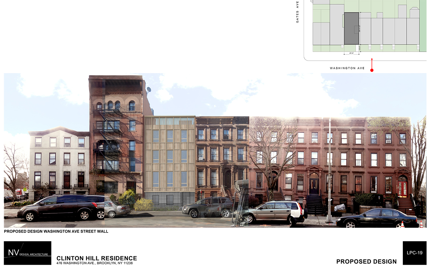
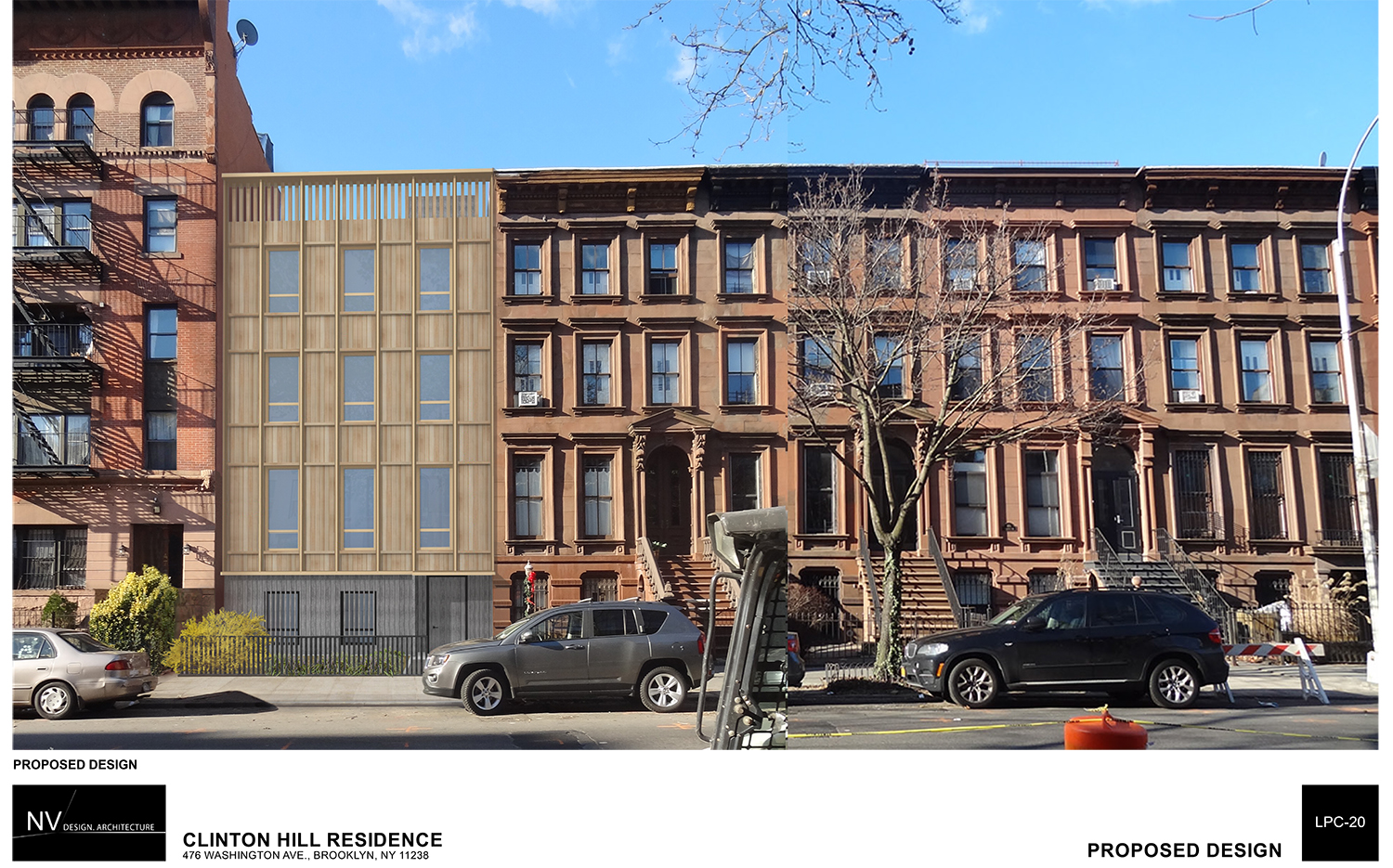
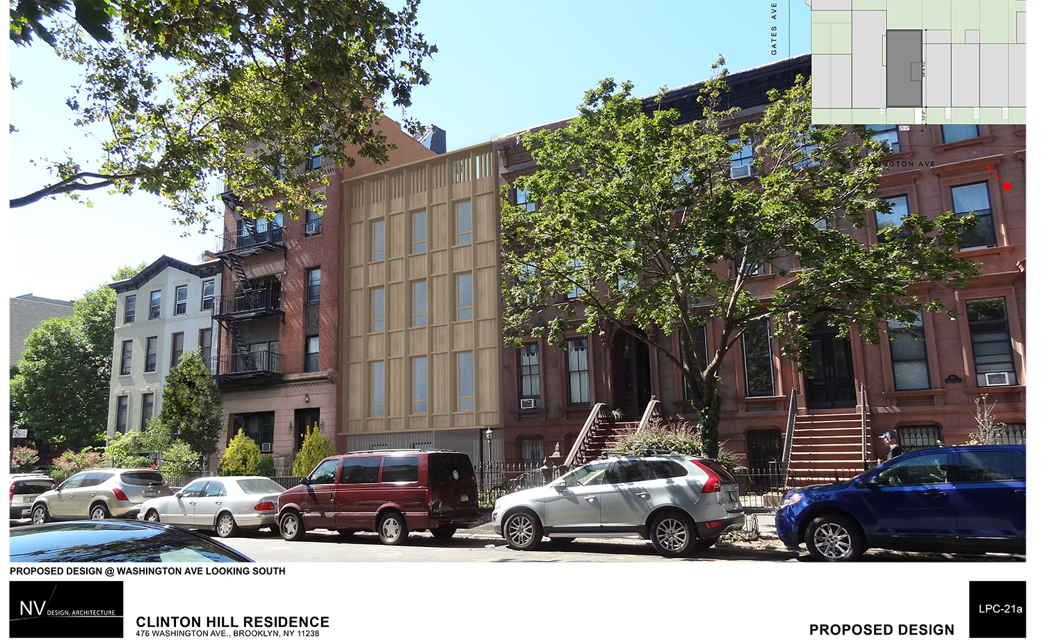
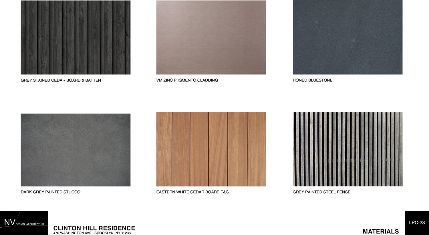
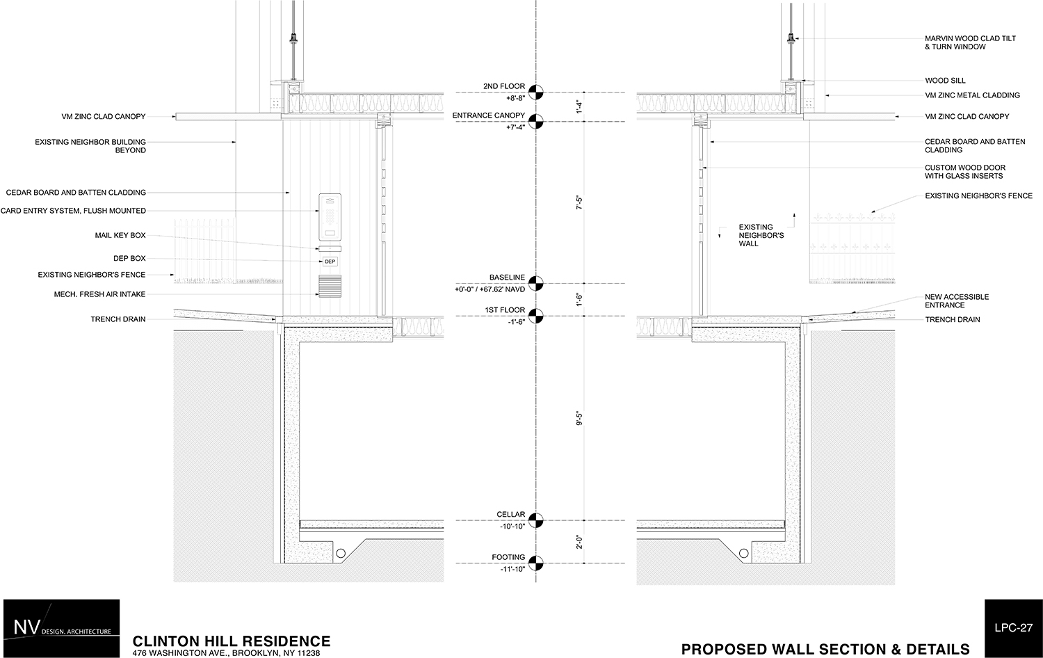
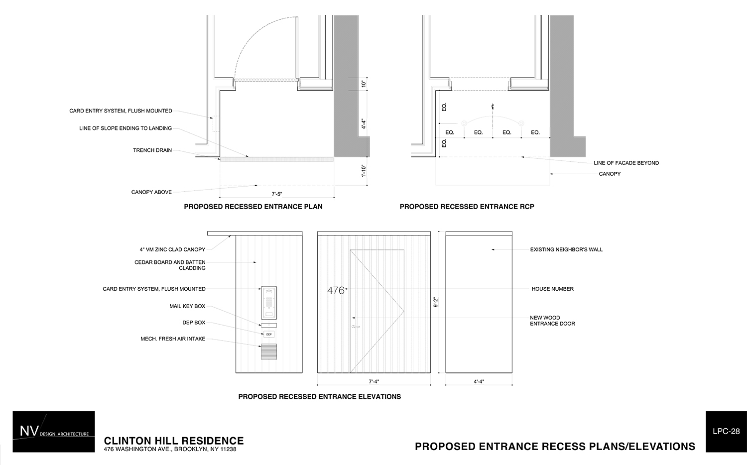
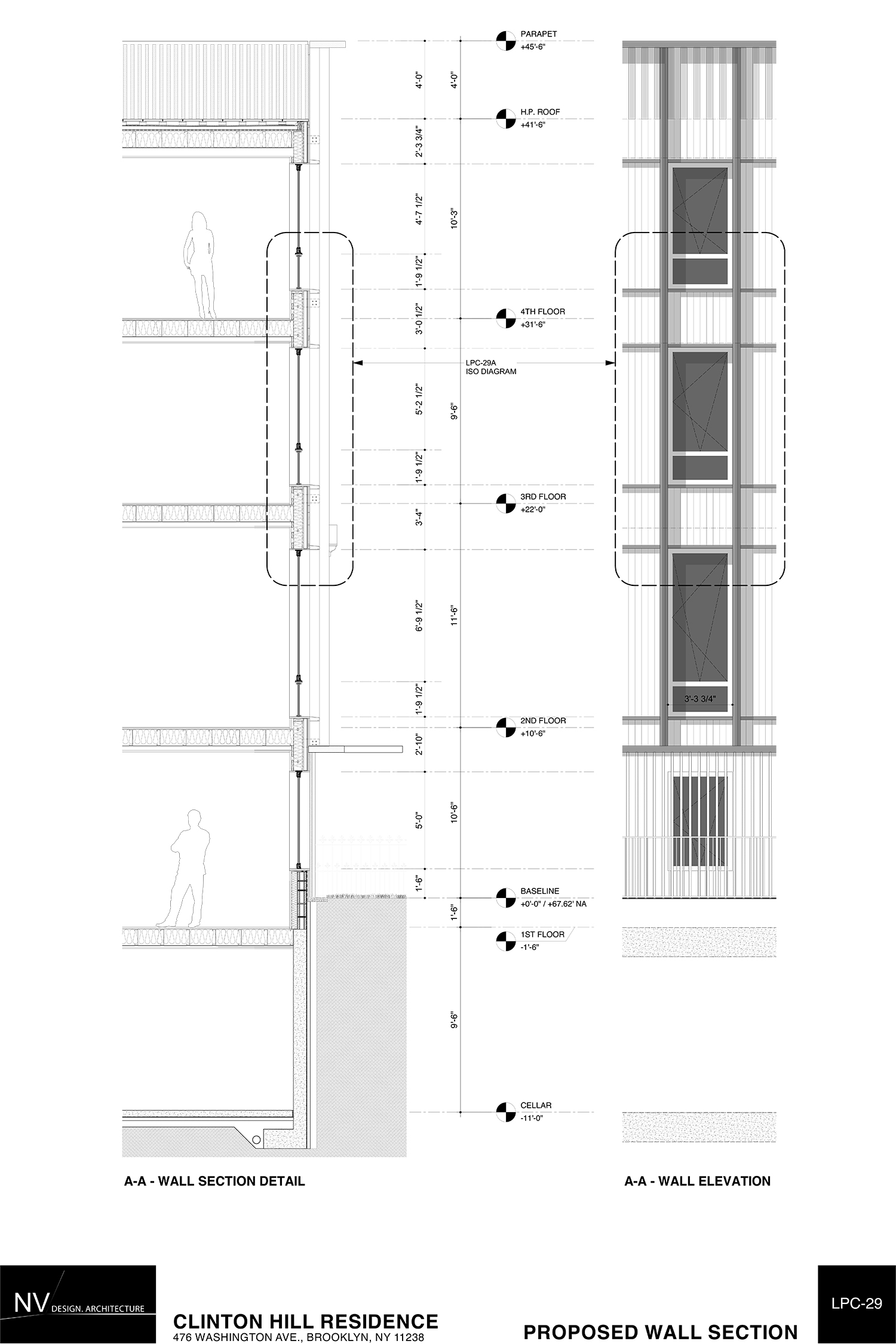
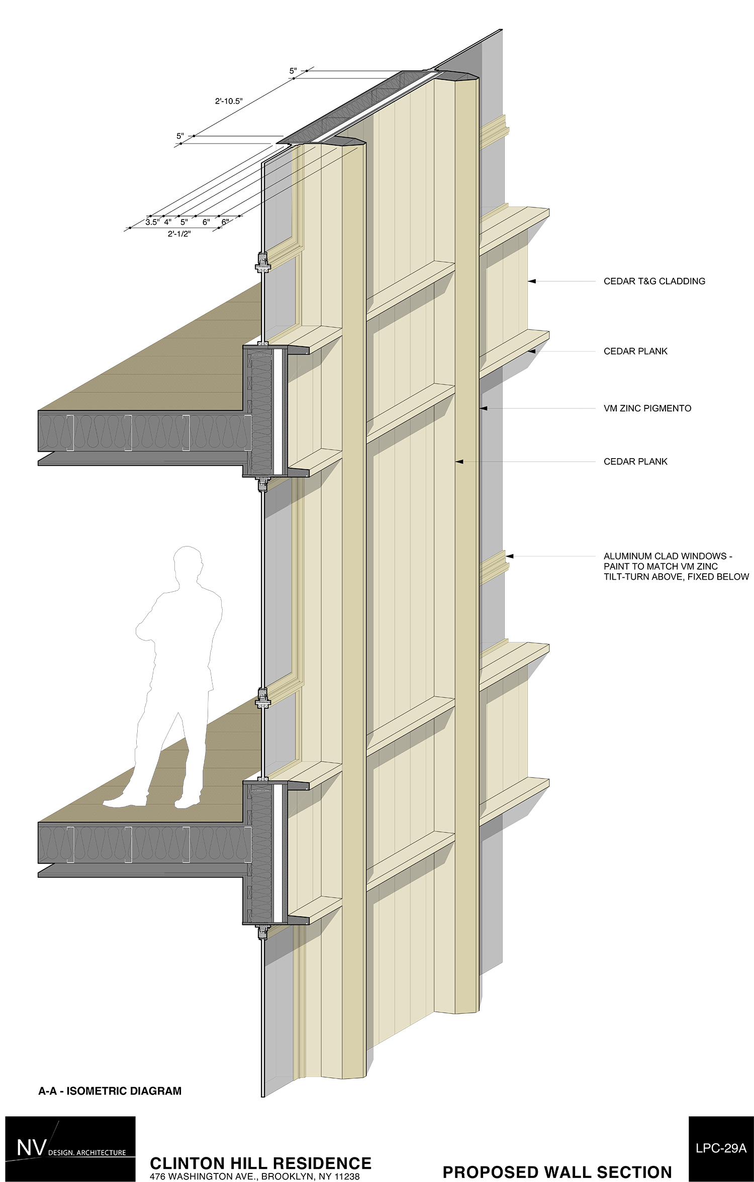
Van Den Bout’s new design removes the setbacks and presents its full height, which matches its brownstone neighbors from every angle. It flips the entrance from the left, the position on the existing building, to the right, which is the position at 474. The façade’s grid will be principally of cedar. Van Den Bout said the revised design has “a little bit more depth and expression.” The rear has also been simplified somewhat. He said it’s “softer.”
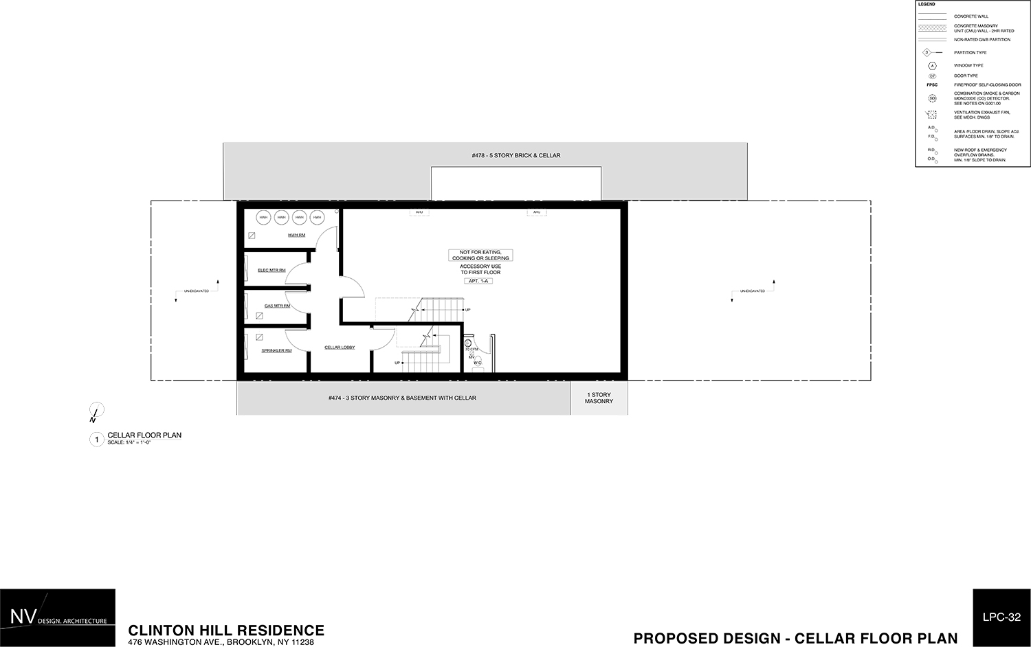
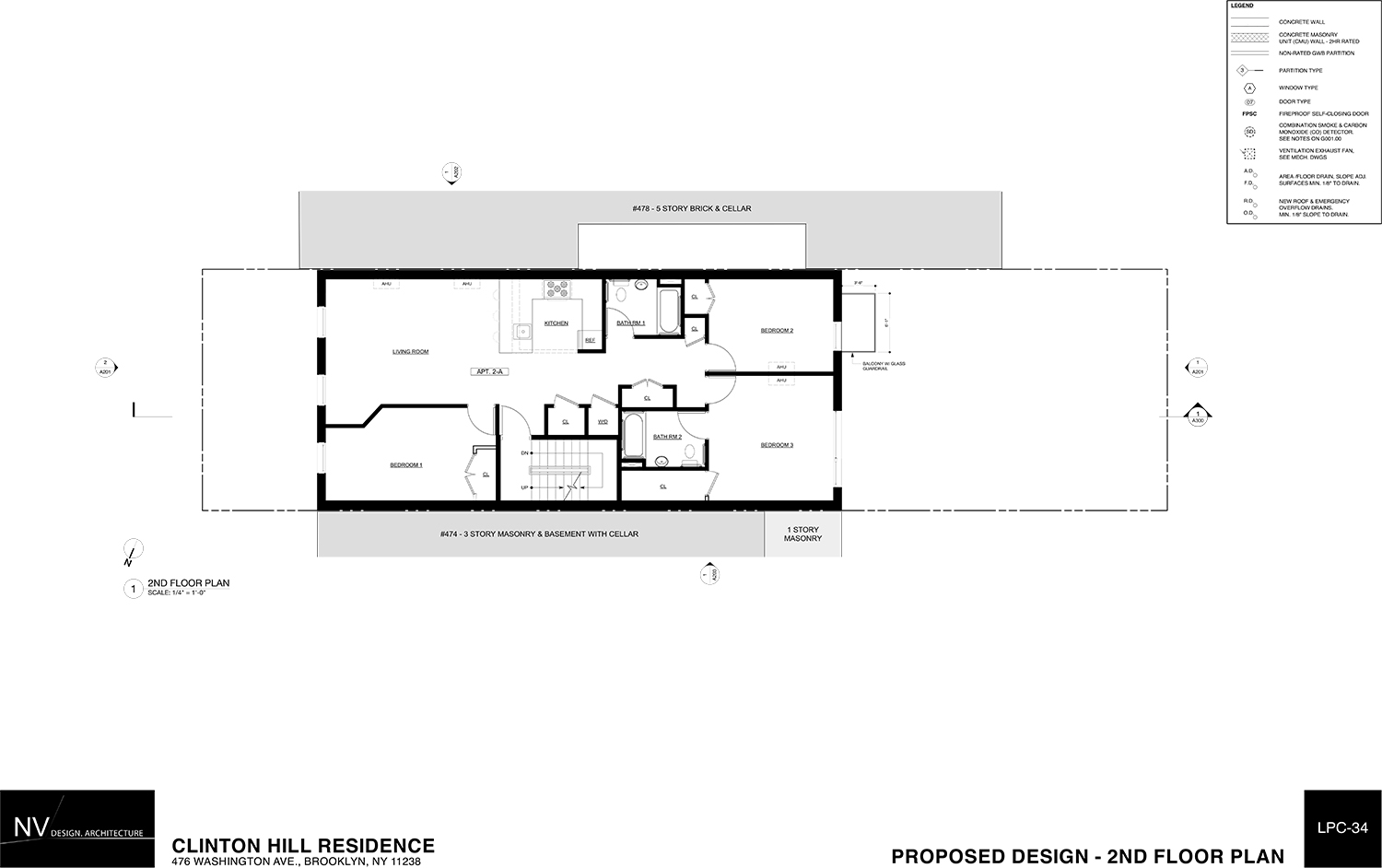
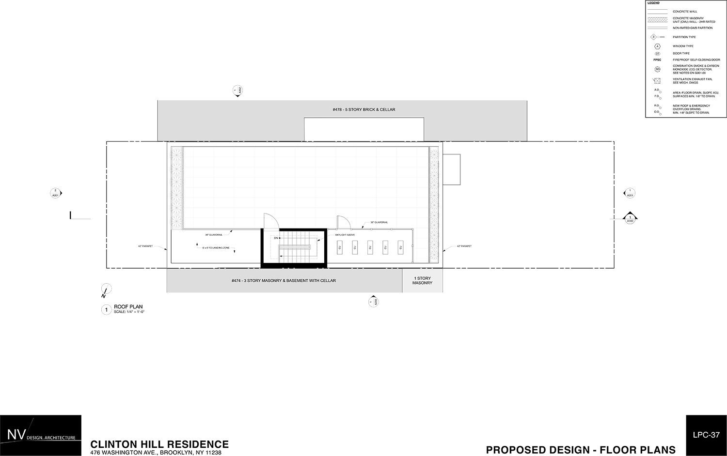
Plans in the LPC presentation showed a two-bedroom unit on the first floor followed by three-bedroom units on the second through fourth floors. Each unit will have two full bathrooms, but one in each will be accessible only through a bedroom.
Before the hearing or meeting is “closed” and commissioners make their comments on a proposal, they get one last chance to ask the applicant questions. Commissioner Adi Shamir-Baron wondered whether they should be seeking a return to the existing building’s original design. Commissioner Michael Goldblum asked why the grid design gives primacy to the vertical elements. Van Den Bout said that the vertical stripes make it look thinner.
When it came time for comments, Shamir-Baron said the new proposal is a “strange jumbling of materials and proportions” and is “working against itself.” She felt that if it was to be constructed of wood, it should be smaller.
LPC Chair Meenakshi Srinivasan said she didn’t want someone to walk by and think a brownstone once sat there.
Commissioner Goldblum said he was okay with the proposed width. However, he was still “sad to see [the original massing] go.” He said the proposed design “does what it needs to,” but isn’t as good as it could be. He still found the verticality “peculiar.”
Commissioner Wellington Chen suggested the applicant work with LPC staff to reduce the emphasis on the vertical lines. Commissioner John Gustafsson didn’t like the way the building looked from the up the street angle.
Commissioner Jeanne Lutfy, for her part, said the materials were very nice. “I love the color palate,” she added.
“The approach to this site is very sound,” said Commissioner Michael Devonshire.
In the end, the commissioners voted, unanimously, to approve the design without modifications.
View the full presentation slides here:
Subscribe to YIMBY’s daily e-mail
Follow YIMBYgram for real-time photo updates
Like YIMBY on Facebook
Follow YIMBY’s Twitter for the latest in YIMBYnews














Is it really that difficult or costly to replicate the original facade? To my mind,they “got it right” in the 19th Century.