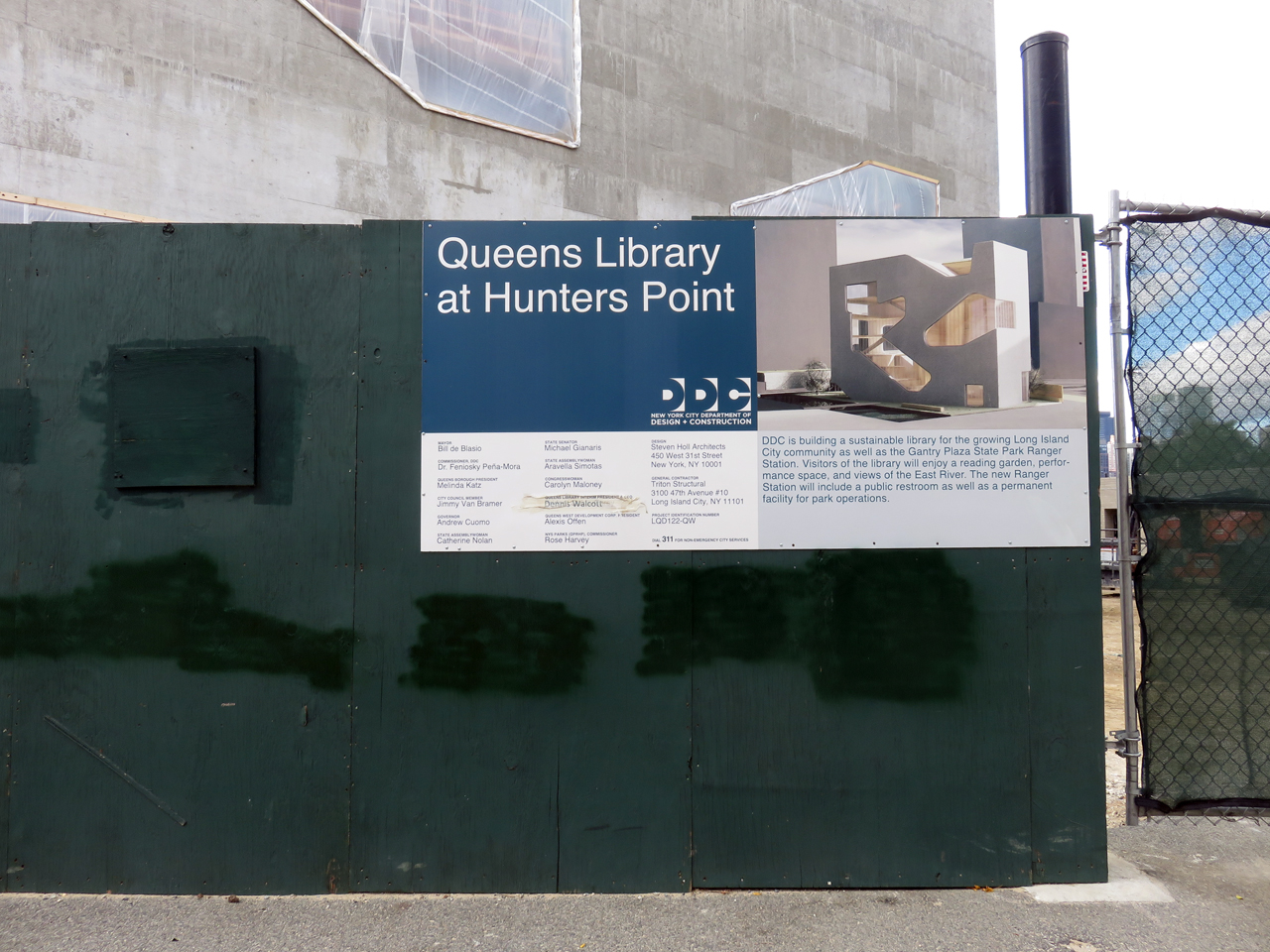
Over the past few years, Long Island City has developed a proud skyline, and the Steven Holl-designed Hunters Point Library will become its latest iconic public building. The space will serve as a much-needed civic hub in this still-developing waterfront residential district. Recently, we had an opportunity to tour the site, which will soon become one of the city’s most striking public spaces.
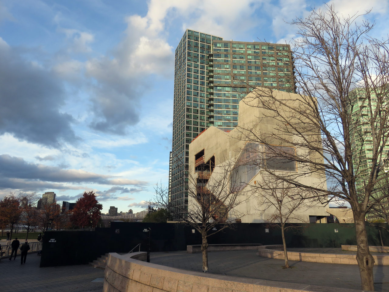
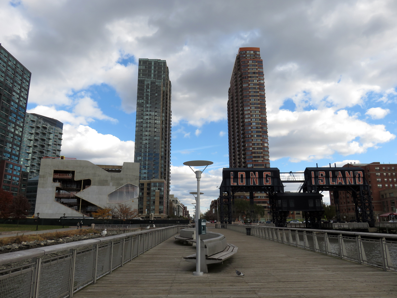
The library’s vertically-minded design draws inspiration from its skyscraper surroundings, because it sits among recently-built waterfront high-rises and faces the Midtown skyline next to Gantry Plaza State Park.
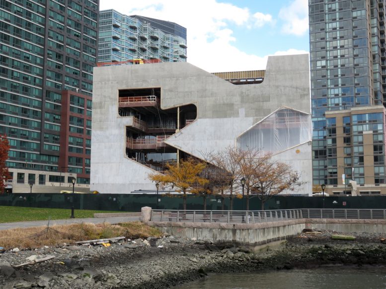
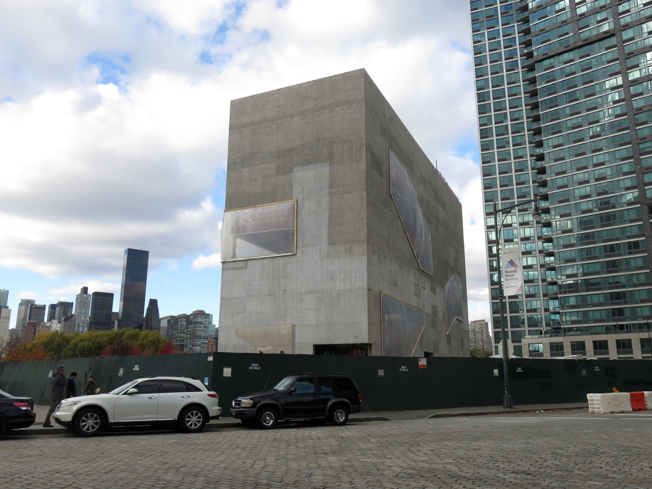
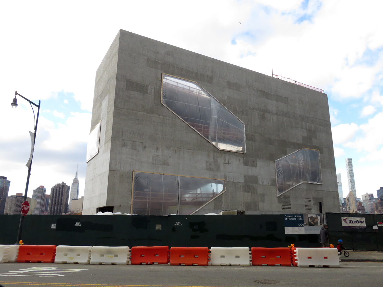
The slender concrete rectangle rises 109 feet high and measures 168 feet long by 40 feet wide.
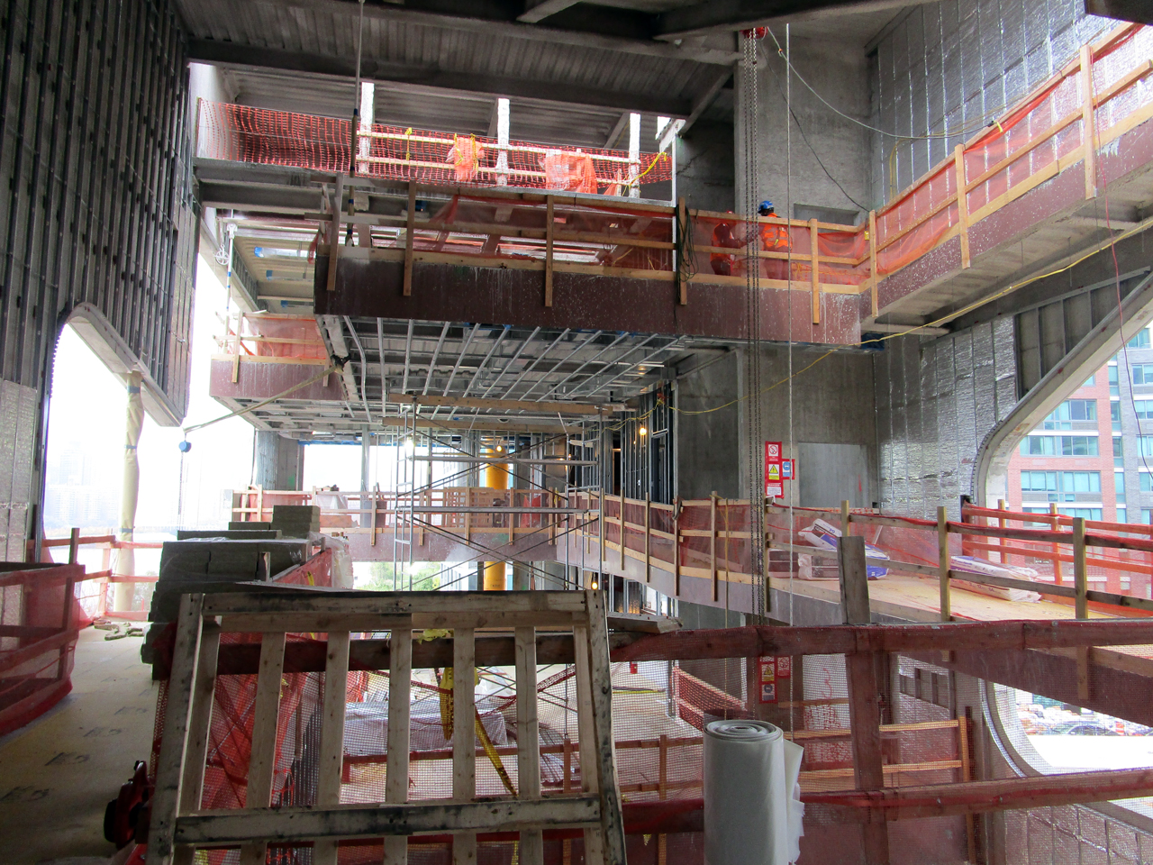
The Hunters Point Library fuses two common urban typologies: the atrium-centered public building and the vertical high-rise. In the library, spaces are stacked within the concrete slab, like books upon a bookshelf. The arrangement also subverts the typical skyscraper, merging independent floors into a single winding interior.
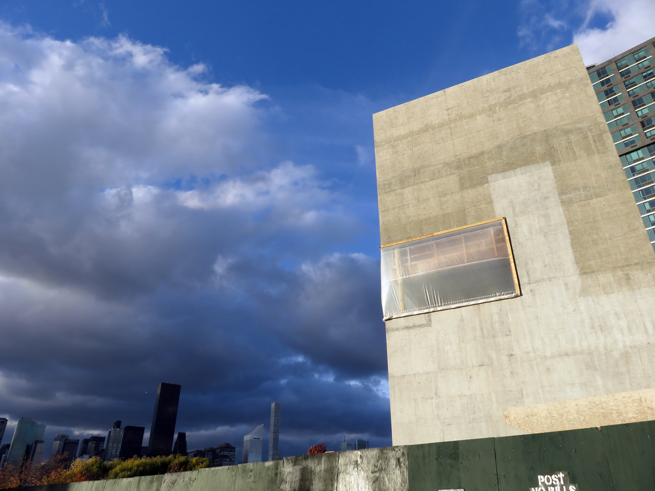
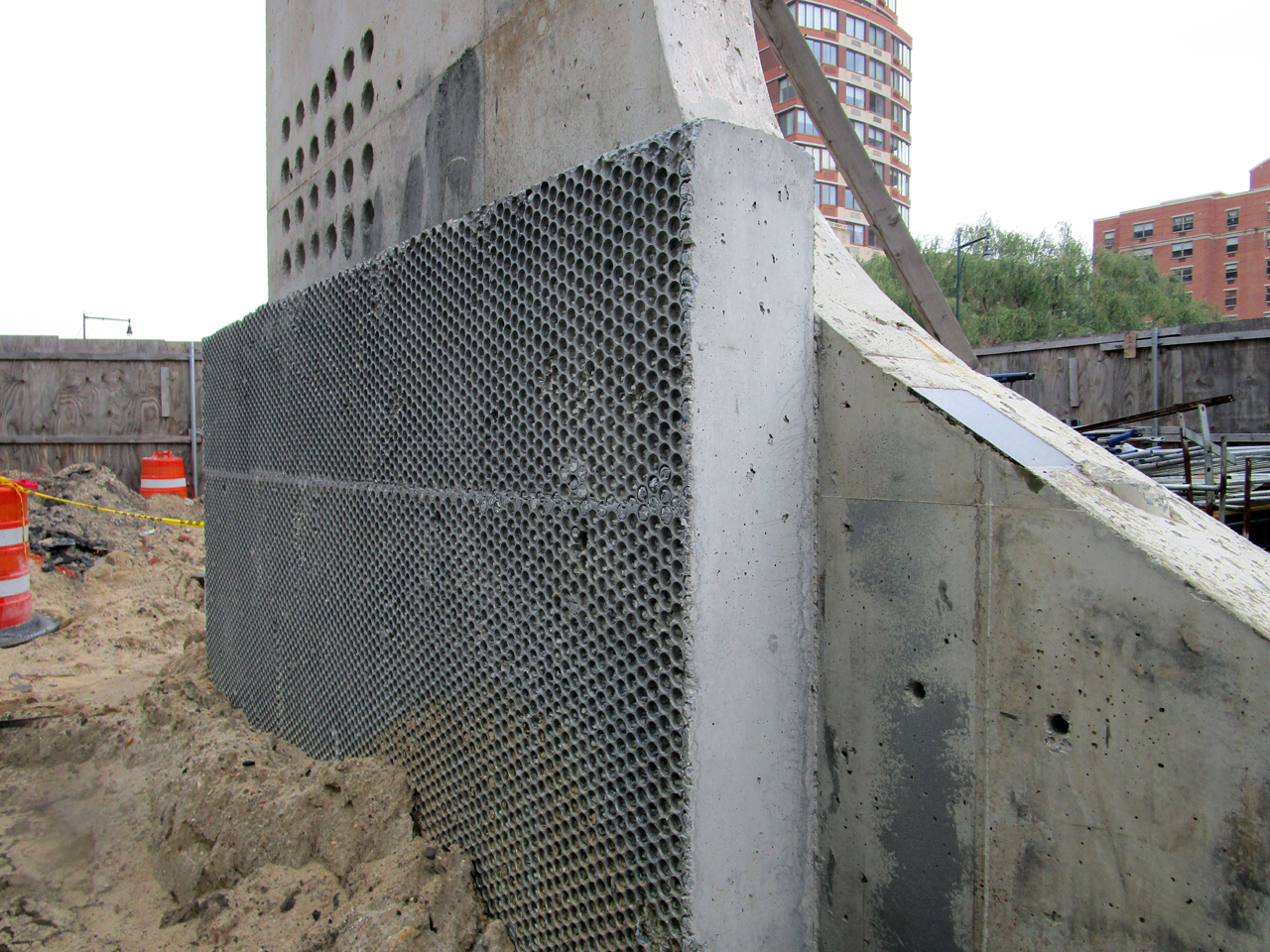
The primary structure consists of a concrete shell. Original plans called for the facade to be clad in aluminum panels, but they were eventually eliminated to cut costs. Instead, the textured concrete will be treated with a mineral-based coating, with a silver finish to maintain the originally-intended metallic sheen.
The coating penetrates the concrete, lasting decades longer than conventional paint and saving the taxpayer money on future upkeep.
The project reportedly went through 25 design changes during its conceptual phase. At one point, the architects proposed inlaying concrete with sheets of bubble wrap, which would leave indentations upon the building surface. Although the concept was eventually discarded, mock-ups of the concept still stand at the construction site.
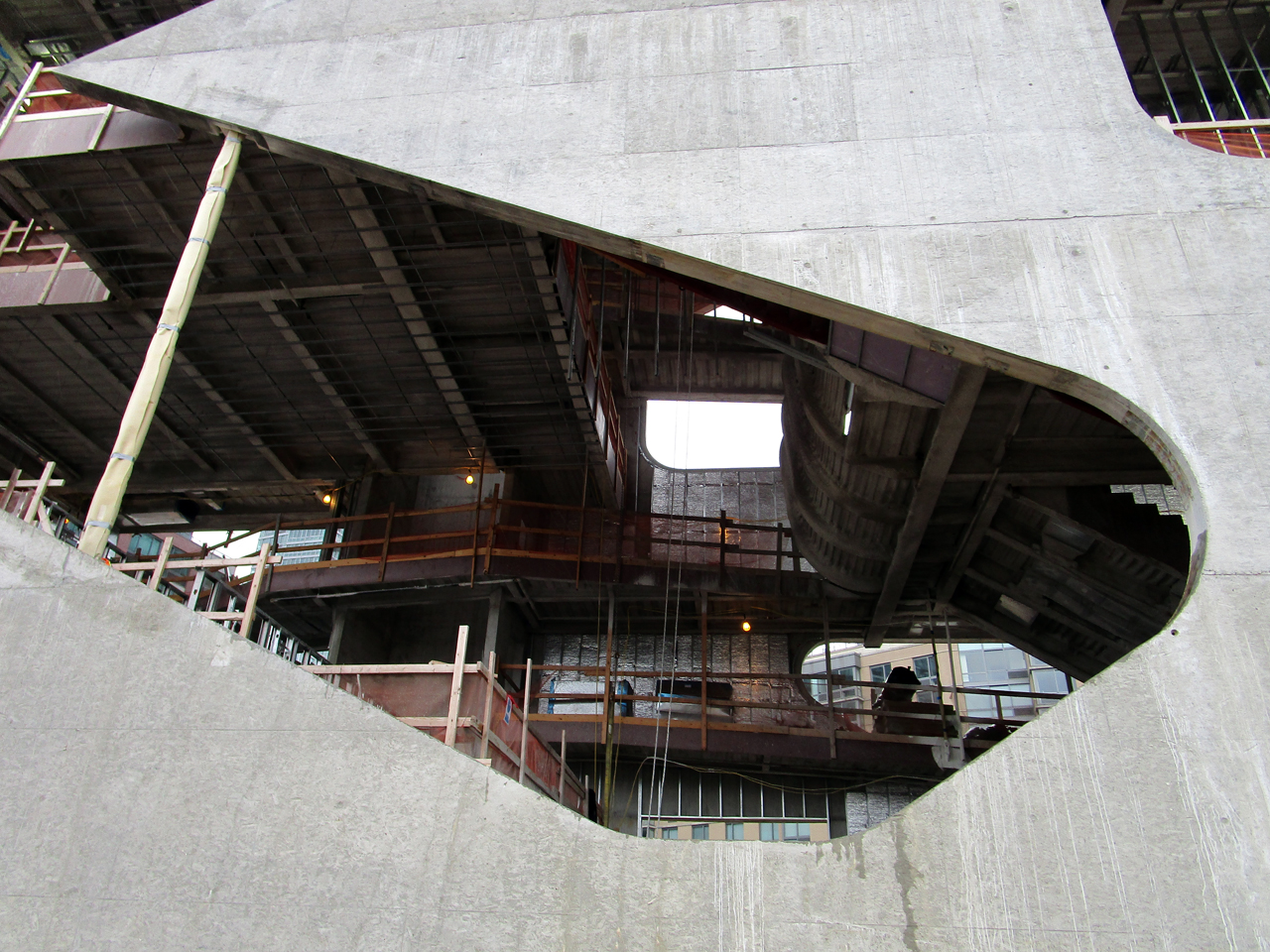
A load-bearing concrete exterior, cast on-site, provides structural flexibility for the curvy openings, which lend an organic touch to the rectangular form. The resulting facade is instantly recognizable when viewed across the river. The cutouts offer glimpses inside the building, where shifting levels and slanted surfaces form a complex interior that defies convention.
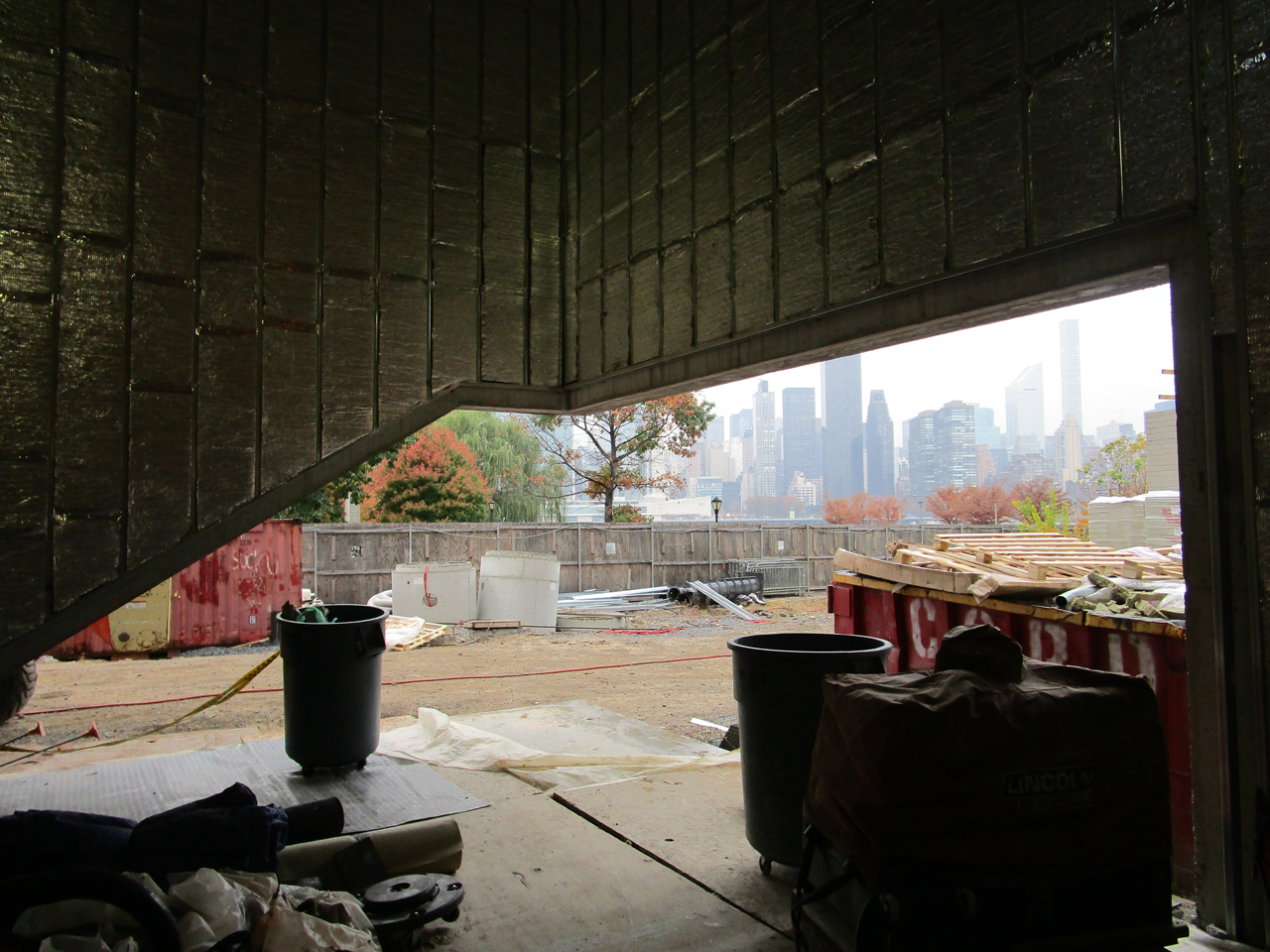
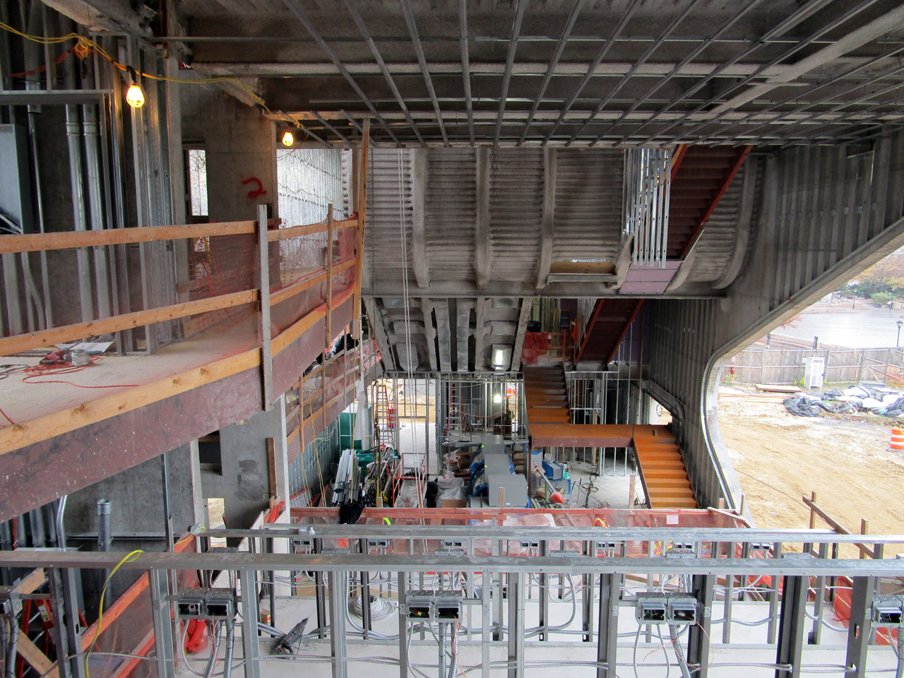
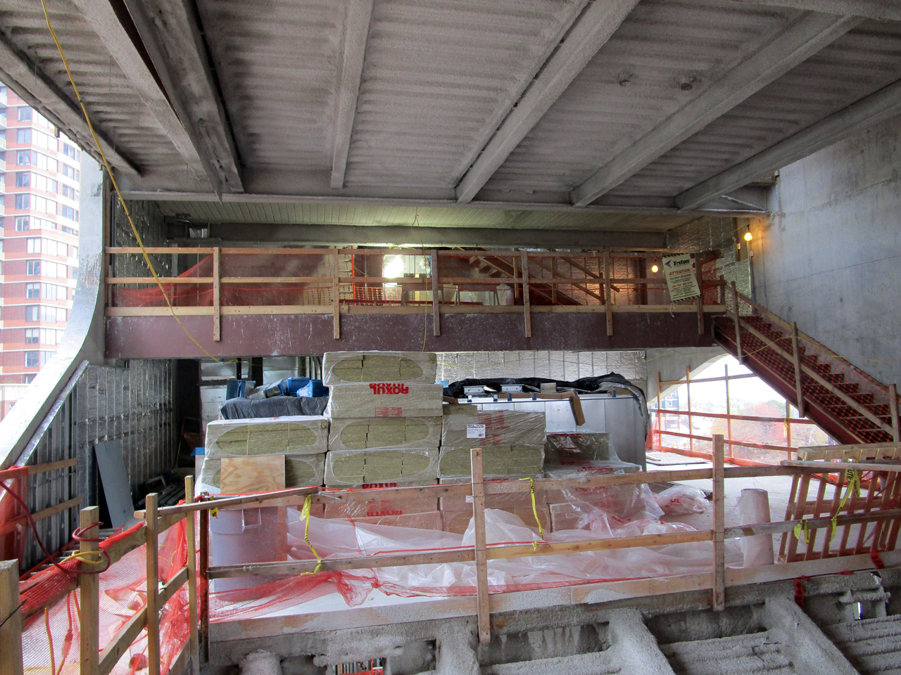
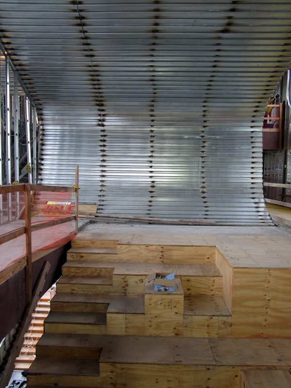
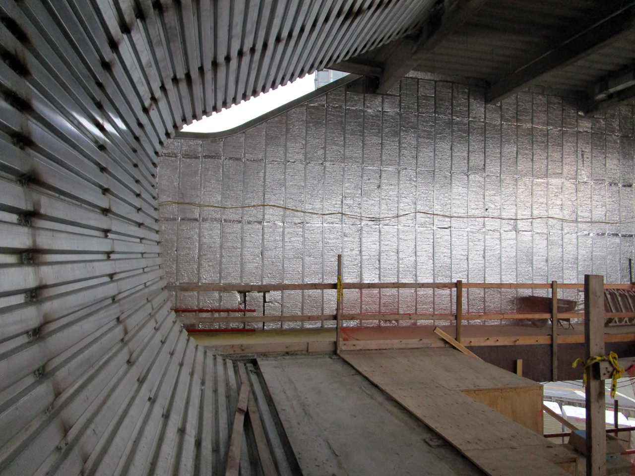
The cavernous space invites the visitor to explore and venture across the winding halls. The unfinished, irregular, dimly-lit interior felt akin to a steel-and-concrete cavern, yielding a disorienting but pleasant experience. Floors warp as they turn into walls and ceilings, mezzanines narrow into slanted catwalks, and slanted ceilings double as terraced seating on the other side.
Steven Holl Architects is also designing interior furnishings and millwork, emphasizing tactile, textured finishes. The concrete floor in the main public areas would be ground to expose the aggregate, which will be treated with a sealer. The quieter areas will be carpeted. Custom-made four-foot by eight-foot bamboo panels spanning the walls and ceiling count toward its LEED Silver classification.
At first glance, the fluid space and dynamic circulation is reminiscent of Rem Koolhaas’ 2004 Seattle Central Library. Instead of concealing book stacks as Koolhaas did in Seattle, Holl puts books and magazines on prominent display. The concept is partially influenced by the Stockholm library, where tiers of bookshelves frame the central space.
The grand atrium stair runs along a slanted stack of bookshelves, the periodical collection, and built-in desks, arranged as auditorium seating. The slanted surface doubles as the ceiling for the auditorium below. The upper seating area slants in a similar, but more organic, manner. Asymmetrically-stepped terraces gently curve upwards, and the floor becomes the wall and then the ceiling.
The northern portion of the third floor splits its space between the teen section and the staff area, which would contain two offices and a lounge.
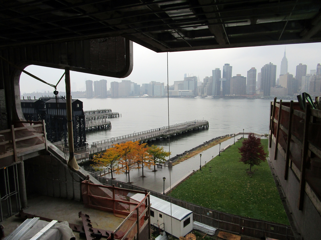
The large aperture on the river-facing, west façade generally follows the atrium contour. The three windows at the east façade, which face the street, correspond with areas for adults, teens and children.
Every interior area contains a window, allowing for natural light and views. Each cutout extends across floor plates, opening onto as many interior spaces as possible.
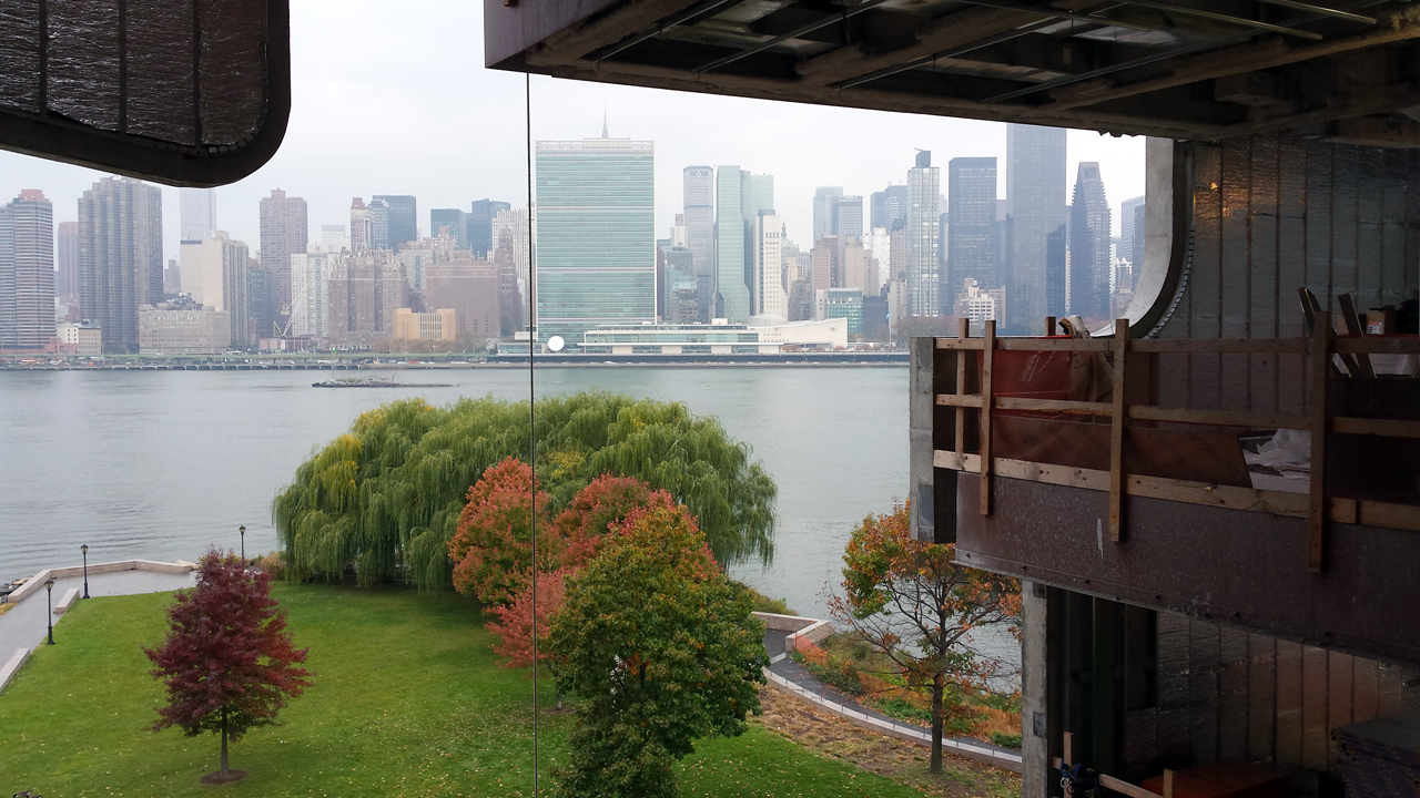
A loggia-like, open-air terrace frames westward views of the skyline at the fifth level. Lunch tables would occupy the majority of this space, which is adjacent to an indoor café. The north side of the terrace, which slopes at a roughly 45-degree angle, will feature benches.
An art installation would look upon the Manhattan panorama, where viewers on the floor below would be able to look out through a “periscope” that distorts city views via a series of lenses.
The uppermost roof deck will not be accessible to the public. This is unfortunate, because it is a spectacular space that opens upon dramatic vistas in all directions. It is the only part of the building tall enough to offer a glimpse of the growing Court Square skyline to the east.
Aside from a chiller unit, the rooftop will contain few mechanical features. The heating equipment, originally intended for the basement, was relocated to a small supporting structure north of the site due to flooding concerns. The single-story annex, which helps connect the library compound with the adjacent park, will also house a park ranger station.
The Hunters Point Library offers a new public space with a fluid, playful concept inviting the visitor on a journey of discovery. The borough’s latest icon, sharing waterfront space with the Long Island City Gantries and the Pepsi-Cola sign, will be of immeasurable value to the growing community.
Subscribe to YIMBY’s daily e-mail
Follow YIMBYgram for real-time photo updates
Like YIMBY on Facebook
Follow YIMBY’s Twitter for the latest in YIMBYnews









Rather confused parts inside the building, but that’s all design for the most modern library in this century.
I was taking photographs at Gantry Plaza during the morning waiting for the sunrise and saw the bus which served as a temporary library for the area. The building looks beautiful with views of the city skyline. Thank you for sharing the plans of an indoor cafe and the planned design of the book layout. Looking forward to seeing the library when it is finally finished.
I think it would be helpful if you also included a picture/illustration of what the library is expected to look like, when it’s completed. I think your text description is great, but a “final” picture says a thousand words.
Thanks!
honest Question: are you building a Library or a piece of sculpture? we already have one BIG PINK Sculpture..
this fits in that category in my humble opinion.. With all of the families & children who are in this NEW neighborhood,
there’s no floorspace for anything other than a walk around looking out the window… POOR USE OF TAX PAYERS DOLLARS… Needs a floor…. & a place for books… not an open ATRIUM…