Just a few blocks south of 25 Kent Avenue, located in the same Williamsburg section of Brooklyn, 187 Kent Avenue is a new seven-story mixed-use residential project rising between Metropolitan Avenue and North 3rd Street. Diego Aguilera Architects P.C. is the architect of record, and the site is being developed by CW Realty Management, who purchased it for $43 million, or $512 per square foot. The building is already a couple floors off the ground and will eventually stand around 85 feet tall, and contain a total of 140,036 square feet of space.
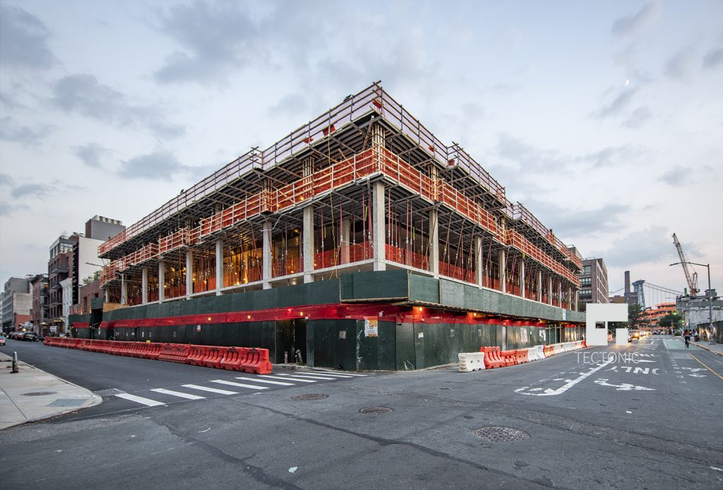
The northwest corner of 187 Kent Avenue by Diego Aguilera Architects P.C., photo by Tectonic
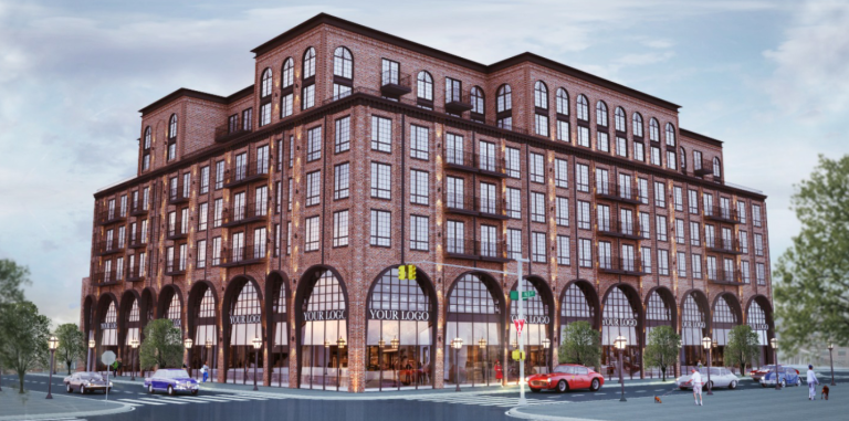
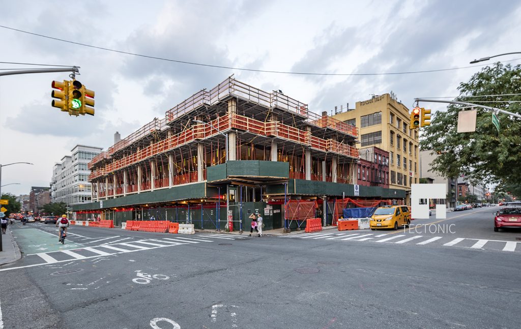
The latest photos from Tectonic show progress is now up to the third floor. When complete, all 96 units will be encased in a unique and distinct symmetrical brick facade. Over-sized arches will rise above the 22,108 square foot retail base to the second floor, which will be a parking garage capable of holding 170 vehicles, surrounded by a dense grid of industrial glass, resembling the transom section of the arch.
Rental apartments will begin on the third floor and continue up to the seventh floor, each averaging 634 square feet. Some will have private balconies that stick out from the facade with a dark color for the floor and railing. The seventh floor will have all arched windows in order to compliment the architecture and contrast the size of the large arched facade below.
The corners of the building will be set back in order to make way for outdoor terraces and landscaped roof decks for residents to enjoy the views of the Manhattan skyline and the waterfront less than 400 feet away, to the west. Dark cornices will wrap around the fifth and seventh floor, giving a more solid and bold appearance to cap off 187 Kent Avenue seen from afar. Access to the ferry is just a short walk to North 5th Street Pier and Park.
No formal completion date has been announced, but sometime by at most mid-2019 seems reasonable with the current pace of construction.
Subscribe to YIMBY’s daily e-mail
Follow YIMBYgram for real-time photo updates
Like YIMBY on Facebook
Follow YIMBY’s Twitter for the latest in YIMBYnews


Please pardon me for using your space: First section started but final section not yet. Thanks to Tectonic.
beautiful design. love love the arches.
The arches may be a distinctive architectural touch,
but they don’t mesh well with the drab building section directing above them..
This building is going up fast! They’re already up to the 6th floor.
Its got some Great Character!!! Finally someone building a classic brick in the North.
Wonderful street level design.