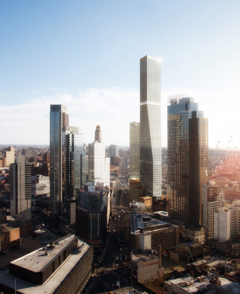
The City Council has unanimously approved the controversial 80 Flatbush project in Boerum Hill after a reduction in size and scale. While the drop in density is not ideal, the the buildings will still be a large player for the housing market and community at large, and will punctuate the neighborhood’s skyline with two new towers that appear both prominent and promising in terms of design.
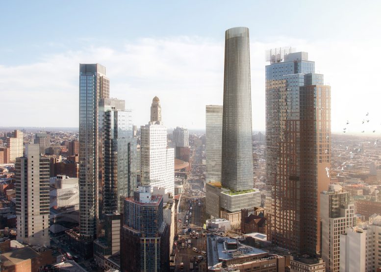
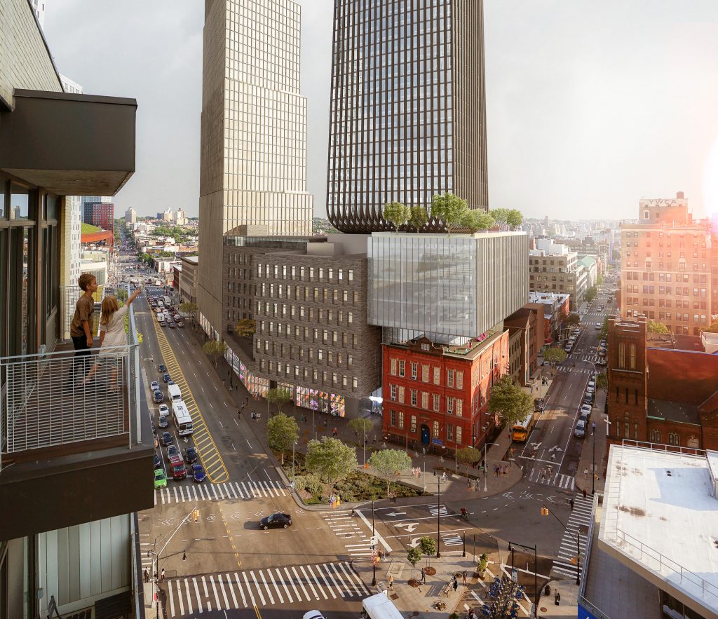
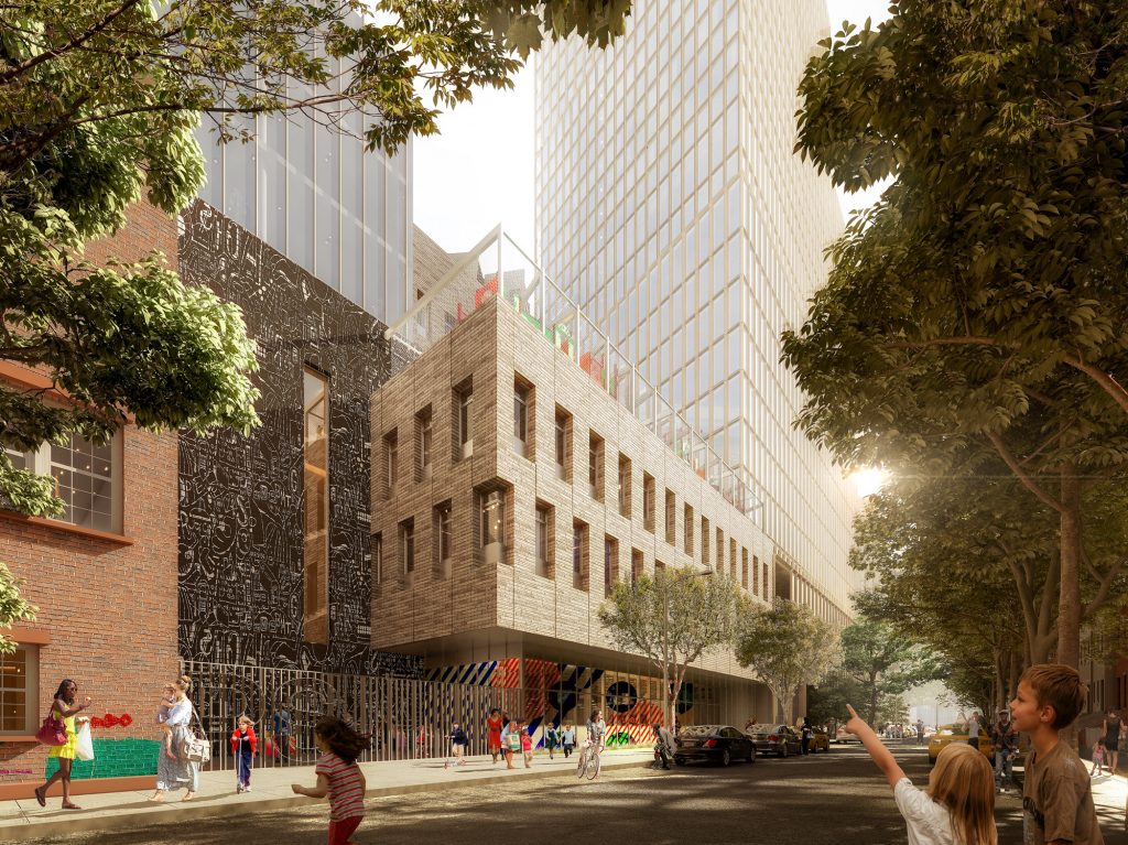
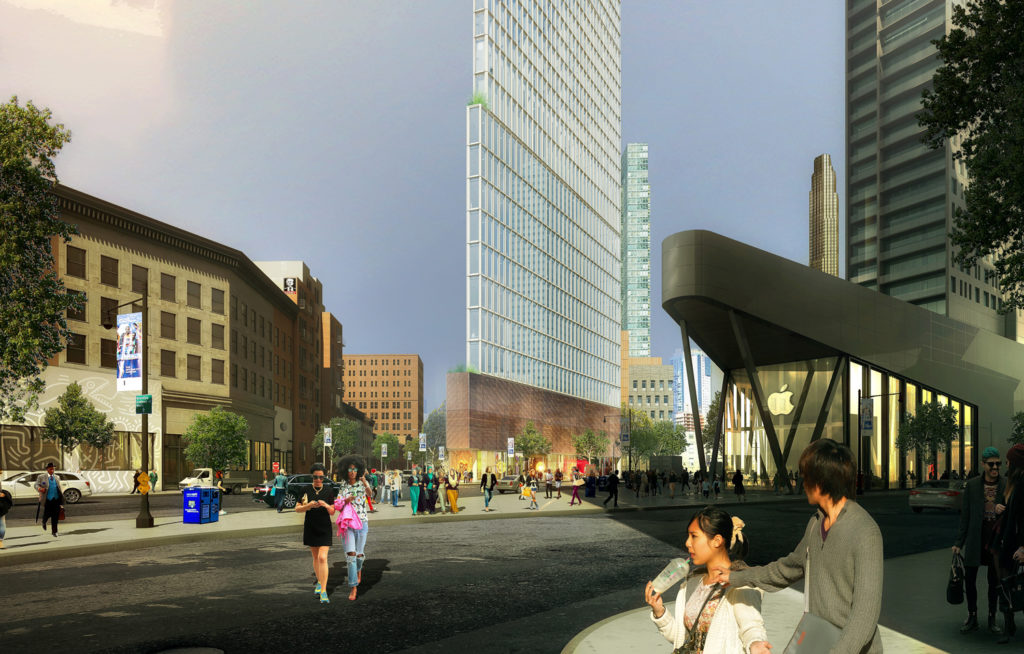
80 Flatbush will encompass five buildings. This will include two historic structures, the school, a new triangular high-rise, and the once-74 story monolith. The redesign has only affected the largest tower. The new look has a curved diagrid base forming a square, then seamlessly rising into a cylinder.
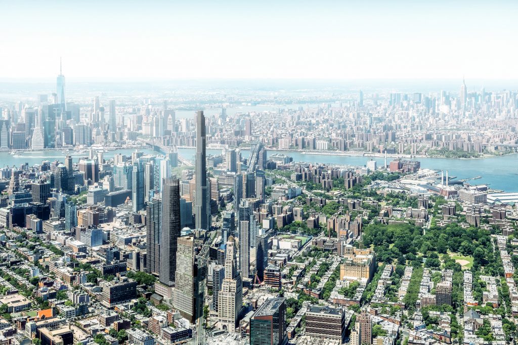
80 Flatbush Aerial View, in which 3WTC has not topped out and only 10HY is complete, rendering courtesy Alloy Development
The most significant decision was to cut the floor-area ratio from 18 to 15.75, moving the building from the originally proposed 986 feet down to roughly 825-845 feet and triggering a redesign. Most of the lost area will equate to lost office space. In terms of housing, there will be 870 units instead of 900. The amount of permanently affordable housing will remain consistent at 200 units. This cut will not affect the Khalil Gibran International Academy’s planned 350-seat elementary and high school.
Speaking to the decision behind the slight reduction, the Brooklyn Paper cites Councilman Stephen Levin as saying, “the shrinkage will result in a development that can retain its public benefits and is more appropriate for a lot he previously stressed must be transitional between Boerum Hill’s Brownstones and Downtown’s skyscrapers.”
For the brownstone residents across the street, this is a significant change. As the housing crisis in New York rages on, it is encouraging seeing that Brooklyn was able to negotiate and agree on this massive housing project in such an affluent, underdeveloped, historic, and transit-rich neighborhood.
Alloy Development is responsible for the project, including design. Alloy’s CEO, Jared Della Valle shared some cheerful words following the approval, stating, “We hope the broad support we received for building a dense project in a transit-rich area sends a strong message across the five boroughs: amid an ongoing housing crisis, New York City needs to be progressive and seize every opportunity for growth in locations that can accommodate it.”
Paperwork still remains to be approved within ULURP and the stamp of approval by Mayor DeBlasio must still be secured, but those are not expected to present any roadblocks.
Subscribe to YIMBY’s daily e-mail
Follow YIMBYgram for real-time photo updates
Like YIMBY on Facebook
Follow YIMBY’s Twitter for the latest in YIMBYnews



Please pardon me for using your space: Do you like summer flowers?
They didn’t need to cut the FAR in my opinion, but the redesign is actually pretty sick, although the base of the taller building seems a bit unnatural though.
So happy that Stephen Levin ultimately decided to keep the design as close as possible, and props to Alloy for ultimately compromising without sacrificing anything. Honestly, I would’ve left the original height with the redesign, but the cut was much smaller than anticipated.
The developer will add to the politicians campaign accounts and everything will be all right.
I like the new design. More Brooklyn, more curvy and sleek than the old design
The final version is definitely the best.
So in character with the neighborhood.
Stupid symbolic height cut. The politicos “mediated.”
The same NIMBY concerns exist, but all of a sudden no coverage of their perspective.
Pointless.
It looks like a giant chimney covered in soot, I hope it doesn’t turn out that dark.