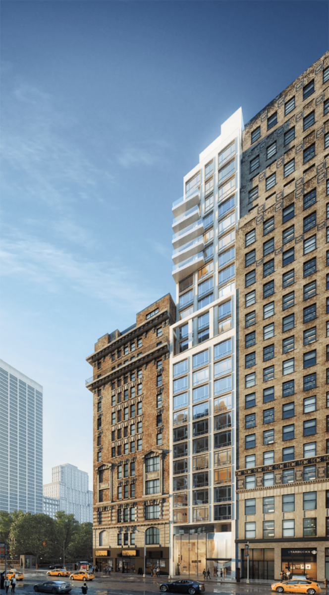
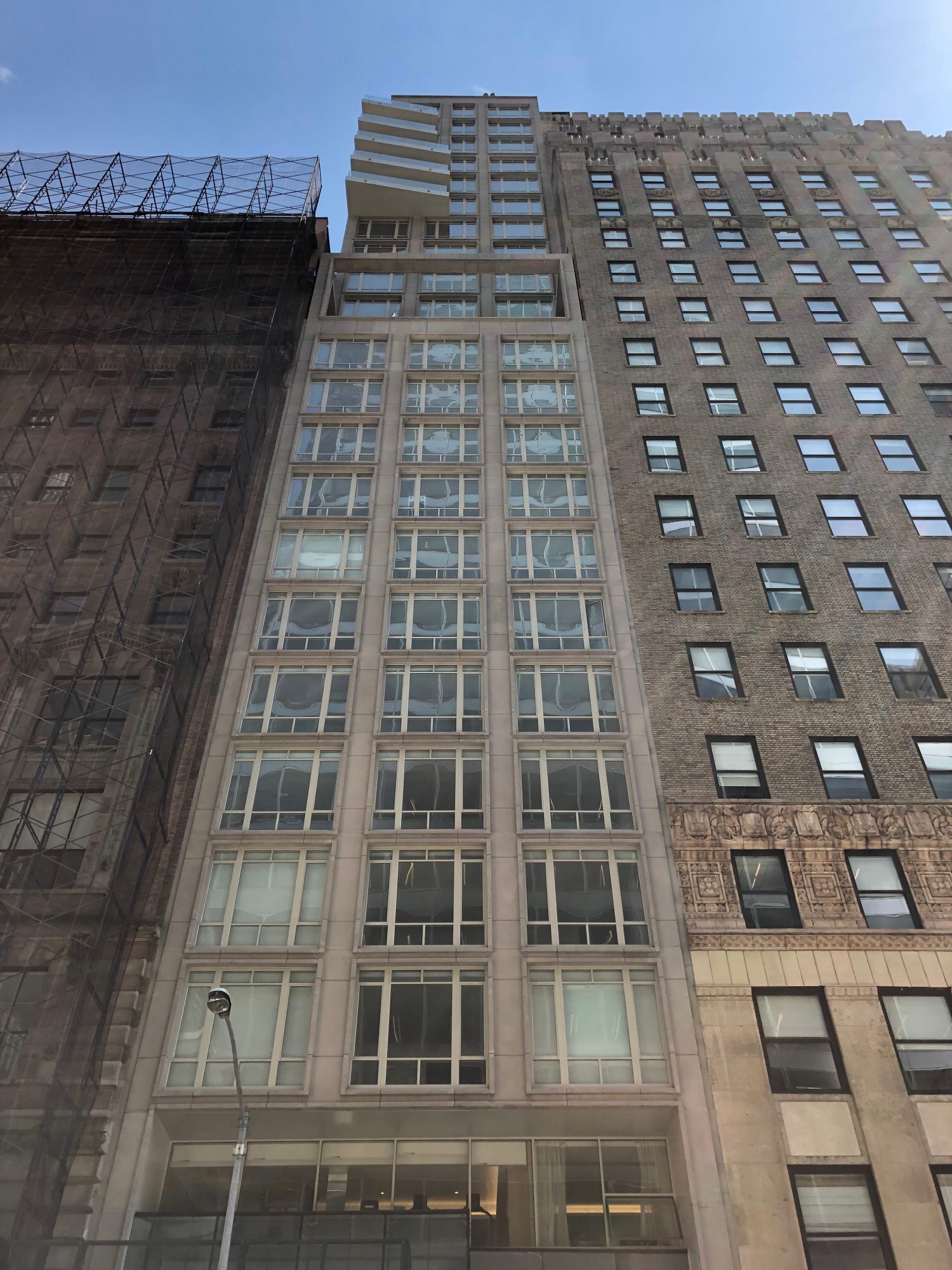
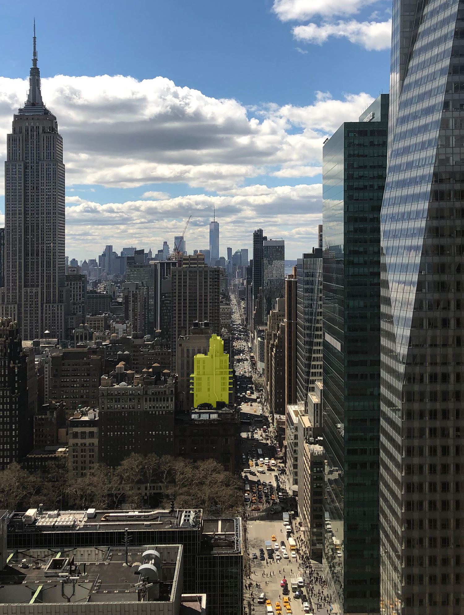
Work has completed at 1050 Sixth Avenue, a 24-story building designed by Gene Kaufman Architects and developed by Skyline Developers. Called ML House, it sits to the south of Bryant Park by the corner of Sixth Avenue and West 40th Street. The tower is fully enclosed and features 62 studio to two-bedroom units that are now 50 percent leased. This is the only ground-up residential rental building surrounding Bryant Park.
“ML House represents the next step in Bryant Park’s evolution into a thriving live, work, play community,” said Orin Wilf, president of Skyline Developers. “ML House will cater to high-end renters looking to move into an exciting and central neighborhood.”
There is a total of 62,880 square feet of residential space with each unit averaging 1,014 square feet. Studios start at $3,075/month, one-bedrooms from $4,875/month, and two-bedrooms from $6,450/month. The penthouse has its own private rooftop deck.
The profile of the building is rather slender for its height when compared to the surrounding structures. The tower rises high enough to provide the top nine floors with north-facing views of Bryant Park. The most prominent design element is the five angled corner balconies on the upper floors. Residents of these units will be able to see Bryant Park and the evolving Midtown skyline. The balconies also protrude far enough to the west to allow for a wider view up and down Sixth Avenue. Unseen from the street is another set of balconies on the back of the building.
ML House is located among a plethora of dining and retail establishments. Whole Foods Market is less than five minutes away by foot across from Bryant Park between West 41st Street and West 42nd Street, and there are number of small cafes and coffee shops around the park and the Times Square theater district. Port Authority Bus Terminal is two avenues to the west while the subway entrance to the B, D, F, M, and 7 train is across the street. The New York Public Library is five minutes to the east, while Grand Central Terminal is an extra five-minute walk from there.
Subscribe to YIMBY’s daily e-mail
Follow YIMBYgram for real-time photo updates
Like YIMBY on Facebook
Follow YIMBY’s Twitter for the latest in YIMBYnews

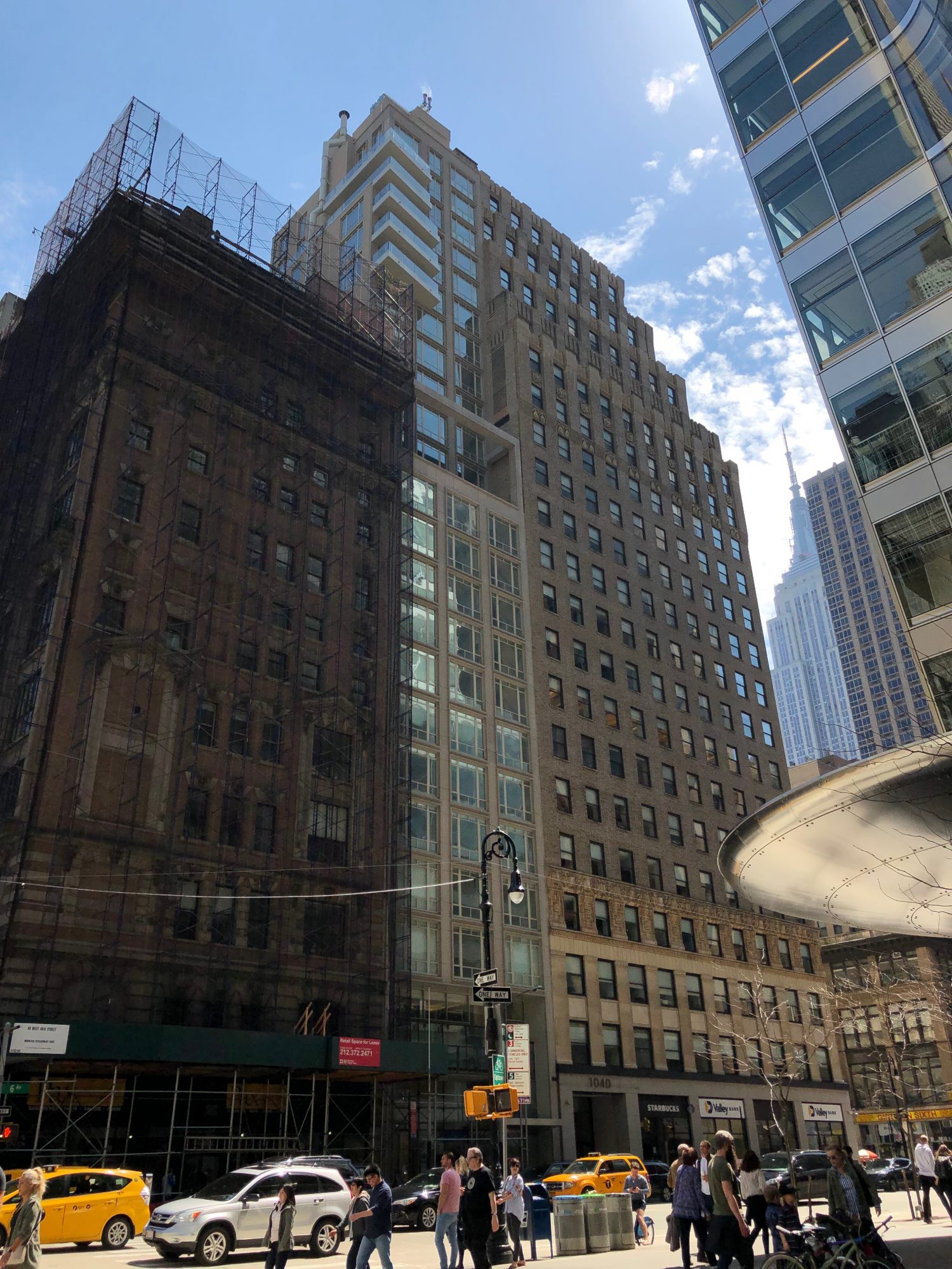




What is going on with the building next to it?
They maybe just renovate it. It’s a Corner building with his busy retail tenants of first floor, high pedestrian traffic and on the Corner of Bryant Park, a major green space in whole neighborhood!!! Major Green Space between Madison Park and Central Park. They probably have a height limit too for new construction in this very historical block of Midtown. And the Location cannot be more prime than this, steps from Central Library, not far from Grand Central and Times Square and just across BRYANT PARK!!!
I think that they plan to preserve that “lowrise corner building”, and he is a “lowrise” for NYC standard, it’s 12 storey, a “highrise” for the rest of country!!!
To sure, they will renovate it, look for new buildings top floors over this one, they have a windows, and I don’t think someone wanted them to be blocked, also they probably not razed it down, for simple reason, for what to built modern 12-14 story to replace it, hell no, they going to renovate it, maybe converting this corner tower in luxury hotel or expensive condo with prime view to Bryant Park. Maybe they want to partial demolition of top floors, make them glassy and more modern and better fit.
Honestly if not this location, that building is ordinary, not worth for being preserving. Yes, tenants looks like already relocated, and partial demolition is in the place.
Honestly, why not preserve that, and not create a beautiful pedestrian friendly plaza cut off and beautify it with trees, flower pots??? Tell me one reason for support the statement “why we should preserve this dark ugly spot on the Renowated and most Renowned Street wall of Avenue Of Americas or Sixth Avenue!????
Unless we renovate it for better fit 21 Century Midtown Streetscape!!!
This may be some of Gene Kauffman’s best work, which isn’t saying much, but at least from what I can tell, there’s no dinky little setback, weird metallic panel or striped brick facade, or exposed mechanical penthouse/water tank that makes me want to punch my computer screen.
This building actually looks decent. It uses the architectural masonry language and fenestration of a classic NYC high-rise to produce a nice infill building without drawing undue attention to itself.
Pardon my for using your space:
I can’t believe there are so many people who can afford to rent in such a building.
(Thanks)
This building may be the best of Gene Kaufman’s efforts, but my god, this is simply not good enough. If the best thing one can say is “it isn’t terrible,” then we have a problem.