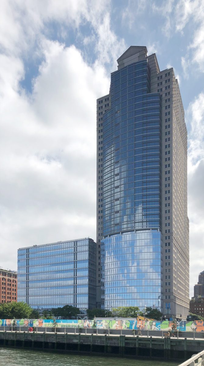
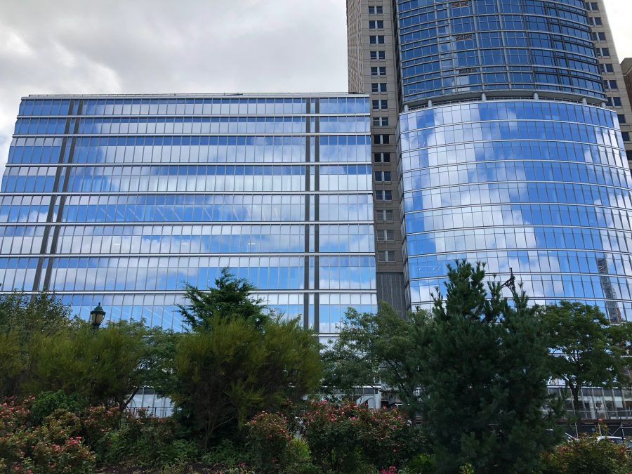
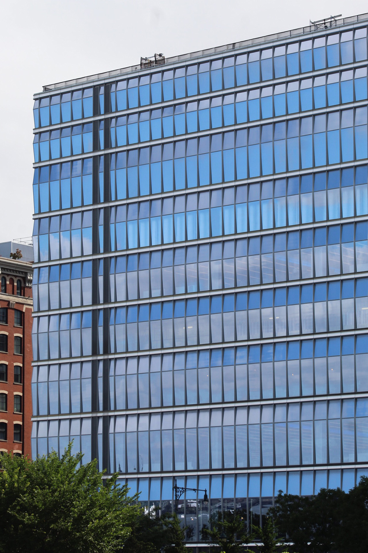
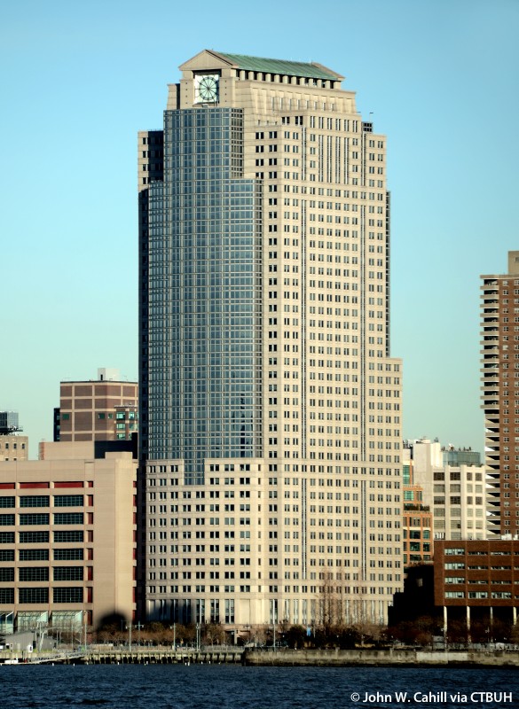
The installation of new glass curtain walls on the lower levels of 388 Greenwich Street and its annex at 390 Greenwich Street is almost complete. The taller, 39-story office building rises above the Tribeca waterfront across from Pier 25 and Pier 26. Skidmore, Owings & Merrill designed the 14-story-high glass envelope, while Gensler is leading the interior renovations in both structures.
New photos from Pier 25 show the reflective glass panels.

The top half is the original curved glass of 388 Greenwich Street, while the bottom is the new, more reflective glass. Photo by Michael Young
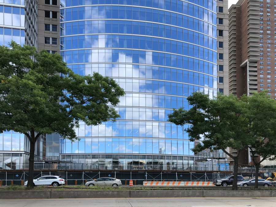
The site is located next to West Street and sits to the north of the Borough of Manhattan Community College. Hudson River Park is across West Street. Work on the ground floor facing west toward West Street appears nearly complete.
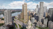
Below is an image showing what the original façade used to look like.
A number of small windows arranged in a grid dotted the curved elevation of 388 Greenwich Street, while wide, rectangular windows on 390 Greenwich Street were sandwiched in between large concrete wall slabs. The new wraparound glass on both buildings will provide their interiors with much more natural light.
Completion of the new curtain appears to be imminent, and the remainder of the renovations could finish by the end of the year.
Subscribe to YIMBY’s daily e-mail
Follow YIMBYgram for real-time photo updates
Like YIMBY on Facebook
Follow YIMBY’s Twitter for the latest in YIMBYnews

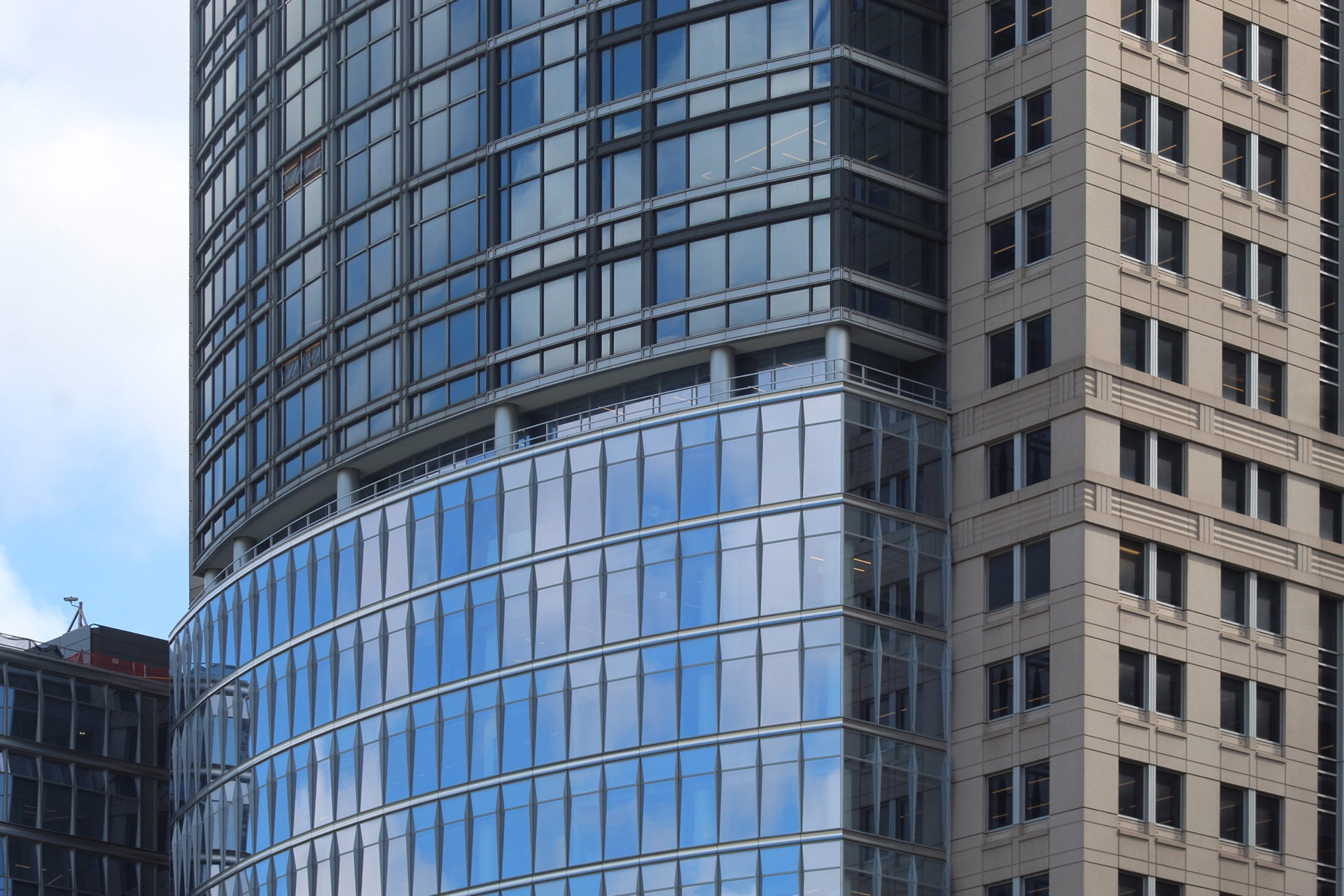

Wasn’t the right side of the original curved glass portion replaced? If you look closely at the photos you can see the difference in the window design. Any thoughts?
What you are looking at is the refurbishment of the existing curtain wall. The original aluminum framing is being repainted with a different color scheme. It was originally a silver color throughout. SOM wanted to deemphasize the grid pattern by blacking out the vertical elements and giving the original facade a horizontal look. They just didn’t finish the repainting on the west elevation because it is the last phase. It obviously just needs to be finished. You can tell with the holes in the facade where the material hoist was installed and has since been removed.
The opposite east elevation of the building was completed 2 years ago. The west elevation is curved but similar east elevation is a flat elevation. Unfortunately, they did not show photos of the east Greenwich Street elevation, which is also the front entrance of the building with a new plaza
Thanks George M
Even time I go by this renovation, I just think it was a mistake. The very new curved windows at the base match the box on the north side and it has nothing to do with the very well designed tower above. By trying to tie the two masses to together, it looks like a simplistic attempt at marriage which ultimately failed.
Wow, what a loss. That building with its limestone facade was so elegant. The garage or whatever next door could certainly use a makeover, but not the tall building. What a loss!! What is with all this glass hangup we see all around? What happened to the city council that deals with such things? How could they allow for this type of vandalism?
Very puzzling, what’s been improved with this look, what was the purpose? The Post Modern quality it had is pretty much gone unless you’re viewing it from the river and can still see the roof temple. Greater glass relectivity––won’t that be a greater hazard for birds? This building tied in nicely with the original four towers of the World Financial Center. Now it just looks totally disjointed, like they put a big shiny bandage on some kind of architectural wound that didn’t exist.
IMO ruined the facade of the building. The smaller I can see a desire to have redone, but the differing curtain walls on the main building just looks terrible to me.
I like the original. I love NYC because of its architecture mainly. I live in Perth Western Australia and so don’t get there often but when I do it is the older buildings I most admire.
Was that a Clock in the original? That was a nice touch. I was always wondering what was going on here as I moved to Tribeca a few months ago. Never paid attention to this building until now. Interesting
The original was actually more handsome and classic.
When an architect is bereft of any ideas, cover it in glass.
I find it really interesting that they didn’t mention that this is the newly-consolidated headquarters of CitiGroup. They take up the entire complex and the renovations were for them. People don’t so much refer to it as 388 Greenwich so much as the ‘Citi Headquarters’.
yikes a really not attractive building before or after new curtain wall.