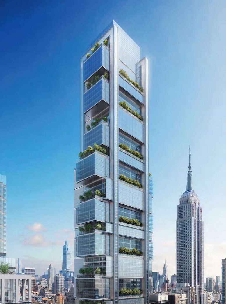
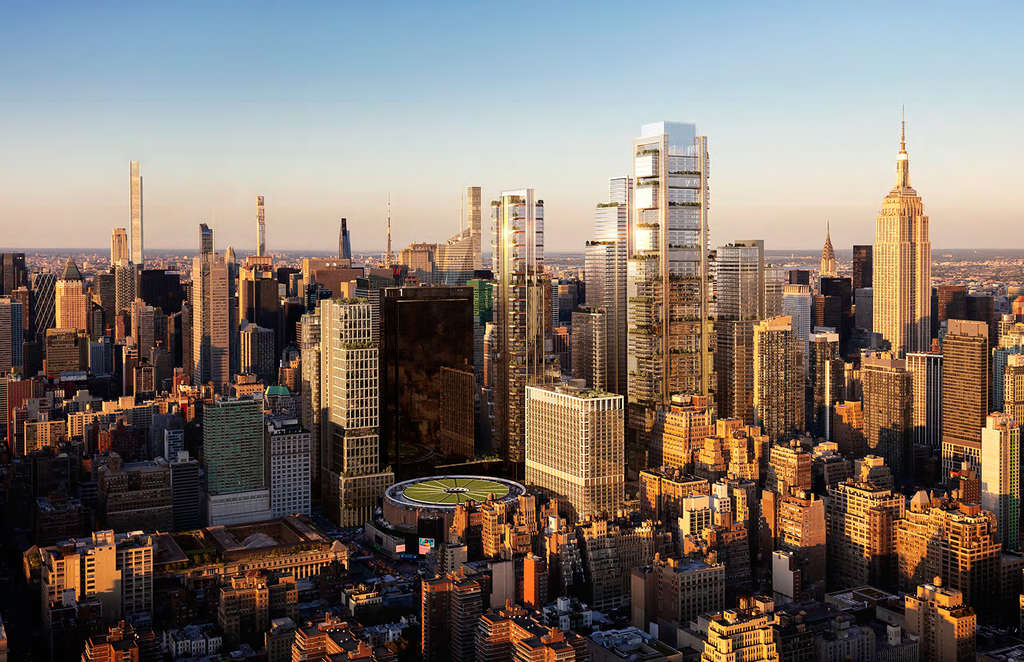
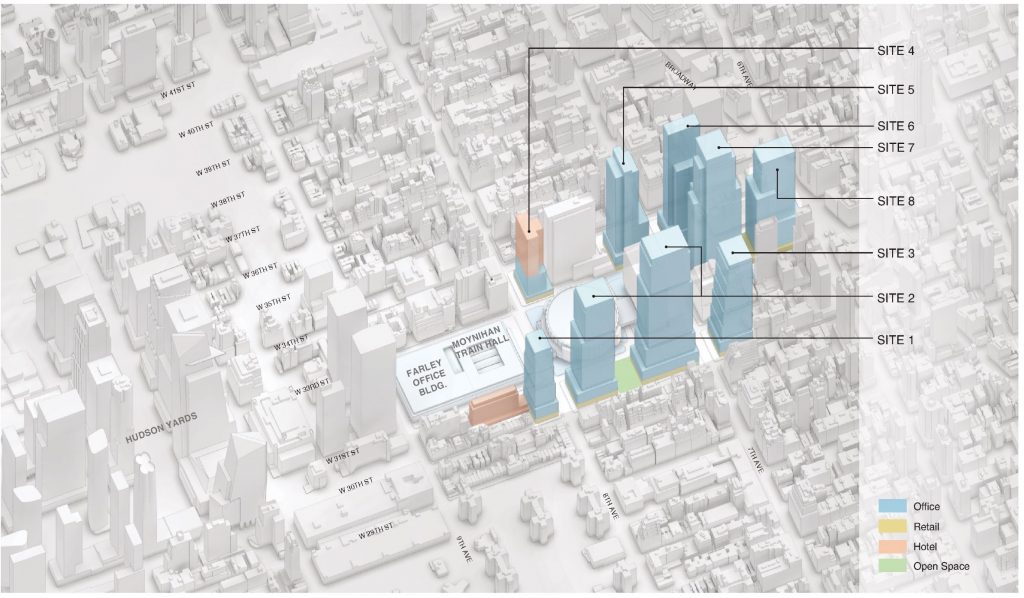
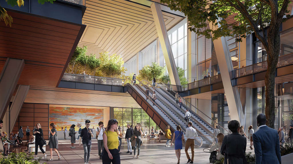
A new set of renderings has been released for Vornado Realty Trust‘s 7.4-million-square-foot Penn District redevelopment in Midtown. Created by DBOX, the images highlight Penn 15, a 1,270-foot supertall designed by Foster + Partners at 15 Penn Plaza. The overall plan aims to transform and revitalize the cityscape between Sixth and Seventh Avenues and West 32nd and West 34th Streets with a total of eight new skyscrapers surrounding the 109-year-old James A. Farley Building and Skidmore Owings & Merrill‘s newly opened Moynihan Train Hall, as well as One and Two Penn Plaza and Madison Square Garden.
A mix of office, hotel, retail, outdoor public space, and much needed upgrades to transportation services would span all of Penn District.
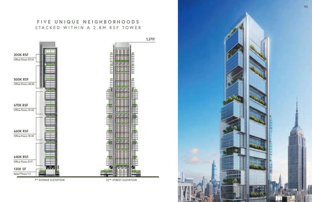
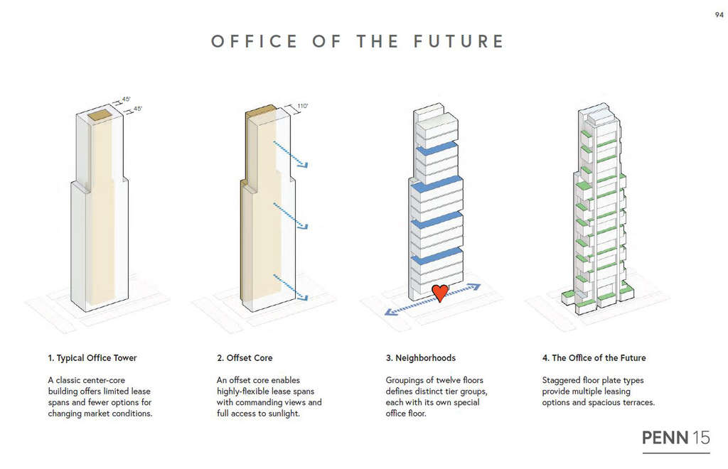
Diagrams show Penn 15’s 2.8 million square feet spread over 61 stories and divided into several large sections of rentable space. The first two levels encompass 130,000 rentable square feet; floors five through 17 with 640,000 rentable square feet; floors 18 through 30 with 660,000 rentable square feet; floors 31 through 43 with 670,000 rentable square feet; floors 44 through 56 with 500,000 rentable square feet; and floors 57 through 61 with 200,000 rentable square feet.
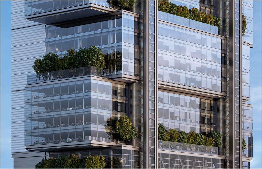
The next diagram below shows how the architectural design came to be, with the core first being offset to the north side of the building’s footprint for higher flexibility in leasing office space and daylight exposure, followed by the grouping of every 12 floors into five distinct vertically stacked blocks, which are then staggered and laterally shifted to create numerous cantilevering landscaped outdoor terraces.
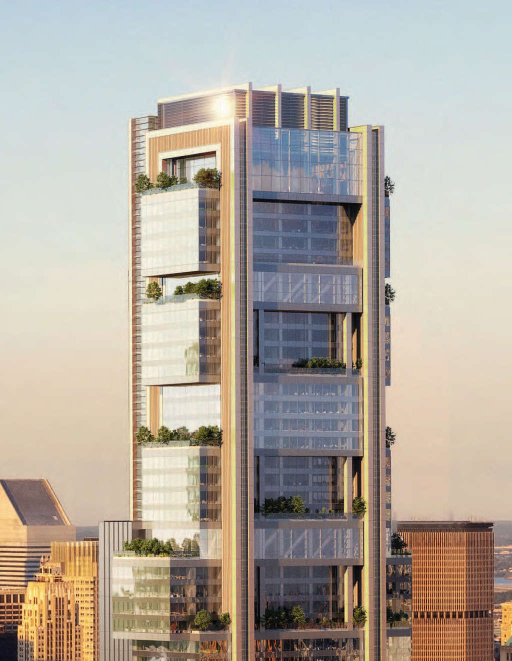
Two thin parallel vertical columns near the northern and southern ends of each elevation wrap over the top of the roof parapet, giving the impression of binding the rectangular blocks. Floor-to-ceiling glass makes up the majority of the façade, while the crown appears to be covered in metal grilles hiding extended mechanical units. A final set of outdoor terraces rests behind a tall multi-story wall of glass.
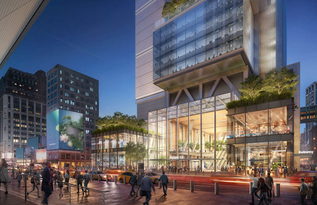
A night time street level and main lobby rendering below show the presence and scale of Penn 15.
A construction timeline and completion date for the entire Penn District have not been finalized, though activity will likely not begin until sometime later this decade, with a completion date some time in the 2030s. Going in tandem with this huge undertaking would be the relocation of Madison Square Garden to its proposed new home closer to Herald Square. If fully realized, the master plan would dramatically alter the skyline between the iconic Empire State Building to the east and both Manhattan West and Hudson Yards to the west, forming a grand corridor of some of New York’s tallest structures.
Subscribe to YIMBY’s daily e-mail
![]()
Follow YIMBYgram for real-time photo updates
Like YIMBY on Facebook
Follow YIMBY’s Twitter for the latest in YIMBYnews


Ugh. Can we just stop with the trees hundreds of feet in the air?
I am so with you on that, David! There’s no evidence at all to support the idea that the trees would even survive in that environment. Subtract the trees, and what have you got?
The treeline is around 4500 feet.
Trees are incredible air filters, and sequester carbon.
If Foster can get the planting bed and watering correct, why would you be opposed?
4500 feet doesn’t mean the same in an urban environment as it does on a mountainside. Two vastly different ecosystems. Foster is simply using trees as decoration, giant window boxes, but it is hoped that in his office there is a landscape architect who can deal with the engineering of all this. Don’t get me wrong: I love trees. The more the better. However, trees are now being used to mask weak designs.
What a waste of money! Everyone is fleeing New York and not coming back.
If you like oxygen we need as many trees as possible to replace what has been lost to destructive development.
Gregory – I agree totally. Sustainable vegetative landscaping at such heights with drastically varying wind and lighting conditions would be a nearly impossible task. Why don’t we see potted trees/plants on residential highrise balconies? Because they die. I think the architects should be required to furnish renderings without the “greenery” to get a more realistic vision of the proposed building.
When you placed it on the seat of development, I think that best friend into tower is only choice at bold lines: Thanks to New York YIMBY.
From NYT The Hunt “Mr. Wu sometimes wondered why people so rarely use their balconies. Now that he has one, he understands — despite the dramatic view. It gets windy so high up, and he feels a little queasy looking down: “I go out there, I look outside, and I come right back in.”
So true. We lived on the 24th floor of a high rise for 4 years and very rarely sat out on our balcony for more than 15 minutes. As you said, it was very windy. I think we ate out there just once! The few times we did use the balcony was because we had guests that wanted to take in our views of the Hudson River the GW.
Disgusting contemporary design that’s going to ruin the skyline. Bring Art Deco inspire.
What an ugliness well it goes fine with MSG.
They’re not actually going to call it PENN 15, right?
Horrible name. Horrible design.
Naming intervention needed ASAP
??♂️
PEN15
yuck
Atrocious! Ugliest building Norman Foster has ever designed.
PENI5… ummmmmmmmmmm
Barf.
Please start over.
Looks good, when do we start construction? Oh right, never. This is all speculation.
Also has the relocation of MSG been adopted by the State’s Empire Station plan? From my understanding that was just a concept by Vishaan Chakrabarti to effectively demolish the existing building and build a new Penn Station that looks like the existing MSG. I don’t know why you would want to do that, but then again I am not a visionary architect that puts together economically unfeasible plans.
The Garden is not moving. Vishaan’s plan is unrealistic.
This whole plan is stupid and here’s why:
1. Way too much office, this should be at least 50% resi with a massive amount affordable, say around 50%. That alone would transform this neighborhood and add a lot more resilience to its economy. Without the office workers this area has been dead.
2. the design is absolute crap. I don’t mind the hanging boxes thing, though it’s a bit played out at this point, but the worst part is that the entire back of the building, which everyone north of 34th will look at is a 1,000 ft silver wall. It’s obscene that Foster is basically putting a lot line wall on the skyline. Other building that have this design (like Foster’s on Park) at least back up against other building hiding the blank wall. The city shouldn’t allow that.
I don’t mind the height at all, hell if they put the core in the middle I’d be fine with the boxes, but as it stands this is a crap plan that will forever seal the fate of the enighborhood.
What about a new MSG. The current design is from the stone age. If moved it would free up a good chunk of Penn Station.
Sorry, not happening.
Nothing in that area should go up more than 500 – 600 feet. Preserve the iconic look of the Empire State Building. This building is literally our Grand Canyon, our Mt. Rainier.
Yes, there should be ample office space within an easy walk of Penn Station, that will make commuting attractive again, but there’s plenty of space for development without making our most iconic sight obsolete.
Second opinion: It’s ugly, too.
Interesting that the renderings do not show the ugly north side. With 425 Park Avenue Foster already showed us how ugly a back of a building can be and if I remember right there will be another ever taller Foster tower in Park Avenue wth the same ugly back. I do not like the trend of moving the core to one side of a tower. If that is really necessary, that ugly side should at least be used for panoramic glass elevators.
If the building is ‘skinny’ then moving the core to a side is more of a necessity than a trend..but I like your idea about panoramic elevators 🙂
Wow. There’s hate here that rivals what is typically reserved for Gene Kaufmann.
lol
Indeed. And it is well-deserved.
Best name ever for a super tall!
C’mon…this building is trying too hard.
Eh, I really don’t know about this one. I think it’s actually sort of nice, but I don’t know if it really works in its context/location. There’s just something about PENN 15 that really bothers me, but maybe I shouldn’t prejudge it. ?
Vornado’s original plan for 15 Penn Plaza (an elegant tower designed by Pelli Clarke Pelli) was far superior to this. And a better name too.
Anyone else see a clunky version of William Lescaze’s proposal for MoMA?
This looks like something out of a 90’s superhero movie, and I mean that in the worst way possible.
Having just gone through a protracted period of repeated ice and snow events in NYC, one of the factors that might be considered is that all the nooks, cranies and setbacks on ths building facade, unless properly designed, might serve as ideal places for ice to accumlate and eventually come crashing down on pedestrians below, as the ice melts and refreezes It’s not that uncommon for some taller NYC skyscapers to have surrounding nearby streets temporarily closed off at times, due to ice falls – sometimes with fatal consequencs. While intricate building design surfaces are often aesthetically pleasing, skyscapers with sleek and uniform facade surfaces also do have their advantages, and in fact may more easiy be made energy efficient.
Noone can afford to build this unless rents around Penn Station can suddenly command $200 for the lwoer floors.
Did anyone involved in this development go to grade school? Penn 15, really?
I’m sorry but this is ugly
More hurricane death by fallen trees nonsense, like the suicide Ingels spiral ugly building. WTF?
Revitalize? Why “revitalize”? Is it somehow an affront to humanity that the area isn’t glassy and antiseptic?
Getting better but bulky, bulky
Another super tall! So cool!
Ummm…. Penn 15?
You’re calling a giant phalic structure.. PEN15
??♂️????
Way to boxy. The tower needs to look more elegant and tapered at the top. The trees and natural light are nice features though.
The primary issue with trees on a tall building is that they can break in heavy wind and kill someone on the street.
If foliage is used to cool and insulate, then I’m fine with it. But it seems as if it is just following a trend to look “Green” by adornment. Flora on the north face won’t survive. Particularly in the lower floors. I hope they get an arborist.
Terraces where masks are mandatory. Suffocating.
Penn 15 … Get it.
All that terrace space seems like a lovely gesture. But the cost is going to be fearsome. And the notion that the terraces will be wide open to the interior is fanciful: entry to the terraces will have to be through revolving doors. Nor are there enough tenants who’ll have a big communal space that would take advantage of the terraces. Mostly, I bet there will be offices facing onto them.
In short, I don’t see the economics of this building working.
in the 60s famous architects would design building that incorporate nature, natural cooling, and heating. Now we have glass facade architect who do not understand how nature works with the cooling and heating system. The best new structure in NYC are the new street side restaurant sheds that are not designed by an architect or mechanical engineer. It is time we look at our true past to build better than build for maximum FAR. Just look at Le Corbusier’s design where he incorporated using water, light, and shading system to control the natural cooling and heating and lighting process of a building. I recently saw the High Court Chandigarh by Le Corbusier; it was amazing how he connected nature and architecture together for bring in fresh air and diffused light. It is time Foster and the developers look at these design techniques to bring fresh air and light without complex mechanical systems that can not filter Covid-19.
Ugly, please reduce to floors to unblock the view of Empire State Building
Cancel this entire skyscraper development project and renovate and upgrade the existing older buildings in this project area. With economic uncertainty, people leaving NYC for cheaper, stress free locales it is time to face harsh reality that many of these planned skyscrapers are really not needed.
I actually like the look of it, but agree with the commenters that it needs to be significantly shorter in order to not overshadow the ESB. We can’t and shouldn’t protect every sight corridor, but if there’s only one building worth keeping things low around for a few blocks, it’s the Empire State.
The bulk of the comments here are simply ridiculous. Whiny, cynical and non constructive. FYI, people are not fleeing NY.
What I hate is that these architects are throwing up buildings that are now surrounding (and blocking) the majesty of the Empire State Building. Like Philadelphia, there should be construction laws that prevent super tall skyscrapers from being built higher than 800 feet within a mile of the Empire State Building.
I can’t help feeling that Foster, or someone in his office, saw a tall filing cabinet with some drawers partially pulled out and became “inspired.” Surely we should demand better than this. Shape aside, that tall blank wall is an abomination and an insult. No wonder the renderings don’t show it.