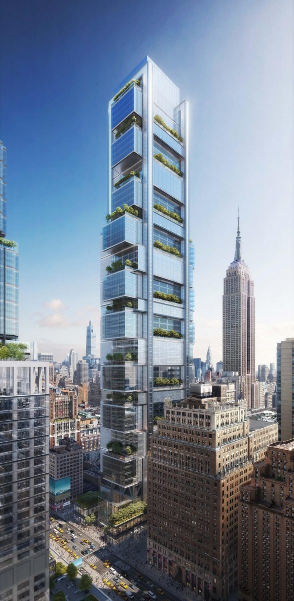
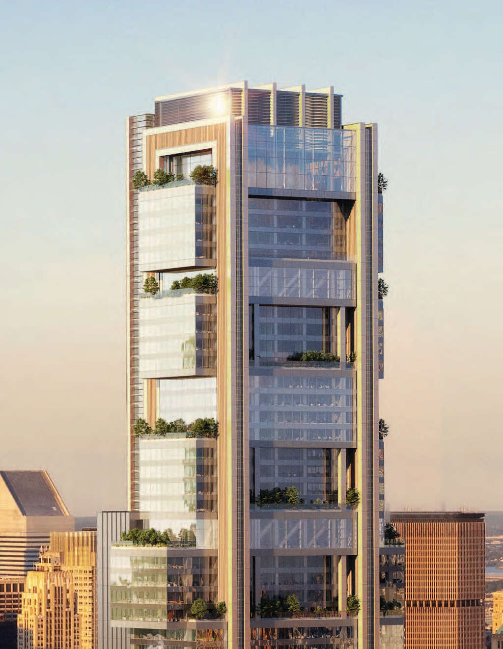
YIMBY spotted a series of new and updated interior and exterior renderings by DBOX of Penn 15, a massive 1,270-foot supertall designed by Foster + Partners at 15 Penn Plaza. The mammoth 2.8 million-square-foot, 57-story office project is being developed by Vornado Realty Trust and is part of the much larger 7.4 million-square-foot Penn District master plan in Midtown, Manhattan. The redevelopment aims to transform and revitalize the area between Sixth and Seventh Avenues and West 32nd and West 34th Streets with a total of eight new buildings. All of which would surround the 109-year-old James A. Farley Building and Skidmore Owings & Merrill‘s newly opened Moynihan Train Hall, as well as One and Two Penn Plaza and Madison Square Garden, which itself has also seen grandiose proposals to be re-imagined.
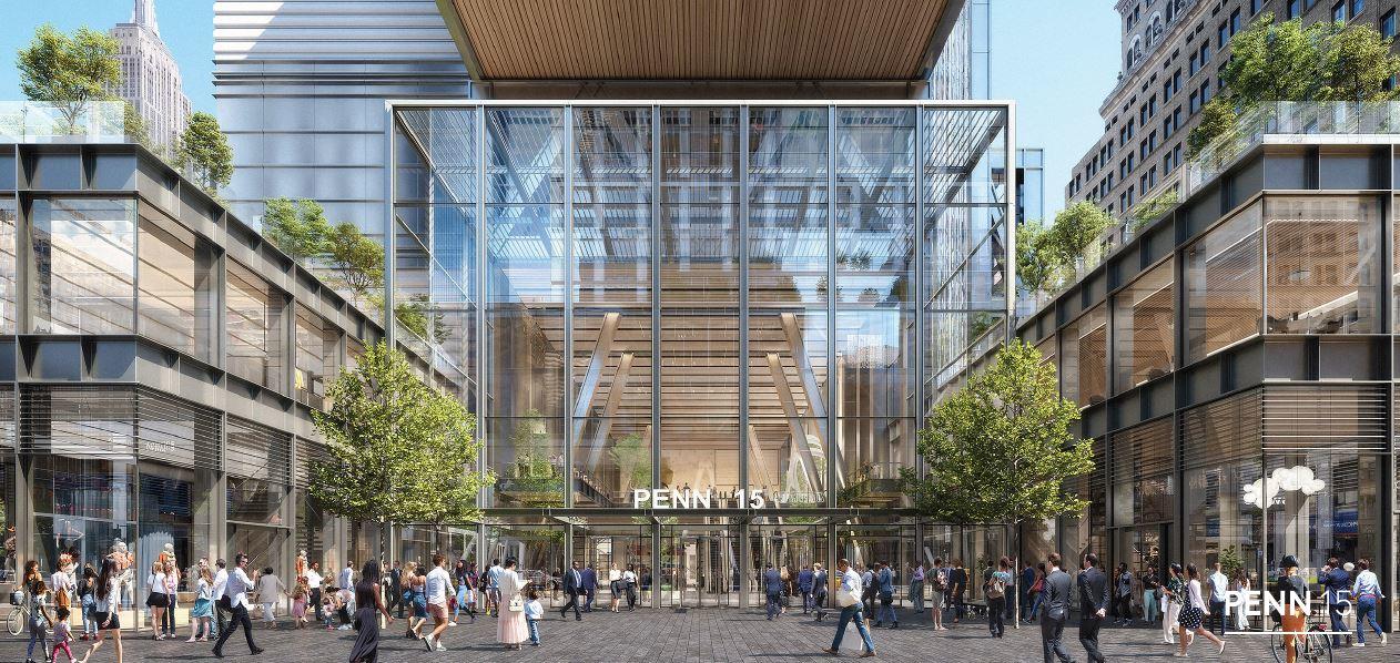
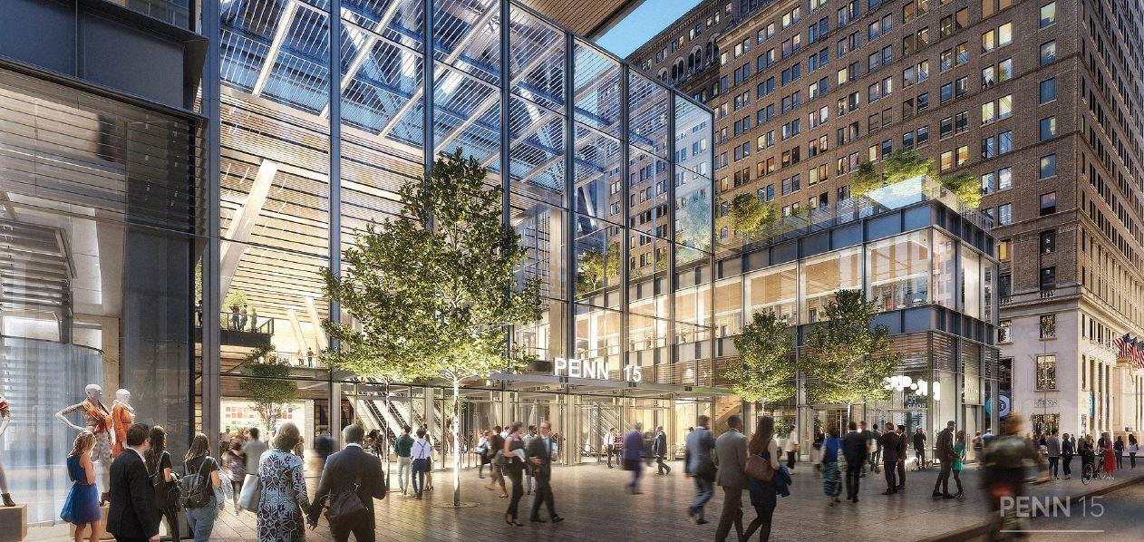
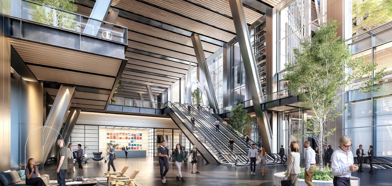
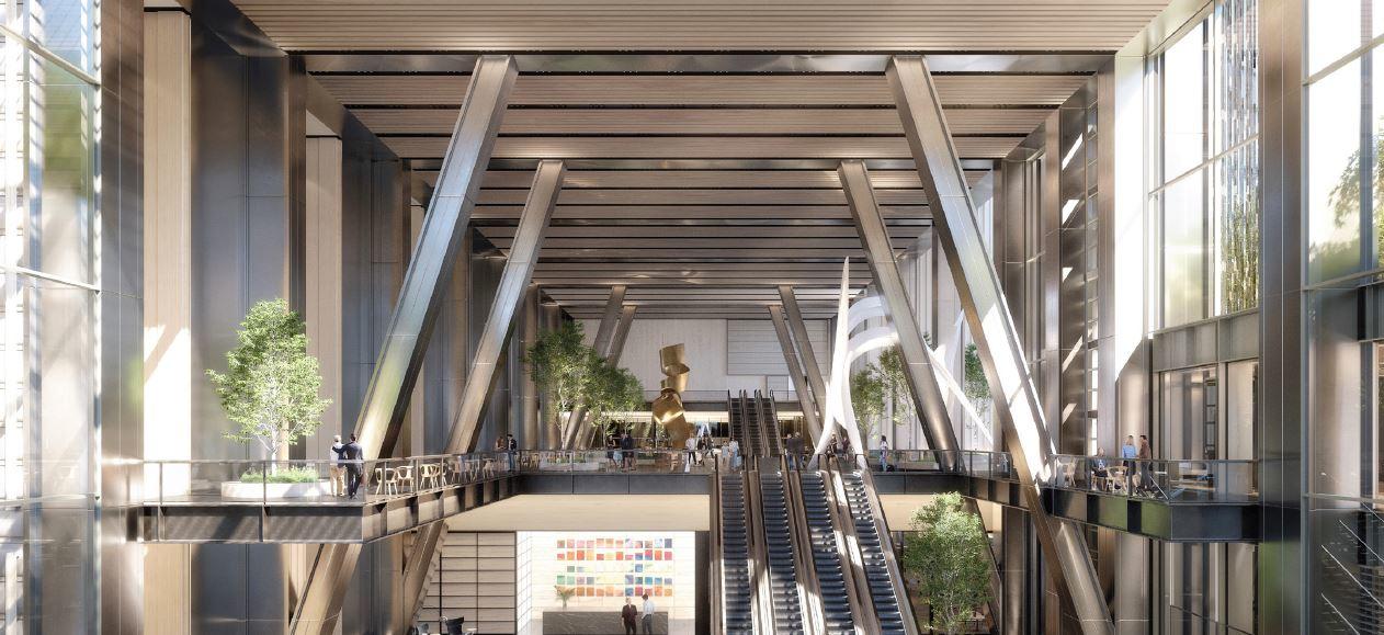
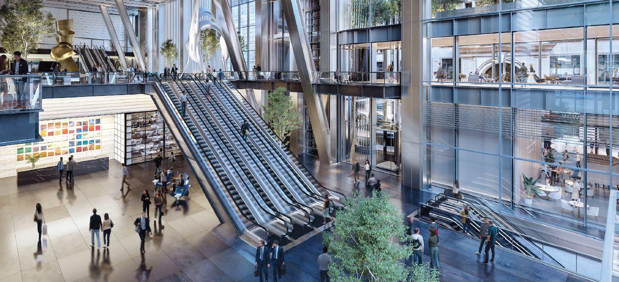
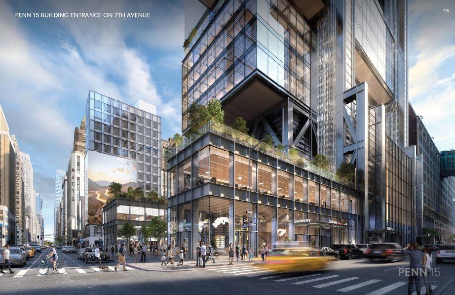
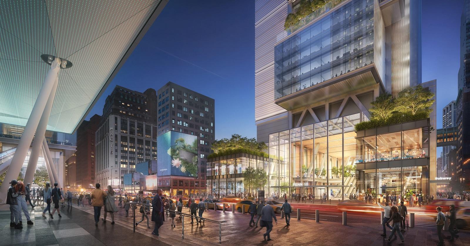
We start with looking at the lower levels of Penn 15 from across the street, on the sidewalks by the front doors, and at the soaring height of the main lobby.
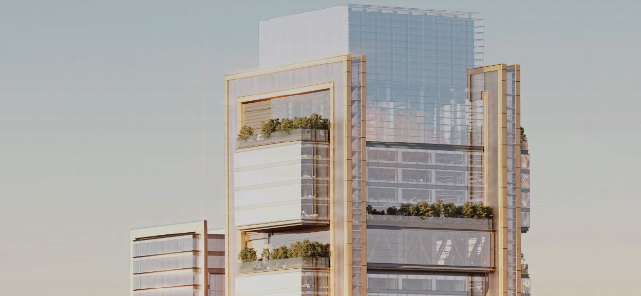
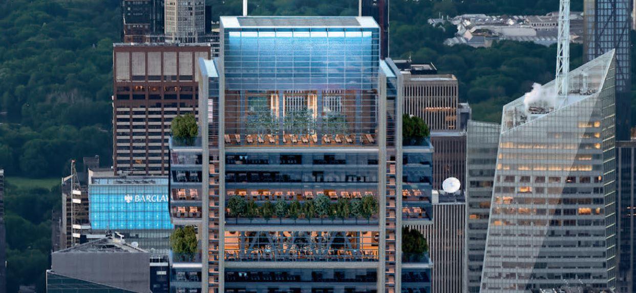
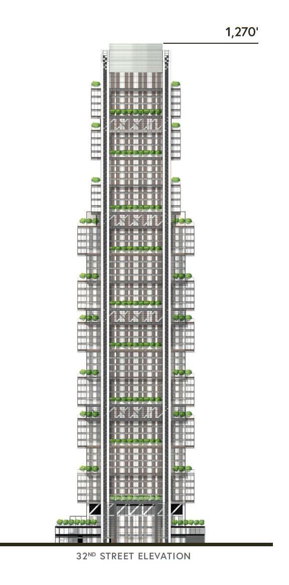
The main difference between what we saw in our last article and today is the change in the design of the crown. The new iteration shows a much taller extrusion of the final rectangular volume that continues the design motif of stacked glass boxes, as opposed to the previous version of the edifice that culminated with a short mechanical extension covered in horizontal metal grilles.
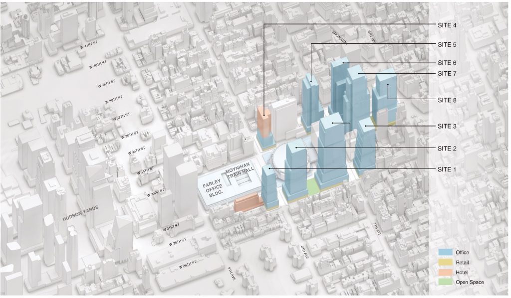
Below is an aerial diagram of the entire Penn District that’s color coded to show a mix of office, hotel, retail, outdoor public space, and much needed upgrades to transportation services.
Penn 15 will be divided into five tiers that encompass a number of office floors that would be serviced by its own set of express elevators. The highest office level will be 1,165 feet high on the 61st level of the supertall. Inside Penn 15 will be 27 landscaped outdoor terraces, 17- to 19-foot-high ceiling heights, and 90- to 100-foot lease spans.
The elevation rendering below highlights both the facade and the many sets of landscaped terraces, and the mechanical extension with its flat roof parapet that brings the architectural height to 1,270 feet tall.
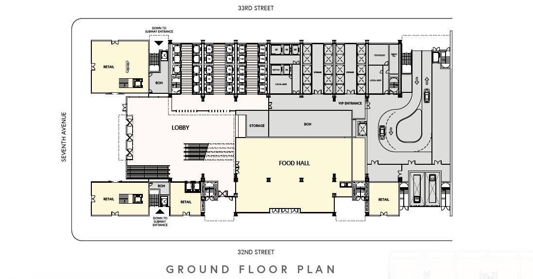
This ground floor plan shows the main lobby facing Seventh Avenue, the egress and elevator cores largely positioned along West 33rd Street, a food hall almost the size of the lobby and three retail spaces along West 32nd Street. On the northeastern corner is a vehicular entrance.
As of now there is still no official construction timeline and completion date for the entire Penn District. However YIMBY predicts that activity will likely not begin until sometime later this decade and fully come to fruition sometime in the 2030’s.
Subscribe to YIMBY’s daily e-mail
Follow YIMBYgram for real-time photo updates
Like YIMBY on Facebook
Follow YIMBY’s Twitter for the latest in YIMBYnews






How to make an ungainly, oversized, boring tower look better? Add trees. But how will these trees look during the winter, or when they inevitably die early?
Destroying a historic hotel for yet another huge office building in a city with a huge glut of new office space is just wrong.
The top rendering with the beautiful adjacent Empire State Building says it all. Stop this madness.
I couldn’t agree more. It seems like everything these days has to be accounted towards the environment, yet nobody ever realizes that it’s unrealistic and it probably won’t work. They also don’t know how to make it look good.
The demolition of the Hotel Pennsylvania also disgusts me.
Hopefully with Cuomo gone this project will be stopped along with the rest of the 7 buildings.
I agree stop the madness and don’t demolish the Pennsylvania hotel !
we don’t need any more office space in NYC
Without the trees that will die it’s just another ugly out of context glass box
It’s a cool design in itself, but I just don’t think it looks good in the context of Midtown Manhattan. ?
I get your all renderings excited and then leave me satisfied, don’t ask me why. It always seems new beautiful structure is showing, design not damn sure do: Thanks to Michael Young.
Huh? Huh? Is this poetry from another planet?
A recent commenter suggested this is a bot, although one would think it could have been programmed more successfully.
I think it’s someone from another planet using google translate
Hahahaha
Sucks
Words can’t describe it…
I guess that lawsuit by the Empire State Building was resolved?
I’ll not soon forgive the ESB and its surrogates for the truncation of 53W53.
I love it!
Name really looks like Pennis
Just awful. Trees don’t help. Midtown will look like Dubai. No history and no context.
Terrible ugly and demolishing Penn Hotel makes it worst also to revitalize the area with office building is a joke its become a deserted place after 5pm {Hudson yard hello)
I like the height, and the underlying design is compelling enough, but the twin vertical elements are a cluttery distraction.
Worst design ever by Lord Foster. And he’s one of my favorite architects.
I hate every single one of his buildings with a side core. It practically guarantees that one side of the building will look like utter garbage no matter how they try to dress it up. And of course they don’t show you that side in the renderings. Absolutely awful.
The dead trees of winter blowing from the upper levels hitting pedestrians on the street and breaking car windows…..do we need all of those terraces…..how much use time if people are really working? The scale of this vision is too wrong to be acceptable.
Beware the bait & switch
Folks, for the thousandth time, a 60 story office tower next to the busiest train station in the Western Hemisphere is not “oversized.” We need more jobs next to transit, and regardless what you think of the design aesthetics, this building is not too big…
Awful, just awful!
Is this actually going to be built or is this just proposed?
Strange that no rendering show the northern side with the core. That might be another Foster Tower that looks good on the front side and very ugly on the back. The other ones are 425 Park Avenue and 350 Park Avnenue, which has not started construction yet.
I’m all for increased development, but this is hideous…
BUT WHAT DOES THE BACK LOOK LIKE! Imagine a 1200 Ft tall metal wall? That is what it will look like.
I’ve said this before, we need projects like this, but this project has it wrong. Way too much office for one thing. Yes Office by transit hubs is a good thing, but this is a generational opportunity to make midtown a true 24/7 community and a far more resilient one. make 50% of the project resi and 75% of that affordable. Put social services there, put schools there, and neighborhood retail. It can be what Hudson Yards should have been.
The Hotel Pennsylvania is an outdated facility that gets terrible reviews in travel forums. The rooms tend to small as is typical of its era. The glorious McKim, Mead & White Roman atrium lobby was lost years ago when the skylight was replaced with an additional floor. People joke the whole area will be overrun with vermin when demolition begins.
Looks great though it’s hard to take seriously with a name like that.
Side cores should be outlawed. Absolutely hideous. And GTFO with trees in the renderings, as if one new building in the city actually had a living tree on it. It’s complete BS.
Yeah, I’m all for the development but design is an eyesore. Like giant balconies, and whoever thought balconies looked good? No one.
Very disappointing. I stil think it looks like a file cabinet decorated with sprigs of broccoli.
Those trees are a shameless feint of cosmetic trickery or to put it more bluntly, lipstick on a pig.
The Hotel Pennsylvania is outdated, because OWNER wants it to be to allow it to be destroyed. This has been done on purpose to say it is not historic or worthy of saving. The entire development is only for Developers to gain saying the area is blighted.
This is more of lets add trees and it will be great design. The trees do not work, I have been going to these projects all over the world and telling them why they are dying. Guess what they all become fake trees.
When is the city going to make this stop, agree it is a file cabinet open drawers with overgrown weeds growing out of them. Stop the madness, with the no character glass buildings
Looks like a tall file cabinet with the drawers open. These glass boxes are replacing the city’s soul.
Much prefer the classic Pennsylvania Hotel which was where I spent my first night after my arrival at wonderful train station across the street, which is now occupied by the horrendous Madison Square Garden. At least they saved the Post Office was renovated into a new train station, which is what should have been done to the original Penn Station. Stop tearing down the iconic classic buildings worth saving to preserve the city’s character.