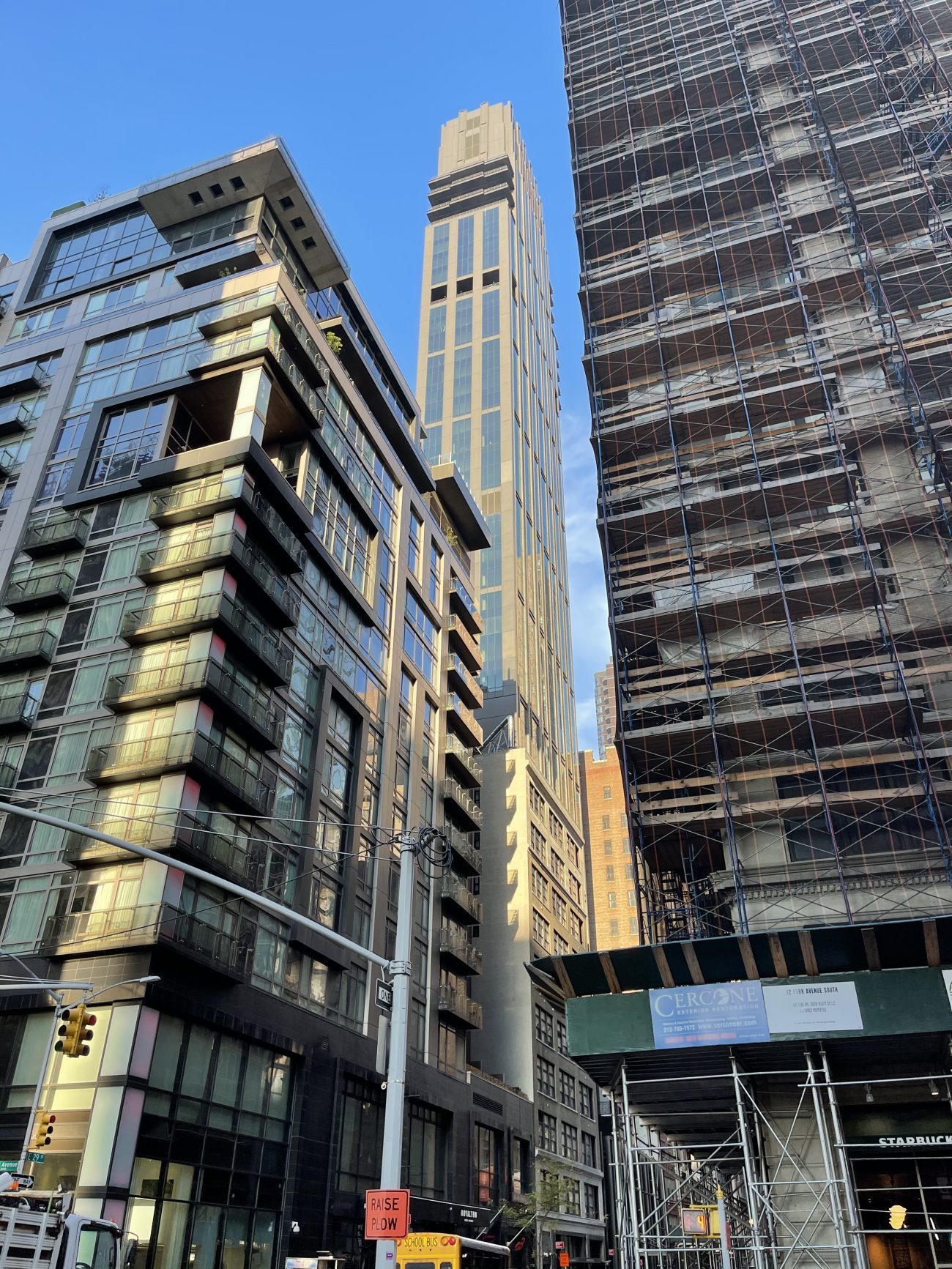
Exterior work is finishing up on Rose Hill, a 45-story residential skyscraper at 30 East 29th Street in Midtown‘s NoMad district. Designed by CetraRuddy Architecture and developed by Rockefeller Group, the 639-foot-tall Art Deco-inspired structure yields 123 condominiums marketed by CORE Real Estate. The one- to four-bedroom homes range in price from $1.385 million to $19.5 million for an upper penthouse. The property is located between Madison Avenue and Park Avenue South, and stands on the site of the 130-acre Rose Hill Farm estate that once occupied this section on the island.
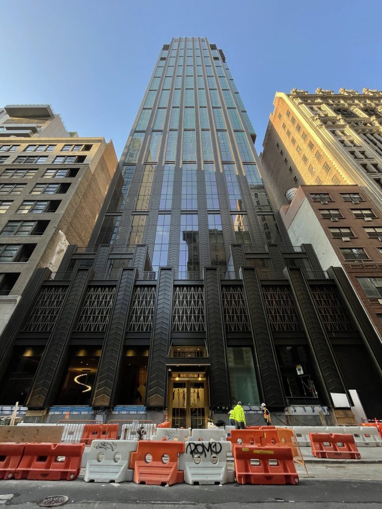
Since our last update in June, the last remaining bronze and glass façade panels have been installed on the upper levels of the southern elevation and the sidewalk scaffolding has been dismantled, giving passersby a better view of the signature chevron motif that lines the exterior. Only a few more panels await installation just above the sidewalk.
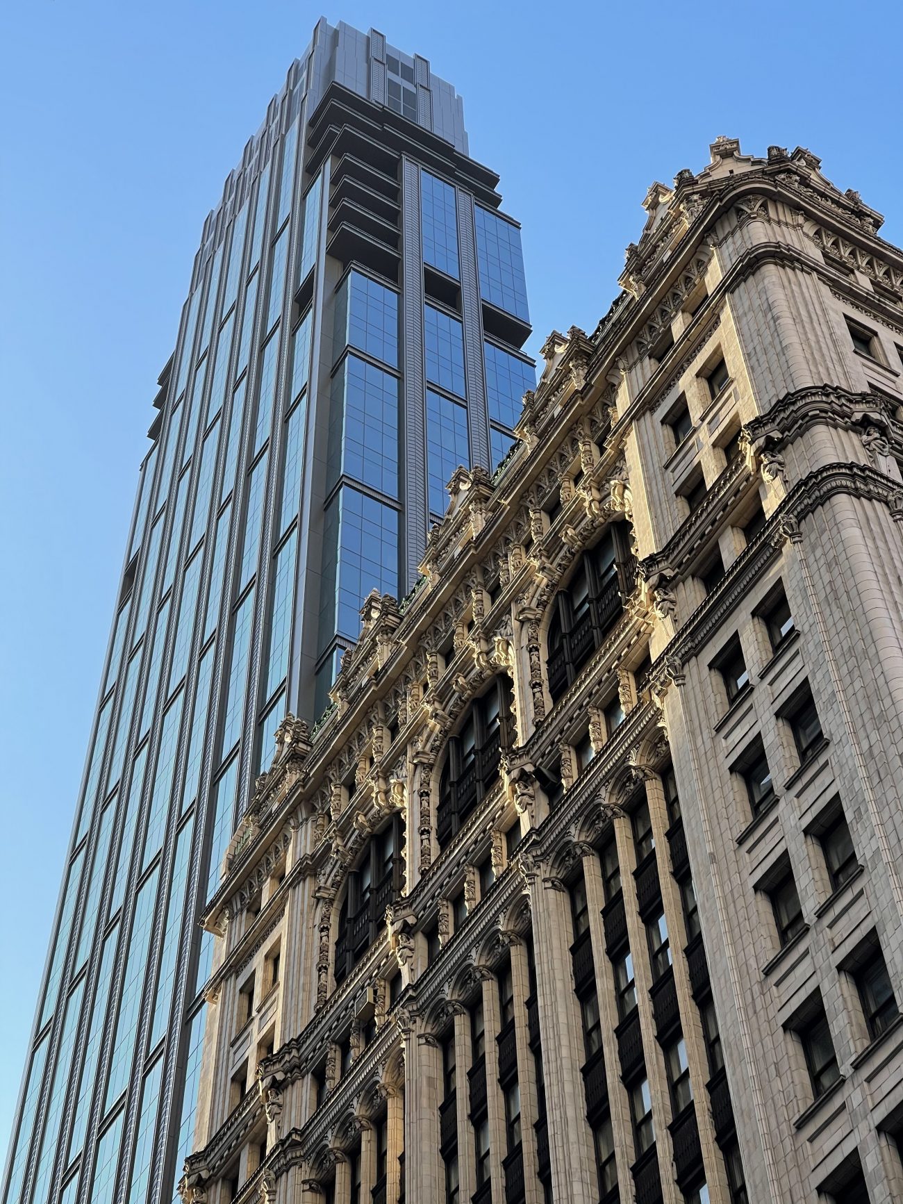
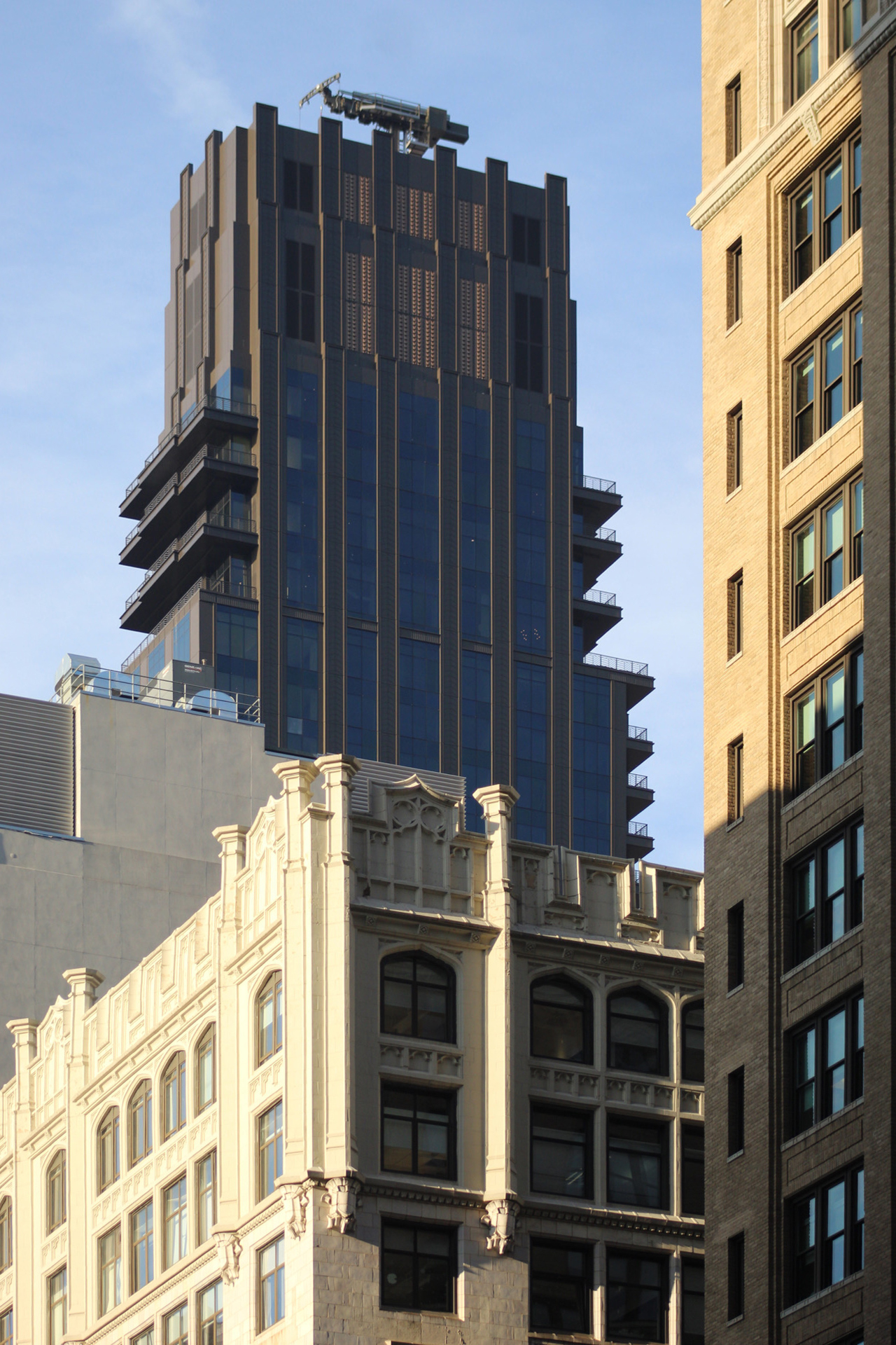
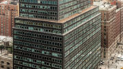
The following photos show the details in the Art Deco motifs, which include the aforementioned chevron pattern, decorative railings on the first setback, and zigzag-patterned grilles over the lower floors. From here are several smaller setbacks flanking the eastern and western corners before the residential floor plates rise uniformly to the crown.
The tower features an elongated rectangular grid of floor-to-ceiling glass and the same bronze panels that cover the perimeter columns and concrete walls. These long lines enhance Rose Hill’s sense of verticality, which is furthered by its multifaceted crown.
There are already a number of model residences built inside Rose Hill that give perspective buyers a look at its interior finishes. Elements include rusticated hardwood floors and bronze-finished hardware throughout, kitchens with custom Italian-made matte charcoal cabinetry with metal-framed glass upper cabinets and Calacatta Razzi honed marble countertops, and master bathrooms lined with Greek Dolomite honed stone walls with Breccia Capraia accent shower walls, dark marble radiant heated floors, custom walnut and bronze vanities with marble countertops, and aged brass fixtures. These are the following model residences built inside Rose Hill: model residence 20A, a two-bedroom two-bathroom home furnished by CetraRuddy; 11A, a two-bedroom, two-bathroom layout; and 20C, a one-bedroom, one-bathroom unit. 11A and 20C were furnished and staged by IMG.
The private outdoor landscaped courtyard in the rear of the property is being worked on, as are a final handful of units. Residential amenities include a double-height lobby with a black marble fireplace, hand-rubbed walnut paneling and hand-crafted metalwork; a lounge; a 50-foot-long indoor swimming pool surrounded by hand-crafted green oxide-glazed tiled walls; a gymnasium curated by Fhitting Room; a squash court designed by SquashRx; changing rooms; a sauna; and a private observatory room equipped with a billiards table, a library, a fireplace, a dining room and bar, and two covered outdoor lounges. Other amenities include a studio guest suite available for reservation for visiting friends and family, bicycle storage, a package and mail room with cold storage, washer and dryers, residential storage available for purchase, and a pet salon with a grooming tub and table.
The final interior work on the remaining residences should soon wrap up.
Subscribe to YIMBY’s daily e-mail
Follow YIMBYgram for real-time photo updates
Like YIMBY on Facebook
Follow YIMBY’s Twitter for the latest in YIMBYnews







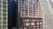

Hate these buildings that ignore and breakup the street wall, and expose tattered sidewalls that weren’t ever meant to be seen. Buildings don’t exist in a void. They are part of an interwoven tapestry of the city’s streets. A little design refinement of 30 East 29th Street could have integrated the lower facade with the neighboring buildings, but the architect couldn’t be bothered. This building is so disrespectful to the street and the neighborhood. Such arrogance!
Completely agree. The balconies on the one side also ruin the symmetry of the building.
What can be said about the tragically flawed DOB setback rule that hasn’t already been said? Nobody at city hall appears to be listening.
Remarkably, after years of abuse by developers such as S Chang & architects such as G Kaufman, there is a zoning txt amendment in place mandating ‘presevation’ of the street wall in new development in the west 30s (possible only west of 8th). Unfortunately, DOB could not see its way around this when the community, elected officials and Sam Change agreed to persevere an existing facade of a centuries old church that ‘set-back’ above the nave that ran parallel to the street plan. DOB insisted Chang demolish the existing 2/3rd story (that formerly housed the 2 story stain glass window) and bring the upper-floors flush with the street plane). Whats left is on of the more odd collaborations of Kaufman & Chang. At least 75′ of street level is the original building.
Stunning.
Giving passerby a better view of the signature chevron motif, that lines the exterior. Thanks to Michael Young for your beautiful photos, I will visit new project next time.
It’s a mess…
Setback… check
Cantilever… check
Overdone crown… check
No relationship to neighboring buildings… check
Missed opportunity… CHECKMATE!
But most will say “oh how beautiful!”
For all those who condemn Gene Kaufman for his little base, setback tower….this building is rather similar. If you squint, the lines are really acceptable….but the glass on inspection is rather flat in appearance, and lends a cheapness to the facade. Do we only judge a building by it’s cover? I still don’t understand why buyers don’t revolt at $2.5m apartments without a coat closet, or a linen closet – place to set a vacuum cleaner, bedrooms without either a closet or space for a dresser. So, for Thomas, who says “stunning”….I ask, really????? Maybe the developer or the sales associates can reply as to how the residents keep their stunning apartments clean?!
the only positive is its not a glass box
Unlike with the rendering, the tower’s multi-floor glass rectangles are not recessed enough by the surrounding frames. They end up looking like they are just pasted onto a glass box. The sadly too-short base has substantial recessed windows which add depth and texture, but not for the tower above. CetraRuddy usually does better work, but this one just fell short.
Good looking other than the too small base
I’m actually going to post a comment in favor of this building. There is quite a bit of detail on this building that we don’t often see in many of the bland boxes that go up. I’m sure it was expensive and it will be worth it. What I suspect really irritates people is that the differences in the building from its neighbors would not be that significant if the street wall had not been broken. I think most of us agree that is urban planning 101. If the base had connectivity to the adjacent buildings then this structure would be a neighbor rather than something jutting out from the streetscape. I suspect, though I cannot confirm, that this may not be the developers doing but city regs instead. Some combination of air right rules and zoning forced the building back from the zero lot line. I’ve seen this elsewhere and I think it’s a mistake (BTW – if I have this assessment wrong someone feel free to correct me
It’s the city’s fault. It’s the DOB “sky-plane” equation rule BUT it results in setbacks with ridiculous bases like this because both developer and architect take the compliance path of least resistance and don’t bother trying to avoid the broken streetwall which is possible through building programming
Both the city and the builders just don’t seem to care that they are wrecking block after block of graceful Manhattan built form. It’s all about the money. The rot starts at the top with the DOB. This shortsighted code has got to be reigned in before its unintended consequences foul up every block in the borough.
Thanks NFA
My friends bought in this building and I did their interior design. The public spaces inside are stunning.