Exterior work is continuing to progress on The Richard Gilder Center for Science, Education, and Innovation, a 203,000-square-foot addition to the American Museum of Natural History at 415 Columbus Avenue on Manhattan’s Upper West Side. Designed by Jeanne Gang of Studio Gang with Davis Brody Bond as the executive architect, Buro Happold as the MEP/FP/ facade consultant, Pentagram designing signage, Arup as the structural engineer, acoustical and audio visual consultants, Tamschick Media + Space with Boris Micka Associates doing the theater design, Renfro Design Group in charge of lighting, and Tishman Construction Company of New York as the general contractor, the amorphous reinforced concrete superstructure is being built by the intersection of Columbus Avenue and West 79th Street. The project is projected to cost around $383 million and the museum is aiming for LEED Gold certification.
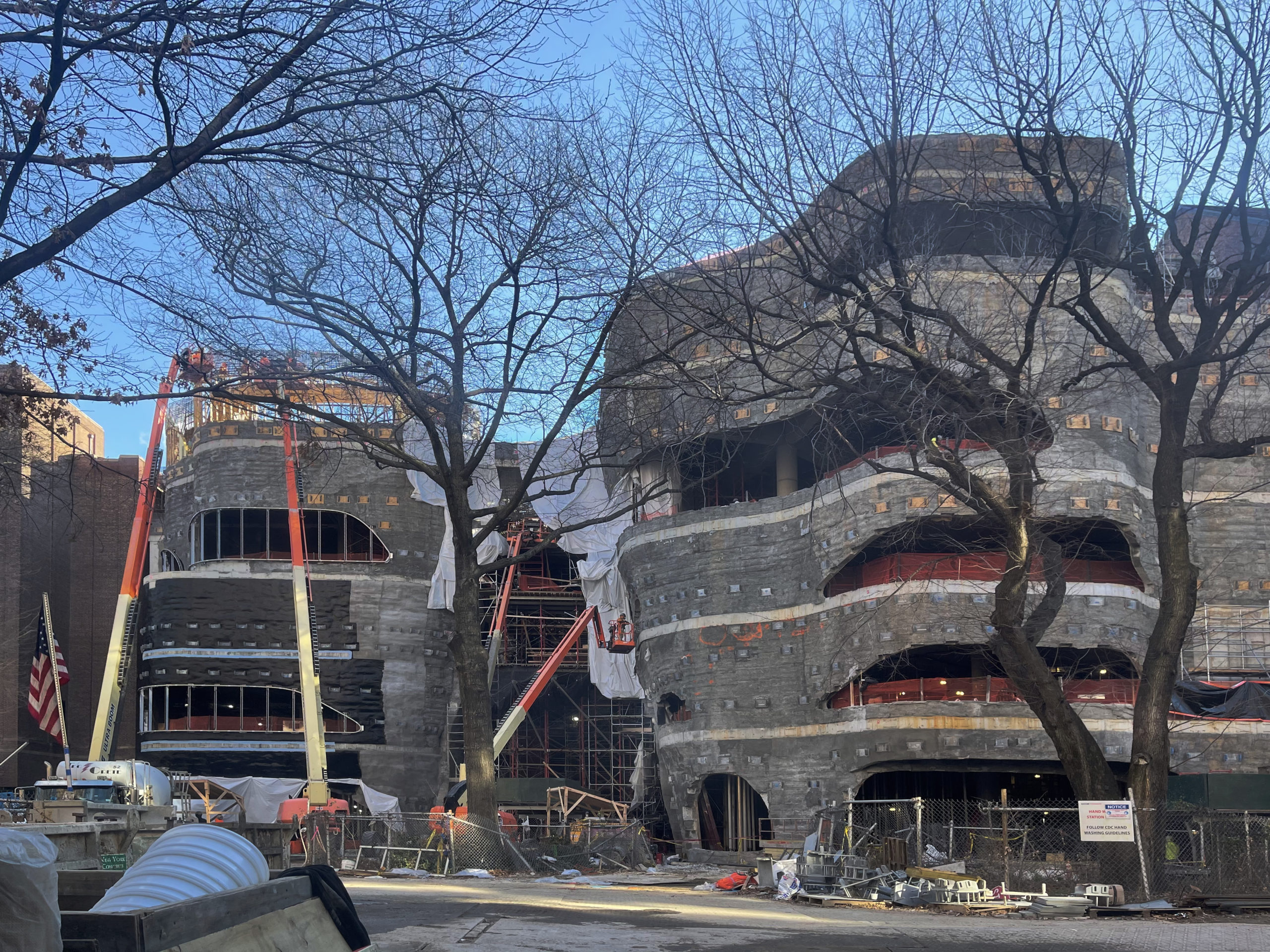
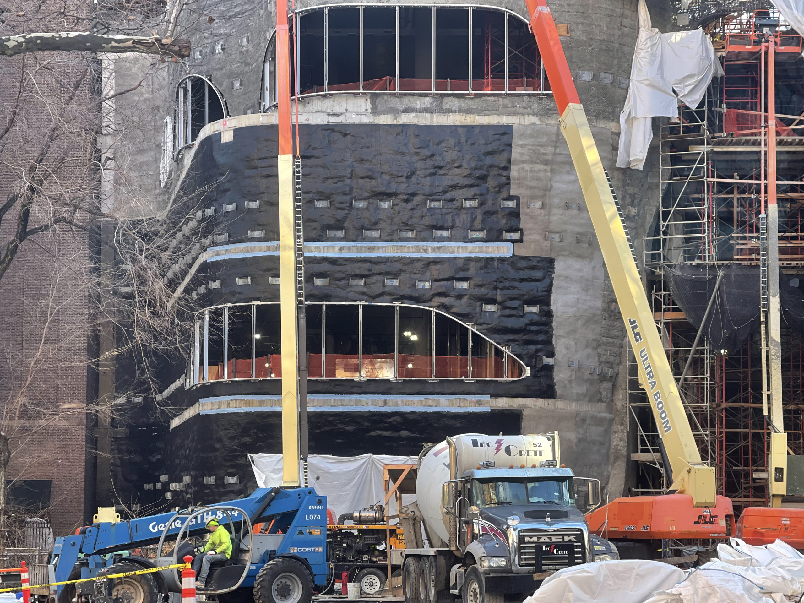
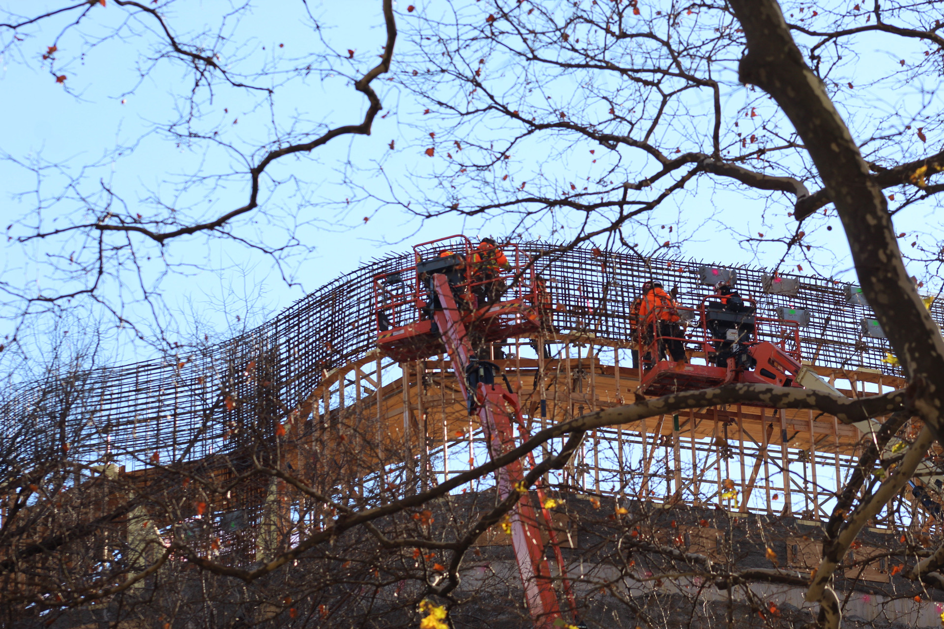
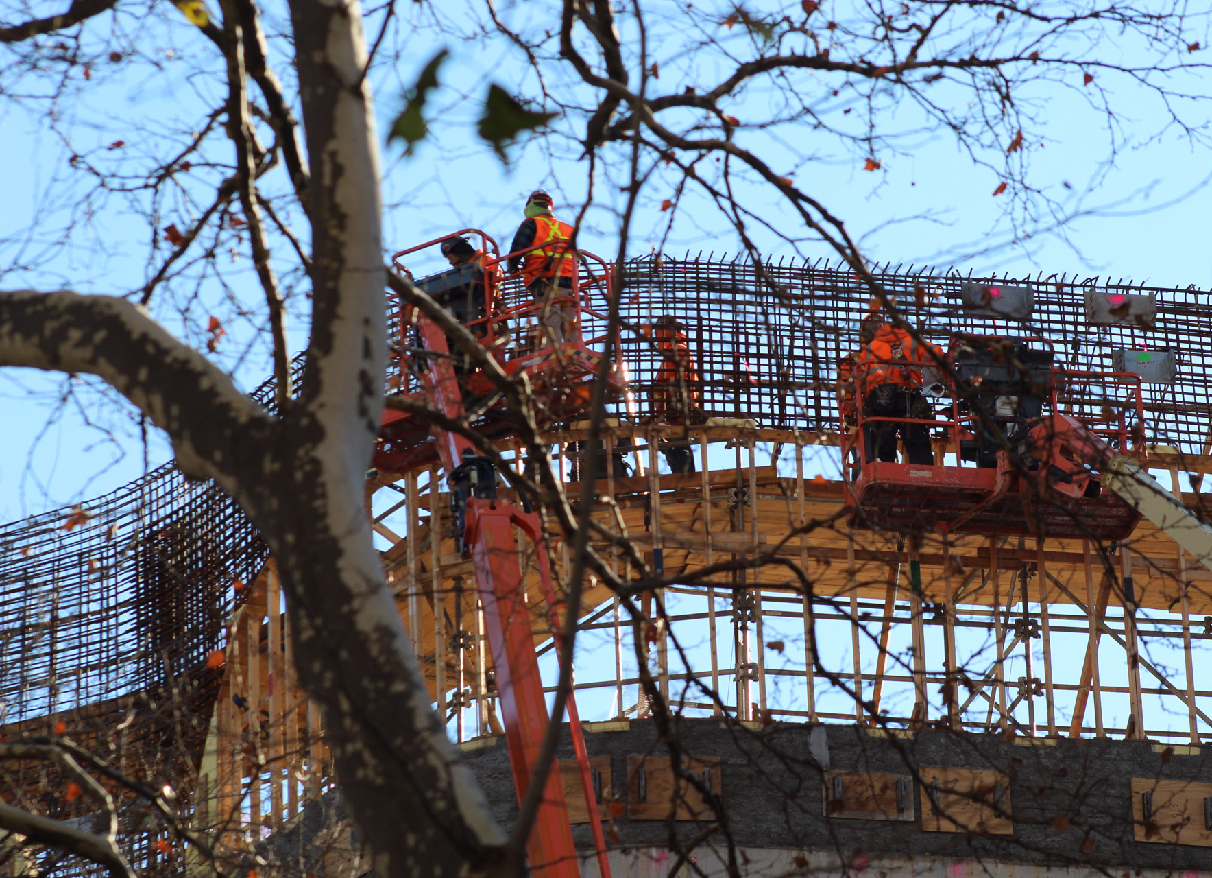
At the time of our last update in September, the addition had recently topped out and much of the interior remained exposed between the floor plates. Since then, most of the walls have been formed in preparation for the strong back system’s installation, which are going to be made with a lightweight, prefabricated stone veneer made of UHPC panels, backed with ultra-high performance concrete, from German manufacturer Hoffman.
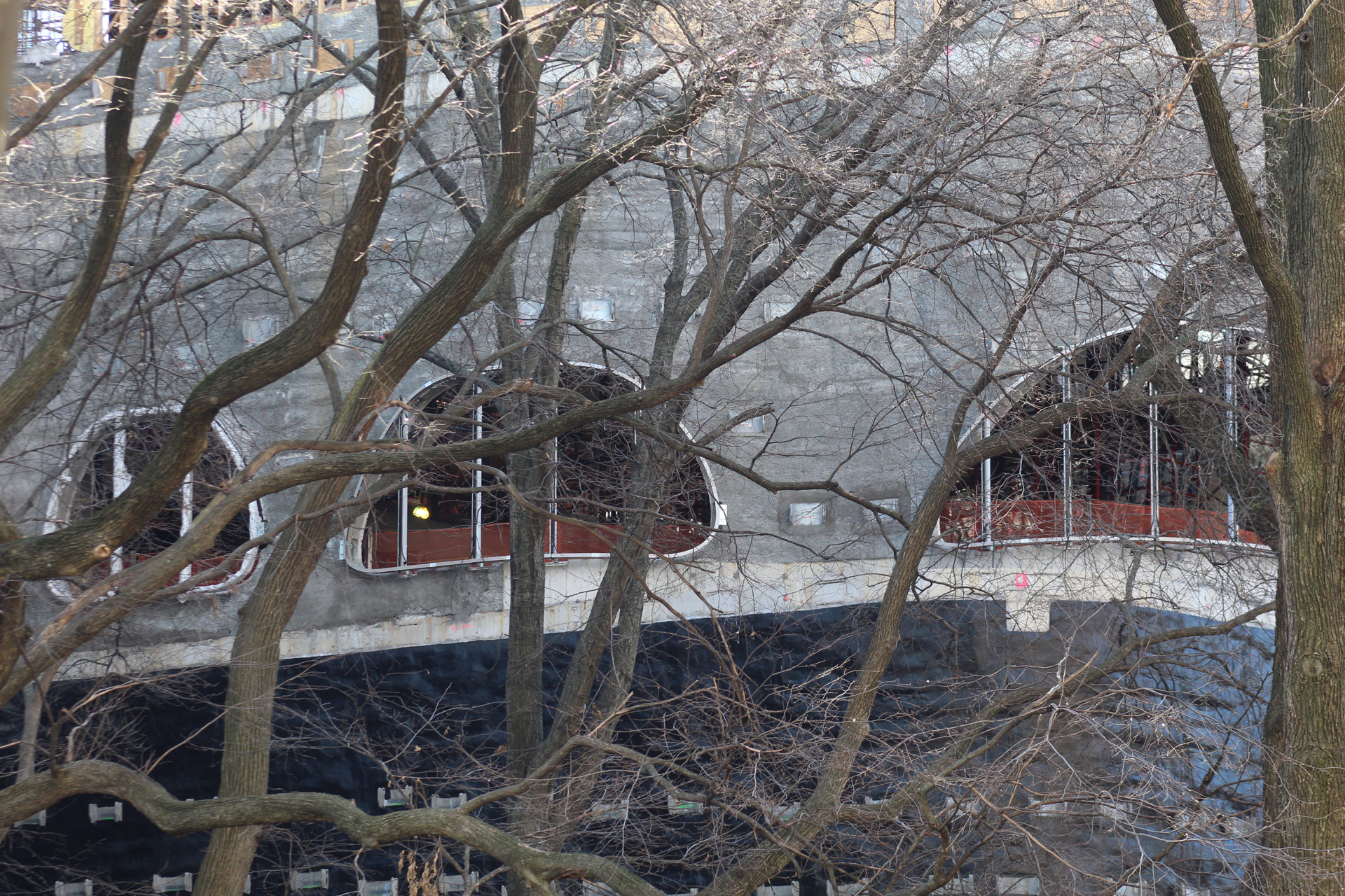
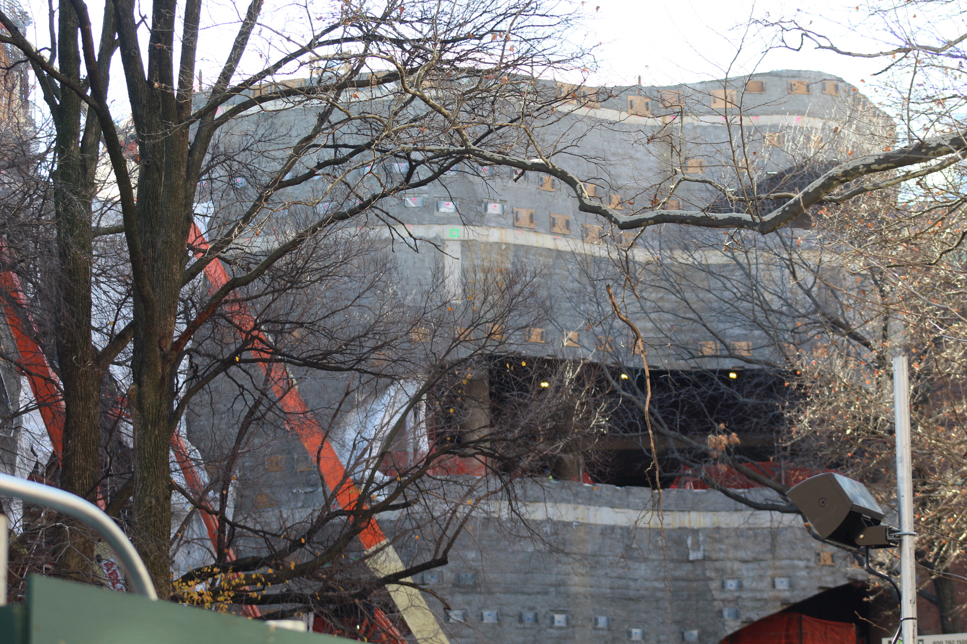
The larger southern half of the museum expansion topped out first, while the roof parapet of the northern counterpart is not too far behind and is waiting for its tied steel rebar to be covered in imminent concrete pours. Some of the organic-shaped trapezoidal windows have their mullions and frames in place up against the sloping walls of the edifice, while the central atrium, which will have the largest surface of glass, is still largely populated with metal scaffolding and white plastic tarps. The array of rectangular metal plates will eventually hold up the light gray paneling system, as depicted in renderings.
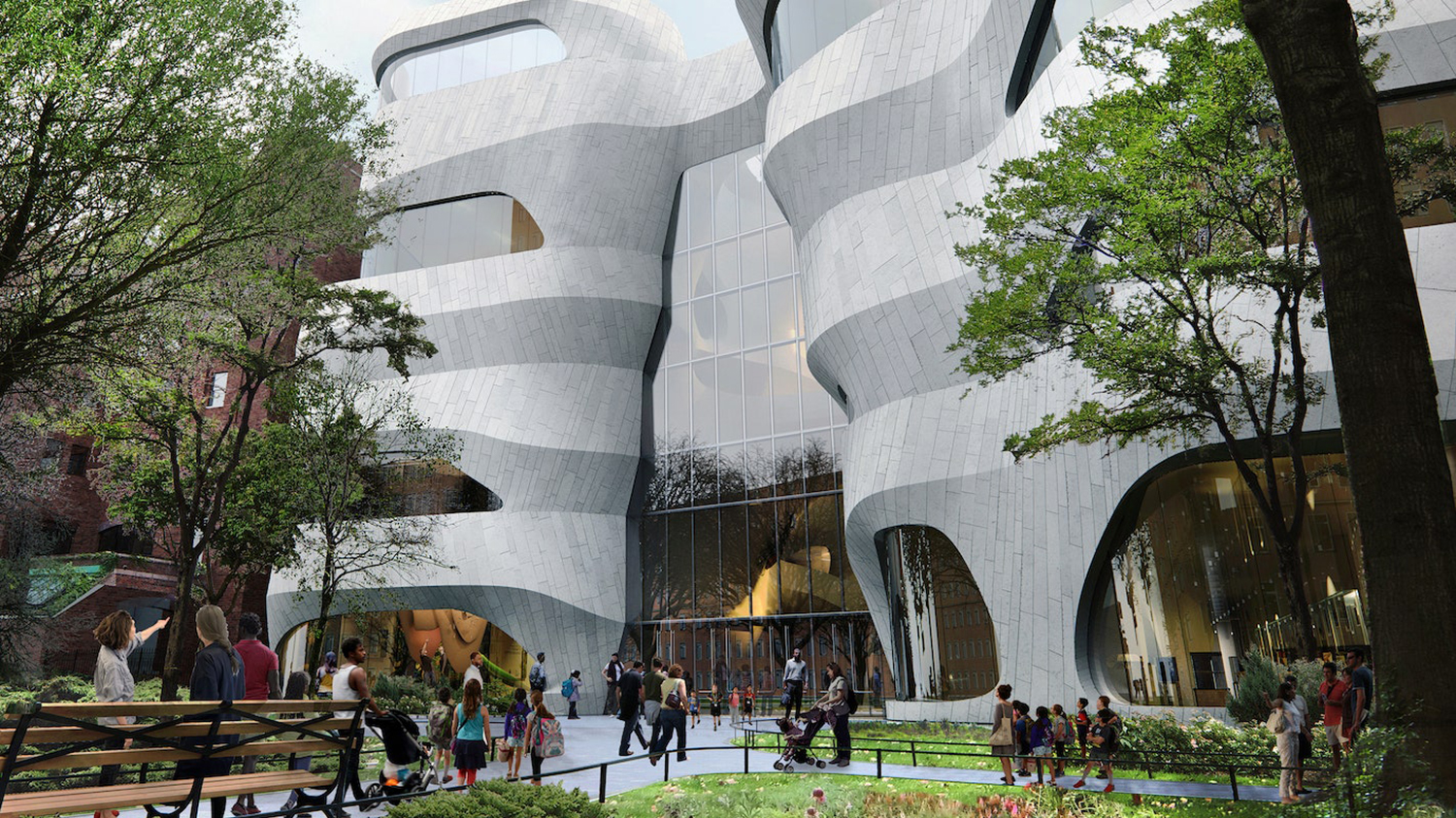
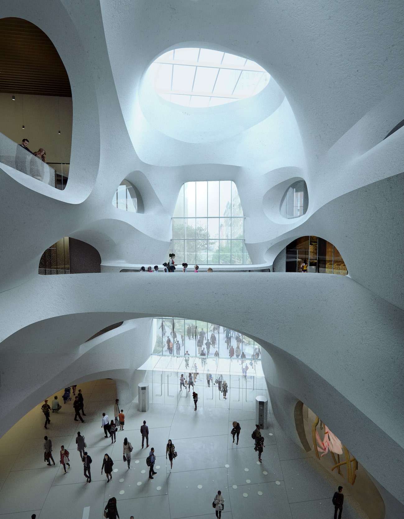
Renderings below show the final appearance of the addition. The educational center will feature new exhibition space for galleries designed by Ralph Appelbaum Associates, a tall central atrium framed by round skylights, a glass-enclosed “Collections Core” showcasing four million specimens, classrooms, an insectarium, and a living butterfly exhibit called the “Butterfly Vivarium.” The outside will include a revamped landscape design and overhaul of Theodore Roosevelt Park by Reed Hilderbrand, who plans to expand the entrance to the public park from Columbus Avenue to achieve more efficient indoor-outdoor pedestrian circulation. Additional outdoor seating and newly planted trees are also part of the landscaping overhaul.
The Richard Gilder Center for Science, Education, and Innovation is slated for completion sometime this year, as noted on the construction board. YIMBY expects this to occur around the end of next year.
Subscribe to YIMBY’s daily e-mail
Follow YIMBYgram for real-time photo updates
Like YIMBY on Facebook
Follow YIMBY’s Twitter for the latest in YIMBYnews







As soon as I get the chance, to take a look your photos. Sure why they’d constructed to show its structure, with the lights not overly bright on exterior; I was taken on crews by how work of a place: Thanks to Michael Young.
The interior will be beautiful. The exterior is a bit too literal, but they are trying to inspire kids away from their phone screen.
The Blue Whale
I can’t wait. It is absolutely my favorite place in New York City.
Removing any sense of sophistication from the architecture of museums doesn’t teach kids to respect and learn. This architecture is already outdated.
There are many many other architects and architectural firms who, to my way of thinking, could have done a much better job designing this science center. Unfortunately the donor and the museum chose an architect who has a somewhat peculiar idea about what a science center for kids is all about. The building’s exterior and interior has without question a somewhat comic book character about it with a heavy dose of sci-fi stage design. Thinking back’ the TWA terminal at JFK airport by Eero Sarinen managed to pull it off this ‘type’ of achitectural pastiche much better than this cartoon of a design. The reality is kids will enjoy this science center and bring them to the museum for is kind of experience but for how long? The center might get ‘old’ very quickly but time will tell.