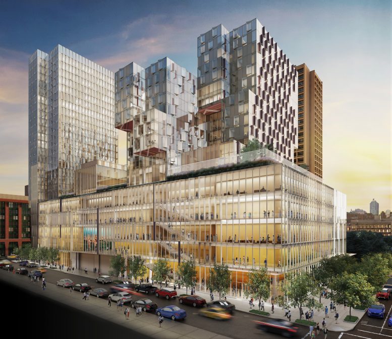
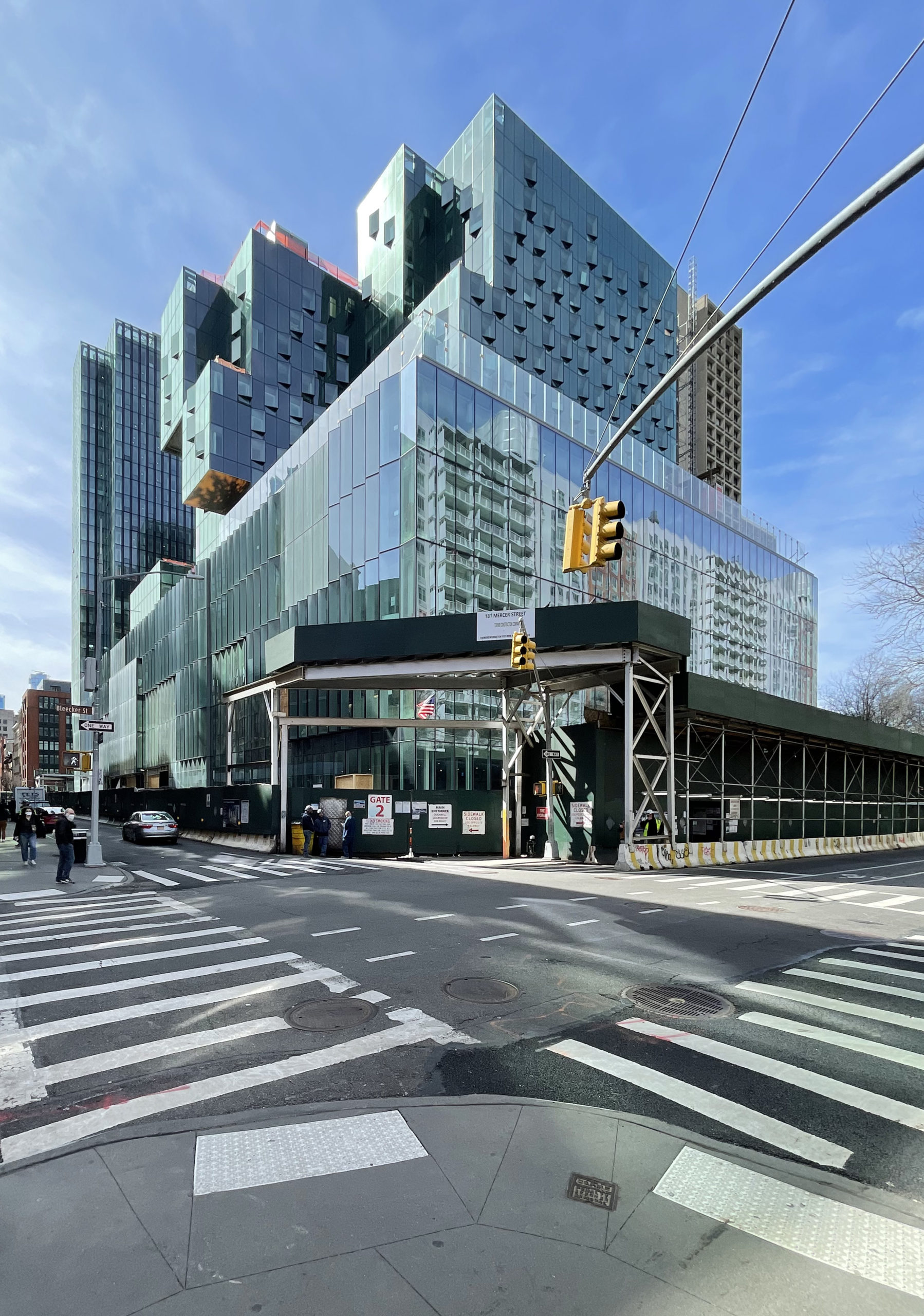
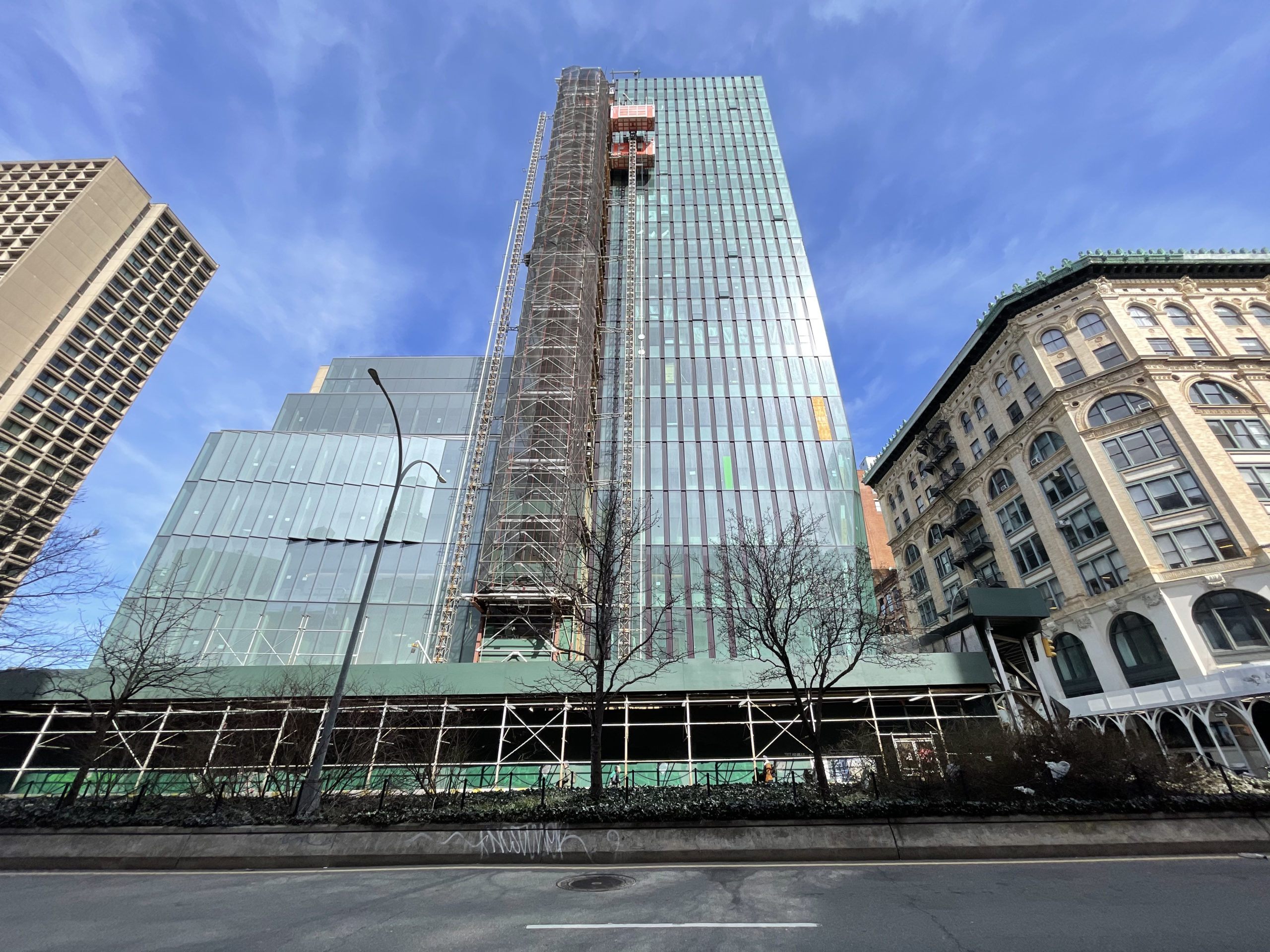
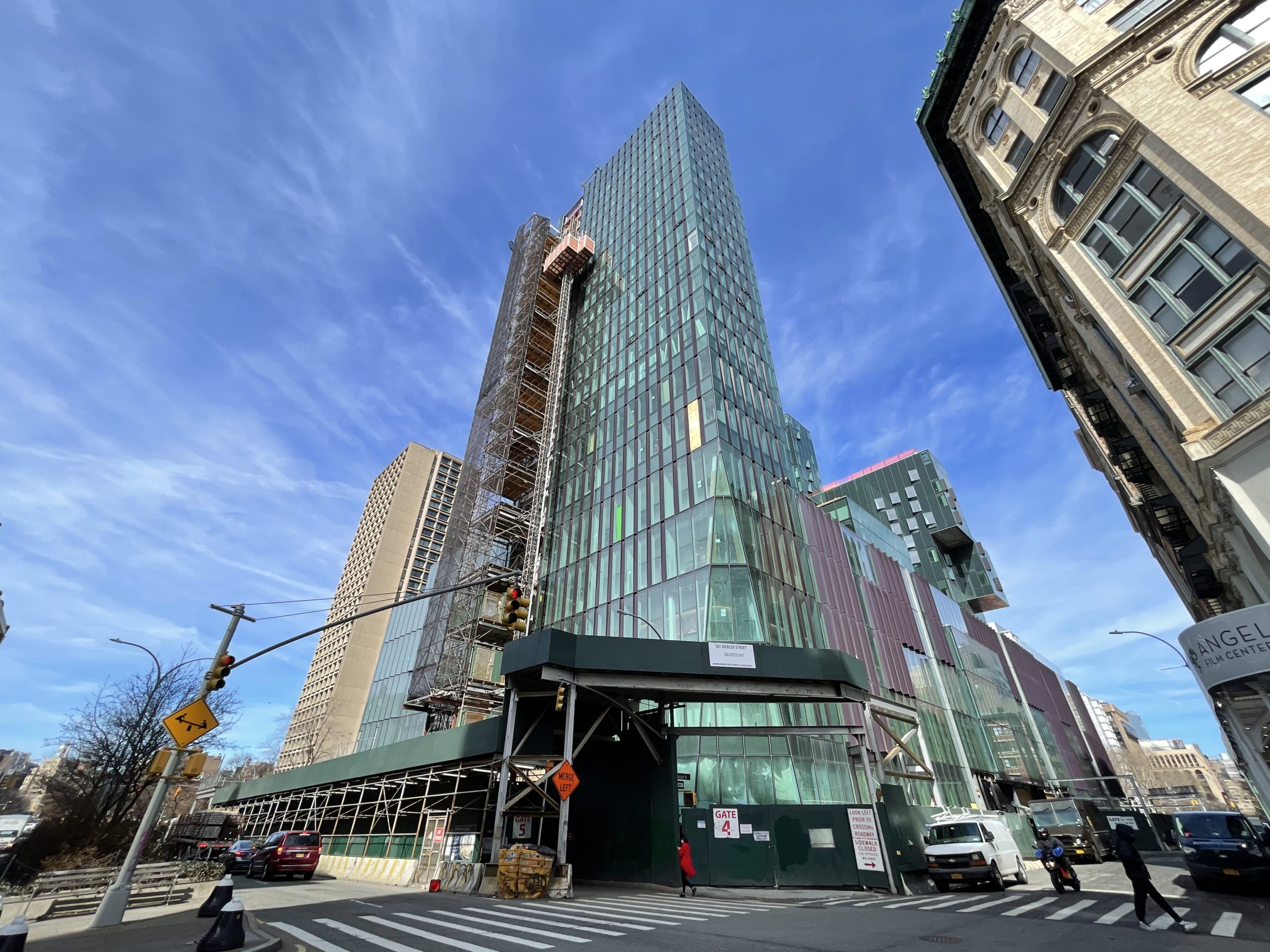
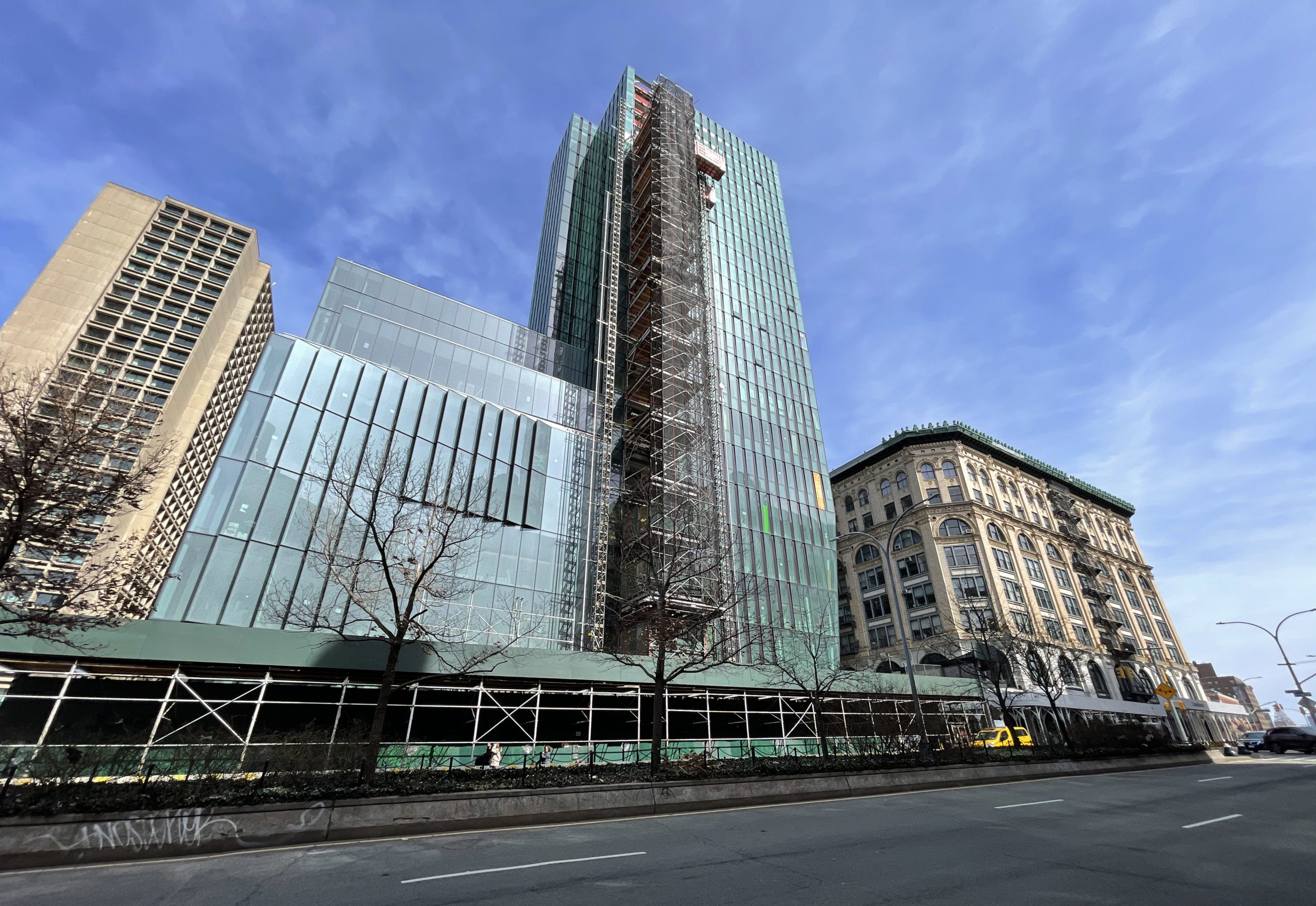
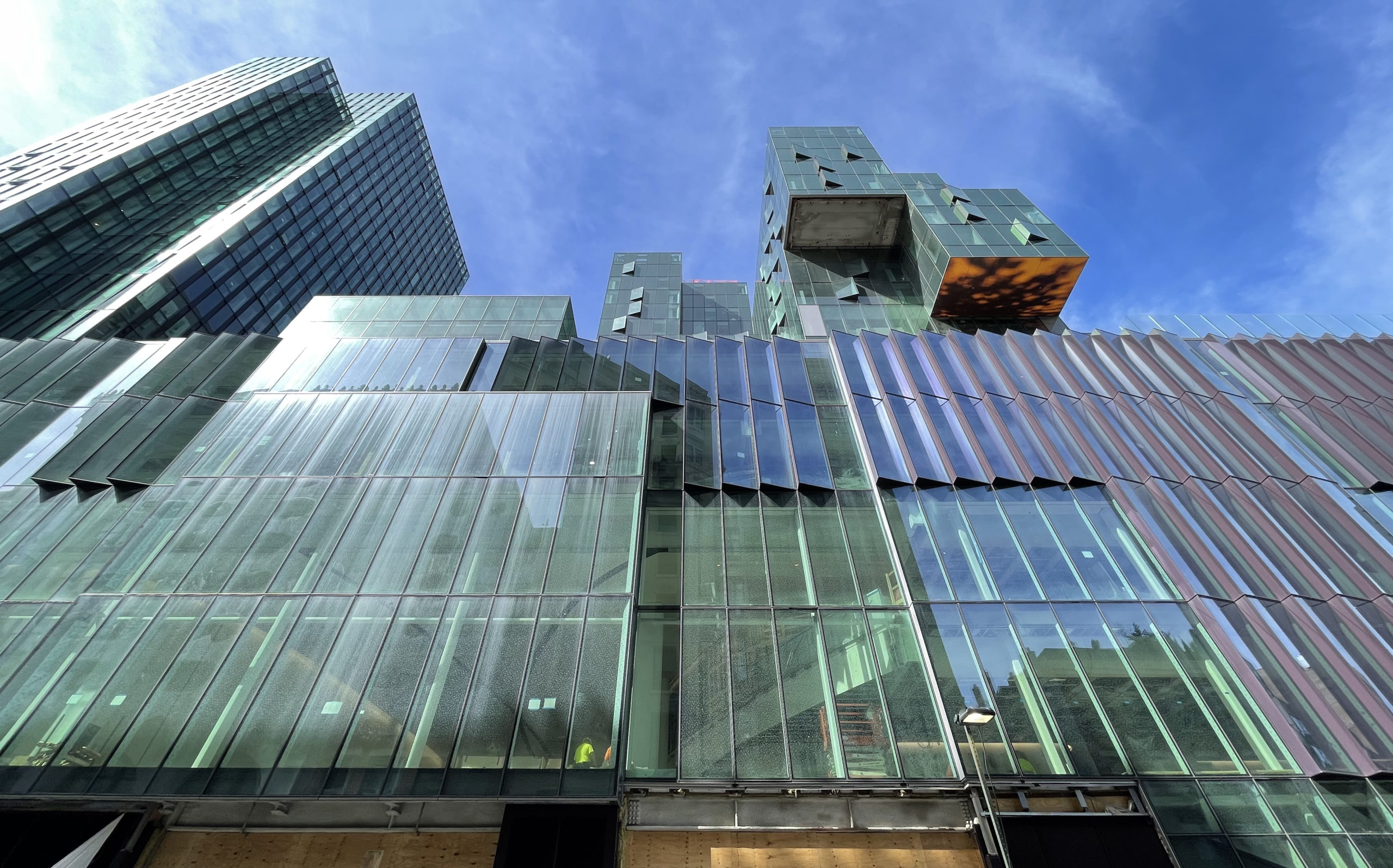
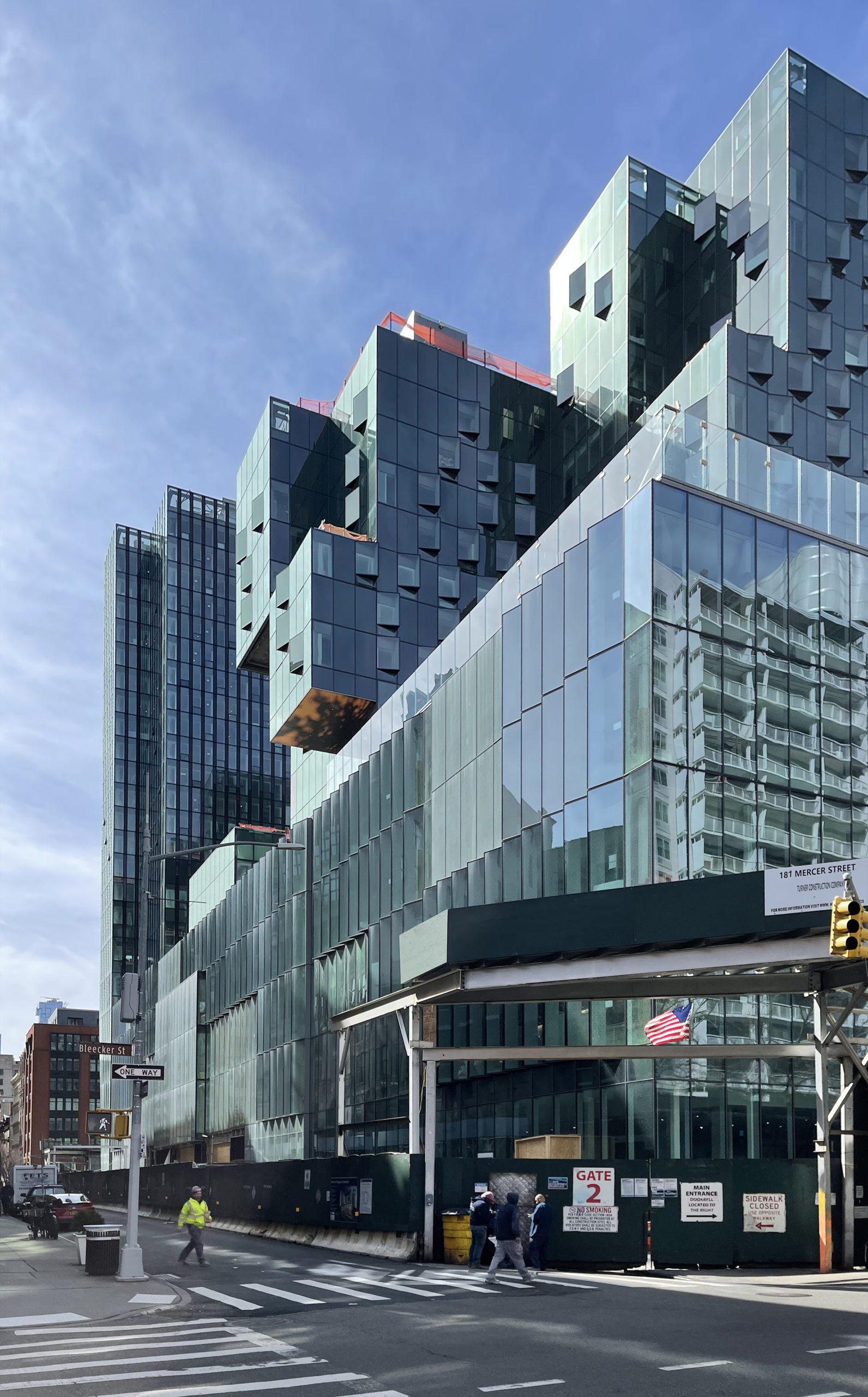
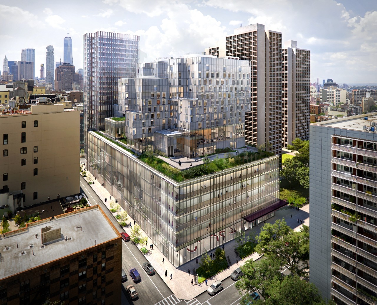
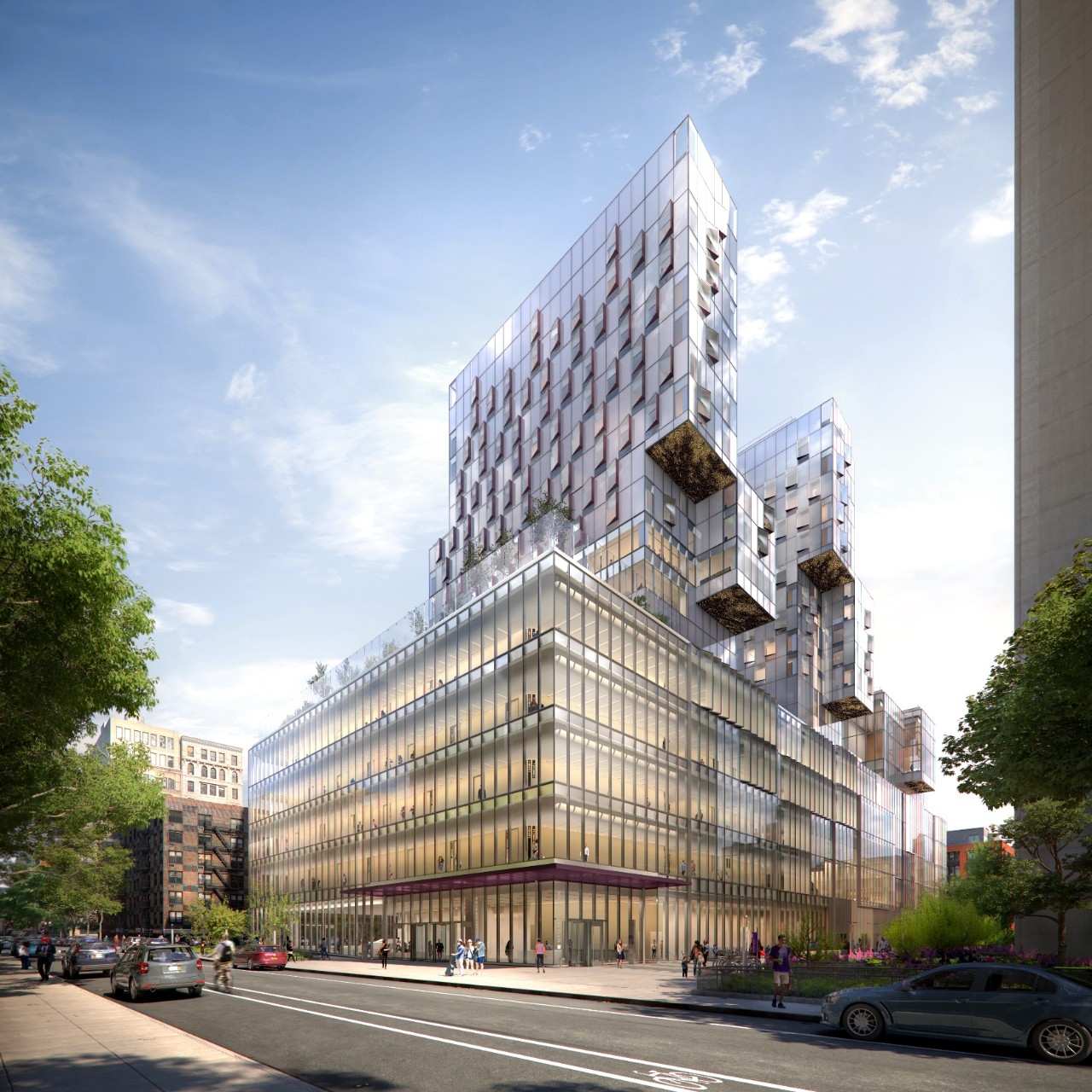
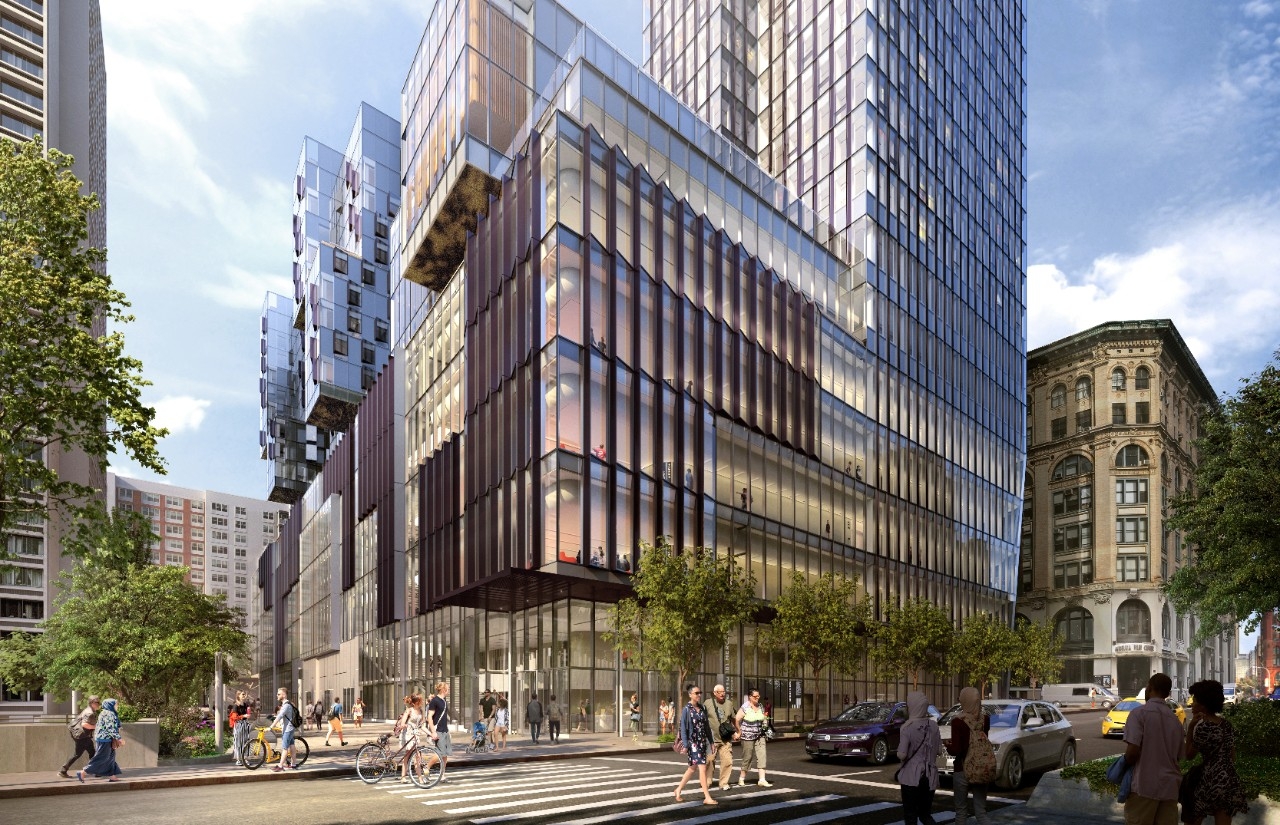
Construction is nearing completion on NYU‘s campus expansion at 181 Mercer Street in Greenwich Village. Designed by Davis Brody Bond and KieranTimberlake, the 735,000-square-foot complex consists of three towers rising from a full-block podium between Houston, Mercer, and Bleecker Streets and I.M. Pei’s University Village complex. The project is the culmination of over a decade of proposals, planning, and building that dates back to the mid 2000s. Turner Construction Company is the general contractor for the development, which is aiming for LEED gold certification.
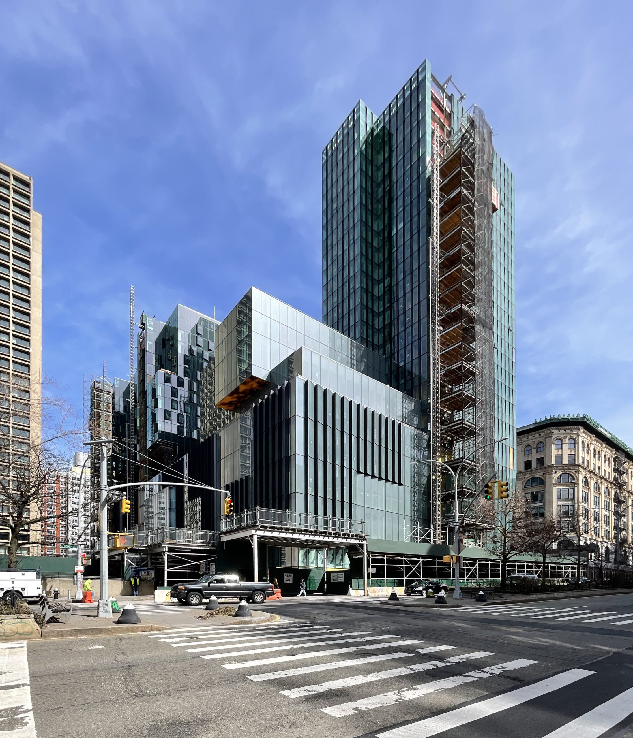
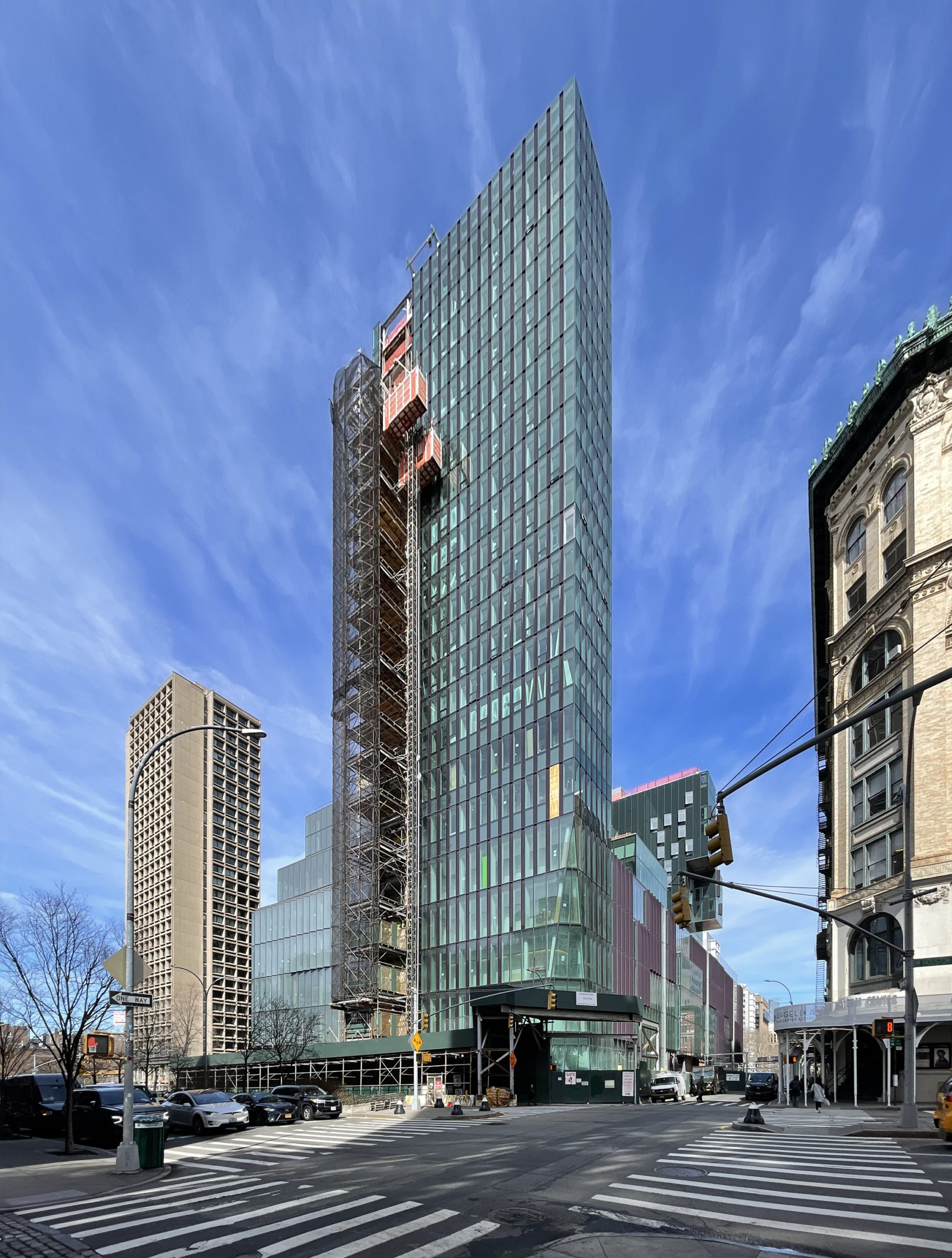
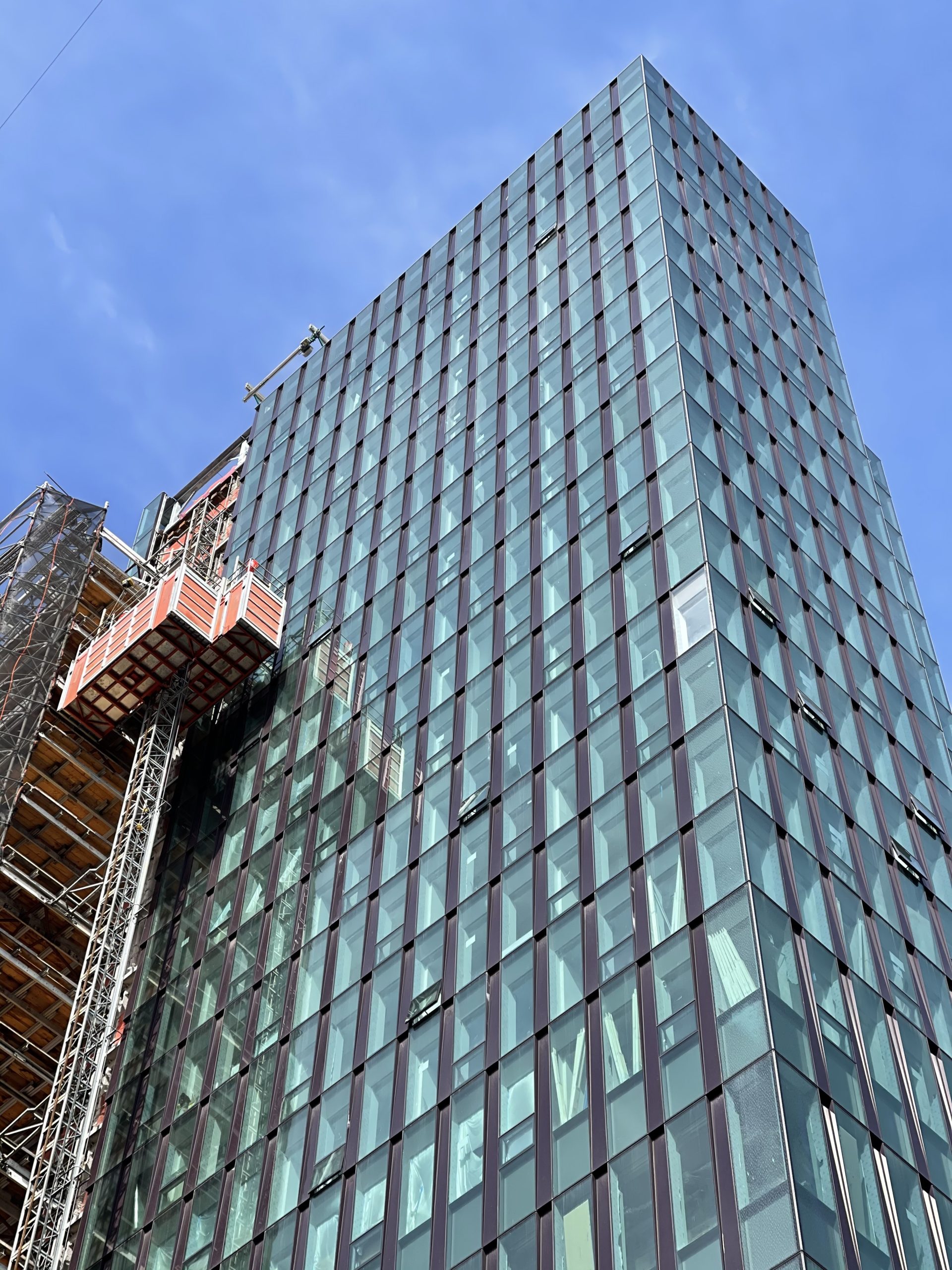
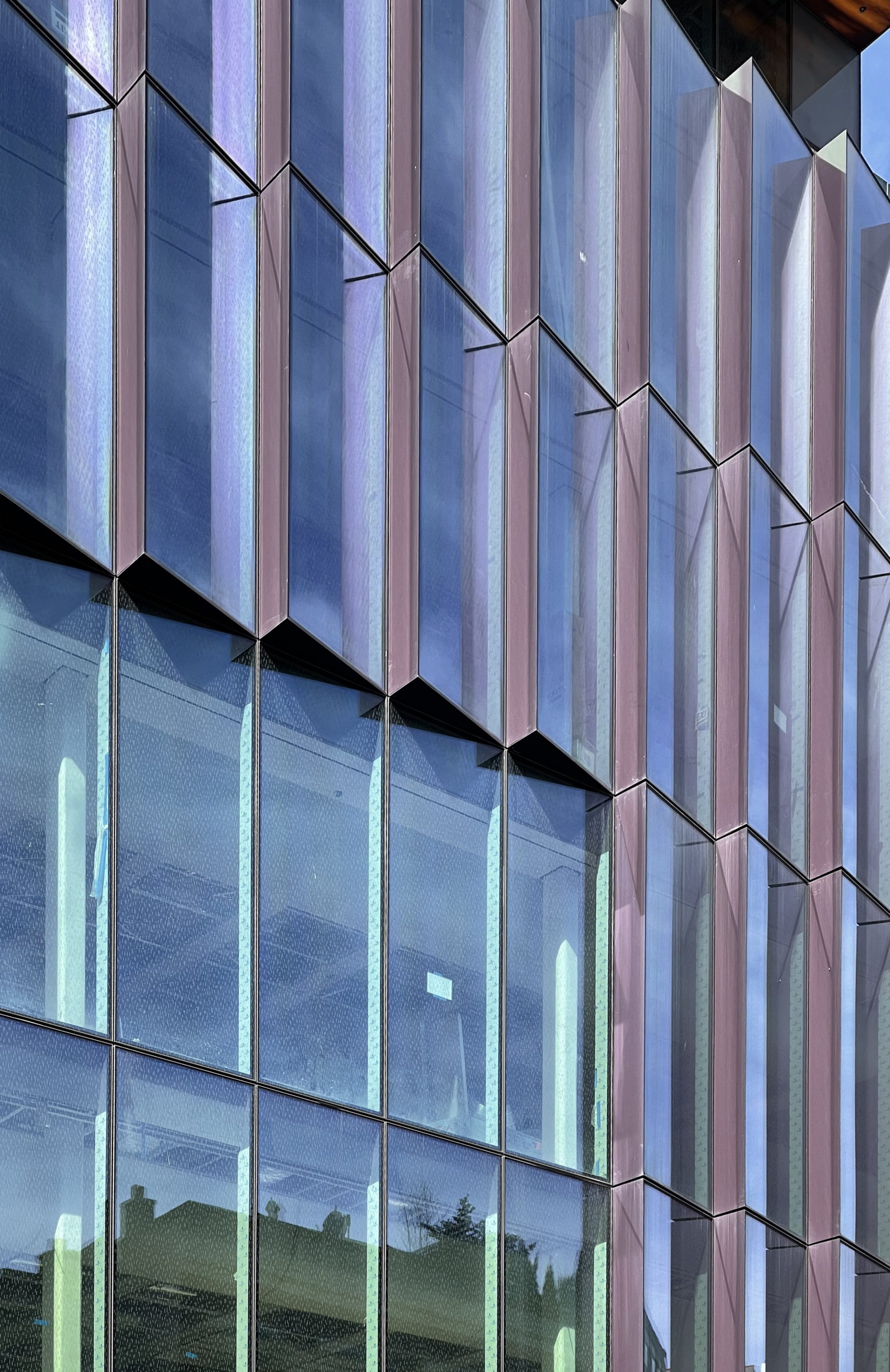
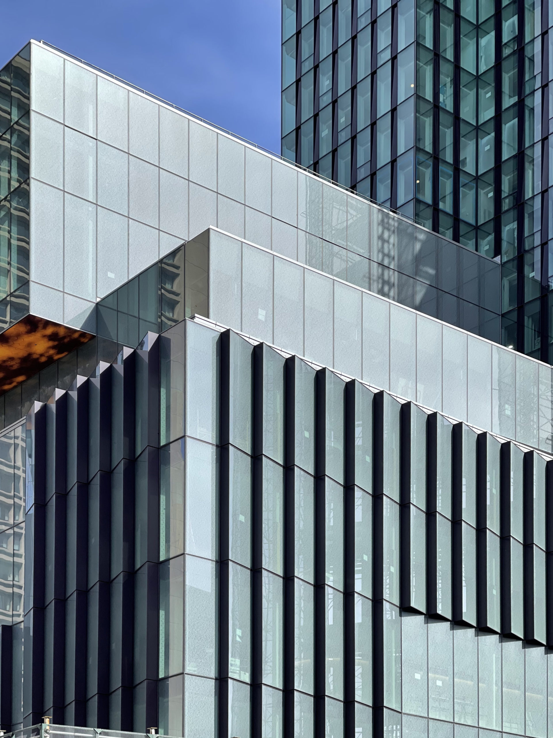
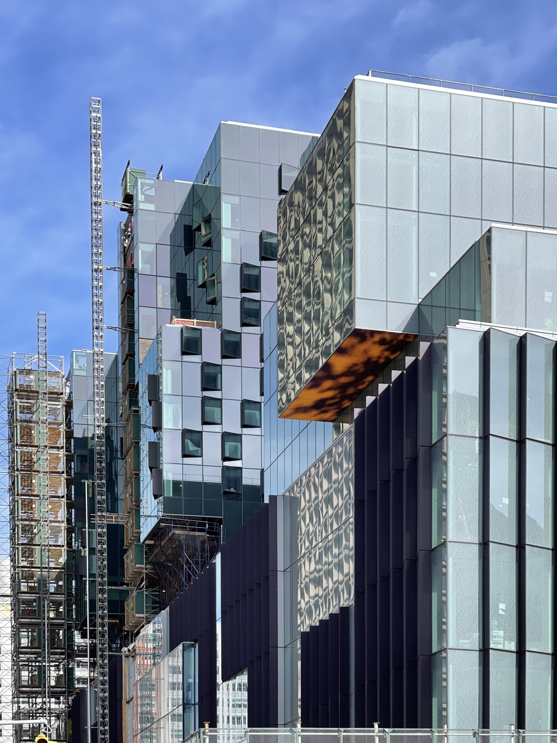
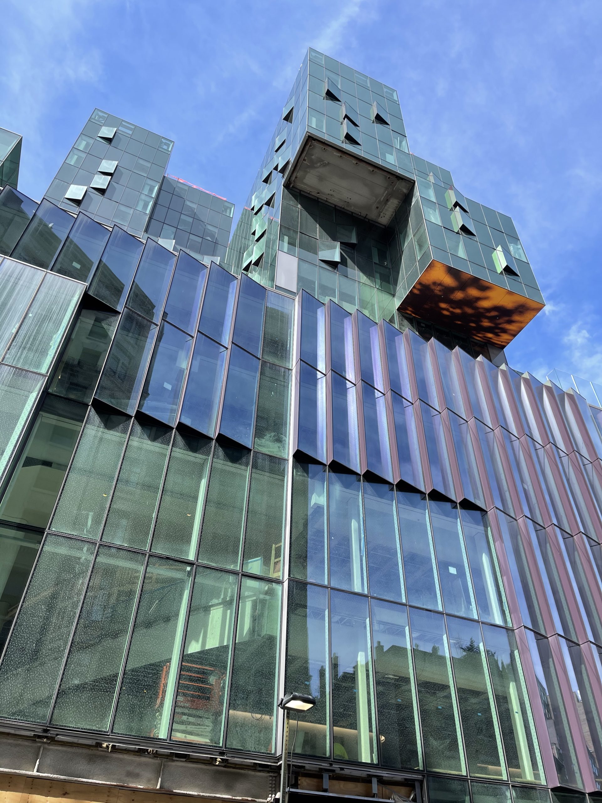
Since our last update in July, the glass curtain wall has enclosed the remainder of the upper floors on all three towers and glass railings have been assembled along the perimeter of the podium. The only façade sections awaiting completion are the gaps where the construction elevators remain attached to the towers. The elevator on the southern elevation facing Houston Street began disassembly on March 5 and should reach street level in the coming weeks.
One interesting detail spotted during our visit are the abstract orange and black patterns across the honeycomb tiles on the underside of the cantilevering sections. So far only two volumes have received this treatment, though the others should likely follow suit.
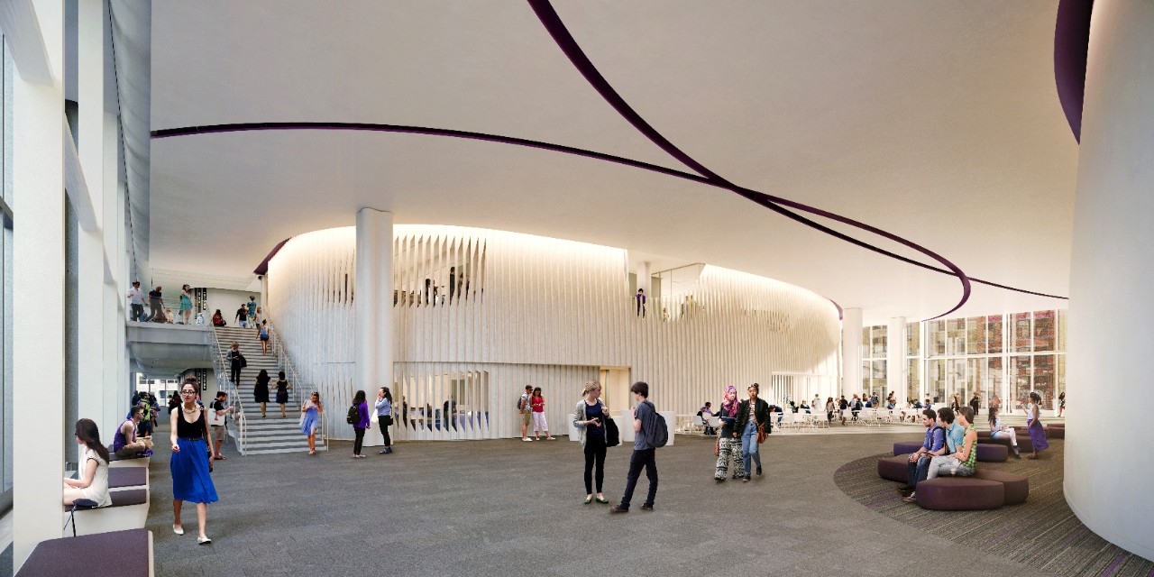
Forty percent of 181 Mercer Street’s interiors will be dedicated to academic space with 58 new classrooms. Other components include new dormitories for students and faculty members, additional office space and dining areas, and outdoor landscaped rooftop terraces atop the podium totaling 25,000 square feet. A centralized space for students, called the Commons, will span two floors with a cafe, large seating areas, and close access to the theater, which comes complete with balcony and mezzanine seating designed to accommodate up to 350 people.
The complex will also house indoor athletic facilities including a six-lane swimming pool, a running track, four basketball courts, squash courts, a wrestling room, and multiple fitness rooms. There will also be dozens of new music instruction and practice rooms and the New York University’s first orchestral ensemble room.
Below are several interior and exterior renderings of the complex.
181 Mercer Street is reported to be ready for occupancy by November 2022, but will formally open in spring 2023.
Subscribe to YIMBY’s daily e-mail
Follow YIMBYgram for real-time photo updates
Like YIMBY on Facebook
Follow YIMBY’s Twitter for the latest in YIMBYnews










A garbage truck.
Tuition hike, anyone ?
A mess of glass. NYU staff clearly weren’t qualified to approve this.
And you are? Your comments suggest you just have an allergic reaction to glass.
It’s really ugly . Guess the architecture school needs help.
What part can the community use? It looked better before as a gym for a university.
My guess is that it’s functional. However, it look like a very upscale House of Detention Annex for the Tombs.
NYU has never had a school of architecture. Does it show?
There should be a yearly design competition among architecture school students to re-skin this unfortunate mistake. Minimal building modification is required and to propose a new look that could be quite brilliant.
I am always curious as to the negative comments here. Always, ugly this ugly that. To me this looks just like a modern city scape in miniature. That seems to be what they were aiming for. My problem is the podium. No one ever comments on that – or, them, as they are fast becoming a fixture of modern buildings. While it’s great to create a green roof, etc, what they actually do is create exclusive playgrounds and turn their back on the street. Look at buildings like one Manhattan square on the LES, or whole areas of LIC and the way in which the street is neglected or even ignored. I think this is far more damaging to NYC than any box glass tower.
Yeah for a YIMBY site I do notice the same few accounts that say they hate every building that is posted here lol
It really is intriguing and quite a shocking spectacle to see the shear hatred and ferocity of such palpable negativity being unleashed by people whenever they feel the need to criticize projects that go against their opinion. This is just a website showing photos of construction. They’re not actually doing anything detrimental, but just reporting what’s going on. Some people need to relax and ease their anger in another way
Eyesore for Greenwich Village! NYU clearly doesn’t respect it’s surrounding historic neighborhood.
Imagine an electronic circuit board with the components on top. Functional but not pretty. A mess of stuff in a pile. It does serve NYU but is an affront to the neighborhood.
Guess the “architectural” era of

“Cantileverism” isn’t finished yet?!
This thing is really ugly. I wonder if it will be as ugly as the renderings present?
Looks like a mess. Will only get worse with age. Another ten thousand students
A good point – the glass panels won’t age well, they will be come discolored and pitted with time, making them look dirty and shabby. A huge contrast to natuaral buildng materials such as brick and stone, which take on a dignity with wear and tear, age typically suits them well.
I love how this project looks actually. More of this color glass if we are to have such glassy buildings.
NYU is notorious for picking the most ugly and noncomformist designs. They have ruined the neighborhood where its buildings stand. And, that is a historic neighborhood in the heart of Manhattan. Arrogance on steroids.
Need two bedrooms
NYU…destroying Manhattan one block at a time