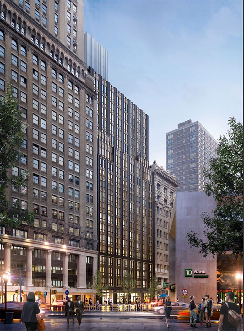
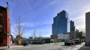
Façade work is continuing on 200 Montague Street, a 20-story residential building in the Borough Hall Skyscraper Historic District of Brooklyn Heights. Designed by Beyer Blinder Belle with James M. Patterson of Ancora Engineering and developed by Midtown Equities, the 140,700-square-foot structure will yield 121 rental units marketed by M.N.S. Real Estate NYC for Aurora Capital Associates. Cauldwell Wingate is the general contractor for the property, which is located between Court and Clinton Streets.
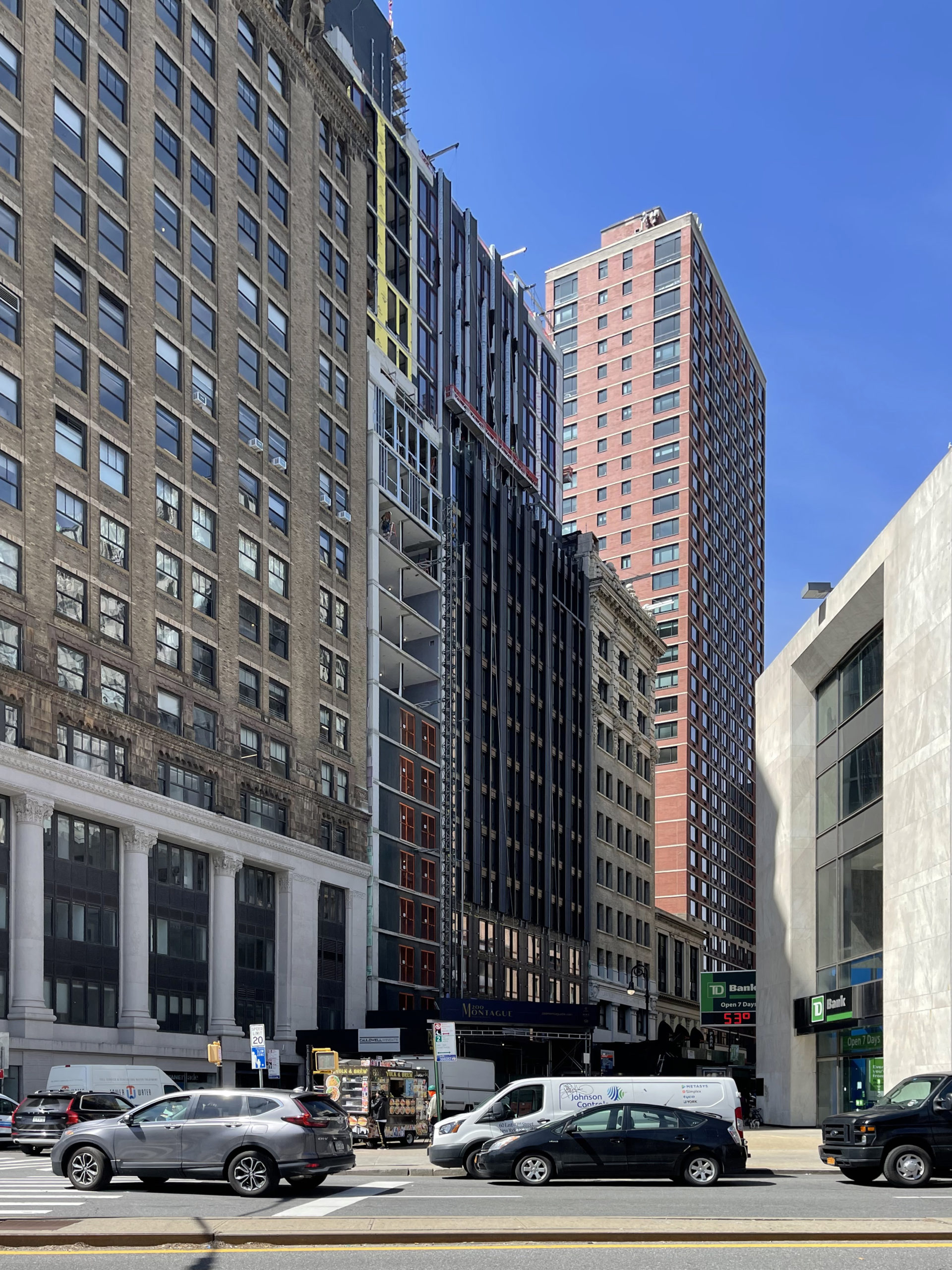
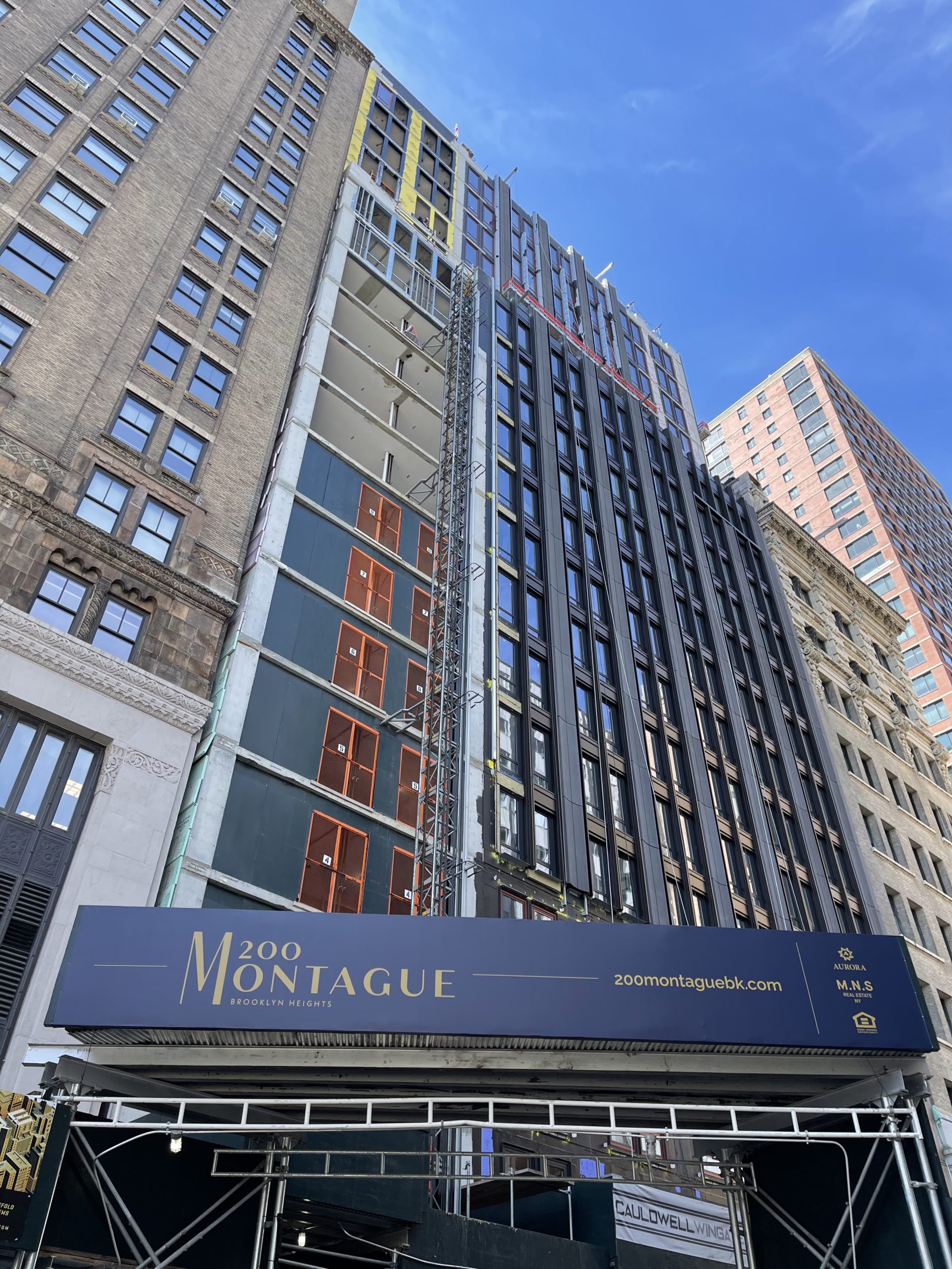
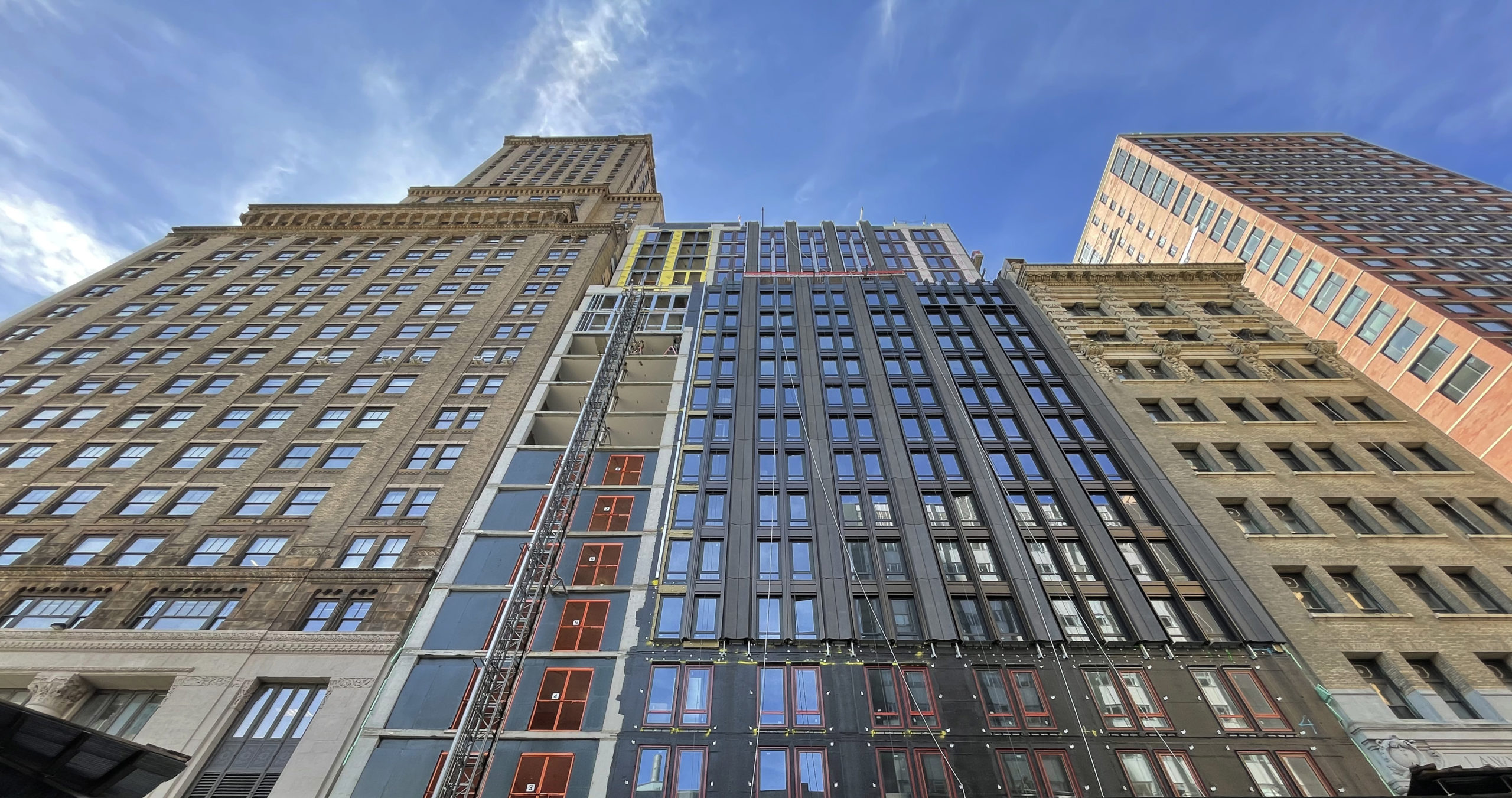
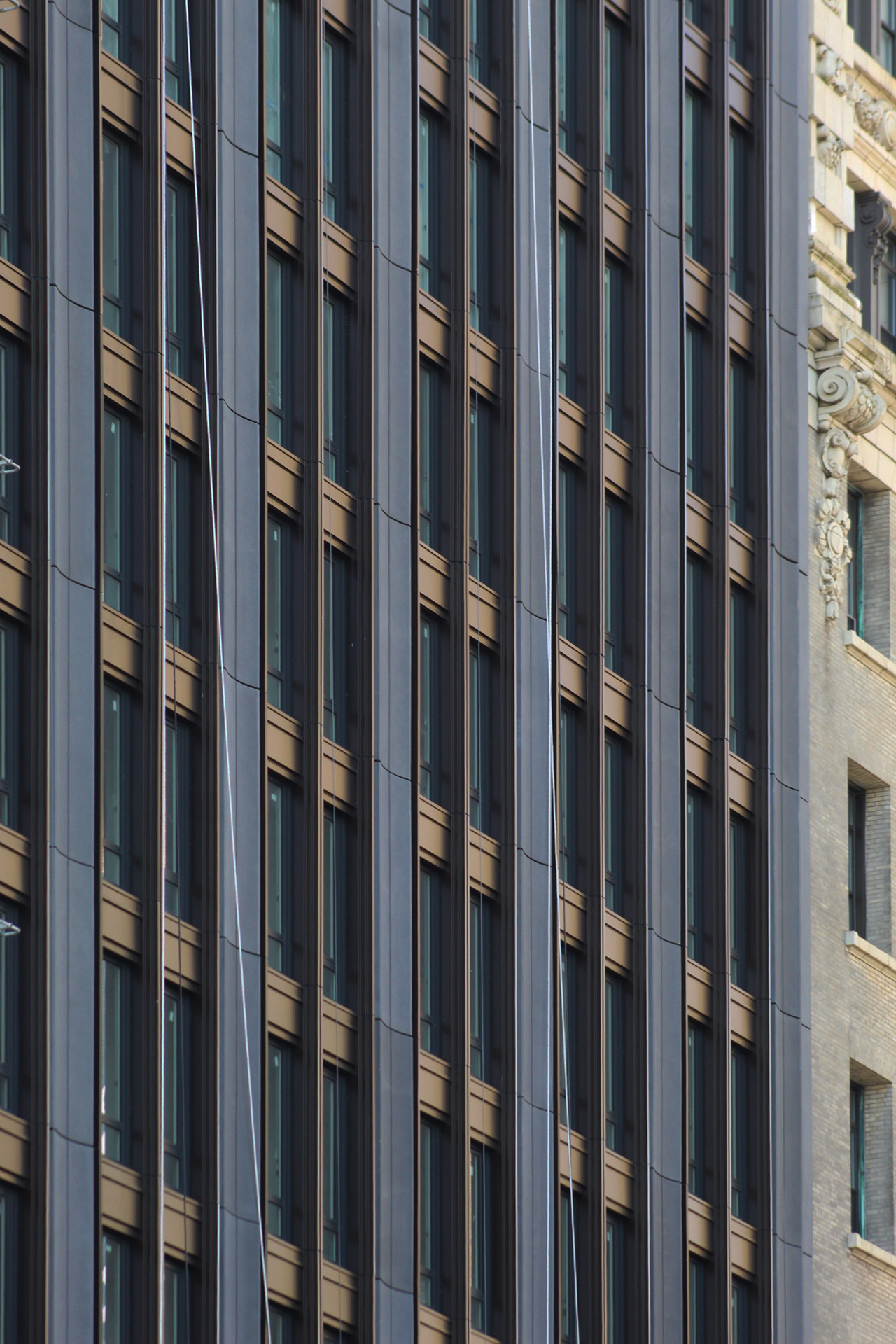
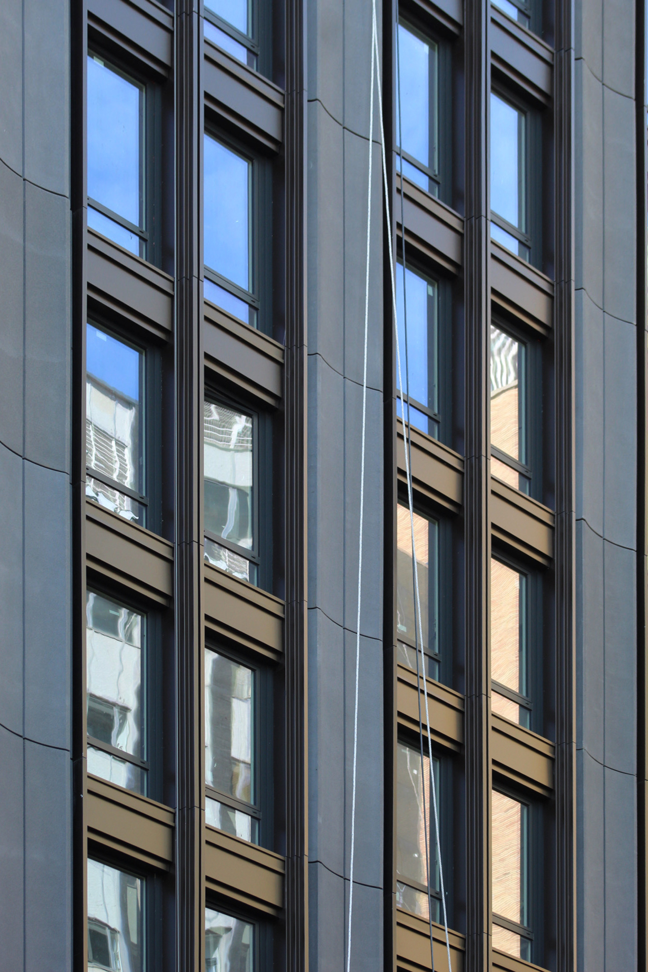
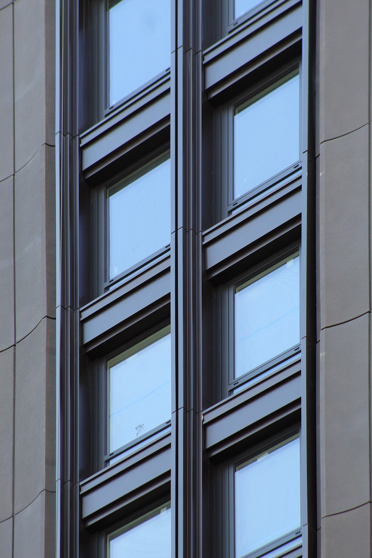
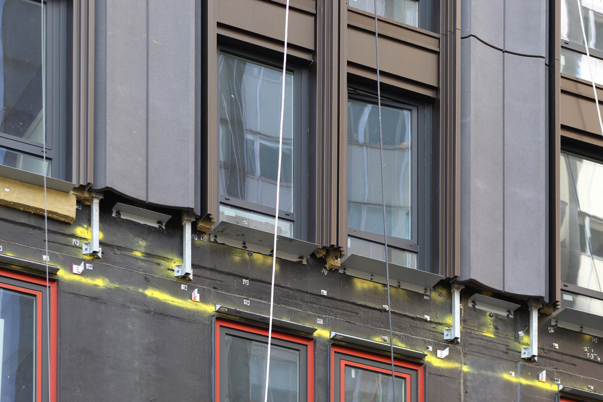
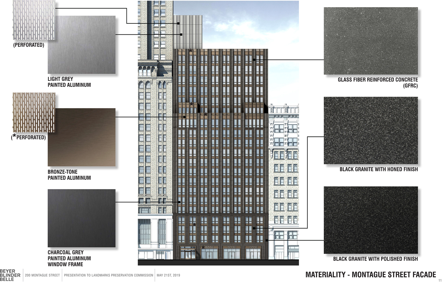
Exterior work has progressed steadily since our last update in September. Almost all of the windows are now in place and work has shifted to the installation of the exterior panels, which are made of bronze-colored aluminum and glass fiber reinforced concrete. The construction elevator has begun to be dismantled, and the gap in the façade where it was attached will soon be filled in.
Apart from the area behind the construction elevator, only the lowermost stories and a corner of the upper levels are awaiting installation of the final exterior treatment.
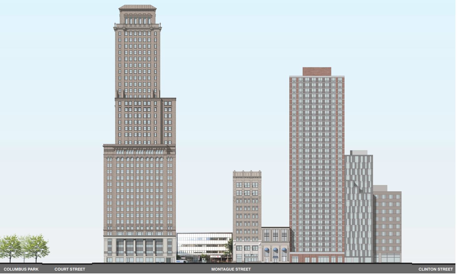
Below are renderings and diagrams that break down the components of the outer walls and how 200 Montague Street compares in scale with its surrounding neighbors. The architectural height contextually follows the evenly stepped roof parapets running from east to west.
Other types of materials for the outside include black granite and aluminium designed and manufactured in various colors and textures.
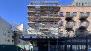
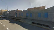
Here we see what the site conditions used to be before demolition of the old bank began.
YIMBY last reported that 200 Montague Street will provide retail space on the ground floor and cellar level. Rental units will span from the second through 20th stories. Amenities include a landscaped outdoor rooftop terrace, private rear yard terraces, a fitness center with yoga rooms, a residential lounge space, a children’s playroom, storage, a bicycle storage room, a communal laundry room, and a pet washing station. There are three convenient subway options: the Court Street station to the west servicing the R train, the Borough Hall station at the eastern end of Montague Street with access to the 2 and 3 trains, and the 4 and 5 trains at the Borough Hall station to the southeast along Joralemon Street.
It looks like 200 Montague Street will wrap up work and be completed near the end of this year.
Subscribe to YIMBY’s daily e-mail
Follow YIMBYgram for real-time photo updates
Like YIMBY on Facebook
Follow YIMBY’s Twitter for the latest in YIMBYnews

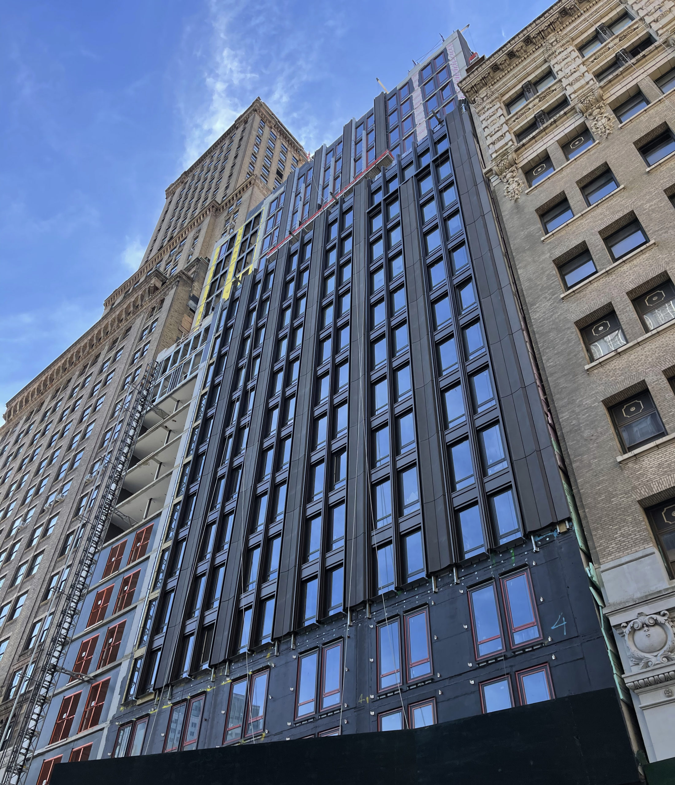
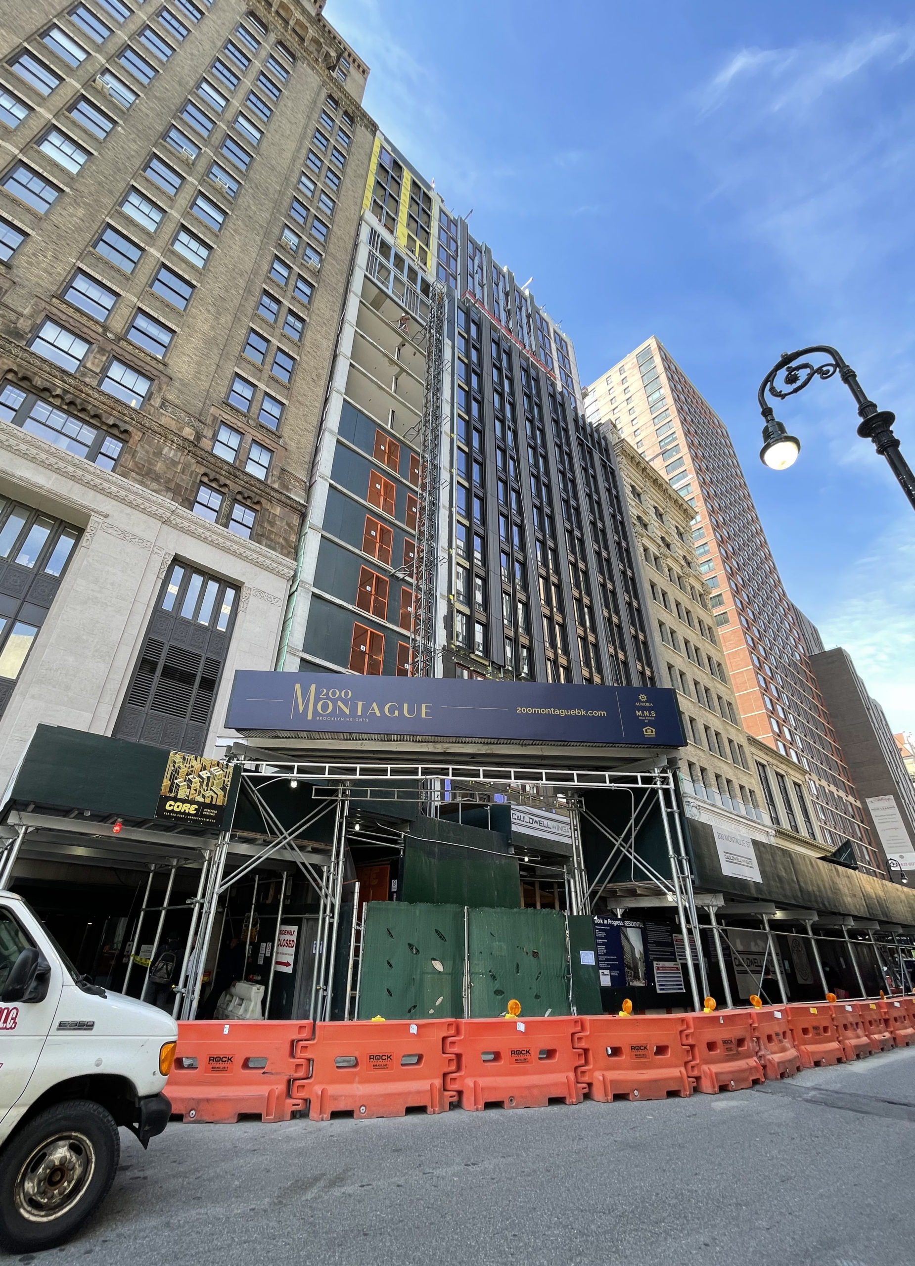
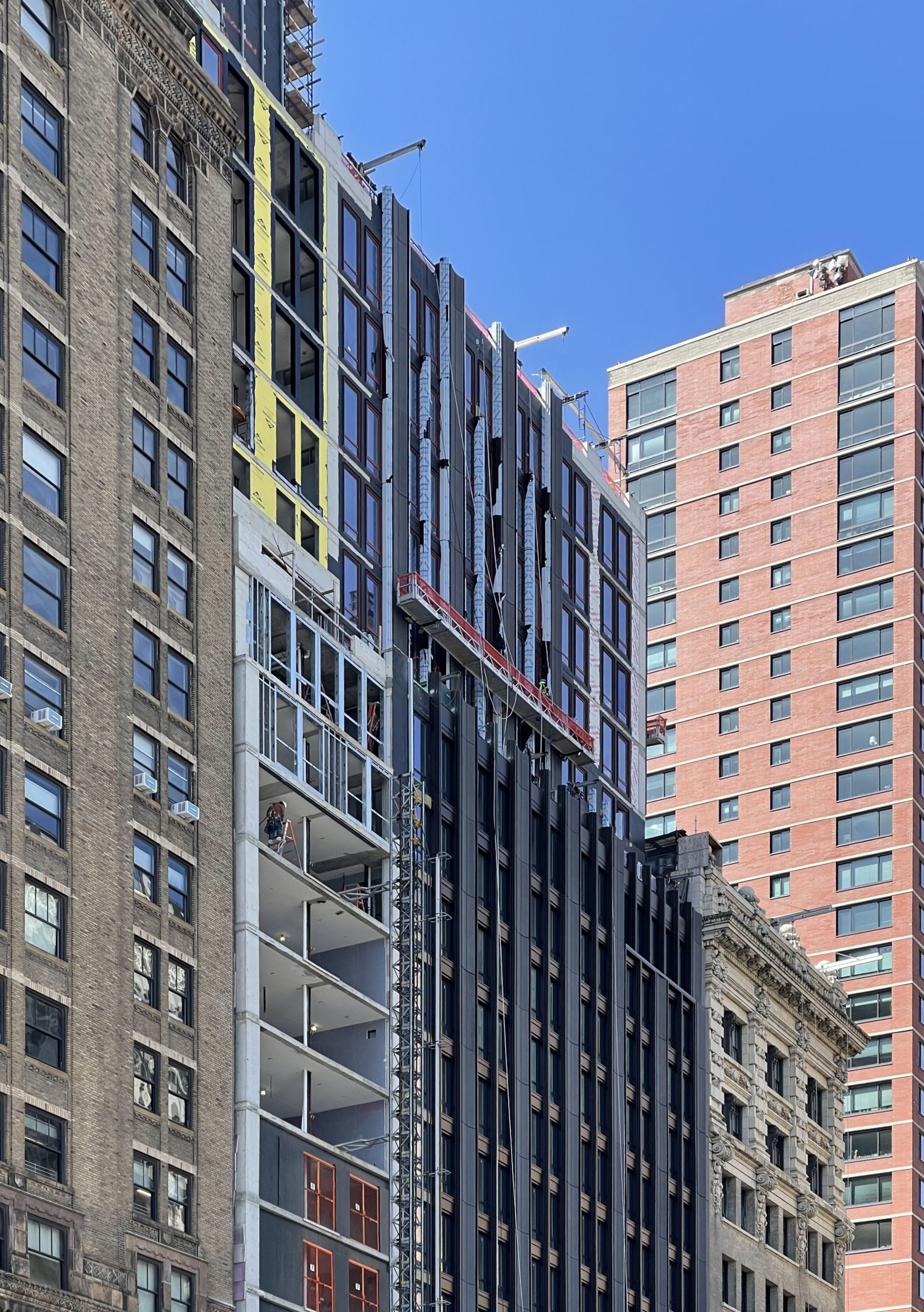
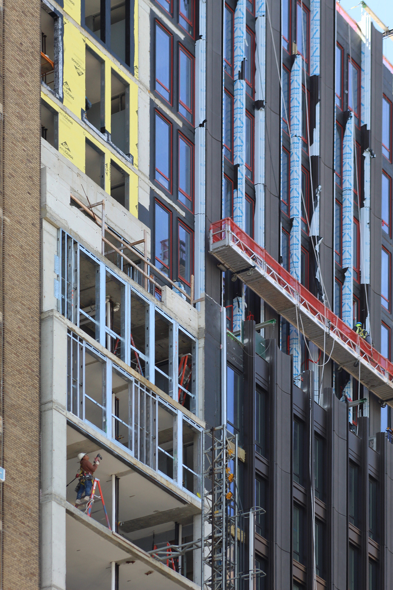
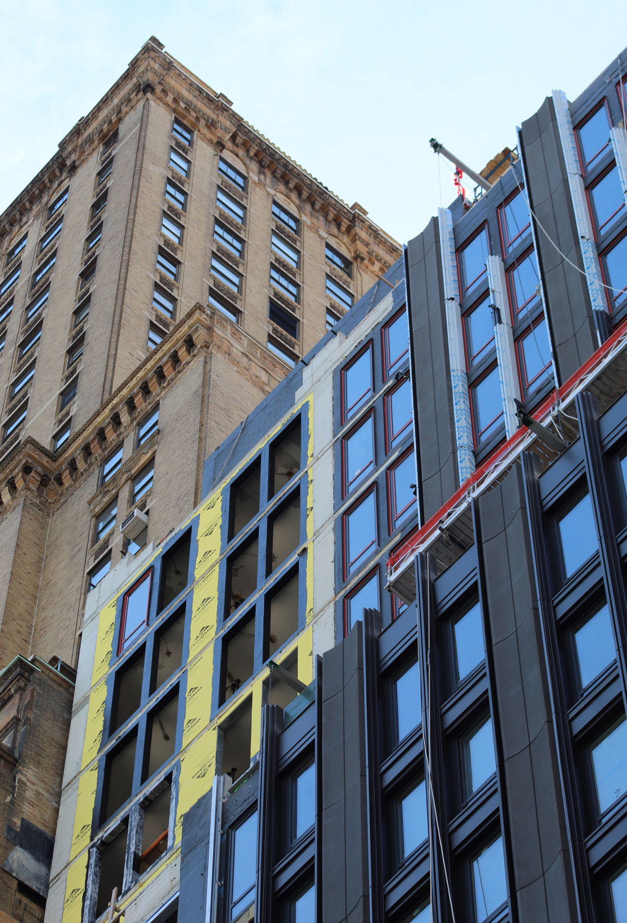
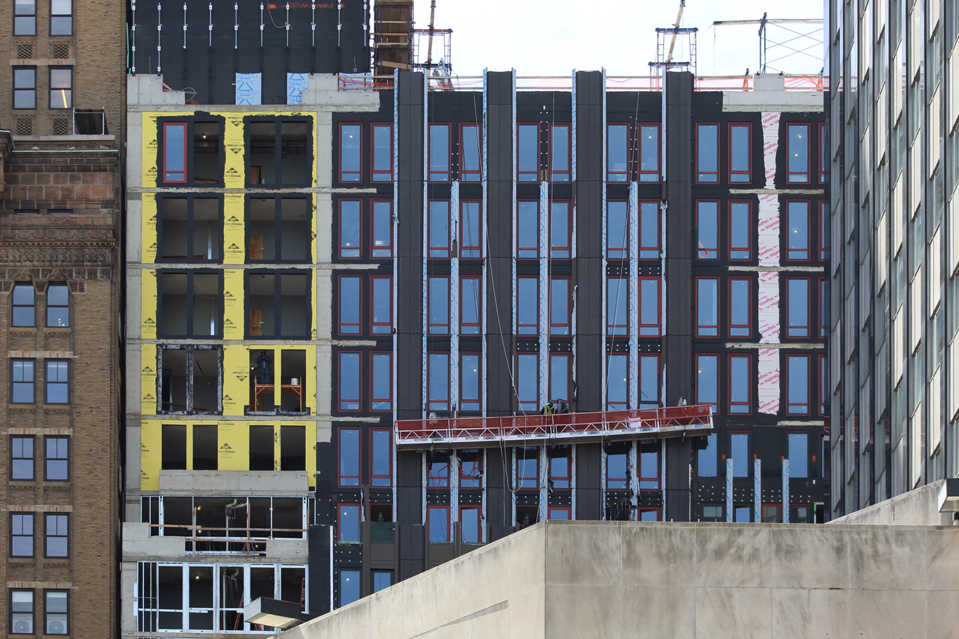
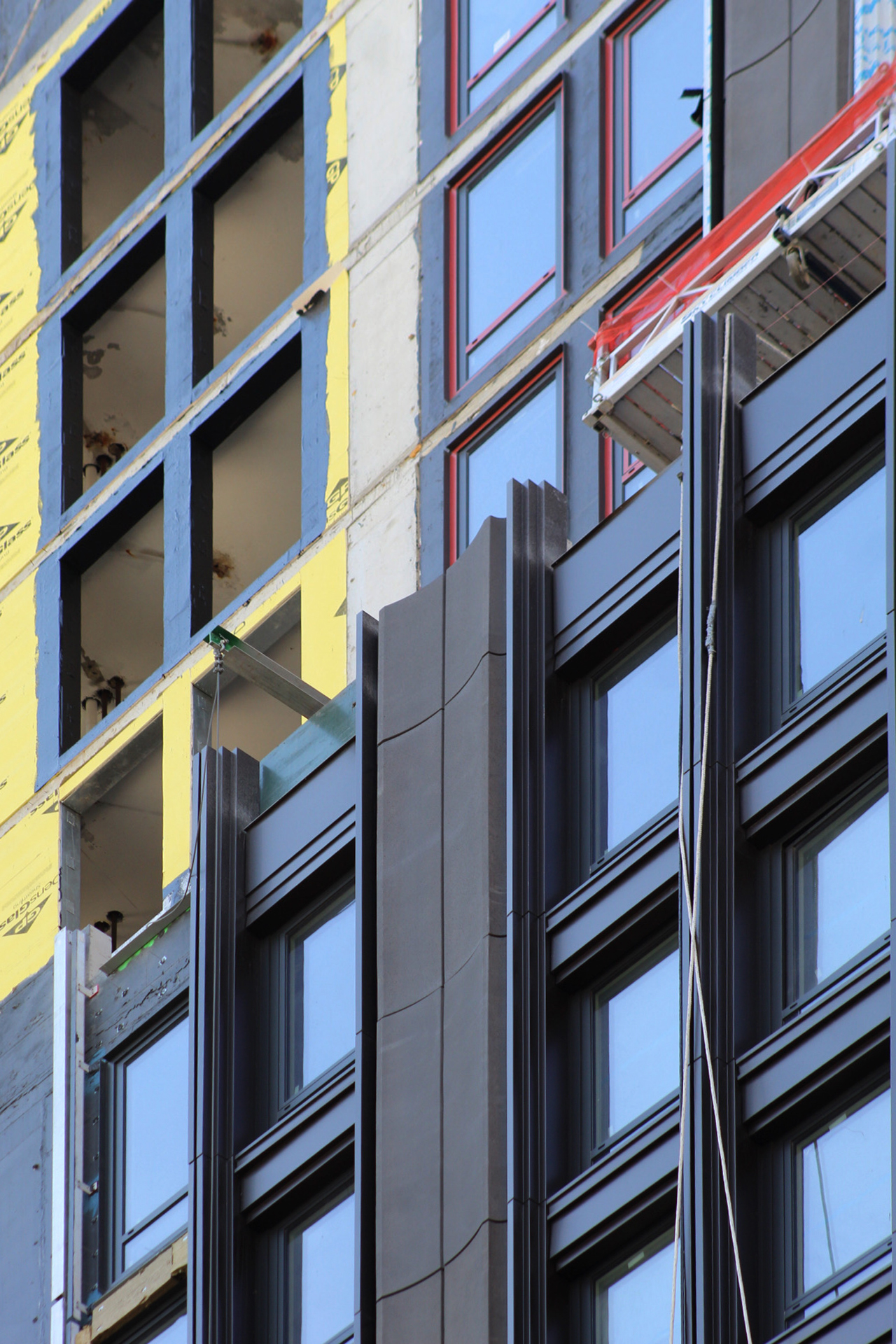
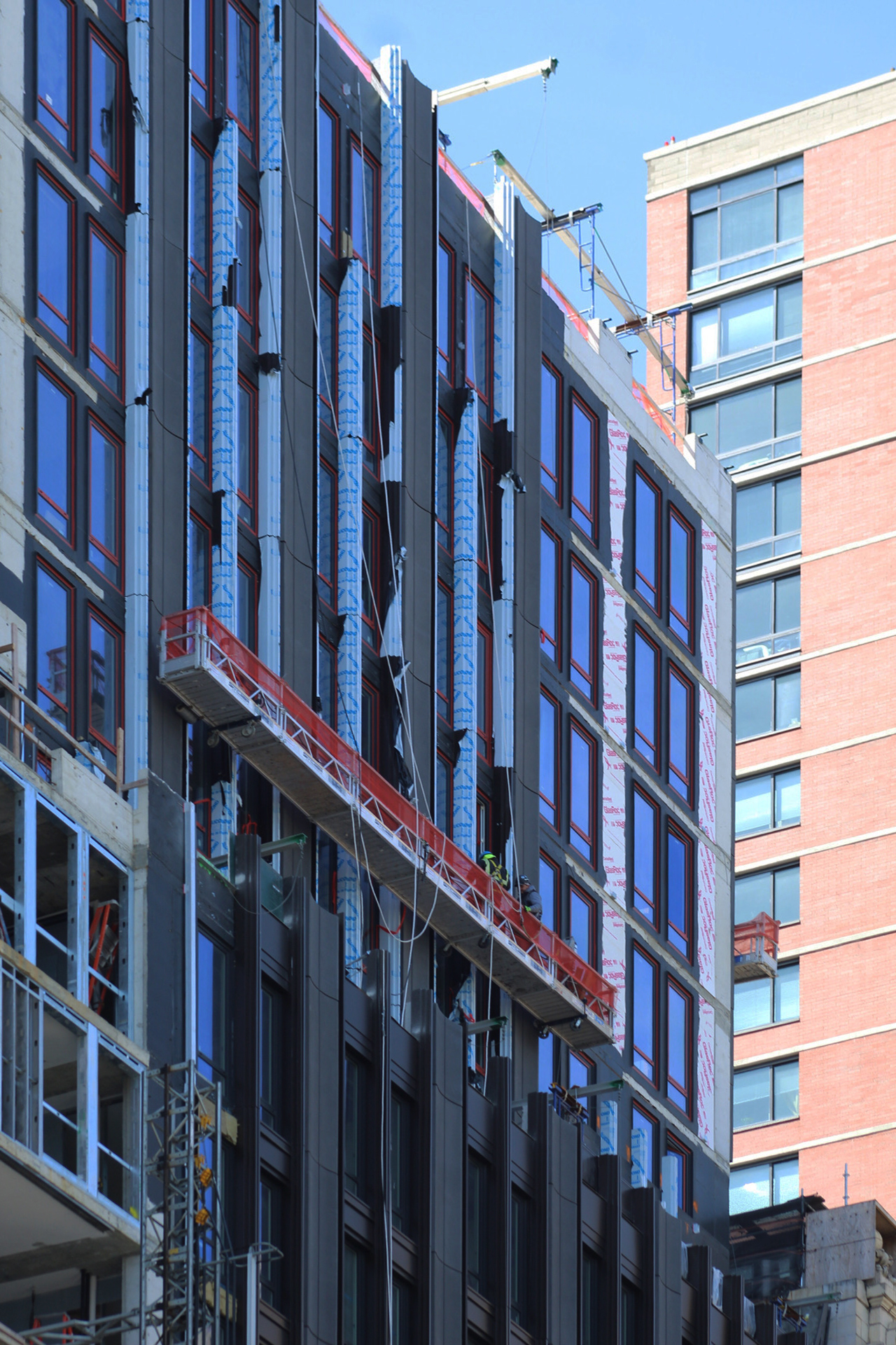

Materials concept on facade, nearly duplicated color but apart from that I can see its blackness. And installation progressed now on the exterior, stepped parapet so showy made for each other: Thanks to Michael Young.
I can see bronzeness, materials in reality on the facade.
Solid design all around.
It doesn’t stand out, and that’s a good thing. A very well done project.
Beautifully detailed. Classic
Beautiful
The terracotta looks so beautiful. Yet, it’s also so low profile.
It’s very good! My only *wish* is that they had built up to the next setback of the adjacent building (and put a cornice on it!). It would also be in better proportion to the second tallest building…. But, very nice!