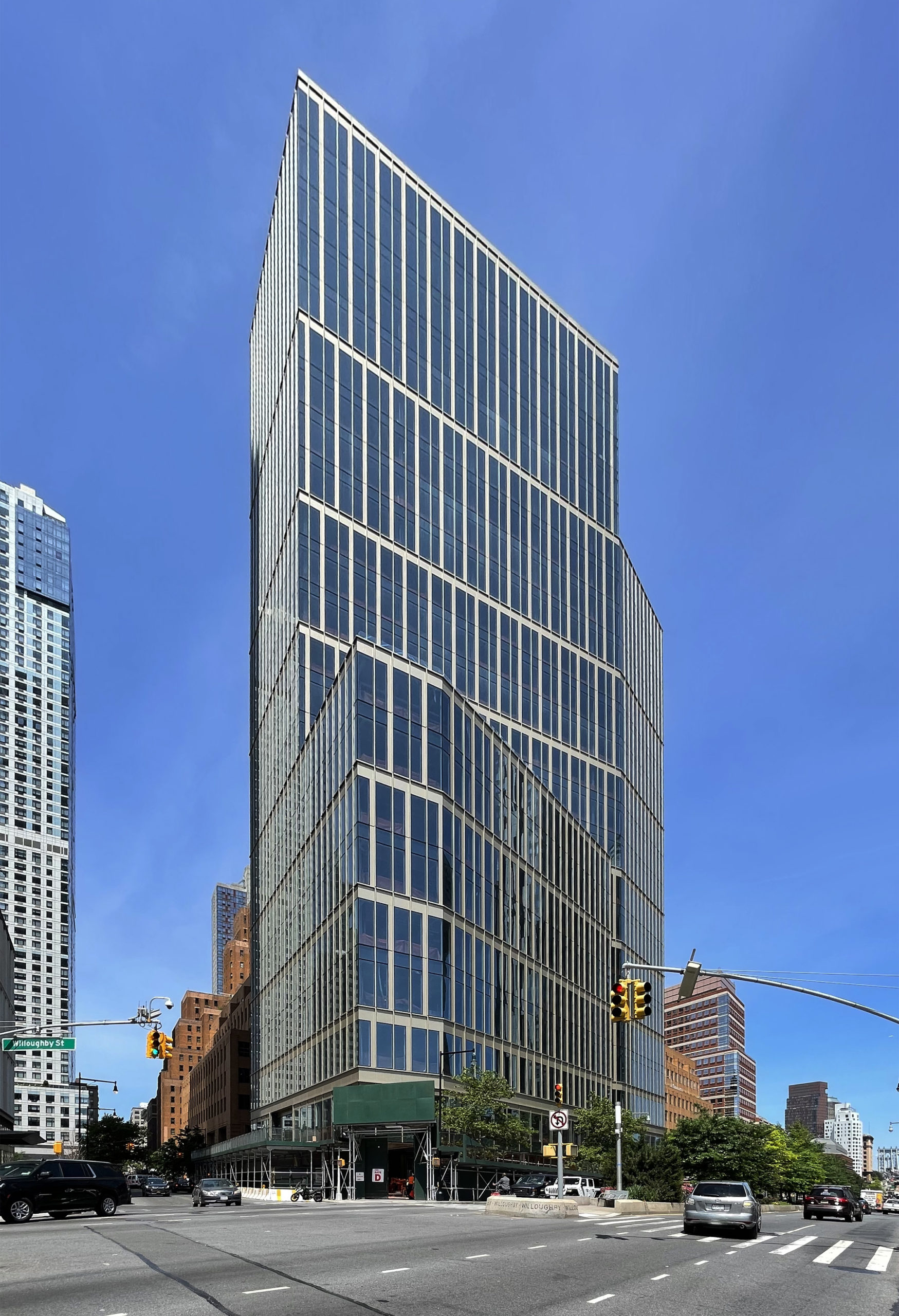
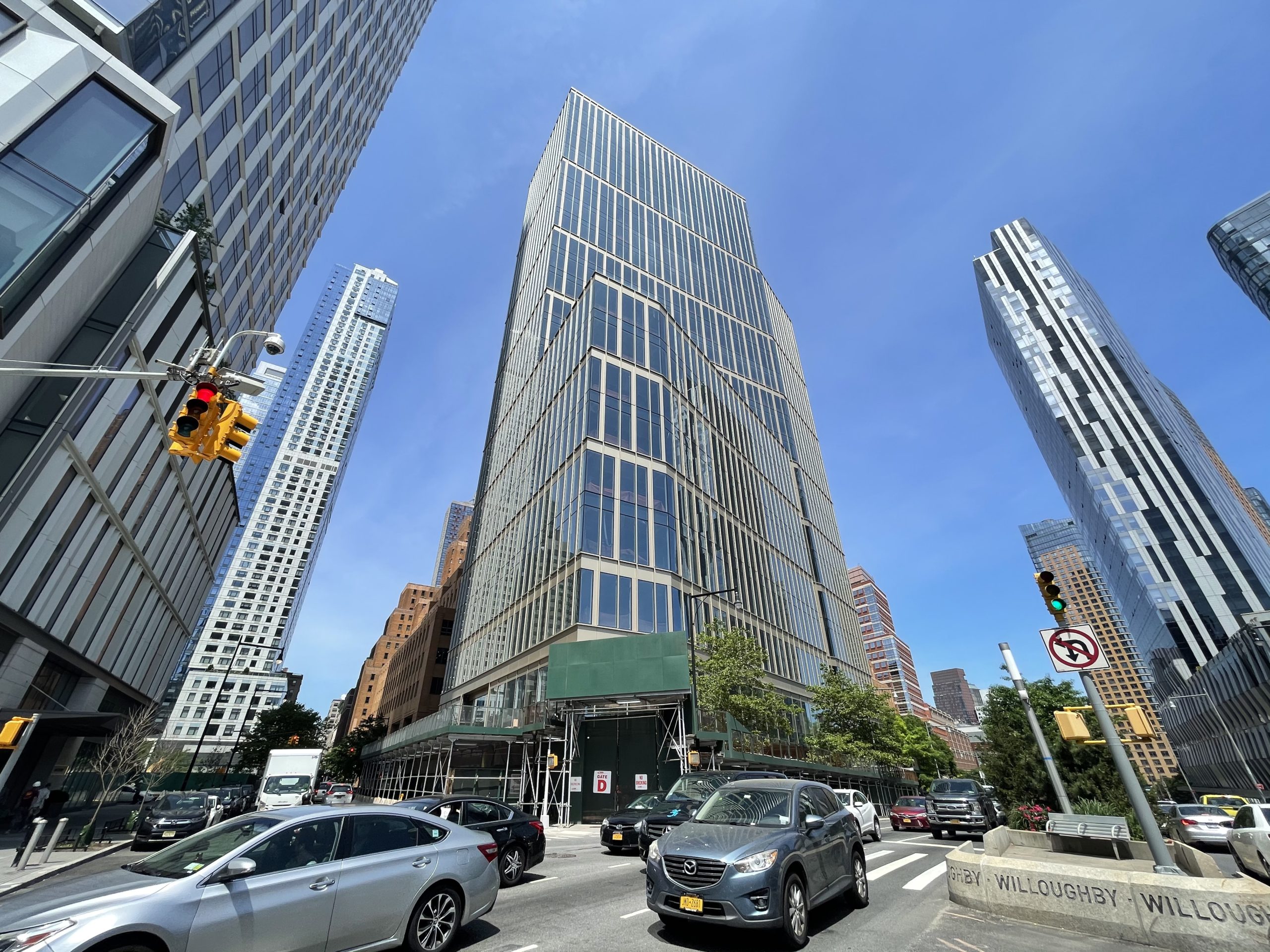
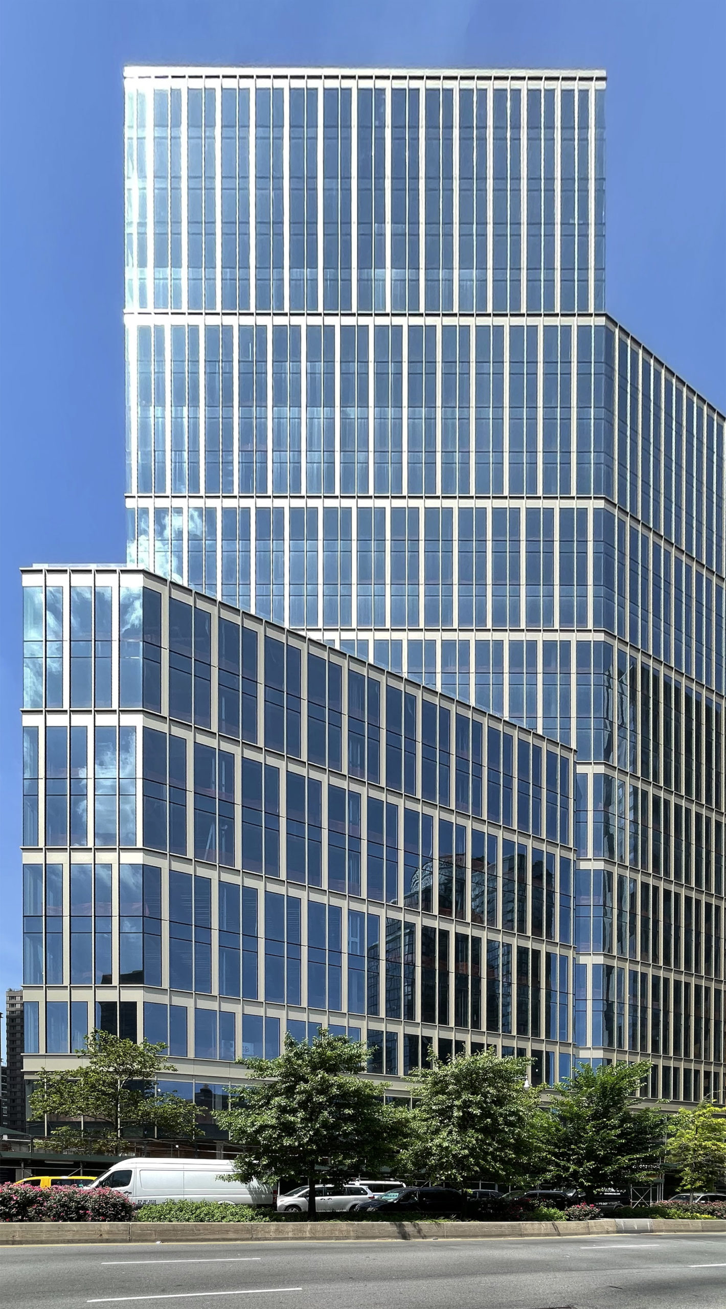
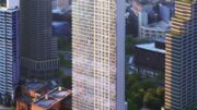
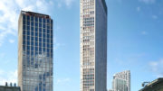
Curtain wall installation is wrapping up on 141 Willoughby Street, a 24-story commercial building in Downtown Brooklyn. Designed by Fogarty Finger with SLCE as the executive architect and developed by Savanna Real Estate, the 400,000-square-foot structure will yield a mix of Class A offices and lower-level retail space, and is engineered to achieve LEED certification. Gilbane Building Company and Savcon are the general contractors, Thornton Tomasetti is the structural engineer, and AKF Group LLC is the MEP engineer of the property, which rises from a trapezoidal plot bound by Willoughby Street to the south, Gold Street to the west, and Flatbush Avenue Extension to the east.
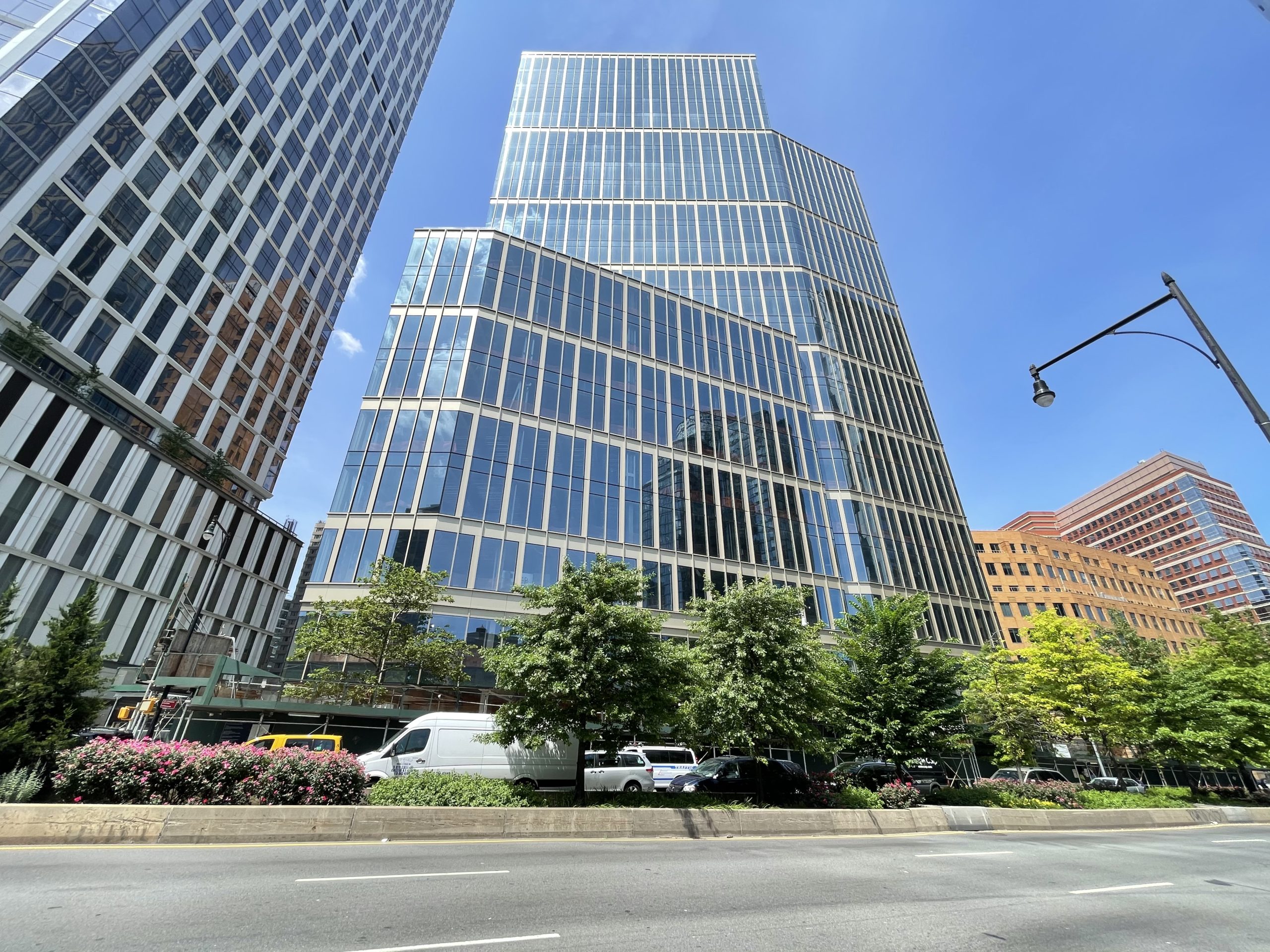
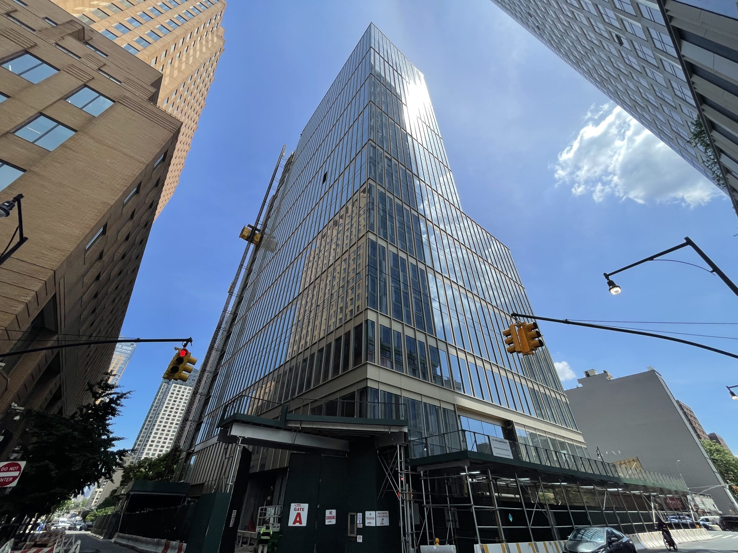
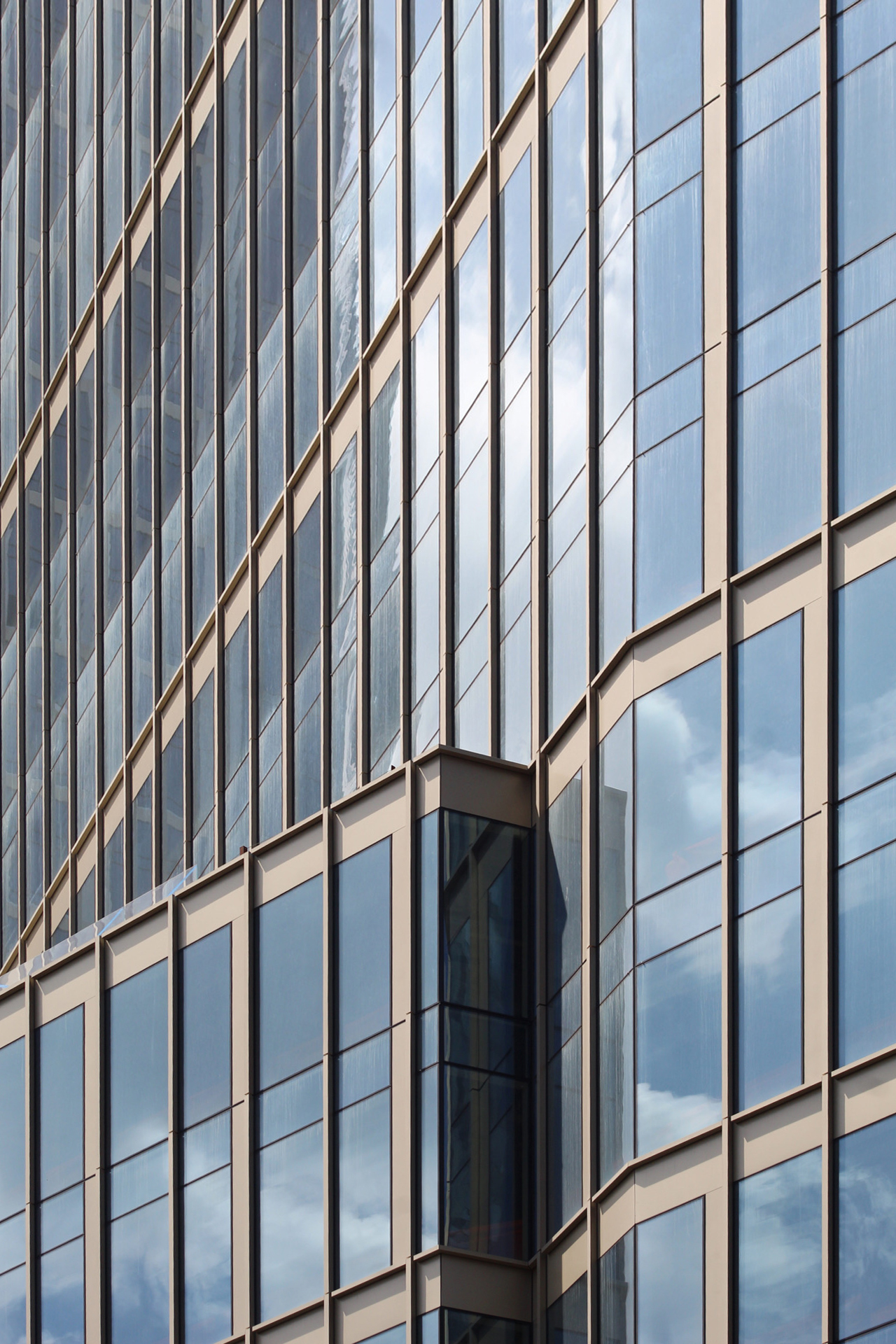
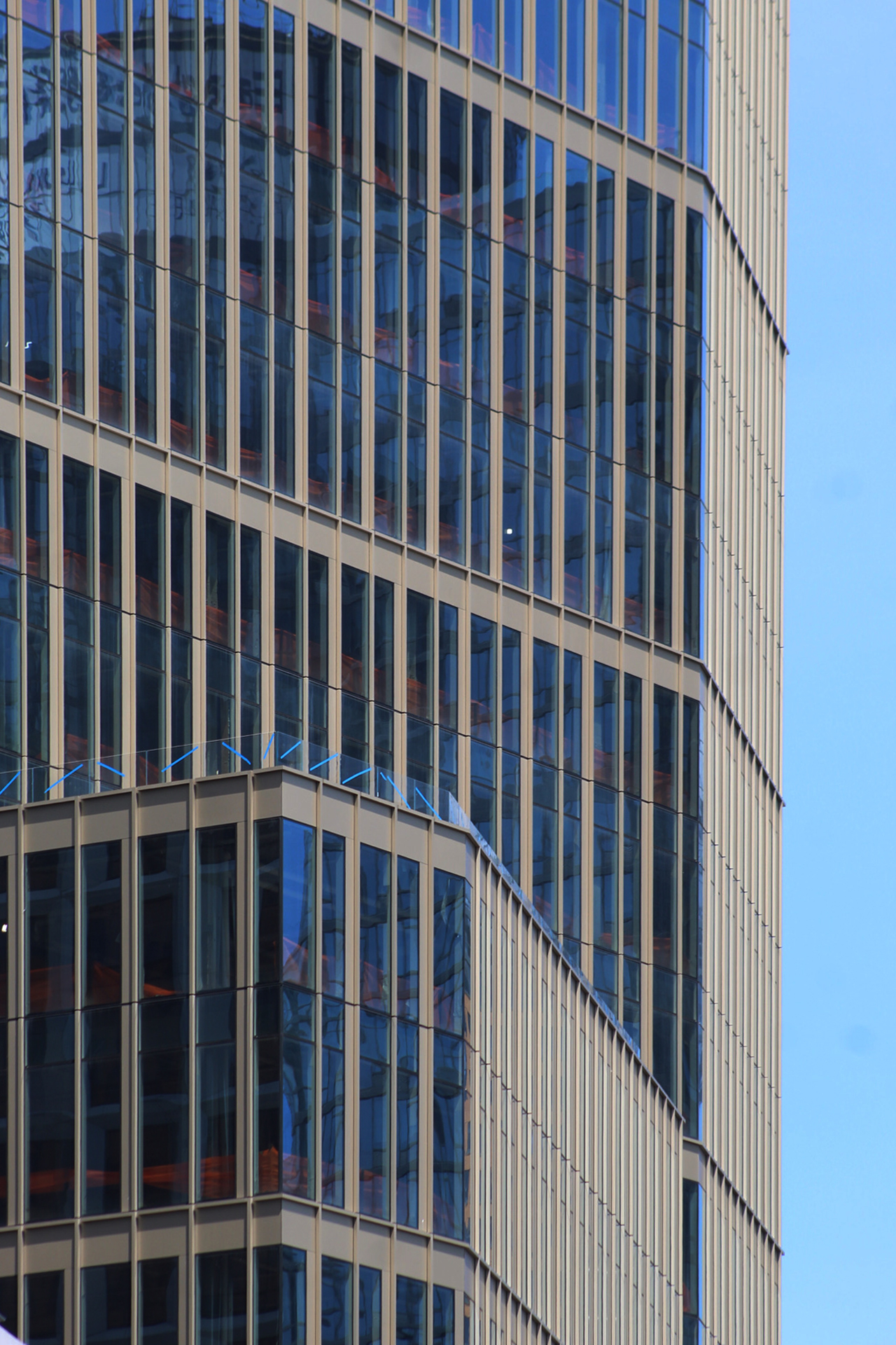
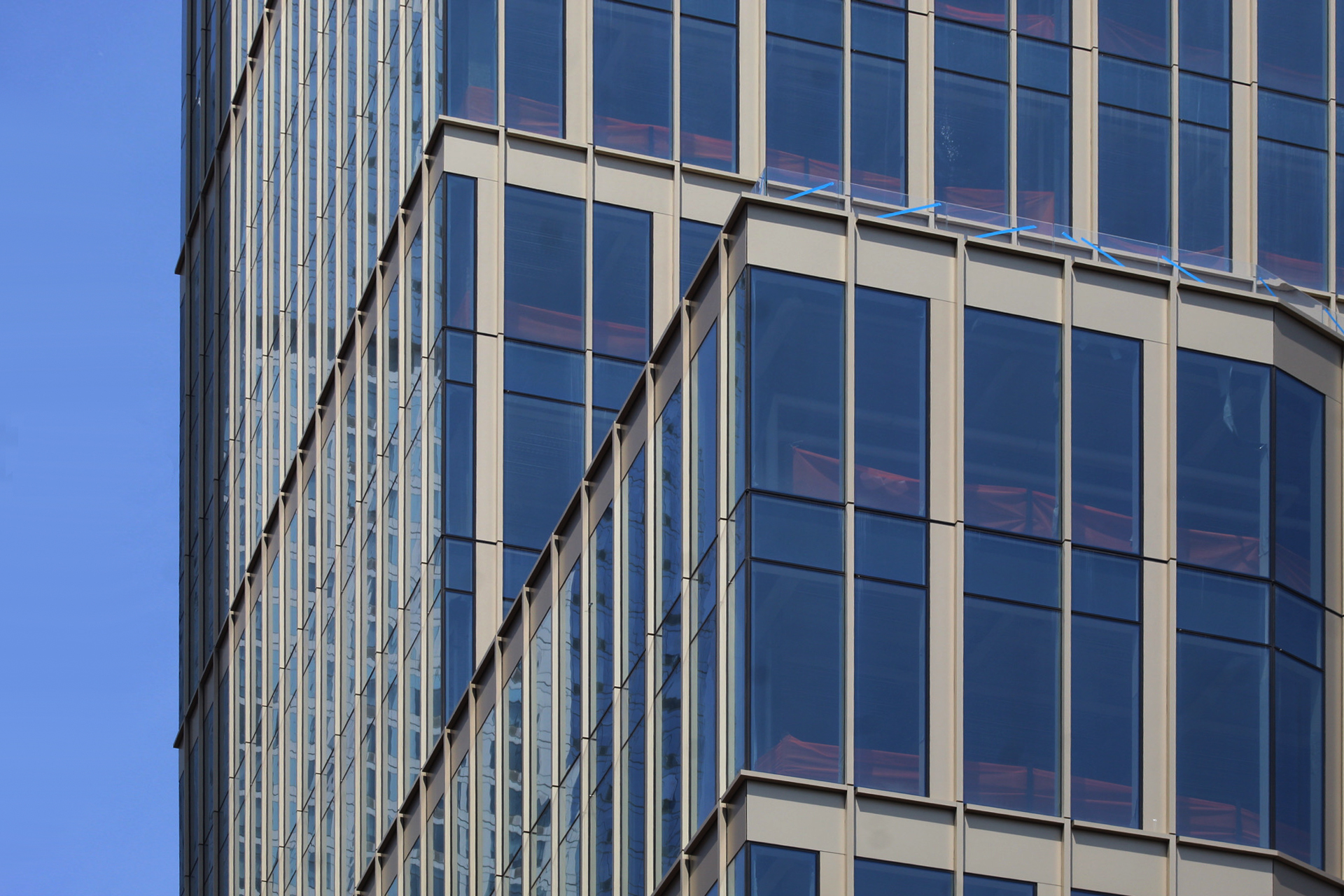
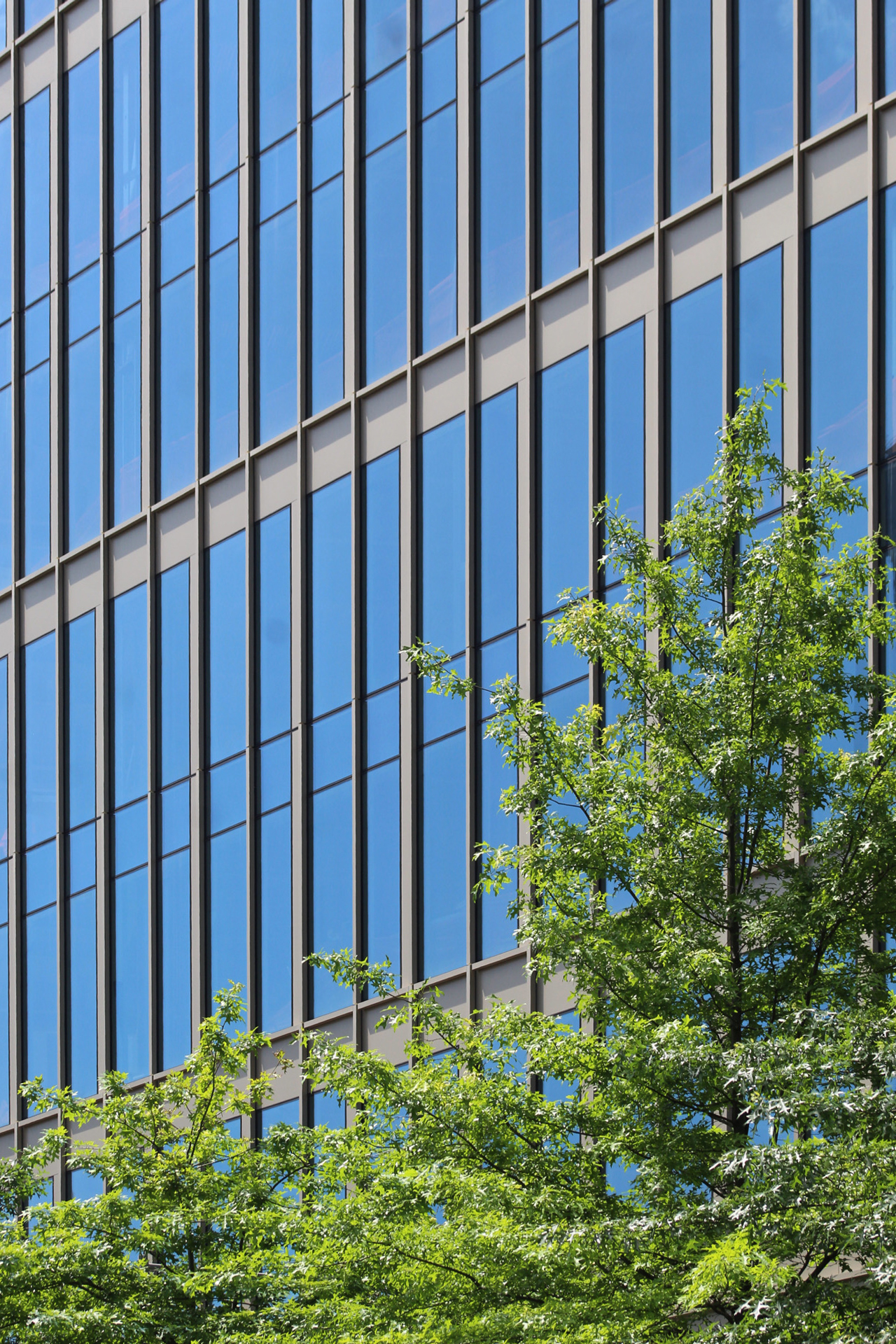
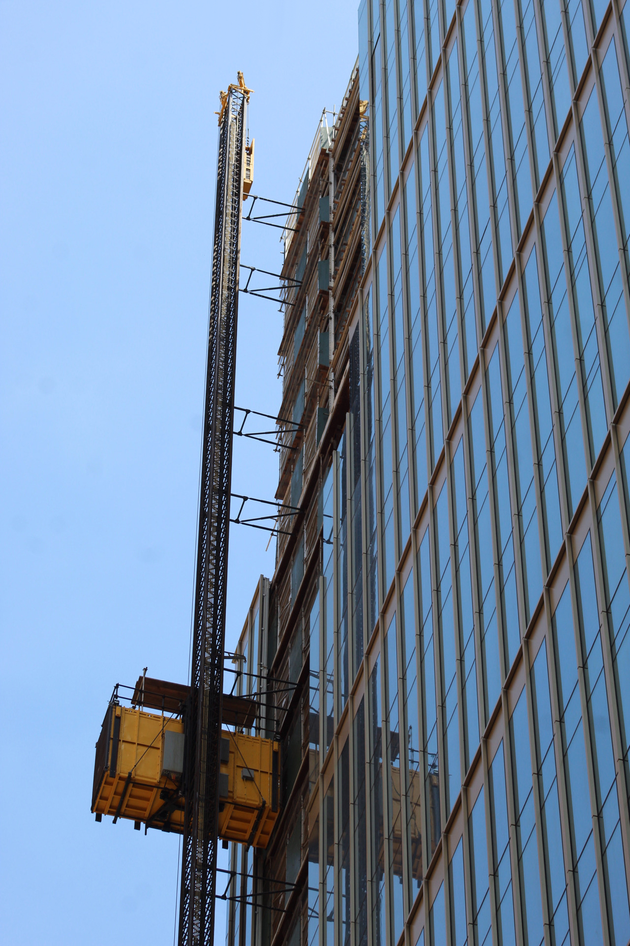
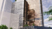
At the time of our last update in March, the floor-to-ceiling glass and bronze-colored paneling were closing in on the parapet. Since then, all of the remaining gaps have been filled in with the exception of the void on the western elevation where the construction elevator remains attached. Glass railings have also been installed along the setbacks on the southern and northern portions of 141 Willoughby Street, which will become outdoor terraces for tenants.
141 Willoughby Street. Photo by Michael Young
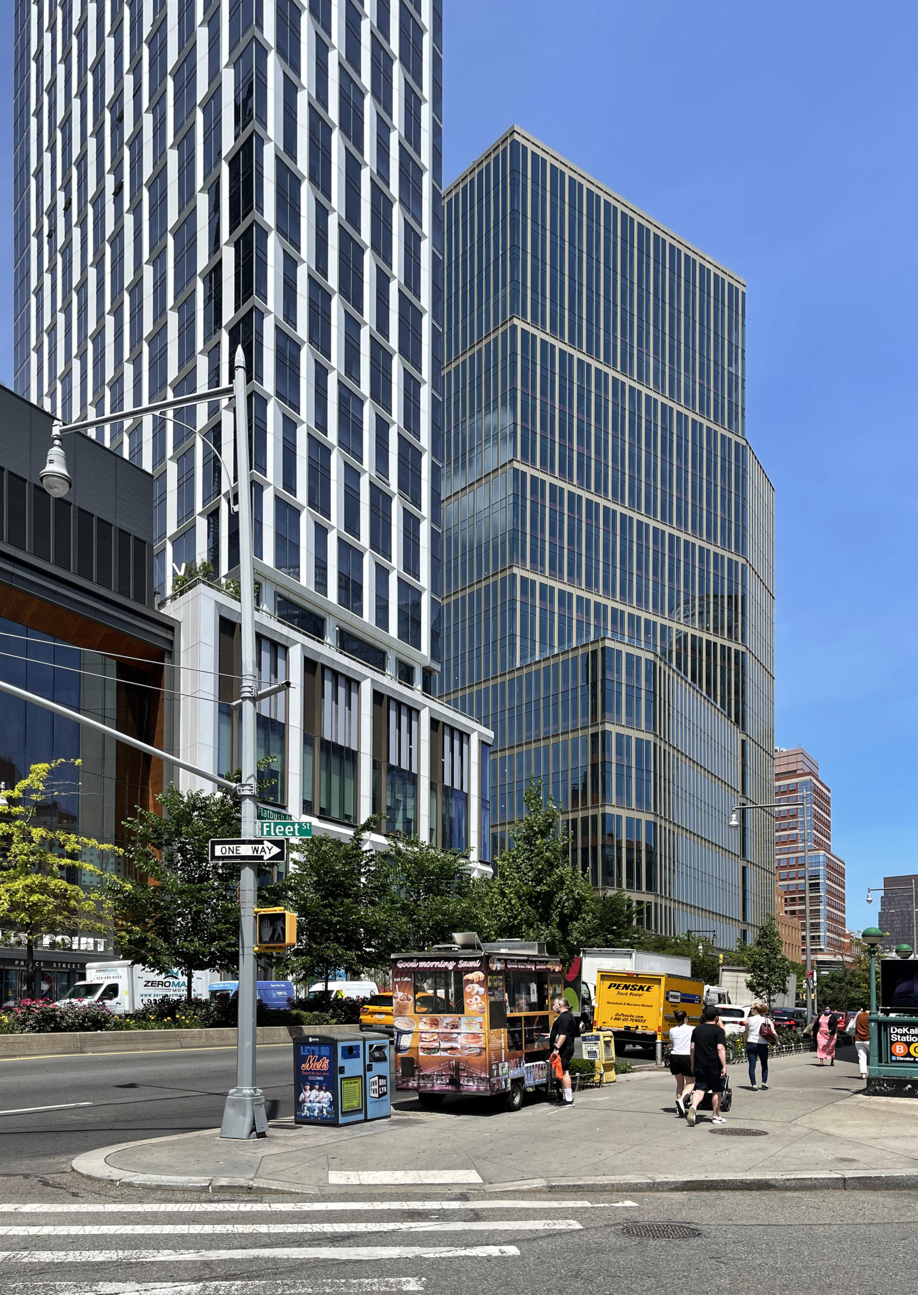
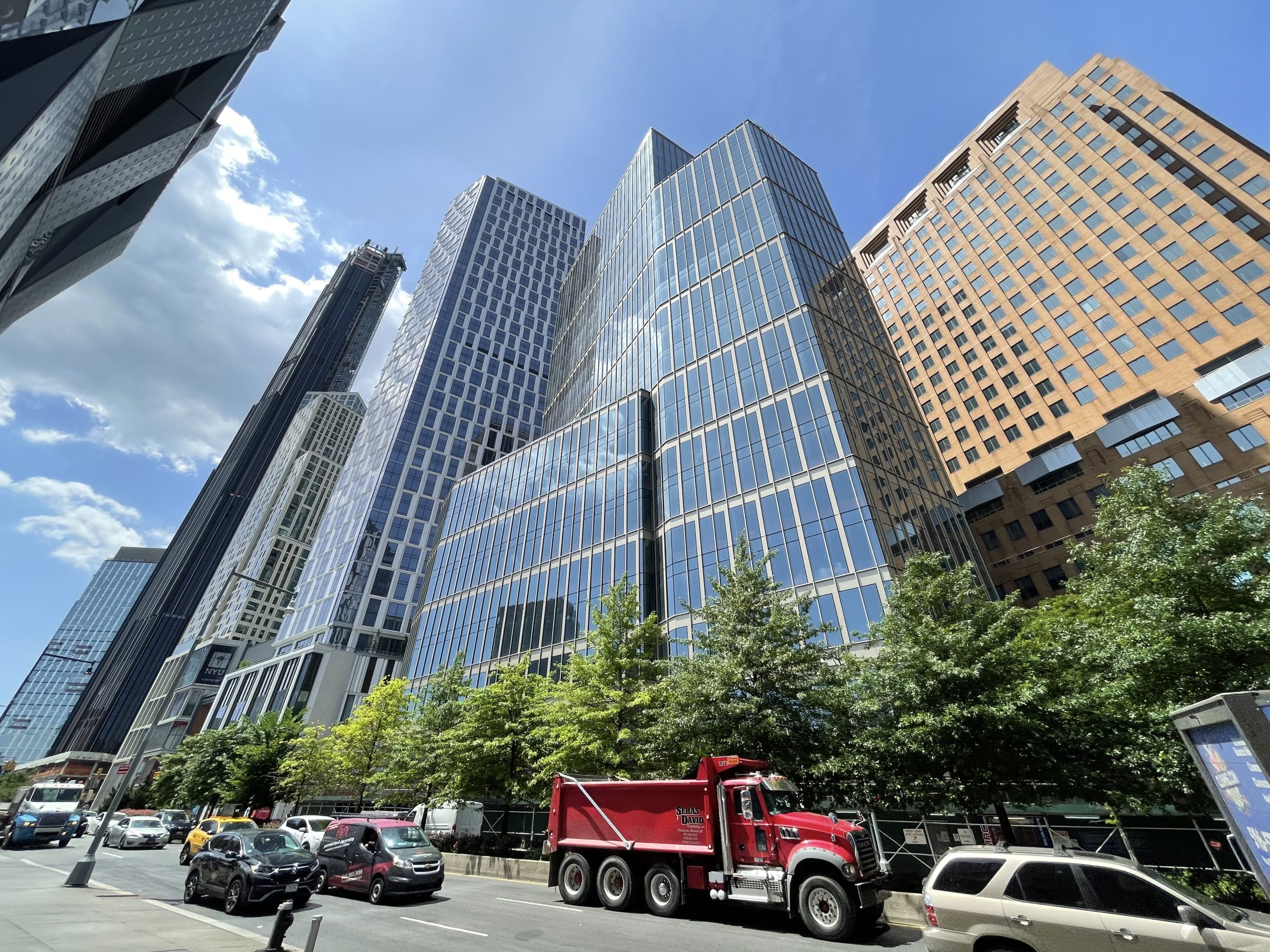
A good vantage point from which to view the building is from north of the parcel down Flatbush Avenue Extension. It is the first structure that one drives past when coming off of the Manhattan Bridge or when walking from Myrtle Avenue. Kohn Pedersen Fox‘s 720-foot-tall Brooklyn Point and SHoP Architects‘ 1,096-foot-tall 9 DeKalb Avenue succeed 141 Willoughby’s height in consecutive order.
YIMBY last reported that 141 Willoughby Street is expected to be finished in the first quarter of 2023. The hoist should be removed in the coming months, and interiors are underway.
Subscribe to YIMBY’s daily e-mail
Follow YIMBYgram for real-time photo updates
Like YIMBY on Facebook
Follow YIMBY’s Twitter for the latest in YIMBYnews






The curtain wall is really nice.
Agree. Very good looking building. That area of a Brooklyn is shaping up its own skyline quite nicely.
Three beautiful towers in row, below on street levels are prominent with their height above. Easily viewed all designs from base to top, three associated exteriors: Thanks to Michael Young.
The 6th photo makes it look like a ship.
Is it me, or did this building go up really quickly?
Some sort of supergraphics in/on the top fifth of the tower woyld look cool.
This building is interesting from so many angles—really working that trapezoidal lot to maximum effect!