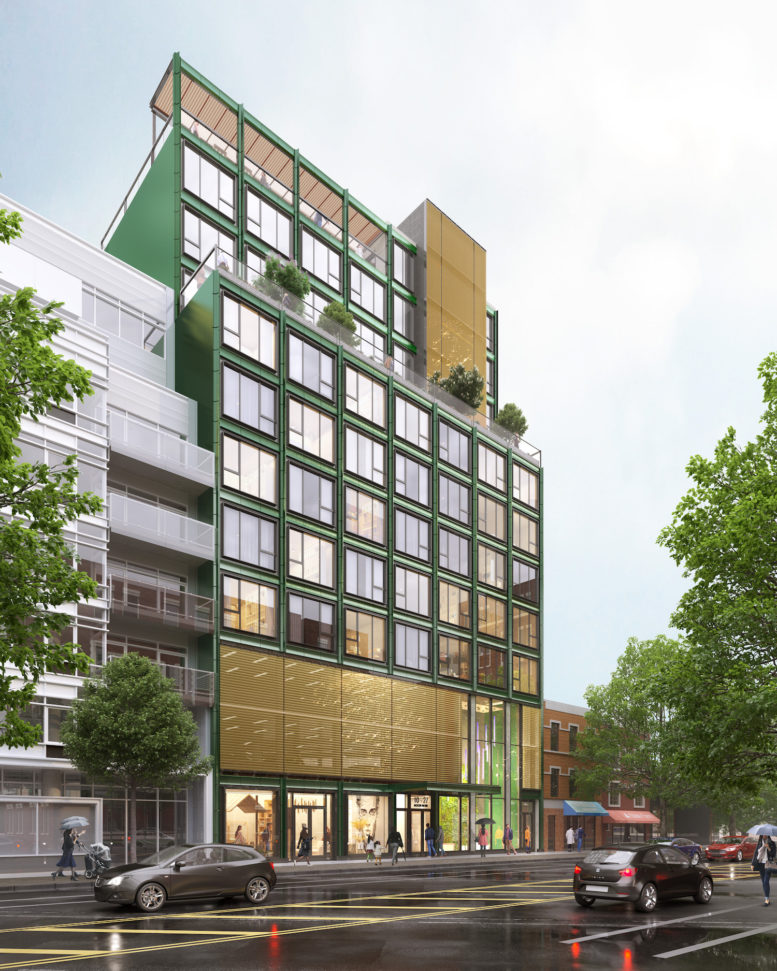
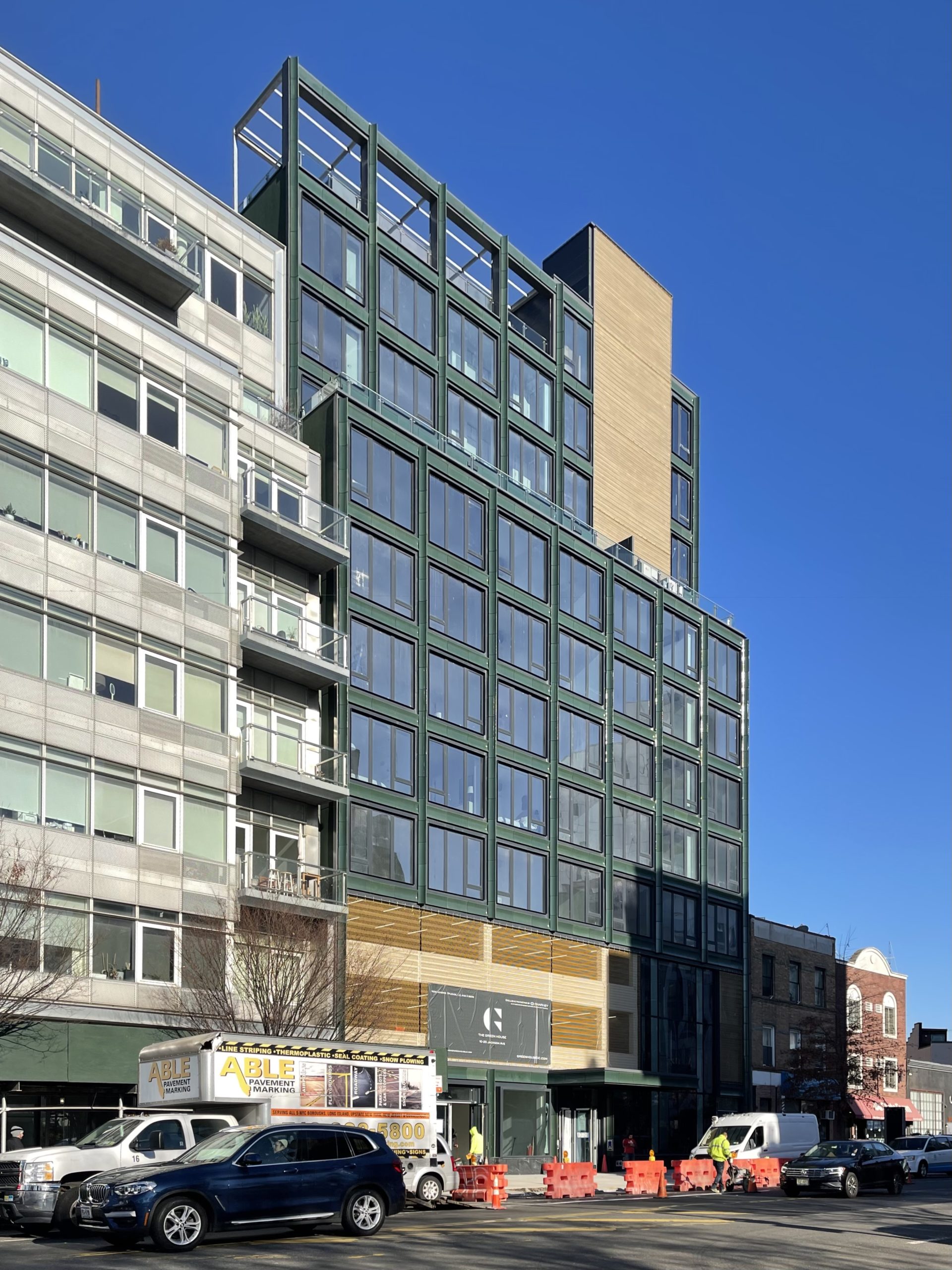
Construction is complete on The Green House, a 12-story residential building at 10-25 Jackson Avenue in Long Island City, Queens. Designed by Studio V Architecture and developed by Charney Companies, the structure yields 46 rental apartments in studio to three-bedroom layouts, ground-floor retail space, and 40 on-site parking spots. AMC Builders was the general contractor for the project, which is bound by 50th Avenue to the north, Jackson Avenue to the southeast, and Vernon Boulevard to the west.
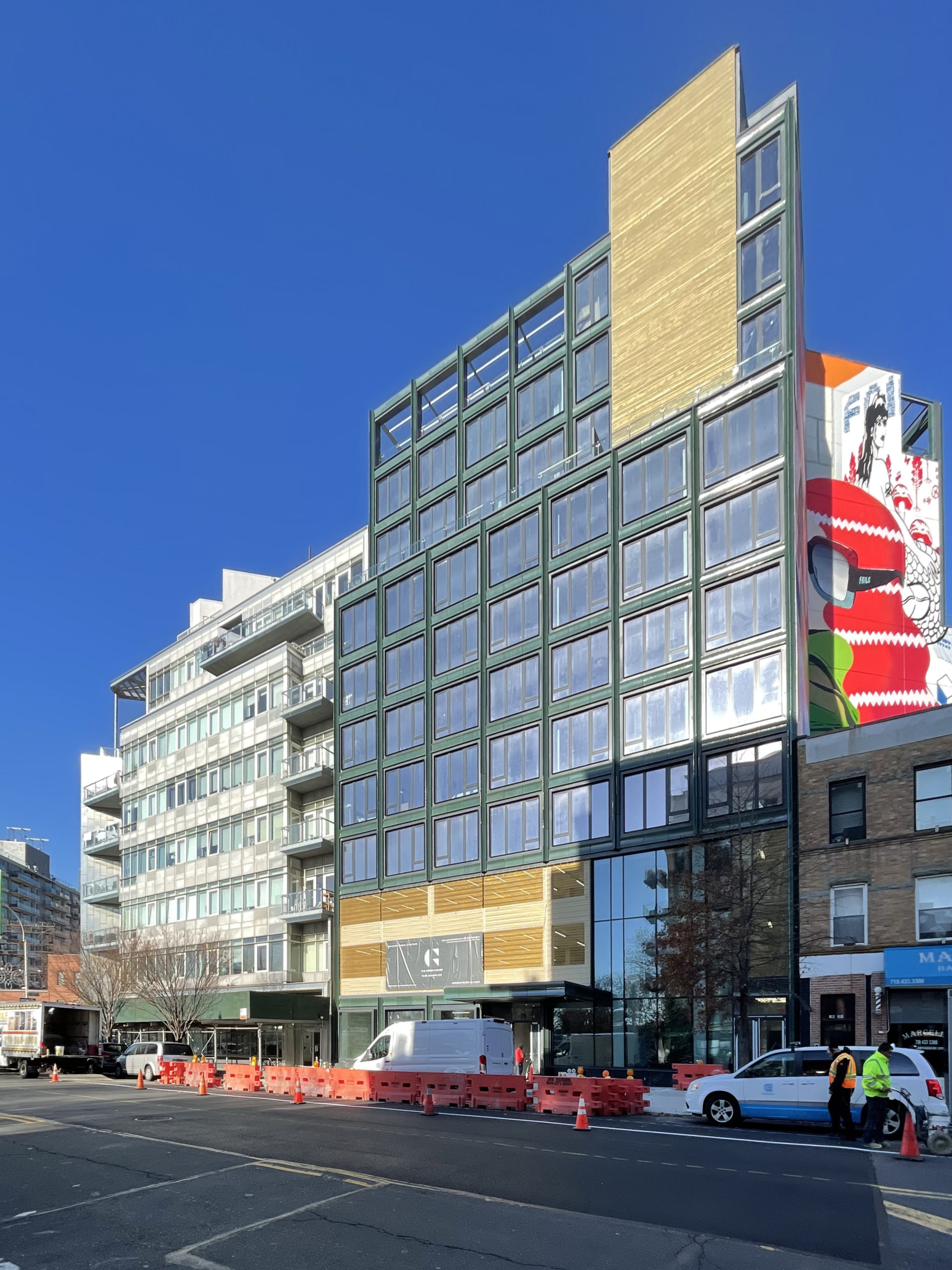
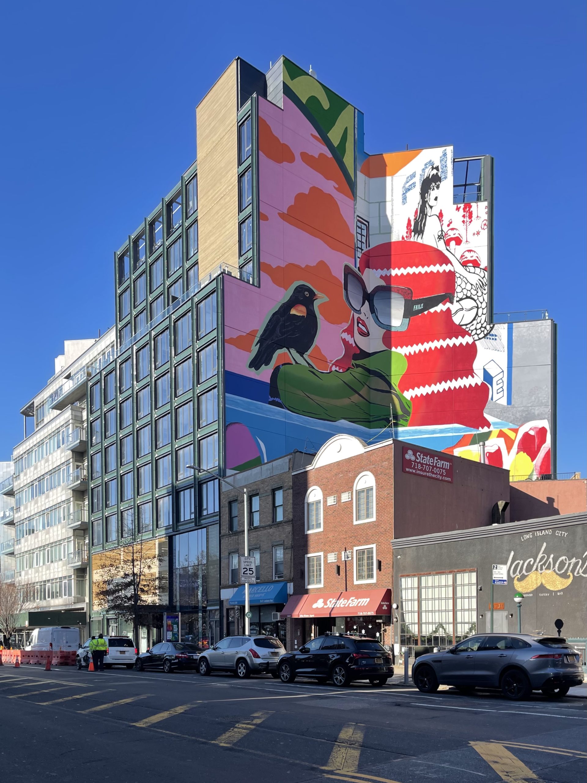
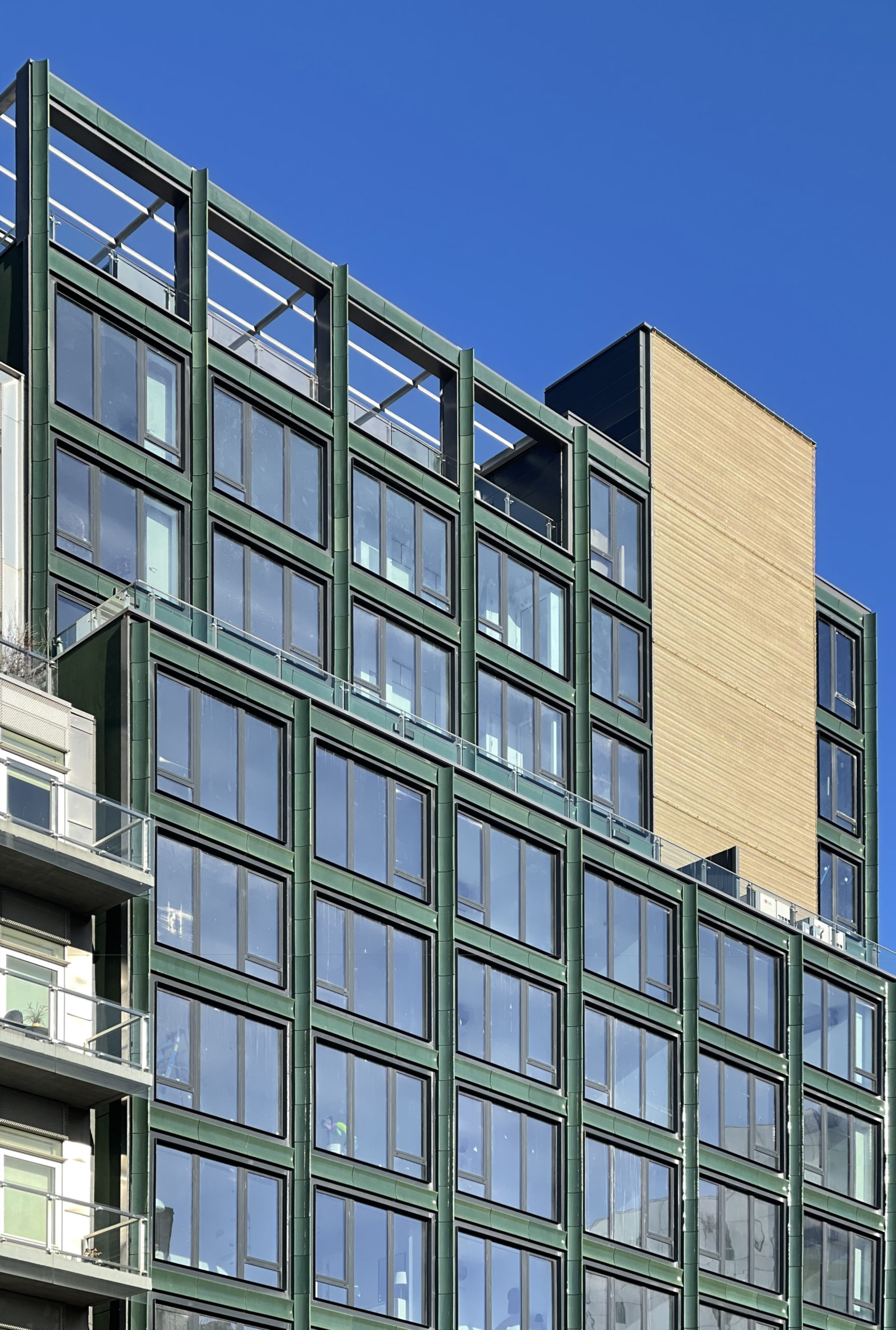
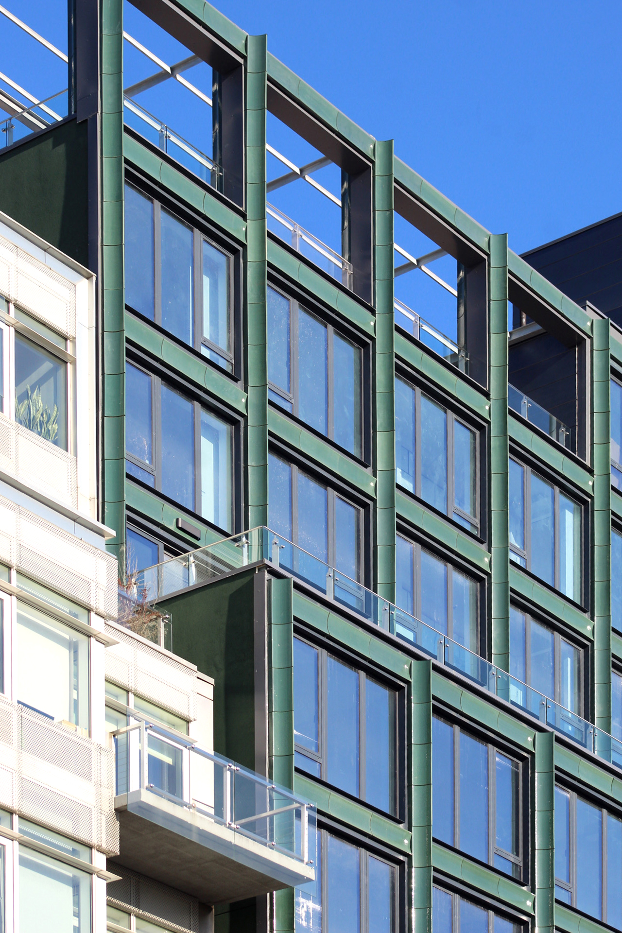
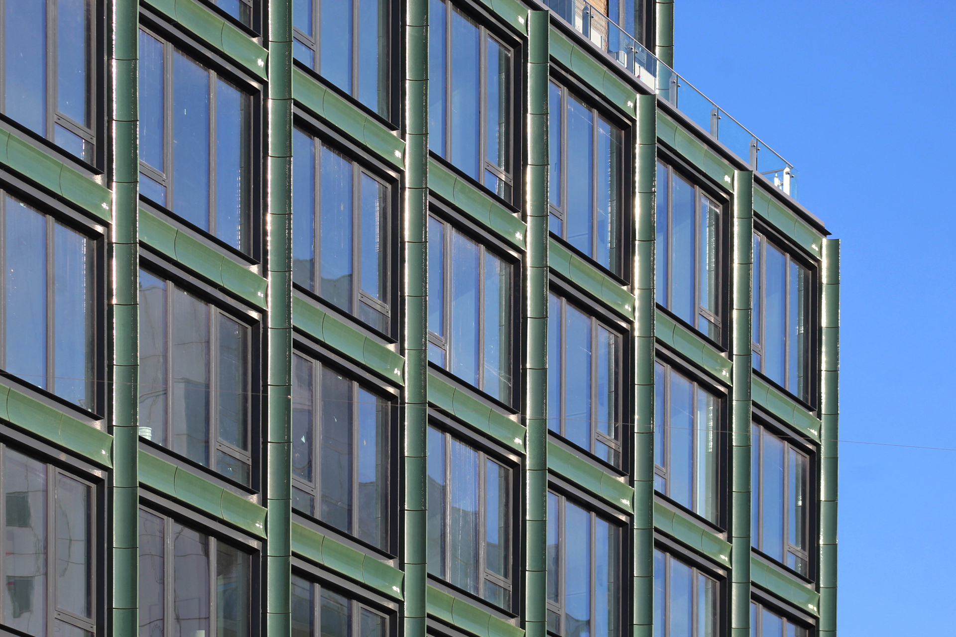
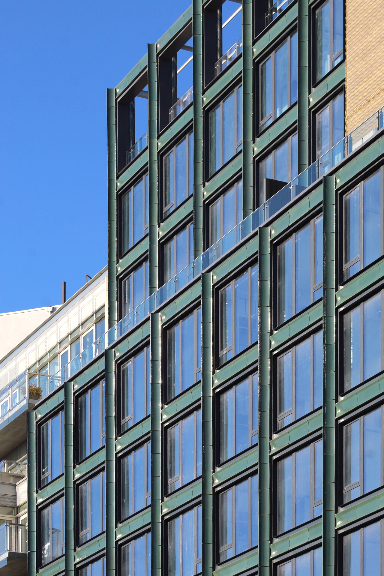
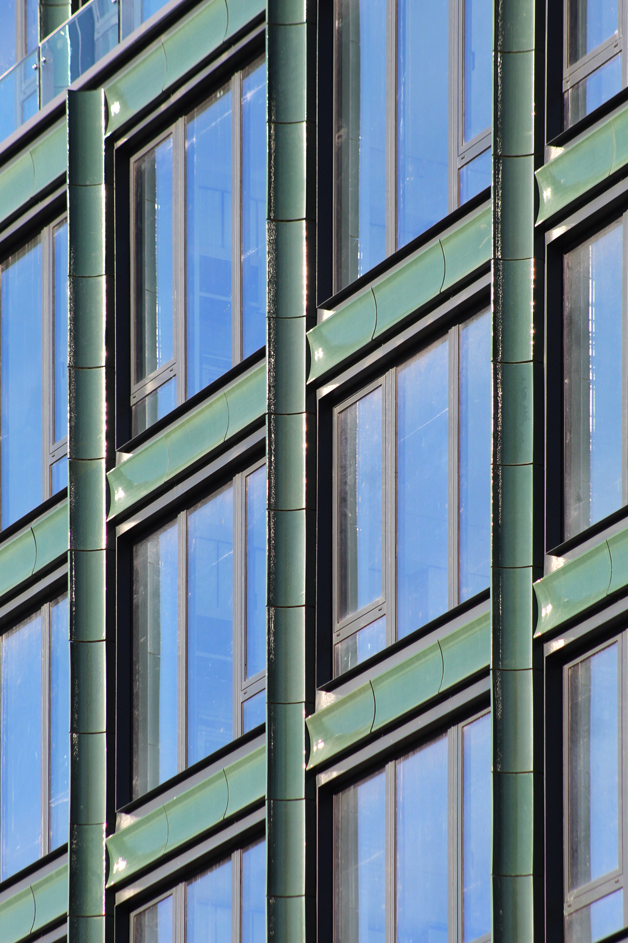
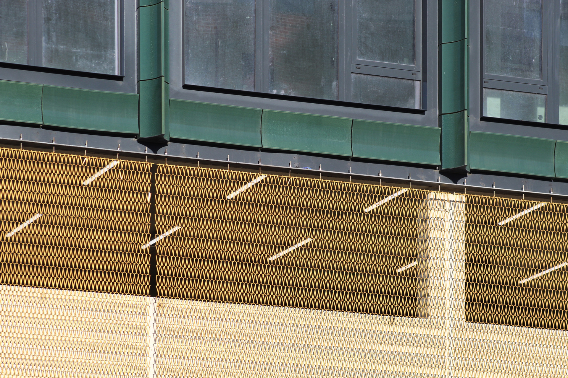
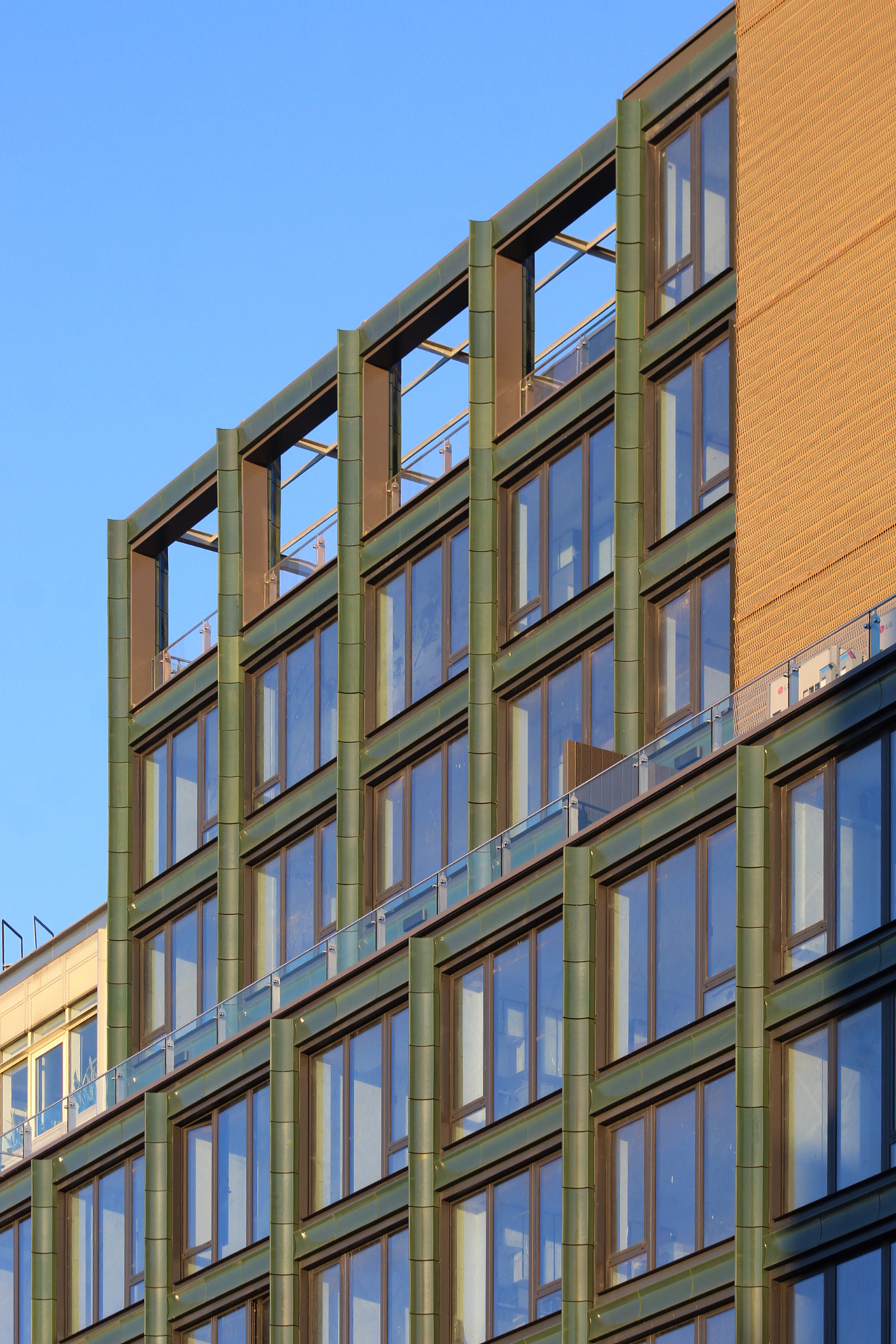
Recent photos show the completed look of the building and its green-glazed terracotta façade provided by Cladding Concepts framing the even grid of oversized floor-to-ceiling windows. All scaffolding has been dismantled from the property and only a few construction barriers remain, but should be removed in the coming weeks.
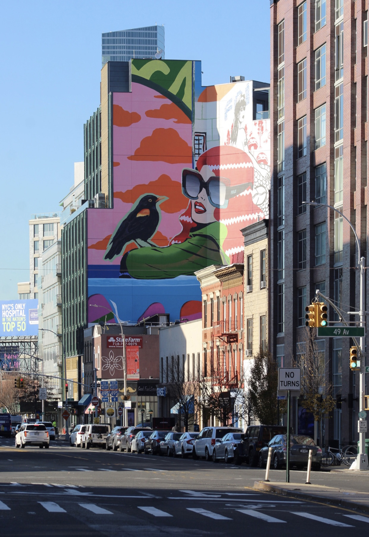
The most distinctive design element is the colorful mural adorning the entirety of the blank eastern elevation.
A setback above the eighth story makes way for a glass-lined terrace. Additional outdoor space is positioned on the roof level.
Below are photographs of the façade during sunrise.
Units come with washers and dryers, concrete Caesarstone countertops and backsplashes, low-iron glass-panelized appliances and cabinetry, wide-plank flooring, and sound-attenuating insulated walls. Homes also feature a climate control package that includes motorized blackout shades.
Residential amenities for The Green House include a rooftop deck with an awning, a double-height lobby with a living green wall and an interactive lighting piece called “Flux Chandelier” by Brooklyn artist and engineer Jen Lewin, a fitness center with equipment by Wright Fit, a lounge with a wraparound outdoor terrace, a coworking lounge, personal storage, and parking with electric vehicle charging stations.
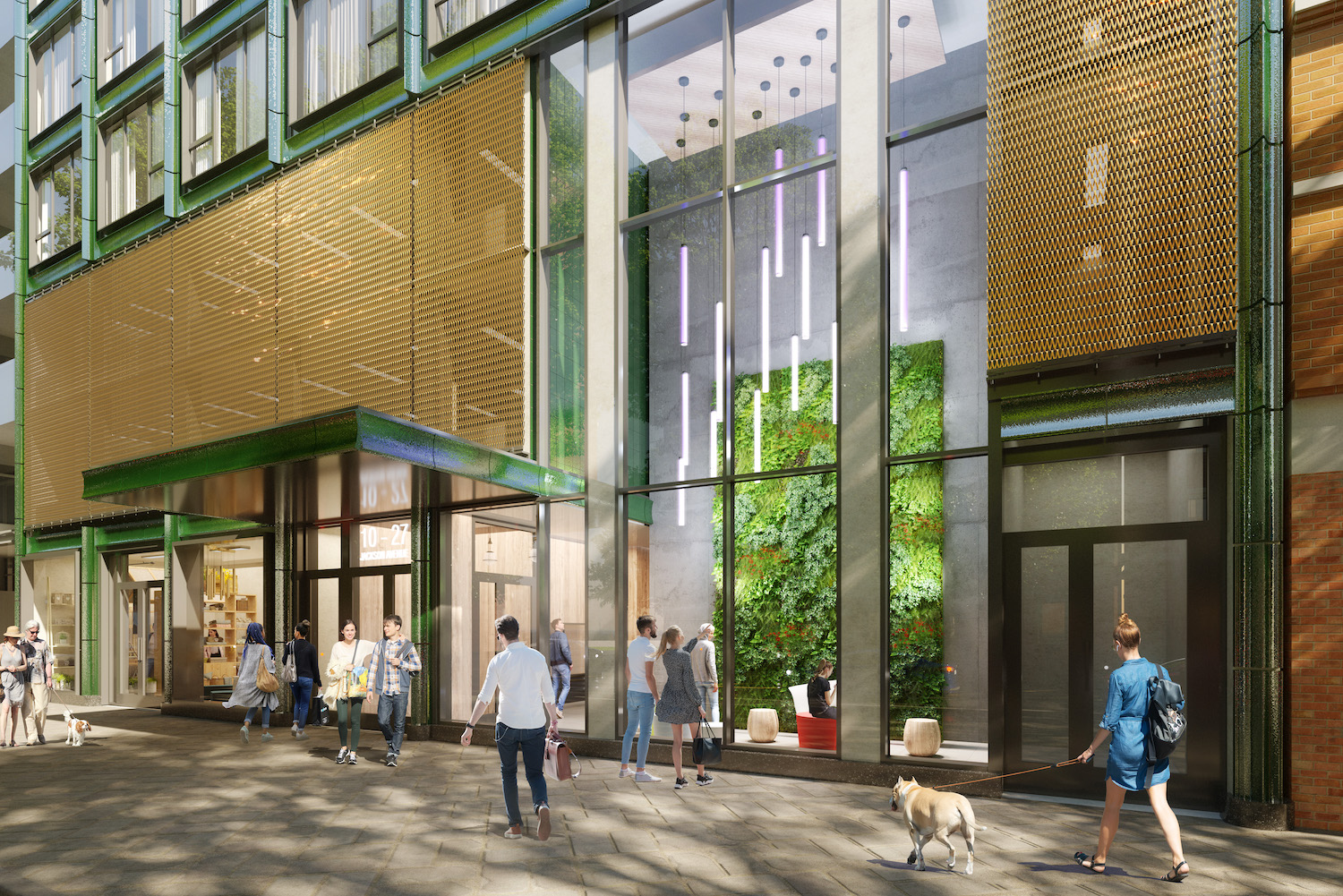
The Green House, at 10-27 Jackson Avenue in Long Island City, Queens. Designed by Studio V Architecture
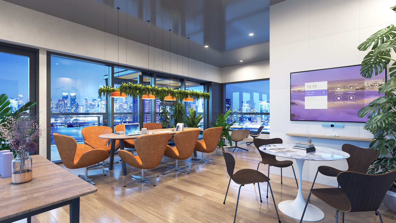
The lounge at The Green House, at 10-27 Jackson Avenue in Long Island City, Queens. Designed by Studio V Architecture
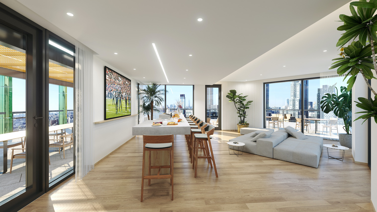
The co-working lounge and adjacent outdoor terrace at The Green House, at 10-27 Jackson Avenue in Long Island City, Queens. Designed by Studio V Architecture
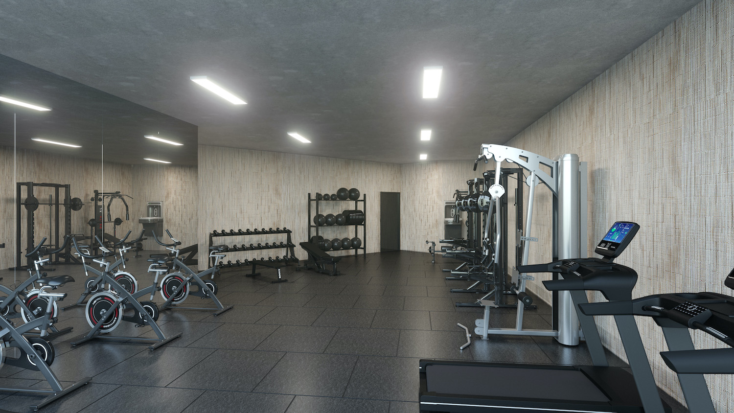
The fitness center at The Green House, at 10-27 Jackson Avenue in Long Island City, Queens. Designed by Studio V Architecture
The Green House is located directly in front of the entrance to the Vernon Boulevard subway station that services the local 7 train, and is only one stop from Grand Central Station in Midtown, Manhattan.
Subscribe to YIMBY’s daily e-mail
Follow YIMBYgram for real-time photo updates
Like YIMBY on Facebook
Follow YIMBY’s Twitter for the latest in YIMBYnews





It’s an interesting design that complements the neighborhood. I’m not so thrilled about the mural.
Would be an A+ if it weren’t for the parking garage.
What the heck is wrong with a parking garage?
It’s decent. I like the depth of the facade. The mural is very uninspiring, though.
Maybe it might get repainted sometime down the road