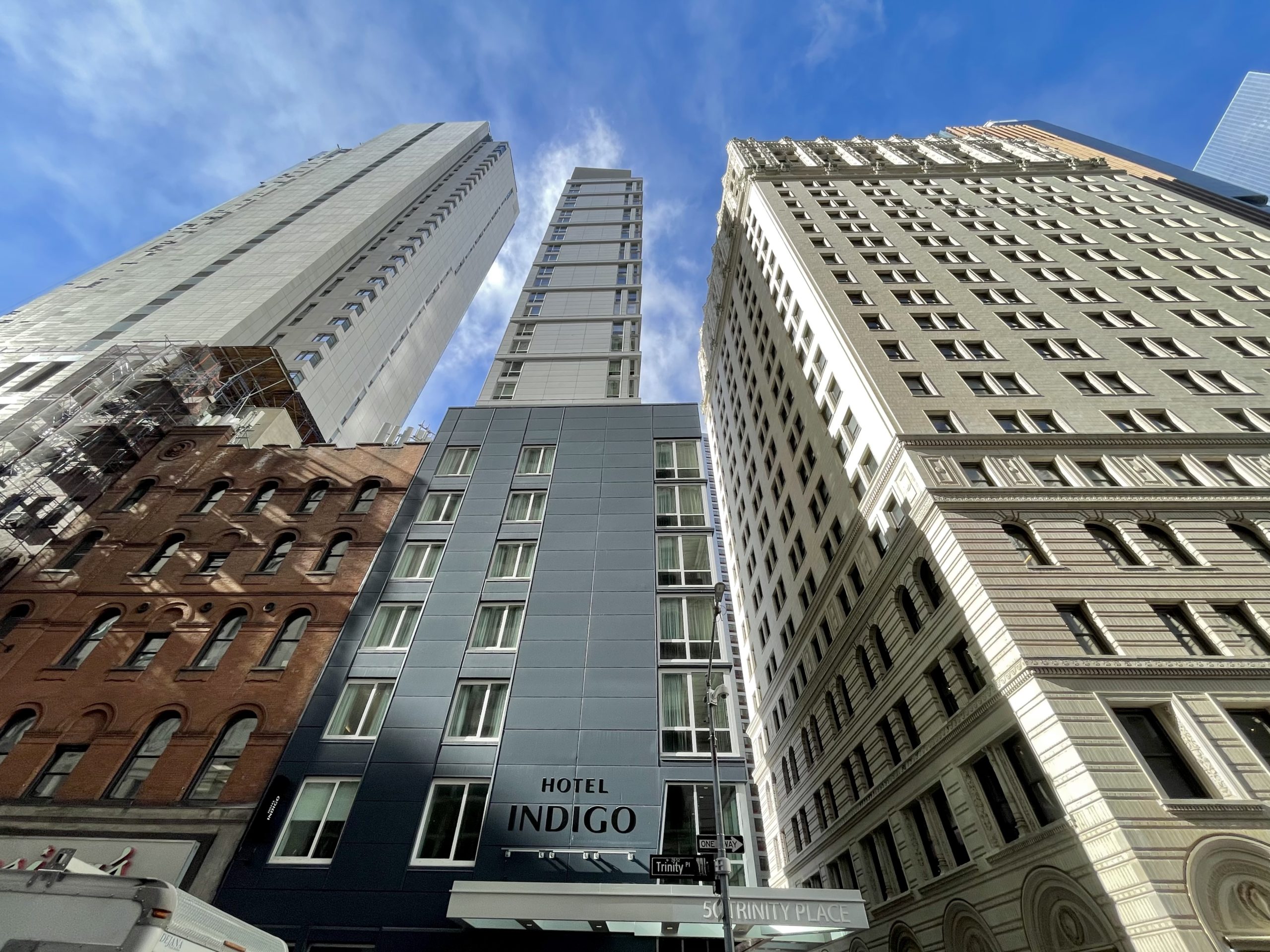
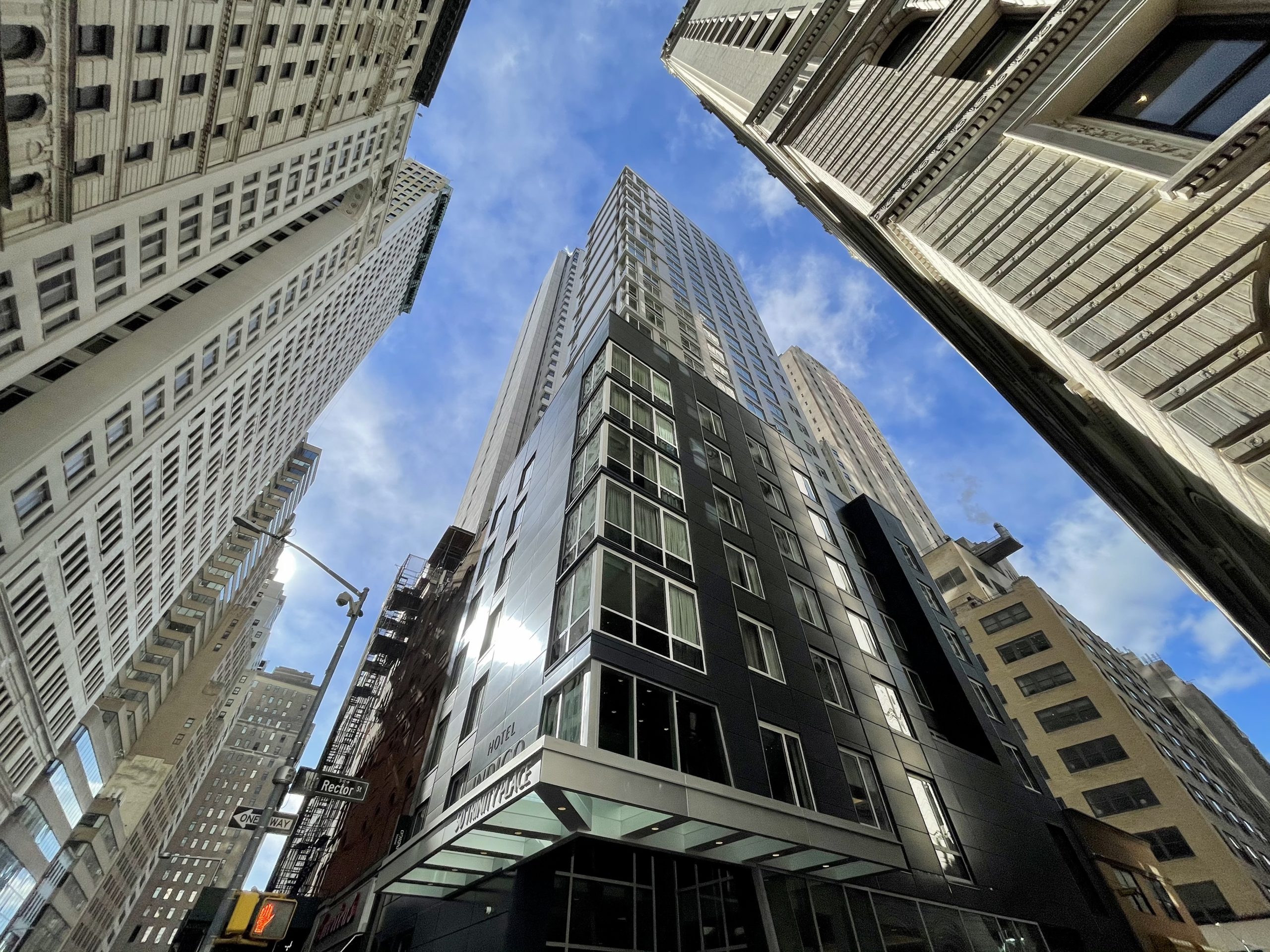
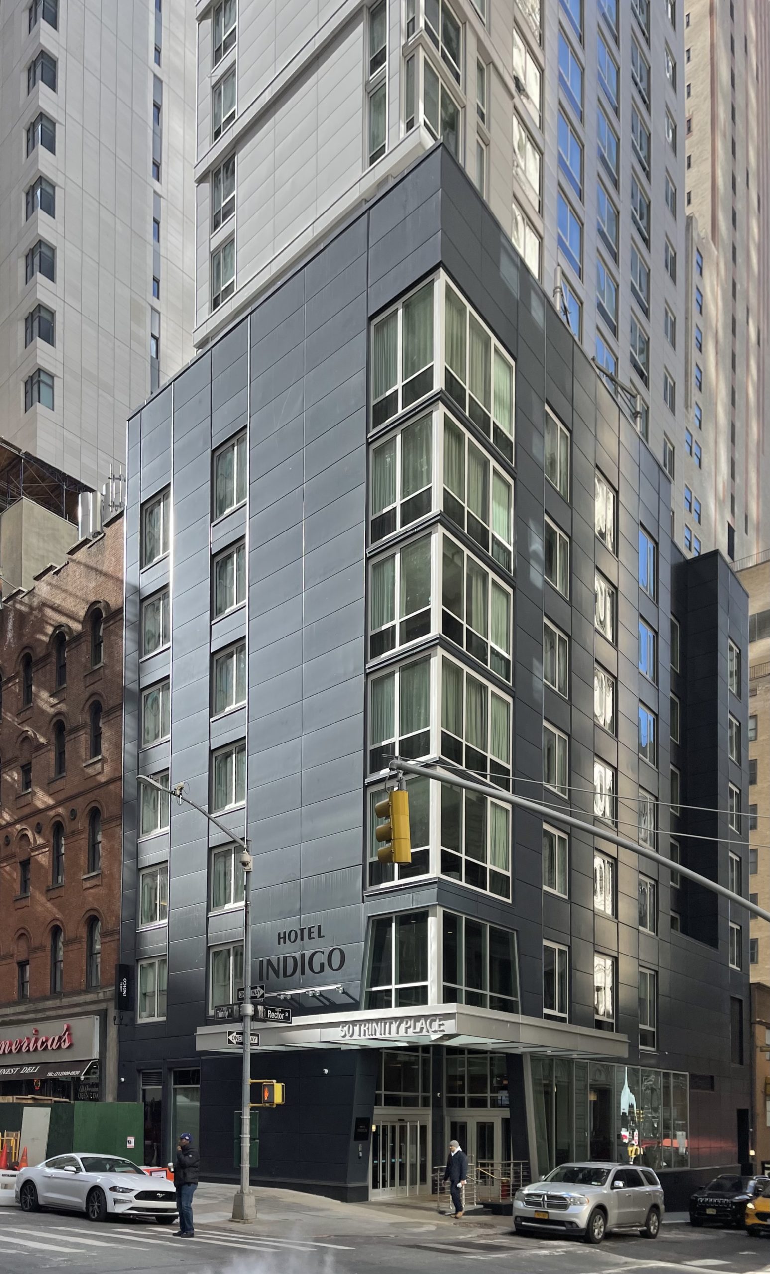
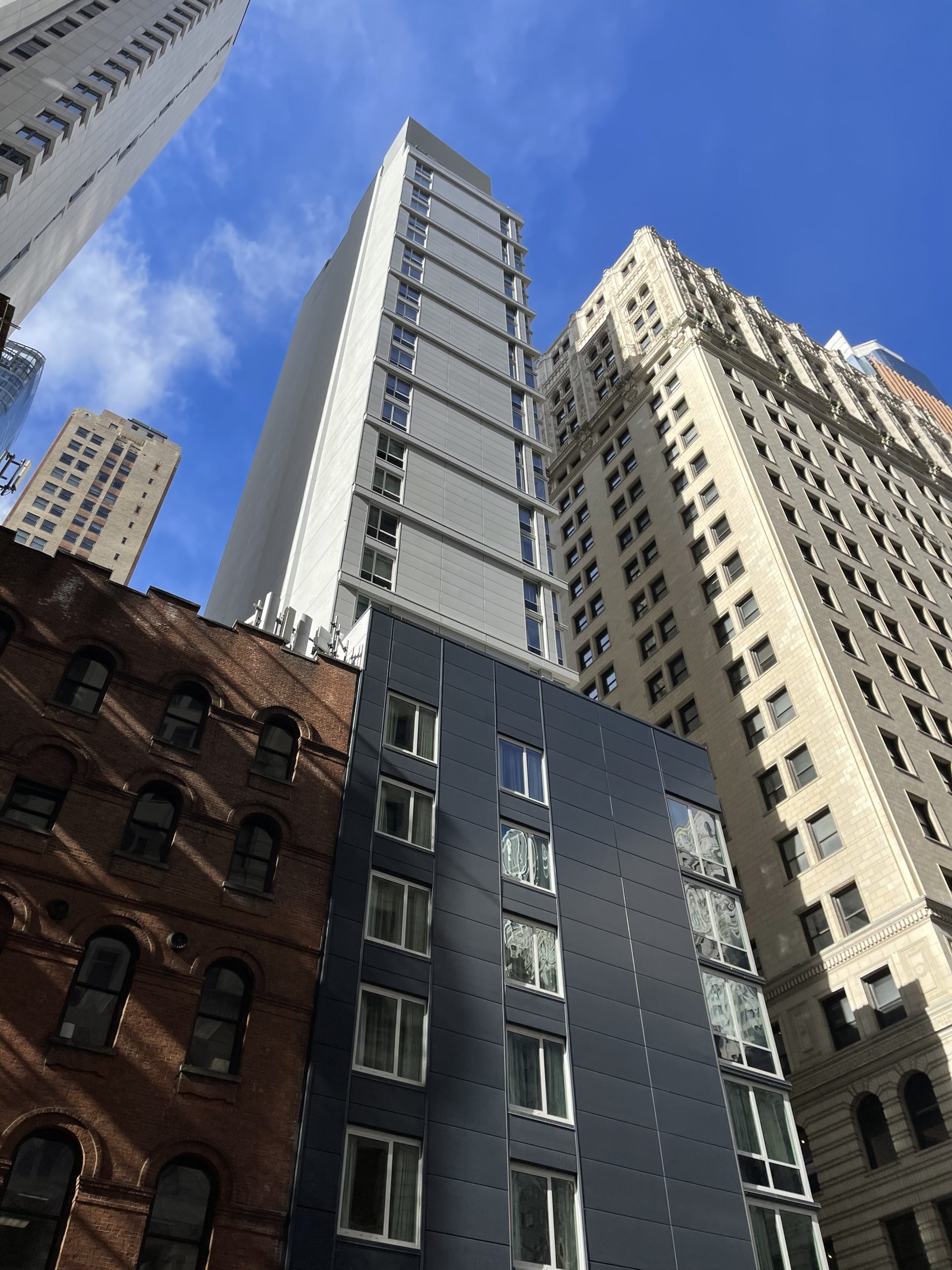
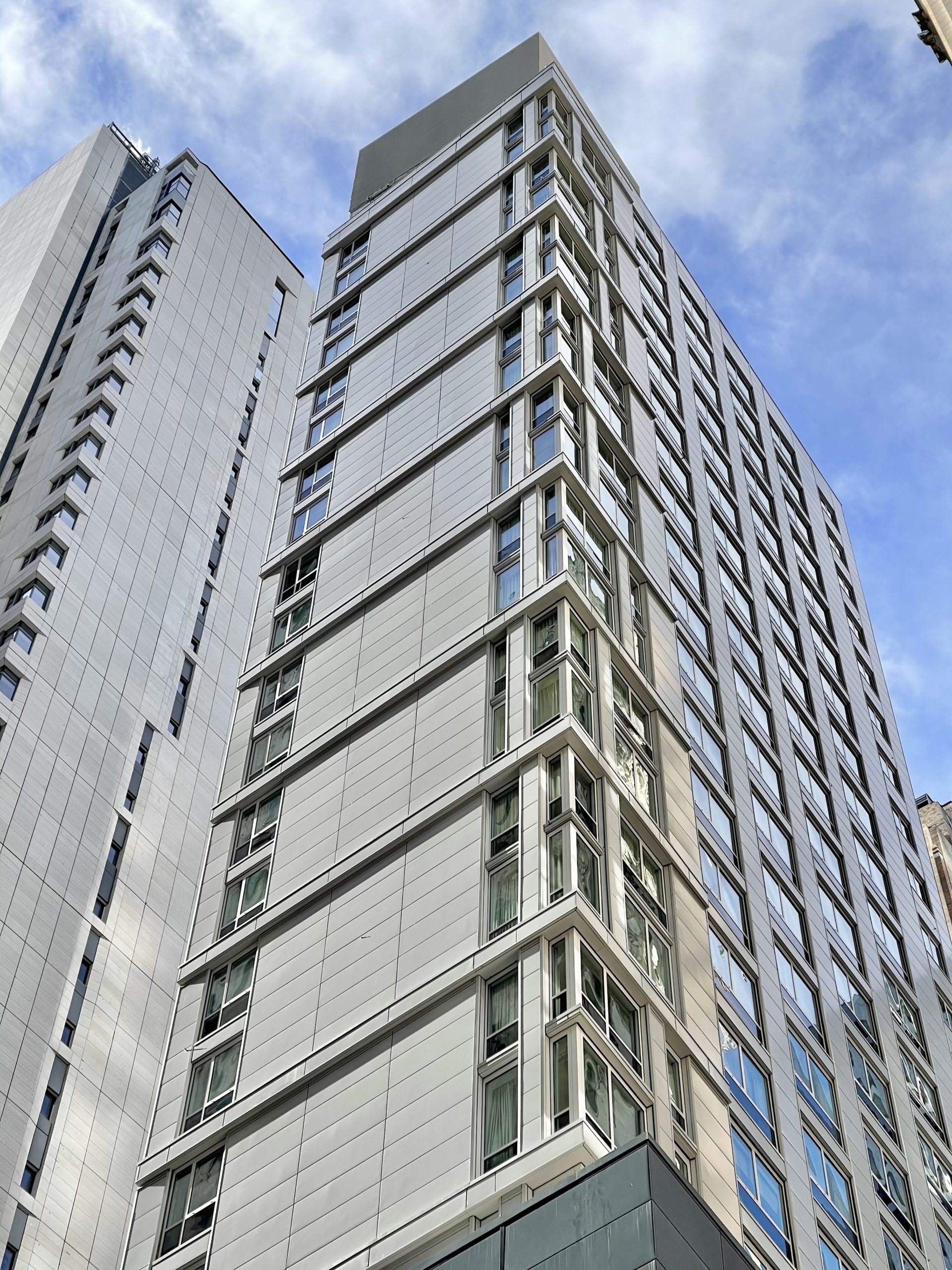
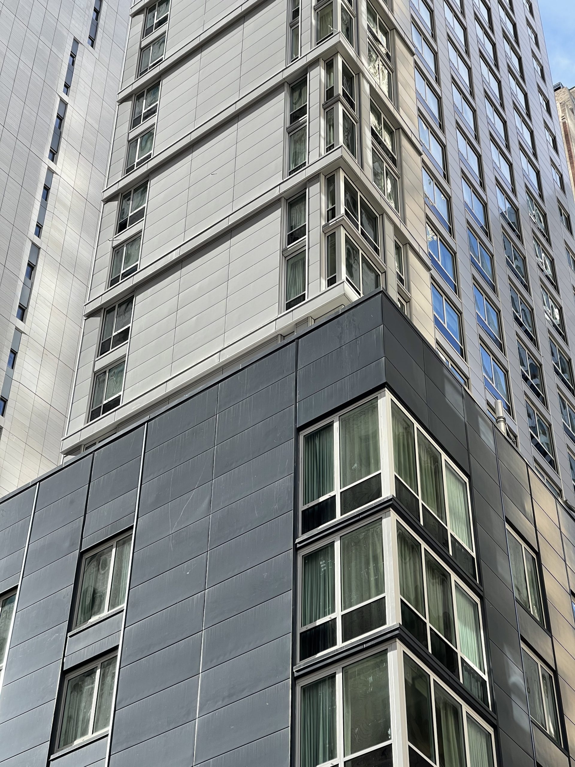
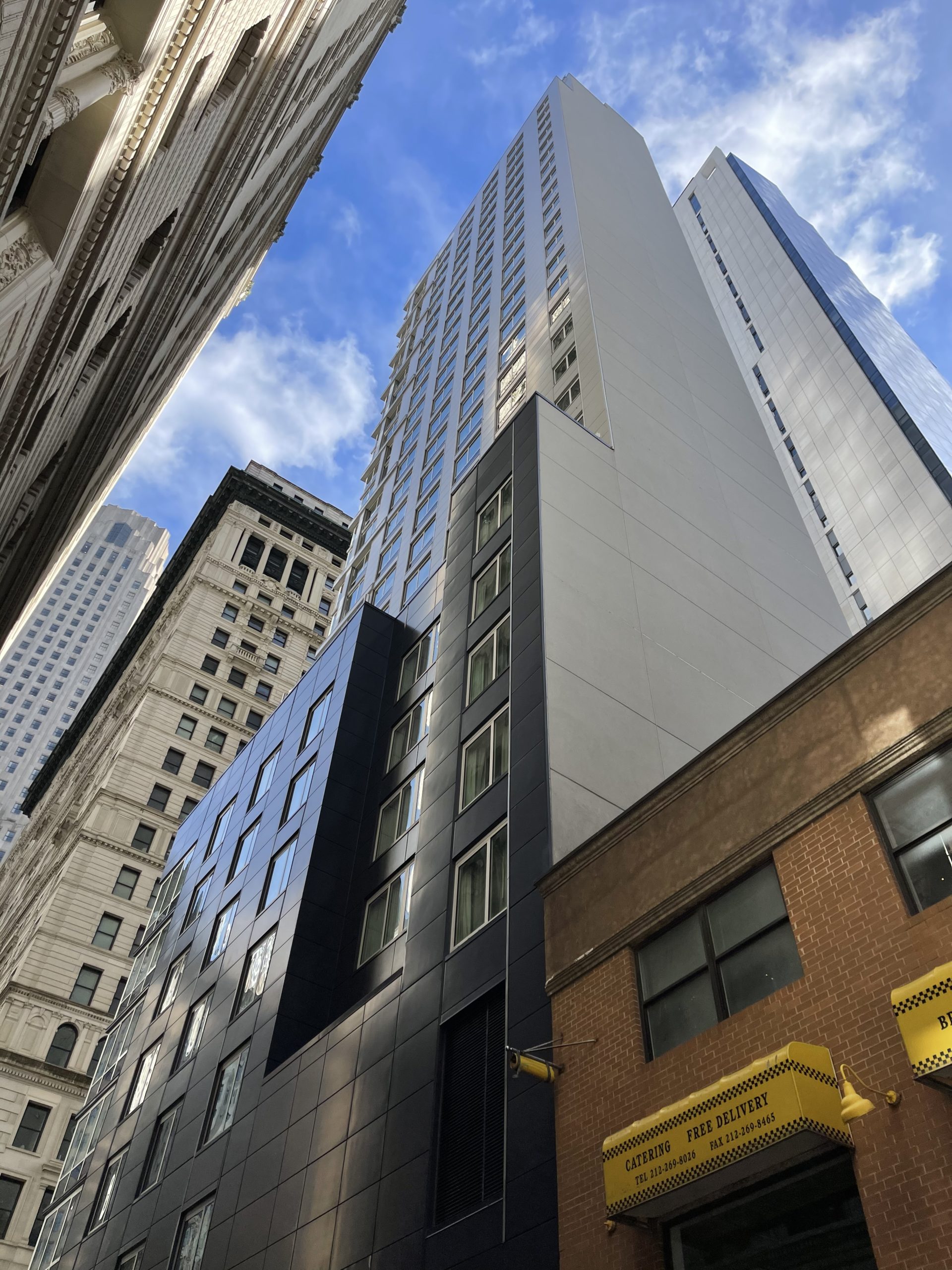
Construction is complete on 50 Trinity Place, a 28-story Hotel Indigo in the Financial District. Designed by Peter Poon Architects and developed by FIT Investment Corporation, the 311-foot-tall structure yields 77,310 square feet and 173 guest rooms. Cauldwell Wingate was the general contractor for the Lower Manhattan project, which is located at the southwest corner of Trinity Place and Rector Street, diagonally across from Trinity Church.
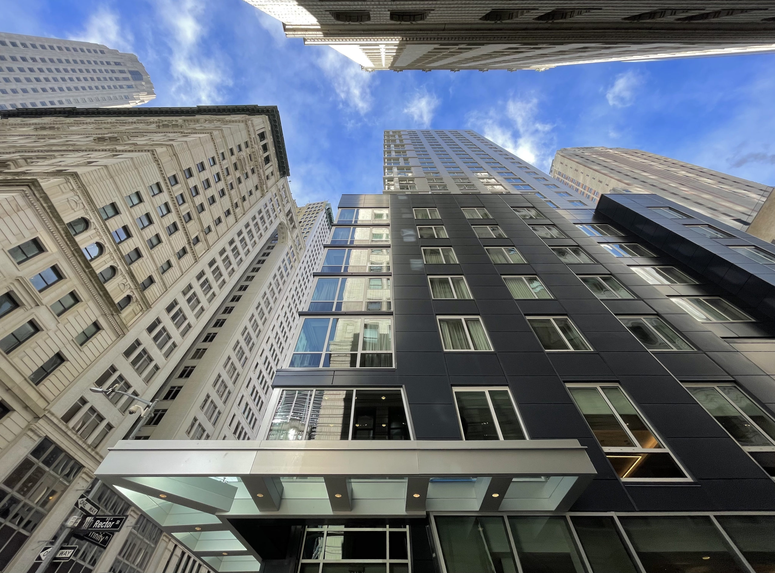
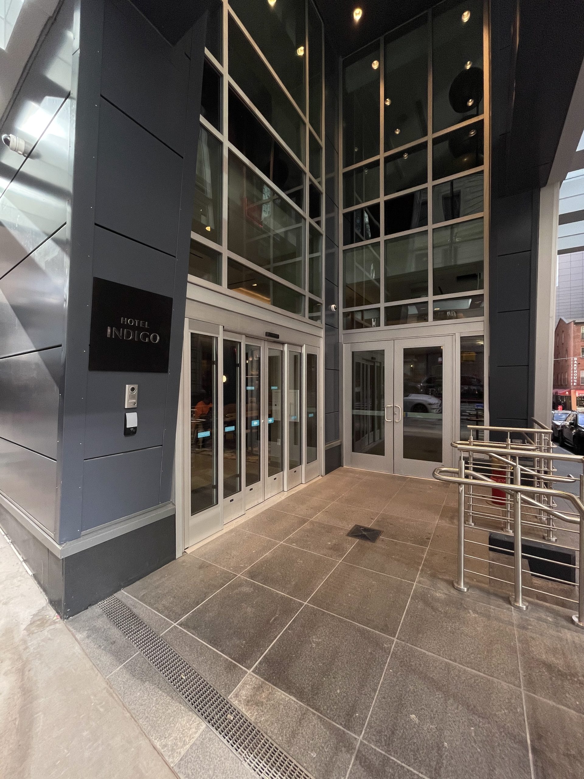
Work has wrapped up on the podium and ground floor since our last update in August, all of the sidewalk scaffolding and construction barriers have been removed, and the hotel has opened its doors to guests. The property was initially reported to be an Aloft Hotel, but recent photos show Hotel Indigo branding above the main entrance.
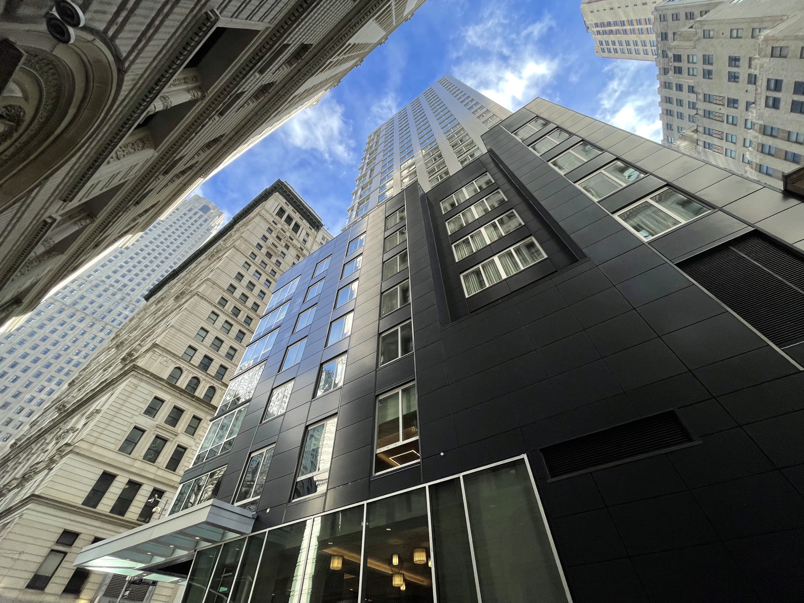
The main tower is clad in light gray paneling with horizontal bands marking the position of each floor plate on the narrow elevation facing Trinity Place. The building’s materials and color scheme blend well with its adjacent residential neighbor at 77 Greenwich Street.
The Hotel Indigo is located within walking distance of a host of New York City highlights including the World Trade Center complex, Liberty Park, and the Westfield mall in the Oculus to the north; the southern stretch of Broadway and Wall Street to the east; the Hudson River esplanade along Battery Park City to the west; and nearby ferries to the Statue of Liberty, Governors Island, and Staten Island.
The Rector Street subway station is located directly in front of the property, providing convenient access to the R and W trains. Also nearby are the 4 and 5 trains at the Wall Street station along Broadway, the 1 train at the Rector Street station to the west, and PATH trains to New Jersey at the World Trade Center complex.
Subscribe to YIMBY’s daily e-mail
Follow YIMBYgram for real-time photo updates
Like YIMBY on Facebook
Follow YIMBY’s Twitter for the latest in YIMBYnews







Bland, cheap Poon.
What a shame!
Tower O’ Trash.
Almost like the task was to disregard and disrespect the surrounding context as much as possible. Unfortunately there is no mechanism in place to require better aesthetic outcomes because technically all professional requirements are being met. That leaves the market itself to encourage quality over poor quality design, which it too in this case failed to prevent this defacement.
This looks like the aluminum utility shed in the backyard of the stone mansion. Disgraceful.
Gene Kaufman wannabe
The place of huge high-rises to crowd the ground below and above the air to show its crown at night, beautiful entrance on the tower which is suitable color over space that it had installed. Clad in light gray paneling with horizontal bands marking the position of each floor plate, color scheme so beautiful and blend well with neighbor so color made me crazy to see: Thanks to Michael Young.
Yikes. This looks really bad.
Soulless. Incompetent. Arrogantly bad. The developer is just as guilty as the architect in perpetrating this travesty.
Just another large pile of Poon!
The blue/grey walls at the base already need repainting.
This isn’t criminal design, it’s just mediocre at best.
I thought abortions were illegal, now.
Never bought into the idea of cladding but I understand the reason behind it’s popularity, which is budget cost
Wow, this is odious. It actually makes me mad to look at.
Hideous. The vacant lot was better.
And
Soon to be the next homeless : refugeee shelter.
Only in New York kids !
Couldn’t be much worse
Everyone has a POV – lol. Here’s mine. I am still amazed that developers and architects can work together to invest in such a cheap product when they are in one of the most expensive real estate markets in the world. It’s like dining at Delmonicos and asking the waiter for wonder bread to save money.