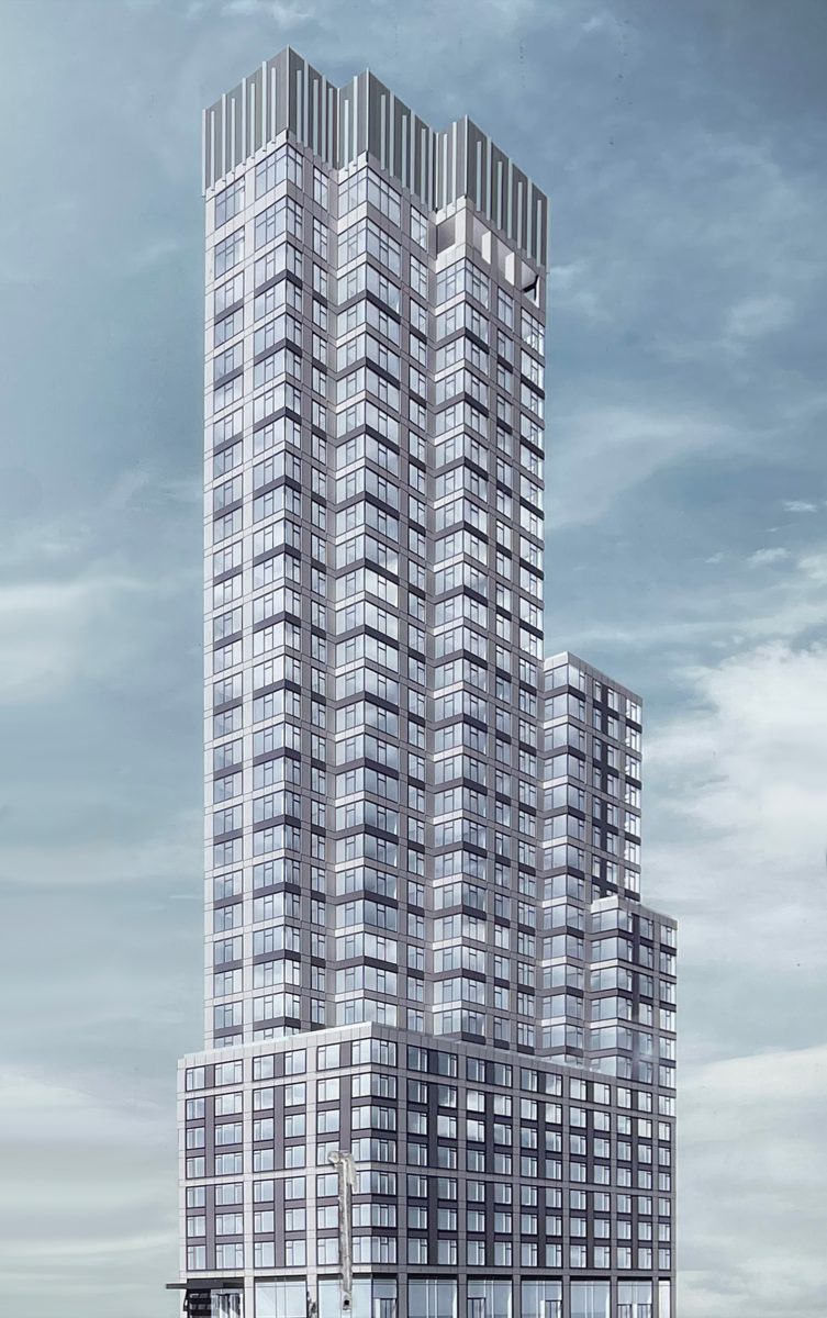
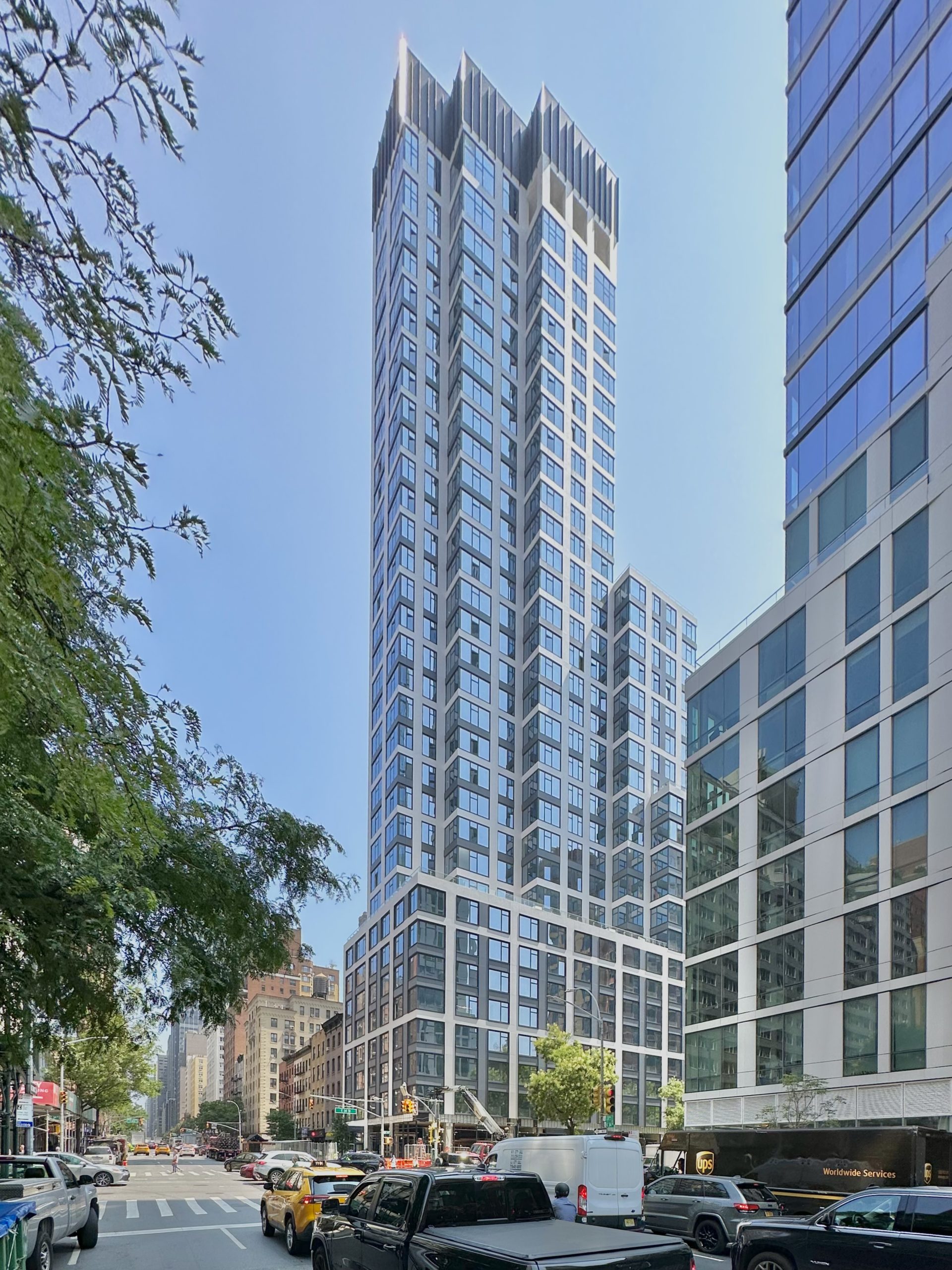
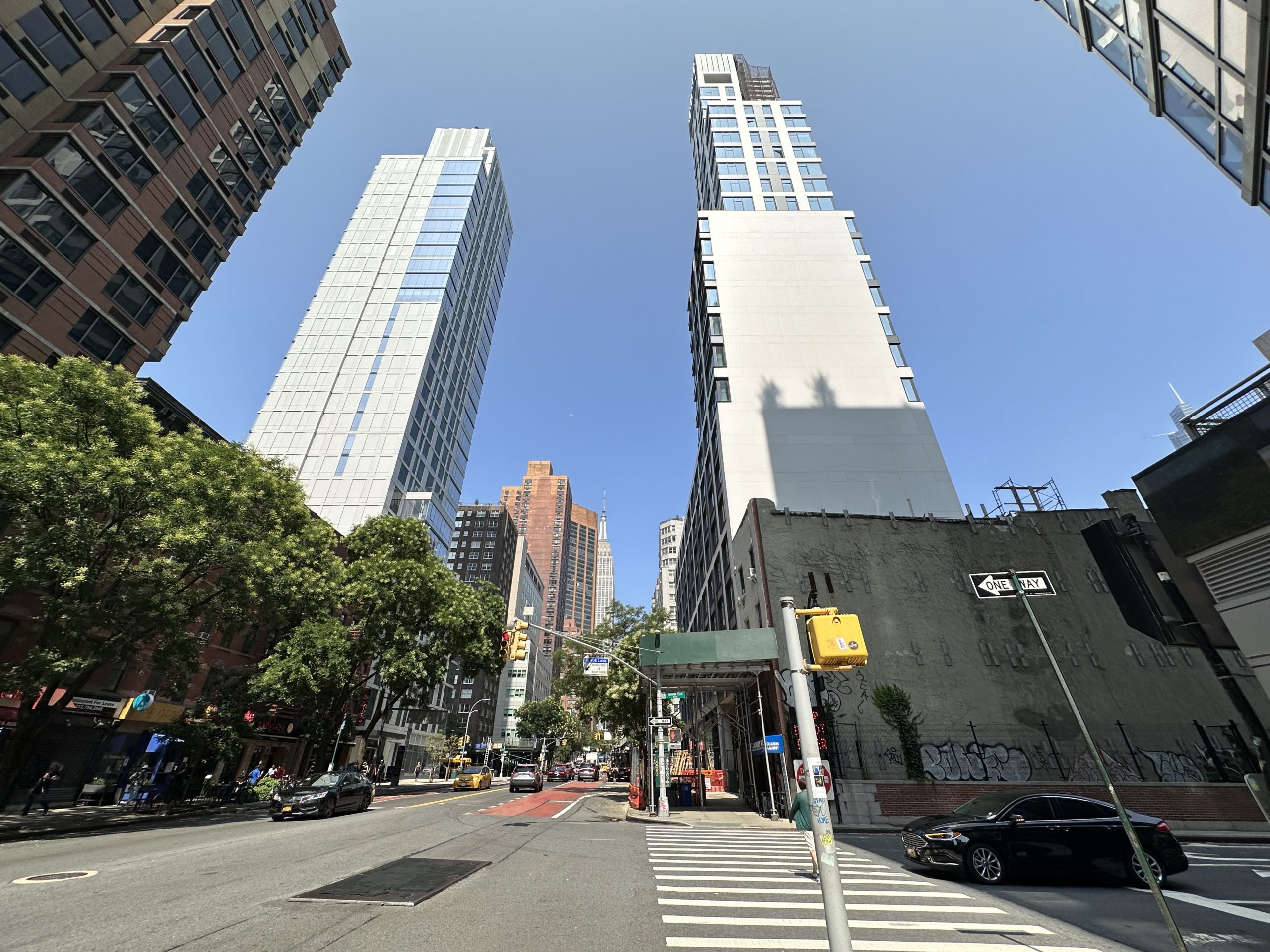
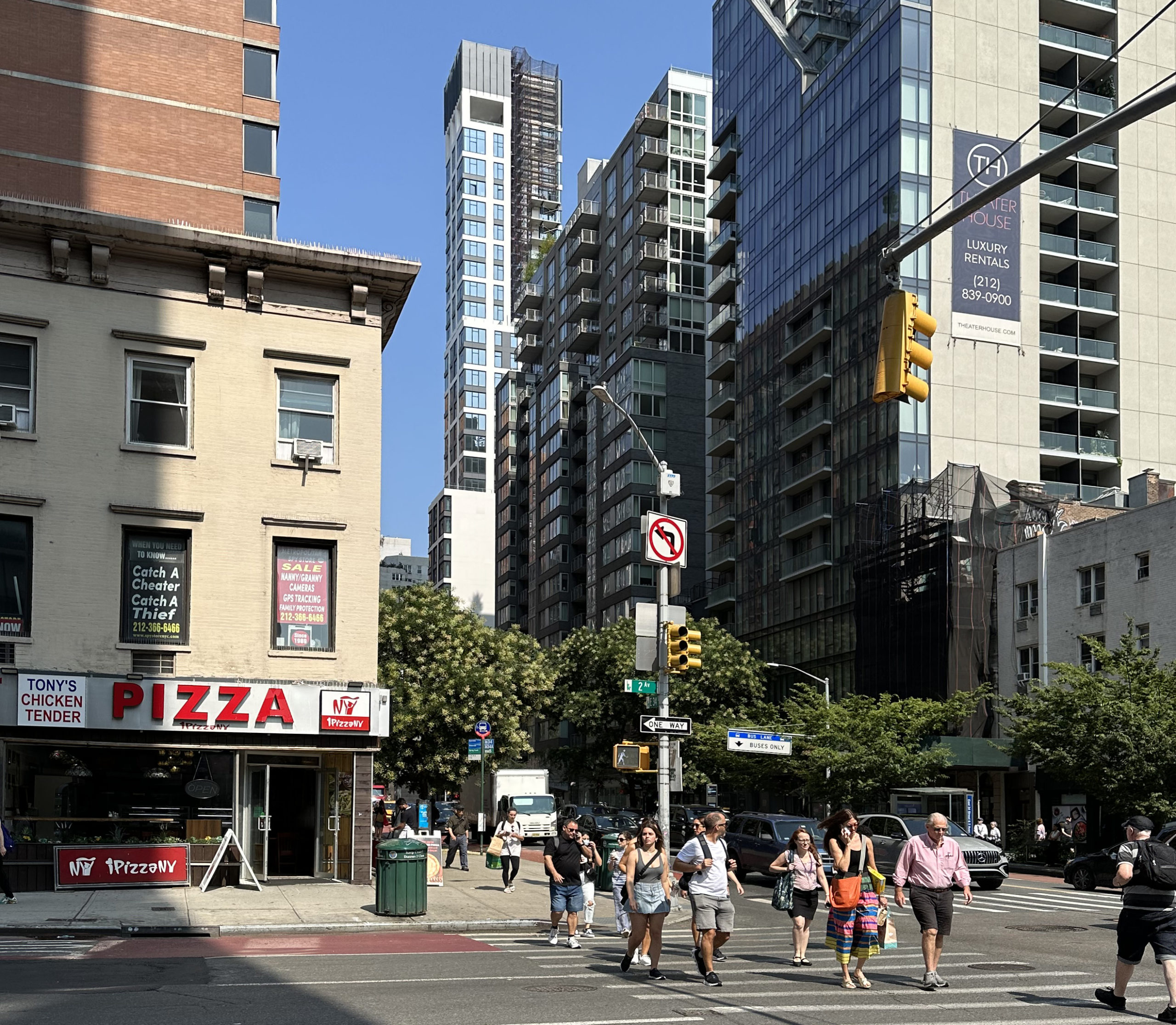
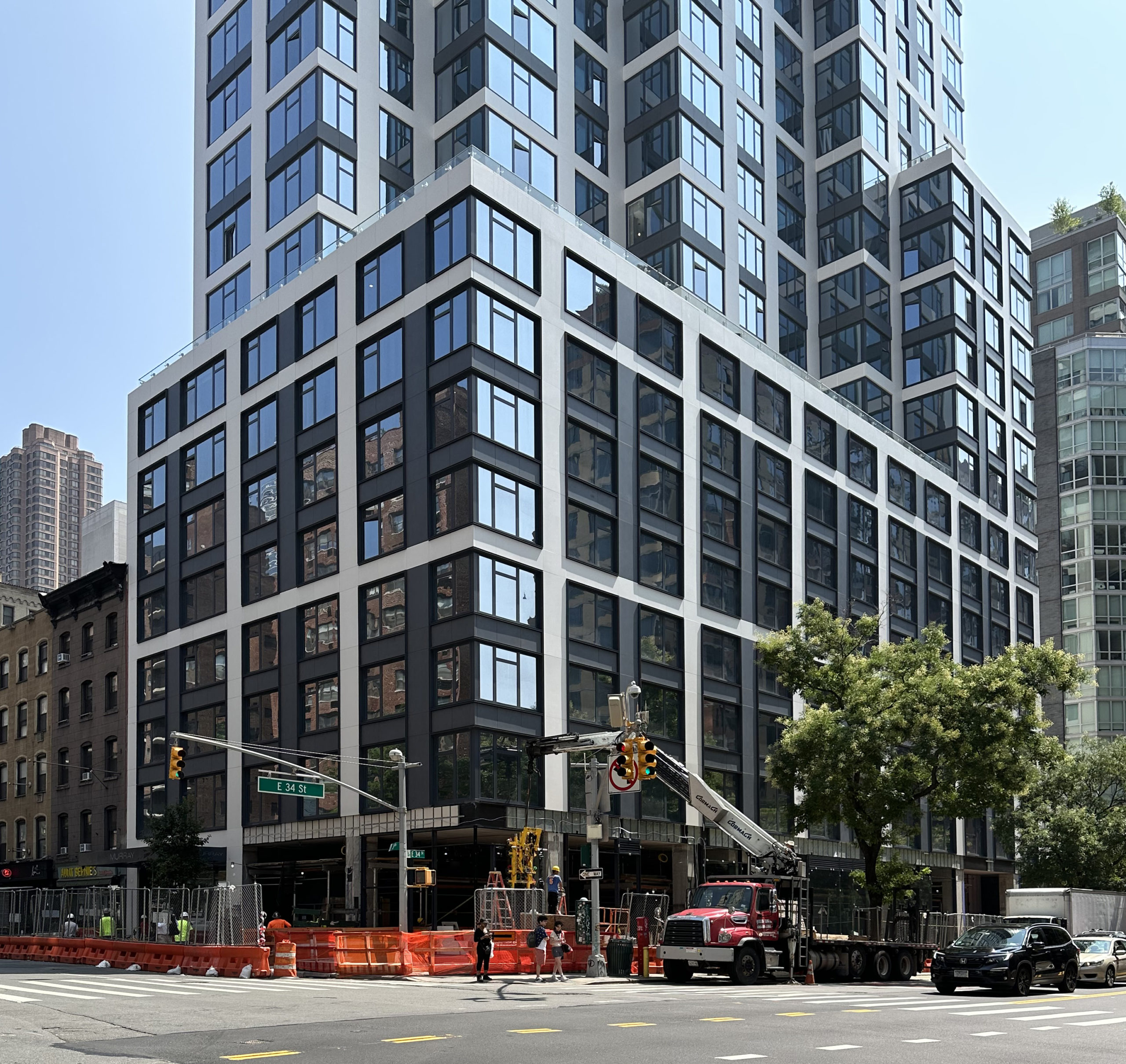
Construction is finishing up on Murray, a 35-story residential tower at 509 Third Avenue in Murray Hill, Manhattan. Designed by Ismael Leyva Architects and developed by Kahen Properties with Lalezarian Properties under the Third and Thirty Four LLC, the 386-foot-tall structure will span 166,917 square feet and yield 229 rental units with an average scope of 692 square feet, as well as 8,253 square feet of retail space on the ground floor and a private 30-foot-long yard. Charlton Development Group is the general contractor for the project, which is located at the corner of Third Avenue and East 34th Street.
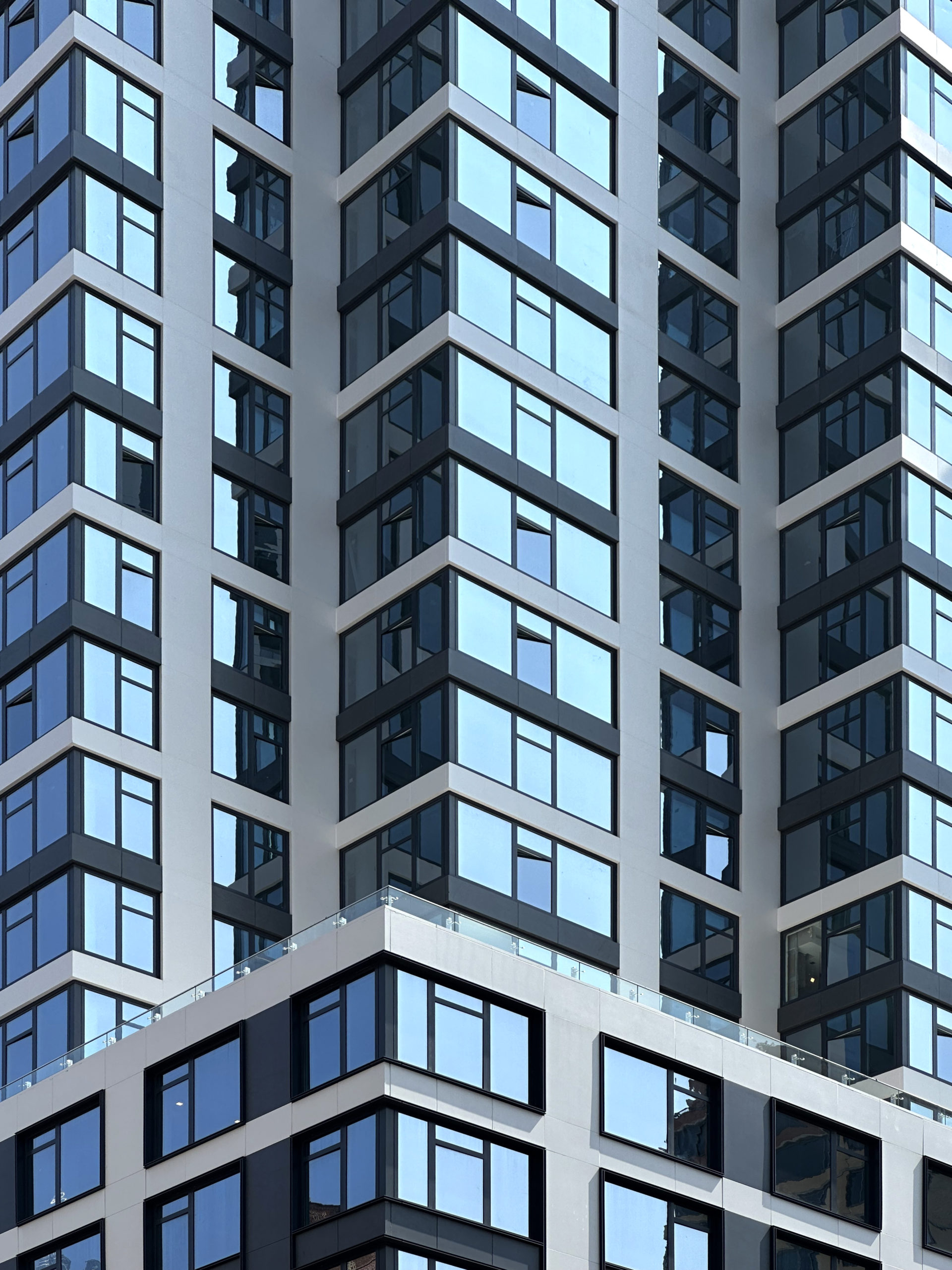
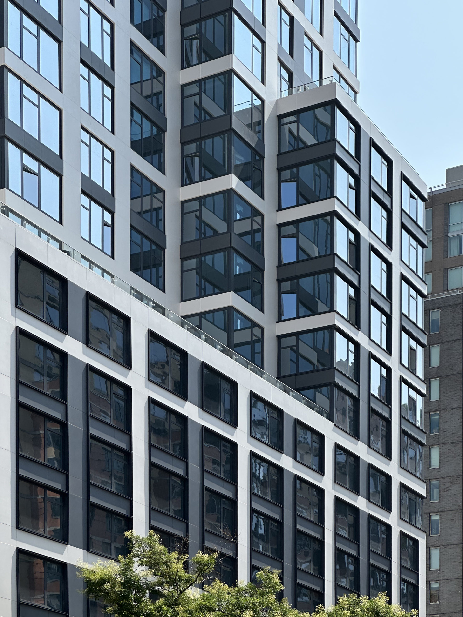
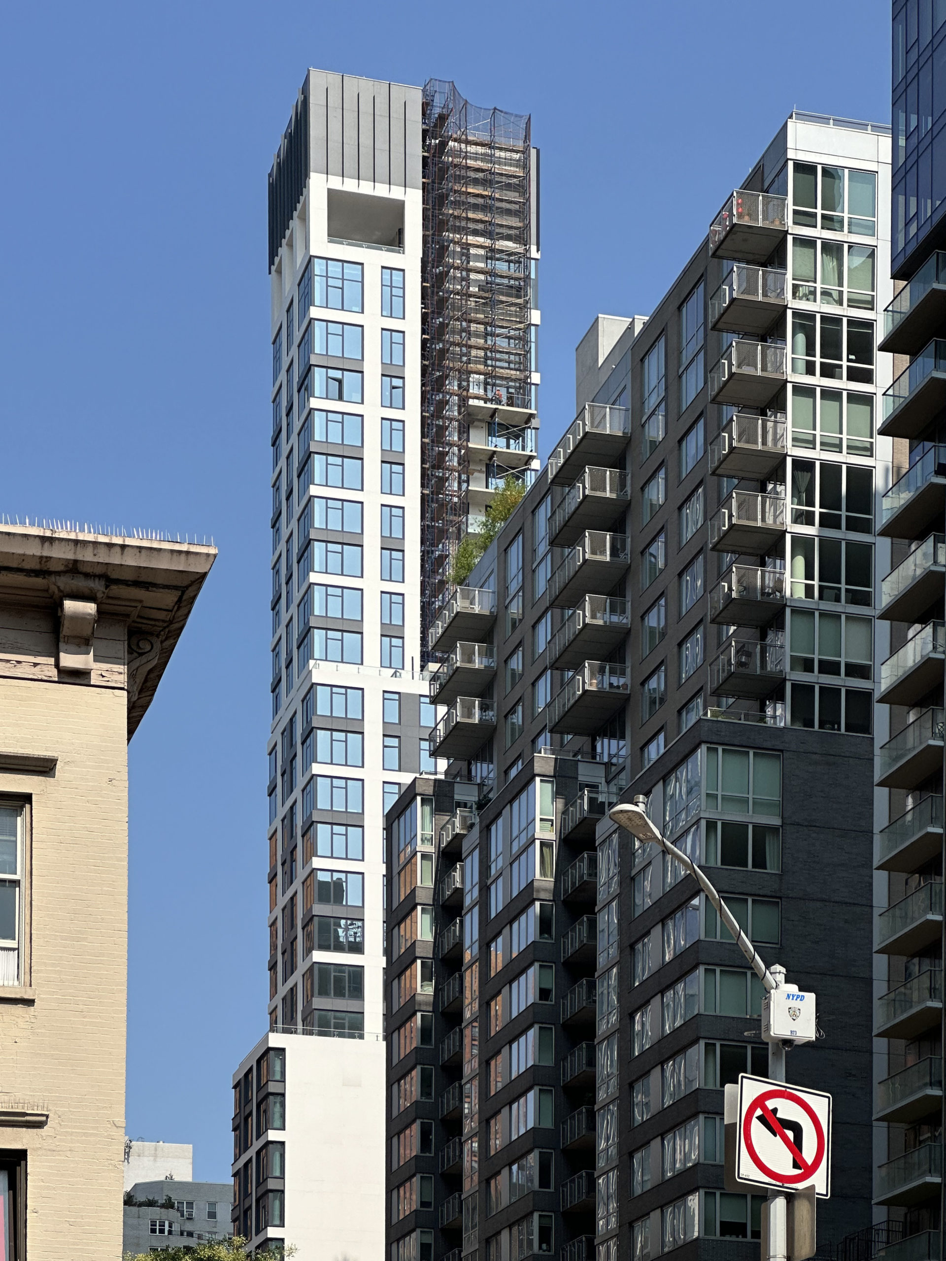
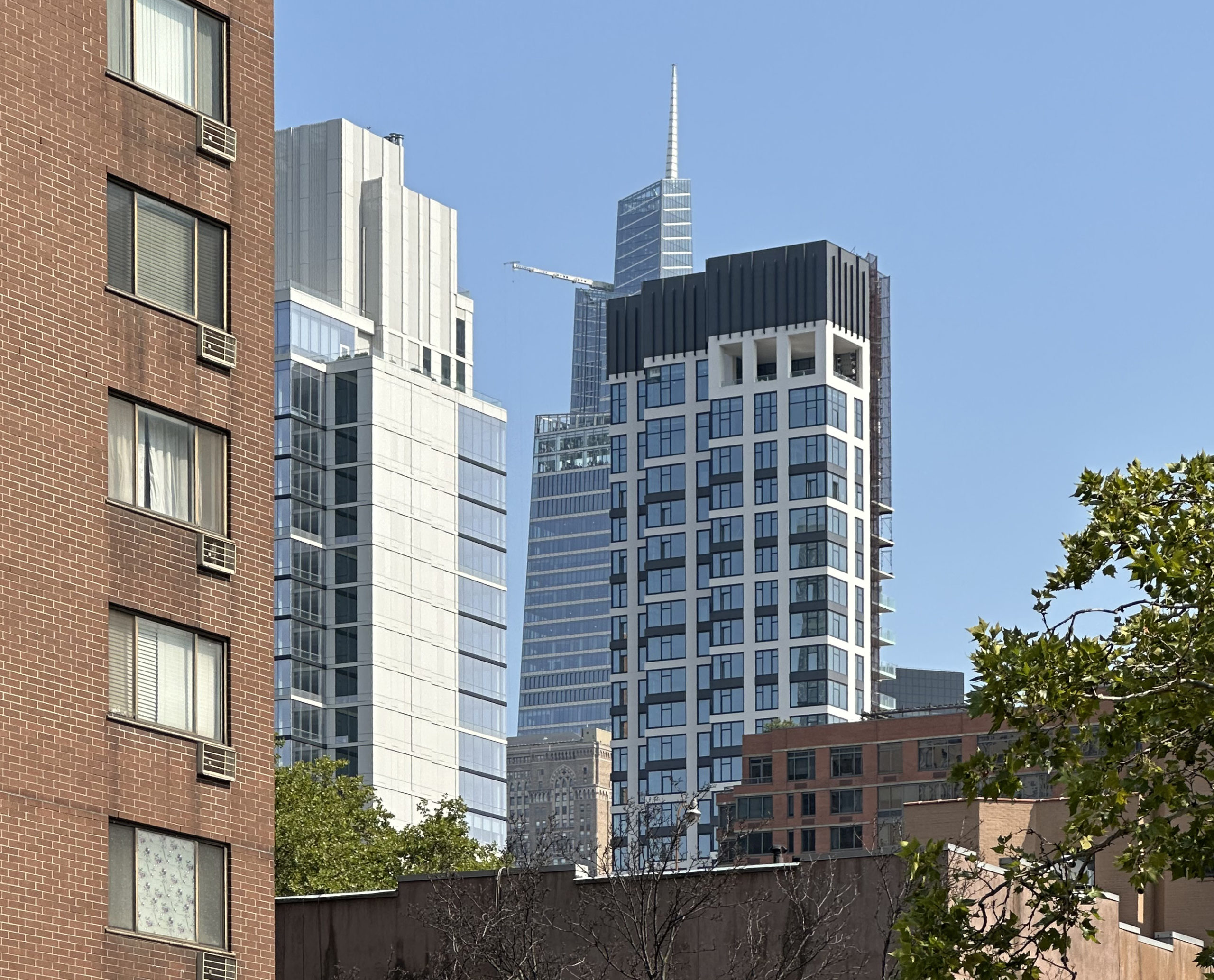
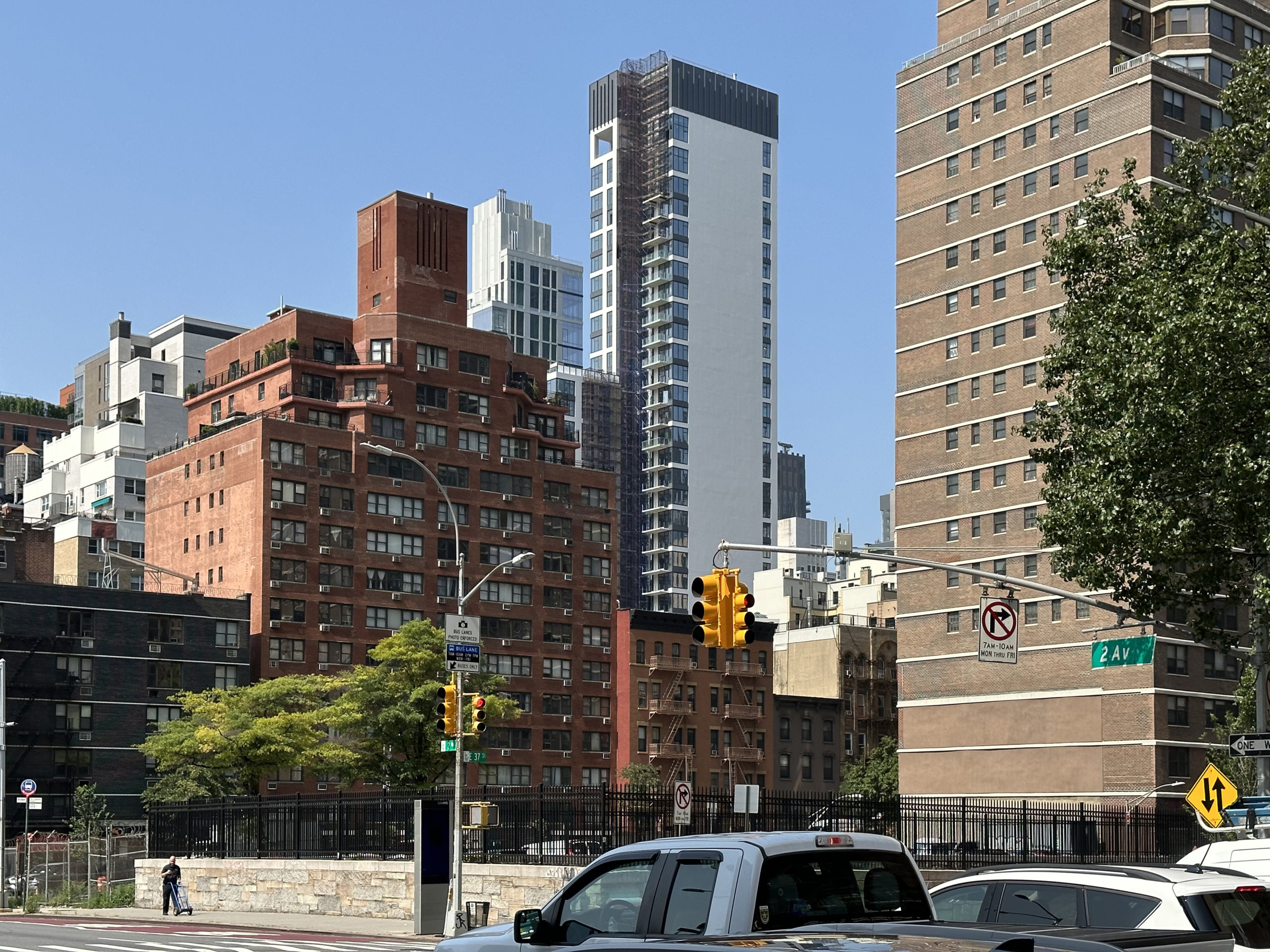
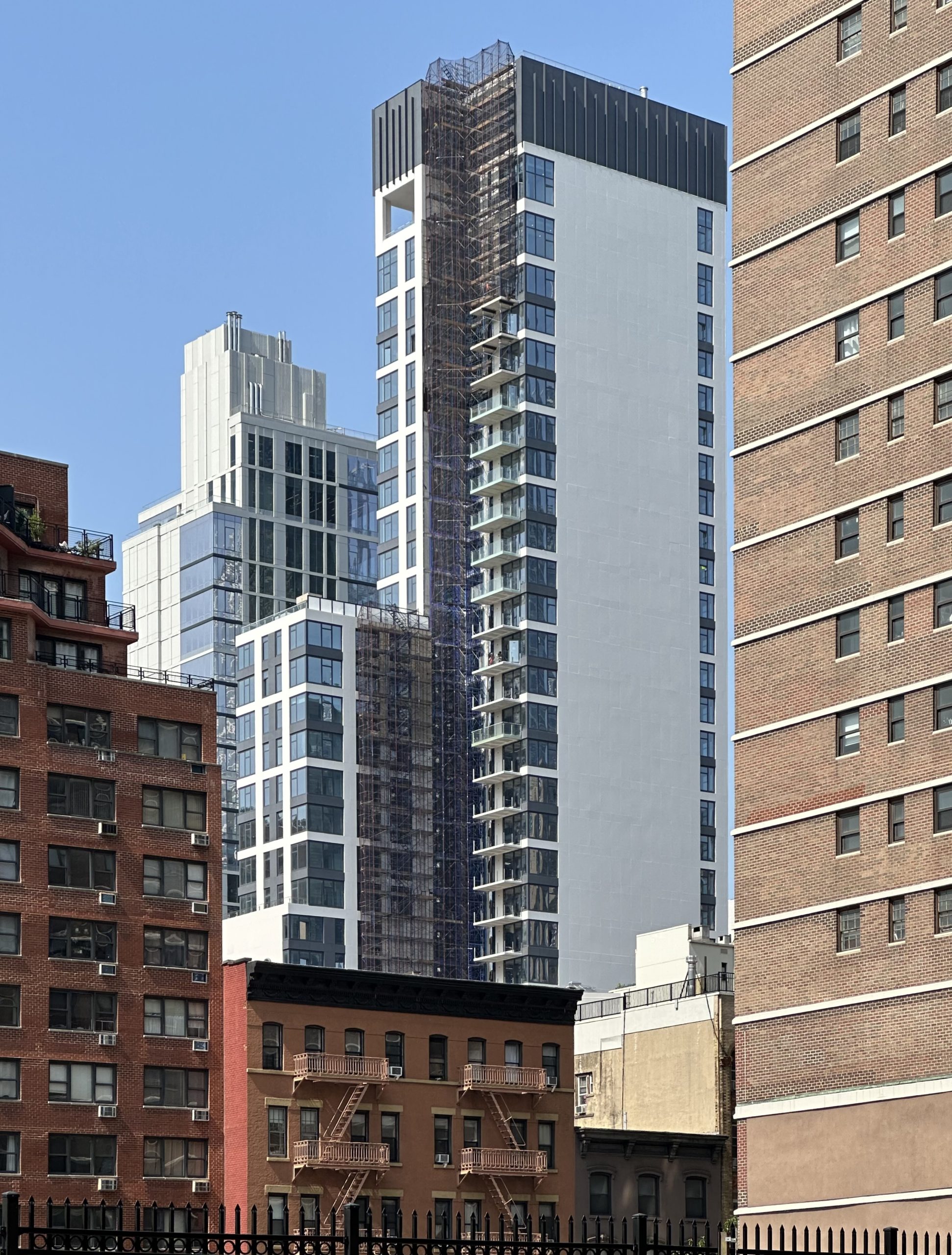
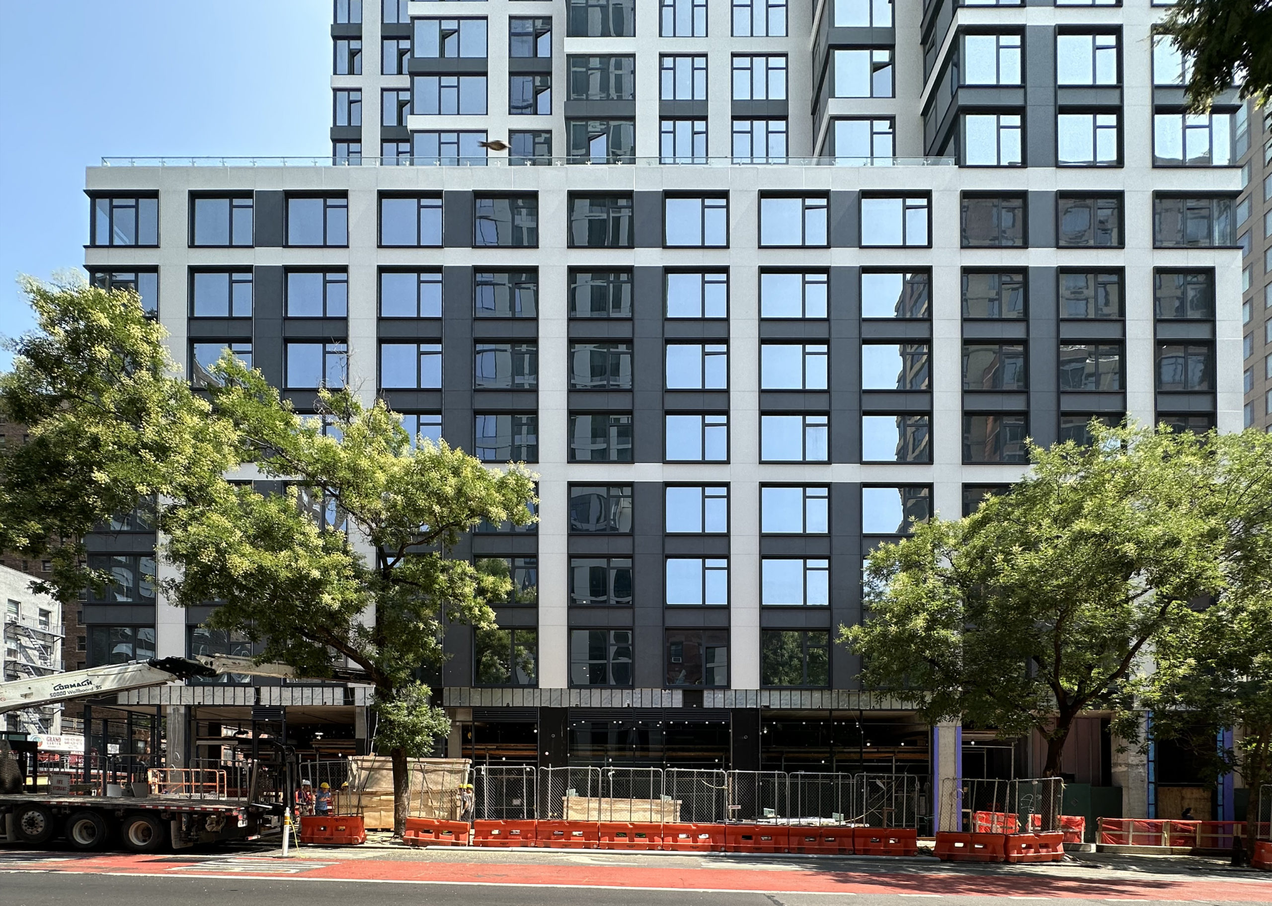
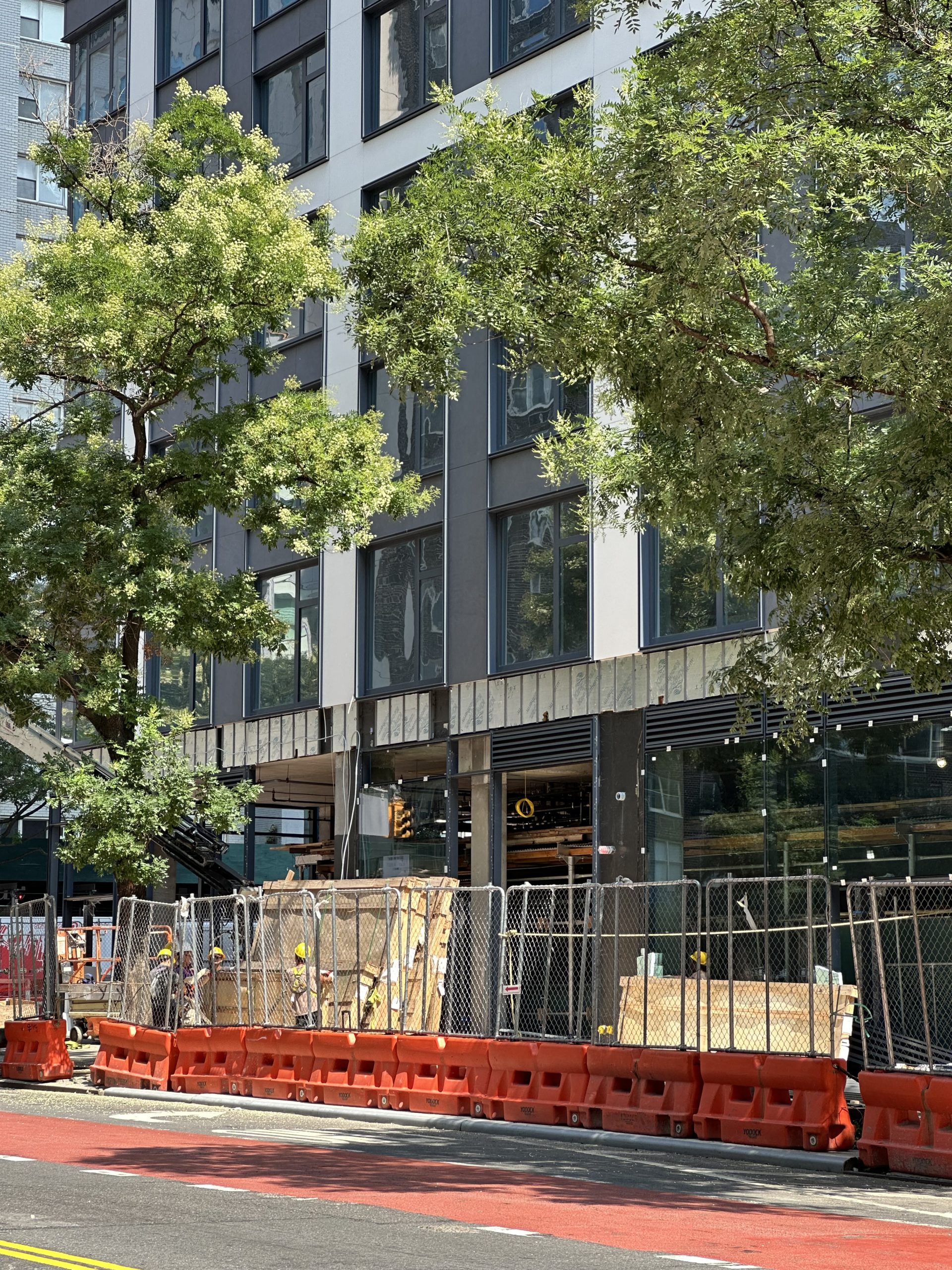
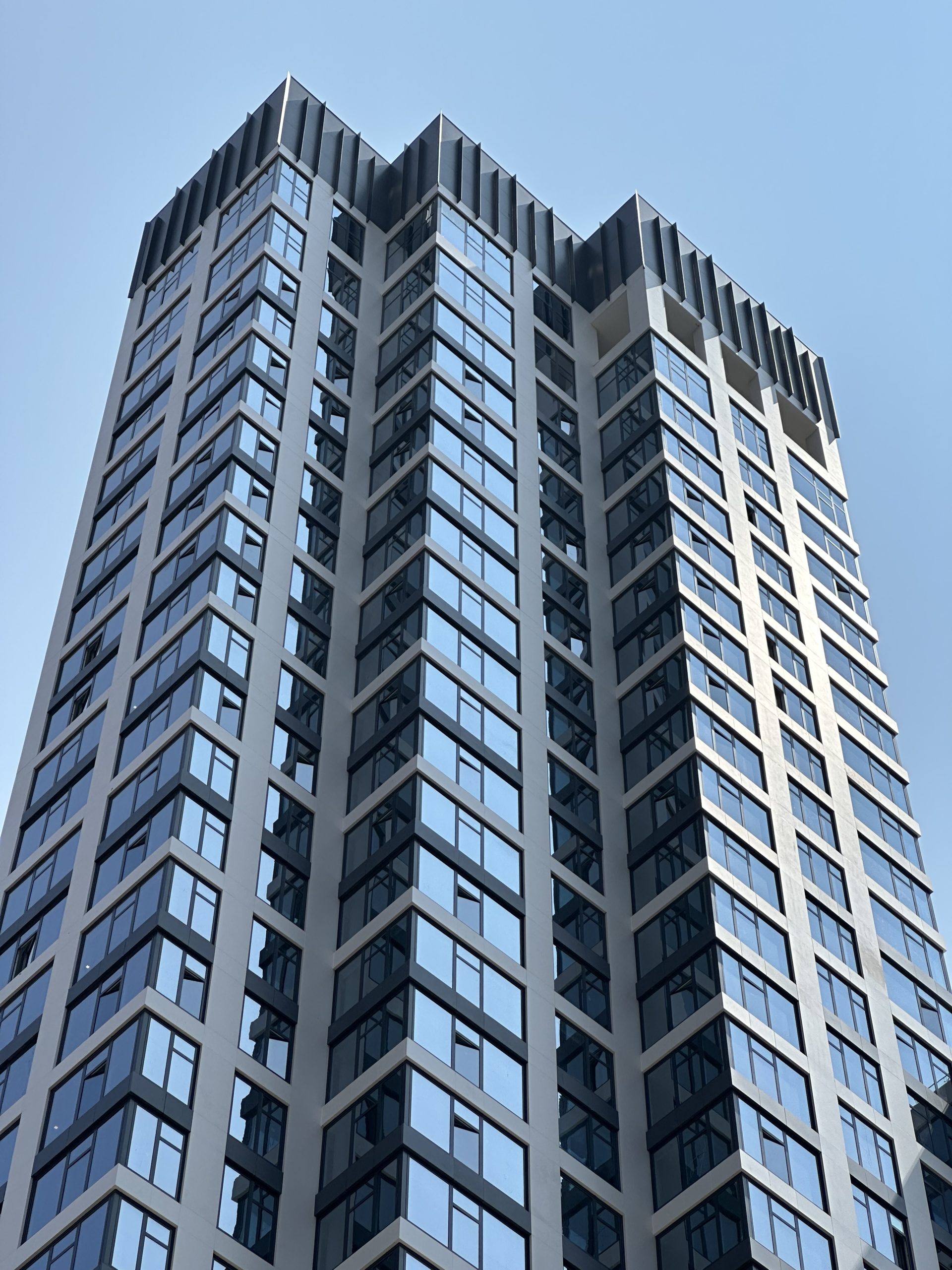
Façade installation was still progressing on the wide southern elevation and slim western profile facing Third Avenue and East 34th Street at the time of our last update in the beginning of the year. Since then, most of the scaffolding and construction netting has been dismantled, revealing the completed look of the exterior, which is composed of floor-to-ceiling glass framed with light gray paneling. Work is still finishing up on the ground floor, but should conclude in the coming weeks.
A small section of scaffolding still remains on the northeastern corner of 509 Third Avenue as crews finish up work on the façade and stacked balconies.
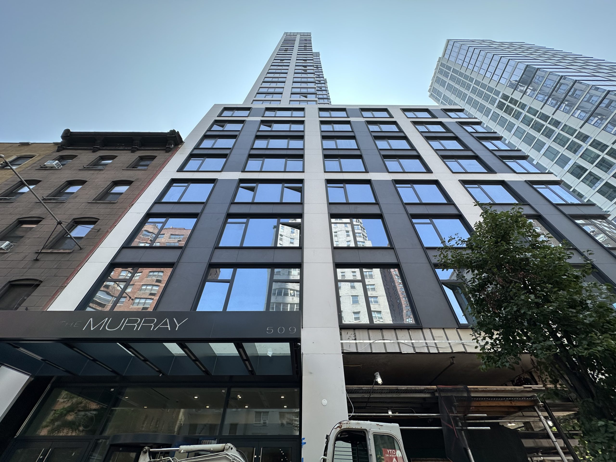
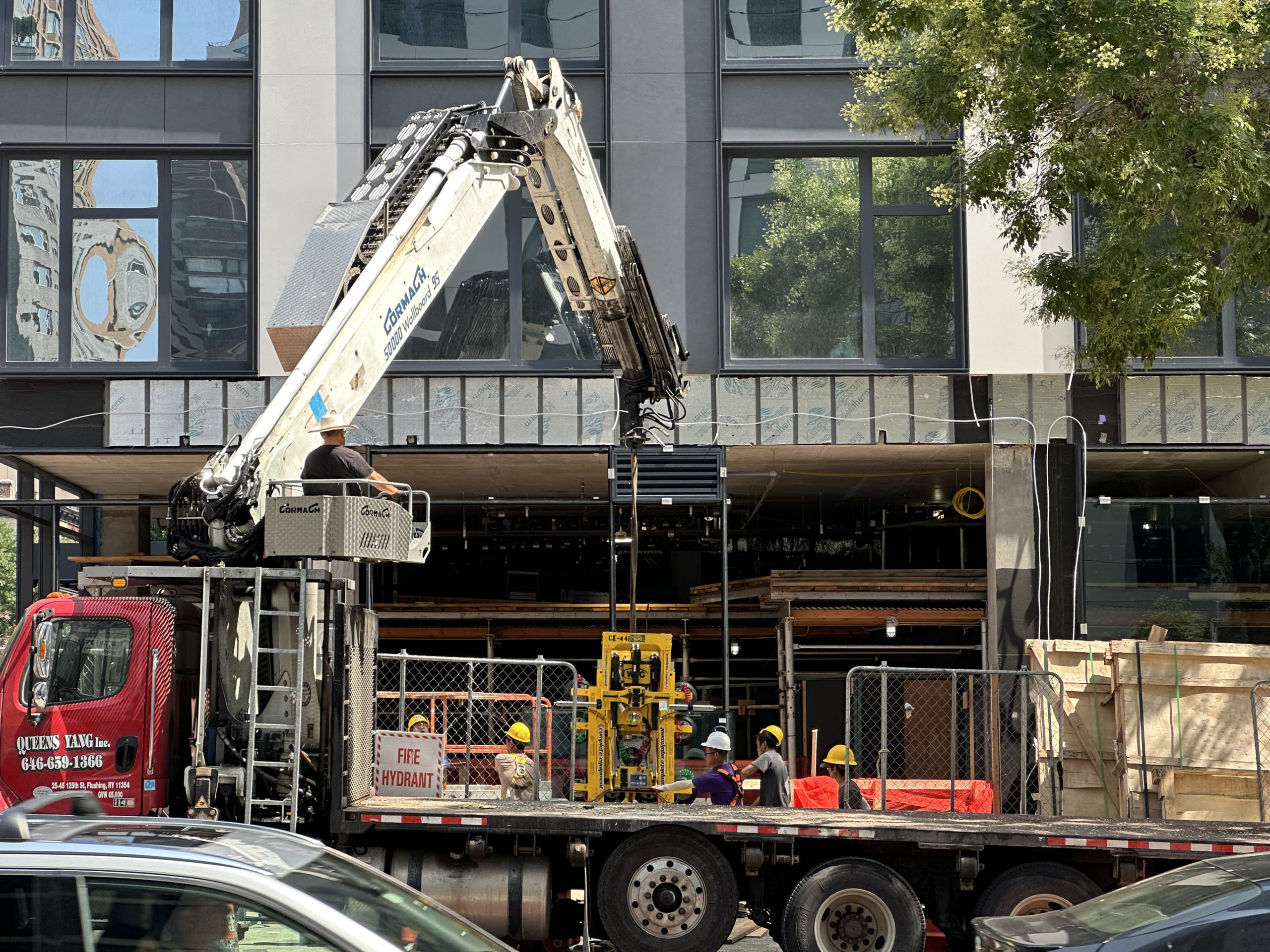
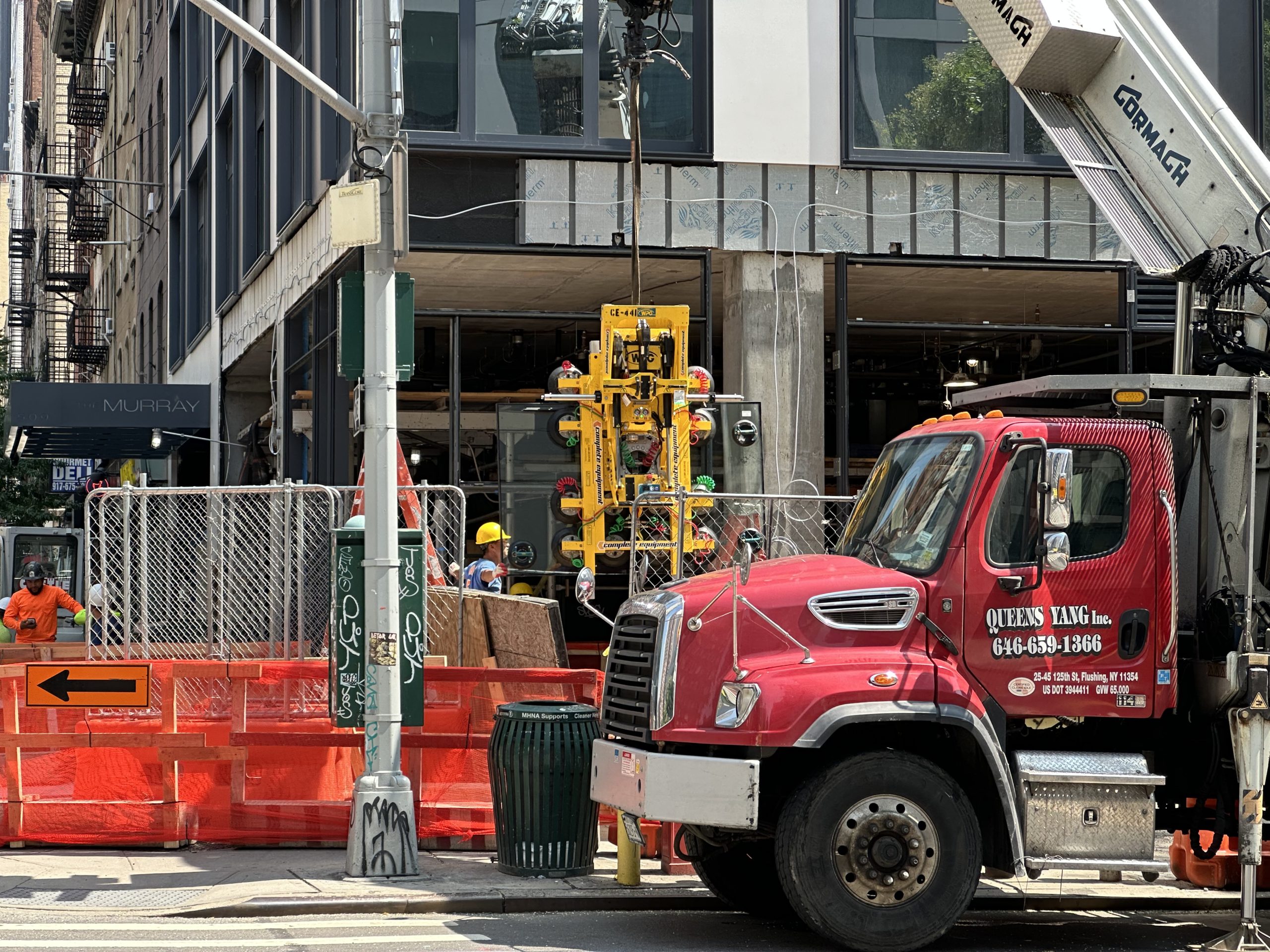
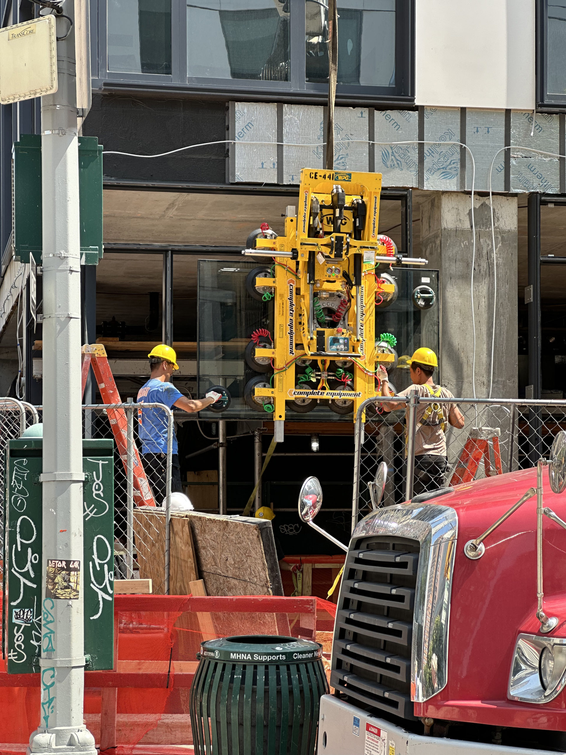
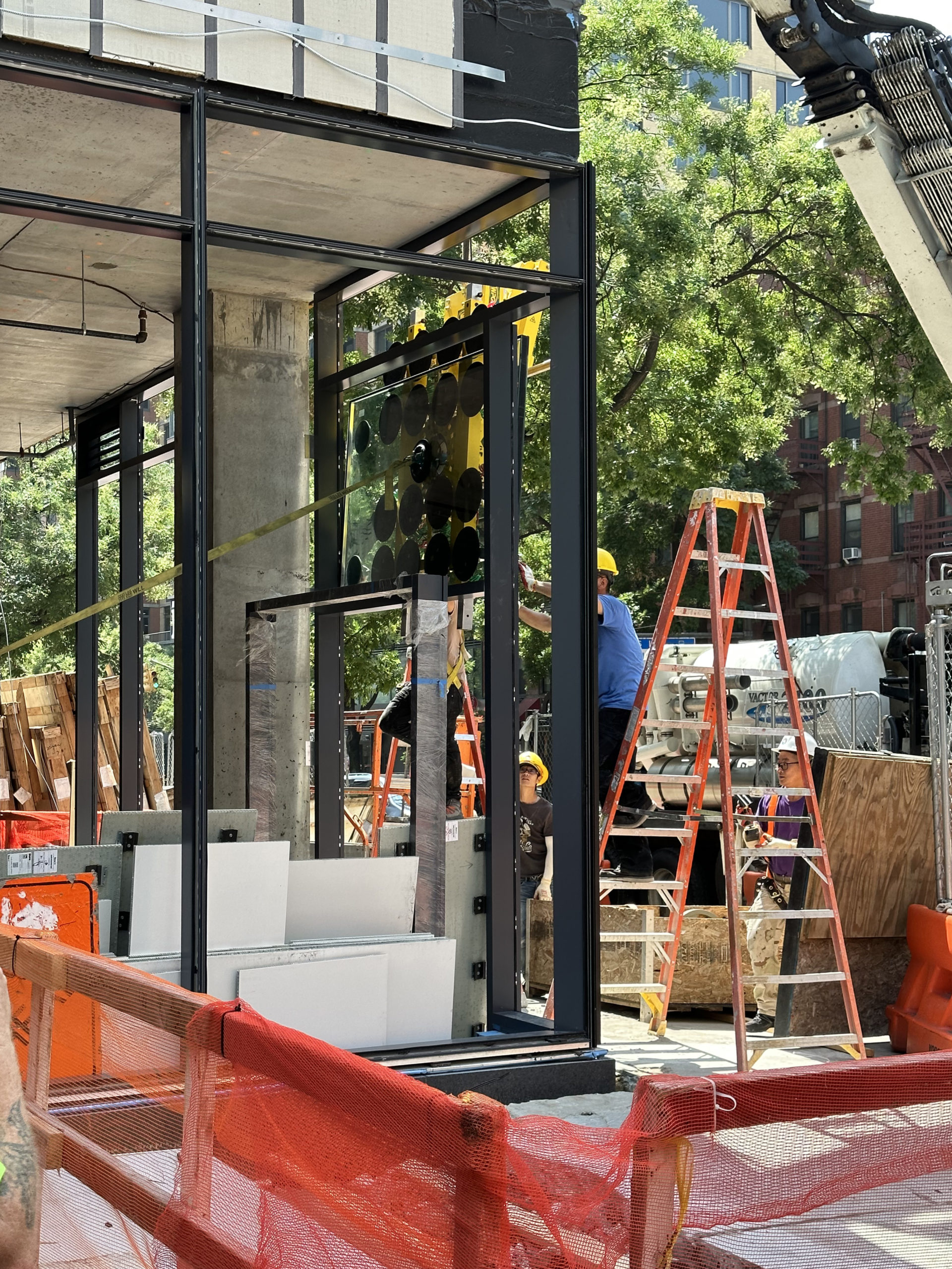
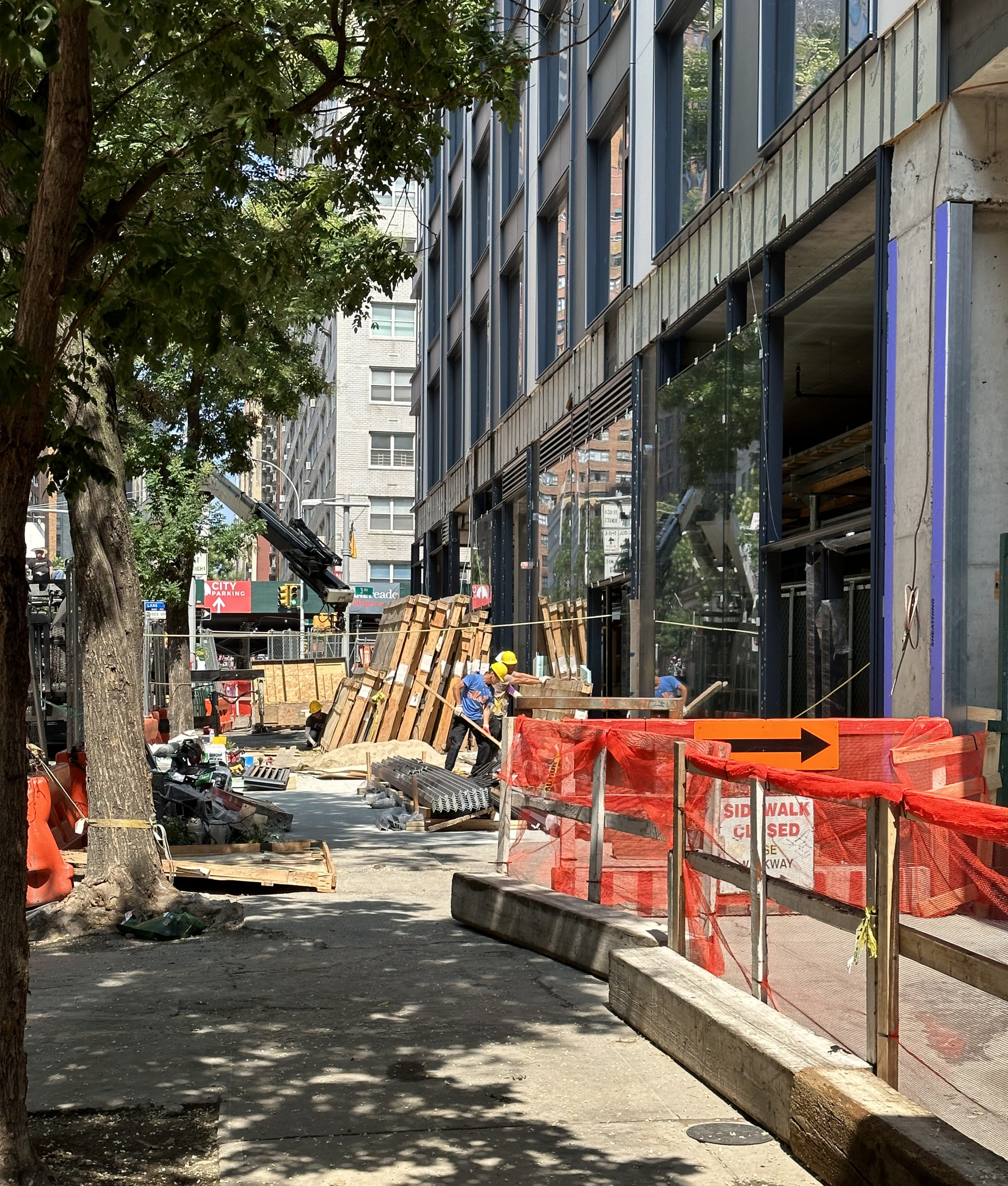
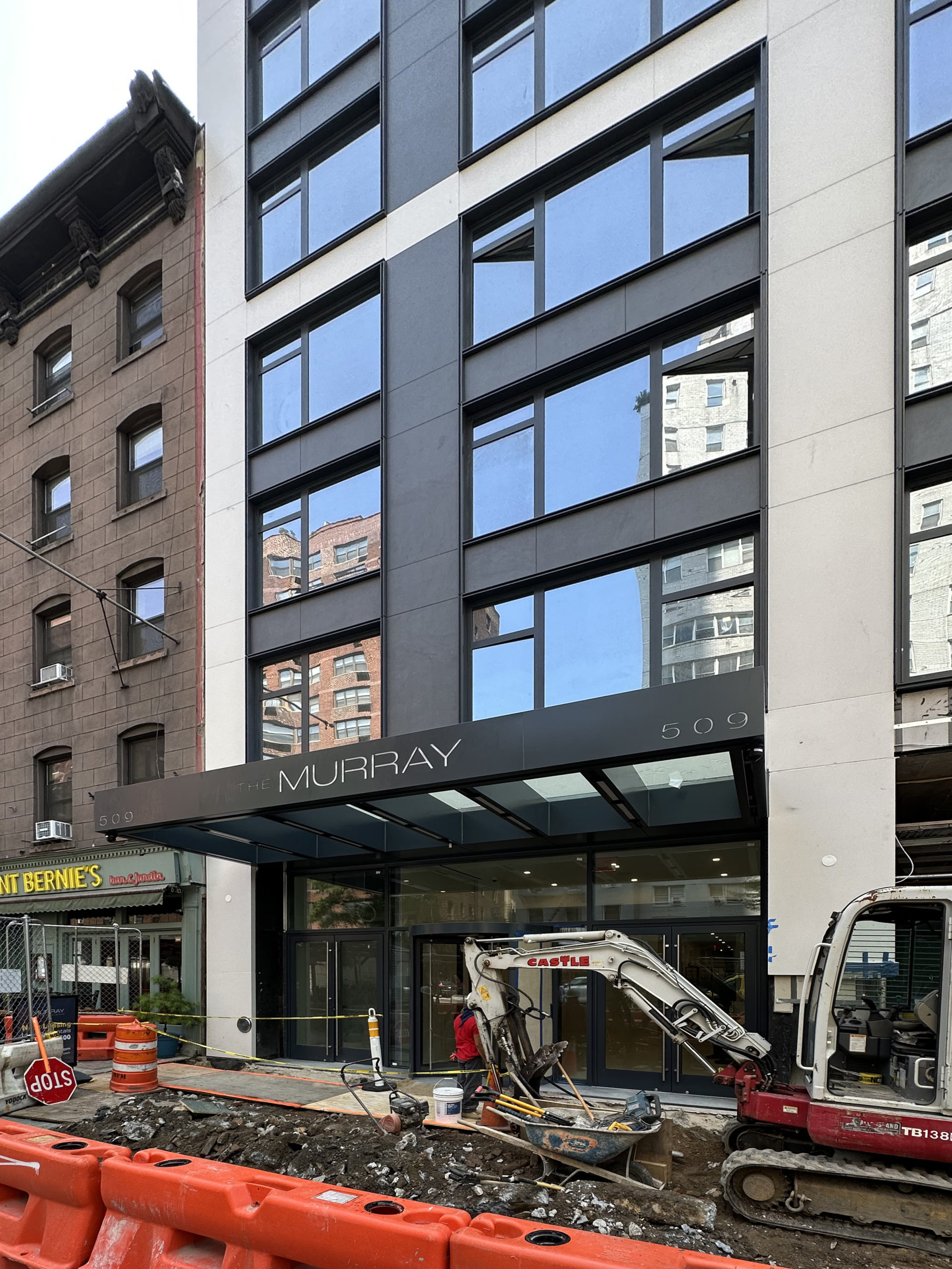
Crews are in the process of installing the large windows for the ground-floor retail frontage. Barricades and metal fencing temporarily redirect pedestrian traffic around the site until the new sidewalks are formed.
A metal canopy bearing the word Murray sits above the sidewalk along Third Avenue where the main entrance to the residential component is located.
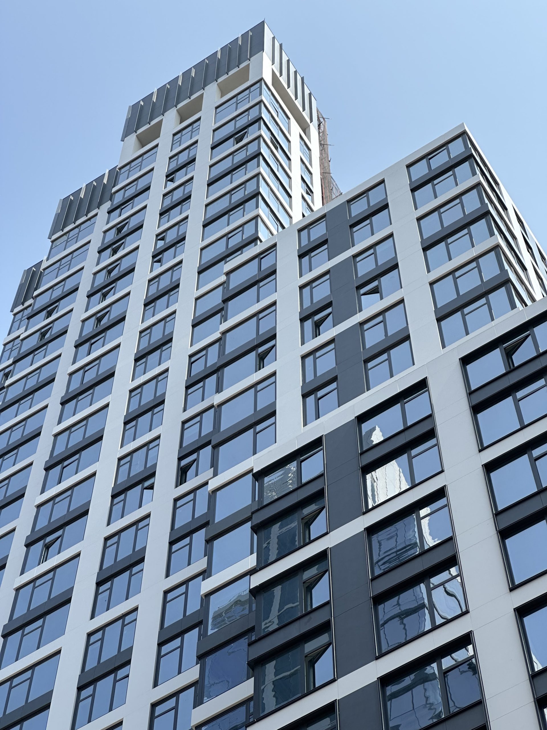
Capping the tower is a crown adorned with vertical fins. An amenity suite will be housed on the top floor, which features an outdoor loggia on the southern corner behind the building’s perimeter columns.
509 Third Avenue has an anticipated completion date of fall 2023, as noted on the construction board.
Subscribe to YIMBY’s daily e-mail
Follow YIMBYgram for real-time photo updates
Like YIMBY on Facebook
Follow YIMBY’s Twitter for the latest in YIMBYnews




Quite shocking there hasn’t been any coverage of the crane collapse on this website. I’d think that’s a major impact piece quite relevant to other info.
The coverage is in the forums not the front page of the blog.
Will admit, I don’t venture to that often. The site design/organization is pretty harsh to follow. I still abide by the thought it deserves a front-page piece, though.
Not my website, just an opinion.
Looks like the rendering—better-than-average glass box.
Divide the corners into at least three sections that I can clearly see the depth, with standard of beautiful facade on towers remains unchanged I really appreciate American real estate development. The focal point would be vertical fins and one more thing, the glass is very new just like it came out of the factory: Thanks to Michael Young.
while boring architecturally, this is a pretty decent looking tower that adds nice density and a clean finish to the neighborhood
Might it be said that it’s a really good 60’s building?