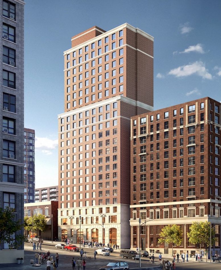
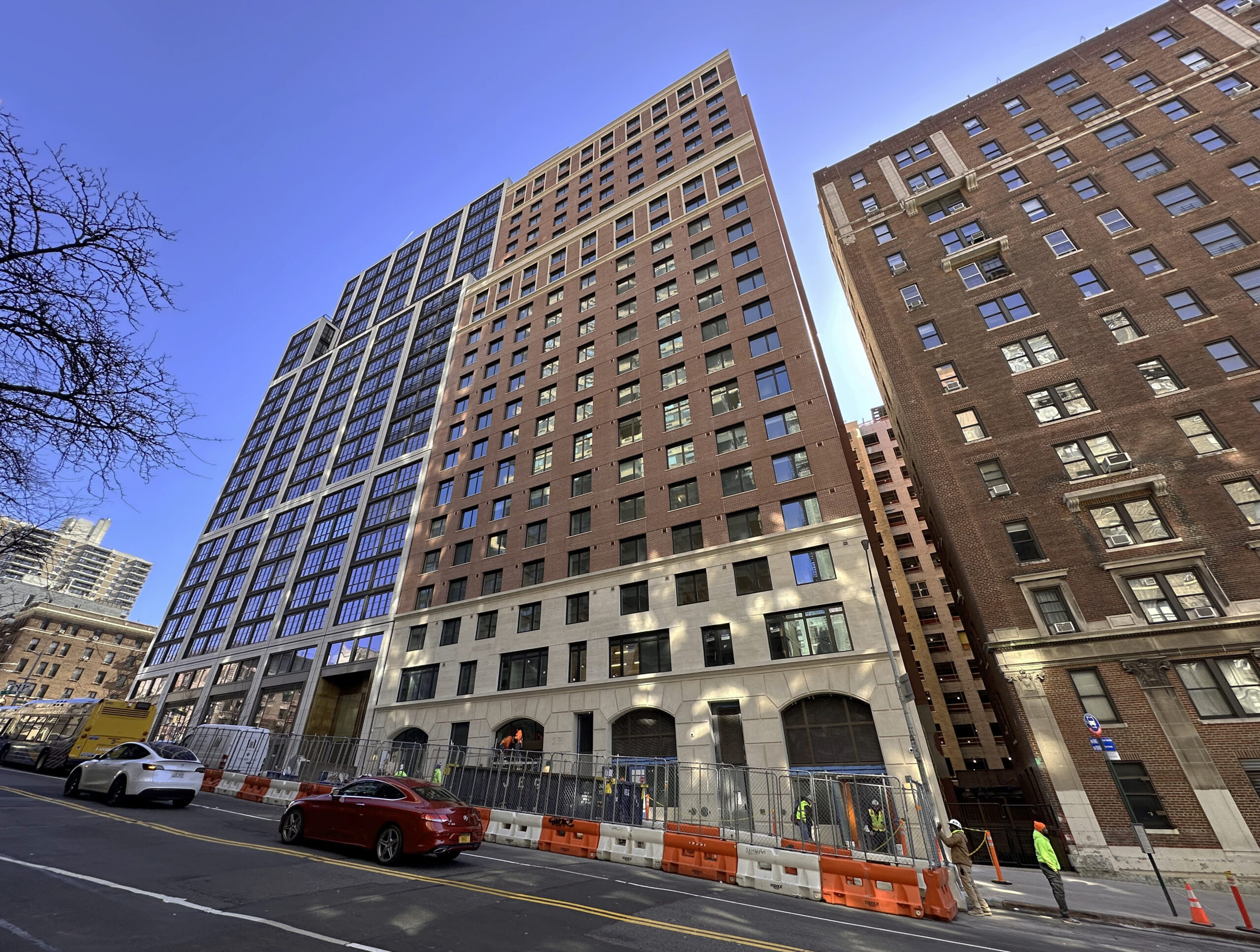
Construction is wrapping up on 266 West 96th Street, a 23-story residential building on Manhattan’s Upper West Side. Designed by SLCE Architects and developed by Fetner Properties, the 235-foot-tall structure yields 171 rental units with 68 dedicated to affordable housing, as well as 8,961 square feet of community facility space. Urban Atelier Group is the general contractor for the property, which is located on an interior lot between West End Avenue and Broadway.
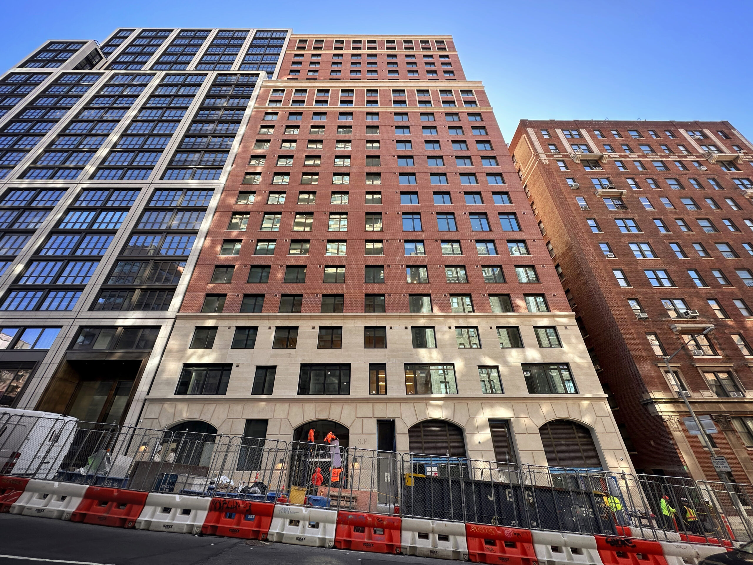
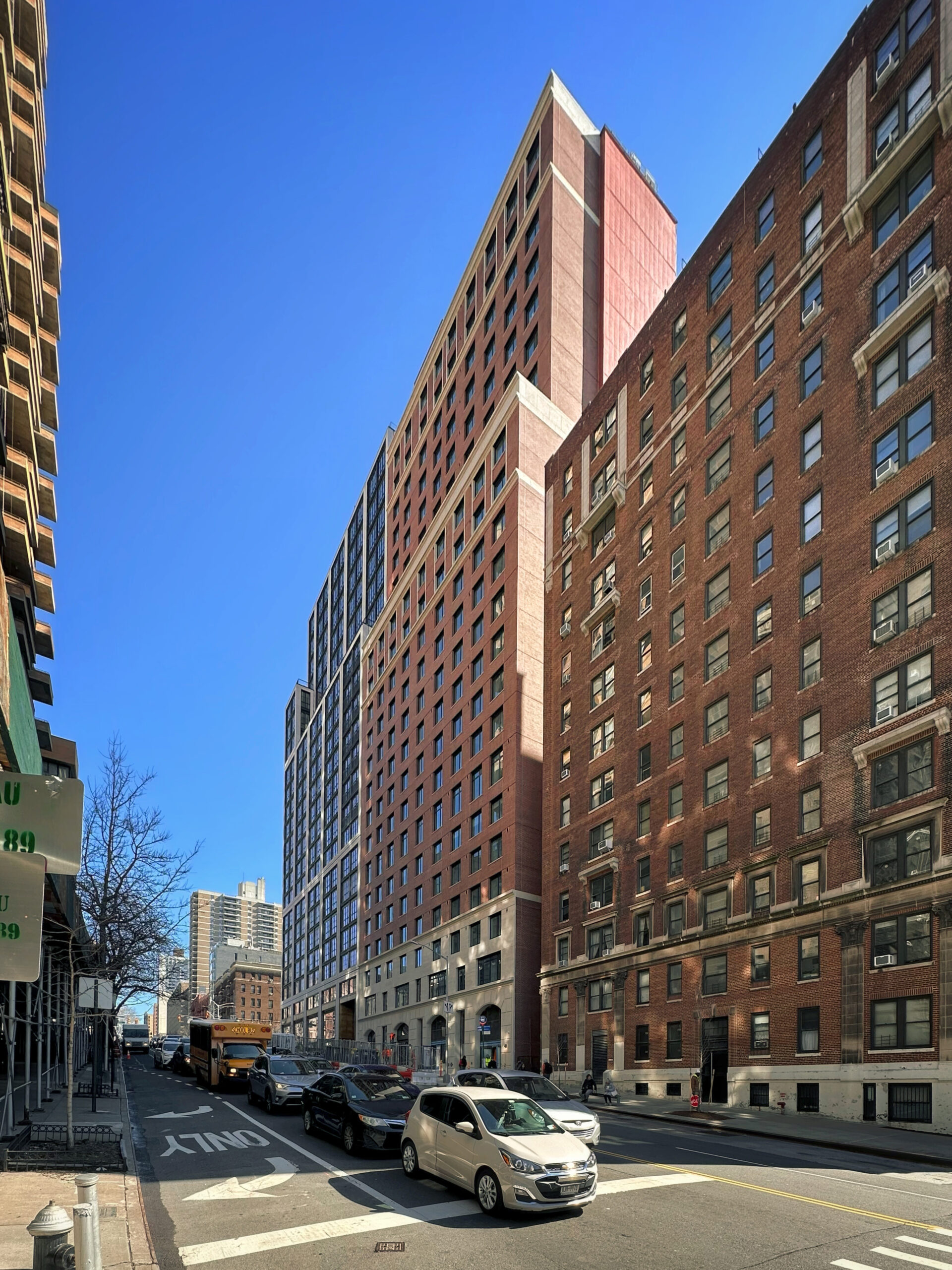
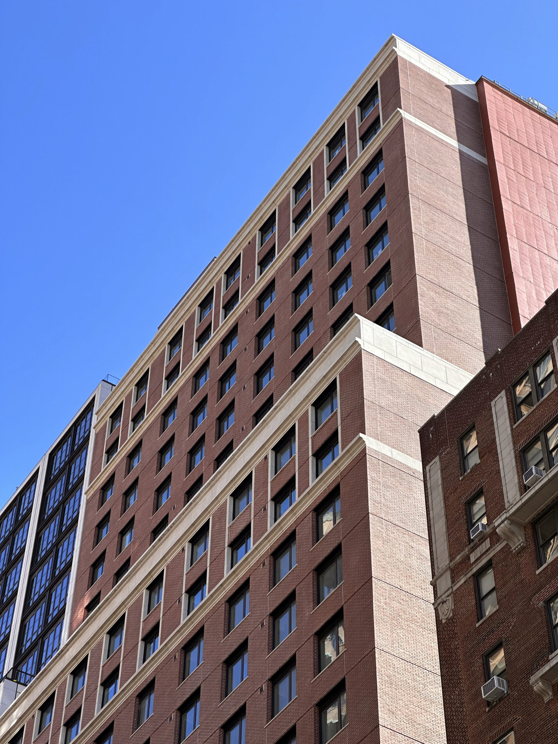
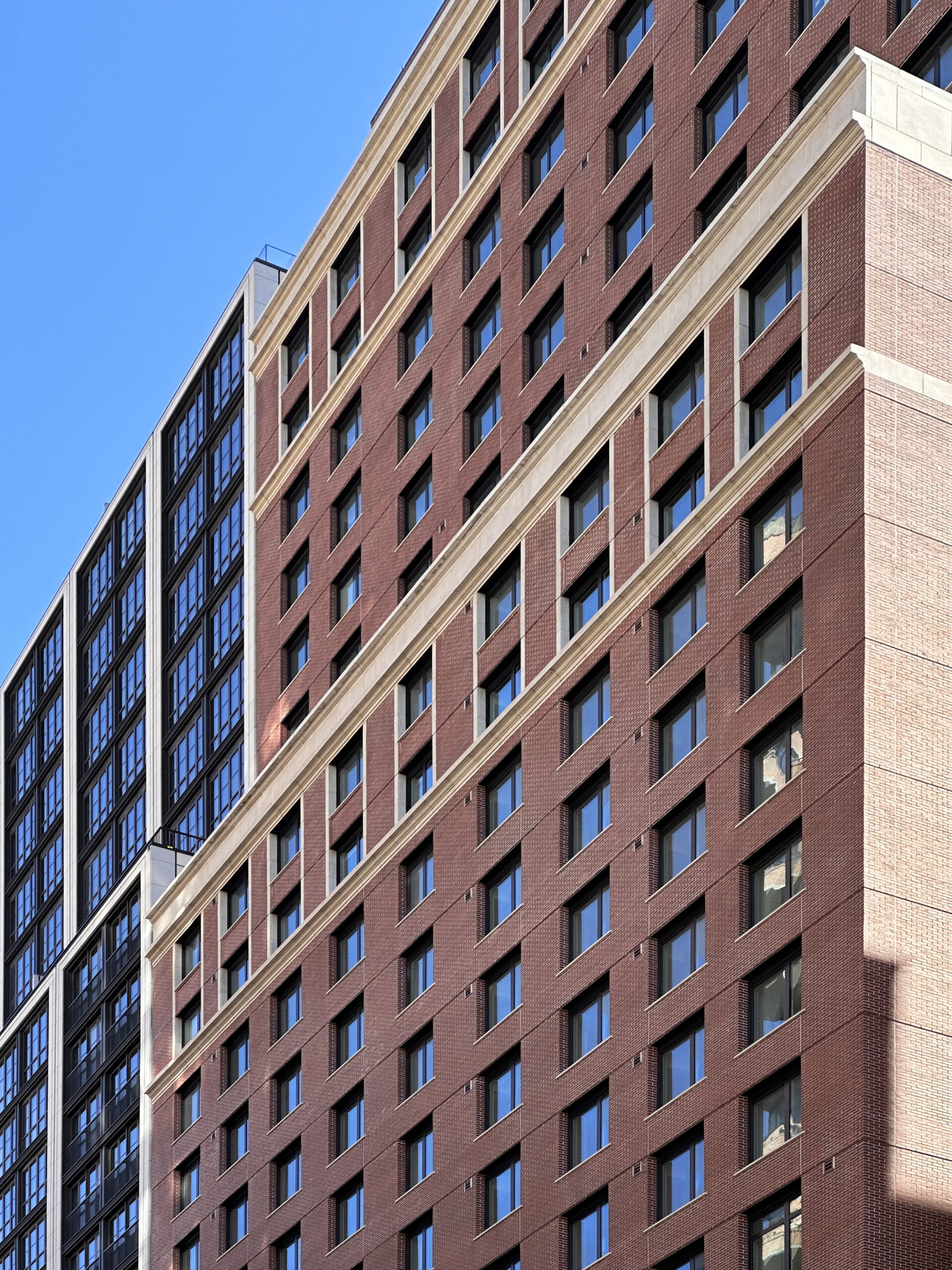
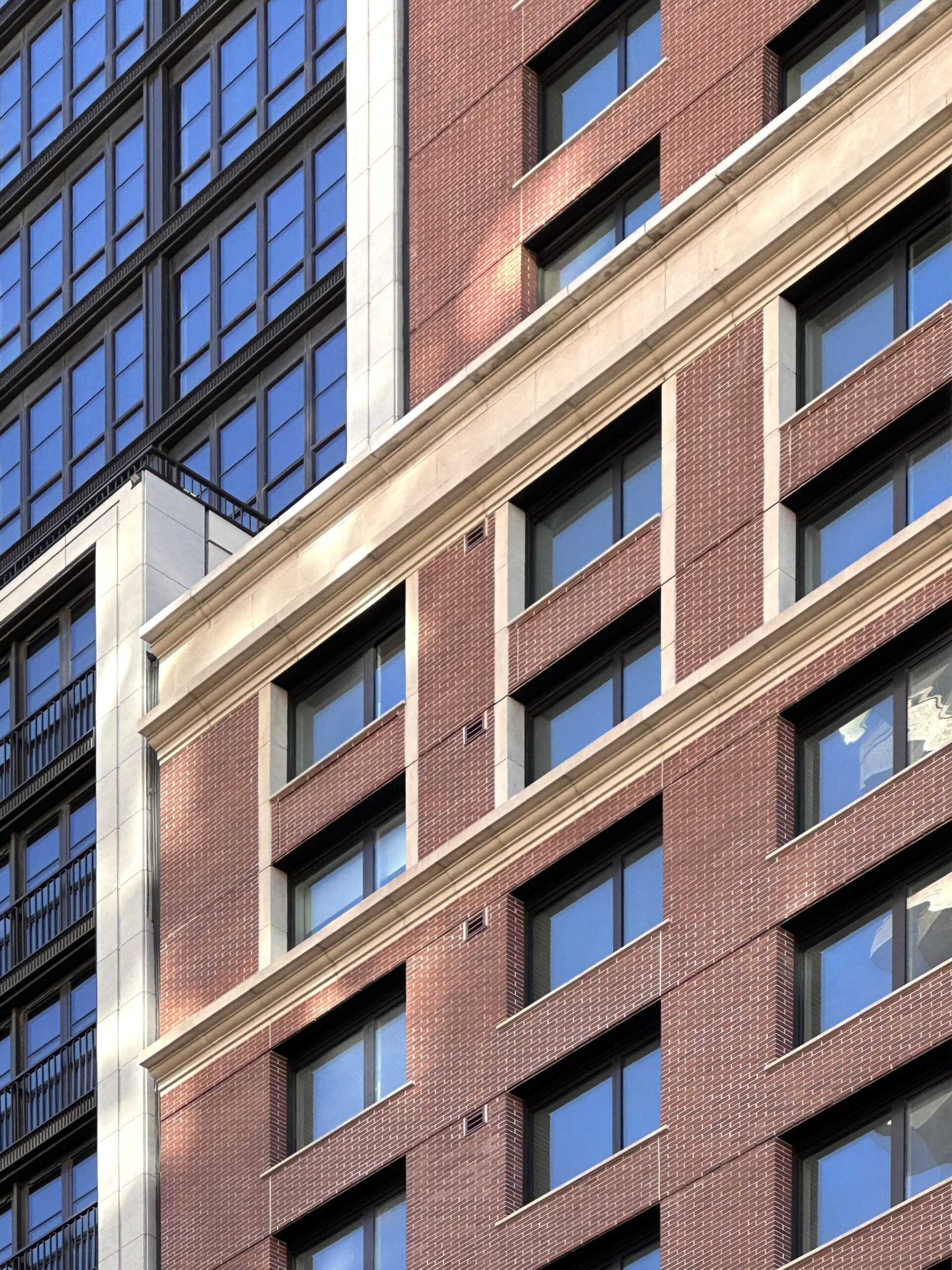
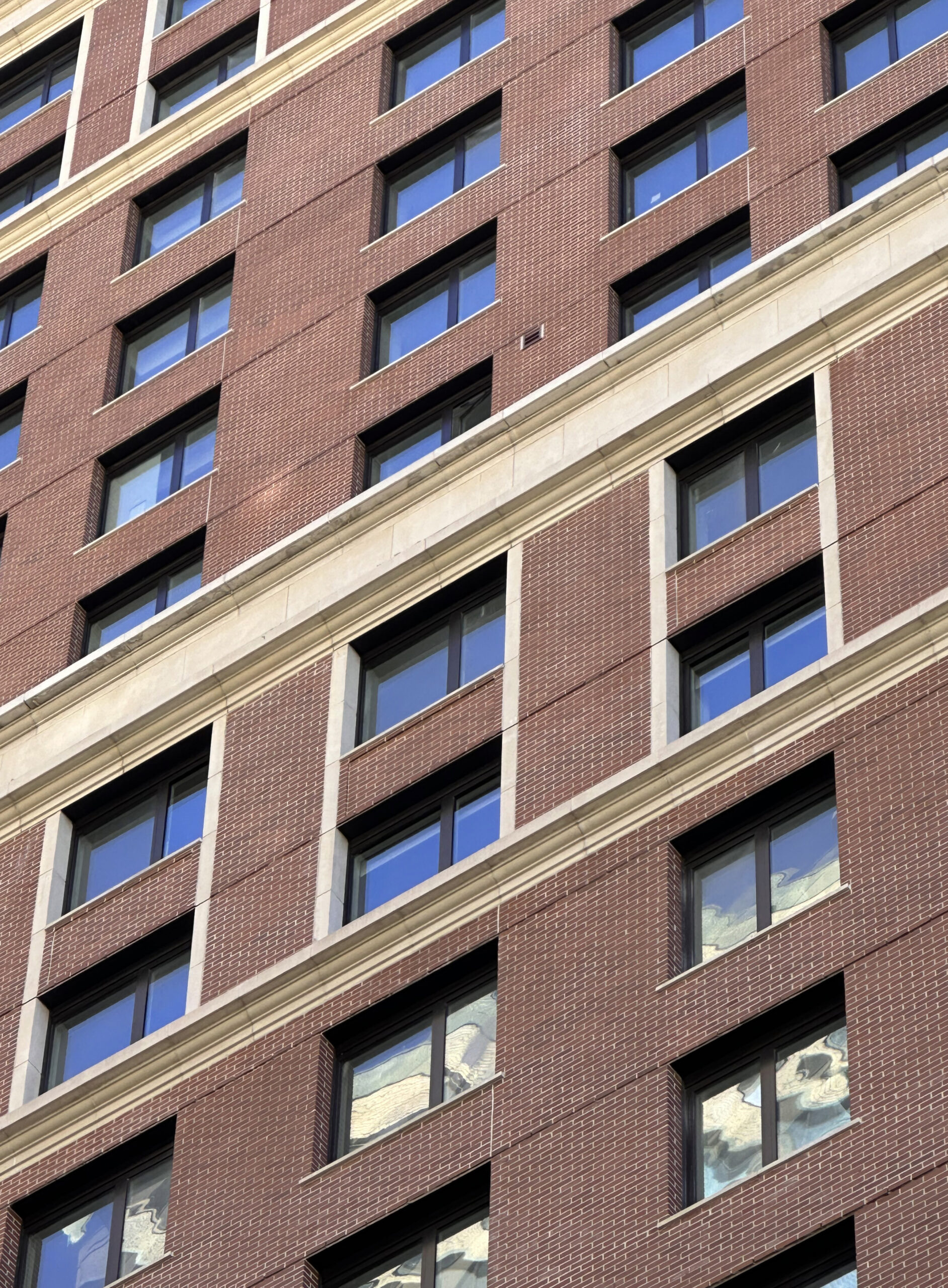
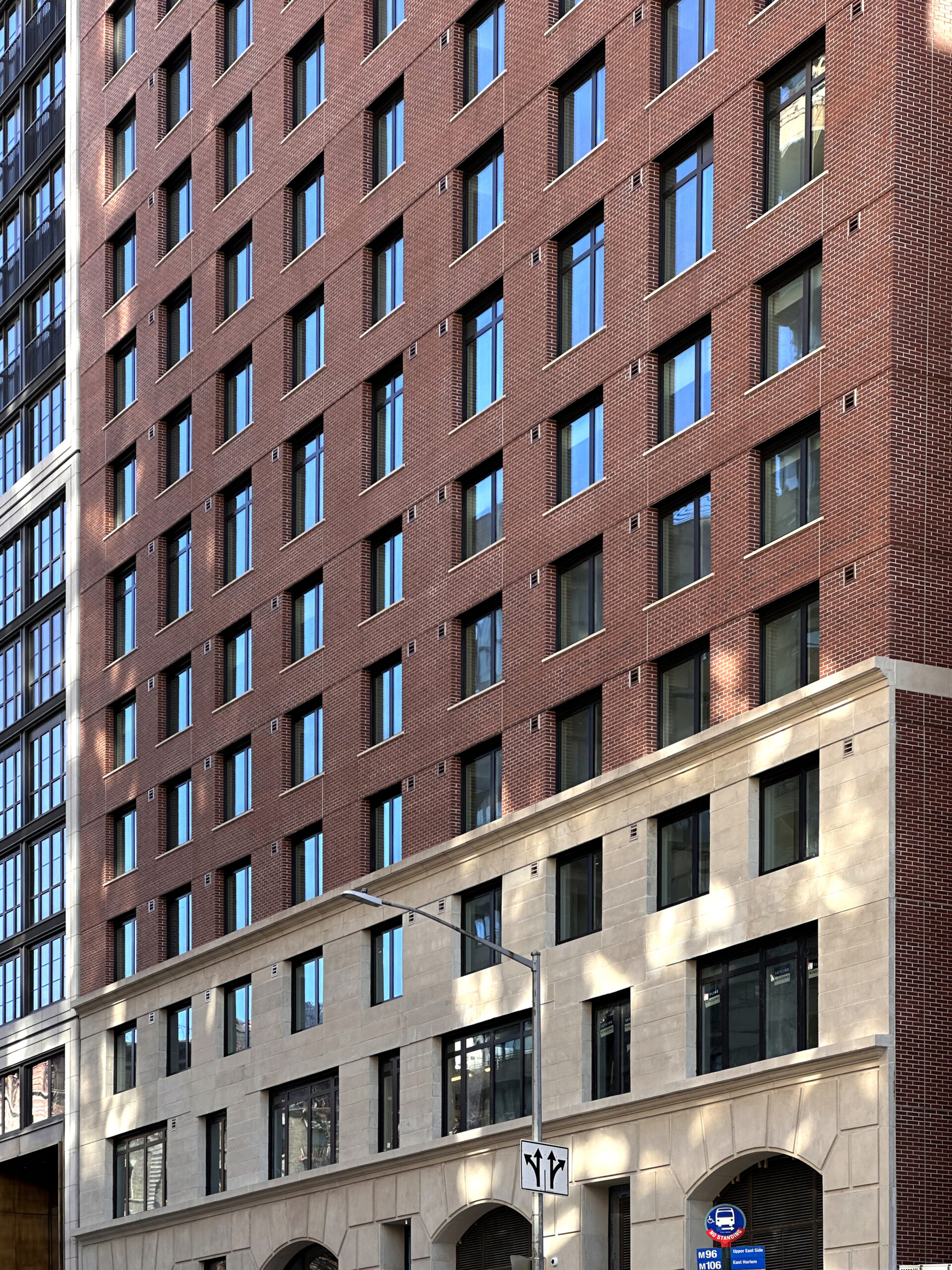
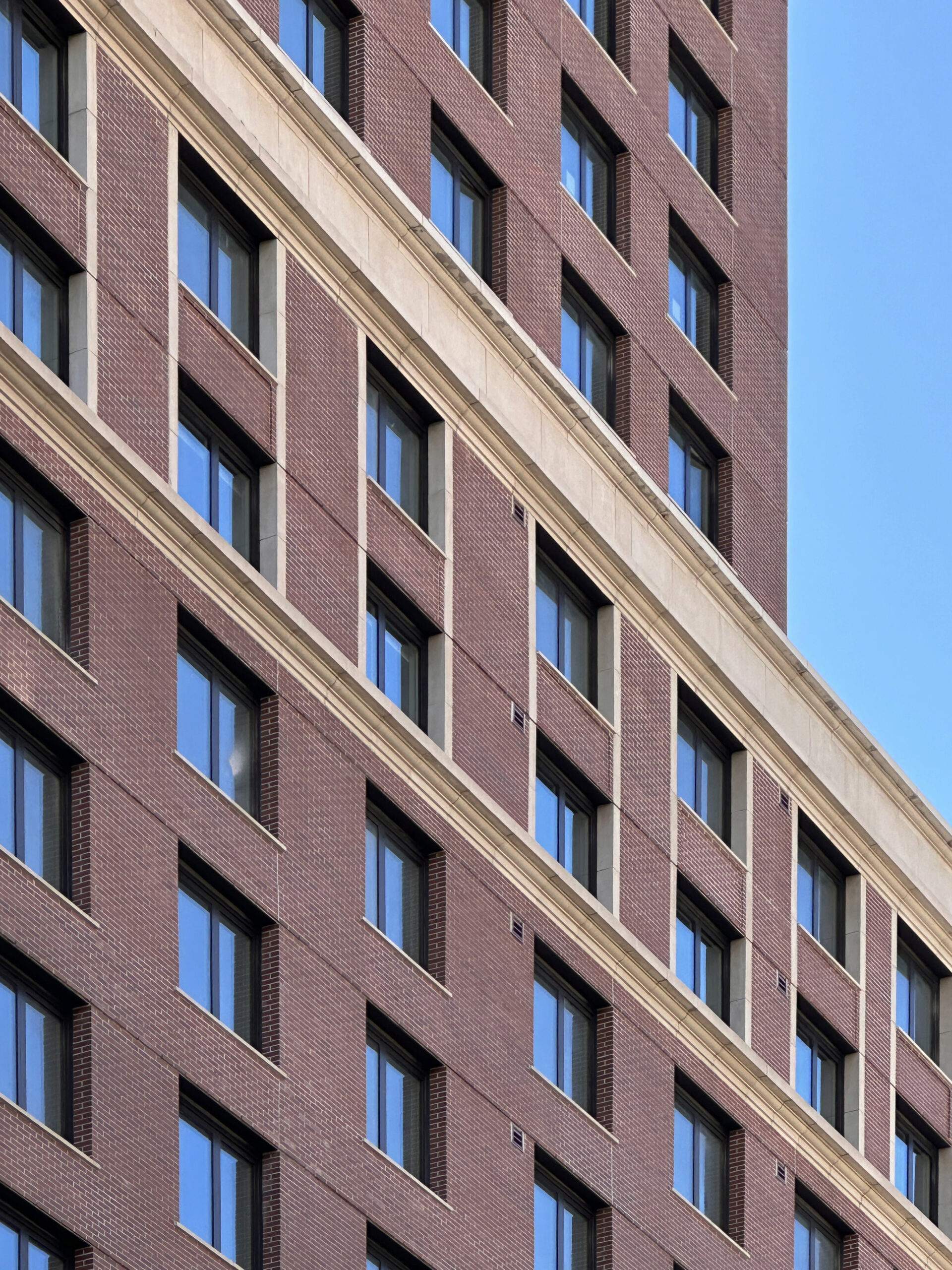
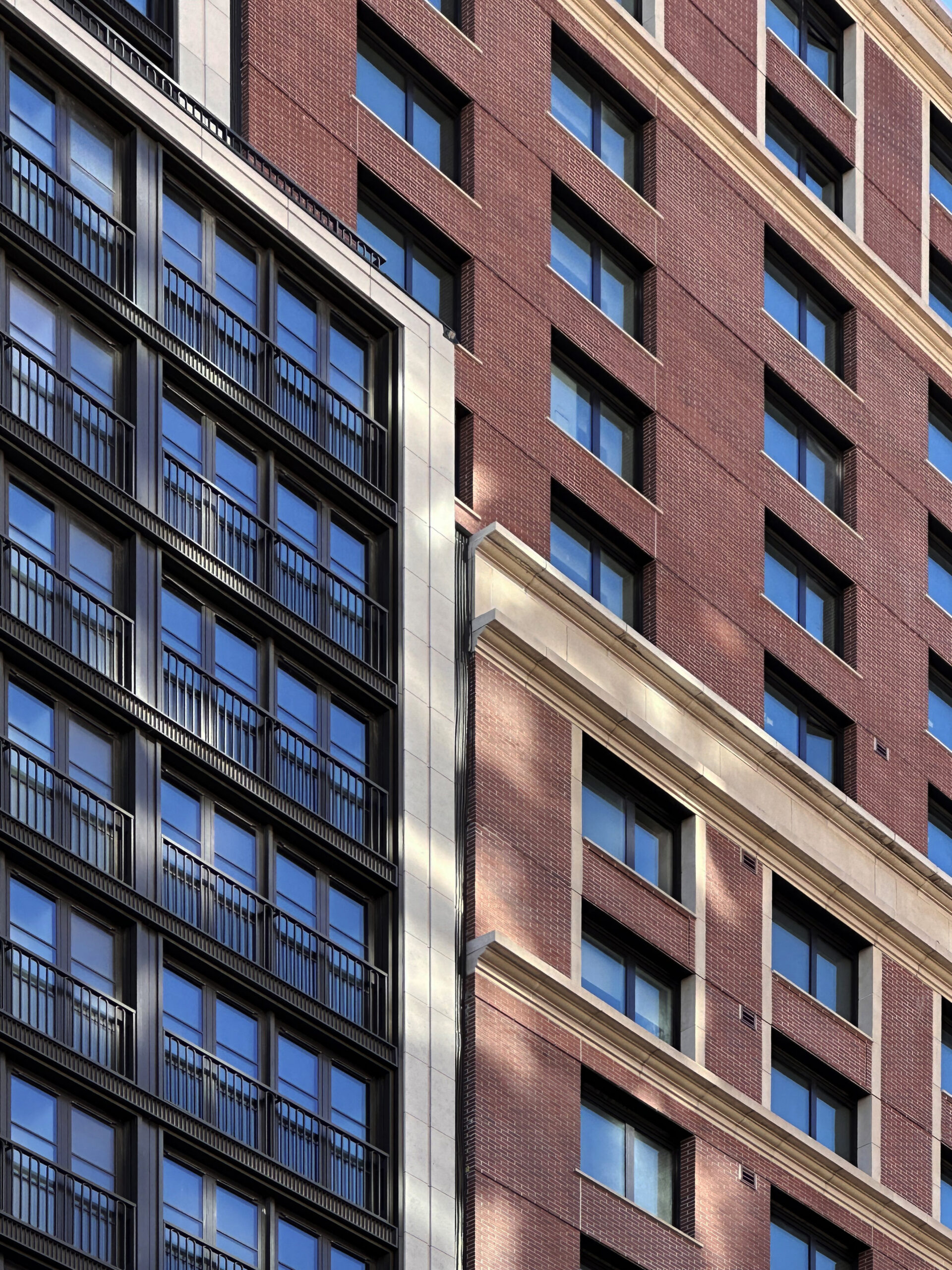
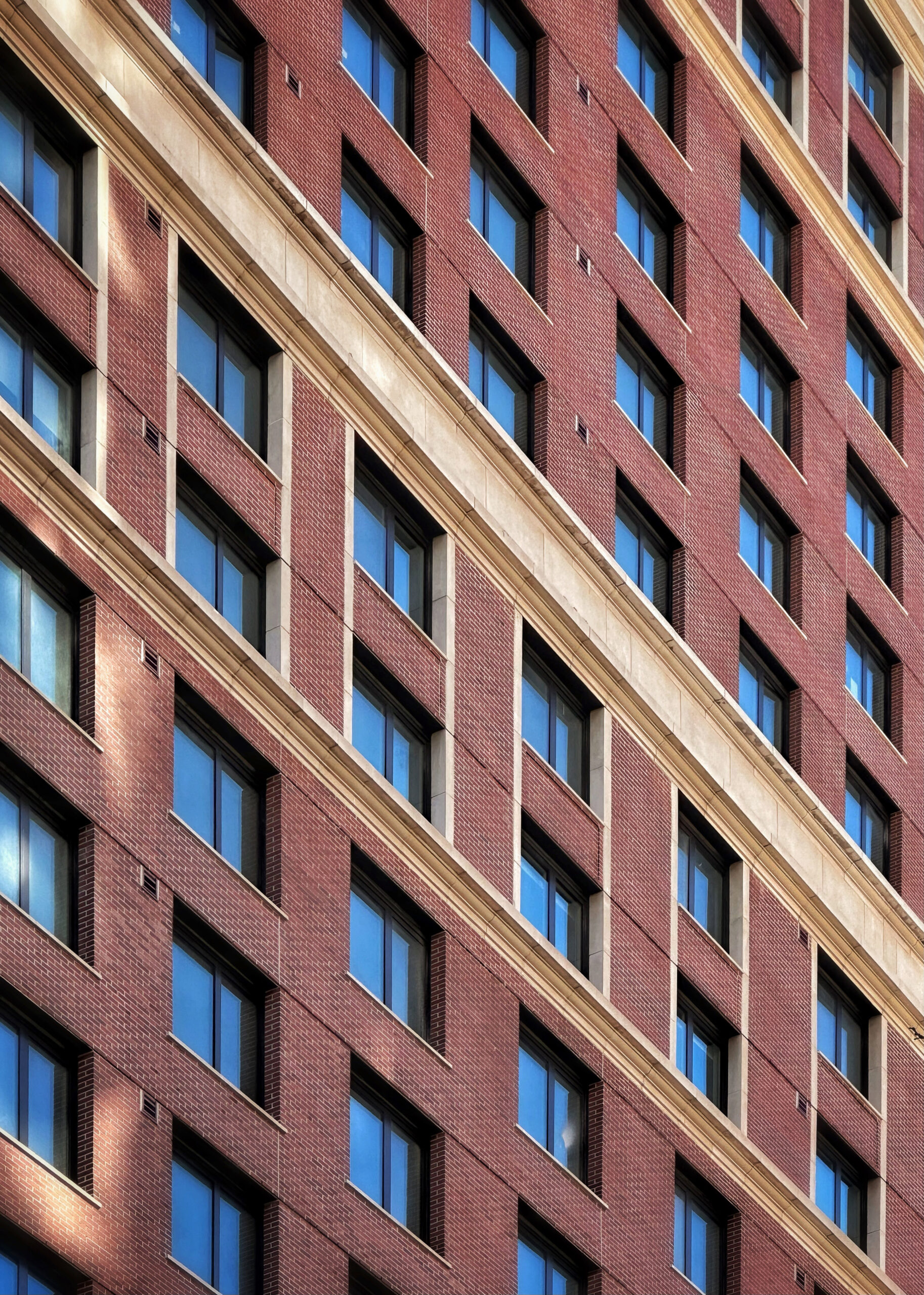
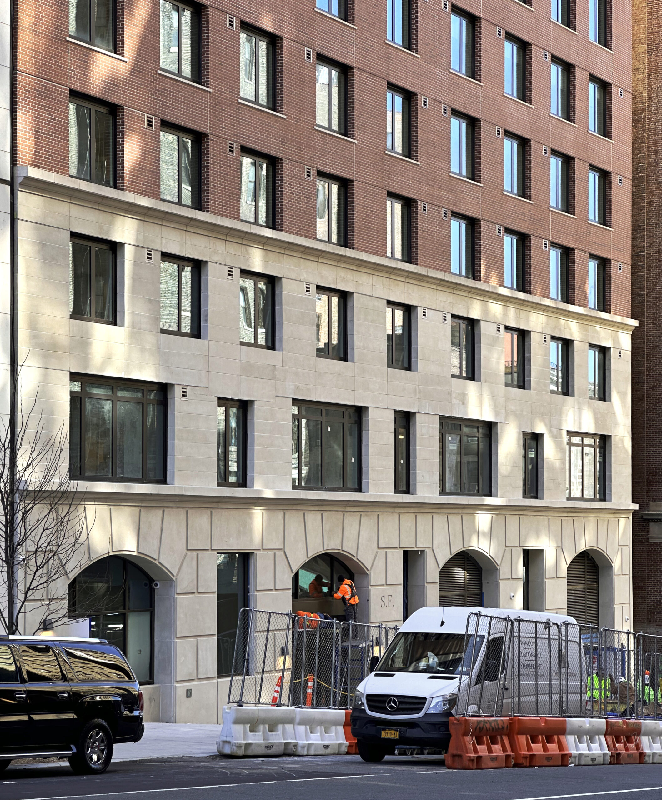
The brick and stone façade has completed installation since our last update last June, when crews were preparing to place the precast stone panels on the bottom three stories. Recent photos show the entire northern elevation finished with minor work wrapping up on the main entrance and its revolving doorway. The building’s setback and parapet nearly align with those of its neighbor, 96+ Broadway, to the east, creating an interesting contrast in design and façade materials. The plastic sidewalk barriers, metal fencing, and dumpster should all be removed in the coming weeks as work draws to a close.
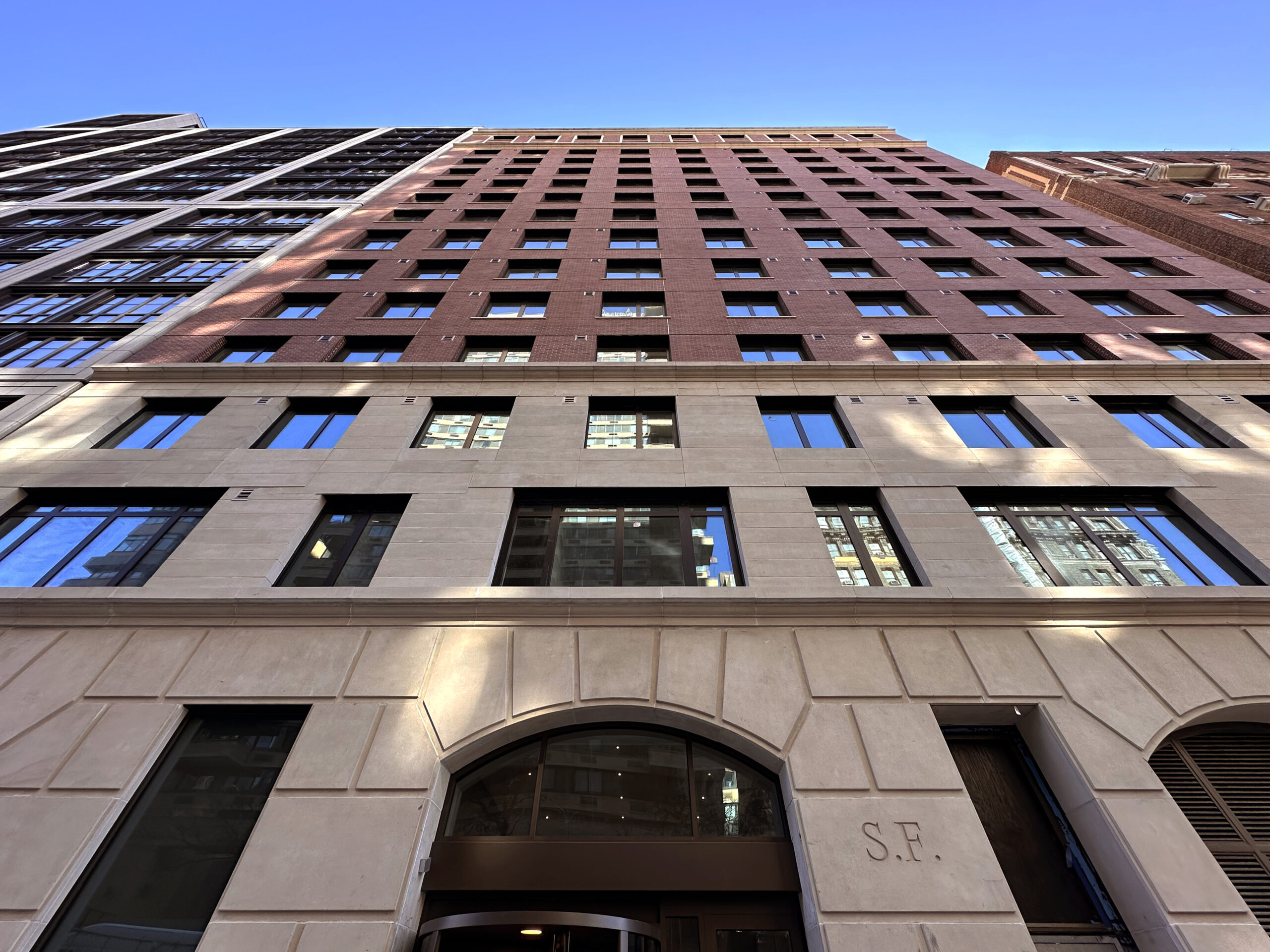
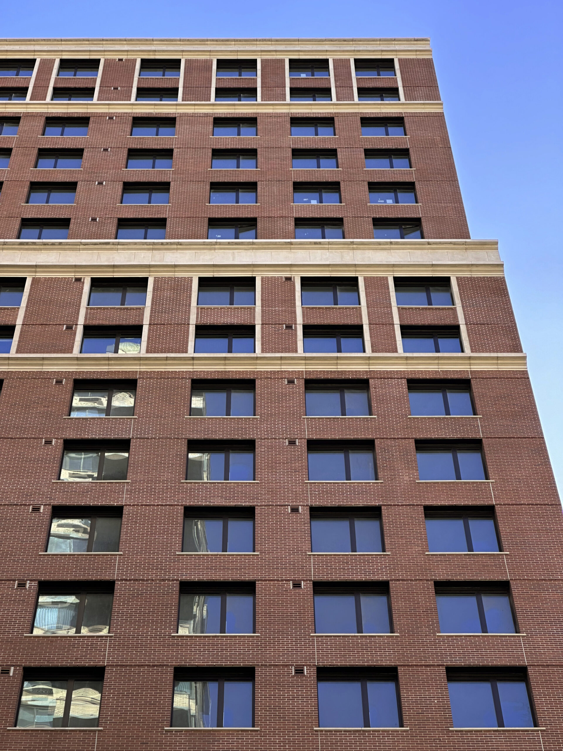
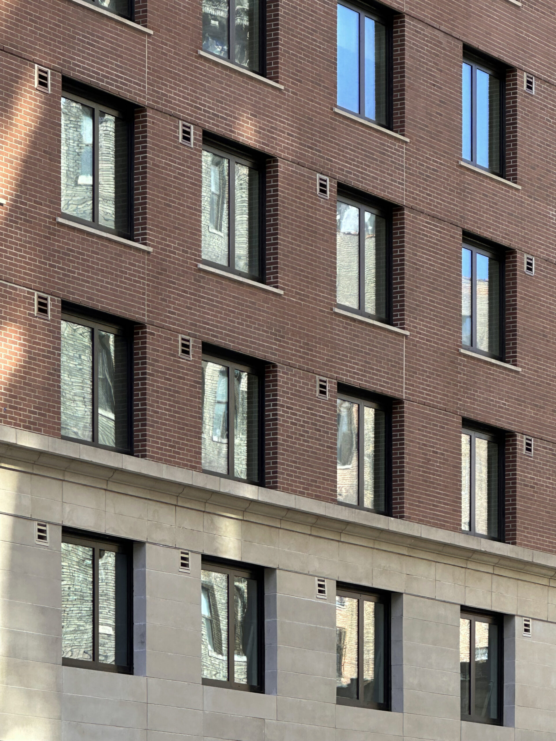
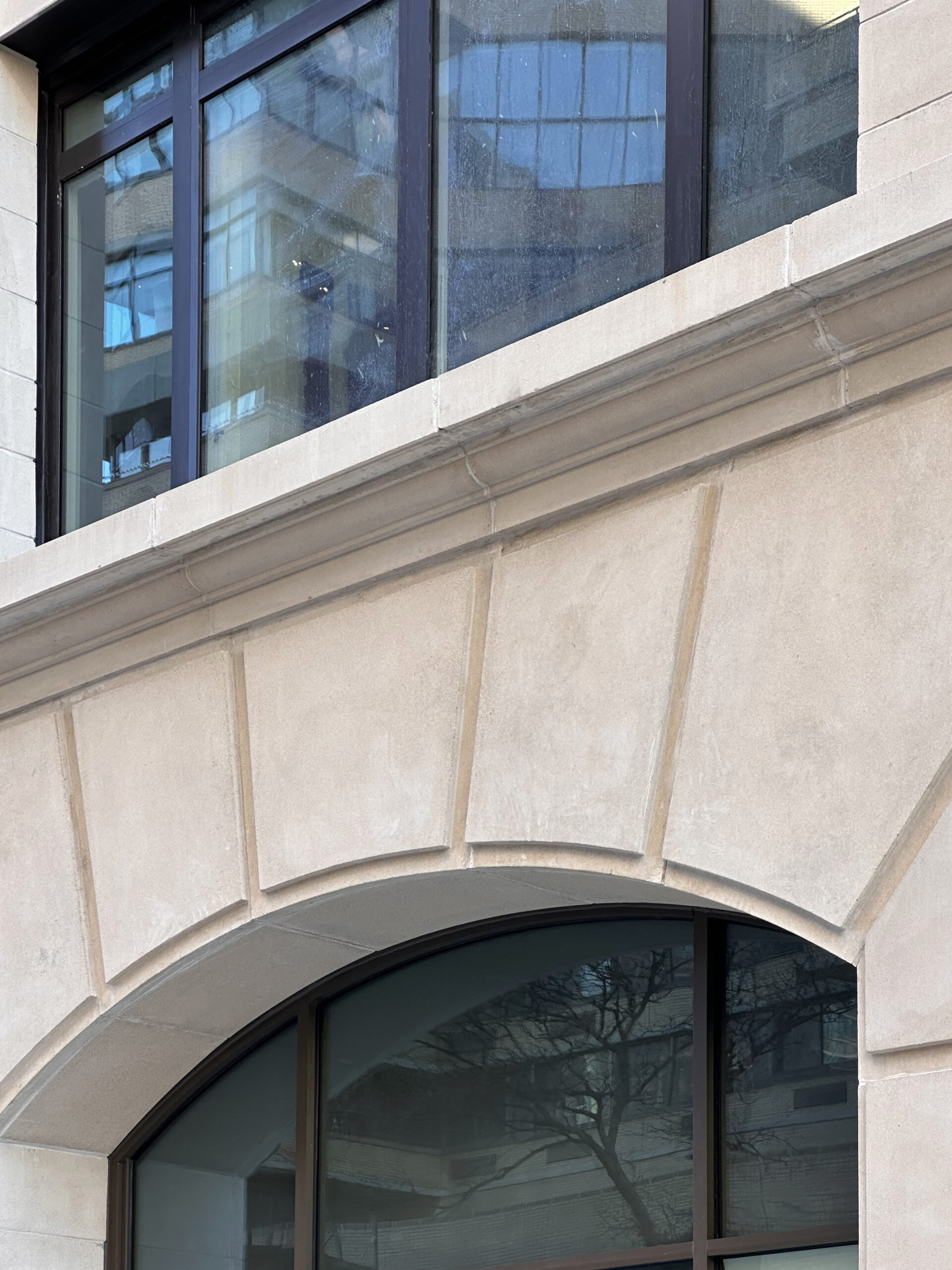
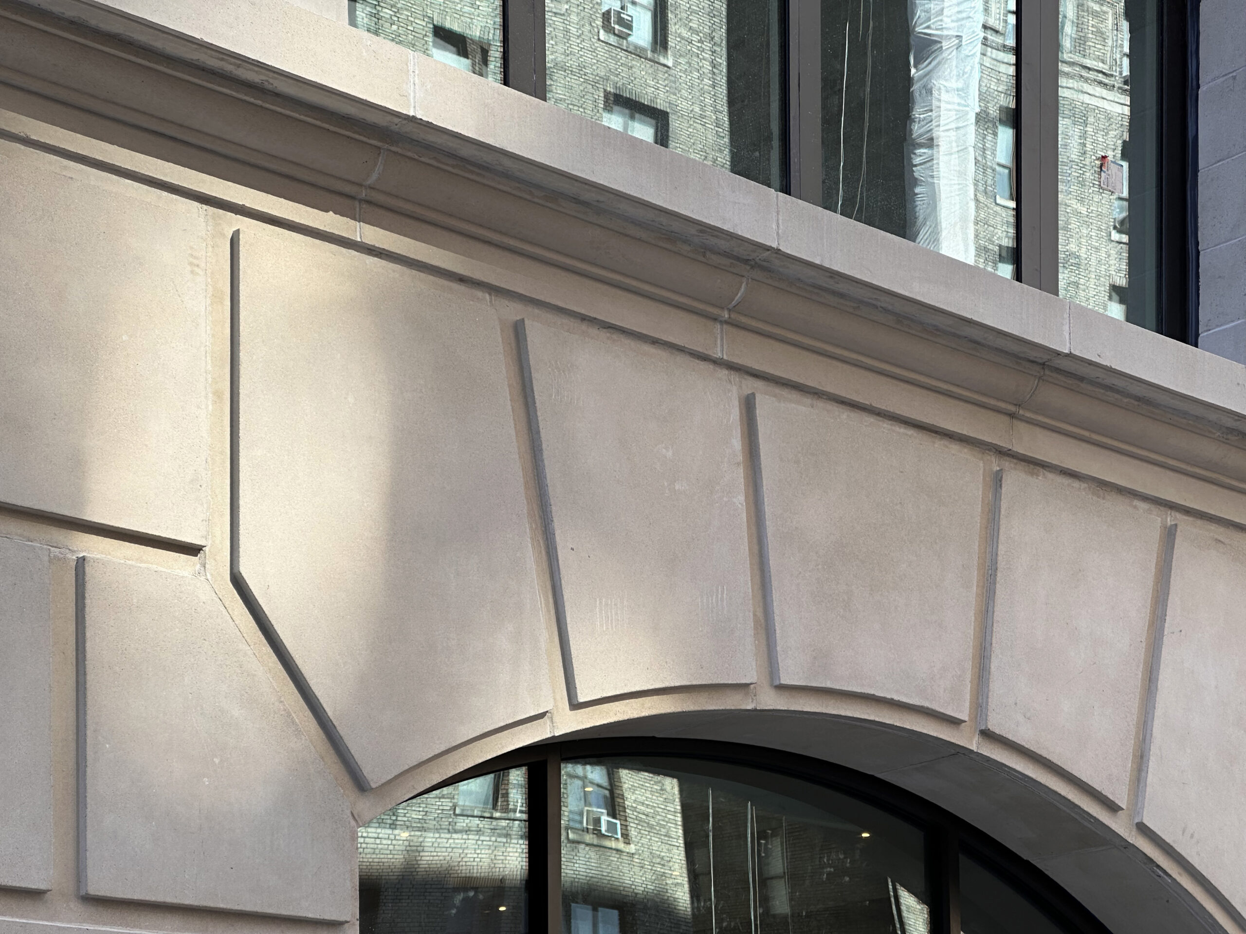
The following close-up shots show the details in the stone façade at the base of the building.
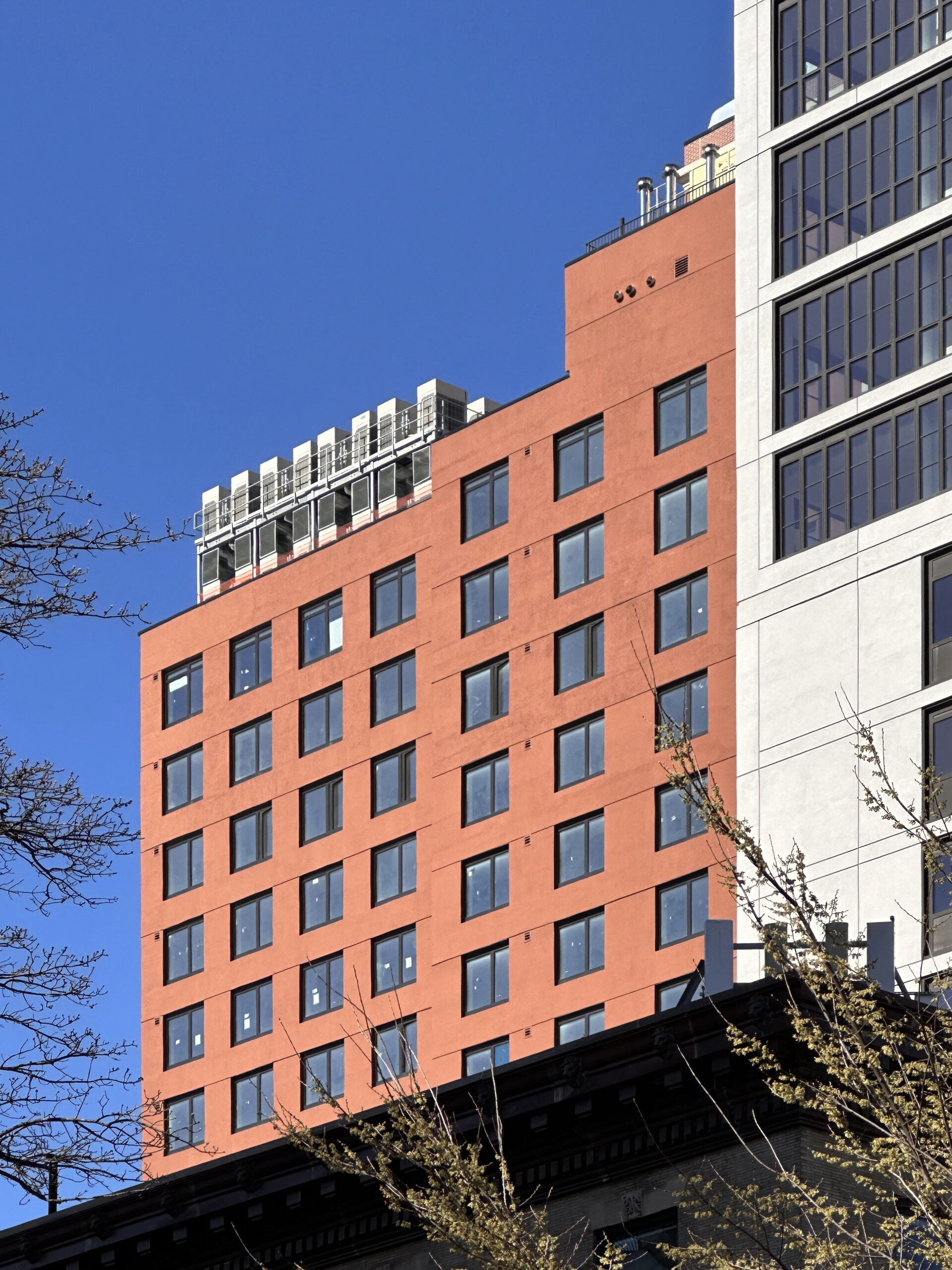
The below image shows a glimpse of the rear southern elevation, which is enclosed in red EIFS paneling with a grid of tall windows.
266 West 96th Street is located directly adjacent to the 96th Street subway station, which serves the 1, 2, and 3 trains. The C and B trains are also nearby along Central Park West.
Subscribe to YIMBY’s daily e-mail
Follow YIMBYgram for real-time photo updates
Like YIMBY on Facebook
Follow YIMBY’s Twitter for the latest in YIMBYnews

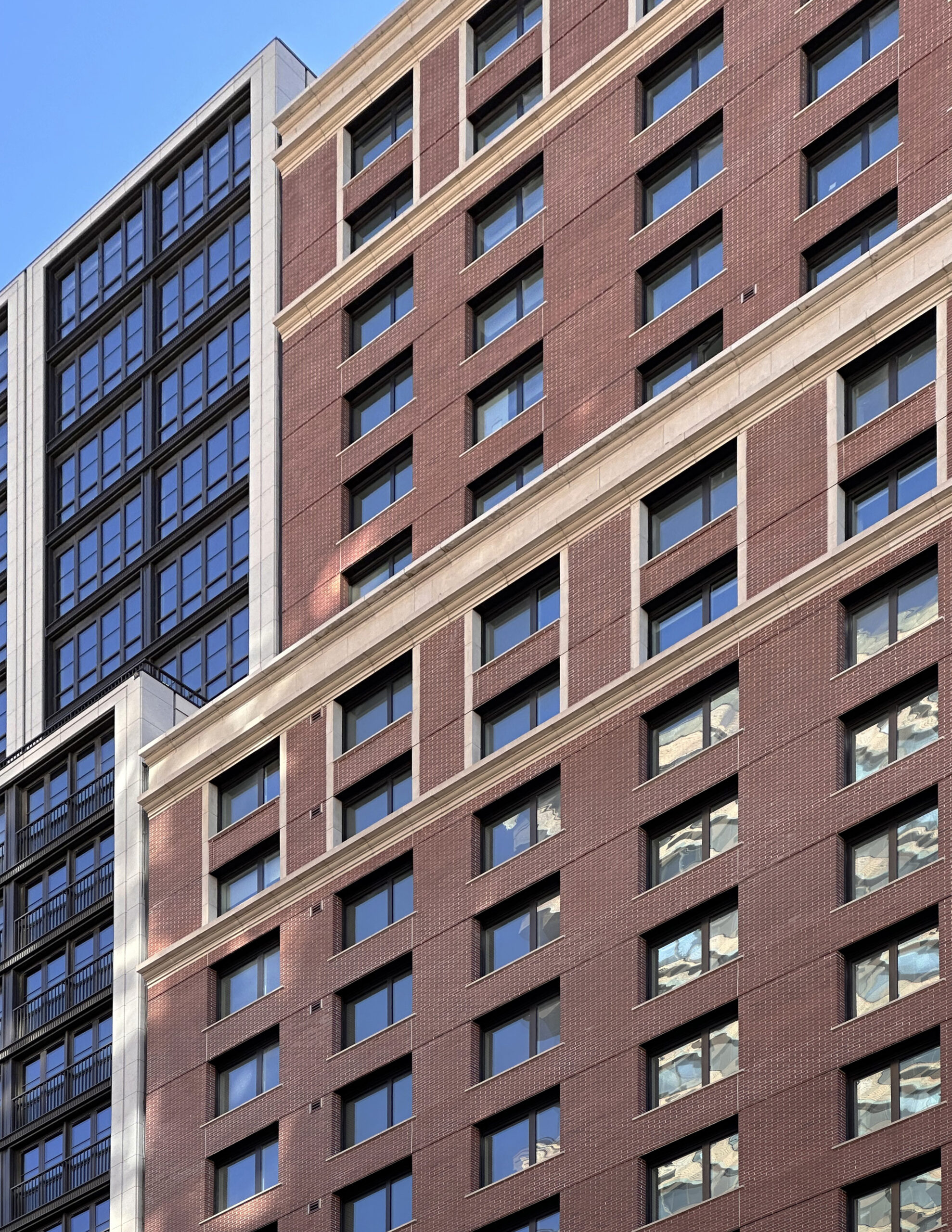


For an “infill” building, it’s decent. Fetner missed a great opportunity to make something special for the floors above the cornice that rises over the West End Ave building to it’s west:
there could have been a corner bay, windows facing the River (one block), to the west….which would raised the architecture to slightly more than mundane. There is nothing really “luxurious” to this building.
It’s probably likely 736 and or 734 West End get redeveloped in the future anyway.
the Building at 95th and WEA is being renovated. Both 736 and 734 are part of the West End Historic District….they aren’t going anywhere or growing.
It’s already a very expensive high rise building with many occupants, buildings like that rarely get demolished even without landmarking
You are technically correct.
But the WEA Historic District Extension is a blanket landmarking not an individual landmarking meaning replacement is possible though admittedly unlikely. I forgot the sliver at 734 is relatively new. I would hope to at least see an exterior restoration of 736 including it’s missing cornice and original balconies that were lost years ago. That would go a long way.
This is 100x better than what was there before that’s all that matters to me + more housing
That might be the ugliest building in the city
It’s a little bit too simple above the base, but all in all, it’s a very good infill design that seamlessly blends into the neighborhood. It’s certainly better than another all glass, cheap facade.
What’s up with the vents in the streetfacing facade? Could there have been a more elegant solution?
#1 pet-peeve
The vents are in the back of the building, not the front.
vents are on the street facade
I’m curious about the gap between this building and it’s neighbor? 🤔
If built that could be the “skinniest UBER LUXURY” tower in NYC! 🤣
More likely 736 West End is replaced in the future
How often do 14 story buildings (with very high rents) get demolished?
…and you get a vent!
…and you get a vent!
…and you get a vent!
Nice enough. There are a lot of new buildings on 95th and 96th streets.
Ahaha! I’m just imagining the entire front of the building constantly smelling like Downy dryer sheets
Also, this was suppose to be in response to the vent meme comment above your comment. I misposted
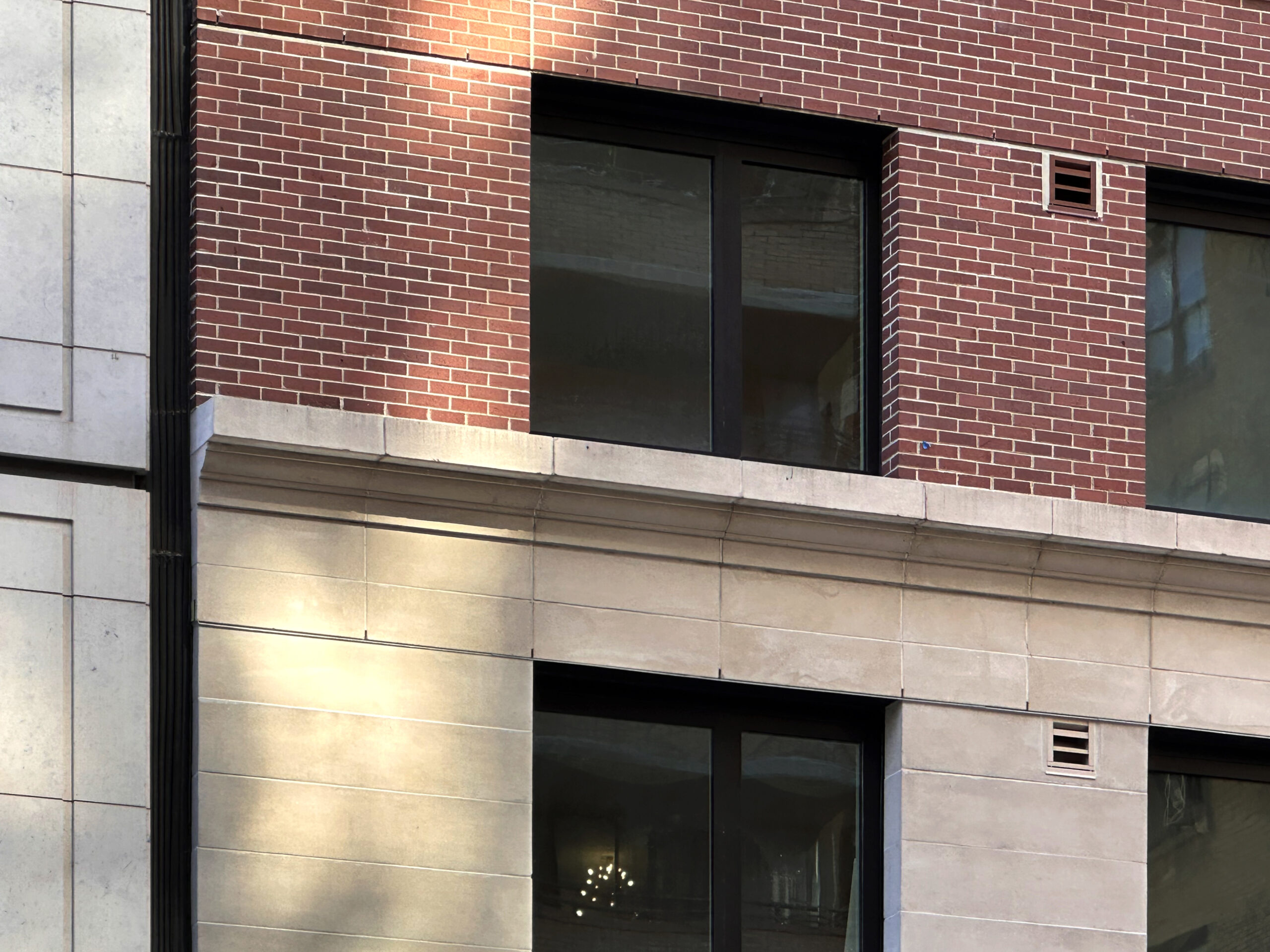
The vents do a nice job of almost distracting from the garbage faux brick panels.
cheers to them for circumventing the FAR cap- how did they do t?
Honestly, it has a cheap 00s look to it. But it adds a lot of units, has no off street parking, and fits the streetwall nicely so I support it.
I think the vents are for the bathrooms and are a product of the new energy code. Also, if you lived in the neighborhood, you would have seen that the brick facade is not panels, but real brick
I stand corrected.
Those are some violent lintels.
Besides the base what a blah building. Such ugly small windows.
Small windows look better than floor to ceiling ones
The rocks at the base might reduce the New York feel a bit, which may have some Parisian elements mixed in: Thanks.