Jane Street has been a hot spot for controversial projects of late. The latest was a proposal for a mega-mansion at 85-89 Jane Street. The presentation packed the house at the Landmarks Preservation Commission on Tuesday, where no decision was rendered.
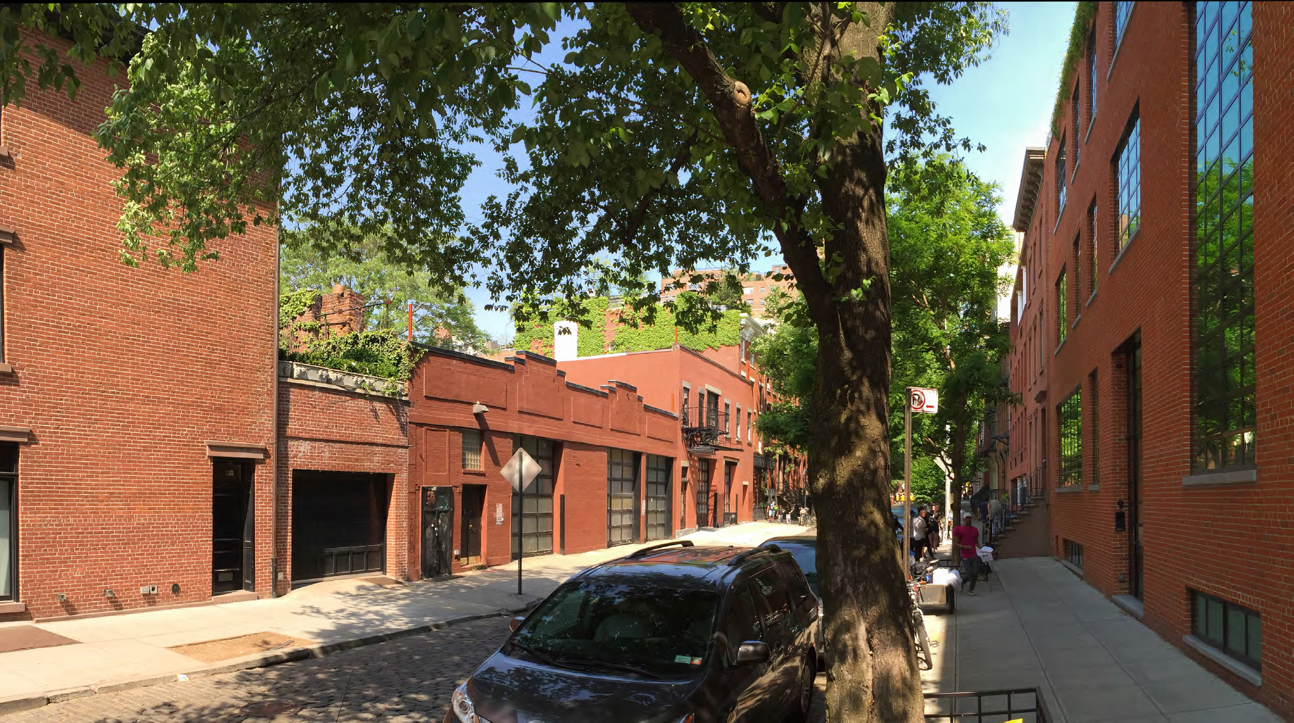
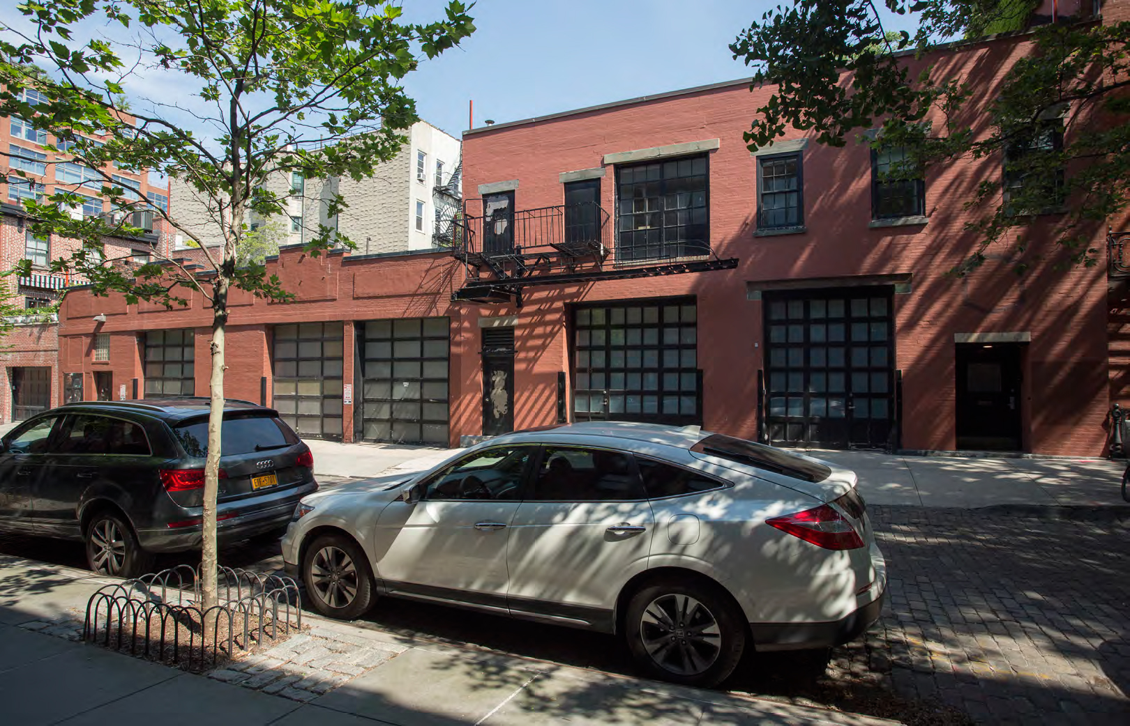
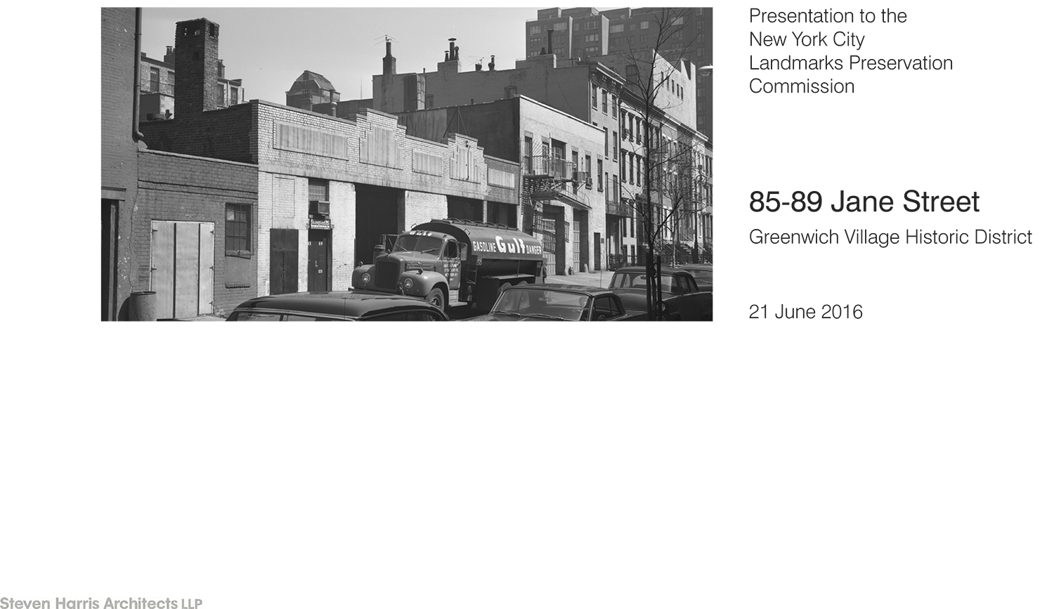
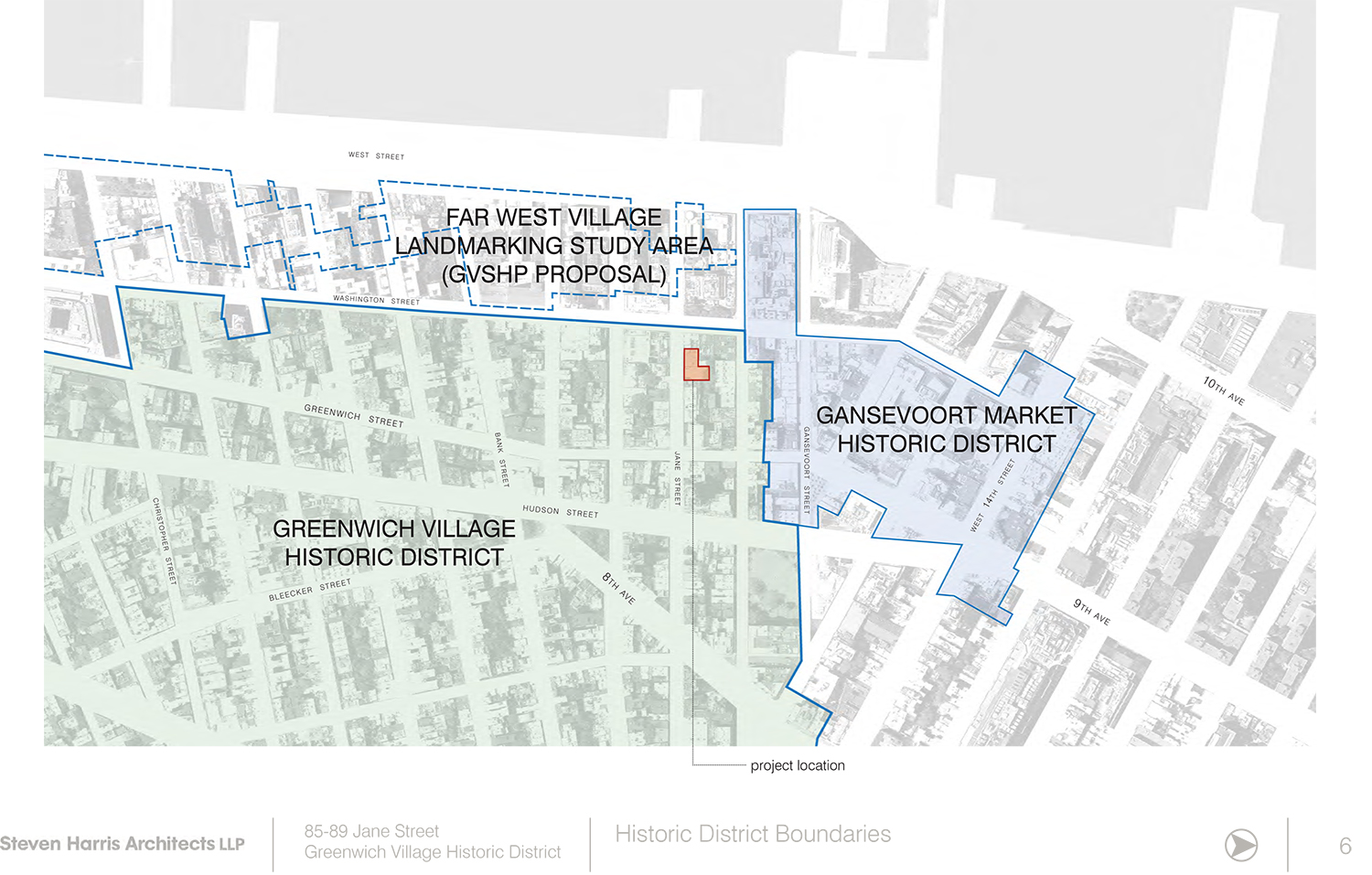
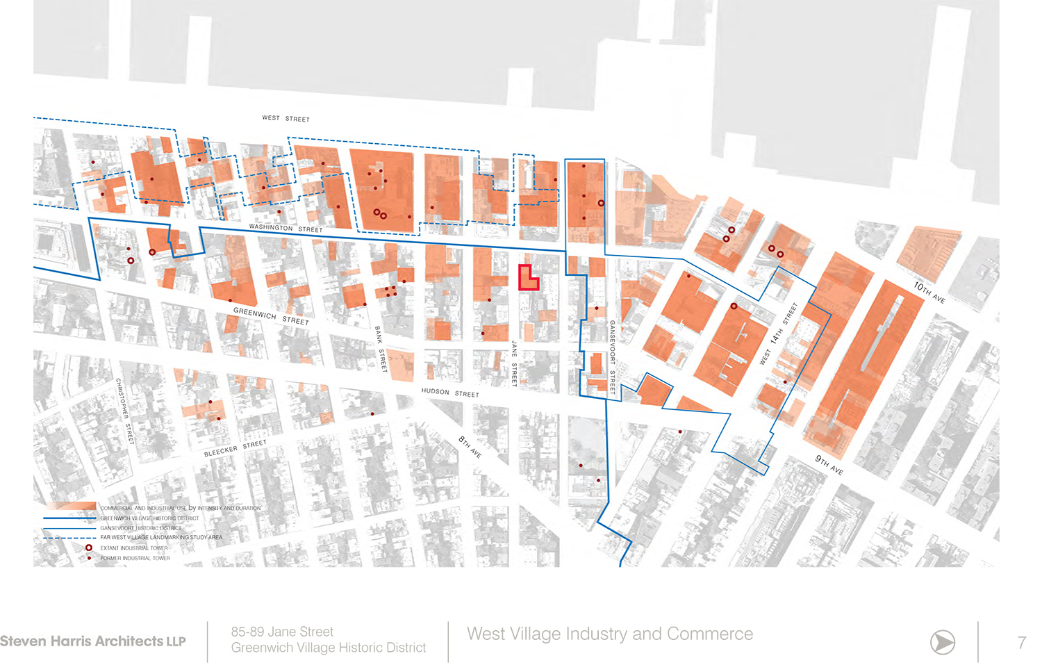
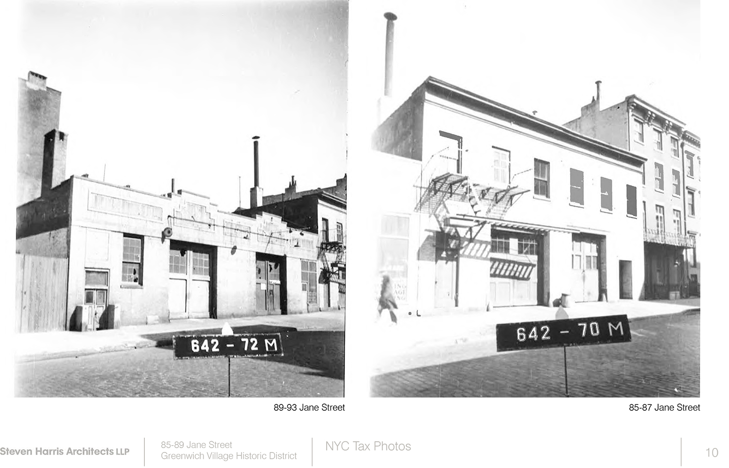
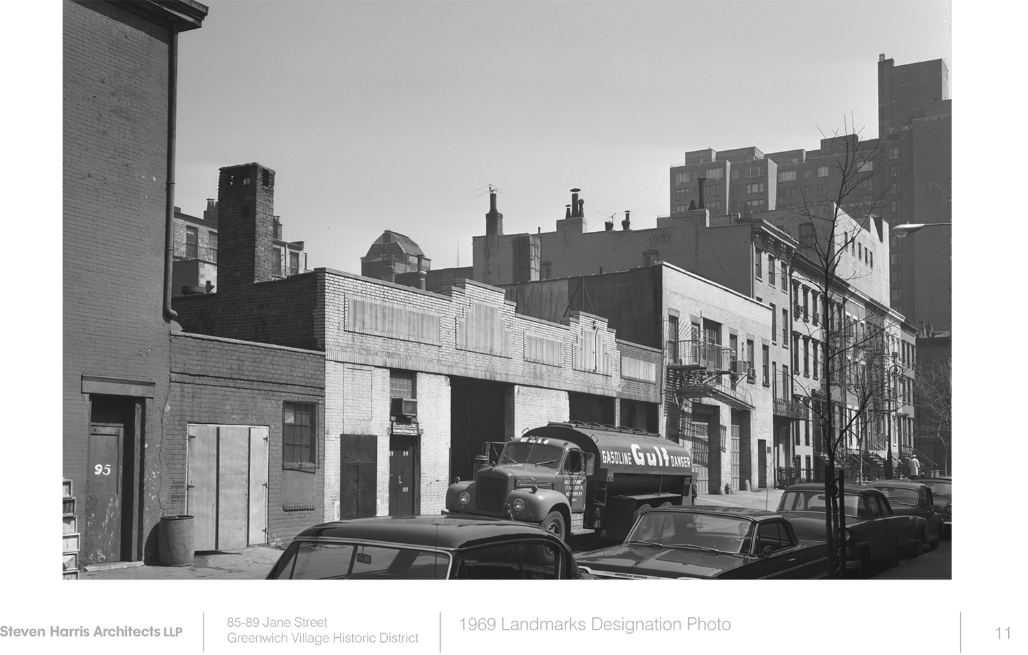
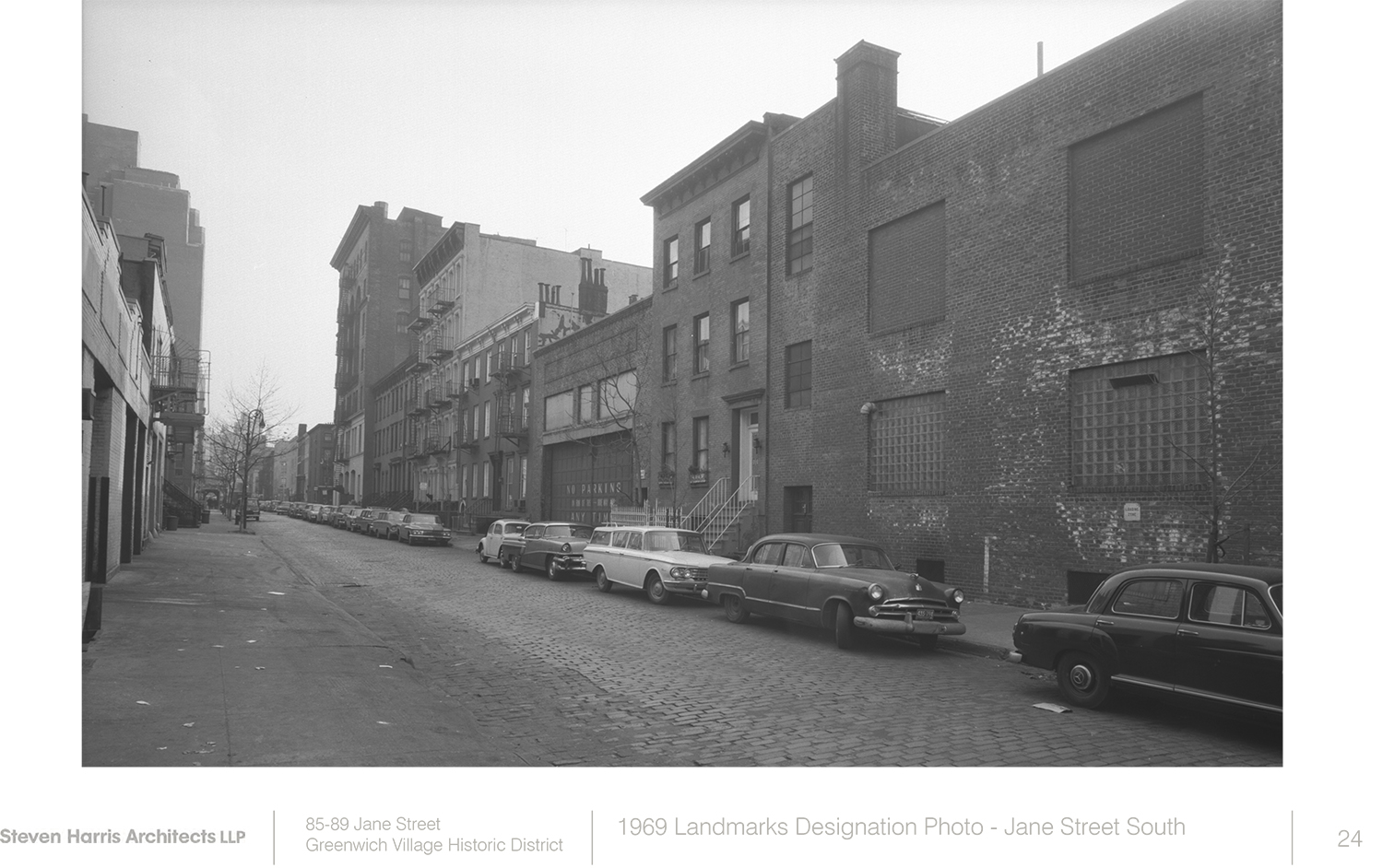
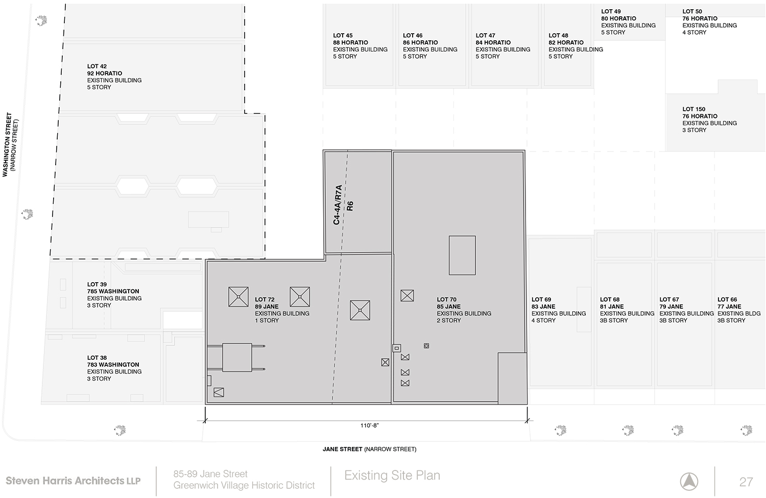
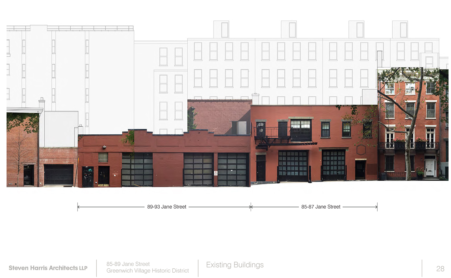
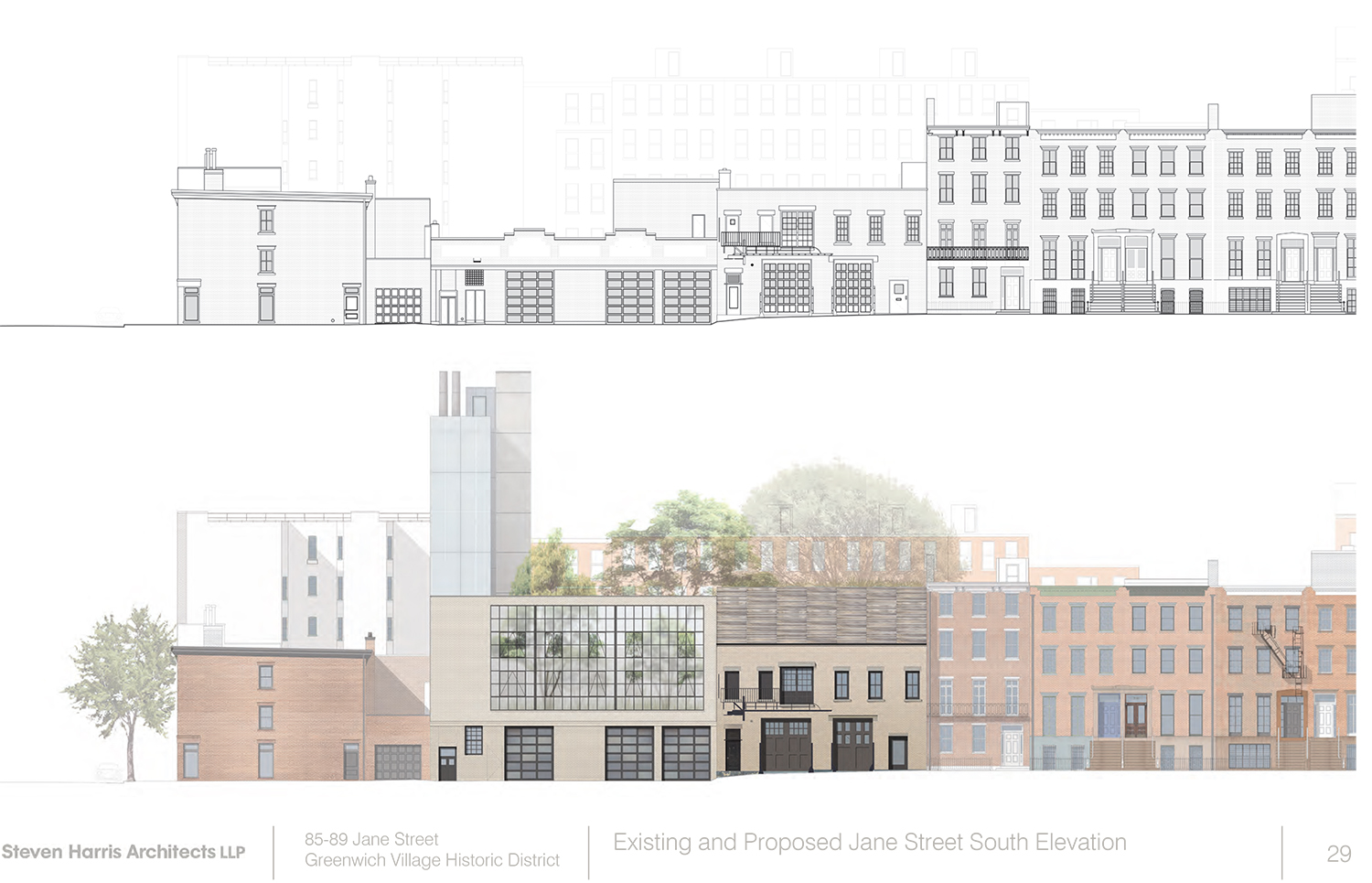
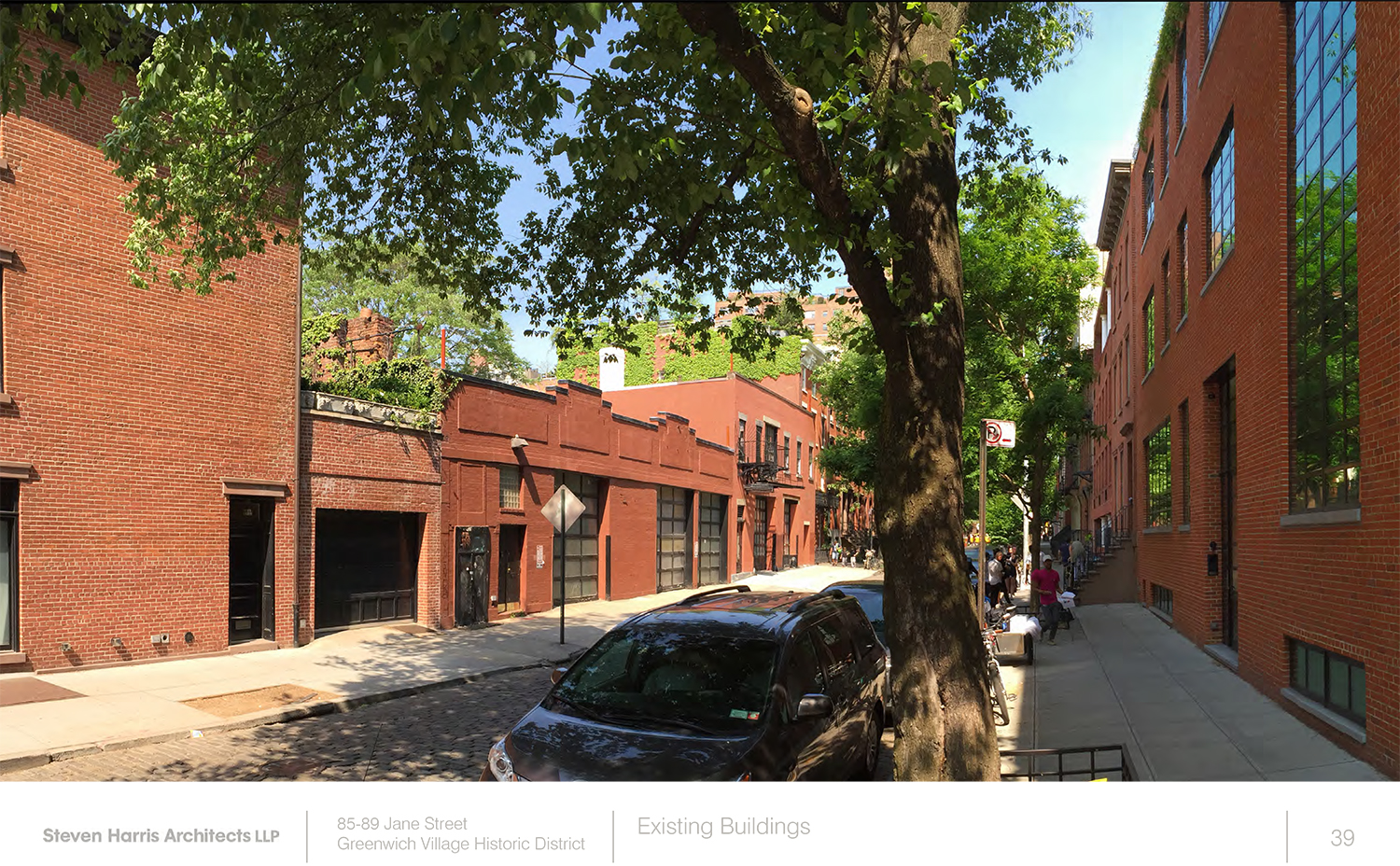
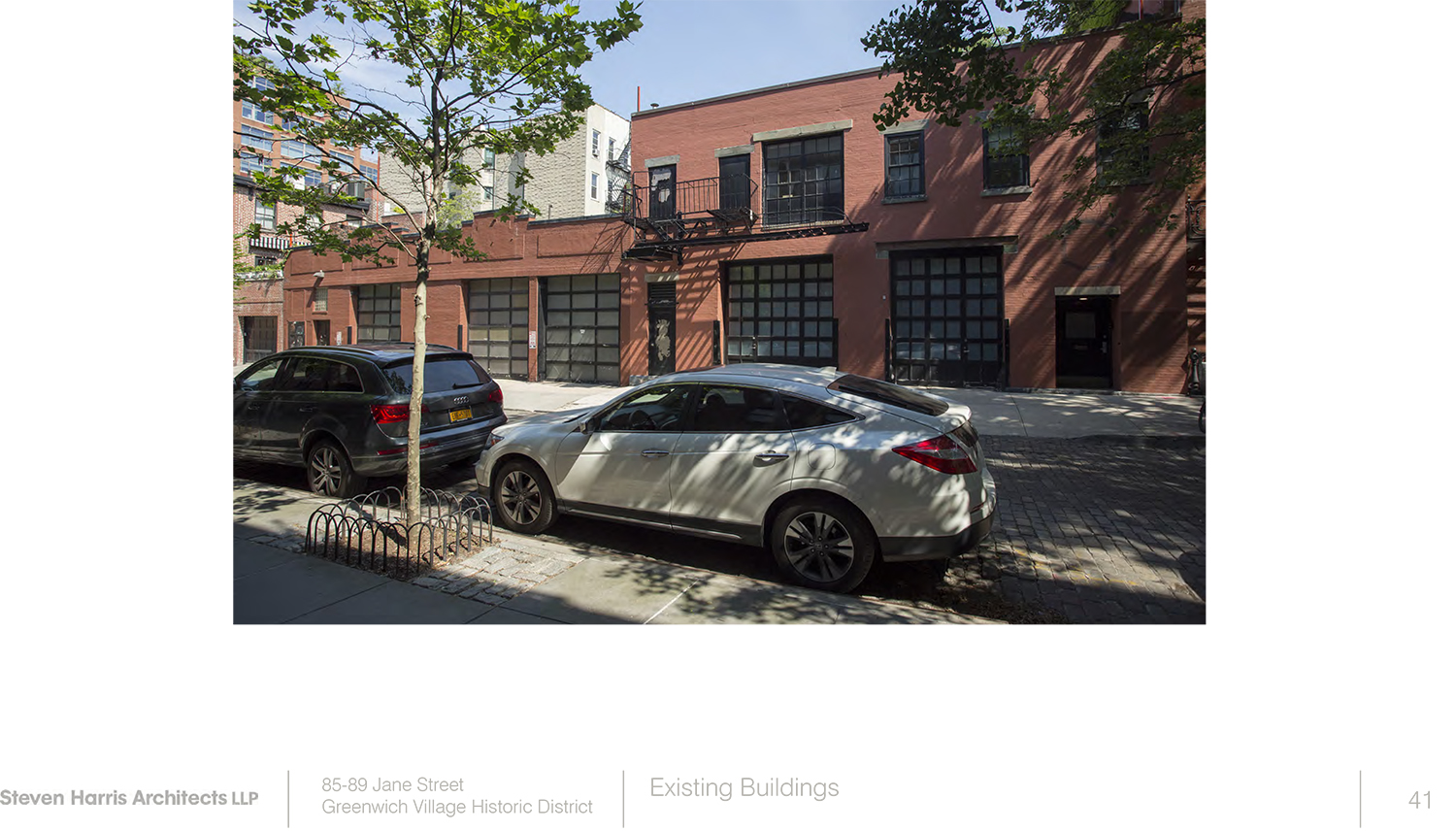
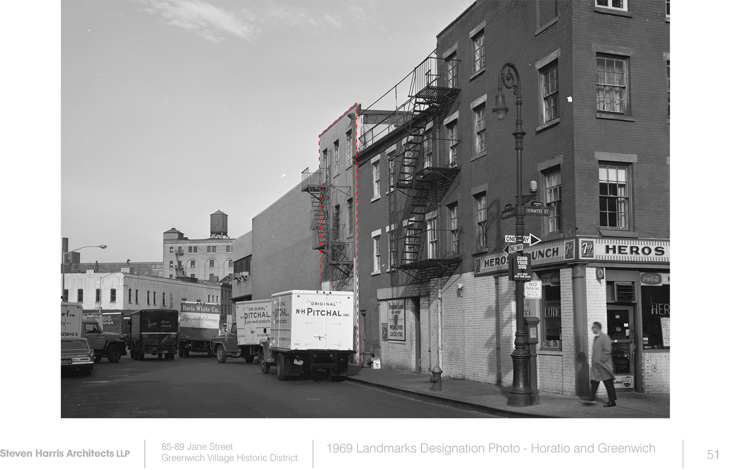
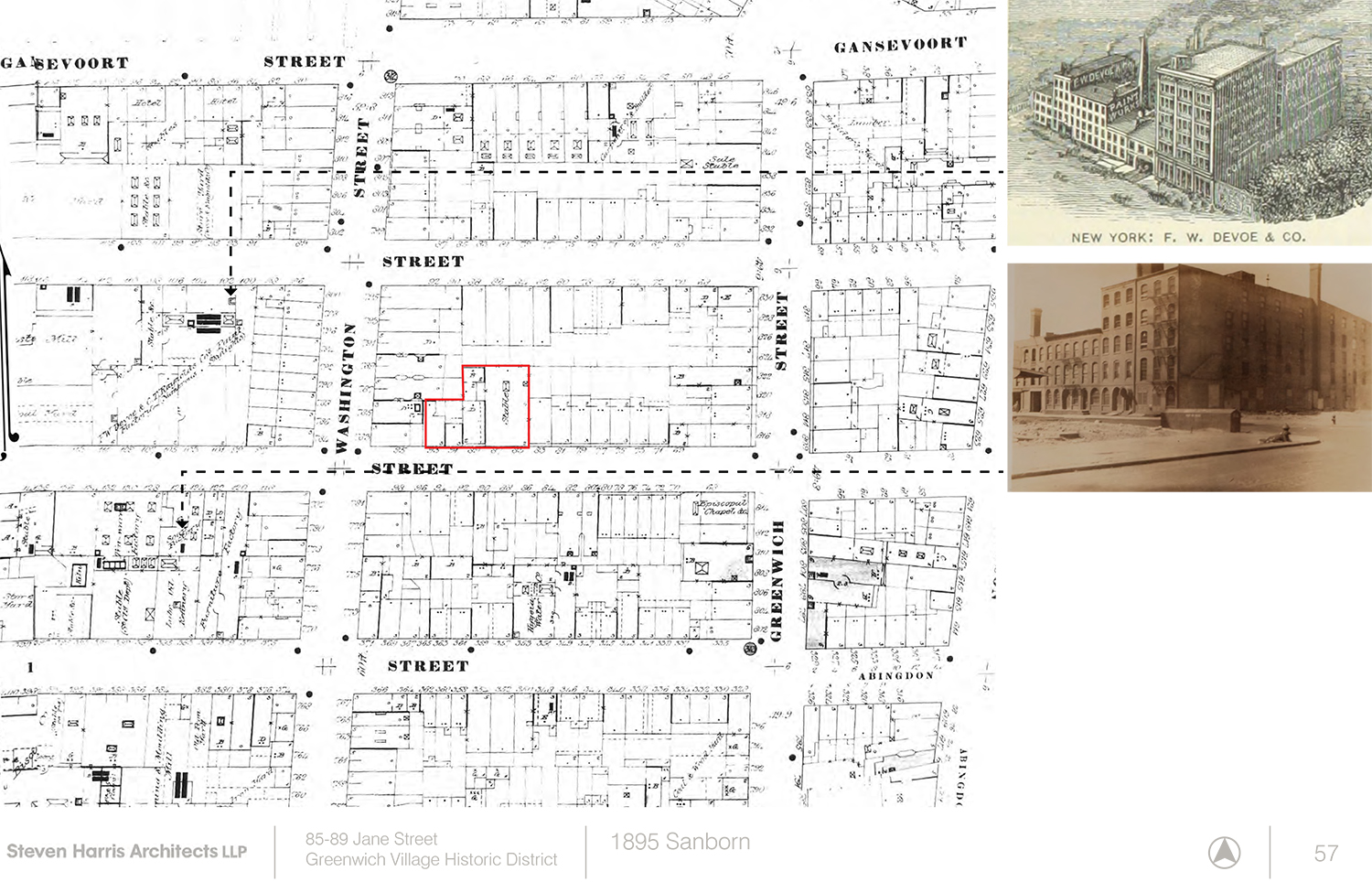
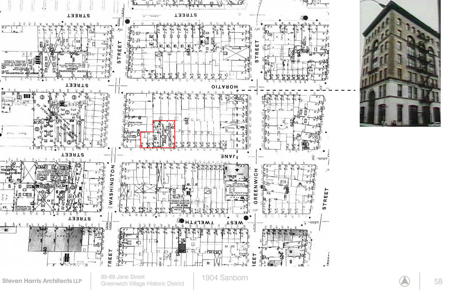
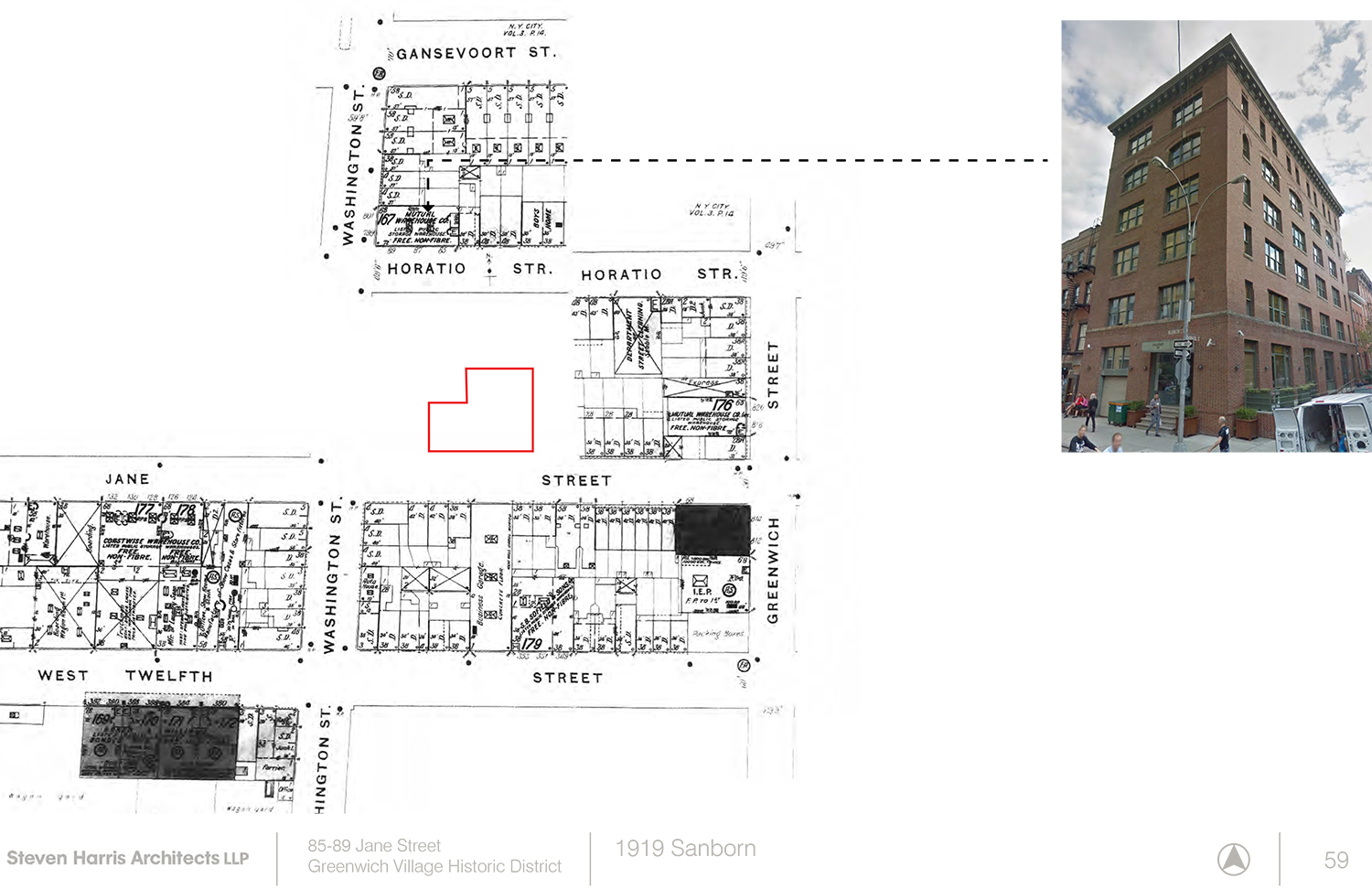
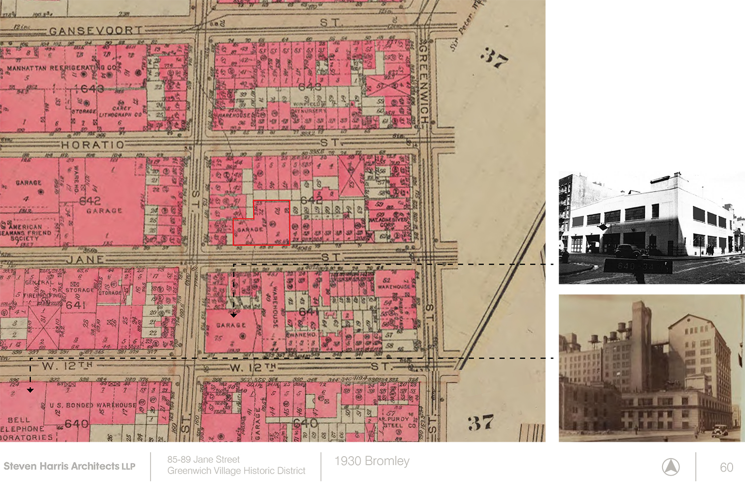
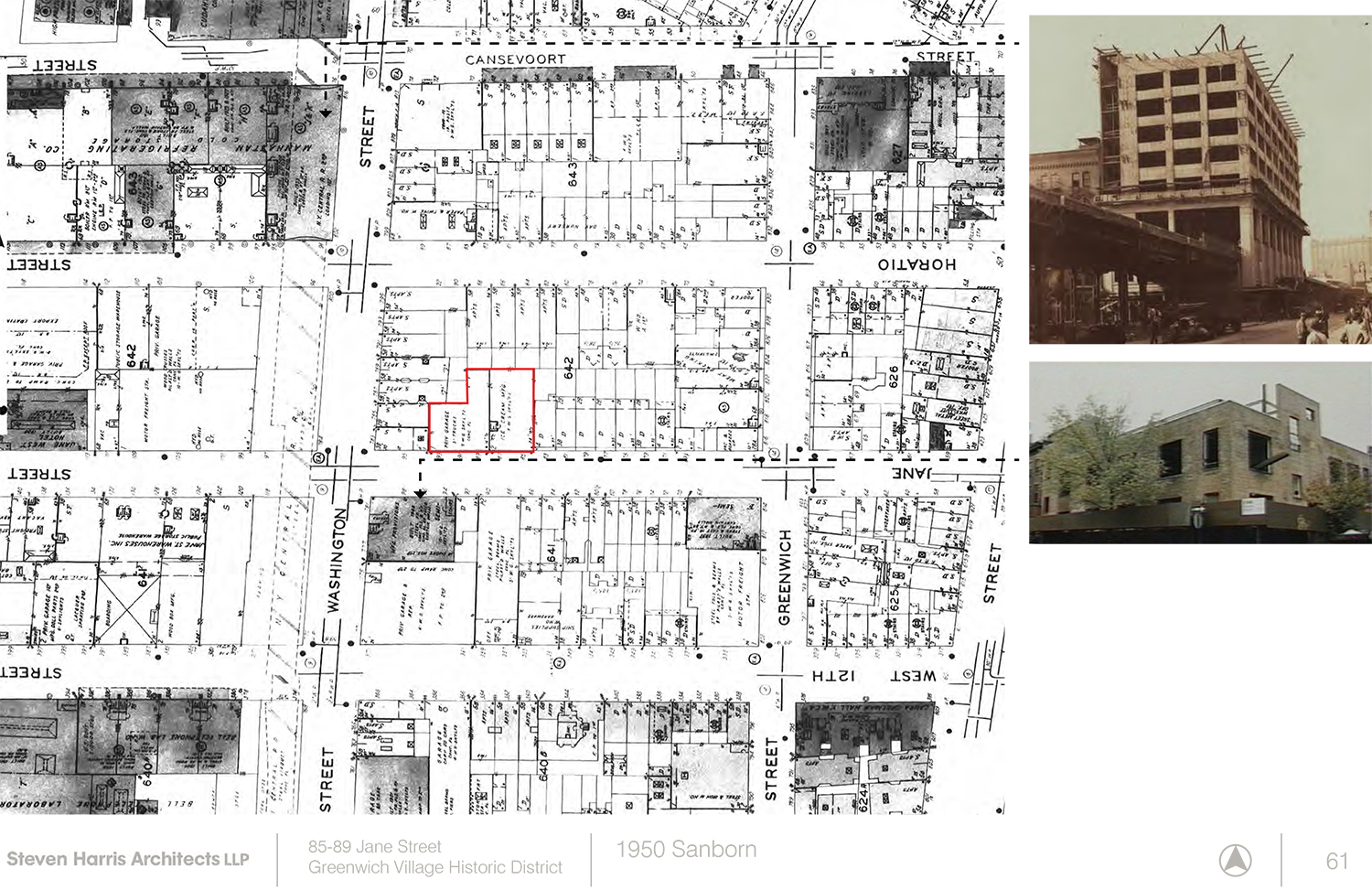
The site sits between Washington and Greenwich streets in the West Village, and within the boundaries of the Greenwich Village Historic District. It consists of a two-story garage building, formerly a stable and carriage house, built around 1885 at 85-87 Jane Street, and a one-story garage built in 1919 at 89-93 Jane Street. They present 110 feet of street frontage.
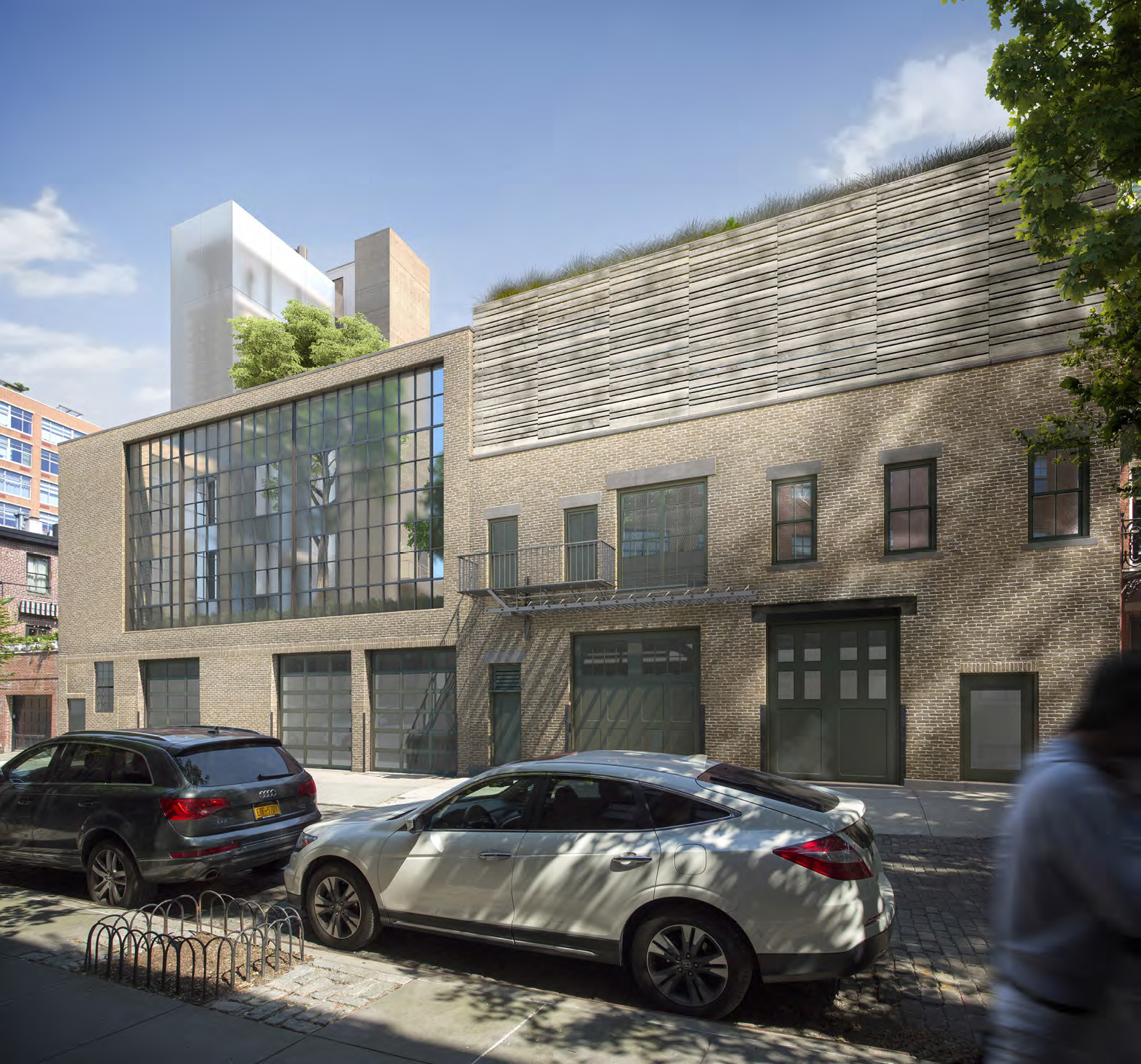
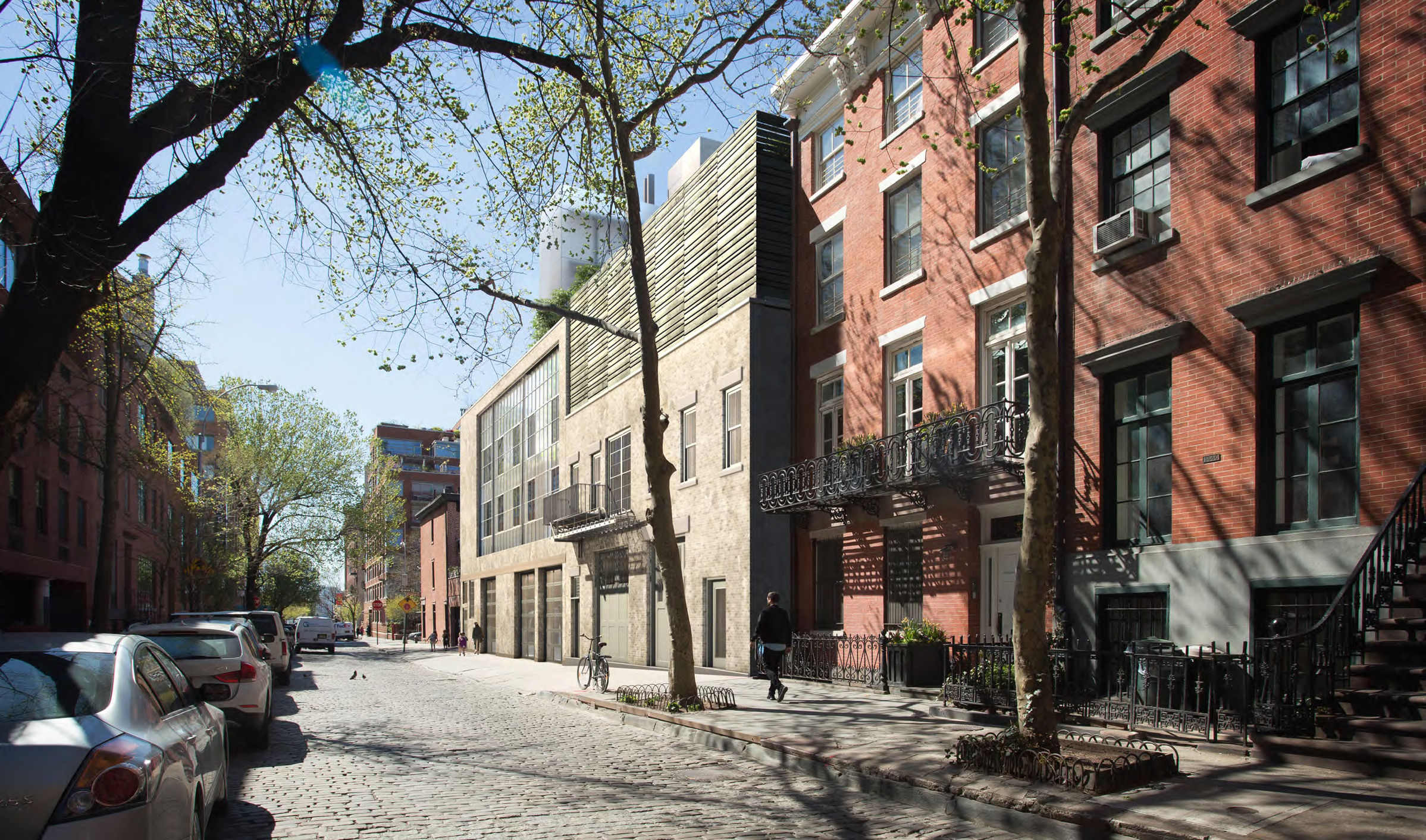
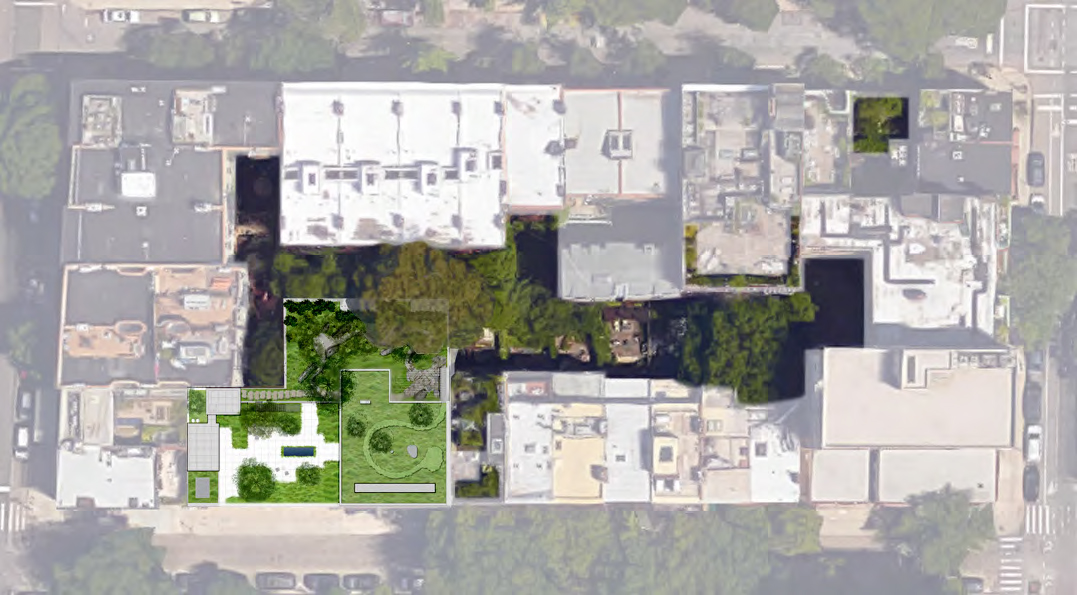
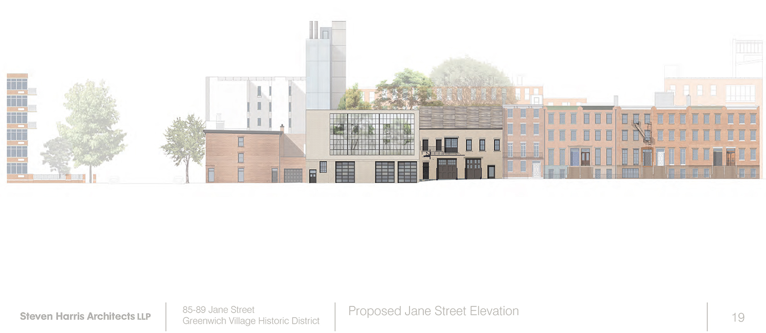
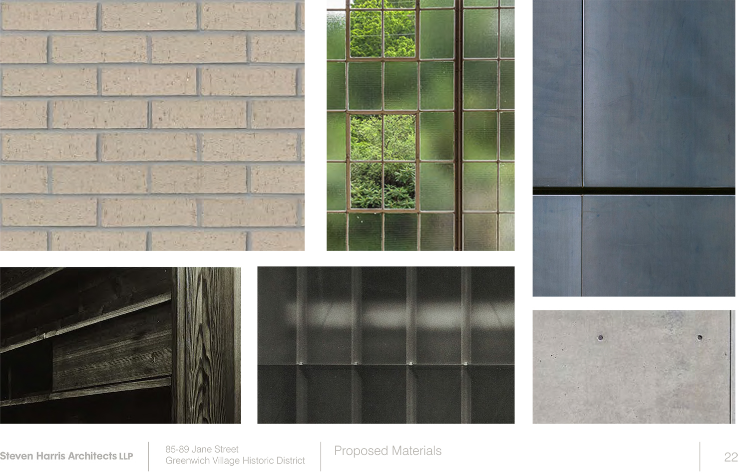
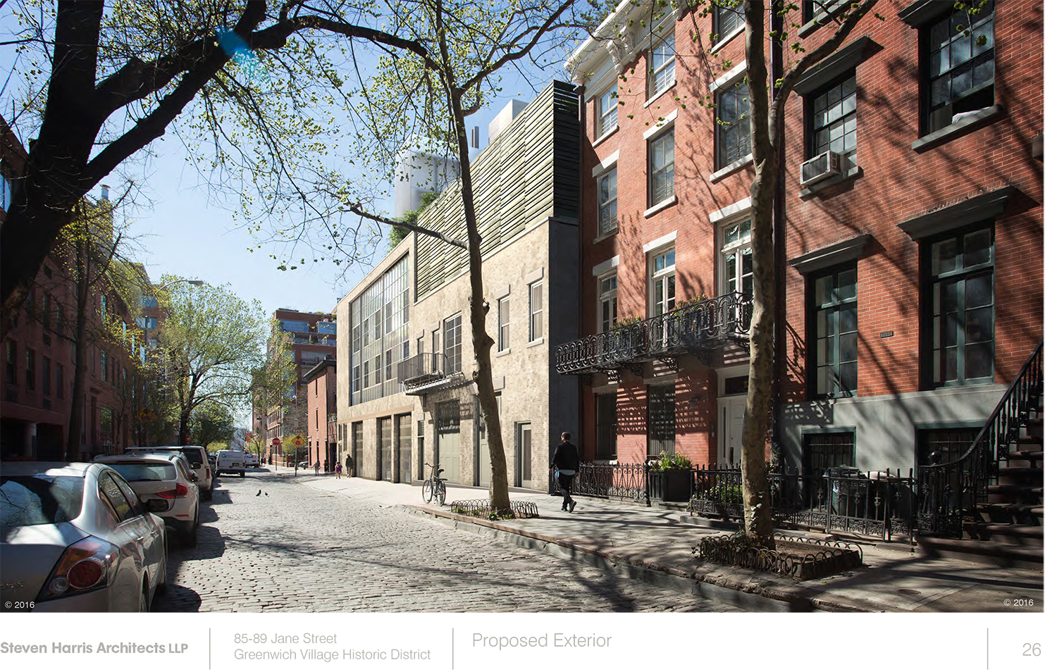
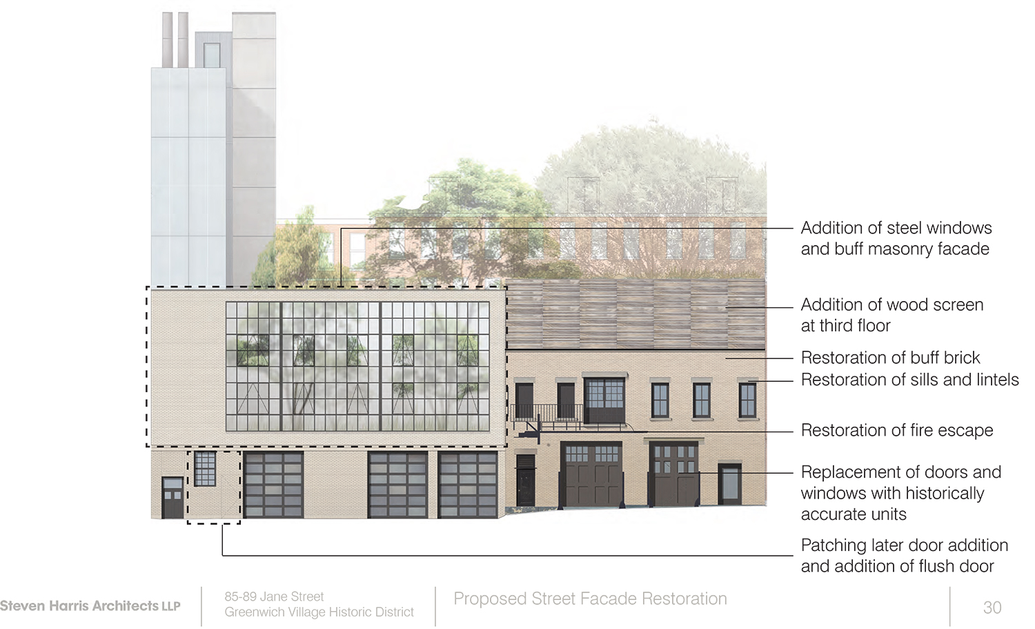
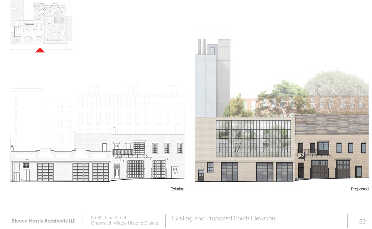
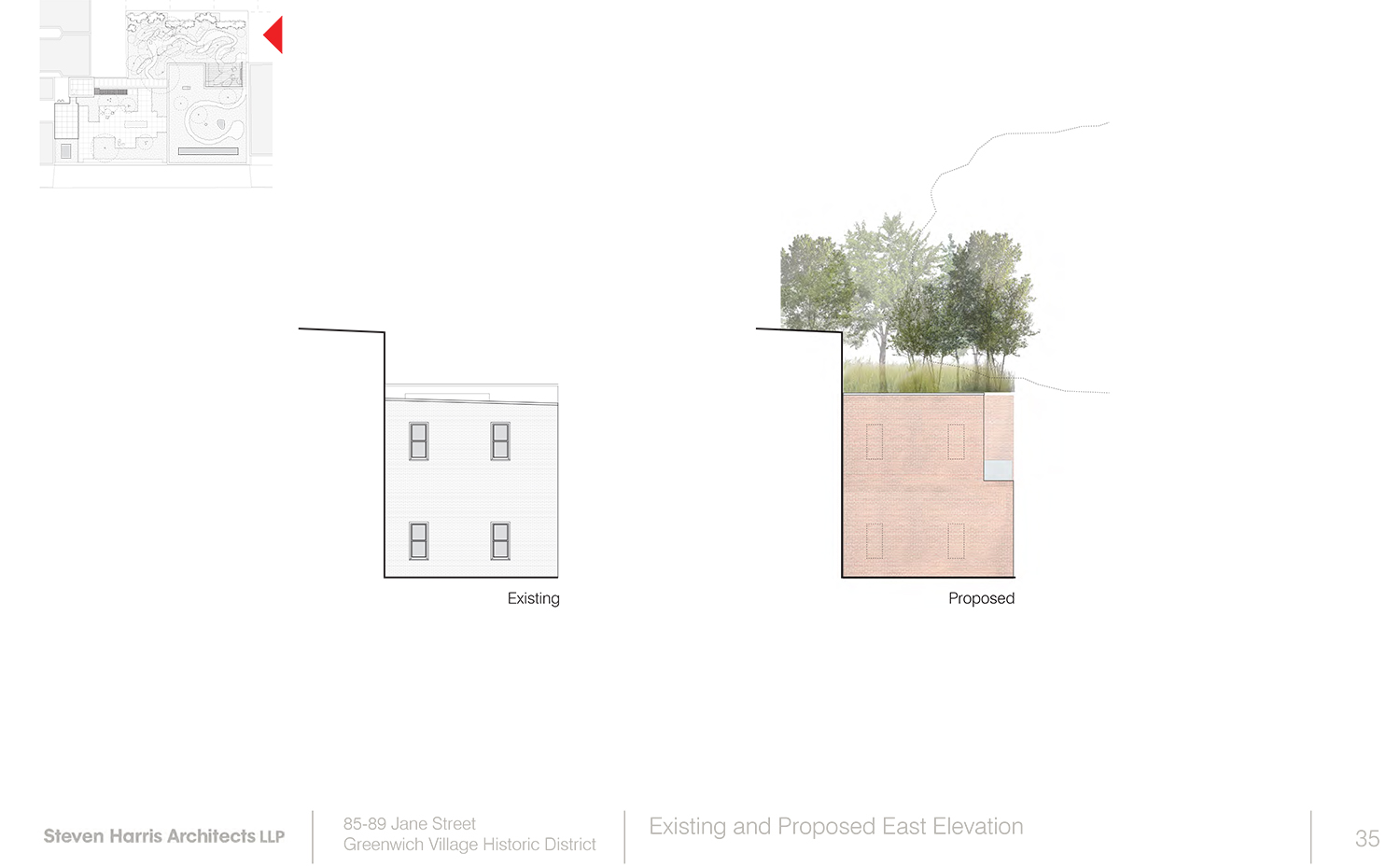
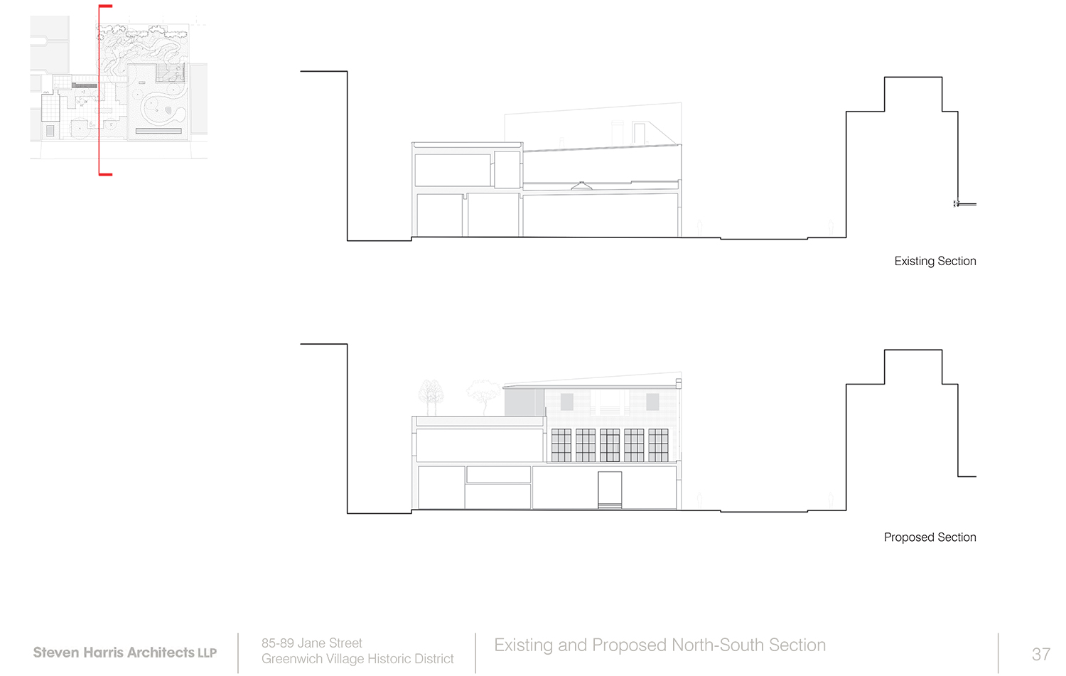
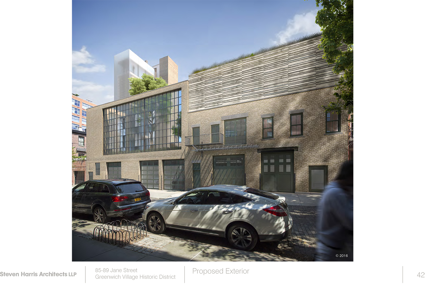
The proposal, designed by Steven Harris Architects LLP, calls for raising the structure that fronts Jane Street to about three stories in height. The portion at 85 Jane Street would still read as separate from the portion at 89 Jane Street, including different heights. 85 Jane would actually rise to three floors in height, with a garden occupying most of the third floor. The addition on the front would be in Japanese Ash. 89 Jane would mostly rise to two floors in height, with a separate garden occupying the bulk of the second floor and screened in by two-story windows.
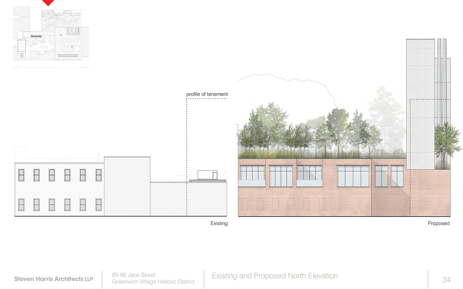
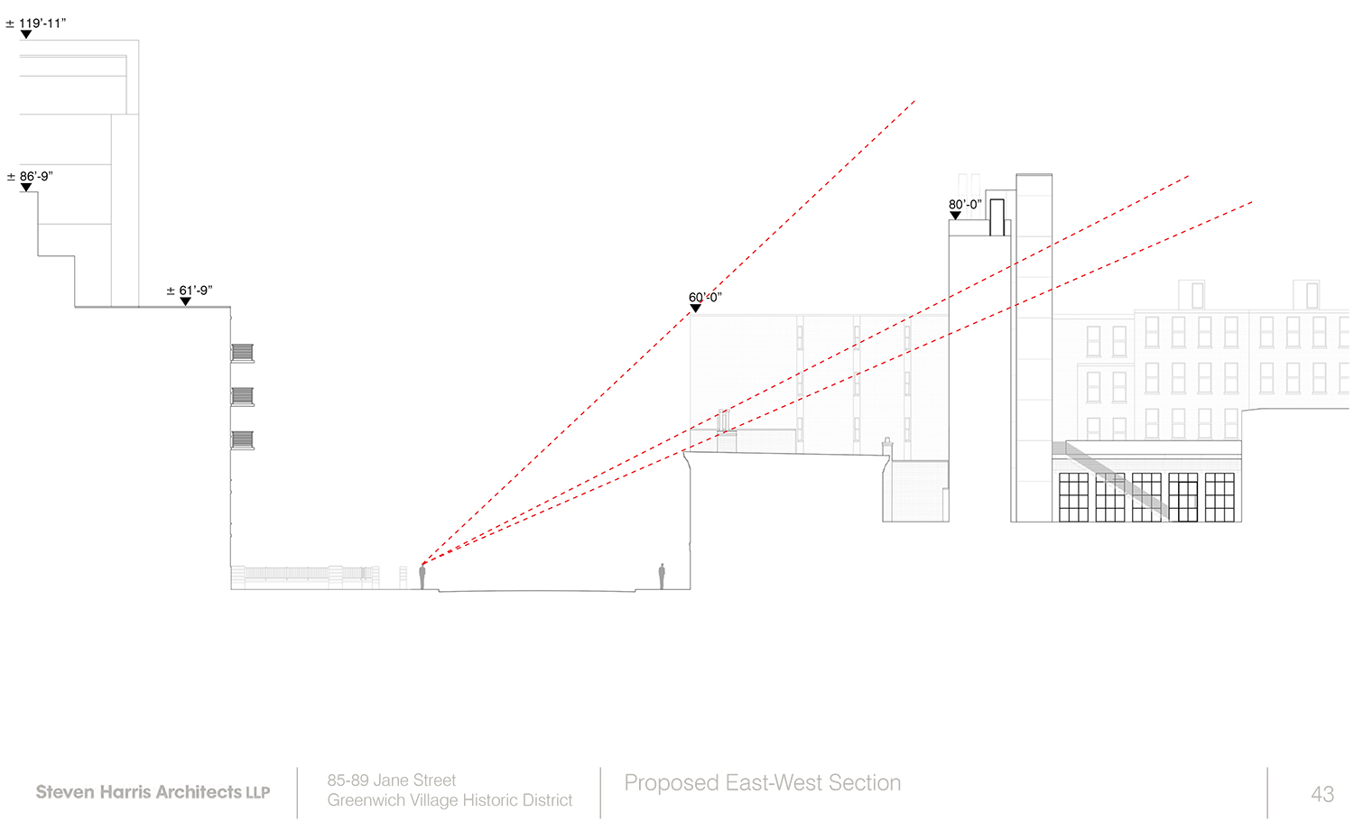
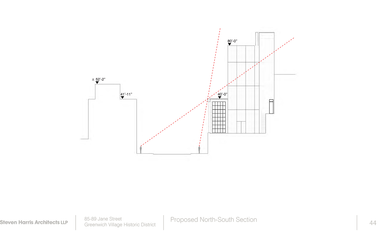
Then a tower would rise several more floors to contain a studio and library. Another tower, completely opaque, would contain the stairs for accessing those library and studio floors. The tower’s height would be around 90 feet.
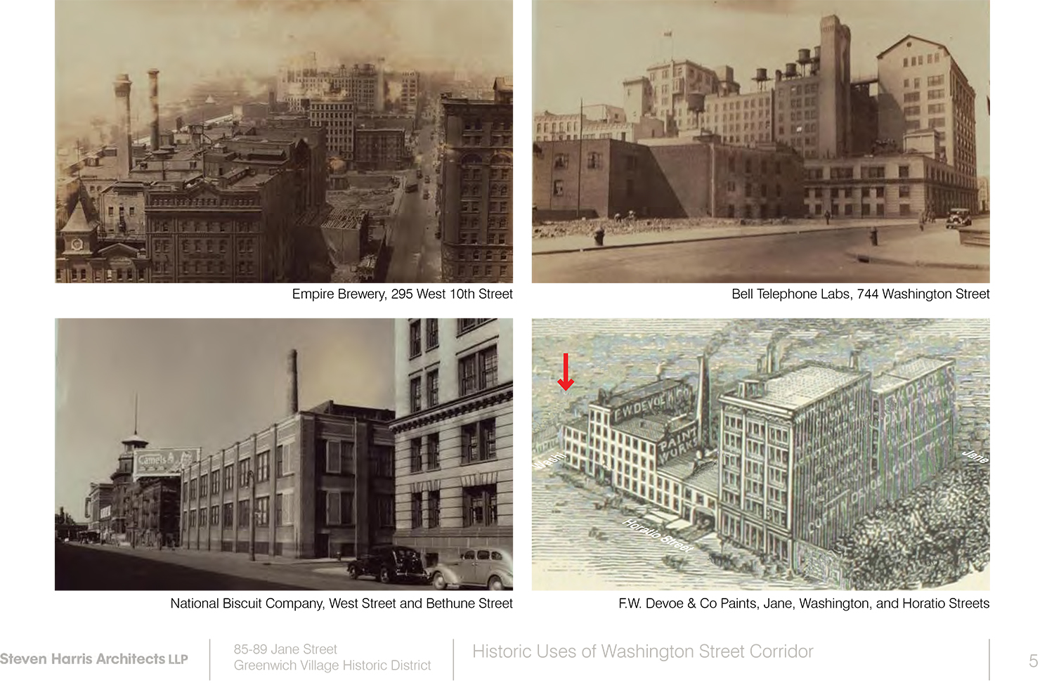
“This is not an Upper West Side brownstone block” Harris said in his presentation. “[The] intent is to preserve the commercial-industrial of the street.” The block does have some commercial use, but these structures represent most of that.
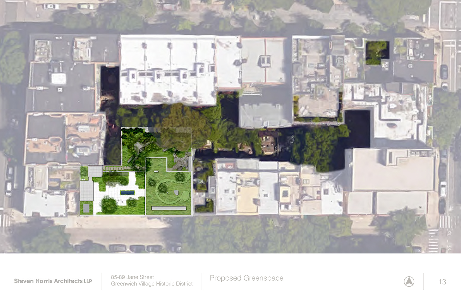
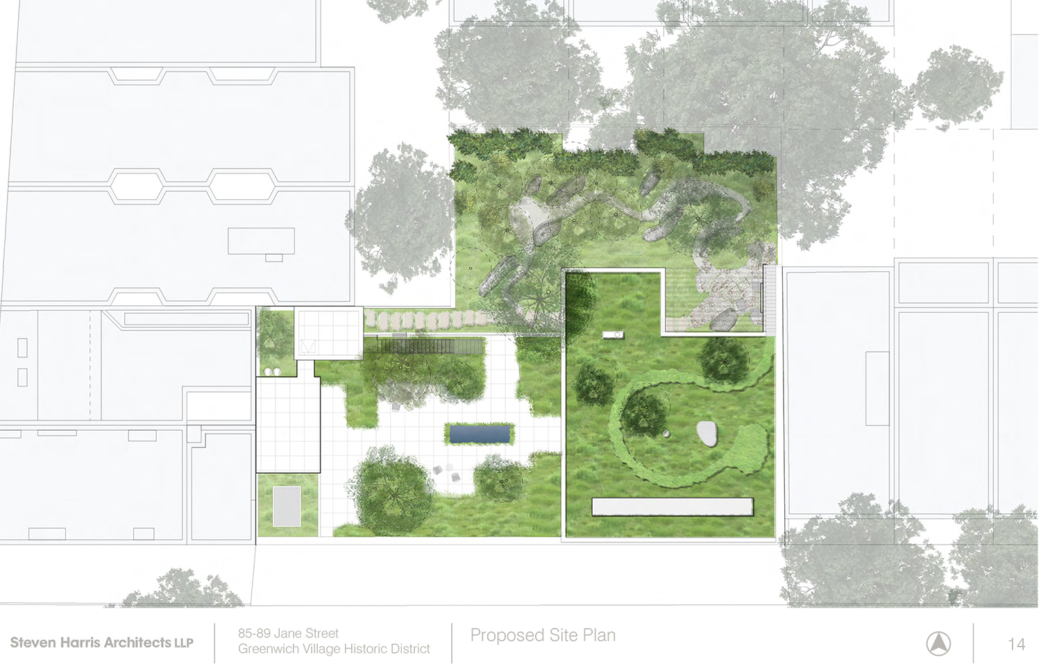
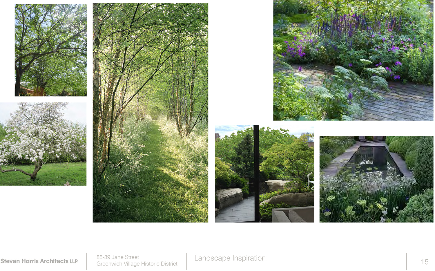
The owner, reportedly billionaire Jon Stryker, bought the properties to create the gardens, Harris said. 1.1 million pounds of soil would be trucked in for the effort.
Harris also emphasized that this three-bedroom home would be as-of-right, as far as other city agencies are concerned, and would actually be smaller than the allowable building envelope.
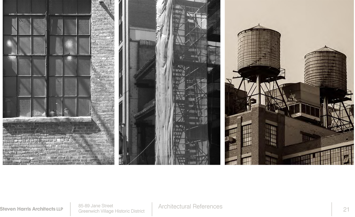
Commissioner Michael Goldblum found himself grappling with the inspiration for the tower, supposedly including water tanks and other small structures. He said the execution fails to make that translation. “This option is not appropriate.” He added that the wood proposed could be approved, but still falls flat, delivering a too two-dimensional appearance.
Commissioner Frederick Bland said the house’s design would be more appropriate elsewhere. He said the tower was clearly inappropriate, noting that the space could be relocated in a still as-of-right house. He joined Commissioner Goldblum in his lack of enthusiasm for the proposed wood.
Commissioner Michael Devonshire said there is “nothing that improves this district” in the design. His tone clearly delivered the message that he did not need to elaborate.
Commissioner Adi Shamir-Baron said the approach had an “artistic aspect” to it and she wanted to “commend that.” However, the tower has lost its relationship to cited precedents and was not appropriate.
Commissioner John Gustafsson said it was a “really cool building” for somewhere other than the West Village.
LPC Chair Meenakshi Srinivasan said the tower was odd and suggested re-massing the overall structure.
State Assemblywoman Deborah Glick testified against the proposal, saying, in part, that it “runs counter to the objectives of neighborhood preservation.” She also commented on the 1.1 million pounds of soil that would be trucked in for the garden, predicting destruction of the street bed would occur in the process.
Christabel Gough of the Society for the Architecture of the City compared the project to Alaska’s infamous so-called “Bridge to Nowhere.”
Andrew Berman, executive director of the Greenwich Village Society for Historic Preservation, delivered extensive testimony opposing the project.
“Good afternoon Commissioners. The Greenwich Village Society for Historic Preservation feels very strongly that the application for 85-89 Jane Street is not appropriate, and should be rejected.
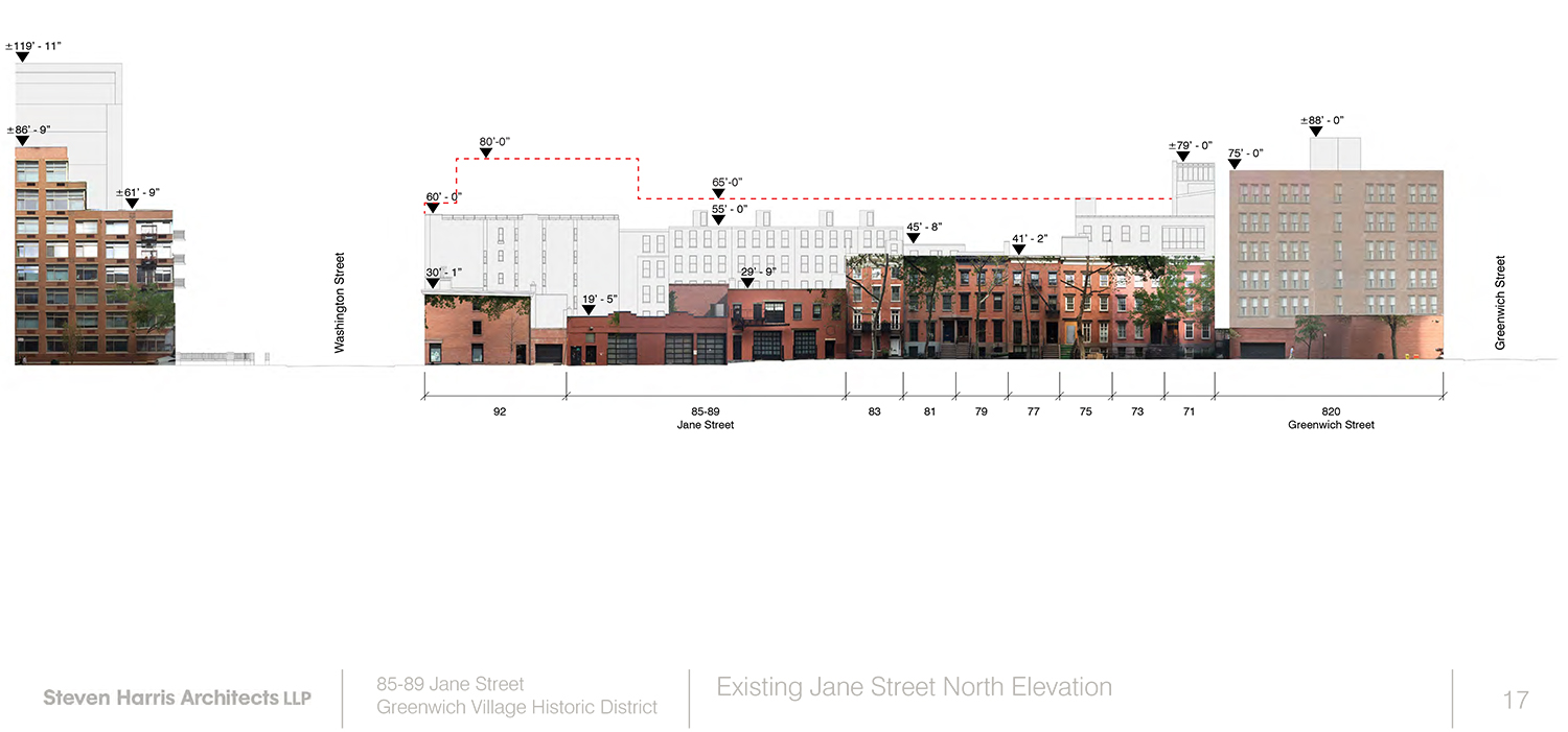
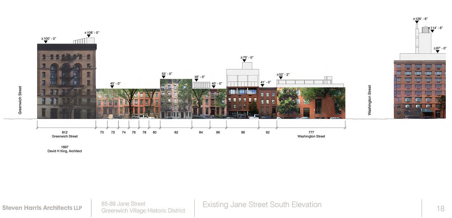
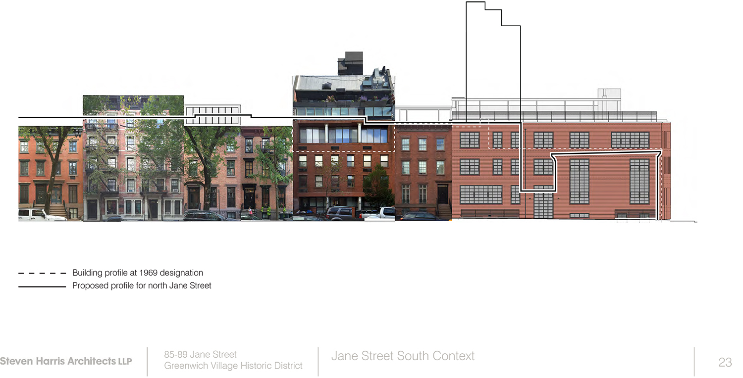
“This is an incredibly special block in the Greenwich Village Historic District. While at its geographic edge, this block is very much at the heart of this district and why it was designated. The north side where the site lies is all 3 ½ story 19th century rowhouses, including the lovely former Robert Bayard House next door at 83 Jane Street, with only 85-89 Jane and one other one-story commercial building deviating from this pattern. The south side of the street is similarly harmonious, with 3 ½ story 19th century rowhouses interrupted only by larger structures at the corners, and the narrow tenements at 80 ½ and 82 Jane Street.
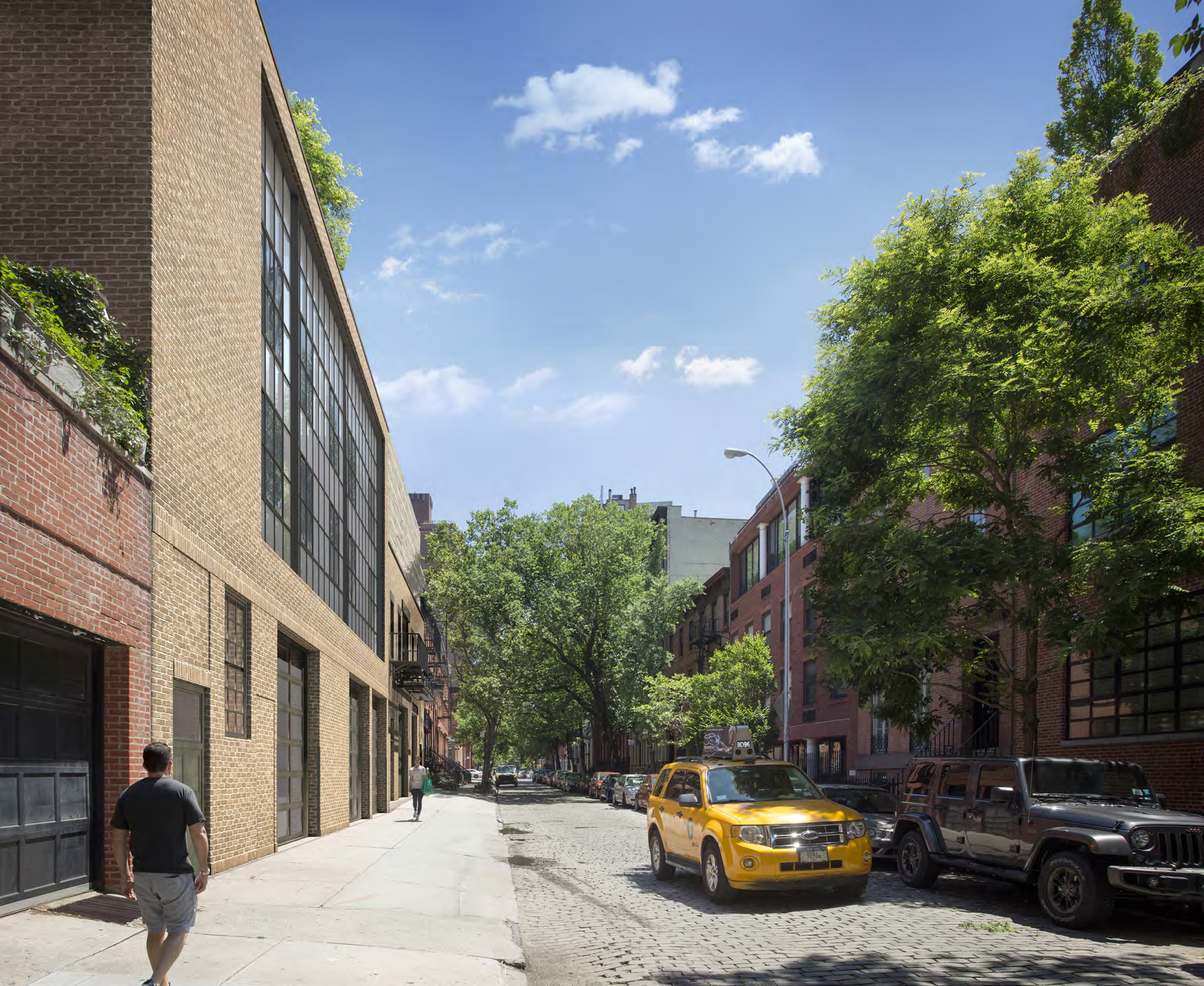
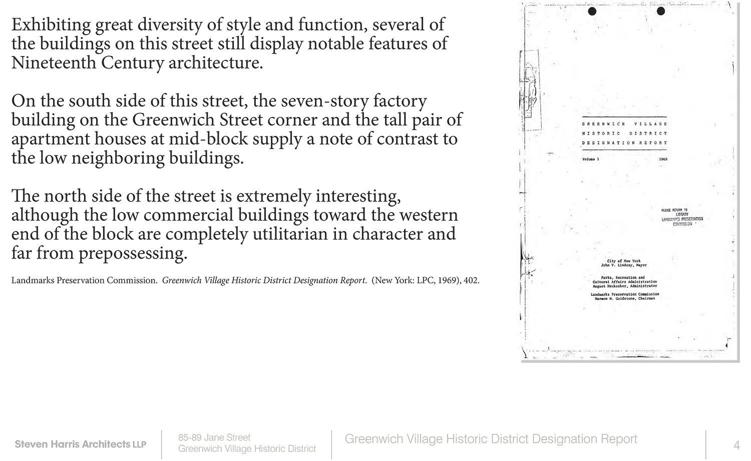
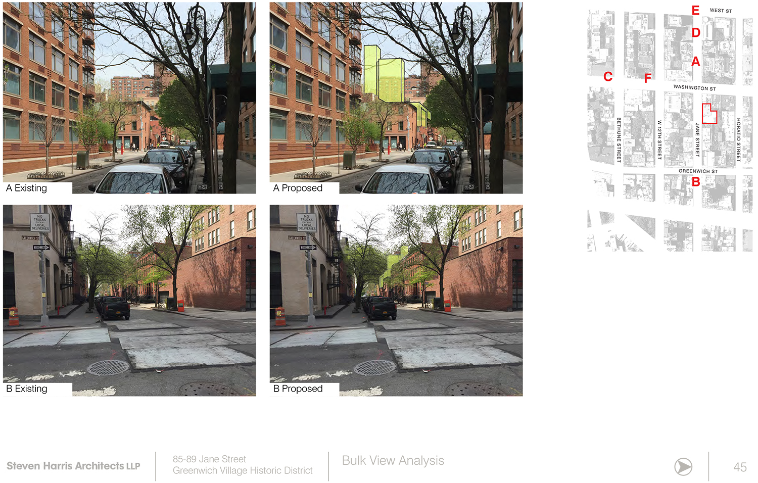
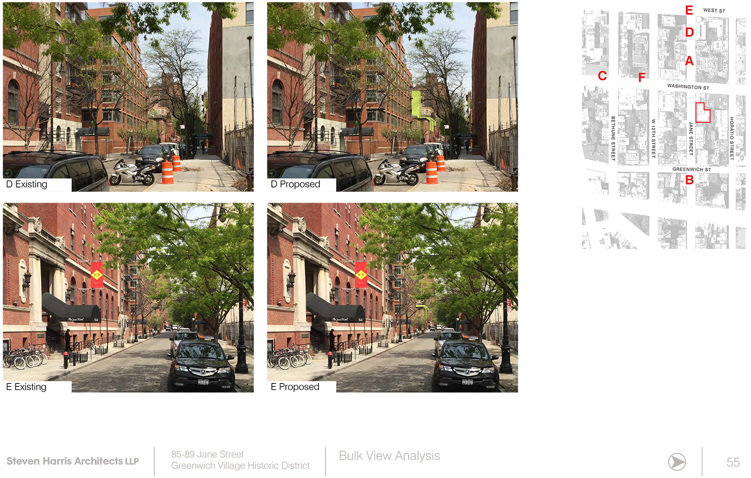
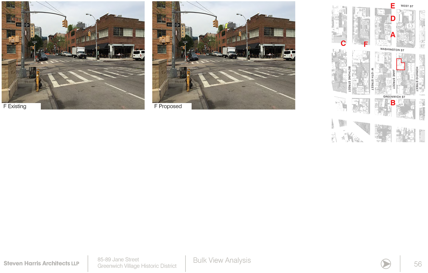
“Into this, the proposal would insert a highly visible 80 ft. tall glass tower that would glow at night, and a 90 ft. tall concrete tower behind it, each of which would be quite prominent from the street and down the block both east and west. There is absolutely no justification for these elements, and they should be eliminated entirely from the proposal. These are not slender chimneys; these are large, jarringly out-of-place elements which are unnecessary visual intrusions into this historic street. For the proposed façade, there is a much greater degree of sensitivity, but still we believe some work needs to be done. We appreciate that the applicant proposes to retain and restore most of the facades of the two buildings, especially as the designation report identifies them (incorrectly, we believe) as “completely utilitarian.” We also think that many of the details and materials of the proposed additions are thoughtful and harmonious with the original buildings and their surroundings.
“However, as currently proposed, the additions could look too monolithic. We urge that the parapet of 89-93 Jane be maintained, and that the addition be set slightly back from the façade of the building, so that it reads clearly as an addition, rather than as a single, massive building.
“The proposed addition to 85 Jane appears to be set back slightly from the existing façade with a slightly different height than the proposed addition to 89-93. We believe this is important to help ensure that any new addition here does not read as monolithic or overwhelming in scale, and that the rhythm and variation of the street is maintained. We believe it is important that the two additions vary from the original buildings and each other in depth and height.
“This is clearly a skillful architect and a thoughtful applicant, and we believe that with the appropriate direction from the Commission this could be a welcome addition to the historic district. Currently, it is not. The startling and intrusive towers have no place here, and the façade should be adjusted to ensure that the modest scale and dimensions of this prototypical Greenwich Village street are maintained.
“Thank you.”
“HDC found the screen to overwhelm the scale of the block, and suggests setting it back so that it appears less like an addition and allows the historic building to read through,” testified the Historic Districts Council’s Barbara Zay. “We found the tower inappropriate and alien to the block and the district, and unnecessary to have so many stories for what will be a library. This square footage should be spread out elsewhere, eliminating the need for a tower.”
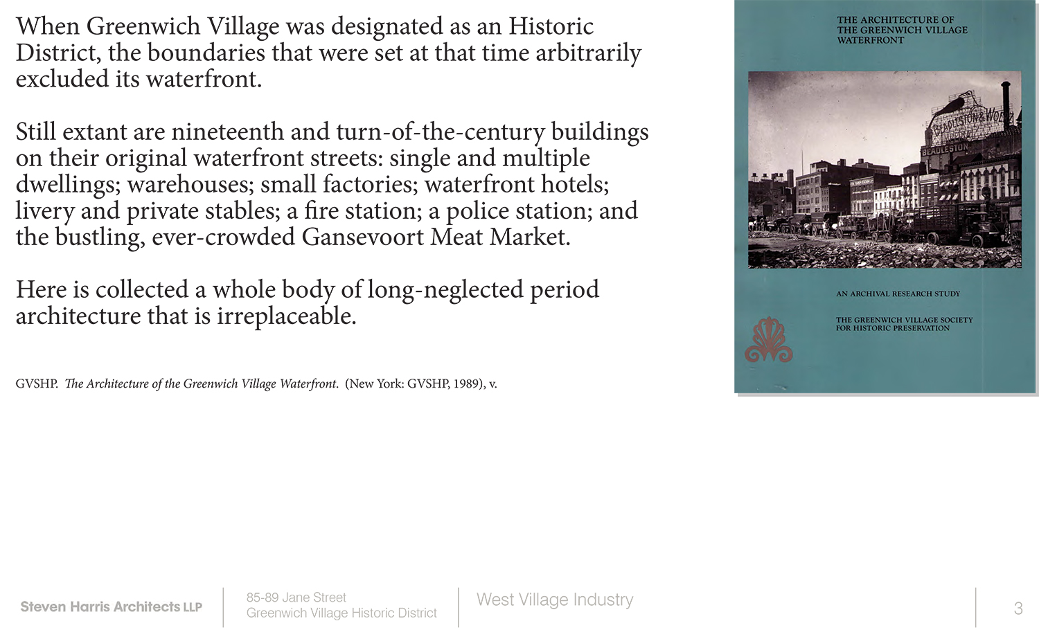
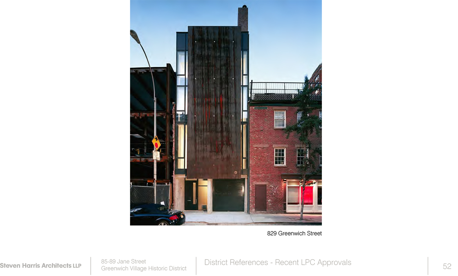
Zack Winestine of the Greenwich Village Community Task Force said there is no precedent for the tower. In the presentation, Harris referenced proposals for historic districts that extended to the Hudson River, to justify the design. Winestine noted that they never came to fruition and, on top of that, were proposed as separate districts, not extensions of the Greenwich Village Historic District.
Activist Theodore Grunewald brought up allegations of a link between Stryker and the ongoing investigation of possible pay-to-play involving Mayor Bill de Blasio. He suggested that warrants the withdrawal of the application.
Cynthia Penny of the Jane Street Block Association said there’s nothing industrial about Jane Street. A resident of 84 Horatio Street said she thought the tower was just a bargaining chip, to be used to allow the rest of the proposal, and was shocked to see that it was a real proposal. Michael Dansky, a 10-year resident of the street said it took real chutzpah to propose something like this.
One member of the public asserted that this proposal must have passed muster with the LPC staff since an LPC staff member reviews all proposals before they go before the commissioners. Sarah Carroll, the LPC’s executive director, said that while LPC staff may give suggestions to applicants, they are free to present whatever they like. She said the fact that a proposal makes it before the commissioners in no way indicated the LPC’s endorsement of that proposal.
In the end, the commissioners took no action. The applicant is free to revise the proposal and go back before commission.
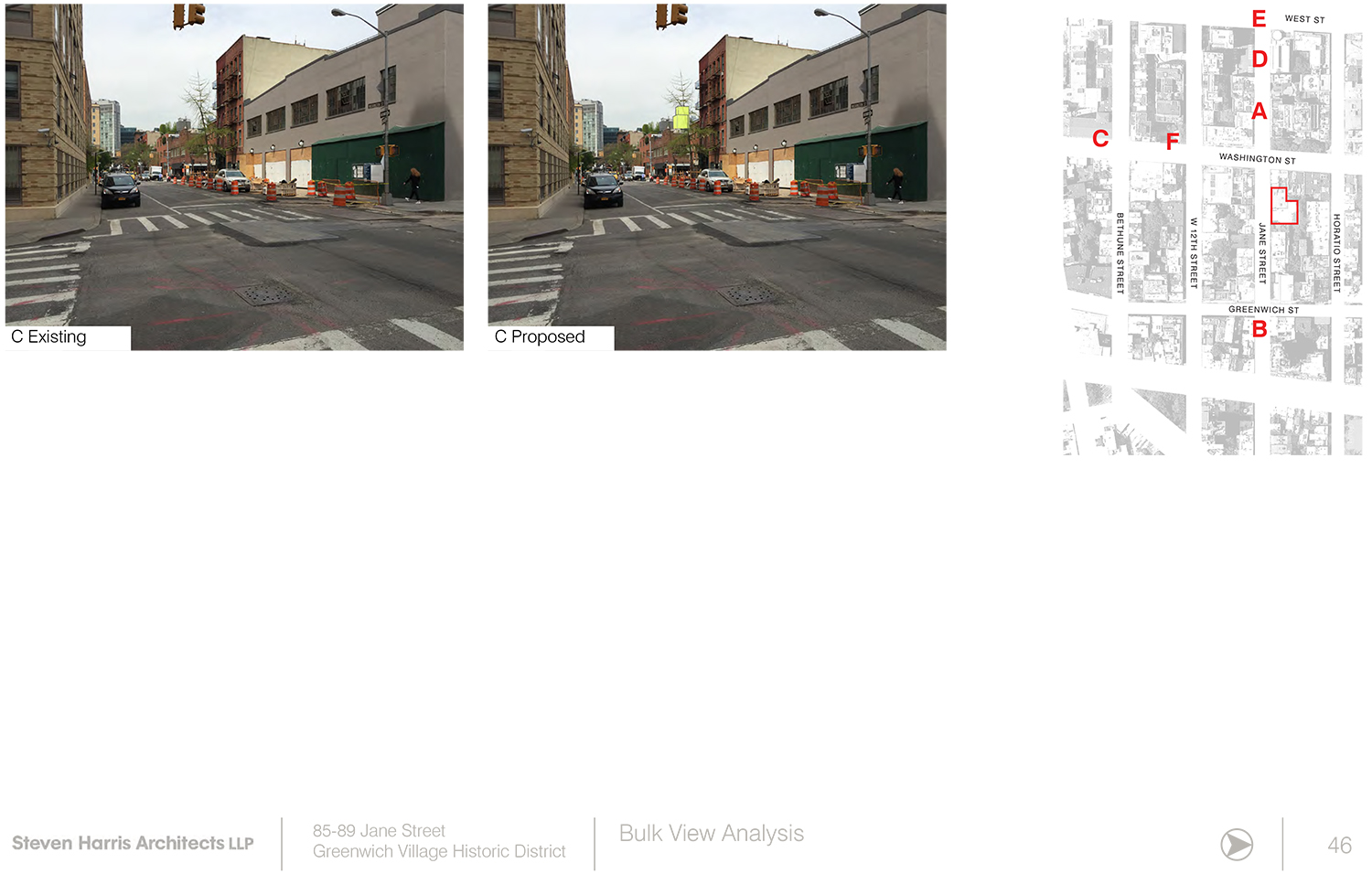
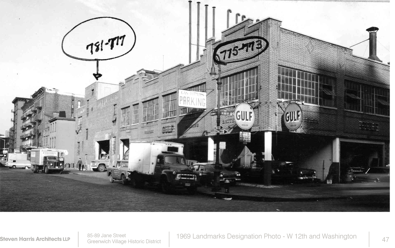
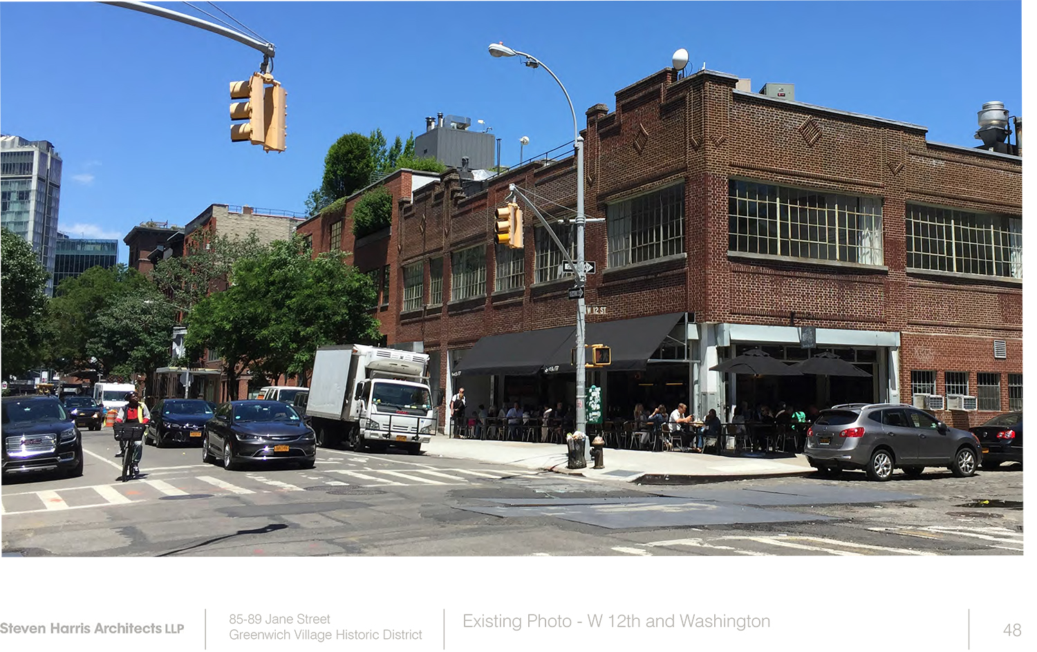
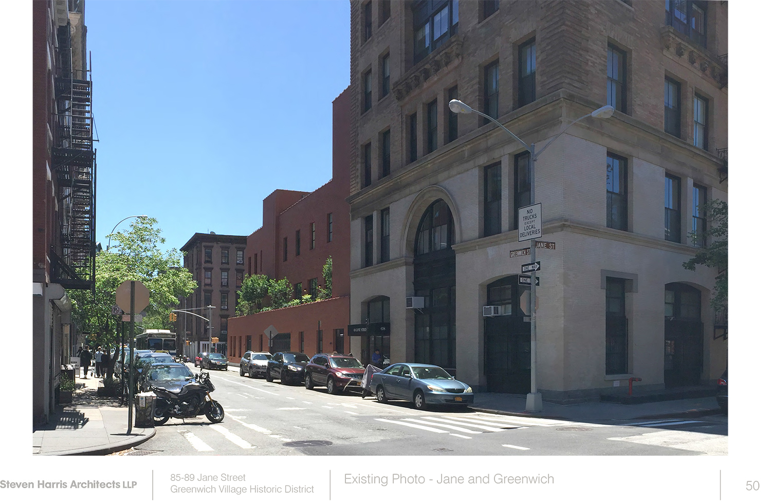
View the full presentation slides below. They presentation bears the date June 21, but it is the presentation shown on Tuesday.
Subscribe to YIMBY’s daily e-mail
Follow YIMBYgram for real-time photo updates
Like YIMBY on Facebook
Follow YIMBY’s Twitter for the latest in YIMBYnews
















Wait..my reading is in process, unfinished and my new comment coming up.
Thanks for very long details, out to the garden I like well middle of forest.
Full of ostensibly ‘artistic’ pretensions to be sure, but bottom line: Ugly façade onto the street, jarring to near neighbors, and destructive of the intricacy and delicateness of these. The materials are riduculous. Buff brick and ‘natural’ wood?? This bit of Pacific-NW kitsch is way off the mark. Unless there is an informed, and compositional intention toward picturesque effect in any proposed design there is no reason to depart from the use of red brick. The idea iof the tower needs to be scrutinized for potential intrusiveness on the privacy of adjacent and nearby backyards. The tower’s cladding materials and image, as experienced from these, as well as from the street needs to be looked at carefully for its thematic contribution thereto. POSITIVE and intentioned contribution to townscape should guide both design and its evaluation here.
I agree with the enlightened city planners. To maintain the historical aspects of these original buildings, I would suggest a liberal scattering of decaying garbage and sculpted horse feces( in artistic, paleo Indian inspired mounds) as well as the odd homeless street person living under traditional cardboard.
Uncontextual and ugly, glad this wasn’t approved. Facade needs to be of red brick or resemble it, what’s there right now is so pretty I’d prefer an addition above tha garage
Beautiful presentation. Ugly product.