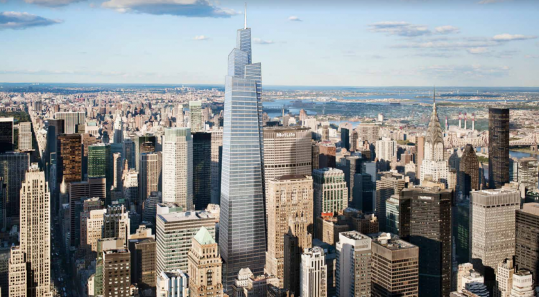
YIMBY has covered One Vanderbilt’s evolution extensively, and several years after it was initially proposed, construction is now reaching well above street level. Today, we have a new look at what the uppermost portion of the tower will yield, in the form of its observation deck. The developer, SL Green, is considering several new options.
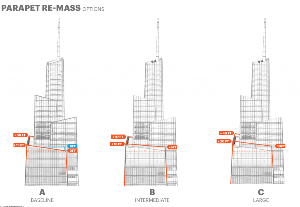
Observation deck versions
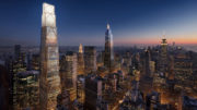
While the supertall will stand 1,401 feet to its pointy parapet, the actual observation deck will be a good bit lower, at around 1,100 feet. The configuration has several potential options in the planned revisions, by architect Kohn Pedersen Fox, and while the changes to the overall envelope won’t be too substantial, the implications for the major public portion of the skyscraper are a bit more significant.
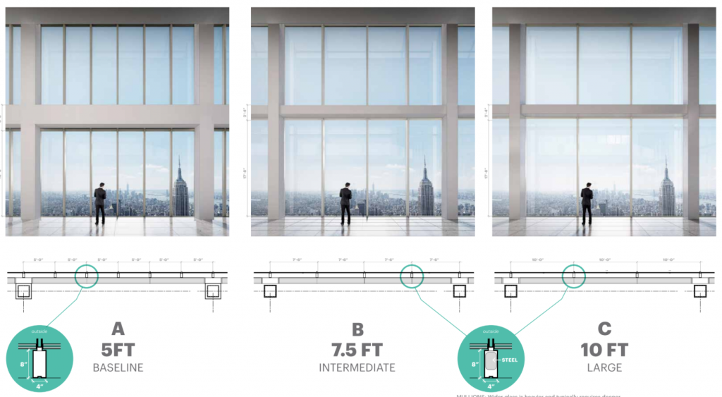
Observation deck possibilities
Several options are on the table in terms of window size and spacing, and the changes will also have an impact on how the tower’s crown appears from afar, with the observation deck’s new glass looking quite a bit different from that on the rest of the tower due to translucency.
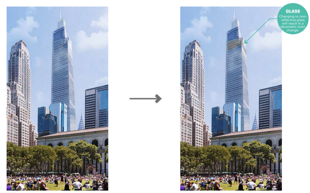
One Vanderbilt
Besides the new renderings, construction on the tower is now climbing several floors above ground level, and the retail floors of the supertall are already quite imposing. The block-spanning project will clearly be a major presence on both skyline and streetscape.
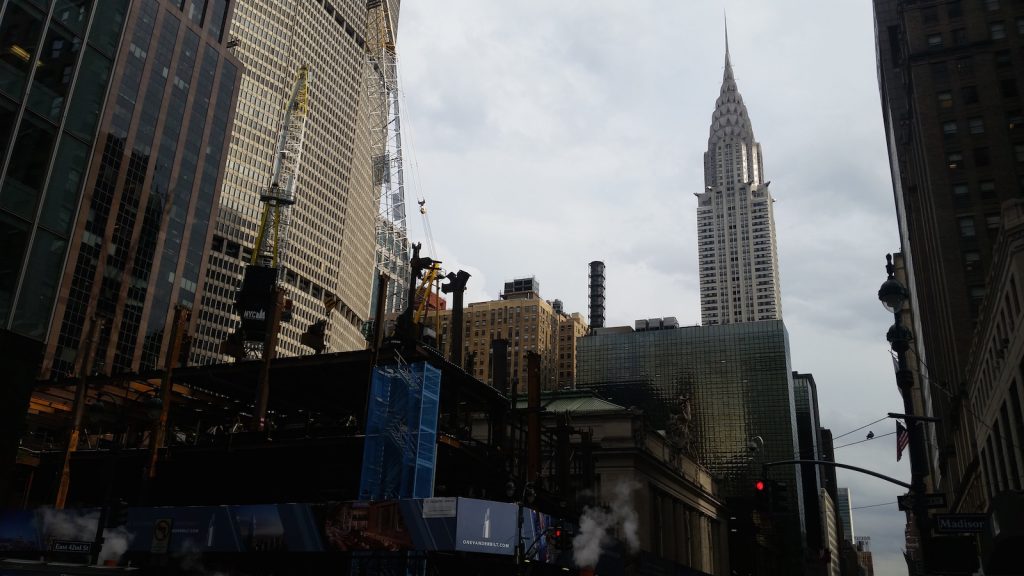
One Vanderbilt October 2017
Completion is currently anticipated for the end of 2021.
Subscribe to YIMBY’s daily e-mail
Follow YIMBYgram for real-time photo updates
Like YIMBY on Facebook
Follow YIMBY’s Twitter for the latest in YIMBYnews


I am carefree. (Thanks to Kohn Pedersen Fox)
Troubling that a fine company like KPF puts out a rendering detail of comparative glass with the description “daramatic color change”. Hope they dont miss anything more crtical.
It looks out of its element. Another glass box albeit one with a slanted facade and awkward setbacks. I classify this as contemporary brutalism.
Contemporary Brutalism indeed.
Especially when juxtaposed with its immediate Grand Central Station neighbor.
Perhaps the lower stories try to mask the essential essence of the hulking building,
with lots of glass enclosures that might have an an inclusive open-air feel to them.
But they can only do so much.
For this is simply a massive, intrusive and unimaginative set of drab building blocks
dumped into an already congested midtown.
But what do you expect in the crass Age of Trump?
Finesse and grace and elegance and beauty? Ha!
Be grateful that we don’t –yet— have massive gold lettering or ugly logos
adorning the building’s facade, and loudly announcing its tenants.
RE: “ugly logos adorning the building’s facade…”
A massive, brightly illuminated sign featuring TD Bank’s logo in its green and white colors is always a possibility given the prominent location of this building, how it will tower over its neighbors for some time, and of course, that this building, when completed will be that bank’s new corporate headquarters.
Just because renderings to date fail to include any visible public corporate logos or other references to the future anchor tenant, certainly does not mean one won’t be disclosed/revealed around the time the last steel beam is hoisted into place, and the building tops out…
…if anything, the surprise will be if something like this does NOT, in fact, happen!!! ?
Foking ulgy ass design. Ruining the NYC skyline.
I love these new futuristic,supertall skyscrapers being built all over NYC!!
It’s not in the age of our President. Totally inappropriate to bring up political opinions that others may see differently. If anything,the age of mayor Deblasio is the problem..moving on