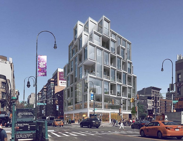
Permits have already been filed for the construction of a 13-story mixed-use building at the corner of 14th Street and Sixth Avenue in Greenwich Village, and today, YIMBY has the exclusive first look at renderings. ODA Architecture is responsible for the design of 101 West 14th Street / 531 Sixth Avenue, which will feature a deconstructivist façade composed of stacked blocks. The site is right next to the 14th Street and Sixth Avenue subway station entrance, serviced by the 1, 2, 3, F, M, L and Path trains. Union Square is just two blocks away.
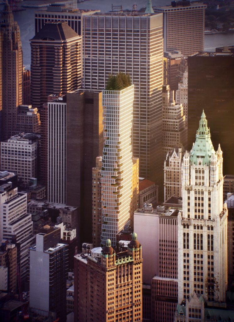
The building’s look certainly resembles the video game Tetris, though not just for randomized engagement. The façade is designed to maximize privacy between neighbors and yield extra space. ODA specializes in this look, most notably on the now-complete 22-22 Jackson Avenue, in Long Island City, and 75 Nassau Street, currently under construction in FiDi.
The 145-foot tall structure will yield 80,140 square feet of total area, with 54,520 square feet dedicated to residential use, and 5,830 square feet for two commercial-retail spaces on the ground floor. 45 condominiums will be created, which includes 21 duplex units. The average residence will be 1,211 square feet.
The entire second floor will be dedicated to a tenant lounge and exercise center, and occupants will also have access to a rooftop terrace, storage for 23 bicycles, a laundry room, and a second fitness room in the cellar.
Gemini Rosemont will be responsible for the development.
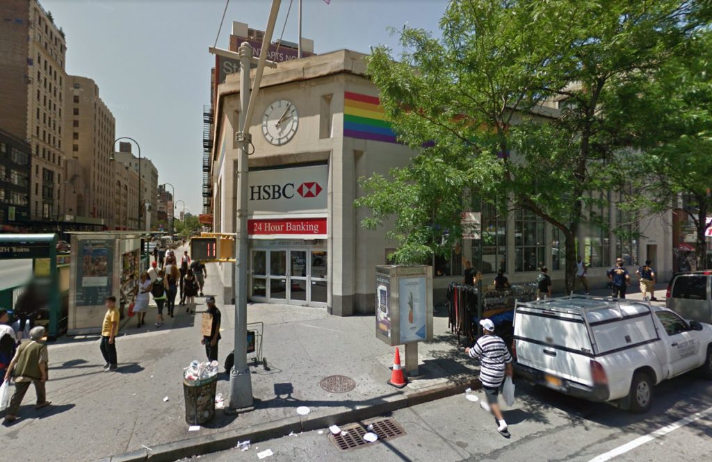
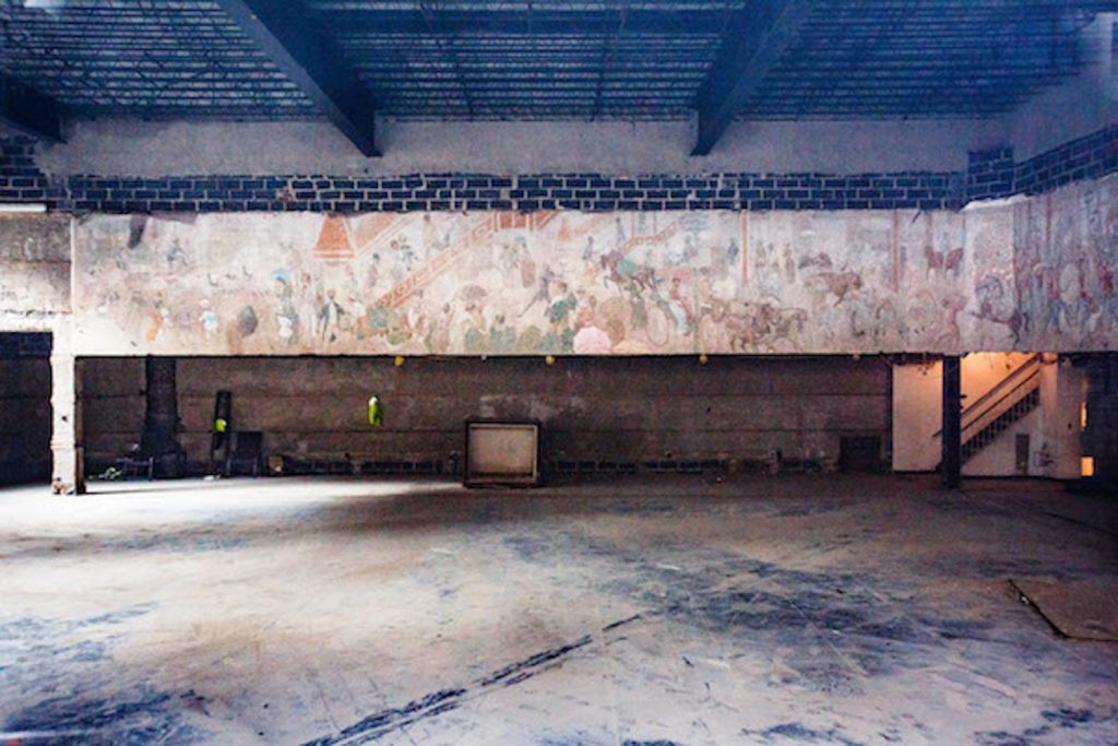
Demolition permits have already been filed, and things do look positive for the 1950’s mural inside, titled, “A Memory of 14th Street and Sixth Avenue.” Jamestown is now the proud owner of the mural as of early 2018.
Construction is expected to start in September, with completion expected in the summer of 2020.
UPDATE: We now know Jamestown possesses the mural.
Subscribe to YIMBY’s daily e-mail
Follow YIMBYgram for real-time photo updates
Like YIMBY on Facebook
Follow YIMBY’s Twitter for the latest in YIMBYnews

Please pardon me for using your space: First come, first served, first follow, first comments. And I’m first.
I see no Tetris shapes on this facade.
80,140 sf sounds short for a 145-foot tall structure…
Disregard above…. (By the way, YIMBY, we should be able to edit/delete comments. I don’t see the option.)
Looks like Habitat in Montreal; shit in the Village.
I know that the appreciation of design is subjective. I also don’t want to stop “progress” but maybe I do want to curtail trends. When architects are asked to design a flagship building on a key corner like 14th Street and 6th Avenue, the demarcation line between the Village and Chelsea, do they ever think to stop and look around at what surrounds them? What was the building like that they were tearing down? (stately) What is the neighborhood like? (mostly low lying brick, cement). Have they noticed how the squared off, glass and steel, odd shaped buildings stick out like sore thumbs and don’t fit in or add to the beauty of the architectural environment? Is it ego or cost reduction that causes them to create glass boxes that are now beginning to look like all the other glass boxes. It really saddens me and I wonder if anyone has taken them on a walking tour of the beautiful streets and the wonderful High Line. I’d be happy to do so.
I think it is very sad that the city government or landmarks preservation is not fulfilling its obligation to the city and its citizens. Why are they permitted to tear down a beautiful old building and put up this crap. I live near this site in flatiron and I think it is disgraceful that permission is so freely granted. We are sick of supertalls and the demotion of beautiful old buildings that are part of our neighborhoods. Who is letting this happen? Where is Corey johnson? Does no one have the balls to go up against the real estate developers. How can we stop this- it’s maadness, not progress.
I agree, the City should upzone 14th Street in its entirety and allow towers of unlimited height. The city’s obligation is to protect promote and cater to the needs of current and future residents, that is not possible if one-story buildings on key commercial thoroughfares with access to handfuls of subway lines are forced to remain extant because grumpy old rich people demand it so.
Any new building at this location should be required to include, within the building footprint, ADA access to the subway lines below. AS noted by others the style of this proposal is questionable. Setting aside the overall aesthetic: Why floor to ceiling glass on such a busy intersection, which usually ends up looking cluttered from the outside (all the stuff crammed up against the glass) and offers minimal privacy for the inhabitants?
OMG! What an abomination. This structure neither fits into the Village/Chelsea ambiance, nor is it, in and of itself, anything Special. It is another very ordinary , lack luster rendition, that a six year old could build with basic building blocks. Where are our elected advocates’ voices? Corey Johnson where are you?
enjoying these angry comments about the new ugly building when in the rendering it is surrounded by truly beat up undistinguished nothing buildings (with a few exceptions) The bank itself was/is an eyesore of 1950s style. next door on 14th st is a non-entity of apartments. next to that is a functional building that houses the Y, and I’m sure was also opposed by all the commenters. This corner is generally a dirty mess and an embarrassment to the city. A residential building can only improve it. Village Chelsea ambiance could be enhanced if the porno store down the block on 6th moves into the new building.
Agreed. I can’t believe this corner could get any worse.
BIG was such a novelty when it came out with his design now everyone is copying and badly, ODA should use creativity instead of their post modern approach to copy and paste